10,000 search results
(0.039 seconds)
- Ayeria by Clevus,
$16.00 Proudly present Ayeria is a Multipurpose serif font with a touch of elegant. Comes with alternatives and ligatures, this typeface is perfect for an elegant & luxury logo, book or movie title design, fashion brand, magazine, clothes, lettering, quotes, and so much more. Font Features : Ayeria Lettres, numbers, symbols, and punctuation 28 alternates and ligatures No special software required they may be used even in Canva, any basic program /website app that allows standard fonts That's it, folks! Multilingual Support Language Support: Danish, English, Estonian, Filipino, Finnish, French, Friulian, Galician, German, Gusii, Indonesian, Irish, Italian, Luxembourgish, Norwegian Bokmål, Norwegian Nynorsk, Nyankole, Oromo, Portuguese, Romansh, Rombo, Spanish, Swedish, Swiss-German, Uzbek (Latin). Follow My Shop For Upcoming Updates Including Additional Glyphs And Language Support. And Please Message Me If You Want Your Language Included or If There Are Any Features or Glyph Requests, Feel Free to Send me A Message. Have a Good Day!
 - Galano Classic by René Bieder,
$30.00 Galano Classic is the display companion of the Galano Grotesque family. Like the Grotesque family, it also pays tribute to the geometric shapes of Futura, Avant Garde, Avenir and the like. However, instead of that family’s modern interpretation of the geometric genre, Galano Classic prefers to stay in the past, a tendency characterized by a moderate x-height and details like the long stretched leg of uppercase “R”, as well as the traditional shaped lowercase “g”, to mention only a few details. Galano Classic, compared to Galano Grotesque, includes lots of redesigned glyphs and consequently adjusted kerning pairs, an extended number of alternative characters, ligatures and opentype features to match a great many design applications. It comes in 10 different weights with matching italics containing 555 glpyhs per font. Although Galano Classic was planned to be the display version of Galano Grotesque, it feels great in small sizes and long text passages, too.
 - Samaritan Tall Lower by Comicraft,
$49.00 Fifteen hundred years from now, a man will be selected to go back in time to prevent a catastrophic event which turned his world into a dystopia. Sent back in time, he was enveloped in empyrean fire, the strands of energy that make up time itself. Crash-landing near Astro City in late 1985, he learned how to master and channel the empyrean forces that had suffused his body -- finally learning to control his powers in time to prevent the destruction of the Space Shuttle Challenger, the event he had been sent to avert. He described himself to journalists as nothing more than "a Good Samaritan", and has continued to help his fellow man in Astro City ever since. John JG Roshell has also been struggling with the empyrean challenge of fitting all of Kurt Busiek's ASTRO CITY dialogue into balloons with the regular Samaritan font, so he created the Samaritan Tall font to help his fellow comic book letterers! It's kinda the same thing, really.
 - Koodgeta by Ws Studio,
$19.00 Koodgeta Script is a calligraphy script font that comes with exquisite character changes, a kind of classic decorative copper script with a modern twist, designed with high detail for an elegant style. Koodgeta Script is attractive because it is smooth, clean, feminine, sensual, glamorous, simple and very easy to read, because there are many luxurious letter connections. I also offer a decent number of stylistic alternatives for some of the letters. Classic style is very suitable to be applied in various formal forms such as invitations, labels, restaurant menus, logos, fashion, make up, stationery, novels, magazines, books, greeting/wedding cards, packaging, labels or all kinds of advertising purposes. . . . Koodgeta Script has alternative Glyph characters, including multiple language support. With OpenType features with alternate styles and elegant binding. The OpenType features work automatically, but you can access them manually and for best results your creativity will be required in combining variations of these Glyphs.
 - ITC Adderville by ITC,
$29.99On a cold winter's night, George Ryan, of Galápagos Design Group, began musing on the possibilities for a “truly original” sans serif typeface. What came out of his musing, and his always-present sketchpad, was ITC Adderville, a typeface whose visual impact is immediate and strong. Ryan explains how he did it: “The rounded ends of its strokes and their skewed baseline contact create an illusion of dancing feet. The tops of lowercase stems emit serif buds, suggesting transition into or out of the serifed form. The spear-like lowercase stroke terminators, along with other distinctive elements such as the stylized reticulation of the lowercase 'g' segments, the salute of that same character's spur, and the bold, non-self-conscious 'i' and 'j' dots, all contribute to the playful and unique nature of this design.” The result is a friendly, lively type family whose graduated weights -- book, medium, and heavy -- lend themselves especially well to use at small display sizes and in short blocks of text. - Savaneta by Arterfak Project,
$20.00 Savaneta is an all caps stylish serif font, designed for display and headline. Inspired by the classic metal movable type (circa the 1440s), with the medium serif thickness. Savaneta is a versatile serif combined with calligraphic sense by adding about 300+ alternates characters so you can create a calligraphic design with ease! This font looks strong and feminine at the same time, that possible to be applied for many purposes. Savaneta is perfect for logos, logotype, letterhead, branding, cards, wedding invitations, label design, posters, apparel, quotes, and short body text. It contains over 500 glyphs and is complete with basic Latin characters. P.S: To access the alternates characters, you need a program with OpenType panel like Adobe Illustrator, Adobe Photoshop, or you can simply copy-paste the alternates characters by accessing Font Book (Mac) and Characters Map (Win) Features included: Uppercase Small case Numbers Symbol Standard Latin accents. Stylistic alternates Stylistic set 01-10 Thank you for visiting, and have a nice day!
 - Beethink by Gassstype,
$25.00 Bee Think This is a Rough Brush Typeface that is written casually and quickly. comes in two mode Standart this font are made with brushes on Procreate. Then crafted carefully drawn into vector format. That is why Bee Think has Rough and strong characteristic more natural look to your text with a more modern look to your text. You can activate Ligature OpenType panel to make these two styles. Bee Think is perfect for homeware designs,branding projects, Logo design, Quotes product packaging, especially with horror and scary themes Bee Think a natural Hand Drawn feel. This handmade font will make your design has a beautiful natural touch for each details. It is perfect for any design project as Invitation,logo, book cover, craft or any design purposes,photos, photography overlays, signs, window art, scrapbooking, tags and so much more! That is has charming, authentic and relaxed characteristic more natural look to your text.
 - Pamithais Script by Creative Lafont,
$8.00 Pamithais Script is a unique blend of classic and modern font. It includes an imperfect style of ups and downs, like a dancing letters, smooth, clean and simple. Pamithais Script font perfect for wedding, event, invitation, escort card, table number, header menus, display, logos, slider blog, custom address, stamps, packaging, greeting card, etc. Pamithais Script comes with a complete set of standard characters, eastern diacritic symbols, consist 902 glyphs in total, and 501 alternative characters as OpenType features to play with. The alternative characters were divided into several OpenType features such as Ligature and Stylistic Sets. You can create an attractive message by using the alternate characters in your design. If you don't have a program that supports OpenType features such as Adobe Illustrator and CorelDraw X Versions, you can access all the alternate glyphs using Font Book (Mac) or Character Map (Windows). If you have any question, don't hesitate to contact me by email: Creative.lafont@gmail.com Thank You !
 - Amory by Suza Studio,
$12.00 Amory Script: a sweet, casual and dynamic handwritten fonts with dancing basics. Also available are Platypus Sans & Ornaments to help you mix and match them to suit your creative work in harmony. all to add an authentic touch to your design. Perfect for Branding, Logo, Greeting Cards, Wedding Stationery, Quotations etc. It comes with a set of Alternative OpenType Characters, Ligatures and various language support. To activate the OpenType Stylistic alternative, you need a program that supports OpenType features such as Adobe Illustrator CS, Adobe Indesign & CorelDraw X6-X7, Microsoft Word 2010 or newer versions. This is coded with Unicode PUA. Mac users can use Font Book and Windows users can use Character Maps to view and copy any of the additional characters to paste into your favorite text editor / application. Thank you very much for viewing, I really hope you enjoyed it and don’t hesitate to send me a message if you have problems or question
 - Periodico by Emtype Foundry,
$69.00 Periódico (newspaper in Spanish), was originally commissioned by the Spanish daily newspaper ABC. Inspired by old Spanish typographic engravings, mostly from the second half of the 18th Century, we picked out the most relevant details of Spanish typography as the source of that inspiration, and instead of making a revival or an interpretation of these models, we started from scratch to create a truly original font family. The goal was to achieve a very distinctive family, functional and versatile at the same time, and reminiscent of old Spanish typography. Although we have borrowed many details from the old Spanish typography, like the nail, which is present in the letters U, G, or J, which we worked and evolved in order to be applied on other letters, we have also left behind several others. One example is the tilde of the ñ engraved by Gerónimo Gil, a very distinctive element of Spanish typography that was intentionally omitted for being too atypical to be used in a contemporary font. The letters a and g are probably the most distinctive of the Periódico family. The shape of the bowl in the letter a, with the top arch in diagonal position, is very characteristic of old Spanish types. In Periódico, we emphasized this detail by applying it to many other letters (such as g, j, and t) up to a point that it became the leitmotiv of this family. The formal finish of serifs and terminals is something that gives great personality to any typeface, so we came up with plenty of alternatives in order to find the exact shape we wanted: sober, elegant, and contemporary. Even though the serifs are geometric, the upper terminals have a curve with a dynamic very similar to the arch in the a or the notch in the j. The terminals in the capitals follow the same style, but, in this case, the inspiration comes from Pradell’s Missal, which on the other hand has been influenced by the types engraved by Johann Michael Fleischman in the Netherlands. Eighteenth-Century types were mostly used for printing books. Therefore, they had very generous proportions (large ascendents and descendants) and high contrast, but today, these characteristics do not work well in newspapers because of the worldwide demand for more space-saving fonts. The adaptation of the type’s proportions to be used for a newspaper was one of the most interesting parts of the project, specially the time taken to find the perfect balance between the x height\ and legibility. Periódico is presented in 30 different styles, for a total of 30 fonts—10 for text (from Light to Bold) and 20 for display sizes (from Thin to Ultra Black); this family results in an extensive system capable of solving all the needs of a large publication.
 - Leather by Canada Type,
$24.95 Over the past few years, every designer has seen the surprising outbreak of blackletter types in marketing campaigns for major sports clothing manufacturers, a few phone companies, soft drink makers, and more recently on entertainment and music products. In such campaigns, blackletter type combined with photos of usual daily activity simply adds a level of strength and mystique to things we see and do on a regular basis. But we couldn't help noticing that the typography was very odd in such campaigns, where the type overpowers all the other design elements. This is because almost all blackletter fonts ever made express too much strength and time-stamp themselves in a definite manner, thereby eliminating themselves as possible type choices for a variety of common contemporary design approaches, such as minimal, geometric, modular, etc. So extending the idea of using blackletter in modern design was a bit of a wild goose chase for us. But we finally found the face that completes the equation no other blackletter could fit into: Leather is a digitization and major expansion of Imre Reiner's forgotten but excellent 1933 Gotika design, which was very much ahead of its time. In its own time this design saw very little use because it caused problems to printers, where the thin serifs and inner bars were too fragile and broke off too easily when used in metal. But now, more than seventy years later, it seems like it was made for current technologies, and it is nothing short of being the perfect candidate for using blackletter in grid-based settings. Leather has three features usually not found in other blackletter fonts: - Grid-based geometric strokes and curves: In the early 1930s, blackletter design had already begun interacting back with the modern sans serif it birthed at the turn of the century. This design is one of the very few manifestations of such interaction. - Fragile, Boboni-like serifs, sprout from mostly expected places in the minuscules, but are sprinkled very aesthetically on some of the majuscules. The overall result is magnificently modern. - The usual complexity of blackletter uppercase's inner bars is rendered simple, geometric and very visually appealing. The contrast between the inner bars and thick outer strokes creates a surprising circuitry-like effect on some of the letters (D, O, Q), wonderfully plays with the idea of fragile balances on some others (M, N and P), and boldly introduces new concepts on others (B, F, K, L, R). Our research seems to suggest that the original numerals used with this design in the 1930s were adopted from a previous Imre Reiner typeface. They didn't really fit with the idea of this font, so we created brand new numerals for Leather. We also expanded the character set to cover all Western Latin-based languages, and scattered plenty of alternates and ligatures throughout the map. The name, Leather, was derived from a humorous attempt at naming a font. Initially we wanted to call it Black Leather (blackletter...blackleather), but the closer we came to finishing it, the more respect we developed for its attempt to introduce a plausible convergence between two entirely different type categories. Sadly for the art, this idea of convergence didn't go much further back then, due to technological limitations and the eventual war a few years later. We're hoping this revival would encourage people to look at blackletter under a new light in these modern times of multiple design influences.
 - Runaround Sue NF by Nick's Fonts,
$10.00In his book Brushstroke and Free-Style Alphabets, Dan X. Solo called this typeface "Tamarind Script" but, whatever its name, this sparkly little gem will add rollicking retro charm to any project it graces. The Opentype version of this font supports Unicode 1250 (Central European) languages, as well as Unicode 1252 (Latin) languages. - Tushy Perfume by Forberas Club,
$16.00 It's Tushy not stussy, even it's Pretty but ain't lazy. yoo what's up, this font is dedicated for you to be your crafting material. Super ready for any craft project as branding image, any tags, card maker, invitation card, greeting card, wedding decoration for your farmhouse wedding or rustic look, or decorative material.
 - ITC Zemke Hand by ITC,
$29.99Zemke Hand was based on the handwriting of its creator, Deborah Zemke, who also designed the symbol font ITC Situations. Cheerful and carefree, the characters have the consciously sketchy look of printed handwriting. ITC Zemke Hand will please young and very young readers and is perfect for cartoons, comics and children's books. - Miracle Script by Din Studio,
$22.00 Miracle Script is modern logo typeface. This font will be suitable for t-shirt printing, name-card design, branding projects, product packaging, quotes, logos, book covers, and all other lovely projects. Miracle Script will further power your design with the included extruded weight. For more information you can contact me : donis4design@gmail.com
 - Zombie Nation by Supfonts,
$19.00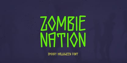 Zombie Nation spooky halloween font will be perfect for halloween lettering, beautiful frame for your home, book covers, greeting cards, logos, marketing, magazines or anything that requires cute handwritten lettering :) What's inside: - Zombie Nation Regular - Multilingual support - Cricut support If you have any questions, please contact me directly or in instagram @superdizigner
 - Erler Titling by RMU,
$30.00 Herbert Thannhaeuser’s 1953 titling font Erler-Versalien which was distributed by Typoart in hot-metal times, was carefully redrawn and redesigned. To preserve its handwritten character, irregularities in the letters’ strokes were left as they are. This font spreads best its beauty in book titles, magazines, diplomas, greeting cards or as initials.
 - Night Ghost by Supfonts,
$13.00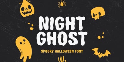 Night Ghost spooky halloween font will be perfect for halloween lettering, beautiful frame for your home, book covers, greeting cards, logos, marketing, magazines or anything that requires cute handwritten lettering :) What's inside: - Night Ghost Regular - Multilingual support - Cricut support If you have any questions, please contact me directly or in instagram @superdizigner
 - Southern Spaceship by Crumphand,
$16.00 Say hello to Southern Spaceship. Southern Spaceship is skinny playful font from space. this font is very quoteable about space. can use for sticker, book cover and your small business. Southern Spaceship comes with opentype feature and Stylistic Alternates. Character on glyph ? Uppercase Lowercase Numerals & Punctuations Multilingual Supports Stylistic Alternates Standart Ligature Regards!
 - Hasan Enas by Hiba Studio,
$59.00 Hasan Enas is an Arabic text typeface. This font is designed for reading texts and inspired in the simple lines of Naskh calligraphy. It supports Arabic, Persian and Urdu. The characteristic of its design is easily recognizable and very stable to use for extended texts in magazines, newspapers, books, and other publications.
 - Florentin 2D by 2D Typo,
$36.00 Angular Old Style by Viktor Kharyk is usable as display font, for non-formal texts, especially poetry, for children books and virtual games about adventures, history, and pirates and includes some original ornament set. By stylistic it connects with Italian Renaissance, Czechian types of the first half of 20th century and cut technology.
 - Korejat by Inumocca,
$20.00 Korejat Modern Typeface , All Caps Serif simple and Playfull. come with some simple Alternates for covering your Project, like Branding, Movie Title, Headline Letter, Bookcover or Book Content, Magazine cover, Poster, Quotes Lettering, Logos, and more your project design. - Unique glyphs - Multilingual Characters - UPPERCASE - Numeric - Symbol - Punctuation Character - Alternates Set inumocca type Studio
 - Girder Poster by GroupType,
$15.00 Girder Poster, also named Spurred Gothic, was inspired by showcard lettering samples featured in the book, Commercial Art Of Show Card Lettering, published in 1945. Although similar to Cooper Bold, Girder Poster's serifs are spurred and the design's inception came out of theatrical poster studios of the mid 1900's in New York.
 - Whirled Peas NF by Nick's Fonts,
$10.00In his book Showcard Alphabets, Dan X. Solo called this little gem "Whitestone Scrawl". This version is beefed up slightly and the letter proportions have been altered somewhat, but it's still LOADS of fun. The Opentype version of this font supports Unicode 1250 (Central European) languages, as well as Unicode 1252 (Latin) languages. - Londrina by Tipos Pereira,
$- Londrina is formerly known as Folk. The Londrina family originally had four typefaces: Solid, Shadow, Outline and Sketches. The idea is to combine the main typeface Solid with the others, experiencing different outlines. Now Londrina has three new weights: Thin, Book and Black, growing the family to work with the Solid version.
 - Boller by Elemeno,
$10.00Boller is based on handwriting found on the blueprints for the Jayhawk Theater in Kansas. Thomas Williams & Boller Bros. Architects are the only names found on the blueprints. The character set is extremely limited and many of the missing characters are extrapolated from existing letters and symbols. Ideal and distinctive at large sizes. - Helaw Wolau by Inumocca,
$13.00 Helaw Wolau Halloween Display Font, simple and strong Character. come with some simple Ligature for covering your Project, like Branding, Movie Title, Headline Letter, Bookcover or Book Content, Magazine cover, Poster, Quotes Lettering, Logos, and more your project design. - Unique glyphs - Multilingual Characters - UPPERCASE - Lowercase - Numeric - Symbol - Punctuation Character - Ligature inumocca type Studio
 - Traditional Spancer by Inumocca,
$18.00 Traditional Spancer Modern Serif Typeface , simple and powerfull. come with some simple Alternates for covering your Project, like Branding, Movie Title, Headline Letter, Bookcover or Book Content, Magazine cover, Poster, Quotes Lettering, Logos, and more your project design. - Unique glyphs - Multilingual Characters - UPPERCASE - Lowercase - Numeric - Symbol - Punctuation Character - Ligature - Alternates inumocca type Studio
 - Local Media by Supfonts,
$12.00 Local Media Cyrillic will be perfect for wedding lettering, beautiful frame for your home, book covers, greeting cards, logos, marketing, magazines or anything that requires cute handwritten lettering :) What's inside: Loval Media Script Multilingual support Cyrillic support Cricut support If you have any questions, please contact me directly or in instagram @superdizigner
 - Kurtzberg by Nerfect,
$15.00Kurtzberg was created after the bold type on the splash pages of many of the classic comics of the 'fifties and 'sixties. Thick and chunky and filled with all those symbols basic comic book fonts rarely come with. Kurtzberg is always ready to swing into action when injustice rears its ugly face. - Agatized Formal by ULGA Type,
$25.00 Agatized Formal is a chunky stencil typeface with slightly condensed letterforms and tight spacing. Designed primarily for display use, it’s ideal for posters, logos, advertising, book cover designs or small chunks of text such as pull-out quotes. It exudes authority without taking itself seriously, like a plump jolly uncle in charge of a brass band. Agatized Formal is a big, bold typeface with a charismatic presence that commands attention – in a friendly way, of course. But what really makes this typeface come alive is its arsenal of alternative characters and ligatures. There is a saying: Use sparingly. Whoa! Not here, no, no, no. Make your Glyphs palette earn its money. Flex your OpenType muscles: get stylized, contextualized, indulge in some ligaddiction. This typeface is a peacock that likes to put on a show, spread its plumage and strut around in all its blazing glory. Agatized, according to Wiktionary, means: A living thing converted into the form of agate; fossilized. I felt the name suited the solid, almost rock-like letterforms, but most of all I just wanted a typeface name that began with the letter A. Although Agatized Formal is a single-weight typeface it has a sibling, Agatized Informal, an older, more casual brother, rougher round the edges with craggy good looks and an altogether more jaunty style.
 - Artisinal by Stiggy & Sands,
$24.00 Artisinal, not to be confused with the term artisanal, is our revival of the Art Deco typeface known as Cubist Bold, by John W. Zimmerman for Barnhardt Bros. & Spindler in 1929, breathes new life into a classic. The original metal cast typeface was designed without a lowercase, as well as some wedge serif capitals made for not always perfect pairings. We've created a lowercase that blends well with the original design to give the typeface more usability. We've also created a fully sans version of the capitals as the default set, and moved the original wedge serif capital styles to a contextual alternates feature. And we created a few stylistic alternates for lowercase characters like the u and y and their accented styles. See the 5th graphic for a comprehensive character map preview. Opentype features include: - Full set of Inferiors and Superiors for limitless fractions. - A Standard lining figure set. - A collection of basic f Ligatures. - Stylistic Alternates for variations of several characters such as u and y. - Contextual Alternates for the original wedge variations of capitals that will mix in where appropriate. Approx. 450 Character Glyph Set: Artisinal comes with a glyph set that includes standard & punctuation, international language support, and additional features
 - Boberia by Linotype,
$29.99Linotype Boberia is part of the Take Type Library, which features winners of Linotype’s International Digital Type Design Contest. Designed by Bo Berndal, its historical roots lie in the neoclassicism of the turn of the 20th century. The slender letters with a large x-height and marked stroke contrast give the font an elegant character. The nostalgic, flowing forms are typical of Art Deco fonts and allow designers a number of possibilities for the font’s use. Boberia includes regular, italic and bold type styles. - Baked Milk by Struvictory.art,
$15.00 Baked Milk is a display font family with nostalgic motives. The font is created in a groovy retro style. Baked Milk includes Regular and Symbol Styles. The font is suitable for retro summer posters, menu and social media design, branding, event design etc. Baked Milk has extensive language support, it includes English, French, German, Italian, Spanish, Portuguese, Danish, Norwegian, Swedish, Finnish, Estonian, Turkish. Baked Milk font contains ligatures: aa, dd, ff, ft, hh, jj, kk, ll, mm, nn, oo, pp, rf, rr, rt, ss, tt, uu, Ti.
 - Boscribe by Monotype,
$29.99Bo Berndal's handwriting was terrible in his younger days, and he could not even read his own notes. When he started out as an apprentice in a printing shop, he started to copy Garamond italic and formed his own style of writing. Later he was inspired by both Alfred Fairbanks and his reform-writing and by Paul Standard in the U.S.A and created the Boscribe font. - Soleil by TypeTogether,
$49.00 Soleil, designed by Wolfgang Homola, is a geometric sans serif typeface. Unlike most existing geometric sans serif typefaces, it has asymmetrical counters, making it look fresher, more dynamic and more contemporary. Simple geometric forms – such as the circle or the square – played a certain role in the design of the letterforms, but in order to introduce more fluidity into the rather stiff and rigid concept of geometric sans serif typefaces, a lot of optical corrections were necessary. Soleil is based on the modernist ideas of simplicity, clarity and reduction to essential forms. Yet its letter shapes are not the result of geometric construction, but of a design process that brings together simplicity and fluidity, clarity and rhythm. Soleil has a rather large x-height, making it legible also in small sizes or from a bigger distance. The typeface family consists of six weights. The Opentype version also allows for the implementation of typographic features such as Small Caps, lining and old-style figures, both tabular and proportional, ligatures, alternate characters, case-sensitive variants and fractions. Soleil offers a wide range of potential applications: signage and wayfinding systems, book and magazine design, branding and corporate publications.
 - Lattoria Script by Rotterlab Studio,
$12.00 Lattoria Script - a new fresh & modern script with a handmade calligraphy style, decorative characters and a dancing baseline! So beautiful on invitation like greeting cards, branding materials, business cards, quotes, posters, and more design concept! The alternative characters were divided into several Open Type features such as Swash, Stylistic Sets, Stylistic Alternates, and Ligature. The Open Type features can be accessed by using Open Type savvy programs such as Adobe Illustrator, Adobe Photoshop, Corel Draw X version, And Microsoft Word. This font is PUA encoded (specially coded fonts) so that all the alternate characters can easily be accessed in full by a craftsman or designer. Unique ligatures Stylistic Alternates Stylistic sets Basic Latin A-Z and a-z Numbers International Symbols included Punctuations How to access all alternative characters using Adobe Illustrator: • https://www.youtube.com/watch?v=XzwjMkbB-wQ There are additional ways to access alternates/swashes, using Character Map (Windows), Nexus Font (Windows), Font Book (Mac) or a software program such as PopChar (for Windows and Mac). How to access all alternative characters, using Windows Character Map with Photoshop: • https://www.youtube.com/watch?v=Go9vacoYmBw File Included: Lattoria Script (otf)
 - The Fright House by IKIIKOWRK,
$17.00 Proudly Present The Fright House - Classic Horror Type, created by ikiiko. Inspired by classic horror movie posters, The Fright House, with its retro appeal and traditional serif styling, revives the spirit of horror from the 1970s. The nostalgia and appeal of a past of dread is captured by this typeface, which pays homage to the typefaces that covered horror novels, movie posters, and spooky magazines during that time. The Fright House is a classic elongated condensed serif typeface with a timeless elegance inspired by 1970s fonts. With a precisely defined serif that gives it a sharp and unsettling feel. Each character has graceful contours and precise proportions, seamlessly blending vintage design with the thrilling charm of suspense. This typeface is perfect for an vintage poster, movie title, classic stuff, magazine layout, book cover, and also good for quotes, or simply as a stylish text overlay to any background image. What's included? Uppercase & Lowercase Number & Punctuation Ligature (Bonus) Multilingual Support Works on PC & Mac Get also a good offer & FREEBIE at our site : www.ikiiko.com Enjoy our font and if you have any questions, you can contact us by email : ikiikowrk@gmail.com
 - Lipa Agate by TypeTogether,
$49.00 Lipa is the name of the Slovenian national tree 'Linden'. The typeface Lipa Agate by Croatian designer Ermin Međedović, is part of a bigger type collection, comprising various type groups into one coherent system which Ermin developed over the past 10 years. Lipa Agate is the first to be released; a sans serif designed and engineered to be used in the smallest text sizes, best under 10pt, and in very bad printing conditions. It is perfect for phone books, classified ads, directories or any other job requiring economy without jeopardising legibility. To achieve this, Lipa Agate employs a range of tools, such as deep ink-traps, narrow proportions and a tall x-height. Contemporary editorial design requires a high amount of flexibility to respond to various design situations in a consistent fashion. Lipa Agate — with its 3 levels of condensation, 4 weights and 2 sets of different x-heights, 'High' and 'Low', which share the same width — fulfils these requirements wonderfully. That's a total of 24 fonts! To make this clean and honest workhorse face complete, its large character set also includes small caps, arrows, info-numerals and much more.
 - Gutta Percha by HiH,
$8.00 Gutta Percha is a font for golfers. It takers its name from a hard, resilient natural substance that comes from the sap of trees grown in southeast Asia and which was used for the hard core of golf balls well into the twentieth century, when it was gradually replaced with synthetic material. It therefore seemed an appropriate name for a font using the image of a golfer of the 1920s. The letters are from our font Besley Clarendon, reduced to 70%. That means that Gutta Percha set at 40 points will have the same size letters as Besley Clarendon set at 28 points. However, it should be noted that the two fonts have different baselines. If you use them together you will have to manually adjust the vertical alignment. Gutta Percha is obviously a very specialized font, both because of the subject matter and because the uppercase is designed for use as dropped caps. There may not be many uses for it, but when it is right, it will be really right. Whether you are publishing a book about the history of golf or a clubhouse bulletin, Gutta Percha will surely be noticed.