10,000 search results
(0.042 seconds)
- Use Your Words by Joanne Marie,
$10.00 Here’s a different kind of font for the hand lettered look! Use Your Words is a catchwords font family consisting of 3 fonts: 1.) Use Your Words Circles 2.) Use Your Words Arrows 3.) Use Your Words Banners It’s all hand drawn and hand lettered in a monoline script font with a shadow effect to boot. This font will be perfect to include on designs such as mugs, t-shirts, bags, notebooks, inspirational quotes for the home and office, and more. There are 215 words (no more than 4 letters per word) in both upper and lowercase, plus numbers, ampersand, question and exclamation marks in all three styles. There are 444 glyphs per font. I love using this font in my hand lettering designs and I hope you will too!
 - P22 Platten Neu by IHOF,
$39.95 The P22 Platten font family has been revisited and expanded by designer Colin Kahn. Platten is based on lettering found in German fountain pen practice books from the 1920s (you may have seen the similar Speedball books in the US). This round tip pen lettering is comparable to the basic forms used in grammar school teaching alphabets, but with a few original characteristics. The Italic version has even more of these unusual features. Geometric and simple yet casual and timeless. Perfect for many uses.
 - Le Jardin by Anmark,
$13.00 Le Jardin comes in two styles: Floral and Regular. This font includes ligatures and a full set of lowercase alternates to make your text as close to a natural handwritten script as possible. Le Jardin Floral is an elegant, decorative, feminine font. Floral uppercase letters are ideal for your wedding monograms and logos. Use this font for wedding invitations, branding, packaging, magazines, florist shops, social media, restaurant menus, greeting cards, headers and many more. Le Jardin Regular is a modern calligraphy font. It's perfect for wedding design projects, instagram, invitations, signatures, watermarks, logos, letterpress address, titles, birthday invitations, handwriting and more.
 - Fan Script by Sudtipos,
$99.00 A friend of mine says that sports are the ultimate popular drug. One of his favorite things to say is, “The sun’s always shining on a game somewhere.” It’s hard to argue with that. But that perspective is now the privilege of a society where technology is so high and mighty that it all but shapes such perspectives. These days I can, if I so choose, subscribe to nothing but sports on over a hundred TV channels and a thousand browser bookmarks. But it wasn't always like that. When I was growing up, long before the super-commercialization of the sport, I and other kids spent more than every spare minute of our time memorizing the names and positions of players, collecting team shirts and paraphernalia, making up game scenarios, and just being our generation’s entirely devoted fans. Argentina is one of the nations most obsessed with sports, especially "fútbol" (or soccer to North Americans). The running American joke was that we're all born with a football. When the national team is playing a game, stores actually close their doors, and Buenos Aires looks like a ghost town. Even on the local level, River Plate, my favorite team where I grew up, didn't normally have to worry about empty seats in its home stadium, even though attendance is charged at a high premium. There are things our senses absorb when we are children, yet we don't notice them until much later on in life. A sport’s collage of aesthetics is one of those things. When I was a kid I loved the teams and players that I loved, but I never really stopped to think what solidified them in my memory and made them instantly recognizable to me. Now, thirty-some years later, and after having had the fortune to experience many cultures other than my own, I can safely deduce that a sport’s aesthetic depends on the local or national culture as much as it depends on the sport itself. And the way all that gets molded in a single team’s identity becomes so intricate it is difficult to see where each part comes from to shape the whole. Although “futbol” is still in my blood as an Argentinean, I'm old enough to afford a little cynicism about how extremely corporate most popular sports are. Of course, nothing can now take away the joy I got from football in my childhood and early teens. But over the past few years I've been trying to perceive the sport itself in a global context, even alongside other popular sports in different areas of the world. Being a type designer, I naturally focus in my comparisons on the alphabets used in designing different sports experiences. And from that I've come to a few conclusions about my own taste in sports aesthetic, some of which surprised me. I think I like the baseball and basketball aesthetic better than football, hockey, volleyball, tennis, golf, cricket, rugby, and other sports. This of course is a biased opinion. I'm a lettering guy, and hand lettering is seen much more in baseball and basketball. But there’s a bit more to it than that. Even though all sports can be reduced to a bare-bones series of purposes and goals to reach, the rules and arrangements of baseball and basketball, in spite of their obvious tempo differences, are more suited for overall artistic motion than other sports. So when an application of swashed handlettering is used as part of a team’s identity in baseball or basketball, it becomes a natural fit. The swashes can almost be visual representation of a basketball curving in the air on its way to the hoop, or a baseball on its way out of the park. This expression is invariably backed by and connected to bold, sleak lettering, representing the driving force and precision (arms, bat) behind the artistic motion. It’s a simple and natural connective analysis to a designer, but the normal naked eye still marvels inexplicably at the beauty of such logos and wordmarks. That analytical simplicity was the divining rod behind Fan Script. My own ambitious brief was to build a readable yet very artistic sports script that can be a perfect fit for baseball or basketball identities, but which can also be implemented for other sports. The result turned out to be quite beautiful to my eyes, and I hope you find it satisfactory in your own work. Sports scripts like this one are rooted in showcard lettering models from the late 19th and early 20th century, like Detroit’s lettering teacher C. Strong’s — the same models that continue to influence book designers and sign painters for more than a century now. So as you can see, American turn-of-the-century calligraphy and its long-term influences still remain a subject of fascination to me. This fascination has been the engine of most of my work, and it shows clearly in Fan Script. Fan Script is a lively heavy brush face suitable for sports identities. It includes a variety of swashes of different shapes, both connective and non-connective, and contains a whole range of letter alternates. Users of this font will find a lot of casual freedom in playing with different combinations - a freedom backed by a solid technological undercurrent, where OpenType features provide immediate and logical solutions to problems common to this kind of script. One final thing bears mentioning: After the font design and production were completed, it was surprisingly delightful for me to notice, in the testing stage, that my background as a packaging designer seems to have left a mark on the way the font works overall. The modern improvements I applied to the letter forms have managed to induce a somewhat retro packaging appearance to the totality of the typeface. So I expect Fan Script will be just as useful in packaging as it would be in sports identity, logotype and merchandizing. Ale Paul
 - Holystone by Letterhend,
$18.00 Holystone is a natural hand writing script typeface. Very suitable to be used as a headline, instagram post and stories, logos, magazines, books, greeting / wedding cards, packaging, fashion, make up, stationery, novels, labels or any type of advertising purpose. Features : uppercase & lowercase numbers and punctuation multilingual ligatures alternates swashes PUA encoded We hope you enjoy the font, please feel free to comment if you have any thoughts or feedback. Or simply send me a PM or email me at letterhend@gmail.com
 - Chewy Caramel by Hanoded,
$15.00 I really don’t like candy. In fact, I even hate the smell of candy! But… You can wake me up for caramel in any form or shape! When I was a kid, we used to get a tin of wrapped English ‘quality’ toffees for Christmas. My favourites were the big, flat chewy caramels in a bright purple wrapper! Chewy Caramel is a happy handmade font, ideal for book covers, candy wrappers and labels. Comes with double-letter ligatures for the lower case.
 - Indigena by Latinotype,
$29.00 Mapuche means ‘man of the land’ and it is also the name of a group of indigenous inhabitants in South America. During the southern Winter solstice, between June 21 and June 24, the We Tripantu, the Mapuche New Year fest, takes place with a magical rite in the middle of the nature. Indigena is a dingbat font that remakes the artistic expression of the Mapuche people in Chile, recovering the handmade stroke they used in textiles and ceramics, but with a fresh look. This dingbat is based on pre-Columbian iconographic drawings shown in the book Dibujos Indígenas de Chile (1929) by chilean art teacher Abel Gutiérrez.
 - NorB Architect Pencil Condensed by NorFonts,
$35.00 NorB Architect Pencil Condensed fonts are the fruit from learning architectural lettering books so featuring 7 condensed weights going from Light to Extra Bold version. These Architectural fonts will add a beautiful architectural hand-lettering style to all your CAD project drawings. Architects have always wanted their CAD drawings to look more like they were drawn by hand, rather than by a CAD program. These AutoCAD fonts are the first step in bringing back that “artistic hand-drawn” feel to your CAD drawings or any graphic design project that can use true type fonts. They also can be used with any word processing program for text and display use, print and web projects, apps and ePub, Comics, graphic identities, branding, editorial, advertising, scrapbooking, cards and invitations … or even just for fun!
 - NorB ARCHITECT PENCIL by NorFonts,
$35.00 NorB Architect Pencil fonts are the fruit from learning architectural lettering books so featuring 7 weights going from Light to Extra Bold version. These Architectural fonts will add a beautiful architectural hand-lettering style to all your CAD project drawings. Architects have always wanted their CAD drawings to look more like they were drawn by hand, rather than by a CAD program. These AutoCAD fonts are the first step in bringing back that “artistic hand-drawn” feel to your CAD drawings or any graphic design project that can use true type fonts. They also can be used with any word processing program for text and display use, print and web projects, apps and ePub, Comics, graphic identities, branding, editorial, advertising, scrapbooking, cards and invitations … or even just for fun!
 - LTC Goudy Initials by Lanston Type Co.,
$24.95LTC Goudy Initials has been a best-seller since it was reformatted to font format by P22 in 2005. We decided that while it works very well at medium sizes, when it was used extra large, the outlines were not as true to Frederic Goudy’s 1917 drawings as they could be. We decided to redraw from the ground up—and here we have the NEW LTC Goudy Initials! Meticulously redrawn by Miranda Roth, these ornaments referenced original proofs of large sizes of Cloister Initials. In our quest for artwork for this project, we even arranged a quickly sold out recasting of the 120 point size and have produced a limited edition letterpress print from this casting This new digital version features two additional layers to allow for quick colorizing of the central letter and/or the floriated background. Registered users of the previous version of LTC Goudy Initials may upgrade to the set at a discount. - TT Marxiana by TypeType,
$59.00 TT Marxiana useful links: Specimen | History of creation | Graphic presentation | Customization options Please note! If you need OTF versions of the fonts, just email us at commercial@typetype.org About TT Marxiana: TT Marxiana is a project to reconstruct a set of pre-revolutionary fonts that were used in the layout of the "Niva" magazine, published by the St. Petersburg publishing house A.F. Marx. In our project, we decided to focus on a specific set of fonts that were used in the preparation and printing of the "Niva" magazine in 1887, namely its Antiqua and Italic, Grotesque and Elzevir. As part of the TT Marxiana project, we sought to adhere to strict historicity and maintain maximum proximity to the paper source. We tried to avoid any “modernization” of fonts, unless of course we consider this to be kerning work, the introduction of OpenType features and creation of manual hinting. As a result, with the TT Marxiana font family, a modern designer gets a full-fledged and functional set of different fonts, which allows using modern methods and using modern software to create, for example, a magazine in a design typical of the late 19th century. The TT Marxiana project started in the late summer of 2018 and from the very beginning went beyond the traditional projects of TypeType because of the importance of preserving the historical identity. Since up to this point, we had never before reconstructed the font from historical paper sources and with such a level of elaboration and attention to detail, it took us two years to implement this project. You can read more about all stages of the project in our blog, and here we will briefly talk about the result. As it turned out, drawing a font following the scanned pages of a century-old magazine is a very difficult task. In fact, such a font reconstruction very much resembles archaeological excavations or solving a complex cipher, and all these efforts are needed only in order to finally understand what steps need to be taken so that the resulting font is not just an antiqua, but the specific and accurate antiqua from "Niva" magazine. In addition, due to the specifics of printing, same characters in the old magazine setting looked completely different, which greatly complicated the task. In one place, there was less ink than needed, and the letter in the reference was not well-printed and thin, in some other place there was more ink and the letter had flooded. An important task was to preserve and convey this feeling of typographic printing, but at the same time it was important to identify the common logic and character of the dot gains so that the font would form a harmonious, single, but at the same time lively picture. Since the "Niva" magazine was historically published in Russian, the magazine had no shortage of references for the reconstruction of Cyrillic characters, but there were not many Latin letters in the magazine at all. In addition, the paper source lacked a part of punctuation, diacritics, there were no currency signs nor ligatures at all—we developed all these characters based on font catalogs of the 19–20 centuries, trying to reflect characteristic details from the main character composition to the max. So, for example, the Germandbls character, which is not in the original "Niva" set, we first found in one of the font catalogs, but still significantly redesigned it. We decided that in such a voluminous project, only graphic similarities with the original source are not enough and we came up with a feature that can be used to exchange modern Russian spelling for pre-revolutionary spelling. When this feature is turned on, yat and yer appear in the necessary places (i, ѣ, b, ѳ and ѵ), the endings of the words change, and so appears a complete sensation of the historical text. This feature works in all fonts of the TT Marxiana font family. TT Marxiana Antiqua is a scotch style serif, the drawing of which carefully preserved some of the artifacts obtained by printing, namely dot gain, a slight deformation of the letters and other visual nuances. TT Marxiana Antiqua has an interesting stylistic set that imitates the old setting and in which some of the signs are made with deliberate sticking or roughness. Using this set will provide an opportunity to further simulate the setting of that great time. TT Marxiana Grotesque is a rather thick and bold old grotesk. Its drawing also maximally preserved the defects obtained during printing and characteristic of its paper reference. In addition to pre-revolutionary spelling, TT Marxiana Grotesque has a decorative set with an inversion. This is a set of uppercase characters, numbers and punctuation, which allows you to type inverse headers, i.e. print white on black. As a result of using this set, you get the text against black bars—this way of displaying was very characteristic for print advertising at the turn of the century. In addition, about 30 decorative indicator stubs were drawn for this set: arrows, hands, clubs, etc. TT Marxiana Elzevir is a title or header font and is a compilation of monastic Elzevir that were actively used in the "Niva" magazine for all its prints. Unlike the antiqua, TT Marxiana Elzevir has sharper forms, and the influence of deformations from typographic printing is not as noticeable in the forms of its signs. This is primarily due to the specifics of its drawing and the fact that it was usually used as a heading font and was printed in large sizes. The height of the lowercase and uppercase characters of Elsevier is the same as the heights of the antiqua, but the font is more contrasting and lighter, it has a lot of white and, unlike the antiqua and the grotesque, there are a lot of sharp corners. An exclusive feature of the TT Marxiana Elzevir is an alternative set of uppercase characters with swash. • TT Marxiana Antiqua consist of 625 glyphs each and and it has 23 OpenType features, such as: aalt, ccmp, locl, subs, sinf, sups, numr, dnom, frac, ordn, lnum, pnum, tnum, onum, salt, calt, liga, ss01, ss02, ss03, ss04, ss05, case. • TT Marxiana Antiqua Italic consist of 586 glyphs each and and it has 22 OpenType features, such as: aalt, ccmp, locl, subs, sinf, sups, numr, dnom, frac, ordn, lnum, pnum, tnum, onum, salt, calt, liga, ss01, ss02, ss03, ss04, case. • TT Marxiana Grotesque consists of 708 glyphs and it has 22 OT features, such as: aalt, ccmp, locl, subs, sinf, sups, numr, dnom, frac, ordn, lnum, pnum, tnum, onum, salt, calt, liga, ss01, ss02, ss03, ss04, case. • TT Marxiana Elzevir consists of 780 glyphs and it has 21 OT features, such as: aalt, ccmp, locl, ordn, frac, tnum, onum, lnum, pnum, calt, ss01, ss02, ss03, ss04, ss05, ss06, salt, c2sc, smcp, case, liga. FOLLOW US: Instagram | Facebook | Website TT Marxiana language support: Acehnese, Afar, Albanian, Alsatian, Aragonese, Asu, Aymara, Banjar, Basque, Belarusian (cyr), Bemba, Bena, Betawi, Bislama, Boholano, Bosnian (cyr), Breton, Bulgarian (cyr), Catalan, Cebuano, Chamorro, Chiga, Cornish, Corsican, Cree, Danish, Dutch, Embu, English, Erzya, Estonian, Faroese, Fijian, Filipino, Finnish, French, Friulian, Gaelic, Galician, German, Gusii, Haitian Creole, Hiri Motu, Hungarian, Icelandic, Ilocano, Indonesian, Interlingua, Irish, Italian, Javanese, Judaeo-Spanish, Kabuverdianu, Kalenjin, Karachay-Balkar (cyr), Kashubian, Khasi, Khvarshi, Kinyarwanda, Kirundi, Kongo, Kumyk, Ladin, Leonese, Luganda, Luo, Luxembourgish, Luyia, Macedonian, Machame, Makhuwa-Meetto, Makonde, Malagasy, Malay, Manx, Mauritian Creole, Minangkabau, Montenegrin (cyr), Mordvin-moksha, Morisyen, Nauruan, Ndebele, Nias, Nogai, Norwegian, Nyankole, Occitan, Oromo, Palauan, Polish, Portuguese, Rheto-Romance, Rohingya, Romansh, Rombo, Rundi, Russian, Rusyn, Rwa, Samburu, Sango, Sangu, Scots, Sena, Serbian (cyr), Seychellois Creole, Shambala, Shona, Soga, Somali, Sotho, Spanish, Sundanese, Swahili, Swazi, Swedish, Swiss German, Tagalog, Taita, Tetum, Tok Pisin, Tsonga, Tswana, Ukrainian, Uyghur, Valencian, Volapük, Võro, Vunjo, Walloon, Xhosa, Zulu.
 - Perfect Love by Goodigital13,
$20.00 wedding invitations, thank you cards, quotes, greeting cards, logos, business cards and every other design which needs a handwritten touch.well together! It is suitable for you to use in making t-shirt design, quote, label, packaging, logo type, or long writing. Because we have compiled kerning and matrices that are tailored to your needs.
 - Dividers by Dingbatcave,
$15.00Formerly only available from my own font site for orders over $50, Ann’s Dividers are now being made available separately. Decorative, spirally, funky and artsy lines and separators perfect for web graphics or on a printed page. A must-have for all web graphic designers. There are 72 characters in this font. - Thalita by Slex Studio,
$12.00 Thalita is an elegant and luxurious calligraphy font. It looks beautiful on a variety of designs requiring a personalized style, such as wedding invitations, thank you cards, weddings, greeting cards, logos and so on. This font is PUA encoded which means you can access all of the glyphs and swashes with ease!
 - Amania by Sealoung,
$15.00 Amania Signature is a unique and elegant handwritten font. It looks beautiful on a variety of designs requiring a personalized style, such as wedding invitations, thank you cards, weddings, greeting cards, logos and so on. This font is PUA encoded which means you can access all of the glyphs and swashes with ease!
 - Utrecht by Cititype,
$10.00 Utrecht is a handwritten font that is composed from natural and casual handwritten characters so that the shapes are less neat. The hand stroke node becomes the hallmark of this font. It was inspired by environmental posters that were directly handwritten in simple media. We named this font Utrecht, referring to this city in the Netherlands. We choose it because it is a friendly city, caring about the environment, its size is compact and therefore it is very easy to get a broad sense of the city in a short time. Likewise, this font is only handwritten with standard characters but on the other hand this handwriting gives the impression of being more familiar, reflecting natural design and spontaneity. This font is suitable for posters, crafts, writing quotes, unique logos, natural text writing. So this is Utrecht, a quirky handwritten font with a casual feel. It will effortlessly turn any design idea into a statement.
 - Abruzzo by Fenotype,
$25.00 Forte e gentile, “strong and kind” is the motto of Abruzzo region located in central Italy on the Adriatic coast. As the region it’s named after, Abruzzo typeface is strong yet inviting with its sharp angular serifs and smooth transitions. Abruzzo is a display typeface with high contrast, large x-height and plenty of character. Abruzzo is equipped several OpenType features: Standard ligatures that take care of the collisions between f and other tall lowercase characters, and for more fun there is over 40 Discretionary ligatures including st, ch and plenty of more unconventional character combinations, such as fy, fr, rw, vi, and so on. See the full range in the specimen poster. On top of that Abruzzo has over 70 variants for the standard characters set in Swash, Stylistic and Titling Alternates. Abruzzo best used in stylish headlines, advertising, packages or as a logotype.
 - The "New Gothic Style" font, while not directly associated with a specific existing typeface, can be interpreted through the lens of contemporary design trends and the historical context of Gothic ty...
- Dead Meat by wearecolt,
$8.00 DEAD MEAT - a bold, uppercase display font. Give your titles and logo types a hand made lettering look Features All uppercase font (use lower case key strokes for alternative character). Each glyph is unique from hand drawn originals. – Web font format included. The zip package contains both an opentype (.oft) and web font (.woff), DEAT MEAT has been created with all Western European characters.
 - Broted Young Plant by Alit Design,
$12.00 Introducing Broted Young Plant Font Duo. Unique and fantastic duo fonts combined or they stand alone. Broted Young Plant Sans Serif font family consists of 14 families, from Thin to Heavy style. The elegant modern font creates a unique design and is sure to steal the eye of the design target audience. Besides being unique, the Broted Young Plant Sans Serif font also has a luxury simple character that makes the design charming and luxurious. Broted Young Plant Script is a signature script that has cool strokes. The line shape of Broted Young Plant Script is inspired by a unique elegant style. In addition, Broted Young Plant Script has an altenate ligature that looks natural and not stiff. Combining the two Broted Young Plant Script and Sans serif fonts will create a design that is charming, unique, elegant and cool. you can see from the design preview. These two fonts are perfect for designs with the concept of elegant, luxury, romance, fashion and so on. In order to use the beautiful swashes, you need a program that supports OpenType features such as Adobe Illustrator CS, Adobe Photoshop CC, Adobe Indesign and Corel Draw. but if your software doesn't have Glyphs panel, you can install additional swashes font files.
 - Gefuh by Twinletter,
$12.00 Gefuh is our latest handwritten font that we designed with a natural theme, if you are having an outdoor project or something related to nature or whatever your special project is then this font will make your project look special because of the theme and the alignment looks appropriate and appropriate. This font is designed with a natural touch of handwriting which is refined to create a portion and composition that suits your needs. So this font is suitable for craft, children’s writing, adventure posters, food banner titles, wedding invitations, product packaging logos, quotes, social media page covers, furniture banner headlines, book covers, and much more.
 - 1695 Captain Flint by GLC,
$42.00 This rough font, was created inspired from a lot of various european documents dated from the end of 1600's. We were in search of a hand to accompany with "The Treasure Island" novel by R.L. Stevenson, and this seems to be the good one. It is a "Pro" font containing Western (including Celtic) and Northern European, Icelandic, Baltic, Eastern, Central European and Turquish diacritics. We have also included a few old English specific abbreviations. The numerous alternates (four sorts of standard lowercases and two sets of capitals) and numerous ligatures allow to made the font looking like a real various hand. Using an OTF software, the features allow to vary each character without anything to do but to select contextual alternates and standard ligatures and/or stylistic alternates options. The "Ru" version is a supplementary choice, offering Russian Cyrillics.
 - Steel Leg by Gatype,
$9.00 Steel leg is a font that was scratched with a brush pen, to get a natural texture, this font will show the characteristics of the hand.This font is perfect for various places such as clothing, posters, title books, stationery designs, quotes, branding, logos, invitations, greeting cards, t-shirts, packaging designs and more.
 - Brush Blaze by Gatype,
$14.00 Brush Blaze is a font that was scratched with a brush pen, to get a natural texture, this font will show the characteristics of the hand. This font is perfect for various places such as clothing, posters, title books, stationery designs, quotes, branding, logos, invitations, greeting cards, t-shirts, packaging designs and more.
 - Kubikajiri by Hanoded,
$15.00 Kubikajiri is a scary, scratchy font, hand-made using India ink and a sharp, old-fashioned pen. You can use it for a variety of projects, like ads, posters and websites. Just be careful you don't lose your head...
 - Aureata by preussTYPE,
$30.00 Whenever I've stayed in Munich my friend Michael Bundscherer and I go on a typographical expedition. When we talk about that, we remember the bygone world of sign painter. On one of the facades of a furniture shop in Munich, you can discover the lettering of the name in golden letters. This one convinced us because of the simple elegance Art Deco. These letters on the facade are in any case the character set, which forms the basis of this document. The missing (especially the lowercase letters and the numbers) were modeled. The "OPEN" called version tries to replicate the 3-D effect. The font is particularly suitable for shorter texts and headlines.
 - Cusp by Typeco,
$29.00 Cusp is a display font that was initially inspired by austere Art Deco lettering. After the capitals were refined, then the lowercase was designed with a bit of techno flair. From these basic letterforms a variety of styles were created, ranging from the rigid DeStijl to the whimsical Loose. The result is a versatile display font family that allows the user to mix, match, and overlay the letters for a dynamic effect. In-fact 2 overlay fonts were designed specifically so that one can create graffiti-like multi-layered effects. Cusp is a super-kawaii display family of 16 fonts plus 2 overlay fonts.
 - Versatile EP by Borges Lettering,
$9.00 Versatile EP is a powerhouse of 9 fonts that make design and logo creation effortless. While other sans-serif fonts tend to be rigid and cold, Versatile stands out with it's warm and natural feel. It's generous x-height aids in its legibility and function, and the forms are classic yet modern allowing this font to live up to its name as a truly versatile workhorse for your next design or layout. Use it by itself, or in combination with Versatile 7 layer font package (Sold Separately.) https://www.myfonts.com/fonts/charlesborges/versatile-bold/ Versatile EP contains 3 body styles, and 6 shadow fonts including striped and solid in different weights. Versatile EP is not just for the Graphic Designer. It's well suited for the Sign Maker, Cricut and Silhouette users, and anyone else who uses a vinyl plotter. It weeds beautifully in cut vinyl. Its different layers allow the user to stack multi-colored vinyl to create one a kind signs and displays. Versatile EP is ideally suited for advertising and packaging, logo, branding and creative industries, poster and billboards, signage as well as web and screen design. What's included: 9 Fonts included in for one low price: 3 body fonts and 6 different shadows. 1,462 Glyphs (Characters) in each font for a total of 13,158 Glyphs per style pack. Over 200 Languages supported including Cyrillic, Bulgarian Cyrillic and Greek. A massive library of Alternate Characters: Latin, Extended Latin and Cyrillic Alternates including their Diacritic and Small Cap counterparts. Superscripts, Subscripts, Numerators, Denominators, and Scientific Inferiors. Small Caps in Latin, Extended Latin and Cyrillic include Numbers, Punctuation, Diacritics and Alternates. Extended currency symbols including Bitcoin. Fun assortment of speech bubbles. Unlimited fractions. PUA Encoded Versatile EP makes designing fun!
 - Yugoslavia - Personal use only

- Srostky by Nikita Kanarev,
$25.00 The Srostky font is willful and stubborn. It is rude, but it is as natural as a country boy. The characters of this font were inspired by an image of the Russian countryside. The letters look as if they were felled with an ax. It is named after the village in Altai region. This font is suitable for short sayings and titles.
 - Memphis River by Balpirick,
$15.00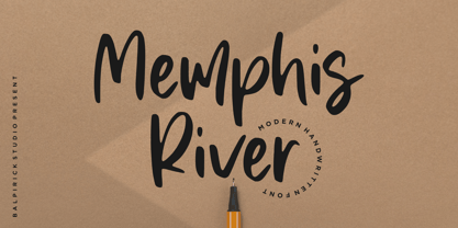 Memphis River is a Modern Handwritten Font. Memphis River is a unique and elegant handwritten font. It looks beautiful on a variety of designs requiring a personalized style, such as wedding invitations, thank you cards, weddings, greeting cards, logos and so on. Memphis River also multilingual support. Enjoy the font, feel free to comment or feedback, send me PM or email. Thank you!
 - Yorkside by Balpirick,
$15.00 Orkside is a Modern Calligraphy Font. Yorkside is a cool, trendy and paint brushed handwritten font. It looks beautiful on a variety of designs requiring a personalized style, such as wedding invitations, thank you cards, weddings, greeting cards, logos and so on. Yorkside also multilingual support. Enjoy the font, feel free to comment or feedback, send me PM or email. Thank you!
 - Oleandro by Balpirick,
$15.00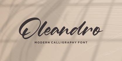 Oleandro is a Modern Calligraphy Font. Oleandro is a unique and elegant handwritten font. It looks beautiful on a variety of designs requiring a personalized style, such as wedding invitations, thank you cards, weddings, greeting cards, logos and so on. Oleandro also multilingual support. Enjoy the font, feel free to comment or feedback, send me PM or email. Thank you!
 - Dancinglove by Balpirick,
$15.00 Dancinglove is a Modern Calligraphy Font. Dancinglove is a unique and elegant handwritten font. It looks beautiful on a variety of designs requiring a personalized style, such as wedding invitations, thank you cards, weddings, greeting cards, logos and so on. Dancinglove also multilingual support. Enjoy the font, feel free to comment or feedback, send me PM or email. Thank you!
 - Niathory by Attype Studio,
$18.00 Niathory is a Modern Calligraphy Font perfect for your wedding dream. Combine Niathory with stylistic set to create amazing script font for wedding! Niathory is perfect for branding, logo, invitation, quotes, apparel design, product packaging, merchandise, game titles, cute style design, Book/Cover Title and more. What's Included : - Ligature - Stylistic Set character - Multilingual Support --- Hope you enjoy with our font! Attype Studio
 - Lehavot MF by Masterfont,
$59.00 Here is you next choice of the desired romantic greeting font you were looking for.
 - Rocher by Harbor Type,
$29.00 🏆 Selected for Tipos Latinos 8. 🏆 Hiii Typography 2018 Merit Award. Rocher was designed while looking for an answer to a simple question: what would a typeface look like if it was made of stone? It certainly would look solid, but did we have to add cracks and rubble so it would resemble rocks? We didn’t think so. We decided to tackle the problem a different way. We added corners where there usually aren’t any and threw some unusual letterforms into the mix. The result is a typeface that feels like stone, but if you look closely there is nothing inherently stony about it. Unexpected corners provide just the right amount of roughness, while unusual letterforms give the text an informal aesthetic, traces of something naive and handmade. A family was born when the sturdy letterforms were turned into a series of playful layers. With 9 fonts in total, Rocher can be mixed and matched to create unique layered compositions that add depth to the layout. We designed Rocher to be used in logotypes, packaging, mobile apps and headlines. We are confident you will find another handful of scenarios where it can shine.
 - FS Conrad by Fontsmith,
$50.00 Art into type In 2008, Fontsmith were approached by their friend, Jon Scott, to investigate whether a typeface could assume the aesthetic of one artist’s body of work. Jon’s not-for-profit charity, Measure, was organising an event for the artist, Conrad Shawcross, whose giant mechanical installation, entitled Chord, was going on public display in the long-disused Kingsway tram tunnel in Holborn. Chord explores the way we perceive time, as either a line or a cycle. Two enormous machines with dozens of rotating arms and moving in opposite directions, weave rope with almost infinite slowness. An unusual brief Phil Garnham visited Conrad in his Hackney studio to get a feel for his work and ideas. “Conrad is a very clever and philosophical guy. He struggled to see how typeface design had any relevance to him and his art. This was going to be a challenge.” The artist presented the type designer with a pile of rope and a huge diagram of sketches and mathematical workings. “This was, in essence, my brief.” Phil developed three concepts, the simplest of which ticked all the boxes. “The idea of the strokes in the letterforms appearing and ending at peaks or points of origin fitted perfectly with Conrad’s idea of time occurring and ending at two ends of the sculpture.” Two versions Phil planned modules for two versions of the typeface: one with five lines in the letterforms and one with seven. He then drew the modules on-screen and twisted and turned them to build the machine that is FS Conrad. “This is not a simple headline typeface,” says Phil. “It’s not a rigid structure. It has varying character widths, and it’s informed by real typographic insight and proportions so that it actually works as piece of functioning, harmonious type.”
 - Vertigirl - Unknown license

- Shocka by Skinny Type,
$16.00 Shocka - a serif look with simple, clean and visual elegance with smooth curves and beautiful ligatures, A very versatile font that works in both large and small sizes. This font is suitable for a wide variety of projects such as: headlines, logos, labels, branding projects, magazines, homeware designs, product packaging, mugs, quotes, posters, and more. It can also be more expressive and fun, thanks to the many alternatives and binders that combine harmoniously in this font and make it more interesting and versatile. Try to change alternatives, binders and you will get many options for your project which will make it bold & beautiful. Features: Section • Full set of uppercase, lowercase • Ligatures • Alternative • A wide variety of numbers, symbols & punctuation • Characters with accents • Support Multiple Languages • PUA encoded WHAT IS INCLUDED: • Shocka – Regular • Shocka– Outline This type of family has become the work of true love, making it as easy and fun as possible. I really hope you enjoy it! I can't wait to see what you do with Stanger Display! Feel free to use the #Skinny_Type and #Shocka Serif font tags to show what you've done visit my Instagram : https://www.instagram.com/skinny.type/ Thank you!

