10,000 search results
(0.024 seconds)
- Gotico by GroupType,
$19.00 Gotico™, meaning Gothic, is a Blackletter script (sometimes referred to as Old English). The original Gotico design was first brought to market by the Fundicion Tipografica Richard Gans type foundry (1888-1975) in Spain. The designer of Gotico is unknown and for many years the font was formerly sold only in Europe.
 - Linotype Albafire by Linotype,
$29.99With Albafire, Jürgen Ellenberger has played with flames that come out of the exhausts from Michael Schumachers Ferrari, or the hot rod cars in America or at the tractor pulling contests. This gives this sans serif face a speedy and wavy flavour. It fits ideally for speedy headlines like for bikers couriers. - Homeplate Rough by Alphabet Agency,
$14.00 Homeplate Rough is a classic serif display font. The font is designed for use in vintage themes and works particularly well in bar, steakhouse, rodeo and country music themes. The font was originally developed for use in branding in baseball teams. The font is an all capitals font and includes 128 characters.
 - Linotype Albatross by Linotype,
$29.99With Linotype Albatross, Hans-Jürgen Ellenberger has played with flames that come out of the exhausts from Michael Schumacher's Ferrari, or the hot rod cars in America, or at tractor pulling contests. This gives this sans serif face a speedy and wavy flavour. It fits ideally for speedy headlines like for bikers couriers. - Lavery by Greater Albion Typefounders,
$18.00 Lavery is a calligraphic display face, drawing its inspiration from the designs of the early years of the 20th century. It has an extensive range of ligatures and other opentype features and a delightfully hand-drawn feel. Lavery combines a great deal of character with clear legibility and a spirit of fun.
 - Rondabo by Yoga Letter,
$14.00 "Rondabo" is a cute display font with cute doll headdresses, cherries, a smiling sun, tulips, carrots, and cute bunny ears. This font can be used for spring, Easter, book titles, movie titles, cartoons, magazines, logos, and more. This font is equipped with upper- and lower-case letters, numerals, punctuation, and multilingual support.
 - Bell Gothic by Bitstream,
$29.99Designed specifically for AT&T to set telephone directories by Chauncey Griffith at Mergenthaler in 1938, Bell Gothic was the standard American directory typeface for forty years. Limited in performance by linecaster matrix requirements, Bell Gothic was replaced by Bell Centennial. Furlong is a version of Bell Gothic adapted for the racing form. - Sportlight by Kaer,
$19.00 Sportlight is a font, each letter connects with near one by middle-high line. This font is inspired by classic car emblems. You can use it in magazine headlines, badges, and posters. Font features: All-caps, numbers, punctuation, and multilanguage support. Please feel free to request to add characters you need: kaer.pro@gmail.com
 - Metrolite #2 by Linotype,
$29.00In 1929 Chauncey Griffith at Mergenthaler commissioned W.A. Dwiggins to design a warmer and less mechanical Geometric Sanserif to compete with Futura. Dwiggins’ best efforts proved that human warmth had little to do with cool geometry; for twelve years, until the introduction of Spartan, Mergenthaler lost ground to Intertype’s licensed version of Futura. - LP Harmonia by URW Type Foundry,
$35.99 LP Harmonia arose from its designer’s private life. As a type designer, Peter Langpeter was often asked by friends or relatives to write a greeting on a birthday card or create a good looking invitation. Over the years, he used ink and a soft feather to form his personal handwriting: LP Harmonia.
 - ITC Schizoid by ITC,
$29.99ITC Schizoid, from designer Frank Marciuliano, displays a stroke contrast which could not be larger, abrupt and uncompromising. Fine strokes turn into thick bars and create angular, consciously awkward forms. Nervous, unbalanced and amusing, Schizoid is an appropriate name for this font. The experimental ITC Schizoid is best used for headlines in print. - Discharge Pro by The Type Fetish,
$25.00 Discharge is a bold, heavy, distressed and destroyed sans serif typeface. It was started alongside Universally Corrupt and Insurgent, but it took a couple extra years to finish. It was expanded to include extended Latin, extended Cyrillic and Greek alphabets, so it will work with most languages in Europe and the Americas.
 - Bodoni by Bitstream,
$29.99 Morris Fuller Benton started the Bodoni revival with this version for ATF in the early years of the 20th century. We consider it the first accurate revival of a historical face for general use. Sturdy and a little mechanical in the 19th century tradition, this is the Bodoni series familiar to us all.
 - Gustatory Delight by Ali Hamidi,
$12.00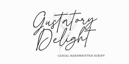 Gustatory Delight is a perfect handwritten script font that has a modern and authentic look, this font has a simple and unique character in both lowercase and uppercase, this font is perfect for branding, signature, logo, packaging, presentations, planners, resumes, business card, brochures, fashion, t-shirt, wedding invitations, yard signs and more.
 - August by Alias Collection,
$60.00 Almost a straightened italic typeface, August explores the idea of taking italic and script letterforms out of context and creating a typeface with a mix of references that does not look like too soft and feminine, but has a sharpness and angularity in some of its characters that jars against this softness.
 - Think Road by Akrtype Studio,
$19.00 Think Road... This idea originated during the year-end holidays, trying to casually scribble on paper so it becomes handwritten, Think Road includes uppercase and lowercase letters, numerals, and supports multilingual. This smooth handwriting is perfect for creating signature logos and watermarks for photography studio or blogger, best for initial or branding logos
 - Linotype Arab Stroke by Linotype,
$29.99Arab Stroke is an exotic typeface with an Arabian touch which makes a variety of applications possible. Whether for products from far away lands travel advertisements or anything needing a dynamic look, Arab Stroke is an excellent choice. The font is particularly eyecatching in headlines and combines well with sans serif fonts. - Mixed Drinks JNL by Jeff Levine,
$29.00 Mixed Drinks JNL derives its look from a set of gold foil self-adhesive letters made by a company called Cameo for the Schenley distilling company circa the late 1950s or early 1960s. The letters were used to personalize bottles of whiskey for your own bar or to give as a unique gift.
 - Gold Standard by FontMesa,
$30.00 Gold Standard got its start from a few letters found on an old Gold Certificate from 1882. From those few letters spelling out the word GOLD, the rest of the alphabet was designed to match. The lowercase design was based on lettering found on an old silver certificate from approximately the same year.
 - Oakland by Greater Albion Typefounders,
$9.50 Oakland is a Streamline era design inspired by some hand-drawn lettering on a 1930's French poster advertising a certain brand of Car (Automobile for our American cousins). It's ideal for giving poster and design work that late 1930s to mid 1950s feel. Make a bold statement with this all capitals typeface!
 - FF Mark Paneuropean by FontFont,
$79.00Geometric sans fonts in the Bauhaus tradition were the inspiration for the design of FF Mark®, for example the Universal font by Herbert Bayer, Erbar® Grotesk, Kabel®, Neuzeit Grotesk and of course Paul Renner's Futura®. From an aesthetic point of view, FF Mark is a descendant of these classics of German typeface design that intends to meet the needs of modern communication. Hannes von Döhren and Christoph Koeberlin had the support of the entire FontFont Type Department in the design of FF Mark, including Erik Spiekermann, who took over the artistic direction of the project. The teamwork resulted in carefully planned, balanced forms, which are responsible for the harmonious overall impression of the font. The capitals are not based on Roman square capitals; rather, they have a uniformly wide letter form in a comfortable ratio to the x-height. Thanks to the x-height, which is significantly larger compared to the historical models, FF Mark is also very legible in small sizes. This makes it a very flexible font in terms of its range of applications. A contrast in the stroke width is barely noticeable. At the same time, light modulation supports readability, especially in the bold styles in small sizes. The uniform line ends are obvious for a contemporary sans family nowadays (unlike some of the historical precedents, which evolved over years). Other details from the predecessors are consciously maintained and provide for added individuality in FF Mark. For example, the limbs in the uppercase "K" and "R" are offset slightly from the stem. Alternative characters with crossbars are available for the numbers "0", "1", "7" and the uppercase "Z" and the lowercase "a" also has an alternative with an open form. German typesetters have the option of uppercase umlauts with points that are set lower, as well as a long "s" from the Fraktur. And last but not least, FF Mark has the very characteristic ft-ligature of Futura. FF Mark is available in ten finely tuned weights ranging from Hairline to Black. A Book style for text setting further emphasizes the well-rounded features of this contemporary typeface. When the font was published, it also included ten carefully designed cursives for all weights. Users also have the option of various numeral sets with old-style and uppercase numbers as well as small capitals. FF Mark also has some geometric shapes and arrows based on the features of Futura. FF Mark is a modern, full-featured, geometric sans serif that you can use without hesitation for large projects in headlines as well as in texts. FF Mark's design is a nod to the historical models and transports their charm, elegance and in some cases unusual design applications into a modern font family equipped with the most current typographical features. NEW: the new FF Mark W1G versions features a pan-European character set for international communications. The W1G character set supports almost all the popular languages/writing systems in western, eastern, and central Europe based on the Latin alphabet and also several based on Cyrillic and Greek alphabets. - Sihmittree by Ingrimayne Type,
$9.00 Sihmitree is a gimmick typeface in which all glyphs have reflective (mirror) or rotational symmetry (or both). Sihmitree has two weights and is caps only, with most of the lower-case letters identical to the upper-case letters. It includes only those accented characters that are symmetrical. The letters of the alphabet are often used to explain symmetry. BCDEK are given as examples of shapes that can easily be formed with symmetry over a horizontal line. AMQTUVWY can easily be formed so that they mirror over a vertical line. Letters HIOX can be formed so they mirror over both horizontal and vertical lines, and as a result they will also have rotational symmetry. Letters NSZ can be formed so that they reproduce themselves with a rotation of 180º. That leaves letters FGJLPR, which are usually considered examples of asymmetry. However, there are script versions of J, L, and R that can be formed with symmetry, and variants of lower-case f and g can be made that are symmetrical. P looks a lot like the thorn character. Some of the numbers also present challenges when trying to form them symmetrically. The symmetrical alphabet is not stylistically harmonious and has limited use other than as an exploration of symmetry.
 - Torus Pro by Monotype,
$40.00 Torus Pro is a rounded monoline typeface. As its name suggests, this is a more professional version of my original Torus family released in 2017. Each glyph has been scrutinised and redrawn where necessary. In addition, there are now italics, small caps, old style figures, and numerous other improvements. Torus Pro includes many new decorative alternates and ligatures that will add distinctive flourishes to your typographic compositions. With up to nine alternates for some glyphs, these additional styles include stencilled, simple dots, looped and smooth swashes, plus a more aggressive angled option for those looking for something a little different. When used subtly, these alternates and glyph combinations will add flair and personality to your own creations. Perfect for titling and branding, Torus Pro also packs a punch without these features activated, as well as being a comfortable read in long runs of text. There are 12 fonts altogether, ranging from Thin to Heavy weights in both roman and italic. The variable font versions of the family allow you to define the weight exactly to your liking. Torus Pro has an extensive character set that covers all Latin European languages. Key features: 6 weights in both roman and italic Variable fonts included with full family 212 Alternates 20 Ligatures Small Caps Full European character set (Latin only) 1450+ glyphs per font.
 - Abrect by Hackberry Font Foundry,
$24.95 My first font for the summer of 2009, Abrect is a new sans serif font where I try to maximize the x-height and keep the design fresh and personal. It fits in with my continuing objective of designing book fonts that I can really use. Abrect is a tangent for me just taking an idea out to its end. In particular, it is a radical modification of my first font in 1993, Nuevo Litho. The hand-drawn shapes vary a lot, many pushing the boundaries of the normal character. With many of the new releases I see, the digital perfection is getting pretty extreme. It’s looking like a Rococo stage of development for many with decoration taking over from function. I'm consciously trying to head a different direction. This is not a normal font for me in that it has caps, lowercase, with the appropriate figures for each case, no small caps. This is the first time I have skipped small caps in over a decade. This font has all the OpenType features in the display set for 2009 except for the small caps. There are several ligatures for your fun and enjoyment: bb gg ff fi fl ffi ffl ffy fj ft tt ty Wh Th and more and many of them are experimental in form. Enjoy!
 - Meteora by Andinistas,
$19.95 Meteora is a font designed for headlines by Carlos Fabian Camargo Guerrero. Its purpose is to be useful tool for solving decorative problems in graphic design which require broken letters without ascending and descending strokes. Due to its vertical and horizontal proportions these letters are compact, appealing and special to compose headlines and featured with worn look in covers, magazines, posters and advertising material. The first Meteora sketches were made by hand, photocopying and deforming letters of an old Letraset catalog, specifically from slab serif typefaces from the Nineteenth Century. Hence, uppers cases and lower cases were merged in the same height x, obtaining a narrow width, endings with some serifs and stencil cuts here and there. The amount of low contrast between thick and thin strokes brings strength and consistency with the contours apparently brokens. Thus, developed features slab serif and sans-serif proposing empty and full shapes connoting decomposition and noise; and from a rigorous process of scanning letters I set up damaged letters, but drawn with the greatest possible thoroughness and high definition in 438 glyphs per font. Finally, in regular and bold variables I included opentype features with some discretionary ligatures and a few titling alternates. In Meteora bold all glyphs are framed simulating the effect of letters cut out of paper.
 - Varese Outlined by Tarallo Design,
$14.99 Varese Outlined is the perfect font for giving content a retro, dimensional, and playful feel. Use it for headlines or short body text for an optimistic or nostalgic tone. It comes in two variations, outlined and shadow. It has standard uncolored and colored options. Please see the slides to know what each color font is named. This geometric and modular typeface was inspired by Italian posters of the 1920s and 1930s. Its design playfully explores the boundaries between unity and variety. The blocky characteristics lend it well to tightly composed text either horizontally or vertically. The lowercase is similar in form to the uppercase, yet many of the lowercase letters have interior spaces (counterforms). It comes with standard ligatures; ff, fi, fl, ffl and three alternate glyphs for number 1. The color fonts in Varese Outlined are vector-based and in the fully scalable SVG OpenType format. Color fonts are supported by Photoshop 2017, Illustrator and InDesign 2018, and QuarkXPress 2018 (and later versions). Those who do not want a color font should purchase the files simply named “Regular” and “Outlined”. These will not have any color words in the names. Varese Outlined has two siblings; Varese and Varese Soft. The designer suggests pairing Varese Outlined with his ornamental fonts FormPattern or FormPattern Color Two, Three, or Six.
 - Adventure Island by Larin Type Co,
$12.00 Adventure Island this is a stunning font family that consists of two types of fonts, script and sans serif, and each has 8 weights (Regular, Rough, Halftone, Pressed, Bold, Bold rough, Bold halftone, Bold pressed,). With their help, a lot of options are opened for you to create your projects, both in vintage and in modern style. These fonts are like twin brothers, they fit perfectly and complement each other. The Script type has flowing shapes and is made to shine and lively for the full hand-signature effect. Sans serif type is also made in monoline and has rounded corners and smooth lines. The script style has alternatives for uppercases and many alternates for lowercaes, with them you can make your design more expressive, varied and playful, change them and you will see how many options you can get for your design, also use swashes touches to complement your design. Enjoy using! The font includes 8 script fonts and 8 sans serif fonts (Regular, Rough, Halftone, Pressed, Bold, Bold rough, Bold halftone, Bold pressed,) Full alphabet with Uppercase and Lowercase A-z for script Full alphabet with Uppercase for sans serif Numbers, fractions for all fonts Punctuation and mathematical symbols for all fonts Alternates Uppercase and Lowercase also ampersand for script Swashes for script Multilingual support all fonts
 - Bello Pro by Underware,
$50.00 Now check this, Underware’s blockbuster type, Bello. Bello Pro is a brush typeface for headline point sizes - it’s big & beautiful. Bello has lots of ligatures and start and ending swashes. They are automatic in Bello Script Pro, which is a cross-platform OpenType font with many OpenType features. Bello has Underware’s world-dominating Latin Plus character set, supporting a total of 219 languages (Latin 1 + 2 and beyond). After a period of hand sketching and lettering, Bello got two main styles: Script and Caps. These two fonts create a strong typographic contrast - while Bello Script Pro is flourished and flowing, Bello Caps Pro provides upright and sturdy capital lettering. As sturdy as brush lettering allows, of course. Careful spacing and kerning ensures* that Bello appears like fluently written handwriting. However, that’s not enough for a hand-lettered feel. Therefore Bello comes with a set of 64 ligatures. Some of them are typographic, some made simply to create a more intimate, natural impression. For the same reasons we have added a few ornaments and a set of snap-on beginning and ending swashes which attach to the lowercase letters of Bello. With Bello Words Pro you can add some two-color words in your text by the pre-designed word logotypes. Trust the brush! *So take care: use ‘metrics’, not ‘optical’ as a spacing setting in layout apps.
 - Cantabile - Unknown license

- Sanity Wide - Unknown license

- Sanity Wide - Unknown license

- Sanity - Unknown license

- Legnano by Nick's Fonts,
$10.00 Here's something you don't see every day—Italian Art Deco woodtype. It's suave but unsophisicated, an unpretentious charmer. Both versions support the Latin 1252, Central European 1250, Turkish 1254 and Baltic 1257 codepages.
 - Tasty Joke by PizzaDude.dk,
$18.00 Tasty Joke was made with a slightly bulgy pen, and by using a loose touch.The result: two fine kinds of naive and lively letters. Combine the Regular and Line versions for cool results.
 - TOMO Ziguret by TOMO Fonts,
$15.00 TOMO Ziguret! A handmade font that would love to play with your designs! Ideal for kids toys or when packaging is involved — We would love to see this one on beautifully crafted book.
 - Big D NF by Nick's Fonts,
$10.00 Another Speedball pen alphabet from master draftsman Ross George, this face is bold and lively. Both versions of this font support the Latin 1252, Central European 1250, Turkish 1254 and Baltic 1257 codepages.
 - Becka Brush by Sulthan Studio,
$14.00 Becka Brush is a bold and chunky lettered display font, created with the help of a brush pen. Add it to your most creative ideas and notice how it makes them come alive!
 - Vertical Roundpoint JNL by Jeff Levine,
$29.00 Vertical Roundpoint JNL is one of a number of classic hand-lettered typefaces found in a 1941 edition of the Speedball® Lettering Pen instruction book and re-drawn digitally by Jeff Levine.
 - Christmas Lantern by Seemly Fonts,
$12.00 Christmas Lantern is a straightforward handwritten font. Add it to your original ideas to see how it helps them stand out since it can be readily suited to a huge range of projects.
 - sideburnBob by JOEBOB graphics,
$19.00 A handwritten font created with a 0.5 - 1 mm felt tip pen that works great with illustrations and comics. It seems a bit creepy because of the strokes getting smaller at the bottom.


