10,000 search results
(0.042 seconds)
- Austin Antique by HiH,
$10.00 “More is better” may have been the motto of Richard Austin of Austin and Son’s Imperial Letter-Foundry on Worship Street at Finsbury Square in London when he designed and cut his Antique typeface. The year it was created is uncertain, but it is known to have appeared in a specimen book produced in 1827. At first glance, the upper case letters of Austin Antique look very much like Figgins Antique. But, upon examination, one will note that the Austin face is much darker. In general, the letters designed and cut by Richard Austin have fatter strokes, larger serifs and smaller counters -- more metal and less daylight. The premise was that the darker the letter, the more attention an ad using the typeface would receive. In old pictures of London and Paris one may see walls crowded with posters and “bills” -- competing for the attention of the passerby. Morris and Updike aside, the early nineteenth century marked the beginning of a commercial as well as industrial revolution. Patterns of commerce were changing. With new methods of marketing came the need for new typefaces to support the new methods. Foundries found the display types were very profitable and competed most energetically and creatively for the trade. There was a lot of trial-and-error. Some ideas faded away. Others, like the Antiques or Egyptians, were refined and developed. From them came the Clarendons that were to prove both popular and long lasting -- because they worked. Their job was to sell goods, not please the aesthetic sensibilities of the critics. They did their job well. Austin Antique has a full Western European character set, plus the following ligatures: ct, st, fi, fl, ff, ffi and ffl. Tabular numbers. Surprisingly readable.
 - Offroad by Grype,
$16.00 Geometric typefaces can harken back and visually tie themselves to so many genres, from constructivist posters, to techno club flyers, to raw industrial era power. The Offroad family finds its origin of inspiration in the O’Neal MX logo for their motocross division, represented in its truest form in the MX styles of this family, and expanded to a type megafamily. Offroad grabs hold of that unique pseudo-unicase style and runs with it to create a range of widths and weights that are perfect for historical through modern use. It embodies the hardcore motocross rigidity from the limited inspiration of the original logotype and expands to include a full and expansive glyphset, and a comprehensive range of widths and weights, creating a straightforward, uncompromising collection of typefaces that lend a solid foundation and a broad range of expression for designers. Here's what's included with the Offroad Collection bundle: 382 glyphs per style - including Capitals, Lowercase (Unicase Style), Numerals, Punctuation and an extensive character set that covers multilingual support of latin based languages. (see the 6th graphic for a preview of the characters included) 45 fonts in 6 width subfamilies: Extra Condensed, Condensed, Standard, Expanded, & Wide. 5 weights per subfamily with obliques: Light, Book, Regular, Bold, & Black. Fonts are provided in TTF & OTF formats. The TTF format is the standard go to for most users, although the OTF and TTF function exactly the same. Here's why the Offroad Collection is for you: You're in need of a geometric pseudo-unicase family with a big range of weights and widths You're a die-hard motocross fan, and want to design anything within that genre You're a club flyer designer, and need a kick-ass techno style font family You're totally into constructivist design, and want to create designs within that genre You just like to collect quality fonts to add to your design arsenal
 - Luxe Atelier by PeachCreme,
$19.00 Hey guys! Meet our new font "Luxe Atelier" which is inspired by a bit quirky but still lovely handwriting. When we launched our font "Lolita" in 2019 many liked the way we replaced some uppercase letters with lowercase ones. The response was overwhelmingly positive. The feedback we received inspired us to refine the idea of the lowercase signature style and we created "Luxe Atelier" with a lot more lowercase letters that give an uppercase look. However, some uppercase letters simply cannot be written as lowercase due to their nature: they would just lose their primary sound. For example, when we tried writing lowercase 'e' in the uppercase style it more resembled lowercase 'l' and affected the legibility of the font. Therefore some letters in this font remained as is. When it comes to other letters, we tried maximally to keep the lowercase style. This playful, non-standard signature font with slightly rough edges includes 37 ligatures which will definitely add realistic handwritten character to your designs. It is perfect for branding, signatures, weddings and so much more.
 - Nanami Handmade by Thinkdust,
$10.00 Can we get a drum roll please? It’s not every day that a new link in a best selling chain is forged. First, there was Nanami, a font which took the world of type by force, storming to the top of MyFonts Hot New Fonts list; then there was Nanami Rounded, the most successful follow-up since Terminator 2. Well, say Hasta La Vista to boring design because now, there’s Nanami Handmade. With all the geometric, Japanese inspiration and style of the first two iterations, Nanami Handmade carries a quirky, mischievous charm. The font has a charisma matched by roguish anti-heroes; bad guys you love to love and good guys the other good guys hate, but everyone knows they’re what the audience turns up to see. Nanami Handmade comes in two styles, a solid and a hand-drawn, each of which has eight weights. Mix and match between these options to create a balanced piece which makes good use of the tactile, warm, earthy nature of the font. With these sans-serif styles working well in small and large sizes, both on and off screen, Nanami Handmade’s applications are virtually endless. Get your own piece of typography’s elite now, with Nanami Handmade, by Thinkdust.
 - Rekusen by Product Type,
$15.00 Rekusen is a modern and bold sans-serif display font that stands out with its cleanness. Perfect for branding, headlines, and editorial design, this font is sure to make a statement. The unique combination of thick and thin strokes creates a dynamic and eye-catching appearance that draws attention to your message. In addition to its stylish design, Rekusen also features a wide range of alternate characters and ligatures that allow for creative customization and increased versatility. With alternates and ligatures, this font provides endless possibilities for unique and impactful designs. And with support for multiple languages, it can be used across a variety of projects with ease. Whether you’re designing a logo, creating a poster, or crafting a website, Rekusen is a powerful tool that will help you achieve your design goals with style and sophistication. Its modern, clean, and versatile design makes it a perfect fit for any project that needs a touch of boldness and professionalism. What’s Included : - All glyphs Iso Latin 1 - We highly recommend using a program that supports OpenType features and Glyphs panels like many Adobe apps and Corel Draw, so you can see and access all Glyph variations. - PUA Encoded Characters – Fully accessible without additional design software. - Fonts include Multilingual support
 - Sament by Product Type,
$15.00 Sament is a Japanese Style typeface that is ideal for projects that require a distinctly Japanese and Asian touch. This typeface will add uniqueness and creativity to your work with its exquisite style and eye-catching appearance. With appealing characters and inspiration from Japan’s rich culture, the Sament typeface combines a traditional touch with a modern vibe. Each figure is designed with care and refinement, creating an alluring environment and highlighting the richness of Japan’s cultural history. You may add an authentic and appealing vibe to your promotional materials, poster designs, websites, and many other projects by utilizing the Sament font. This font will leave a lasting impact and quickly capture the attention of potential customers. Make your project stand out by using Sament as the main typeface. With its rich richness and distinct style, this typeface provides a visually pleasing experience. With Sament, your designs will create an exceptional experience, instantly engaging potential buyers. What’s Included : - File font - All glyphs Iso Latin 1 - We highly recommend using a program that supports OpenType features and Glyphs panels like many Adobe apps and Corel Draw, so you can see and access all Glyph variations. - PUA Encoded Characters – Fully accessible without additional design software. - Fonts include Multilingual support
 - P22 Plymouth by IHOF,
$34.95 Plymouth is a pen-drawn calligraphic font of narrow proportions featuring plain capitals and an alternate range with swashes.
 - ATHEWE by Twinletter,
$17.00 Athewe is a display font with a strong and courageous superhero theme. Created specifically for projects that require a bold, impressive impression, this font is the perfect solution for creating bold and bold designs. With Athewe, you can bring an awesome superhero feel to any of your projects. This font brings strength and boldness to your designs, creating a look that is both impressive and full of character. Each letter expresses a strong and daring style, delivering a memorable message to your audience. With features such as ligature and alternate, Athewe provides unlimited flexibility and creativity. You can combine these font elements to create unique and interesting variations of the style. In addition, multilingual support allows you to use Athewe in multiple languages, so your project can reach a global audience. If you’re looking for an alluring, powerful, and superhero-themed font, Athewe is the right choice. With a striking style and features that allow for creative experimentation, this font will catch the eye and inspire your potential customers. What’s Included : - File font - All glyphs Iso Latin 1 - Alternate, Ligature - Simple installations - We highly recommend using a program that supports OpenType features and Glyphs panels like many Adobe apps and Corel Draw so that you can see and access all Glyph variations. - PUA Encoded Characters – Fully accessible without additional design software. - Fonts include Multilingual support
 - BAXAU by Twinletter,
$17.00 Baxau is a superhero-themed display font that brings strength, courage, and modernity to your projects. With a strong, bold, and bold style, this font is the perfect solution for creating an impressive and aggressive look. The Baxau font features letters that combine boldness with a modern twist, creating a fresh and energized look. Each character exudes undeniable power and charisma, delivering compelling and inspiring messages to your audience. With features such as ligature and alternate, Baxau provides unlimited flexibility and creativity. You can combine these font elements to create unique and exciting style variations. Multilingual support also allows you to use Baxau in multiple languages, so your project can reach a global audience. Baxau is the perfect choice if you need a font that is attractive, powerful, modern, and true to the superhero theme. With a strong message and features that give room for creative experimentation, this font will quickly grab the attention of your potential customers and make a memorable impression in no time. What’s Included : File font All glyphs Iso Latin 1 Alternate, Ligature Simple installations We highly recommend using a program that supports OpenType features and Glyphs panels like many Adobe apps and Corel Draw so that you can see and access all Glyph variations. PUA Encoded Characters – Fully accessible without additional design software. Fonts include Multilingual support
 - Raqib by Twinletter,
$18.00 Introducing Raqib, a distinctive and eye-catching font that gives any project a robotic, sci-fi edge. Raqib is ideal for creating futuristic and intriguing designs due to its bold font shape and distinctive robot style. Raqib is the ideal option if you’re working on a project with a sci-fi theme or want to incorporate robotics into your branding. Because of its bold design, it’s perfect for headlines, posters, and social media graphics, and its distinctive font shapes give your text a standout, memorable appearance. For those looking to stand out in the modern era and add a touch of innovation and futurism to their designs, the Raqib font is ideal. This font is a must-have for anyone looking to create designs that really stand out. Don’t miss this limited-time offer, get the unique and versatile Raqib font today and start creating designs that will be remembered. With Raqib, you can create stylish and professional designs, with a futuristic robotic look that’s sure to stand out. What’s Included : - File font - All glyphs Iso Latin 1 - Alternate - Simple installations - We highly recommend using a program that supports OpenType features and Glyphs panels like many Adobe apps and Corel Draw so that you can see and access all Glyph variations. - PUA Encoded Characters – Fully accessible without additional design software. - Fonts include Multilingual support
 - Whiplash by 38-lineart,
$16.00 Whiplash is a natural handwritten font with firm strokes as the main character. All-caps and mixed-match are the main concepts of this font, where the uppercase and lowercase can be pair according to your taste. This font has a very strong and very prominent character that will distract the eyes. This is a great choice when used as a title on banners, posters, book titles and even magazine covers. Modern lifestyle brands such as fashion, cosmetics, and outdoor sports are also a trend to use this font style. You who like travelling can also try to write a caption or quote, people are increasingly curious about the mystery of your adventure and short notes. Besides being equipped with multi-language, we also equip ligature such as ee, ll, gg, oo, ss, tt, pp, rr. Enjoy our fonts, and make sure your brand will stand out and invite people to take a closer look.
 - Runista by Struvictory.art,
$14.00 We would like to introduce our new Thin Line Geometric Font Runista. Runista is a linear font in folk style, lowercase is decorated with geometric elements. The typeface includes a Decorative and a Symbol version. Letters and symbols are perfectly combined with each other. The font is easy to use in various design programs or without any program. Runista Typeface is suitable for lettering posters, music albums, tattoos and photo overlays in hipster style. The font works great for both printing clothes and craft products branding and packaging. Also use individual letters and symbols to create logos and monograms. Runista Decorative contains stylistic alternates for letters O, Q, C, D, G and the most popular ligatures: bb, cc, dd, ee, ff, gg, ll, mm, nn, oo, pp, rr, ss, tt, zz, ty, ly, ct, sp, st, in, ch, ck, sh, ou, qu, th, ph, ge, ng, gn, gh, au QU. The font has extensive language support.
 - FF Kaytek Headline by FontFont,
$50.99 Kaytek™ Headline completes the Kaytek typeface family with seven weights optimized for display purposes. Like the Kaytek Sans it is a fresh take on the correspondence typefaces of the 90s - which were originally designed for the demands of office environments. Just like its predecessors, this text typeface is robust and hard-working - meaning it works well in challenging design or printing environments - but it’s not without personality. Look closer at the lowercase g and a, especially in the italic, and you can see some unexpected elements of subversiveness within the design Every style of the typeface takes up exactly the same amount of space, thanks to the careful creation by Radek Lukasiewicz. This means designers can switch between styles without the text being reflowed, making it particularly useful in magazines, where space might be limited, and also on the internet, where hover links appear in a different style Kaytek Headline comes in seven weights, from Thin to ExtraBlack. Kaytek Sans, Kaytek Slab, and Kaytek Rounded, are also available.
 - Akueila by Sensatype Studio,
$15.00 Akueila is a Luxury font that we created special for elegant, elegant, modern, wedding, branding needs, font that you can combine to get any variations and unique shapes easily just in seconds with choose alternates of them. What's Included: Character set A-Z Normal & Italic Style Numerals & Punctuation Accented Characters (West Europe) Stylistic Ligatures Works on PC & Mac Recommended using Adobe Illustrator or Adobe Photoshop. Wish you enjoy our font. :)
 - Friendly by Sensatype Studio,
$15.00 Brother is a High-Contrast font that we created special for elegant, luxury, modern, wedding, branding needs, font that you can combine to get any variations and unique shapes easily just in seconds with choose alternates of them. What's Included: Character set A-Z Normal & Italic Style Numerals & Punctuation Accented Characters (West Europe) Stylistic Ligatures Works on PC & Mac Recommended using Adobe Illustrator or Adobe Photoshop. Wish you enjoy our font. :)
 - Caliban by Adobe,
$29.00In 1994, John Benson designed the typefaces Caliban, Alexa and Balzano, all with similar characteristics. The typefaces are distinguished by their calligraphic style and their closeness to handwritten script. Caliban looks as though it were written with a broad tipped pen, with reserved yet lively figures which retain their legibility. Caliban is a good typefaces to use in short and middle length texts as well as headlines, wherever a personal touch is desired. - Technical Lettering JNL by Jeff Levine,
$29.00 A set of vintage lettering templates manufactured by Albert Nestler in Germany yielded this Art-Deco flavored typeface with many unusual letter forms. Lettering templates were used for decades by architects and draftsmen prior to other advanced lettering methods to label renderings, blueprints and layouts. Although they are similar to stencils in the fact that the lettering is traced, templates are designed to produce solid lettering with the use of a technical pen.
 - Monograph by Pelavin Fonts,
$25.00 Monograph conjures ancient typewriters, telephone switchboards, vintage office machines past visions of the future. As though it were drawn with the rounded nib a of a Speedball "B" style pen, the soft curves and rounded serifs speak of a gentler less complicated time. It is nuanced with traces of the Arts and Crafts movement at the turn of the 20th Century which stressed craftsmanship and preserving and emphasizing the qualities of construction and materials.
 - Bermuda LP by LetterPerfect,
$39.00 The Bermuda Family was designed by Garrett Boge and Paul Shaw, in the vein of freely-drawn showcard lettering — jaunty, fun and friendly. In fact the drawings were made with a Speedball™ B-series pen nib, the stock tool of the showcard letterer. Bermuda Open is a stroked outline version and its character shapes are repeated in the other three styles, each with a separate fill variant — Solid, Dots and Squiggles.
 - Retro Games by Hexa,
$0.80 Introducing HEXA’s second family-font, Retro Games Font. The RetroGames font is a witty reinterpretation of the fonts found in 90s 16-bit games that we enjoyed when we were young, presented as bitmap imaged fonts. It offers superior legibility and aesthetic sensibility compared to many other existing bitmap fonts. For instance, while most bitmap fonts create one stroke with 1 pixel or have various thicknesses in pixels, we have standardized it to a maximum of one stroke with 1-3 pixels, enhancing both legibility and aesthetic appeal. Since there are many similar bitmap fonts, we wanted to reinterpret it as a genre of its own. Our latest designed fonts HEXA, we noticed some shortcomings in legibility, and we aim to address those shortcomings in this bitmap font, Retro Games. Our RetroGames font, which brings back memories of our analog past, can be a valuable design element in many design works." ※ RetroGames is Latin-based and a completely crafted font that consists of 2 typefaces. Each typeface contains 195 sets of characters. This font family is in all-caps fonts. ※The font family includes 'Dropline' and 'Black.' 'Dropline' comes with a shadow effect, while 'Black' is designed without a shadow for simplicity." ※RetroGames is a monospaced fonts. So kerning is not applied.
 - Kaneda Gothic by Dharma Type,
$19.99 Kaneda Gothic is a whole new basic gothic. Philosophically, Kaneda Gothic is the one of the niche answers in the interspace between these antinomies. Image of near-future and giant metropolis in 80s, 90s vs our real life in the 2010s,20s. What we acquired by Industrial, scientific developments vs our emotional demands, imagination in our brain. Design transition in short period of time vs the consistency of real function which laid along the human history. Technically, Kaneda Gothic has a geometric letterform which called “gaspipe” or “Gothic” in woodtype era. But Kaneda has very sharp curves and lines for contemporary demands, that is to say, impact and clearness. Geometric and clear letterform is perfect for eye-catching part such like company logo, movie title and picture’s captions. Consists of seven weights and their matching italics. Supporting almost all latin languages.
 - Berliany by Ably Creative,
$10.00 Berliany As the name suggests, berliany are handwritten fonts that look like they were written by hand perfect mix modern calligraphy, Add a touch of luxury and style to your projects too, with Berliany font Collection. It's highly recommended to turn your Opentype features on while using the script font, to make use of it's best features - the multitude of OpenType ligatures. As you type, your text looks like natural handwriting, and less like a monotonous font. Berliany font was created to help you designing makes gorgeous logos, posters, wedding invitations, blog posts, social media etc
 - Daily Sans by Up Up Creative,
$15.00 Introducing Daily Sans, a complete sans serif font family with 10-weights, plus italics (20-fonts total). Daily Sans was designed to be an everyday-use geometric typeface with excellent legibility and a neutral tone. It's a perfect go-to for branding, web, and print design projects and can stand out on its own or play a supporting role in font pairings. It’s great for body/paragraph type as well as for larger display type. Because the goal was to create a font you can truly use for any project, purpose, or occasion, Daily Sans includes a wide range of weights starting from the very thin Hairline all the way through to the very bold Heavy. This means that you’re always able to find just the right weight for your needs, and it makes creating type hierarchies a breeze. Daily Sans comprises 20 fonts, each with approximately 450 glyphs - including 16 standard and discretionary ligatures, three ampersand variants, a full set of arrows, and more - and supports over 200 languages. The OpenType features can be very easily accessed by using OpenType-savvy programs such as Adobe Illustrator and Adobe InDesign. (To access these awesome features in Microsoft Word, you'll need to get comfortable with the advanced tab of Word's font menu.) PLEASE ENJOY! I can't wait to see what you make with Daily Sans. Feel free to use the #upupcreative and #dailysansfont tags to show me what you've been up to.
 - Rivea by Magpie Paper Works,
$36.00 Rivea is two-font, hand-lettered script family designed to mimic real calligraphy. Each font dances along a natural, variable baseline and has a distinctive slant. Long, thin upstrokes contrast with rich downstrokes in a style reminiscent of "wet noodle" pen writing. Each Opentype font includes eight different ampersands, a swash feature that automatically substitutes beginning & end of word letters, a set of alternate letters, old style numerals, arbitrary fractions, six common "word-art" prepositions and six common honorifics. All Opentype features have been duplicated in Stylistic Sets for Microsoft Word users. To enable alternate ampersands, simply turn on the contextual alternates feature and type &1, &2, &3, etc. Opentype coding automatically substitutes the new "and".
 - URW Grotesk by URW Type Foundry,
$102.99 URW Grotesk was designed exclusively for URW by Prof. Hermann Zapf in 1985. At the same time, Zapf designed URW Antiqua to go with URW Grotesk. At that time, we were working with a large German publishing house (Axel Springer) on type design solutions to replace certain of their newspaper fonts. Test pages of large German newspapers (e.g. Bildzeitung) were printed with URW Grotesk and URW Antiqua font families. For reasons not disclosed to us, the project was dropped and Springer never used URW Grotesk and URW Antiqua for that purpose. Anyway, Zapf finished his designs and URW produced both families. Zapf’s intention for the two typefaces was to design two highly legible, open and classical fonts that could be used for any kind of typography, especially books, newspapers, magazines, etc. However, we realized later on, that URW Grotesk is very well suited for multi media applications on screen.
 - URW Antiqua by URW Type Foundry,
$89.99 URW Grotesk was designed exclusively for URW by Prof. Hermann Zapf in 1985. At the same time, Zapf designed URW Antiqua to go with URW Grotesk. At that time, we were working with a large German publishing house (Axel Springer) on type design solutions to replace certain of their newspaper fonts. Test pages of large German newspapers (e.g. Bildzeitung) were printed with URW Grotesk and URW Antiqua font families. For reasons not disclosed to us, the project was dropped and Springer never used URW Grotesk and URW Antiqua for that purpose. Anyway, Zapf finished his designs and URW produced both families. Zapf's intention for the two typefaces was to design two highly legible, open and classical fonts that could be used for any kind of typography, especially books, newspapers, magazines, etc. However, we realized later on, that URW Grotesk is very well suited for multi media applications on screen.
 - Pinatas Cottons by Piñata,
$12.00 Original Foundry: TypeType Original typeface name: TT Cottons Pinatas Cottons is a friendly hand-drawn typeface with condensed proportions. Each separate style of Pinatas Cottons was drawn by using different instruments. For instance, the black style was painted with a real brush, and the thin one was created with a pen. We tried to keep this analog feeling of hand drawing while we digitalized each style of the typeface. Pinatas Cottons is your ideal design helper.
 - Sedhayu by Kulokale,
$19.00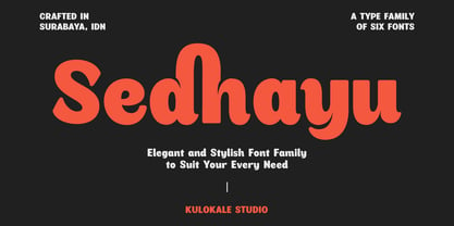 Sedhayu is a modern and bold sans serif font. It has a unique style and will give your design a friendly and expressive look. Sedhayu is perfect for many different projects such as logos and branding, invitation, stationery, wedding designs, social media posts, advertisements, product packaging, product designs, labels, photography, watermark, special events or anything. We hope you enjoy the font and have fun! Thank You.
 - Michegar by Kulokale,
$19.00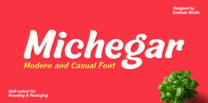 Michegar is a modern and casual display font. It has a unique style and will give your design a friendly and expressive look. Michegar is perfect for many different projects such as logos and branding, invitation, stationery, wedding designs, social media posts, advertisements, product packaging, product designs, labels, photography, watermark, special events or anything. We hope you enjoy the font and have fun! Thank You.
 - Astrella by Handpik,
$13.00 Hello, this time we want to introduce a new product. namely "Astrella Typeface", a Serif display font that has a classic, feminine and elegant style. Mechta font is perfect for many different projects such as logos & branding, invitation, stationery, wedding designs, social media posts, advertisements, printed quotes, product packaging, product designs, label, photography, watermark, special events or anything. Feature Uppercase Lowercase Numeral Functional Ligature Stylistic Multilingual
 - Akahe by Product Type,
$17.00 Introducing Akahe, a font that blends traditional elegance with modern sophistication. With its thick strokes and serif edges, Akahe adds a touch of classic style to any design. And with its stylistic set options for upper and lowercase letters, you can personalize the font to suit your unique style. Whether you’re working on a website, a brochure, or a branding project, Akahe is the perfect font to elevate your designs. Its thick strokes and serif edges make it highly legible, so your designs will always be easy to read and understand. But Akahe isn’t just beautiful, it’s also versatile and functional. You can use its stylistic set options to customize the font to your specific needs, making it perfect for a wide range of design projects. And with its comprehensive character set, you can create designs in multiple languages. So why settle for a standard font when you can have Akahe? Download it today and start creating designs that are both classic and modern, sophisticated and stylish. Whether you’re working on a large-scale project or just looking for a new font for your personal designs, Akahe is a perfect choice. What’s Included : - File fon - All glyphs Iso Latin 1 - We highly recommend using a program that supports OpenType features and Glyphs panels like - many Adobe apps and Corel Draw, so you can see and access all Glyph variations. - PUA Encoded Characters – Fully accessible without additional design software. - Fonts include Multilingual support
 - Saint Petersburg by Haksen,
$14.00 "Saint Petersburg" fonts were created to look as close to a natural handwritten script as possible by including over 20 ligatures. With built-in OpenType features, this script comes to life as if you are writing it yourself. It's highly recommended to use it in OpenType capable software - there are plenty out there nowadays as technology catches up with design. Other than Photoshop, Illustrator and Indesign, many standard simple programs now come with Opentype capabilities - even the most basic ones such as Apple’s TextEdit, Pages, Keynote, iBooks Author, etc. Even Word has found ways to incorporate it. Your download will receive 4 font files, designed to work as perfect companions or simply as strong standalone typefaces. WHAT'S INCLUDED : 1. Saint Petersburg • A clean, free-flowing script font containing upper & lowercase characters, numerals and a large range of punctuation. 2. Saint Petersburg Alt • This is a second version of Saint Petersburg Script, with a completely new set of upper & lowercase characters. If you wanted to avoid letters looking the same each time to recreate a custom-made style, or try a different word shape, simply switch to this font for an additional layout option. 3. Saint Petersburg Slant • The Slant Version of the point 1. 4. Saint Petersburg Slant Alt • The Slant Version of the point 2. I surveyed mostly common letter combinations and made 20 Discretionary ligatures with following letter combos: aa bb ee ff ll ss tt at et it ot sl st rt ut att ett itt ott utt (in Saint Petersburg & Slant Version) aa bb ee ff ll ss tt at et it ot sl st rt ut att ett itt ott utt (in Saint Petersburg Alt & Slant Version) By using these ligatures, you can give realistic handlettered style, escaping font "pattern" effect.
 - William Milner by Silverdav,
$18.00 Introducing “William Milner” a modern Calligraphy font, created because it was inspired by a famous Calligraphy Writing Expert, we made it by adding digital touches to beautify it so that the result is a beautiful and stunning font. The William Milner font has Alternate characters that you can use to complete your design to make it more beautiful and aesthetic. This font is very suitable for branding, logotype, magazine covers, quotes, wedding invitations, and others.
 - Glaston by Gatype,
$12.00 Hello friends... We are proud to present our new font. New natural Glaston with handwriting and script style makes this font look elegant, natural, stylish. Glaston would be perfect for invitations, logos & branding, photography, advertising, watermarks, social media posts, product packaging, product designs, labels, wedding designs, stationery, special events or anything else that requires a taste for handwriting. What this font includes: Glaston (OTF) Fully accessible without additional design software. Fonts include multilingual support. Enjoy!
 - Imperial Signature by Silverdav,
$18.00 Introducing “William Milner” a modern Calligraphy font, created because it was inspired by a famous Calligraphy Writing Expert, we made it by adding digital touches to beautify it so that the result is a beautiful and stunning font. The William Milner font has Alternate characters that you can use to complete your design to make it more beautiful and aesthetic. This font is very suitable for branding, logotype, magazine covers, quotes, wedding invitations, and others.
 - Sigmund Freud Typeface by Harald Geisler,
$29.00 “For those who regret what keyboards and touch screens have done to their penmanship, typographer Harald Geisler has an answer: Sigmund Freud.” — The Wall Street Journal Sigmund Freud was a neurologist who lived from 1856 to 1939. His research and studies led to the foundation of ‘Psychoanalysis’. When I first saw Freud’s century old letters, I was fascinated by the beauty of these historic manuscripts. It made me smile to imagine a person writing his or her shrink a letter set in Freud’s handwriting. I started to plan creating a font based on his manuscripts. I contacted the Sigmund Freud Museum Vienna and Freud Museum London. To start the creation I selected eight handwritten documents from the archive in Vienna – This selection of specimen was my orientation during the design process. The Samples were created between 1883 to 1938 and are of various character such as handwritten scientific papers, personal letters, notes and a telegram. A successful Kickstarter Campaign "The Sigmund Freud Typeface - A Letter to your Shrink" with over 1400 Backers enabled me to visit the archive in Vienna and study the original manuscripts of Sigmund Freud. After a year of preparation and design work, I finished four alphabets based on Freud’s handwriting. What are the different Versions PRO, Kurrent, #1, #2, #3 and #4 about? “This project gives people the convenience afforded by the computer while maintaining the romantic nostalgia, beauty, and character of letter writing with real handwriting.” — Daniel Vahab, The Huffington Post When you write with your hand, every letter looks a little different. When you write a text on your computer every letter looks exactly the same. In order to make type look like handwriting, I chose four different variations of each letter from Freud’s manuscripts, drew and stored them in the font. The font is then programmed to exchange letters while you are typing. This makes the rendered result on your screen or print look like unique handwriting. PRO While you are typing… the PRO Version actively combines all four alphabets and exchanges them automatically. Through this mechanism never the same two o’s will stand next to each other. With every touch a unique look is generated. This works in certain applications i.e. Word 2010(or newer), Pages, TextEdit, Editor(Pre-installed on Windows 7 or newer), InDesign, Illustrator… →Here you can see an animation of what this effect looks like in action. (Please Note: some applications like LibreOffice, OpenOffice do currently not support this feature. Date: December 2013) #1 #2 #3 and #4 The Sigmund Freud Typeface #1, #2, #3 and #4 each hold one individual lowercase alphabet based on Freud’s handwriting. Kurrent Most of Freud’s correspondence was written in German. Until the 1950′s a different handwriting was taught throughout German speaking countries (Switzerland, Austria, Germany). This style is called Kurrent. The name Kurrent and Cursive derive from the Latin word currere - to run, hurry - both styles were designed to write fast. As you can see in the samples above, Freud practiced both Kurrent and when writing english Cursive (Latin script or Joined-up). Kurrent has three significantly different letters (s,h,e). Use Kurrent to render the authentic look of an historic Sigmund Freud letter in German. Bundle On the Top of this page you can get all six fonts of the Sigmund Freud Typeface Family in a bundle. International Typeface All styles of the Sigmund Freud Typeface feature a wide range of accented letters so you can write to all your friends in Sweden (Bjørn) France (Chloé & Zoë), Ireland (Dáirine), Poland (Łucja), Germany (Jörg) and almost everywhere around the globe (Find a complete list in the tech specs). Usage recommendations I hope that this design will be valuable to you and most of all that you have fun with this typeface! 1. Point Size — To reproduce the size of Sigmund Freud’s handwriting adjust the type size between 18-24 point in your word processor. If you are using an imaging software like Photoshop set the resolution to 300dpi and adjust the point size between 18-24. 2. Line Spacing — Narrow the line hight until swashes of capital letters touch the baseline above. This also happens when you write a letter and gives the document a unique handwritten look. 3. Right Aligned — Freud had the habit to write towards the right edge of the page and start loosely on the left. Set your text alignment to ‘right’ to incorporate this dramatic expression also to your documents. What do other People say about the Sigmund Freud Typeface? “Wouldn’t you love to write a letter to your shrink using the Sigmund Freud typeface?” — Dorothy Tan, Design TAXI ''“JUST DON’T WRITE A LETTER TO YOUR MOTHER WITH IT… …until the reader looks a bit closer, and they see 70+ years of modern science weighing in on turn-of-the-century pop psychology."'' — Mark Willson, Fast Company “Doctor, what does it mean if you dream of creating a font of Freud’s handwriting?” — Ayun Halliday, Open Culture “…geekily romantic, at once artistic and scientific” — Edie Jarolim, Freud’s Butcher “…sympathisch” — Jürgen Siebert, Fontblog !WOW! Thank you for reading the complete font description! You are awesome! If you still have a question please contact me through MyFonts or my website haraldgeisler.com. Credits This project was made possible by the help of 1481 Backers on Kickstarter and the kind support of the Sigmund Freud Museum Vienna and the Freud Museum London. Thank you. All of Freud’s Manuscripts shown are © Sigmund Freud Museum Vienna. Poster Image: IN17 - Sigmund Freud, Germany 1932. © Freud Museum London. Flag Image: IN19 - Sigmund Freud 1930’s. © Freud Museum London.
 - Slug by FaceType,
$18.00 Slug is a clean, geometric font, like those that were widely used in the 1970s. To give the user a wide range of possibilities, we made not only a half, a single and a double version, but also provided a bicolor solution: by combining Bicolor A and B you will create astounding multicolored pieces of typography.
 - Fauna by Del Alma,
$14.99 Fauna is the set of cute animals you were looking for! We know these animals will give their best in order to give a lovely touch to your work. With a total of 108 characters; the font family is divided into two styles of 54 each: Fauna Blanca and Fauna Negra. Choose one of them... or better, choose both!
 - Amiela by Asd Studio,
$15.00 Amiela is a script font created with love, sincerity, and patience. Can be used to make invitation writing, lettering, and all graphic design needs. This font is equipped with 7 stylistic sets and 1 stylistic alternate set that will make your design look more attractive and beautiful. I highly recommend using a program that supports OpenType features and Glyphs panels such as Adobe Illustrator, Adobe Photoshop CC, Adobe InDesign, or CorelDraw, so you can see and access all Glyph variations. This font is encoded with Unicode PUA, which allows full access to all additional characters without having special design software. Mac users can use Font Book, and Windows users can use Character Map to view and copy one of the extra characters to paste into your favorite text editor / application. Thank you if you are interested in purchase and using Amiela. I hope you enjoy the font, thank you.
 - Textworthy Serif by Caron twice,
$78.00 Textworthy Serif is a simple serif typeface with a human character. It is based on writing with a classic pen. Serif form we know as the trustworthy type style. Similar shapes we’ve been reading about since the 15th century when letterpress began. And antique can be developed after blackletter type. Textworthy Serif was created because we still believe in serif type for over 500 years. And we still need to use serif types in today’s world for comfortable and rational acceptance of text information. Italic styles are in production. We wanted to offer these 5 styles for those purposes where the number of styles is enough.