10,000 search results
(0.048 seconds)
- New Molly Script by Rifa Studio,
$12.00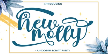 New Molly is a modern script.This font looks fresh, stylish, elegant and natural. This font is great for logo branding & invitations, wedding design, photography, quotes, posters, watermark, special events and much more.
 - Notebook Scribble by Mariess,
$7.00 A hand drawn font thats perfect for kids cards, scrap-booking and photo annotation etc.. Full set of alternative characters included. Comes with CSS and HTML code plus all web compatible formats.
 - Hakigai Heart Font by IbeyDesign,
$17.00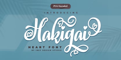 Hakigai Heart Font that inspires friendliness and elegance. It is perfect to use for any of your wonderful creations such as branding projects, logos, brochures, business cards, wedding invitations, and many others.
 - Tropical Nature by Skinny Type,
$15.00 Tropical Nature is a smoothie handwritten font perfect for your boho and farmhouse designs! This font is perfect for signs, shirts, wedding, home decor, branding, blogs, logos, invitations and more! Thank you!
 - HS Alwajd by Hiba Studio,
$50.00 Hs Alwajd is an Arabic display typeface, under “titles” category. It is useful for book titles, creative designs and modern logos. Also, it is used when a contemporary and simple look is desired that can fit with the characteristics of Kufi fatmic where horizontal parts are equal than vertical ones. It is a new style based on HS Almajd but without swirling round forms terminating in ball. The font is based on Kufi Fatmic calligraphy along with some derived ideas of decorative fonts, maintaining the beauty of the Arabic font and its fixed rates. Undoubtedly, the insertion of curved ornament in some parts adds more beauty and fascinating diversity in the flow line between sharp, soft and curved parts. This font supports Arabic, Persian, Pashtu, Kurdish Sorani, Kurdish Kirmanji and Urdu, consisting only one weight which can add to the library of Arabic Kufic fonts contemporary models that meet with the purposes of various designs for all purposes and all tastes.
 - Monoline Rounded JNL by Jeff Levine,
$29.00 Monoline Rounded JNL borrows the inline portion of Sales Event JNL. Making a few adjustments to some characters, it is now a lovely monoline with rounded terminals that emulates pen hand lettering.
 - Zt Nezto Variable by Khaiuns,
$18.00 ZT Nezto is a new work that focuses on curved areas, bringing out an elegant and refined style. The emergence of this idea was due to the constraints when designing with W&V letters which were very difficult to combine with other letters, and also the desire to present new elements in the world of typography, thus making each design more unified between letters. ZT Nezto design with this charming curved shape and still maintains the identity of each weight so it is very beautiful to apply to web design, packaging, or branding. ZT Nezto is a very useful typeface for you and it also comes in eight weights with matching italics and comes with a variety of open type features. I hope you have fun using ZT Nezto Thanks for using this font ~ Khaiuns X zelowtype
 - Sgraffio by Eurotypo,
$48.00 Sgraffio is a classic script font with an elegant contemporary style. Inspired by the CopperPlate script, it is an updated viewpoint. The special characteristics of this typeface is that its strokes are agile and dynamic, with slight and smooth variations in thickness, giving to the final art a sophisticated atmosphere. It is attractive and readable. It can be used in decorative titles, as well as in large readable text. Contain a useful set of OpenType features that can help you in many typographic fine adjustments, you can choose from different alternates, swashes, discretionary and standard ligatures. This fonts is completed with Old Style figures and Central European languages. It is ideal for fashion magazines, advertising, business web, logotypes, lettering - logotypes, e-commerce brands, books, greeting / wedding cards, packaging, labels or any type of effective visual communication purpose.
 - Zt Nezto by Khaiuns,
$14.00 ZT Nezto is a new work that focuses on curved areas, bringing out an elegant and refined style. The emergence of this idea was due to the constraints when designing with W&V letters which were very difficult to combine with other letters, and also the desire to present new elements in the world of typography, thus making each design more unified between letters. ZT Nezto design with this charming curved shape and still maintains the identity of each weight so it is very beautiful to apply to web design, packaging, or branding. ZT Nezto is a very useful typeface for you and it also comes in eight weights with matching italics and comes with a variety of open type features. I hope you have fun using ZT Nezto Thanks for using this font ~ Khaiuns X zelowtype
 - Atomic Marker by Set Sail Studios,
$16.99 Inject some energy into your design with the ATOMIC Marker Font. This loud and proud all-caps font was hand-drawn with a real acrylic marker, maintaining the authentic high definition brush detail in each stroke. It’s an exhilarating font choice perfect for header text, poster designs, album covers, product designs, merchandise, logos & more. The Atomic Marker family includes 2 fonts; Atomic Marker • Includes 2 sets of uppercase characters, simply switch between upper & lowercase on your keyboard to access the 2 sets. Also included are 18 ligatures (double letter pairings), which can be accessed by turning on ‘Standard Ligatures’, and 6 Small Caps, which can be accessed by turning on Small Caps. (All characters can also be accessed via a Glyphs panel). Atomic Marker Extras • Includes 26 ‘doodles’ (see images), and 23 underlines, designed to perfectly pair with the Atomic Marker font letters. Simply install this as it’s own separate font, and type A-Z (doodles) or a-w (underlines) to access each design. Language Support; Atomic Marker supports the following languages; English, French, Italian, Spanish, Portuguese, German, Swedish, Norwegian, Danish, Dutch, Finnish, Indonesian, Malay, Hungarian, Polish, Croatian, Turkish, Romanian, Czech, Latvian, Lithuanian, Slovak, Slovenian
 - Dinastri by Mantra Naga Studio,
$20.00 Dinastri is a condensed sans serif font that has a modern edge with bold characteristics. At 385 glyphs, this font is perfect for modern logos, contemporary web designs, or printed headlines. 385 Glyphs 5 Opentype features 7 Ligatures and 11 Stylistic alternates Multilingual support for 89 languages We highly recommend using a program that supports the OpenType feature and the Glyphs panel like many Adobe and Corel Draw applications, so that you can view and access all variations of Glyphs. Thanks for your support of our product and using it in your project.
 - Alcantera by Typebae,
$15.00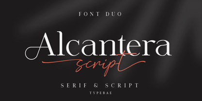 Alcantera Font Duo is a stunning pair of fancy script and serif fonts. These typography are designed to contrast and complement each other with elegant beauty and contemporary style. Use Alcantera Font Duo to create beautiful wedding invitations, beautiful stationery art, great social media posts, cute greeting cards and much more. To use the stylistic alternate, beginning and ending swashes you don't need to use software that supports opentype, because we have made it separately so it's very easy to use. Features: Stylistic Alternate, Ligature, Swashes, Multilingual & PUA Encoded
 - Allieno by Keristyper Studio,
$14.00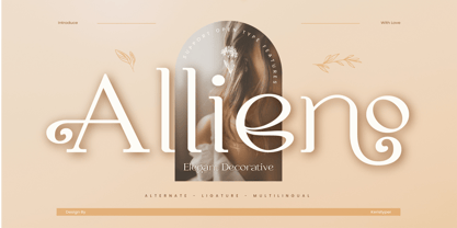 Allieno font is a stunning and ornate typeface that adds a touch of elegance and sophistication to any project. Its intricate and decorative design makes it perfect for use in wedding invitations, greeting cards, and other special occasions. Featured: Standard, Uppercase & Lowercase Numeral & Punctuation Multilingual : ä ö ü Ä Ö Ü ß ¿ ¡ Alternate & Ligature PUA encoded We recommend programs that support the OpenType feature and the Glyphs panel such as Adobe applications or Corel Draw, so you can use all the variations of the glyphs. Hope you enjoy our fonts!
 - Rose Garden Deluxe by Fenotype,
$25.00 Rose Garden Deluxe is an elegant type collection including a luscious high contrast serif in three weights and an ethereal pen script also in three weights. Together the fonts form an effective all-around set for sophisticated display purposes. The fonts are best used for imposing headlines, as a logotype, in packaging and posters. Rose Garden Serif has an extra high contrast giving it a sophisticated look, suitable for fashion or luxurious high-end products, magazines and anything such. Rose Garden Pen has no contrast, as if it was written with a steady and precise inking pen. Rose Garden Pen is equipped with plenty of useful OpenType features: it has Contextual Alternates and Standard Ligatures to enliven the flow of “writing” and to keep the connections between letters smooth. In addition it has Stylistic and Swash Alternates for every standard uppercase and lowercase characters, as well as for ampersand and few ligatures. On top of that it has initial and terminal swashes - a feature that is set in Titling Alternates. The feature works following: click it on and write normally. Type a space before a word and after it to get a special swash character in the beginning and in the end of the word. If that isn’t enough seek for even more alternates in the Glyphs Palette. Each weight has over 650 glyphs in total. Rose Garden Ornaments is an extension to Rose Garden Pen. It’s a set of Ornaments with the same weight and handwriting style as the font. The swooshes can be combined with the font for even more ornamental looks and the swashes set in lowercase letters can be used as additional terminal swashes, combined with any lowercase character.
 - Blinsithar by Hanzel Space,
$25.00 introduce our font "Blinsithar" font Happy! finally this font has been released in 2023, with full of new ideas having new character for each letter. It has beautiful curves that enhance the appearance of the font which is no less attractive. Complete with lowercase and uppercase letters, punctuation, swash and ligature. By creating this font, we hope to help your design type needs, to support your business and your business. This font is very suitable for use as branding, logos, slogans, websites, weddings, products and so on. Full Set of standard alphabet and punctuation Extra set of ending swashed lowercase Handwritten ligatures Thanks so much for checking out my shop! Happy creating! Cheers! Hanief - Hanzel Space
 - Morelinia by Gatype,
$12.00 Morelinia is a modern, handwritten, modern calligraphy font. The shape is modern and unique and the writing style is very natural. Morelinia features a varied baseline, smooth lines, gorgeous glyphs, and stunning alternatives. Hand-drawn design elements allow you to create many beautiful typographic designs in an instant like branding, web design and editorial, prints, crafts, quotes, It's great for logotypes, wedding invitations, romantic cards, labels, packaging, spelling of names and others. Add to your most creative ideas and watch how they bring them to life! Morelinia is coded with PUA Unicode, which allows full access to all the extra characters without having special designing software. Mac users can use Font Book , and Windows users can use Character Map to view and copy any of the extra characters to paste into your favorite text editor/app. Morelinia includes OpenType stylistic alternates, ligatures and International support for most Western Languages. To enable the OpenType Stylistic alternates, you need a program that supports as Adobe Illustrator CS, Adobe Indesign & CorelDraw X6-X7, Microsoft Word 2010 or later versions.
 - Bordonaro Script by Estudio Calderon,
$35.00 Bordonaro Script - Bordonaro Spur’s partner - is an interpretation of the “English Roundhand” style with a strong influence by the logos of American basketball and baseball teams. It is designed from simple shapes ideal to be used in long titles and fits perfectly into the branding design. Psss...Check out the NEW Bordonaro Script with Rounded corners , same version but soft! Bordonaro has a complete set of special and original characters: Stylistic Ligatures, Discretionary Ligatures, Swashes, Contextual Alternates, Titling, ss01,ss02, ss03 & apostrophes' ligatures that work as complements to enrich the text composition. Bordonaro Script and Bordonaro Spur are two typographic styles that were designed under the same characteristic features with the idea of combining them to obtain better results, for that reason, we recommend merging them in a creative way and you will realize everything you can design with them. The banners designs are based on old brands of beer labels, coffee packaging, sports logos and in some cases we use Copperplate Gothic but only as a complementary font in order to harmonize the layout of the elements in each banner.
 - Mid Century Sans by Dharma Type,
$19.99 Mid Century Sans (MCS) is composed of high-geometric shapes. László Moholy-Nagy —professor in the Bauhaus— said “Typography is a tool of communication. It has to be communication in its most intense form. The emphasis must be on absolute clarity since this distinguishes the character of our own writing from that of ancient pictographic forms.” As same as you can see in modern typefaces in the early twentieth century, MCS has very efficient, clear and minima letterforms. There are not any decorative parts in the skeleton of letters. At the same time, Mid Century Sans has one more feature. In the middle of the twentieth century, one big movement which was called Mid-century modern had occurred. The Mid-century modern movement in the U.S. was an American reflection of the International and Bauhaus movements and it was slightly more organic in form and less formal than the International Bauhaus-style. In other words, it was friendly and stylish. We added Mid-century-spices to the Bauhaus-modernism. The basic letter form is geometric yet it has very friendly strokes and human touch. Mid Century Sans consists of 8 weights and their matching Italics for a wide range of usages. Farther, Mid Century Sans is supporting international Latin languages and basic Cyrillic languages including Basic Latin, Western Europe, Central and South-Eastern Europe. Also MCS covers Mac Roman, Windows1252, Adobe1 to 3. This wide range of international characters expands the capability of your works. Lowercase "a" has OpenType stylistic alternates for advanced typography.
 - Poetica by Adobe,
$29.00Poetica font was designed by Robert Slimbach in 1992 with particularly generous characters. The typeface family consists of 21 weights to allow for an unusual variety of design possibilities within one typeface family. Numerous swash letters, ornaments and ligatures remind one of the early Renaissance and its unforgettable masters, for example, Giambattista Palatino, who later gave his name to Hermann Zapf's creation. Slimbach used the Lettera Cancellaresca as a model for his typeface, the cultivated humanistic italic which later served as a point of departure for the development of italics of the Renaissance and thereafter. Lettera Cancellaresca is very legible, extremely harmonic and impressively beautiful. The early forms display two different compositional tendencies, namely the static of the simple vertical capitals and the italic dynamic of the slanted lower case alphabet, as shown in the weight Chancery 4. The capitals later conform to the slant of the lower case, as shown in the weights Chancery 1-3. Poetica font should be set according to the included suggestion in order to see the full benefit of its grace and beauty. - Foobar Pro by CheapProFonts,
$- This is the cool and stylish relative to Familiar pro. Like a cousin. Or perhaps a second cousin twice removed. Because parts of the letters are removed, see... ALL fonts from CheapProFonts have very extensive language support: They contain some unusual diacritic letters (some of which are contained in the Latin Extended-B Unicode block) supporting: Cornish, Filipino (Tagalog), Guarani, Luxembourgian, Malagasy, Romanian, Ulithian and Welsh. They also contain all glyphs in the Latin Extended-A Unicode block (which among others cover the Central European and Baltic areas) supporting: Afrikaans, Belarusian (Lacinka), Bosnian, Catalan, Chichewa, Croatian, Czech, Dutch, Esperanto, Greenlandic, Hungarian, Kashubian, Kurdish (Kurmanji), Latvian, Lithuanian, Maltese, Maori, Polish, Saami (Inari), Saami (North), Serbian (latin), Slovak(ian), Slovene, Sorbian (Lower), Sorbian (Upper), Turkish and Turkmen. And they of course contain all the usual "western" glyphs supporting: Albanian, Basque, Breton, Chamorro, Danish, Estonian, Faroese, Finnish, French, Frisian, Galican, German, Icelandic, Indonesian, Irish (Gaelic), Italian, Northern Sotho, Norwegian, Occitan, Portuguese, Rhaeto-Romance, Sami (Lule), Sami (South), Scots (Gaelic), Spanish, Swedish, Tswana, Walloon and Yapese.
 - Relato by Emtype Foundry,
$69.00 Relato has a low contrast and “a muscular” structure that makes it useful for setting longer text. In display sizes it has a variety of details that lends it a unique and personal expression. The formal principle of the serif, the variety of terminal strokes and the combination of curves and semi-straight lines gives the Relato a more “human” flavor. The inspiration for the design comes from different traditional calligraphic styles. The upper case letter, for example, is based on roman capitals from the Rennaissance, whereas the lower case relates to humanist handwriting. Even so, Relato is a decidedly contemporary typeface, proposing individual ideas on the design of type. The italic has a distinct typographic color thanks to the construction principle of broken lines. The bold weights have an increased contrast in the union of the strokes which helps improve legibility in small sizes and reinforce their personality in display sizes. The family consists of a Regular version, Italic, Small caps, Semibold and Bold. For a sans serif version of Relato, please see Relato Sans.
 - Little Mess by Gleb Guralnyk,
$12.00 Hi! Introducing this handcrafted calligraphic script named "Little Mess". It's made with a calligraphic pen in a casual rough style. It has a multilingual support and several ligatures. Thank you and have a great day!
 - Slothy Jelly by Scratch Design,
$12.00 Introducing Slothy Jelly! A fun font for everyone. Slothy Jelly is a cute handwritten font that has fun and happy characteristics. This font is authentically handwritten with the marker pen for a consistent look. This font also has alternates so you can mix and match the letters and make it more fun! For some extra hand-drawn cuteness, this font is also thrown in a bonus font with symbols like emojis, hearts, underlines, arrows, and circles - and drawn with the same pen to perfectly go with the writing. So it will help to make your design more cute and happy. This font is suitable for branding, posters, children's books, magazines and others. Your download will contain the following fonts such as Slothy Jelly Regular - a pretty and cute handwritten including a set of uppercase, lowercase, alternates, ligatures and multilingual support. Slothy Jelly Symbols - a dingbat font of many hand-drawn elements These fonts will work in any program, but please note that the alternates and ligatures of the font can only be accessed on software that supports OpenType features. Thank you for your purchase! Hope you enjoy this font
 - Mashiya by Stringlabs Creative Studio,
$25.00 Mashiya is a Monoline Script Font with elegant style. This font is perfect for fashion brand, apparel, shoes company, wedding invitation, business card, logo brand, clothing, and also business brand name like barber shop or taylor.
 - Gladstone by Michael Browers,
$25.00 Gladstone is a charming script typeface inspired by pen lettering techniques.
 - Quill by Monotype,
$29.99The Quill font is based on classic Renaissance broad-pen calligraphy. - Mezalia by Arrière-garde,
$9.00 Mezalia is a one of a kind typeface. Its shapes were strongly influenced by bastarda scripts of high medieval times. Unlike most fonts sharing similar origin, Mezalia is not just another blackletter but a fully functional text typeface, blending medieval poise and character with modern sensibilities. Stroke widths, imitating a broad nibbed pen of a scribe, fluctuate constantly giving paragraphs a characteristic vibrating texture. Despite it's strong character Mezalia is very legible and will be an excellent choice for a book or an elegant magazine. Mezalia has two distinct styles: straight and cursive (true italic if you will, although the word is not really correct here), which come in seven weights, from thin to black. Each weight contains a set of old-style figures, lining figures, small caps and ligatures. A separate style containing drop-cap initials is also available.
 - Linotype Belle by Linotype,
$29.99Linotype Belle is a casual script face. Created in 1999 by the Swiss designer Isabelle Stutz, the letters in this design have a light, informal nature, and appear as if they were written out quickly, using a writing instrument similar to a ballpoint pen. Linotype Belle has two fonts to offer: Linotype Belle Plain and Linotype Belle Bonus. Linotype Belle Bonus contains more extravagant, swash-like capitals than Linotype Belle Plain's characters; when used together, these two fonts can create a varied, lively impression. Linotype Belle was a prizewinner in Linotype's Third International Type Design Contest. Additionally, the design is part of the innovative Take Type Library, and can be purchased as part of the Take Type 3.1 CD collection. The typeface works excellently when used to set magazine or newsletter headlines, and as text for greeting cards." - Otama by Tim Donaldson,
$49.00 From the dainty light weight through to the striking UltraBold, Otama raises the bar to a new level of dangerous sophistication. Although easily classified alongside Modern typefaces such as Didot and Bodoni, Otama was purposely developed with minimum reference to these two visual heavy weights. In search of something more than a mere historical revival, Otama instead draws proportional reference from popular 20th century Transitional and Garalde typefaces with visual inspiration coming from calligraphic studies. Many characteristics from Tim Donaldson’s 2010 display face Pyes Pa were directly passed on in execution of Otama — The shoelaced k, e and a being the most obvious examples of this family relation. Refined over 2 years with well over 8,000 characters over 28 styles, Otama certainly deserves its place as a comprehensive and versatile typeface in any designer’s font library.
 - Generis Slab by Linotype,
$29.00The idea for the Generis type system came to Erik Faulhaber while he was traveling in the USA. Seeing typefaces mixed together in a business district motivated him to create a new type system with interrelated forms. The first design scheme came about in 1997, following the space saving model of these American Gothics. Faulhaber then examined the demands of legibility and various communications media before finally developing the plan behind this type system. Generis’s design includes two individually designed styles; each of with is available with and without serifs, giving the type system four separate families. Each includes at least four basic weights: Light, Regular, Medium, and Bold. Further weights, small caps, old style figures, and true italics were added to each family where needed. The Generis type system is designed to meet both optical criteria and the highest possible measure of technical precision. Harmony, rhythm, legibility, and formal restraint make up the foreground. Generis combines aesthetic, technical, and economic advantages, which purposefully and efficiently cover the whole range of corporate communication needs. The unified basic form and the individual peculiarity of the styles lead to Generis’ systematic, total-package concept. The clear formal language of the Generis type system resides beneath the information, bringing appropriate typographic expression to high-level corporate identity systems, both in print and on screen. The condensed and aspiring nature of the letterforms allows for the efficient setting of body copy, and the economic use of the page. A range of accented characters allows text to be set in 48 Latin-based languages, offering maximal typographic free range. This previously unknown level of technical and design execution helps create higher quality typography in all areas of corporate communication. Optimal combinations within the type system: Generis Serif or Generis Slab with Generis Sans or Generis Simple. - Generis Serif by Linotype,
$29.00The idea for the Generis type system came to Erik Faulhaber while he was traveling in the USA. Seeing typefaces mixed together in a business district motivated him to create a new type system with interrelated forms. The first design scheme came about in 1997, following the space saving model of these American Gothics. Faulhaber then examined the demands of legibility and various communications media before finally developing the plan behind this type system. Generis’s design includes two individually designed styles; each of with is available with and without serifs, giving the type system four separate families. Each includes at least four basic weights: Light, Regular, Medium, and Bold. Further weights, small caps, old style figures, and true italics were added to each family where needed. The Generis type system is designed to meet both optical criteria and the highest possible measure of technical precision. Harmony, rhythm, legibility, and formal restraint make up the foreground. Generis combines aesthetic, technical, and economic advantages, which purposefully and efficiently cover the whole range of corporate communication needs. The unified basic form and the individual peculiarity of the styles lead to Generis’ systematic, total-package concept. The clear formal language of the Generis type system resides beneath the information, bringing appropriate typographic expression to high-level corporate identity systems, both in print and on screen. The condensed and aspiring nature of the letterforms allows for the efficient setting of body copy, and the economic use of the page. A range of accented characters allows text to be set in 48 Latin-based languages, offering maximal typographic free range. This previously unknown level of technical and design execution helps create higher quality typography in all areas of corporate communication. Optimal combinations within the type system: Generis Serif or Generis Slab with Generis Sans or Generis Simple. - Generis Simple by Linotype,
$39.00The idea for the Generis type system came to Erik Faulhaber while he was traveling in the USA. Seeing typefaces mixed together in a business district motivated him to create a new type system with interrelated forms. The first design scheme came about in 1997, following the space saving model of these American Gothics. Faulhaber then examined the demands of legibility and various communications media before finally developing the plan behind this type system. Generis’s design includes two individually designed styles; each of with is available with and without serifs, giving the type system four separate families. Each includes at least four basic weights: Light, Regular, Medium, and Bold. Further weights, small caps, old style figures, and true italics were added to each family where needed. The Generis type system is designed to meet both optical criteria and the highest possible measure of technical precision. Harmony, rhythm, legibility, and formal restraint make up the foreground. Generis combines aesthetic, technical, and economic advantages, which purposefully and efficiently cover the whole range of corporate communication needs. The unified basic form and the individual peculiarity of the styles lead to Generis’ systematic, total-package concept. The clear formal language of the Generis type system resides beneath the information, bringing appropriate typographic expression to high-level corporate identity systems, both in print and on screen. The condensed and aspiring nature of the letterforms allows for the efficient setting of body copy, and the economic use of the page. A range of accented characters allows text to be set in 48 Latin-based languages, offering maximal typographic free range. This previously unknown level of technical and design execution helps create higher quality typography in all areas of corporate communication. Optimal combinations within the type system: Generis Serif or Generis Slab with Generis Sans or Generis Simple. - Generis Sans by Linotype,
$29.00The idea for the Generis type system came to Erik Faulhaber while he was traveling in the USA. Seeing typefaces mixed together in a business district motivated him to create a new type system with interrelated forms. The first design scheme came about in 1997, following the space saving model of these American Gothics. Faulhaber then examined the demands of legibility and various communications media before finally developing the plan behind this type system. Generis’s design includes two individually designed styles; each of with is available with and without serifs, giving the type system four separate families. Each includes at least four basic weights: Light, Regular, Medium, and Bold. Further weights, small caps, old style figures, and true italics were added to each family where needed. The Generis type system is designed to meet both optical criteria and the highest possible measure of technical precision. Harmony, rhythm, legibility, and formal restraint make up the foreground. Generis combines aesthetic, technical, and economic advantages, which purposefully and efficiently cover the whole range of corporate communication needs. The unified basic form and the individual peculiarity of the styles lead to Generis’ systematic, total-package concept. The clear formal language of the Generis type system resides beneath the information, bringing appropriate typographic expression to high-level corporate identity systems, both in print and on screen. The condensed and aspiring nature of the letterforms allows for the efficient setting of body copy, and the economic use of the page. A range of accented characters allows text to be set in 48 Latin-based languages, offering maximal typographic free range. This previously unknown level of technical and design execution helps create higher quality typography in all areas of corporate communication. Optimal combinations within the type system: Generis Serif or Generis Slab with Generis Sans or Generis Simple. - FF Kaytek Sans by FontFont,
$50.99 Kaytek™ Sans is a fresh take on the correspondence typefaces of the 90s - which were originally designed for the demands of office environments. Just like its predecessors, this text typeface is robust and hard-working - meaning it works well in challenging design or printing environments - but it’s not without personality. Look closer at the lowercase g and a, especially in the italic, and you can see some unexpected elements of subversiveness within the design. This blend of sturdiness and quirkiness means it’s just as relevant for information-heavy projects, such as annual reports, as it is in more expressive environments. Although first and foremost designed for text, Kaytek Sans’ details shine through in its heavier weights and larger sizes, meaning it also has display potential. Every style of the typeface takes up exactly the same amount of space, thanks to the way Radek Łukasiewicz created the design. He based the entire typeface on a single, master set of proportions. This means designers can switch between styles without the text being reflowed, making it particularly useful in magazines, where space might be limited, and also on the internet, where hover links appear in a different style. As well as its roots in the office, Kaytek Sans draws on a little bit more 90s nostalgia. It’s named for the first and only Polish walkman, and embodies the same solid, no-nonsense shapes that made the analogue technology of the era so charming. Just like these early personal music devices, Kaytek Sans is practical, but not clinical, able to work hard while still exuding warmth and personality. It pairs effortlessly with Kaytek Slab, which is a sturdier and more expressive take on the design. Kaytek Sans comes in 12 weights, from Thin to Black Italic, and offers multi-language support. Kaytek Slab, Kaytek Headline and Kaytek Rounded are also available.
 - Revillia by Din Studio,
$29.00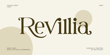 Revillia is modern serif font. Made for any professional project branding. It is the best for branding, printing, wedding and quotes. Every letter has a unique and beautiful touch. Features: Beautiful Ligatures Many Swashes Stylistic Sets PUA Encoded Multilingual Support Numerals and Punctuation
 - Magreb by 38-lineart,
$19.00 Magreb is a classic serif font inspired by Garamond and Venetian Serif Styles, accentuating softness and conveying luxury. This family of four weights and their corresponding italics is an old style construction and bridges the glory of the past with the elegance of the present. The process of making this fonts starting with an ellipse brush with a certain slope so that it resembles calligraphy pen strokes. followed by creating the basic serif elements, refining the vectors and softening each joint so that it looks natural. Next, develop it from regular weight to weight bold. Magreb has expanded the latin character set to support 200+ latin based languages. We added opentype features suchs superscript and subscript; Numeretor and Denominator; Old Style figures and lining figures.
 - Heavenlight by Fargun Studio,
$15.00 Heavenlight is an elegant and casual monoline-signature font. This font is suitable for branding, logos, wedding invitations, magazines, brochures, and more This font has unique set and swashes alternates that will enhance your design.
 - Edith Calamar by Calamar,
$16.00 Edith is the new elegant sans serif font that will bring in your projects a touch of luxury and style. It's perfect match for logotypes, branding, wedding monograms and invitations, blog headlines and much more.
 - Santoria Christmas by Yoga Letter,
$18.00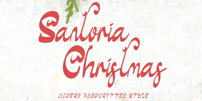 "Santoria Christmas" is a neat, beautiful, and elegant handwritten font. This font is equipped with uppercase, lowercase, numerals, punctuation, and multilingual support. Very suitable for Christmas, weddings, engagements, invitations, banners, branding, posters, photography, and others.
 - Restine by Yoga Letter,
$18.00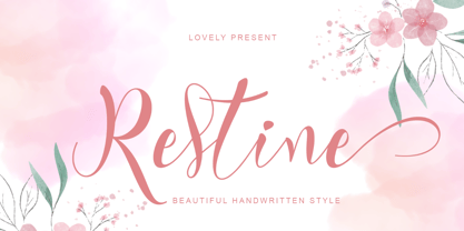 "Restine" is an elegant and beautiful handwritten font. This font is equipped with uppercase, lowercase, ligatures, swash, titling, numerals, punctuation, and multilingual support. Very suitable for weddings, Christmas, engagements, posters, stickers, banners, branding, and others.