10,000 search results
(0.046 seconds)
- Magicstar by Rockboys Studio,
$23.00 Magicstar is a daring handwritten font created with brush pen strokes. This bold font will beautify and emphasize your design. Add it confidently to your projects, and you will love the results.
 - Endellia by Sealoung,
$12.00 Endellia is a bold and thick lettered display font, created with the help of a brush pen. Add it to your most creative ideas and notice how it makes them come alive!
 - Pirate Station by Oleg Stepanov,
$16.00 Pirate Station is the hand-drawn font made with brush. It is good for games, cartoons, posters, children's books, and whenever you want to see grimy and funny but yet readable typeface.
 - Romantika Hidup by Stringlabs Creative Studio,
$29.00 Romantika Hidup is a flowing and elegant handwritten font, created with the help of a brush pen. Get inspired by its unique and beautiful style and add it to your favorite designs!
 - Light Storm by Epiclinez,
$19.00 Light Storm is an urban styled handwritten font, designed with the help of a brush pen. This signature script font is a good choice for creating eye catching logos, branding and quotes.
 - Personal Note JNL by Jeff Levine,
$29.00 Personal Note JNL gets its inspiration from a semi-calligraphic pen alphabet found in the 1960 edition of the Speedball® lettering textbook and is offered in both regular and oblique versions.
 - Amellis Path by Stringlabs Creative Studio,
$29.00 Amellis Path is a flowing and elegant handwritten font, created with the help of a brush pen. Get inspired by its unique and beautiful style and add it to your favorite designs!
 - AZ Rough Fart by Artist of Design,
$20.00 AZ Rough Fart font was created out of a need for a typeface that would compliment a rough outlined Tee-Shirt design. For use as a headline or subhead in your design.
 - Monoline Rounded JNL by Jeff Levine,
$29.00 Monoline Rounded JNL borrows the inline portion of Sales Event JNL. Making a few adjustments to some characters, it is now a lovely monoline with rounded terminals that emulates pen hand lettering.
 - Silver Rocky by Illushvara,
$15.00 Silver Rocky is a unique and flowing handwritten font, designed with the help of a brush pen. Fall in love with its incredibly versatile style and use it to create spectacular designs!
 - Rollaway by Brilliant Mix Design,
$7.00 Retro display font was inspired by rollerskating which is a timeless treasure. The letters you can see them groove along and rollaway. Hand drawn essence with a illustrated to created whimsical story.
 - FranklinGothicHandLight by Wiescher Design,
$39.50 FranklinGothicHandLight is part of a series of hand-drawn fonts from way back in time – before computers changed the way we worked. When I was in advertising – before computers – a very time consuming part of my daily work was sketching headlines. I used to be able to sketch headlines in Franklin Gothic, Times, Futura, Helvetica and several scripts. We had a kind of huge inverted camera – which we called Lucy. We projected the alphabet onto a sheet of transparent paper, outlined the letters with a fineliner and then filled them in. It was very tedious work, but the resulting headline had its own charm and we had a permanent race going on who was best and fastest. I won most of the time! They used to call me the fastest "Magic Marker" this side of the Atlantic. Great days, just like today! Your sentimental type designer from the past Gert Wiescher
 - FranklinGothicHandDemi by Wiescher Design,
$39.50 FranklinGothicHandDemi is part of a series of hand-drawn fonts from way back in time – before computers changed the way we worked. When I was in advertising – before computers – a very time consuming part of my daily work was sketching headlines. I used to be able to sketch headlines in Franklin Gothic, Times, Futura, Helvetica and several scripts. We had a kind of huge inverted camera – which we called Lucy. We projected the alphabet onto a sheet of transparent paper, outlined the letters with a fineliner and then filled them in. It was very tedious work, but the resulting headline had its own charm and we had a permanent race going on who was best and fastest. I won most of the time! They used to call me the fastest "Magic Marker" this side of the Atlantic. Great days, just like today! Your sentimental type designer from the past Gert Wiescher
 - Paranoid Android by Comicraft,
$29.00Fonts are Inhuman and Human Fonts are IN! Now, the Comicraft Cybernetics Corporation is proud to announce the first in a new line of fonts with GFP... Genuine Font Personalities. Paranoid Android is an outer alloy, inner void, solitary solenoid GFP prototype -- you can tell, can't you? Finally a font that knows its place as a digital servant to the human race. What will Comicraft think of next? No, don't bother to answer that, Comicraftsmen are fifty thousand times more intelligent than you and even they don't know the answer. Warning: Nothing left to be enjoyed, every diode rheumatoid*, terminally Paranoid Android is not so much a font, and more a kind of electronic sulking device. Share and Enjoy! *The moving parts on the left side of this font are in a solid state. It may sit in a corner and rust, or just fall apart where it's standing. - CA Spy Royal by Cape Arcona Type Foundry,
$19.00 Spy Royal is a junctionless script typeface and comes in 6 styles. It’s a hybrid between script and so called streamline fonts. The origins are based on an advertising by Japan Airlines, dated around 1954, offering flights to San Francisco, Honolulu and Okinawa in the new DC-6B “Pacific Courier” airplane. Only the letters for the words “JAPAN AIR LINES” were used, so that the creative part was to reimagine a full font out of just a handful of uppercase letters. Originally released in 2004, Spy Royal was now undergoing a major rework and is now republished with additional styles like shadow-lines and 3D-shadow. Its charm is manifold, we think everything related to cars, racing, hot rod, vintage, cocktails, retro, restaurants, gasoline and of course airlines will look great in Spy Royal. Spy Royal includes alternate characters, ligatures and West European diacritics.
 - Wermut by Brownfox,
$45.00 An intoxicating blend of rare flavours is what makes the new transitional typeface Wermut (German for vermouth) resemble its alcoholic namesake. Bitter and thorny at first glance, it proceeds to surprise the palate with a complicated taste that leaves a pleasant aftertaste. Wermut may not be taken in hastily, but needs to be thoughtfully enjoyed at a measured pace. Its dark colour, compressed, spring-like, shapes, well-built proportions, and agreeable letterforms all look safe enough until one is jolted to encounter the clipped serifs that lend the page an unexpectedly edgy appearance. The font comes in two weights with an extended character set in Latin and Cyrillic scripts supporting 66 languages. A product of slow, careful distillation, this infusion of multiple ingredients comes together to form a unique mature taste which will be appreciated by true connoisseurs of typographic cocktails. Desined by Gayaneh Bagdasaryan and Vyacheslav Kirilenko.
 - Metalista by Suitcase Type Foundry,
$39.00 The Metalista font was created as a sign of undying admiration for the persistence of heavy metal culture. The angled font of almost fixed width proportions combines capitals with small letters for more variety and better definition of individual letters. Stressing the horizontal strokes subdued the historical Gothic character and emphasized a more modern signature, which is far different from the majority of current attempts at a modern adaptation of Fraktur fonts. We offer Metalista in three styles, or rather widths to be exact: Speed is inspired by the whiplash pace of 70s and 80s speed metal, and can tell and perform a lot even in a very small space; uncompromising Death balances on the fine line between expression and readability; and Metalista Black is the universal go-to, whether as megalomaniacal titles sprawled across the entire LP cover or as tiny texts for glam rock CD booklets.
 - FS Conrad by Fontsmith,
$50.00 Art into type In 2008, Fontsmith were approached by their friend, Jon Scott, to investigate whether a typeface could assume the aesthetic of one artist’s body of work. Jon’s not-for-profit charity, Measure, was organising an event for the artist, Conrad Shawcross, whose giant mechanical installation, entitled Chord, was going on public display in the long-disused Kingsway tram tunnel in Holborn. Chord explores the way we perceive time, as either a line or a cycle. Two enormous machines with dozens of rotating arms and moving in opposite directions, weave rope with almost infinite slowness. An unusual brief Phil Garnham visited Conrad in his Hackney studio to get a feel for his work and ideas. “Conrad is a very clever and philosophical guy. He struggled to see how typeface design had any relevance to him and his art. This was going to be a challenge.” The artist presented the type designer with a pile of rope and a huge diagram of sketches and mathematical workings. “This was, in essence, my brief.” Phil developed three concepts, the simplest of which ticked all the boxes. “The idea of the strokes in the letterforms appearing and ending at peaks or points of origin fitted perfectly with Conrad’s idea of time occurring and ending at two ends of the sculpture.” Two versions Phil planned modules for two versions of the typeface: one with five lines in the letterforms and one with seven. He then drew the modules on-screen and twisted and turned them to build the machine that is FS Conrad. “This is not a simple headline typeface,” says Phil. “It’s not a rigid structure. It has varying character widths, and it’s informed by real typographic insight and proportions so that it actually works as piece of functioning, harmonious type.”
 - dearJoe 7 by JOEBOB graphics,
$39.00 The dearJoe series of fonts came to life around the year 1999, when I created dearJoe 1, which was a first (and half-assed) attempt to convert my own handwriting into a working font. Being able to type in my own hand had always been a childhood fantasy, and even though I only partly understood the software, a working font was generated and I decided to put it on the internet for people to use in their own personal projects. Which they did: at this moment the dearJoe 1 font has been downloaded millions of times and can be found on Vietnamese riksjas, Tasmanian gyms and chocolate stores on 5th Avenue for instance. The font is not something I am particularly proud of, but it started me of in building what's now the JOEBOB graphics foundry. Inbetween creating other fonts, the dearJoe series has become a theme I revisit every once in a while, trying to create an update on how my handwriting has evolved, along with my abilities in creating fonts that mimic actual handwriting. In the last decade or so I started implementing ligatures and alternate characters, which helped a lot in coming to a result that can almost pass for actual handwriting. The 2019 dearJoe 7 font is the latest addition to this font family. All characters were scanned from handwritten notes, cherrypicking the characters and letter-combinations I liked best. They were written with a Lamy M66 B pen and only minor adjustments were made to the original scans, leaving most little flaws and rough edges as they were for a convincing ball-point on paper result. The font comes with over 150 ligatures, making sure the font has a variated and credible overall look and feel.
 - FF Kaytek Sans by FontFont,
$50.99 Kaytek™ Sans is a fresh take on the correspondence typefaces of the 90s - which were originally designed for the demands of office environments. Just like its predecessors, this text typeface is robust and hard-working - meaning it works well in challenging design or printing environments - but it’s not without personality. Look closer at the lowercase g and a, especially in the italic, and you can see some unexpected elements of subversiveness within the design. This blend of sturdiness and quirkiness means it’s just as relevant for information-heavy projects, such as annual reports, as it is in more expressive environments. Although first and foremost designed for text, Kaytek Sans’ details shine through in its heavier weights and larger sizes, meaning it also has display potential. Every style of the typeface takes up exactly the same amount of space, thanks to the way Radek Łukasiewicz created the design. He based the entire typeface on a single, master set of proportions. This means designers can switch between styles without the text being reflowed, making it particularly useful in magazines, where space might be limited, and also on the internet, where hover links appear in a different style. As well as its roots in the office, Kaytek Sans draws on a little bit more 90s nostalgia. It’s named for the first and only Polish walkman, and embodies the same solid, no-nonsense shapes that made the analogue technology of the era so charming. Just like these early personal music devices, Kaytek Sans is practical, but not clinical, able to work hard while still exuding warmth and personality. It pairs effortlessly with Kaytek Slab, which is a sturdier and more expressive take on the design. Kaytek Sans comes in 12 weights, from Thin to Black Italic, and offers multi-language support. Kaytek Slab, Kaytek Headline and Kaytek Rounded are also available.
 - FS Silas Sans by Fontsmith,
$80.00 The great enigma There are hidden depths to FS Silas Sans. First impressions are of a functional, multi-purpose typeface with a cool, edgy, angular character. Gaze into its eyes a little longer, though, and you'll detect a more nuanced, colourful personality, with full, open, satisfyingly squarish forms balancing the abruptness of the sharply-angled terminals and ascenders. Authoritative, official and stern on the outside; amiable and welcoming on the inside. You’re so Dane The designers, led by Phil Garnham, were trying to capture something straight-talking, authentic, and a little... Scandinavian. ‘We were thinking about some of the characters in Danish dramas that were on in the early stages of the font’s development, like The Killing and The Bridge,’ says Phil. ‘The police officers, that is, not the psychopathic killers. Smart and a bit cool, but with a warm heart.’ For a good Danish name, we settled on Silas. It was that or Hans-Christian. The finer points Silas Sans rewards close inspection. Study, if you will, its amply squarish forms, the roomy ‘o’ and ‘e’, in particular. Observe the angular ascenders and terminals of, for example, the ‘L’, ‘I’, ‘d’ and ‘i’, inferring the movement and lift of a pen. Consider the cuts to the ‘A’ and ‘v’ that create harmony with adjacent letters. And scrutinise the subtle ink traps set within the ‘A’ and ‘Y’ for reproduction at small sizes. A fine subject, we think you’ll agree, and available in a versatile range of weights to make (with FS Silas Slab) a typographic system with a comprehensive hierarchy.
 - Grafical by Halbfett,
$30.00 Grafical is a contemporary take on 19th-century sans serifs. In this family, the amount of geometry inherent within the letterforms has been amped up. Many shapes have received further streamlining, too. All the geometric forms you see have been optically corrected, ensuring their delivery of better legibility. Grafical ships in two different formats: depending on your preference, you can install the typeface as two Variable Fonts or use the family’s 16 static OpenType font files instead. The static fonts offer eight weights, running from Extralight through Black. Each weight has an upright and an italic font available. While the static-format fonts offer a good intermediary-step selection, users who install the Variable Fonts have vastly greater control over their text’s stroke width. The Grafical Variable and Grafical Variable Italic font’s weight axes allow users to differentiate between almost 1,000 possible font weights. That enables you to fine-tune your text’s exact appearance on-screen or in print. Grafical is the perfect tool for a range of design uses, including text on the web, text in print, and text in motion graphics. Its fonts are typographic workhorses – not just from their legibility perspective but also because of the amount of OpenType features they include. There are ligatures, for instance, as well as proportional and tabular lining and oldstyle figures, fractions, numbers placed inside circles, and even Roman numerals. Users can also substitute alternate versions of the “a”, “g”, “i”, “j”, “y”, “G”, and “Q” into their work.
 - Kontext H by Elster Fonts,
$20.00 Imagine a font that is easier to read the smaller it is – or the further away the text is. There are already many line screen fonts, I wanted to take it to the extreme and use as few lines as possible, while keeping the grid of the fonts metrics. The result is a typeface that lives up to its name. Each individual line makes no sense on its own; individual letters are only recognisable in the context of all associated lines, individual letters are most likely to be recognised in the context of whole words. Attached to a building wall, text would be readable from a great distance and become increasingly difficult to decipher the closer you get to the building. Placed on the ground or on a large flat roof, text would only be readable from an aeroplane or - depending on the size - in Google Earth. Kontext has old style figures, superscript numerals, case-sensitive questiondown and exclamdown and an alternative ampersand, 390 glyphs at all. Use the same value for font size and line spacing to keep the lines in the grid, or change the line spacing in 10% steps. Change the spacing in 100-unit or 25-percent increments increments to keep the grid. The »H« in the font name stands for horizontal (lines). The numbers in the font name refer to the brightness of the background and letters themselves, with the first number describing the background and the second the letters. Starting with »00« (white) to »200« (dark) See also my Family Kontext Dot
 - Dolsáb by Kent Barns,
$20.00 Dolsáb was designed from scratch with uniqueness in mind. The subtle movement from thick to thin and the variants of sharp to rounded make this cutting edge san serif a must have. The inspiration for Dolsab was a simple pairing of a rhombus and calligraphy. While neither of those two elements can be seen in their entirety in any instance, the influence of both is strong. The rhombus can be notice on most ascenders like on the lowercase t & l, for example. And the calligraphy inspiration is most easily captured on the descenders such as the lowercase y & g. The most beautiful characteristics of Dolsab is definitely the calligraphy-influenced movement. These features really stand out on the lowercase a & e. It's almost amusing to let your eye follow the contours of those two letter forms as they travel from thick to thin, sharp to rounded and back again. Users are welcomed to try all font styles of Dolsab in any applique of their choosing. However, it will be quickly noticeable that only Dolsab Air & Demi (the thiner of the styles) will be best suited for body copy. Personally I like to see these letterforms as large as they can be to really showcase the subtle movement, especially in Dolsab Heavy where these movements become much more dramatic. You'll never know what really works best unless you experiment. Dolsab surely isn't the answer to all projects, but it's certainly worth trying. No other typeface moves quite like Dolsáb.
 - Kontext V by Elster Fonts,
$20.00 Imagine a font that is easier to read the smaller it is – or the further away the text is. There are already many line screen fonts, I wanted to take it to the extreme and use as few lines as possible, while keeping the grid of the fonts metrics. The result is a typeface that lives up to its name. Each individual line makes no sense on its own; individual letters are only recognisable in the context of all associated lines, individual letters are most likely to be recognised in the context of whole words. Attached to a building wall, text would be readable from a great distance and become increasingly difficult to decipher the closer you get to the building. Placed on the ground or on a large flat roof, text would only be readable from an aeroplane or - depending on the size - in Google Earth. Kontext has old style figures, superscript numerals, case-sensitive questiondown and exclamdown and an alternative ampersand, 390 glyphs at all. Use the same value for font size and line spacing to keep the lines in the grid, or change the line spacing in 10% steps. Change the spacing in 50-unit or 25-percent increments to keep the grid. The »V« in the font name stands for vertical (lines). The numbers in the font name refer to the brightness of the background and letters themselves, with the first number describing the background and the second the letters. Starting with »00« (white) to »200« (dark) See also my family Kontext Dot
 - Ongunkan Cypriot Linear C Sylla by Runic World Tamgacı,
$100.00 This font is an adaptation of the cyprus syllabic script to a Latin-based font. I tried to assign as many correct letters as possible, but there were too many characters so I had to fit them. Please review the alphabet table of Cypriot syllabic to use the Font. To see all the characters, you can see all the characters and add them to the text by selecting this font from the add character section on the word page. Cypriot syllabary The Cypriot syllabary was used in Cyprus from about 1500 and 300 BC and is thought to have developed from the Linear A. The earliest known inscriptions from between 1500 and 1200 BC are in an unknown language called 'Eteo-Cypriot', or 'True Cypriot', and the script in which they are written is called Cypro-Minoan. From around 1200 BC Cyprus began to be colonised by Mycenaean, Minoan and possibly Cretan Greek settlers, and they probably adapted the existing script to write their own language - the oldest known inscription in Greek dates from the 11th century BC. Cypriot Greek had much in common with Greek dialects of Arcadia and Pamphylia, which corresponds to the province of Antalya in Turkey.
 - PF DIN Stencil by Parachute,
$39.00 DIN Stencil on Behance. DIN Stencil: Specimen Manual PDF. Despite the fact that over the years several designers have manually created stencil lettering based on DIN for various projects, there has never been a professional digital stencil version of a DIN-based typeface. After the successful introduction of DIN Monospace a few months earlier, PF DIN Stencil now completes Parachute’s extensive library of DIN superfamilies. It was based on its original counterpart DIN Text Pro and was particularly designed to address contemporary projects, by incorporating elements and weights which are akin to industries such as fashion, music, video, architecture, sports and communications. Traditionally, stencils have been used extensively for military equipment, goods packaging, transportation, shop signs, seed sacks and prison uniforms. In the old days, stencilled markings of ownership were printed on personal possessions, while stencilled signatures on shirts were typical of 19th century stencilling. Two companies dominated the market in the mid-twentieth century: the Marsh Stencil Machine Company in the United States and the Sächsische Metall Schablonen Fabrik in Germany. Ever since the late 1930s, it was the German Sächsische Metall Schablonen Fabrik which used heavily the new DIN 1451 standard font (introduced in 1936), attempting to overthrow the reign of the Didot-style modern roman which was at the time the most common stencil letter in Germany. These letters were manufactured mainly as individual zinc stencils which could be ordered in sizes between 10 and 100mm. The DIN Stencil family manages to preserve several traditional stencil features, but introduces additional modernities which enhance its pleasing characteristics and make it an ideal choice for a large number of contemporary projects. Furthermore, the spacing attributes of the glyphs were redefined and legibility was improved by revising the shape of the letterforms. The DIN Stencil family consists of 8 diverse weights from the elegant Hairline to the muscular Black. Currently, it supports Latin, Eastern European, Turkish and Baltic.
 - FS Split Sans by Fontsmith,
$80.00 Quirky and irregular FS Split is no ordinary typeface. Its irregular proportions make it unique, with round letters appearing wide, and straight letters narrow. Other quirks include its eclectic crossbars – the uppercase ‘A’ has an unusually low bar, while the bar on ‘G’ is particularly long. The uppercase has many interesting features in fact, including large counters, closed terminals on certain letters like ‘J’, and a cap-height that lines up with ascenders. The lowercase also holds surprises – the dots on ‘i’ and ‘j’ are unusually large, and some characters, such as ‘g’, feature double-storey counters. An extreme but stylish italic The italic versions of FS Split Sans and Serif are particularly striking. While similar in style to their upright, Roman versions, they take on a larger-than-usual 18-degree angle, making the forward-slant more dramatic. Although the main purpose of any italic is to help words and phrases stand out, this unique execution helps to make the italic variants of FS Split stylish fonts in their own right – they would work brilliantly on magazine covers, in titles and headlines, pull quotes, and even used commercially in logos and corporate branding. Serif and sans: a split personality FS Split Sans and Serif have their differences but also their similarities, contrasting and complementing each other perfectly. This ‘love hate’ relationship inspired the name of the typeface family, and means the two variants provide a versatile, typographic palette for use in graphics and branding. While its proportions are similar to the sans, the serif has a bigger contrast between its weights of bold, regular and light, bracketed serifs, and different styles of terminals, some being straight and others ball-shaped. FS Split Sans has more subtlety and simplicity, with a smaller weight contrast, less flamboyant terminals, and more consistent counter sizes. The two variants are distinct yet alike, so can be used successfully either in isolation or together.
 - FS Split Serif by Fontsmith,
$80.00 Quirky and irregular FS Split is no ordinary typeface. Its irregular proportions make it unique, with round letters appearing wide, and straight letters narrow. Other quirks include its eclectic crossbars – the uppercase ‘A’ has an unusually low bar, while the bar on ‘G’ is particularly long. The uppercase has many interesting features in fact, including large counters, closed terminals on certain letters like ‘J’, and a cap-height that lines up with ascenders. The lowercase also holds surprises – the dots on ‘i’ and ‘j’ are unusually large, and some characters, such as ‘g’, feature double-storey counters. An extreme but stylish italic The italic versions of FS Split Sans and Serif are particularly striking. While similar in style to their upright, Roman versions, they take on a larger-than-usual 18-degree angle, making the forward-slant more dramatic. Although the main purpose of any italic is to help words and phrases stand out, this unique execution helps to make the italic variants of FS Split stylish fonts in their own right – they would work brilliantly on magazine covers, in titles and headlines, pull quotes, and even used commercially in logos and corporate branding. Serif and sans: a split personality FS Split Sans and Serif have their differences but also their similarities, contrasting and complementing each other perfectly. This ‘love hate’ relationship inspired the name of the typeface family, and means the two variants provide a versatile, typographic palette for use in graphics and branding. While its proportions are similar to the sans, the serif has a bigger contrast between its weights of bold, regular and light, bracketed serifs, and different styles of terminals, some being straight and others ball-shaped. FS Split Sans has more subtlety and simplicity, with a smaller weight contrast, less flamboyant terminals, and more consistent counter sizes. The two variants are distinct yet alike, so can be used successfully either in isolation or together.
 - Dom Loves Mary by Correspondence Ink,
$39.99 Dom Loves Mary has a baby brother! Check out Fratello Nick here: http://www.myfonts.com/fonts/correspondence-ink/fratello-nick/ The DomLovesMary font family has all you need to create unique, custom stationery products. THE INSPIRATION BEHIND THE DOMLOVESMARY FONT FAMILY: DomLovesMary is named in memory of Dominic and Mary Sementelli, Debi’s in-laws. Dom and Mary were opposites who were truly “made for each other”. A snazzy dresser, Mary was feisty, loved to dance, sing, and be the life of the party. Dom was cool, calm and collected and was happy to shine the spotlight on the love of his life. They balanced each other out in a really great way. Going through some of her in-laws old photos, Debi found their wedding album. She was struck by the beautiful look on their faces as they got ready to start their life together. She saw the excitement, joy and anticipation of them envisioning “Una Bella Vita!” (A beautiful life!) She decided to create a hand-lettered font with them in mind represented by two totally different lettering styles that were, like Dom and Mary, “made for each other”. It’s her way of honoring them and sharing their beautiful life with all of the couples just starting theirs together. They truly had “Una Bella Vita” and we hope you do too. WHAT'S UNIQUE ABOUT THE DOMLOVESMARY FONT FAMILY: The SCRIPT & TEXT FONTS are lettering styles that were made to compliment each other. With a vintage, classic feel, they will add elegance to your design, while the TEXT serves to offer support with easy to read simplicity. In addition to the standard character set, each of the uniquely styled script fonts includes a collection of flourished ornaments. Use them to create corners, headers or other embellishments to complete the look. And if you really want to fancy things up, we offer two sets of 72 additional flourishes that were specifically made to add to upper and lower case letters for easy customization. Dress them up with one, two or more. It’s like choosing simple pearls or piling on the glitz! Or combine several to create unique flourished ornaments of your own. To add even more panache, we're pleased to present our ready made set of most frequently used ADD-ON WORDS. Created with the wedding client in mind, this set of 66 includes envelope friendly titles: Mr and Mrs, Mr, Mrs, Miss, Ms, Doctor, the Doctors, as well as words to fill out your invitation suite: RSVP, Respond, Save the Date, Accommodations, Directions and more! Easily create Bride and Groom signs or Thank You cards or tags with the click of a key. Or use angled words like “and, at, to, on, for, from and of” to add a special touch to your large groups of copy. PACKAGES: We are pleased to have a variety of customers. From professional invitation designers to DIY brides, publishing companies and website / blog designers among others. So we've created packages to help fit their diverse needs. Purchase just one of our beautiful DomLovesMary SCRIPT fonts, each with its collection of included flourishes or the PRO VERSION complete with ALL THREE script fonts and a combined total of over 100 flourished ornaments. Add our TEXT font, a set of FLOURISHES or ADD-ON WORDS. Love the idea of customizing your letters with all the possible combinations? We offer a special price when you purchase both sets of flourishes. Or choose our Accoutrements Package containing both sets of FLOURISHES for letter customization as well as our ADD-ON WORDS. Want to have it all? The “DomLovesMary Total Design” package is for you. Each of these packages are offered at a 25% savings. WHAT PROGRAM WILL YOU USE?: All of the font options come in both Pro and Standard format fonts. For those with programs that can take advantage of OpenType features (click on the link to see if the program your using is one of them) the Pro fonts are for you. http://www.typotheque.com/fonts/opentype_feature_support/ For others without the ability to use Open Type features, we provide all of the script fonts that comprise the Pro Version as separate versions (Regular, Contextual and Stylistic). If you are using a program like Microsoft Word, and want all three script fonts, you can still purchase the Pro Version (a $50.00 savings), and install the individual fonts bundled in the Standard Fonts folder. We have set it up so they will appear separately as DomLovesMary, DomLovesMary Contextual and DomLovesMary Stylistic in your fonts list. Exciting news! In an effort to help our customers access all the goodies that are normally only available in Open Type Capable programs (like the flourished ornaments that come with our script fonts), we have found a simple application that allows you to do just that. For this reason, we've made sure to unicode all of our characters and glyphs so that they will work in this type of program. There may be others, but we checked this one out and found that it works. Check out PopChar
 - Namaskarn by Jipatype,
$25.00 ฟอนต์ นมัสการ แบบอักษรได้แรงบันดาลใจจากเขียนตัวอักษรวิจิตรด้วยปากกาหัวตัด ที่มีองศาในการเดินเส้นที่ 45 องศา เลยเอาตัวเลข 45 องศามาใข้ในการออกแบบ สังเกตได้จากการจบเส้น เช่น "r" ปลายตัดที่ 45 องศา แบบอักษรมีความเปรียบต่างสูง เหมาะกับการใช้เป็นผาดหัว ข้อความสั่นๆ หรือ Quote มี 9 น้ำหนัก ทั้งตัวตรงและตัวเอียงรวมเป็น 18 สไตล์ -- Namaskarn Font inspired by flat calligraphy pen, with at 45 degrees when holding the pen, so the number 45 degrees was used in the design for example "r" at the terminal cut at 45 degrees. The font has a high contrast. Suitable for use as a headline, sub-headline or quote, comes in 9 weights, upright and italic for a total of 18 styles.
 - Bonsai Paufo by Intellecta Design,
$18.90 Bonsai Paufo are a collection of dingbats fonts inspired in the ancient art of Bonsai. A beautiful work with organic forms and sensibility with the taste of the vegetal world, by Chyrllene K, who brings you with an amazing extra gift: Buying the family pack (two fonts) you get a special free bonus: the Victorian Advertising EPS PACK 2 with ten beautiful artworks (in eps) inspired in the Victorian ages magazine advertisings (see the banners). See all the glyphs from BonsaiPaufo in the pdf brochures at the gallery section.
 - Silent Movies JNL by Jeff Levine,
$29.00 An ad in the Oct. 27, 1919 issue of the trade magazine “The Moving Picture World” promoted “Princess Virtue” from Bluebird Pictures starring Mae Murray – The Adorable [as noted by the movie studio in the ad]. The Art Nouveau hand lettering emulated the style usually drawn with a round nib pen, but was given a specialized treatment for the ad. It was re-drawn in a more traditional ‘pen nib’ look for digital revival. The end result is Silent Movies JNL, which is available in both regular and oblique versions.
 - Richard Starkings Brush by Comicraft,
$19.00 If you’re looking for lettering that’s a little fancy-schmancy, a little stylish, lively and free flowing, comic book lettering legend Richard Starkings has a bold, bodacious and exciting pen style for your font library! Richard Starkings Brush is exuberant and yet also quietly confident -- originally rendered with a Brush Pen, this slick new addition to the Comicraft library puts the Flam in Flamboyant. Includes four weights (Regular, Italic, Bold & Bold Italic) with automatic alternate letters, Western and Central European international characters, Vietnamese characters, and Comicraft's patented Crossbar I Technology.
 - Le Havre Sketch by insigne,
$22.00 Le Havre Rough, a letterpress variant of Le Havre is 72% off for a limited time! Le Havre Sketch is a hand-sketched geometric sans serif. The family contains three weights. All members of the family include Sixty-four OpenType ligatures that add a realistic, natural effect and ensure that no two letters in a word repeat, oldstyle figures and small caps. Please see the sample brochure to see these features in action. Le Havre Sketch is an excellent choice when you need a fun and interesting sans-serif.
 - Unione by TOMO Fonts,
$15.00 Unione by TOMO FONTS is a clean and modern sans-serif type family with a geometric touch. Available in six weights (sharp and rounded) and with their corresponding obliques. A family of 28 members, with more than 1000 glyphs per font! The family has a wide range of language support, including Latin Plus & Cyrillic. Check out the interesting stylistic alternates Unione has for you. Geometric and modern Sans-Serif 28 styles 1000 glyphs per font. Latin Plus support, Extended Latin Cyrillic support, Basic & Extended Fractions Circled Numerals & Letters Lots of Stylistic Alternates
 - Insigne Fleurons by insigne,
$21.99 Insigne Fleurons offers a wide range of diverse text ornaments to enhance your designs. These 52 ornaments can be used as components of a logo, background patterns or elements, border patterns or to add flourishes and refinement to your designs. Insigne Fleurons can be resized and rotated easily without any loss of quality and can easily be converted to outlines and modified. Combine them to form unique compositions or insert them into text to draw attention. Please see the sample .pdf to see all 52 ornaments in action.
 - Ratatatat by Comicraft,
$19.00 So y'think youse gonna whack me, huh? Y'think that font o' yours is packin' enough heat to finish me off? Huh? Is that what youse is thinkin'? Well go ahead, but if y'whack me then every two bit hood in Alphabet City is gonna hunt youse down and kern youse like the rat you are! So go ahead, show them you're the Big Boss, the Kingpin of Crime, the Godfather... but you won't see me beggin' for my life, 'cause I got pride, see? I got --RATATATATATATTATATATATTATAT... Ahhh... fuggedaboutit!!
 - Uncencored Halloween by Ably Creative,
$12.00 Uncensored Halloween is a cute font for Helloween. Expertly designed to become a true favorite, this font has the potential to take your every creative idea to the highest level! Add it to any of your Halloween-related designs and see how to make it come alive, add this font to your creative ideas and see how to make it so scary. An uncensored Halloween font, eye-catching, cute horror-style font for you to use in your future projects. With this unique font, you're sure to make your designs stand out!
 - Edellyn Script by Letterhend,
$19.00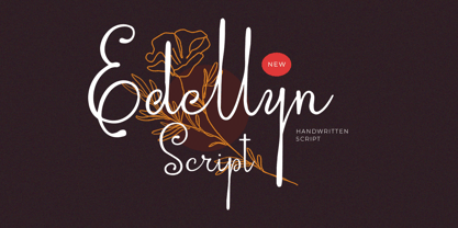 Introducing, Edellyn Script, a modern script typeface. This collection of scripts is perfect for personal branding. As you can see, this typeface has beutiful and modern look which is perfectly made to be applied especially in headline, logotype, apparel, invitation, branding, packaging, wedding card, advertising etc. Features : uppercase & lowercase numbers and punctuation multilingual alternates PUA encoded We highly recommend using a program that supports OpenType features and Glyphs panels like many of Adobe apps and Corel Draw, so you can see and access all Glyph variations. Thank you for purchase this font and Happy Creating !!!