7,610 search results
(0.036 seconds)
- Enchant by Beary,
$10.00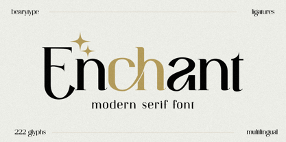 Introducing Enchant, the modern serif font that will elevate your designs to new heights. With its modern and sophisticated style, Enchant is the perfect choice for any project that demands elegance and class. Whether you're creating a website, presentation, or marketing materials, Enchant's unique blend of classic and contemporary design will leave a lasting impression on your audience. So why settle for ordinary fonts when you can have Enchant's timeless beauty? Upgrade your designs today with Enchant.
 - Bubble Horns by Sipanji21,
$17.00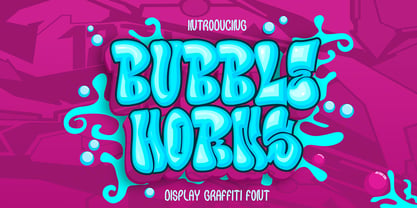 "Bubble Horns" is an urban graffiti font characterized by Bubble edges and a bold look. Ideal for music posters, apparel designs, shirts, and streetwear, this font brings a touch of edginess to your projects. The unique style of "Bubble Horns" makes it the perfect choice any urban graffiti themes. Whether you want to create a strong and powerful statement or simply add a touch of attitude to your designs "Bubble Horns" is the font for you.
 - ITC Santangeli by ITC,
$29.99ITC Santangeli is based on an eighteenth century manuscript by Italian writing master Benedetto Santangeli. Giuseppe Errico's design exudes the elegance and patina of a baroque sculpture. The capitals have verve, and the richly flowing ascenders and descenders enhance the vintage panache of the design. Errico has even included alternate characters and ink splotches to enable a realistic reproduction of antique lettering. Whether for large display copy or short blocks of text, Santangeli speaks with resonance and grace. - Corda by Hoftype,
$39.00 Corda – an elegant serif family with an easygoing, flowing ductus. It is semi-contrasted and even in the heavier styles appears light and breezy. Pleasant for reading and in display sizes very attractive. Corda comes in ten styles, in OpenType format and with extended language support for more than 40 languages. All weights contain standard and discretionary ligatures, proportional lining figures, tabular lining figures, proportional old style figures, lining old style figures, matching currency symbols, fraction- and scientific numerals.
 - Riona Sans by Melvastype,
$25.00 Riona Sans is a sans serif type family of 16 fonts, including true italics. It can handle every challenge you throw at it. Use it on websites, print, applications, games, logos, packaging, as a brand font: You name it. It looks good at large sizes and remains legible at small sizes. Rely on Riona Sans to convey a mood and make an impact, whether you want to be elegant and subtle, strong and dynamic, friendly or powerful.
 - Billson Script by Arsa Visual,
$10.00 Introducing, Billson Script Font with signature style. This font will look outstanding in any occasion design concept, whether it’s being used on colorful backgrounds or as a stand as a headline in the minimalist background! Billson has multi-language support, swashes, alternate and ligature. Please enjoy the Billson Script Font and makes some stunning designs, like name cards, posters, invitations, quotes, logos, signature logos, packaging, prints ads and this font also good for kids media branding.
 - Fresh Garden by Epiclinez,
$18.00 Fresh Garden is an elegant, cursive font. It's a great fit for any project you have in mind! Use it as your wedding invitation text or to create a logo design with a feminine touch. Whether you're taking on a fun project or tackling something serious the script font will always please and soothe your senses. So what’s included : Basic Latin Uppercase and Lowercase Numbers, symbols, and punctuations Ligatures Multilingual Support. Simple Installations Works on PC & Mac
 - Fast Blaze Graffiti by Sipanji21,
$19.00 "Fast Blaze" is an urban graffiti font characterized by sharp edges and a bold look. Ideal for music posters, apparel designs, shirts, and streetwear, this font brings a touch of edginess to your projects. The unique style of "Fast Blaze" makes it the perfect choice for death metal or urban graffiti themes. Whether you want to create a strong and powerful statement or simply add a touch of attitude to your designs "Fast Blaze" is the font for you.
 - Riot Funky by Beary,
$10.00 Get ready to make a bold statement with our revolutionary font that combines various styles into one. This eclectic, rebellious font is perfect for anyone looking to add an unpredictable touch to their designs. Whether you're creating posters, templates, or any other type of design, this font will help your work stand out and leave a lasting impression. Don't settle for ordinary, upgrade to this bold and daring font today and let your designs do the talking.
 - Little Merry by Astageni,
$15.00 "Introducing Little Merry — the bubbly, round typeface that adds a touch of whimsy to your design endeavors! This fun and friendly script font boasts a bold style, perfect for sparking creativity in your projects. Whether you're crafting T-shirt designs, phone cases, greeting cards, invitations, mugs, or anything else you can imagine, Little Merry is here to infuse your creations with charm. Let your designs come to life with this delightful font and unleash your creative spirit!"
 - Jackipur by HGB fonts,
$20.00 The motivation for Jackipur was: to achieve more openness and thus more clarity. That's why I created more clarity in the structure of the letters in order to avoid formal ambiguities that arise especially with small degrees. I found it important to open up the round letters so that they are straight and horizontal along the center and baselines so that the eye can connect the letters directly and quickly. A simple font, but neither plain nor without elegance.
 - Under Boom Graffiti by Sipanji21,
$15.00 "Under Boom" is an urban graffiti font characterized by sharp edges and a bold look. Ideal for music posters, apparel designs, shirts, and streetwear, this font brings a touch of edginess to your projects. The unique style of "Black Squad" makes it the perfect choice for death metal or urban graffiti themes. Whether you want to create a strong and powerful statement or simply add a touch of attitude to your designs, "Under Boom" is the font for you.
 - Fun City Life by Epiclinez,
$18.00 Fun City Life is a smooth and bold display font. Its casual style makes it appear wonderfully down-to-earth, readable, and, ultimately, incredibly versatile. Whether you’re using it for crafting, digital designing, posters, movie headlines, or apparel, it’s lovely. So what’s included: Fun City Life in OTF format. Basic Latin A-Z, a-z, numbers, symbols, and punctuations Multi-Languages support: from Afrikaans Albanian Catalan Danish to Dutch English Spanish Swedish Zulu. Accented Characters : ÀÁÂÃÄÅÆÇÈÉÊËÌÍÎÏÑÒÓÔÕÖØŒŠÙÚÛÜŸÝŽàáâãäåæçèéêëìíîïñòóôõöøœšùúûüýÿžß Thank you
 - Road Vanders Graffiti by Sipanji21,
$15.00 "Road Vanders" is an urban graffiti font characterized by sharp edges and a bold look. Ideal for music posters, apparel designs, shirts, and streetwear, this font brings a touch of edginess to your projects. The unique style of "Road Vanders" makes it the perfect choice for death metal or urban graffiti themes. Whether you want to create a strong and powerful statement or simply add a touch of attitude to your designs, "Road Vanders" is the font for you.
 - Ferghaus Sans by Fontdation,
$15.00 Introducing Ferghaus Sans, a modern sans serif font. This all-caps font is crafted with high attention to the details, gives you a clean and sharp feeling using it on your designs. Packed with so many OpenType features (such as alternate chars, swashes, ligatures, etc), lets you play and explore every possibilities with the letters combo. Ferghaus Sans is highly versatile, suits best for almost everything, whether you're working on classic themed design, or the modern ones.
 - Perfect Signature by Letterara,
$26.00 Introducing "Perfect Signature," a captivating handwritten font that brings an air of elegance and sophistication to your projects. With its fluid strokes and impeccable letterforms, this signature font captures the essence of personal touch and authenticity. Elevate your designs with the charm of a handwritten signature, whether it's for branding, invitations, logos, or any creative endeavor that requires a touch of class. Embrace the uniqueness and timeless beauty of Perfect Signature, and let your designs make a lasting impression.
 - Mister Crack by Olivetype,
$18.00 Say goodbye to boring typography and hello to an impactful visual experience! Mister Crack's rough texture adds depth and dimension to your designs, making them stand out from the crowd. Whether you're designing a vintage-inspired poster or crafting a powerful logo, this typeface injects charisma and attitude into every word. Mister Crack features : Standard Latin Numbers, symbols, and punctuations Multilingual Support. Fully accessible without additional design software Simple Installations Works on PC & Mac Thank You.
 - Yeti by Glyphon,
$10.00 Yeti is tall and hand-drawn with a hint of calligraphy. It is quite possibly influenced by a yeti’s penmanship, but even that cannot be proven. Whether you enjoy writing or designing in all-caps or not, this font has something for you. Something furry. Yeti supports multiple languages and includes graphics and web icons to help get those creative juices flowing. Naturally, yetis love Easter egg hunts and being superstitious. This font is no exception.
 - Dinzy Minzy by The Printers,
$20.00 If you are looking for an expressive, witty and whimsical typeface, Dinzy Minzy will beckon to a change of pace for any designer looking to create space, time and lighthearted imagery. This typeface draws you into the message of the mind, lending fresh, new life to party, holiday and grand opening invitations. Whether it's a poster, a billboard, or the card in the mail, Dinzy Minzy will be sure to capture attention and turn on the senses.
 - Location JNL by Jeff Levine,
$29.00 The lettering style of Location JNL is based on sets of "vintage" metal house identification letters and numbers seen for sale online. As these sets are available from overseas sources, it's not clear whether those metal characters are cast from original vintage dies that have been used for years or just designed to look like a vintage style of lettering. Nonetheless, they make for a great digital interpretation and the design is available in both regular and oblique versions.
 - Black Squad Graffiti by Sipanji21,
$16.00 "Black Squad" is an urban graffiti font characterized by sharp edges and a bold look. Ideal for music posters, apparel designs, shirts, and streetwear, this font brings a touch of edginess to your projects. The unique style of "Black Squad" makes it the perfect choice for death metal or urban graffiti themes. Whether you want to create a strong and powerful statement or simply add a touch of attitude to your designs, "Black Squad" is the font for you.
 - Eternity by Senekaligrafika,
$12.00 "Eternity" is a font with hard strokes and a signature style that instantly evokes a romantic sensation. With this font, you can take your creative projects to the next level. Whether it's for everyday use or special occasions such as weddings, Valentine's Day, greeting cards, headings, flyers, product packaging, book covers, printed quotes, logos, and more, "Eternity" will help you create unique and touching typographical designs. It's a versatile and modern font that offers endless possibilities to the user.
 - Cristal Stitches by Johannes Krenner,
$5.99 Whether it's your grandparents birthday, „Almabtrieb“ (ceremonial driving cattle down from the alpine pastures) or Oktoberfest (ceremonial drinking of huge amounts of beer): create the homely feeling of embroidery with this font. It comes with a vast language support, open type features, stylistic alternatives, boxes and frames, various numeral sets ... DEUTSCH: Ob Alm-Abtrieb oder Oktoberfest: Erzeuge das heimelige Gefühl großelterlicher Stickereien mit diesem Font. Große Sprachvielfalt, Opentype-Features, stylistische Alternativen, Boxen und Rahmen, diverse Zahlensysteme …
 - Konstanz by W Type Foundry,
$25.00 Konstanz is a sans serif font family inspired by the design of books and magazines for museums, art galleries, design biennials, architecture, and theater, among others. Its design focuses on a grotesque aesthetic but brings back certain shapes from Bauhaus and Futura. Konstanz includes 8 weights plus its matching italics, besides a stylistic set that increases its use possibilities. Konstanz ensures a graphic with a high impact and is ideal for designing editorial projects, posters, branding, and advertising.
 - Overbeat by PizzaDude.dk,
$20.00 Grunge is not dead! Neither is punk! The proof is the Overbeat font! It has got both grunge and punk in the one and same. The letters are grungy, and punked up with a sort of halftone slime effect. It's hard, it's tough and perhaps even scary! Play around with the font and you'll quickly notice the variety of the font. Each lowercase letter has 4 different versions and there is ligature substitution for most common uppercase double letters!
 - Wild Graf by Sipanji21,
$17.00 "Wild Graf" is an urban graffiti font characterized by sharp edges and a bold look. Ideal for music posters, apparel designs, shirts, and streetwear, this font brings a touch of edginess to your projects. The unique style of "Wild Graf" makes it the perfect choice for death metal or urban graffiti themes. Whether you want to create a strong and powerful statement or simply add a touch of attitude to your designsWild Graf" is the font for you.
 - Pelegotic by T4 Foundry,
$21.00Pelegotic makes you think of Scandinavian pioneer design, with its functional letterforms and architectural look. It is also a very versatile typeface, and fits easily as headline type for a magazine, or as part of a graphic profile for a company. It looks simple, but that impression is deceptive; the letters are drawn with a flair and individuality that shows the hand of a master typographer. Pelegotic Regular is rather thin, and is useful for big type like signs. Veteran designer Bo Berndal has created Pelegotic: "Pelegotic is a sansserif inspired by the Art Deco of the 20's and the Swedish functional style of the 30's. The slightly condensed design is an attempt to find a somewhat more elegant lettershape than the usually rather technical expression of monoline typefaces", says Bo Berndal. Pelegotic comes in three weights, with roman and italic in each weight. It is an OpenType creation, for both PC and Mac. - Scandiebox by My Creative Land,
$25.00 It’s time to have some fun! The Scandiebox Hadlettering Collection was inspired by simplicity of the modern Scandinavian style and also have some influence of Japanese kawaii. All handwritten fonts in this collection perfectly compliment each other as well as the set of more than 100 illustrations created in the same happy style. You can find Scandiebox Extras Manual here. The collection’s childish look-and-feel makes it perfect for all sorts of designs for children - books, cards, invitations, packaging, apparel, children shop ads, etc. If you are an Adobe Suite user, you’ll find that working with illustrations is extremely easy - just select a stylistic alternate you want in either drop down list or using the glyphs panel. If you are using an application that doesn’t support opentype features, you can use all the fonts additional features with a help of either your default font management software or using the pdf reference guide mentioned above. Enjoy!"
 - Korde by Alit Design,
$14.00 Introducing Korde Typeface Korde font is designed with a retro style concept that has a unique and cool shape. It is suitable for header text fonts, book covers and designs that have a retro elegant concept, besides that Korde font is also very good when used for body text. Korde font has 26 families from Thin to Heavy and Condensed. Sans Serif typefaces such as “Korde typeface” are very easy to apply to any design, especially those with an retro and classic concept, besides that this font is very easy to use both in design and non-design programs because everything changes and glyphs are supported by Unicode (PUA). The Korde typeface contains 549 glyphs with many unique and interesting alternative options. Plus, there's a cool sans serif font family for header and description text from thin to heavy and thin condensed to heavy condensed. In the poster preview all the letters are in the Korde typeface.
 - Canari Script by Redy Studio,
$17.00 Canari – Modern Calligraphy Fonts Canari, modern calligraphy font is of great interest to all graphic designers and die-hard fans of handwriting. Canari comes with 105 extravagant ligatures, so you can give your work the personal touch it deserves. It is great for expressive projects such as using it for a logo design, wedding invitation design, social media headers, product packaging, and much more! If you are looking for a condensed font that is perfect for use as social media headers or logos then Canari would definitely be the perfect choice for you. Just take a look at this example above and you will definitely fall in love with this font! Canari features: A full set of upper & lowercase characters Numbers & punctuation 105 Extravagant ligatures Multilingual symbols PUA Encoded Characters – Fully accessible without additional design software. Feel free to give me a message if you have a problem or question. Thank you so much for taking the time to look at one of our products.
 - Scala Sans Pro by Martin Majoor,
$49.00 The award-winning Scala family (1990-1993) is a worldwide bestseller and has established itself as a ‘classic’ among digital fonts. It was one of the first serious digital text fonts to support small caps, ligatures and different set of numbers. In fact Scala and Scala Sans (1990-1993) are two workhorse-like typefaces sharing a common form principle: the skeletons of both Scala and Scala Sans are identical, therefore they can be combined perfectly. Where many of the modern sans serifs (like Helvetica and Univers) have rather ‘closed’ letter shapes, the same elements in Scala Sans are much more ‘open’. This greatly improves legibility, especially in the smaller point sizes. The italic of Scala Sans is not a slanted version of the roman, but rather a ‘real’ italic. Another part of Scala is very popular among its users: Scala Hands, containing more than one hundred decorative hands and pointers, is included in the Scala fonts and is a free bonus.
 - Vtg Stencil DIN by astype,
$35.00 The Vtg Stencil DIN fonts were developed to made the most common stencil type of Germany available in digital type. Of course there are several, slightly different stencil designs from different manufactures in circulation, but all share the typical design of DIN type. » pdf specimen « Vtg Stencil DIN comes in many styles – Regular, Alt, Fabric, Halftone and Rough. The Alt style features older designs of letter “a” and figures “6” and “9”. Fabric, Halftone and Rough styles have an eroded, weathered look using up to four glyph variations of each letter. For an random effect an glyph rotator is programmed into the fonts opentype-code and applied by typing in opentype-savvy application.
 - Hummingbird by Laura Worthington,
$39.00 Hummingbird is reminiscent of old-fashioned cursive penmanship found in treasured letters bundled together by silken ribbons or in worn leather-bound ledgers. Hummingbird is graced with an impressive number of contextual alternates (214!) that bring a flowing randomness to the typeface, creating a more natural handwritten appearance. The font also has 266 swashes including an entire set of decorated uppercase letters that add personality, emphasis, and beauty. See what’s included! http://bit.ly/2cdVw4d *NOTE* Basic versions DO NOT include swashes, alternates or ornaments These fonts have been specially coded for access of all the swashes, alternates and ornaments without the need for professional design software! Info and instructions here: http://lauraworthingtontype.com/faqs/
 - PiS Hansch by PiS,
$28.00 PiS Hansch has its origin on a small graveyard in Salzburg, Austria. The hand-carved epigraph on a weathered tombstone inspired PiS to create this slightly twisted serif monster. It contains OpenType Features including contextual alternates (you get three different versions of 's', two different versions of 't' and much more), some ligatures and a very special Long S substitution feature that throws you over a hundred years back in time by changing your everyday small "s" into the classic "long s". Use PiS Hansch for your new Metalcore band logo, a zombie flick poster or some hack'n slay computer game titles. works both in display size and for texts in smaller sizes.
 - Schism One by Alias,
$55.00 Schism is a modulated sans-serif, originally developed from our Alias Didot typeface, as a serif-less version of the same design. It was expanded to three sub-families, with the thin stroke getting progressively heavier from Schism One to Schism Three. The different versions explore how this change in contrast between thick and thin strokes changes the character of the letterforms. The shape is maintained, but the emphasis shifts from rounded to angular, elegant to incised. Schism One has high contrast, and the same weight of thin stroke from Light to Black. Letter endings are at horizontal or vertical, giving a pinched, constricted shape for characters such as a, c, e and s. The h, m, n and u have a sharp connection between curve and vertical, and are high shouldered, giving a slightly square shape. The r and y have a thick stress at their horizontal endings, which makes them impactful and striking at bolder weights. Though derived from an elegant, classic form, Schism feels austere rather than flowery. It doesn’t have the flourishes of other modulated sans typefaces, its aesthetic more a kind of graphic-tinged utility. While in Schism Two and Three the thin stroke gets progressively heavier, the connections between vertical and curves — in a, b, n etc — remain cut to an incised point throughout. The effect is that Schism looks chiselled and textural across all weights. Forms maintain a clear, defined shape even in Bold and Black, and don’t have the bloated, wide and heavy appearance heavy weights can have. The change in the thickness of the thin stroke in different versions of the same weight of a typeface is called grading. This is often used when the types are to used in problematic print surfaces such as newsprint, or at small sizes — where thin strokes might bleed, and counters fill in and lose clarity, or detail might be lost or be too thin to register. The different gradings are incremental and can be quite subtle. In Schism it is extreme, and used as a design device, giving three connected but separate styles, from Sans-Didot to almost-Grotesk. The name Schism suggests the differences in shape and style in Schism One, Two and Three. Three styles with distinct differences, from the same start point.
 - Schism Three by Alias,
$55.00 Schism is a modulated sans-serif, originally developed from our Alias Didot typeface, as a serif-less version of the same design. It was expanded to three sub-families, with the thin stroke getting progressively heavier from Schism One to Schism Three. The different versions explore how this change in contrast between thick and thin strokes changes the character of the letterforms. The shape is maintained, but the emphasis shifts from rounded to angular, elegant to incised. Schism One has high contrast, and the same weight of thin stroke from Light to Black. Letter endings are at horizontal or vertical, giving a pinched, constricted shape for characters such as a, c, e and s. The h, m, n and u have a sharp connection between curve and vertical, and are high shouldered, giving a slightly square shape. The r and y have a thick stress at their horizontal endings, which makes them impactful and striking at bolder weights. Though derived from an elegant, classic form, Schism feels austere rather than flowery. It doesn’t have the flourishes of other modulated sans typefaces, its aesthetic more a kind of graphic-tinged utility. While in Schism Two and Three the thin stroke gets progressively heavier, the connections between vertical and curves — in a, b, n etc — remain cut to an incised point throughout. The effect is that Schism looks chiselled and textural across all weights. Forms maintain a clear, defined shape even in Bold and Black, and don’t have the bloated, wide and heavy appearance heavy weights can have. The change in the thickness of the thin stroke in different versions of the same weight of a typeface is called grading. This is often used when the types are to used in problematic print surfaces such as newsprint, or at small sizes — where thin strokes might bleed, and counters fill in and lose clarity, or detail might be lost or be too thin to register. The different gradings are incremental and can be quite subtle. In Schism it is extreme, and used as a design device, giving three connected but separate styles, from Sans-Didot to almost-Grotesk. The name Schism suggests the differences in shape and style in Schism One, Two and Three. Three styles with distinct differences, from the same start point.
 - Schism Two by Alias,
$55.00 Schism is a modulated sans-serif, originally developed from our Alias Didot typeface, as a serif-less version of the same design. It was expanded to three sub-families, with the thin stroke getting progressively heavier from Schism One to Schism Three. The different versions explore how this change in contrast between thick and thin strokes changes the character of the letterforms. The shape is maintained, but the emphasis shifts from rounded to angular, elegant to incised. Schism One has high contrast, and the same weight of thin stroke from Light to Black. Letter endings are at horizontal or vertical, giving a pinched, constricted shape for characters such as a, c, e and s. The h, m, n and u have a sharp connection between curve and vertical, and are high shouldered, giving a slightly square shape. The r and y have a thick stress at their horizontal endings, which makes them impactful and striking at bolder weights. Though derived from an elegant, classic form, Schism feels austere rather than flowery. It doesn’t have the flourishes of other modulated sans typefaces, its aesthetic more a kind of graphic-tinged utility. While in Schism Two and Three the thin stroke gets progressively heavier, the connections between vertical and curves — in a, b, n etc — remain cut to an incised point throughout. The effect is that Schism looks chiselled and textural across all weights. Forms maintain a clear, defined shape even in Bold and Black, and don’t have the bloated, wide and heavy appearance heavy weights can have. The change in the thickness of the thin stroke in different versions of the same weight of a typeface is called grading. This is often used when the types are to used in problematic print surfaces such as newsprint, or at small sizes — where thin strokes might bleed, and counters fill in and lose clarity, or detail might be lost or be too thin to register. The different gradings are incremental and can be quite subtle. In Schism it is extreme, and used as a design device, giving three connected but separate styles, from Sans-Didot to almost-Grotesk. The name Schism suggests the differences in shape and style in Schism One, Two and Three. Three styles with distinct differences, from the same start point.
 - Temeraire by TypeTogether,
$49.00 Quentin Schmerber’s Temeraire serif font family was not designed to be invisible. It is a typographic exploration meant to be seen — with its beauty, one could even say beheld. While some fonts aim to be as easily ignored as possible, Temeraire is offered as a gift to wide-eyed readers with its anything-but-boring character and its conspicuous inconsistency in styles. Most type families increase the weight of each character to expand the family. Instead, research into 17th century sources produced Temeraire’s wide range of letterforms, from the predictable to the odd and loosely related through time. Each style is designed to work alongside the others but are also standalone homages to specific parts of English lettering tradition: gravestone cutting, writing masters’ copperplates, Italiennes, and others. Temeraire’s Regular style is a contrast-loving Transitional Serif with vertical stress, making it great for period and classic works, ironic pieces, and modern throwbacks. The weight of the Bold squares off the ends of each glyph to give it stability, and the italic style rings true: flowing, contrasting, and purposefully inconsistent. Temeraire’s Display Black style is one salvaged from expressive gravestone artistry. The details most easily noticed are the ‘g’ with its descending bowl that has been pressed back up in the centre, and the additional serif on the ‘t’ crossbar that holds its neighbouring character at bay. (The ‘g’ and ‘Q’ have loopless alternates.) The final style is the Italienne, the horizontally stressed counterpoint to the family. By design its characters flow and bend in ways not in step with the rest of the family. All the weight has been pushed to either hemisphere within each glyph, resulting in a display style that demands space and peacefulness around it so its presence can impress. As with all TypeTogether families, Temeraire meets the current designer’s needs. Not only does its five styles shine in print work, it includes alternates for when the defaults are too boisterous and has been expertly crafted for screens. The Temeraire serif font family is resurrected from echoes in time and finds its family relation through impeccable taste.
 - Quite Something by Hanoded,
$15.00 I have always liked the word ‘quite’ - you can stick it in a sentence and all of a sudden that sentence looks quite sophisticated! Quite Something may not be all that sophisticated; in fact, it is a rather messy font. But that’s where the fun begins! Use it for your children’s book covers, toy packaging and posters. I am sure people will say that your designs are Quite Something!
 - Corton by Greater Albion Typefounders,
$14.00 Corton was inspired by the traditional lettering on a gravestone in an English village. While that might sound a rather solemn beginning, Corton has wonderfully lively air, with distinctive lively serifs and beautifully swashed downstrokes. Eight faces are offered: regular and titular each in three weights plus regular condensed. Between them they are ideal signage and display faces, merging 'olde-worlde' charm and fun character, but remaining clear and legible.