10,000 search results
(0.02 seconds)
- Knitting And Sewing Doodles by Outside the Line,
$19.00Knitting & Sewing Doodles are just that. If you type all caps you get 15 knitting icons and lower case is 15 sewing doodles. Knitting items include yarn, knitting, needles, ball winder, spinning supplies, stitch counter, etc. Sewing machine, buttons, thread, pin cushion, bobbin, thimble and needles, scissors, label, tape measure, darning egg, zipper, seam ripper, and pins, all in the Outside the Line style. - Tzur by Hacollective,
$45.00 Tzur is a Hebrew sense-serif font with a nostalgic scent. The shape of the letters has two qualities - Raw and processed - and they are combined without canceling each other out. The resulting product is a font that conveys power, stability, and prominence, and echoes typographic values that correspond with the graphic/visual language that was accepted in The early years of the State of Israel.
 - Offhand Brush by PintassilgoPrints,
$24.00 Offhand Brush is a fast and spontaneous brush font with quite a messy feel, a great option for book covers, packaging projects, album art, web titles, and even small chunks of text. It looks messy, but don't get it wrong: on the inside, it's a laborious piece of work, with four alternates for each Latin letter and two for numerals, as well as two options for Cyrillic and Greek letters. To make things even more uneven, there are still a few different letter designs programmed to pop up when specific combinations of three or four glyphs appear in the text. These are managed by the OpenType 'Standard Ligatures' feature, although they are far from standard and are not quite ligatures. And why so? Because this way it will usually be on by default, making the font way more interesting. Hey, wait! There are some ornaments too. And a couple of contextual kerning pairs, hell yes! Use it big!
 - Golem by Comicraft,
$19.00 Trolls are lurking under each and every river crossing. The earth is shaking as Ogres stomp across the land, spiked clubs in hand. Swordsmen and Sorcerers are waging war on one another even as the pure and young and stout of heart search for the talisman which will restore harmony once more. Are you under the spell of some wizard's magickal incantation or are you just looking for exactly the right typestyle for your J.R.R. Tolkien Convention newsletter? Regardless, an ancient curse has been lifted and the Talmudic Legend of the Clay Beast they call GOLEM has been restored to his former majesty. The shapeless mass is no longer one of unfinished substance, no longer a body without a soul. The Homunculus that was once Comicraft's Golem has had a spiritual awakening and is now available with the crinkly bits smoothed off.
 - Zulu-Ndebele Pattern by Scholtz Fonts,
$19.00Zulu-Ndebele Pattern is the first ever font to be based solely on the traditional decorative patterns of the Zulu and Ndebele tribes of Southern Africa. The designer has lived in KwaZulu (Place of the Zulu), for over 50 years and has made a life-long study of traditional Zulu beadwork and carving, and of Ndebele wall decoration. There are 52 pattern units that may be combined in many ways to create borders, backgrounds and an unlimited number of designs. The pattern units correspond to the upper and lower case letters. The reason that the Zulu and Ndebele patterns have been grouped together is that the true tribal areas are contiguous and the there has been much artistic cross-fertilization between the two cultures. Many of the patterns that are used by the two tribes are identical. - Mercedes1937 by scarab13,
$9.00 There is an interesting story about this vintage professional Mercedes typewriter I’ve used to make this font. My grandfather, who was a Yugoslavian partisan during the WWII captured it from a Wehrmacht command building during an attack, and he kept it in a perfect shape for so many years. After I inherited it, I wanted to share it’s uniqueness (as well as it’s story). I’ve intentionally kept it in it’s original condition - I haven’t replaced the ribbon that was some 34 years old (or more) before sampling the font, and it turned out really nice. One more important thing - I have used ONLY it’s original set of characters (Latin with some Balkan-based letters). With it’s untouched originality and uniqueness it fits to our modern culture perfectly. There are no compromises here - there are no popular @,#,$ and other characters you would expect in a font. You will get EXACTLY what’s on this genuine “Mercedes” typewriter with so much soul.
 - Ginko by Monotype,
$29.99Ginko is a capitals only display font with an obvious Asian influence. The characters are formed with short tapered strokes, reminiscent of those produced by a broad pen. An ideal face for signage, menus, advertising, wherever an Asian feel is required. - Delichan by Prioritype,
$19.00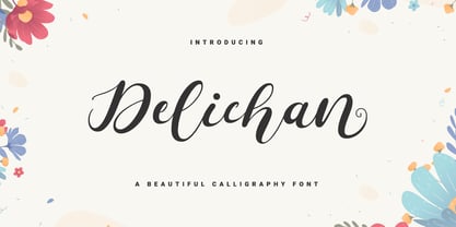 Introducing. Delichan: Beautiful and modern fonts that are so special to use in your projects. It is suitable for wedding invitation designs, social media posts, blogs, crafts, quotes etc. Features: Uppercase, Lowercase, Numeral, Punctuation, Multilingual, Ligature, Alternates & PUA Encoded. Thanks!
 - Architype Albers by The Foundry,
$50.00 Architype Konstrukt is a collection of avant-garde typefaces deriving mainly from the work of artists/designers of the inter-war years, whose ideals have helped to shape the design philosophies of the modernist movement in Europe. Due to their experimental nature character sets may be limited. Architype Albers draws on early grid-based attempts by Josef Albers, in 1926, to design an alphabet by reducing the forms to purely geometric elements – the square, triangle and parts of a circle – and in the process creating an unusual stencil effect typeface.
 - Architype Van Doesburg by The Foundry,
$99.00 Architype Konstrukt is a collection of avant-garde typefaces deriving mainly from the work of artists/designers of the inter-war years, whose ideals have helped to shape the design philosophies of the modernist movement in Europe. Due to their experimental nature character sets may be limited. Architype Van Doesburg derives from the 1919 experimental geometric alphabet by Theo van Doesburg, whose work was heavily influenced by De Stijl theories, specifically rectangularity. The typeface has been constructed on the same 5 x 5 grid, and is limited by his ‘single alphabet’ theory.
 - String Theory by Ampersand Type Foundry,
$20.00 String Theory has been a 10+ year project in the making which originated from a type workshop in Graduate School at Otis College of Art & Design. The workshop was hosted by Dutch designer Hansje Van Halem, and we were tasked to play with string to create letterforms. Thus String Theory was born, and slowly migrated from yarn, to an illustrator file, to what it is today as a type family. Each glyph has it’s own custom string set up, along with each weight. Experimental in nature, edgy, with subliminal angst and grittiness.
 - Architype Van der Leck by The Foundry,
$50.00 Architype Konstrukt is a collection of avant-garde typefaces deriving mainly from the work of artists/designers of the inter-war years, whose ideals have helped to shape the design philosophies of the modernist movement in Europe. Due to their experimental nature character sets may be limited. Architype Van der Leck originates from the lettering that Bart Van der Leck created for ‘Flax’ magazine in 1941. The letterforms‘ restricted shapes and abstract, stencil-like forms reflect the strong geometric language of De Stijl and show influence from his abstract paintings.
 - Architype Bayer Type by The Foundry,
$99.00 Architype Universal is a collection of avant-garde typefaces deriving mainly from the work of artists/designers of the inter-war years, whose ideals underpin the design philosophies of the modernist movement in Europe. Their ‘universal’, ‘single alphabet’ theory limits the character sets. Architype Bayer-type is based upon Herbert Bayer’s 1931 universal, modern serifed alphabet. Although the ‘modern’ style appears to be a radical departure from his first sans single alphabet of 1925, the structure of this later serifed style is still grid based and geometrically constructed.
 - Monotype Bernard by Monotype,
$40.99In the early years of the twentieth century a number of romans with a soft and slightly script like quality were evolved. Although they did not represent the future in terms of the major design influences that were to appear after the First World War, they were a break with the past, and were developed further in the nineteen twenties and thirties. Monotype Bernard Condensed is closely associated with this period, a condensed roman evoking an easy charm. The Monotype Bernard Condensed font offers many display applications where warmth and friendliness is required. - Architype Schwitters by The Foundry,
$99.00 Architype Konstrukt is a collection of avant-garde typefaces deriving mainly from the work of artists/designers of the inter-war years, whose ideals have helped to shape the design philosophies of the modernist movement in Europe. Due to their experimental nature character sets may be limited. Architype Schwitters was developed from the phonetic experiments made by Kurt Schwitters with his 1927 universal alphabet, where he attempted to link sound and shape. He ‘played with’ using heavier, wider, rounded forms to convey the vowels, creating a unique visual speech texture.
 - Travel East JNL by Jeff Levine,
$29.00 “Tropical Type” was Alf Becker’s 148th submission to “Signs of the Times” magazine (a publication for the sign trade) where for years Becker would provide a monthly lettering design to inspire other sign writers. This particular design has more of a Far East flair to it, and was redrawn digitally as Travel East JNL, which is available in both regular and oblique versions. Special thanks to Tod Swormstedt of the American Sign Museum and S.T. Media Group for providing the sample image from which the font was derived.
 - Hello The Dog by Yumna Type,
$16.00 t can be complicated to create unique, attractive designs for your latest projects especially when you are left with an abundance of boring fonts because ordinary fonts make your designs less prominent, unattractive, and unprofessional. Therefore, we would like to introduce you to Hello the Dog. Hello the Dog is a display font with cute, charming characters inspired by a dog theme. All of its letters and characters are created in a cute way that portrays a dog’s characteristics, such as long ears, big eyes, and a cute nose. It has various sizes and variations ranging from uppercases for title displays and lower cases for softer text displays. Hello the Dog font, of which available features and a clipart bonus you can enjoy, will live up and charm your designs in order to attract the audience with the theme you have. In fact, it will also help you build up your brand identity to be unique and memorable, particularly brands related to dogs or pets. Features: Alternates Multilingual Supports PUA Encoded Numerals and Punctuations Hello the Dog fits best for various design projects, such as brandings, headings, magazine covers, quotes, printed products, merchandise, social media, etc. Find out more ways to use this font by taking a look at the font preview. Thanks for purchasing our fonts. Hopefully, you have a great time using our font. Feel free to contact us anytime for further information or when you have trouble with the font. Thanks a lot and happy designing.
 - bearerFond by JOEBOB graphics,
$9.00 BearerFond has been in my pen for years and I've used this way of writing a lot on cassette cases. Anyone still using cassettes? Me neither, so in order to keep it alive I have made a font out of it and named it bearerFond; as in bearer bond, since it looks like it could be used on official documents. Nothing too official though.
 - East India Company NF by Nick's Fonts,
$10.00Put the kettle on and break out the biscuits. This no-nonsense stencil face is a faithful recreation of Tea Chest, released by the Stephenson Blake Type Foundry in 1939. Its bold strokes and slender profile retain their freshness, even seventy-plus years on. Both versions include the complete Latin 1252, Central European 1250 and Turkish 1254 character sets, as well as localization for Moldovan and Romanian. - Christmas Sheep by Stefani Letter,
$14.00 Christmas Sheep is a modern and relaxed display font. It embodies playfulness and authenticity and is the perfect choice for any children activity, school project, Christmas, New Year, Birthday and many more. Add this playful font to your designs and notice how it makes them come alive! This font is PUA encoded which means you can access all of the cute glyphs with ease!
 - Dinkle by Chank,
$30.00 The Dinkle fonts are the creation of a sketchbook artist who spent years refining her craft, Diana Hollingsworth Gessler. She created the Dinkle handwriting fonts for use in her book "Very New Orleans," and now you can use it in four convenient styles: Regular, Bold, Italic and Bold Italic. Each font in this family was drawn individually, capturing nuanced differences of natural penmanship when the weights are paired together. A hand-lettered journal style, the highly legible Dinkle fonts offer tidy text and clear captions. Use it for signage, quotations, or anywhere you need a personal touch in your designs.
 - Normandia by Canada Type,
$30.00 Designed over three years after the second World War, and published in 1949 by the Nebiolo foundry, Normandia was Alessandro Butti’s take on the fat face. As it usually was with Butti’s designs, this face effectively injected a catchy yet expertly calculated calligraphic spin into its source of inspiration — which was the essentially geometric/deco, thicker model of Bodoni’s very popular aesthetic. The metal Normandia saw some widespread use for a handful of years after its publication, not least because of the multitude of sizes in which it was available. It stepped out of the limelight by the mid-1950s, due to a combination of the popularity of cold type and Nebiolo’s refusal to retool its faces for new technologies. It was copied by a few small film typesetting outfits on both sides of the Atlantic, but never really found its way back to the mainstream. By the time computer type became the norm, Normandia was pretty much relegated to a type historian’s collection of anecdotes. This digital update of the classic series revives and refines the three original metal designs (Tonda/Regular, Corsiva/Italic, and Contornata/Outline) and expands the character set to more than 600 glyphs per font, including small caps, six types of figures, fractions and nut fractions, a full set of f-ligatures, some stylistic alternates, and other fine typography niceties.
 - Anno by Linotype,
$29.99The impulse behind André Maaßen’s design of the Anno typeface was the design of a New Year’s card for the year 2000 (Anno 2000). His desire to create the perfect printed image developed into a family with four styles: Anno 1, Anno 1 Italic, Anno 2, and Anno 2 Italic. Anno 1 and its Italic are semi-classicist typefaces, with a high degree of stroke contrast, while Anno 2 and its Italic are semi-grotesks, with less stroke contrast. Both Anno 1 and Anno 2 are sans serifs typefaces, but they each offer a new interpretation of the genre. The Anno typeface may be used in a number of applications and sizes. And it is naturally suitable for New Year’s greetings and other cards, of course! - Kerp by aRc,
$10.00 Kerp introduces the new trend in handwriting practice for kids in preK-Kindergarten. It's fun, unique and visually stimulating that will encourage any young "alphabet tracers" to find joy while learning their ABCs. This TrueType font is great for creating personalized tracing worksheets, flashcards and even home-made greeting cards. For best results, big fonts are highly recommended to see the fine details of each character. Kerp was conceptualized in 2007 to inspire a 4 year-old boy to stop from his hectic schedule of playing. It started from hand-drawn apples forming the letter A to non-stop digital editing until 2008. The images selected are things that are associated to a preschooler's life varying from food to school supplies.
 - BoiTu by Vei Vei,
$16.00 BoiTu is a typeface in the BoiTu project designed by Vei Vei. BoiTu has a strong contrast between bold bars and long sharp hook strokes inspired by pheasant feathers on the hat in Hat Boi costume. "Tuong or Hat Boi is a form of Vietnamese classic opera, combining various elements of arts such as stage, music, fine art, literature, dancing, and martial arts. Older Tuong plays are usually about historical events or tales. Allegories, melodramas, soliloquies, modes of expression, forms of performance, repartee singing and recitative conventions, etc., are constantly updated and elevated, and are quintessential elements in the art of Tuong." Boi Tu is a classic design to bring traditional art and culture closer to everyone. Boi Tu is a Vietnamese font that supports multiple languages.
 - Business Helpers JNL by Jeff Levine,
$29.00 Duluth, Minnesota's Horace P. Brouillet Syndicate (later known as Syndicuts, Inc.) was one of a number of stock cuts providers to the letterpress trade in the decades preceding paper, then electronic clip art. Brouillet's "Typeps" catalogs offered a wide range of images covering numerous subjects, as well as cartoons, catch words and automotive logos. Many of these images have been reproduced in a number of royalty-free clip art publications over the years. Twenty-Six of these newly-redrawn catch words are found within Business Helpers JNL in two styles. On the capital keys are the original white-on-black designs, modeled from the vintage source material. The lower case keys have the phrases separated from the decorative ovals and are in black type.
 - Pea Jane In A Hurry is a font that truly captures the essence of spontaneity and movement. Created by Fonts For Peas, this typeface stands out for its hand-drawn, casual style that appears to have be...
- Flying Dutchman by FontMesa,
$25.00 In nautical folklore, the Flying Dutchman is a ship that can never go home and is doomed to sail the seas forever as a ghost ship. The story of the Dutchman appeared in print in the 1820s. With different versions written over the years, some date the legend to the 1640s or the early 1700s. The Flying Dutchman font is a revival of an 1876 font from MacKellar, Smiths & Jordan Co. The Truetype and OpenType formats include a larger extended character set with Central and Eastern European accented letters. Extra characters in this font are left and right pointing hands in place of the less than and greater than keys and a pirate flag is on the bracket keys. New to this style is the distressed version where the letters look like they've been hacked by a cutlass.
 - Corbert by The Northern Block,
$- Initially released in 2013 Corbert was a big hit and was named one of the most popular fonts of the year by MyFonts. Following on from its success the design is updated and remastered to meet the latest standards of The Northern Block and to satisfy critical issues put forward by the most demanding of users. A geometric sans serif typeface influenced by Bauhaus and the early modernist era. Precise shapes are optically adjusted to create a clear, natural typeface with excellent legibility. Corbert is a regular, self-evident design that works well across a wide range of applications. Details include nine weights with matching italics and over 540 characters per style. Opentype features consist of five variations of numerals, including inferiors, superiors, fractions, alternative lowercase a, e and g, and language support covering Western, South, and Central Europe.
 - Calligraphica by Monotype,
$49.00Calligraphica was designed because there are very few inline fonts, and even fewer inline calligraphic fonts. The original forms were written with a split pen in a single stroke. The minuscules have a rougher look and the capitals have a smoother shape to imitate hand written calligraphy with more formal, decorative initial caps. The Calligraphica family contains 6 fonts: Calligraphica Regular and Italic are the regular upright roman true italic version of the font. The ascenders on this font are a bit higher than the capital letters--this is standard for most fonts. Calligraphica LX Regular and Italic are similar to the first 2 fonts except their ascenders are longer and reach high above the capital letters--giving these fonts a taller appearance. Calligraphica SX Regular and Italic are similar to the first 2 fonts except their ascenders are shorter and are the same height as the capital letters--giving these fonts a shorter appearance. - Delegation by Jorsecreative,
$12.00 Delegation fonts are very beautifully designed and combine Delegation Script and Delegation Sans. The styles are suitable to be used for media promotion especially on social media, but not less beautiful when used for magazines, brochures, branding, etc. Delegation Features: Multilangual Ligatures (Delegation Script) Alternates PUA Encoded Numerals and punctuation Programs that support this font are Adobe Photo Shop, Adobe Illustrator, Adobe Indesign, Corel Draw and Microsoft Office. Languages supported: Breton, Catalan, Czech, Danish, Estonian, French, German, Hungarian, Icelandic, Italian, Romanian, Gaelic, Slovak, Latvian, Lithuanian, Norwegian, English, Finnish, Polish, Portuguese, Slovenian, Spanish, Swedish, Turkish, Welsh. Basically, all European languages are based on latin alphabet. Thank you!
 - Melowest by Zamjump,
$13.00 MELOWEST fonts are a broad category of fonts designed for short and often large format applications, such as billboards or posters; logotypes; headline or header in a magazine or website; and book covers. Display fonts go beyond style - they are. MELOWEST with a round style gives the impression of being flexible and not rigid. Includes: Uppercase Lowercase Numbers Punctuation Symbols Multilingual support PUA Encoded Characters Fully accessible without additional design software.
 - Serona by Balevgraph Studio,
$16.00 Serona - Beautiful Duo with Ornaments We are so exited to present Serona, a combination of sans serif fonts and signature styles complemented by beautiful ornaments, Serona with Modern Elegant Style is perfect for branding, logos, invitations, Magazine and more. Serona Features: Multilingual Ligatures Alternates Swashes PUA encoded Files Included: Serona Regular Serona Italic Serona Signature Serona Signature Slanted Serona Ornaments We are ecstatic if our fonts can help your project.
 - Kolorans by Ronny Studio,
$19.00 Kolorans is a cute comic display font. Funny comic fonts are characterized by their whimsical and playful designs, which are meant to evoke a sense of lightness and humor. It features bold, slightly exaggerated letterforms that have a cartoonish feel to them. The letters are cute and quirky, giving off a friendly and approachable look. This font is perfect for comic books, titles, poster designs, and more. Features : - All Caps - Alternate & Ligature - numbers & punctuation - Multilingual - PUA encoded Please contact us if you have any questions. Enjoy Crafting and thanks for supporting us! :) Thank you
 - Paralucent by Device,
$39.00 Paralucent is versatile all-purpose modern sans. Available in seven weights, from Thin to Heavy, and in two widths each with corresponding italics, it avoids some of the more eccentric calligraphic quirks of Akzidenz or Helvetica or the cool precision of Univers for an elegant, functional, yet warm design. There are two additions to the core 28-weight family: a three-weight stencil set, and a four weight text family. The text weights have been adjusted for use at small point sizes, and feature more open character shapes, looser inter-letter spacing for improved readability, and lining numerals for use in listings and tables. Several core ideas inform Paralucent’s design. Prime attention has given to the negative space between characters, giving a more even “colour”, especially in text. For example, the J, L and T have shorter arms than comparable sans typefaces, while the M and W are wider. The A has a lower bar, opening up the interior counter. An unusually high lower-case x-height again helps to give a more even colour and improve legibility. Care has been taken to rationalise repeated elements like the tails on lower-case letters, or the Q and the “ear” of the g. Typographic design solutions that are consistent across all these features add more stylistic cohesion. ‘Ink traps’ are exaggerated incisions used to open up a letter's narrower internal angles, which can become clogged with ink, especially in small point sizes. Now largely redundant due to the high quality of modern print, they are still sometimes used as a stylistic quirk or design feature. Now that digital fonts are often reversed or outlined, or enlarged to enormous sizes, these can also lead to unexpected or obtrusive results. Paralucent takes these inevitable digital manipulations into account, and adds optical corrections without resort to ink traps. The family has been picked up by many UK and US publishers, featuring heavily in magazines like Loaded, Heat and TV Quick, as well as high-end coffee-table photography books and gallery websites. A perennial Device bestseller.
 - Monieta by Almarkha Type,
$35.00 Monieta -is a Adorable Script Calligraphy font with a natural handwritten feel. It has lovely ligatures and alternates that are perfect for any creative design. This handmade font will make your design has a beautiful natural touch for each details. It is perfect for any design project as Invitation,logo, book cover, craft or any design purposes. This font is PUA encoded which means you can access all of the magical glyphs and swashes with ease! It also features a wealth of special features including alternate glyphs and ligatures. Simple installationsAccessible in the Adobe Illustrator, Adobe Photoshop, Adobe InDesign, even work on Microsoft Word. PUA Encoded Characters – Fully accessible without additional design software. Fonts include multilingual support Image used : All photographs/pictures/vector used in the preview are not included, they are intended for illustration purpose only. Cheers! Thank You
 - Morgow by Scriptorium,
$18.00Morgow is a decorative Celtic uncial font based on original hand lettering. It is similar to other uncial fonts, but the characters are embellished with traditional Celtic spiral designs. The font is appropriately named after a species of legendary Cornish sea serpent. - Santa Christmas by Ake,
$12.00 Santa is a lovely duo font (display and script). Together or apart, these fonts are ideal for adding a chic and cheery touch to your crafts. This font is PUA encoded which means you can access all glyphs and swashes with ease!
 - Matricia by Type-Ø-Tones,
$40.00 Matricia by Pera Ribalta, José Manuel Urós / OpenType, 3 styles Nostalgically, the three weights of Matricia try not to recreate the modern pixel fonts but the noisy needle printers. The Uno and UnoXt are made of squares and the Dos version of dots.
 - Dausby by Corien’s Handwritingfonts,
$20.00 Dausby is the elegantly slanted handwriting of the 1850s. It was based on records written with a flexible tip dip pen and jet black ink by Mr. Dausby. Made for those of you who are just looking for an affordable handwriting font.