10,000 search results
(0.042 seconds)
- Aneska Kids by Ditatype,
$29.00 Aneska Kids is a display font. Made with a playful style, it brings a fun and chic typeface. Chalk Brush is best used for card, branding, logotype, and quotes. Features: - PUA Encoded - Multilingual Support - Numerals and Punctuation
 - Blackink by Juncreative,
$19.00 Blackink is a delicate and elegant handwritten font. Its distinct and well balanced letters make this font a masterpiece. This font is PUA encoded which means you can access all of the glyphs and swashes with ease!
 - Nikki by Galapagos,
$39.00This typeface was named for one of George's daughters, at her request, after she discovered that another of George's designs, ITC Kristen, bore an appellation strikingly similar to that of her sister. And then there was peace... - Watershed by Epiclinez,
$18.00 Watershed is a stylish script font. It has Open Type features such as Stylistic Sets, Ligatures, and Swashes. This font is also multilingual and PUA encoded. Use it for any design projects that require a charming appearance!
 - Ashgabat by GlyphStyle,
$16.00 Ashgabat is a signature style font that looks natural with a pen stroke-like texture. A bold and elegant looking font like the original signature style. Font feature Uppercase, Lowercase, Numerals & Punctuations, Stylistic Alt, Swash Ligature, Multilanguage
 - Sisterhood by Din Studio,
$29.00 Sisterhood is a beautiful brush signature font. Made for any professional project branding. Every letter has a unique and beautiful touch. Made from our talented font designer. Features: 52 Stylistic set 52 Ligatures Multilingual Support PUA encoded
 - Helmida by ahweproject,
$9.00 Helmida is a distinct and graceful retro script font. Fall for its ravishing style and use it to create gorgeous designs. This font is PUA encoded which means you can access all glyphs and swashes with ease!
 - Bubble Boom by Blankids,
$18.00 Bubble Boom is inspired by graffiti, and fits well for themes such as graffiti posters, Hip Hop music, kids posters, flyers, children books, cartoons, comics, and more. Features included: Uppercase Lowercase Number Punctuation Multilingual PUA Encode OpenType
 - Rahgbok by Letterena Studios,
$9.00 Rahgbok is a stylish and elegant serif font. It is PUA encoded which means you can access all of the glyphs and swashes with ease! Add it confidently to your projects, and you will love the results.
 - Manor by Jonahfonts,
$35.00 Manor script is designed with an oval brush and a pen, with two alternate [ r's ] completing the connected lowercase handwritten appearance. Suitable for Captions, packaging, cards, posters, ads, book jackets, manuals, and menus, short text and paragraphs.
 - Mooneyes by ErlosDesign,
$19.00 Mooneyes is an elegant and thin, lettered serif font. Trendy and stylish, this font will elevate each of your creations. Coquet is PUA encoded, which means you can access all of the glyphs and swashes with ease!
 - Amegap by Letterena Studios,
$9.00 Amegap is a delicate and stylish serif font. Get inspired by its ravishing style and use it to create gorgeous designs. This font is PUA encoded which means you can access all glyphs and swashes with ease!
 - Qegor by Letterena Studios,
$9.00 Qegor is a thin and classic serif font. Use it for any design projects that require a charming appearance! This font is PUA encoded which means you can access all of the glyphs and swashes with ease!
 - Capital by Aboutype,
$24.99A pen stroke Roman with a medium thick to thin contrast and slightly flared stroke endings. Capital was designed for all media and works best at 30 point and above. Capital requires subjective display kerning and compensation. - The Hungary by Skiiller Studio,
$20.00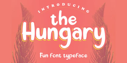 The Hungary is a playful display font with a friendly style. It is perfectly suited for a wide variety of projects! What's include: Ligature PUA Encoded Characters - Fully accessible without additional design software.\ Basic Latin Language Support
 - Sundaytime by Letterena Studios,
$9.00 Sundaytime is a thin lettered and graceful script font. Fall for its ravishing style and use it to create gorgeous designs. This font is PUA encoded which means you can access all glyphs and swashes with ease!
 - Roquette by ITC,
$29.00Roquette is the work of British designer Martin Wait, a casual all capital wedge serif typeface which brings the 1950s back to life. The undulating baseline and lively spot illustrations of Roquette will pep up any headline. - Captain Shipwreck by Alphabet Agency,
$20.00 Outlaw marauders! Stand in awe of the magnificent Captain Shipwreck! Works excellent in all caps, and has a great set of lowercase to match. Capture this treasure of the high seas for a steal of only $20
 - Mahgin by Letterena Studios,
$10.00 Mahgin is a bold and thick lettered serif font. Fall for its assertive style and use it to create distinct designs. This font is PUA encoded which means you can access all glyphs and swashes with ease!
 - Arinoe by Azzam Ridhamalik,
$10.00 Arinoe is a cool display font that embodies uniqueness and authenticity in every character. Get inspired by its rustic feel, and use it for your lovely creative projects! FEATURES : Uppercase Lowercase Number Punctuation Multilingual PUA Encode Opentype
 - Basdela by Letterena Studios,
$9.00 Basdela is a bold and stylish serif font. It is PUA encoded which means you can access all of the glyphs and swashes with ease! Add it confidently to your projects, and you will love the results.
 - Brightsome by FHFont,
$18.00 Brightsome is a hand-lettered brush script with OpenType features. It is suitable for design, weddings, events, t-shirts, logos, badges, stickers, and more to make your work awesome. Features: - OpenType Features - PUA Encoded - Multi-Language Support
 - American Grunge by Hanoded,
$15.00 American Grunge is a spooky font. It was created using a steel pen and China ink - and a lot of splatter. American Grunge is my tribute to that nineties wave of fantastic music coming out of Seattle.
 - Mantika Sans Paneuropean by Linotype,
$67.99With its well-defined characters that are readily legible even in the small font sizes, Mantika Sans by Jürgen Weltin is ideal for typesetting. The elaborately designed and highly individual set of italics enhances the attractiveness of the font.Jürgen Weltin developed the Mantika™ Sans sans serif font using older designs for an serif font as his inspiration. Nothing more than the merest suggestion of the original serifs has survived. Bevelled line endings and the slight variation in thickness of verticals, in particular, provide Mantika Sans with a very dynamic character that evokes manuscript. Short ascenders and descenders give the font a compact appearance that is also underscored by its condensed proportions. Weltin has achieved his aim of producing a typeface with excellent legibility even in small sizes not just by means of the x-height, which is tall in comparison with the capital letters, but also by using clearly defined and well differentiated designs for critical letters, such as i", "I" and "l". Lower case "i", for example, has a serif while the "l" has a curved base.In addition to uppercase numerals, Mantika Sans also has lowercase or old style numerals that have been designed so that they can be used in both tabular and proportional settings. The uppercase numerals are slightly shorter than the uppercase letters, ensuring that the latter can be sympathetically incorporated within continuous text.The Mantika Sans italics are very unusual. They are inclined at only 4.5° (the usual angle for italics is 10 - 12°) and so appear to be almost upright. In addition, they also have quite distinctive forms. The overall effect calls attention to their curvilinear, manuscript character, enhances contrasts and further emphasizes the terminals. Weltin explains: "Within the variety of forms of the italics there are many contrasting terminal elements that create dynamism. The result is a diversity of interaction between the rounded and angular forms". Mantika Sans Italic thus has all the features of a display typeface, but can also be happily used on its own to set longer text passages. Mantika Sans is available in two weights; Regular and Bold, both of which have corresponding italics sets. Mantika Sans has been designed so that the widths of the four related cuts are identical, meaning that a change of font within a single layout will have no effect on justification. In addition, the members of the Mantika Informal font family, designed by Jürgen Weltin in 2010, also have the same thickness. Other font families having weights with equal thickness can be found in the "Linotype Office Alliance series".The Mantika Sans character sets are paneuropean. There are characters for setting texts in Eastern European languages, Greek and Cyrillic. There is also a range of special symbols, including right-angled brackets, subscript and superscript lower case letters, together with numerals, arrows and many different bullet points.As a vibrant and highly legible text font, Mantika Sans has a broad spectrum of potential applications. Its unusual italics are not just perfect for use in display text. The fact that it has only four cuts means that Mantika Sans is particularly suitable for office use or for the setting of business reports. Its excellent legibility even in the small font sizes also makes it ideal as a text for electronic reading devices; this also applies to Mantika Informal.At the 3rd International Eastern Type Design Competition Granshan 2010, Mantika Sans was awarded in the category Greek text typefaces." - Mantika Sans by Linotype,
$50.99 With its well-defined characters that are readily legible even in the small font sizes, Mantika Sans by Jürgen Weltin is ideal for typesetting. The elaborately designed and highly individual set of italics enhances the attractiveness of the font.Jürgen Weltin developed the Mantika™ Sans sans serif font using older designs for an serif font as his inspiration. Nothing more than the merest suggestion of the original serifs has survived. Bevelled line endings and the slight variation in thickness of verticals, in particular, provide Mantika Sans with a very dynamic character that evokes manuscript. Short ascenders and descenders give the font a compact appearance that is also underscored by its condensed proportions. Weltin has achieved his aim of producing a typeface with excellent legibility even in small sizes not just by means of the x-height, which is tall in comparison with the capital letters, but also by using clearly defined and well differentiated designs for critical letters, such as i", "I" and "l". Lower case "i", for example, has a serif while the "l" has a curved base.In addition to uppercase numerals, Mantika Sans also has lowercase or old style numerals that have been designed so that they can be used in both tabular and proportional settings. The uppercase numerals are slightly shorter than the uppercase letters, ensuring that the latter can be sympathetically incorporated within continuous text.The Mantika Sans italics are very unusual. They are inclined at only 4.5° (the usual angle for italics is 10 - 12°) and so appear to be almost upright. In addition, they also have quite distinctive forms. The overall effect calls attention to their curvilinear, manuscript character, enhances contrasts and further emphasizes the terminals. Weltin explains: "Within the variety of forms of the italics there are many contrasting terminal elements that create dynamism. The result is a diversity of interaction between the rounded and angular forms". Mantika Sans Italic thus has all the features of a display typeface, but can also be happily used on its own to set longer text passages. Mantika Sans is available in two weights; Regular and Bold, both of which have corresponding italics sets. Mantika Sans has been designed so that the widths of the four related cuts are identical, meaning that a change of font within a single layout will have no effect on justification. In addition, the members of the Mantika Informal font family, designed by Jürgen Weltin in 2010, also have the same thickness. Other font families having weights with equal thickness can be found in the "Linotype Office Alliance series".The Mantika Sans character sets are paneuropean. There are characters for setting texts in Eastern European languages, Greek and Cyrillic. There is also a range of special symbols, including right-angled brackets, subscript and superscript lower case letters, together with numerals, arrows and many different bullet points.As a vibrant and highly legible text font, Mantika Sans has a broad spectrum of potential applications. Its unusual italics are not just perfect for use in display text. The fact that it has only four cuts means that Mantika Sans is particularly suitable for office use or for the setting of business reports. Its excellent legibility even in the small font sizes also makes it ideal as a text for electronic reading devices; this also applies to Mantika Informal.At the 3rd International Eastern Type Design Competition Granshan 2010, Mantika Sans was awarded in the category Greek text typefaces."
 - Chalk Hand Lettering by Fontscafe,
$39.00 If you are into the vintage feel, you will love this one. This is as vintage as it probably gets. There are probably only a handful of places in the world where schools still use blackboards and chalk – they’ve given way to their white board and marker counterparts for decades now. White boards are definitely more practical and less messy when compared to chalk, but then if you are creatively inclined you will agree that a little bit of mess is worth it if you are going to get the effects that you desired! Well, we can give you the effects minus the mess with our chalk hand lettering fonts! As the name suggests, this font gives you that distinctly unique chalk on slate feel, and if you are wondering what’s distinct about it; writing on slate or blackboard was a slow process which required deliberated and concentrated efforts resulting in a handwriting which was usually quite different to a person’s handwriting on paper. Typography of chalk on slate was an everyday event in the classrooms of yesterday, and today we hardly ever get to see one of these if it all. Writing on a black board with chalk was quite an interesting achievement in its own right, if you ended up with anything legible and if your writing remained focused and ‘in-line’! But of course like everything else, his took time to master and when you did get it right, chalk hand lettering was quite an enjoyable experience! For semi-permanent designs, say for example an eventful day at school; students of the day would create beautiful typography on the boards, and add a solidarity to it sometimes by shading one side of the lettering – usual y the right side towards which the lettering leaned. This is the effect our chalk hands lettering shaded variation gives you. You could get this font individually, but we strongly advise you check out the “chalk hand lettering pack” font. It includes the simple “chalk hand lettering” (minus the shading effect) and also a “chalk hand elements” bag of tricks. The elements is a collection of graphic art which resemble shapes and designs that used to be added to chalk art, to beautify the typography. If you enjoyed seeing the effects of our Chalk Hands font, and the shaded variant – you are simply going to go gaga over Chalk Hand Elements! The chalk hand font of course enables you to make typographic art similar to the effect of chalks on slates and black boards. This was quite the art form in the days gone by! The shaded variation added a bit of solidarity and the technique was commonly used to make semi-permanent designs say for example a welcome note when somebody important was to visit. Classic chalk hand designs, especially the semi permanent ones often had little pieces of art to help beautify the creation as a whole. It could simply be symmetrical graphics appearing before and after the title and headings, maybe just an interesting shape to fill in an empty area on the board, and such…our Chalk Hand Elements offers you a ton of such graphics. The two chalk hand variations and the elements are all included in the Chalk Hand Family, and this is strongly recommended if you want to make designs that are truly reminiscent of the days of chalk on slate.
 - Beth Ellen is a unique font that harnesses the essence of heartfelt, handwritten correspondence. Designed by Rob Jelinski, this font captures the intimate and personal touch often found in handwritte...
- Alisal by Monotype,
$29.99 Matthew Carter has been refining his design for Alisal for so long, he says, that when he was asked to complete the design for the Monotype Library, it was almost as if he were doing a historical revival of his own typeface. The illusion even extended to changes in his work process: although he now does all his preliminary and final drawing on screen, the first trial renderings of Alisal were done as pencil renderings. Alisal is best classified as an Italian old style design. Originally created between the late 15th and mid-16th centuries in northern Italy, the true Italian old styles were some of the first roman types. They tend to be the most calligraphic of serifed faces, with the axis of their curved strokes inclined to the left, as if drawn with a flat-tipped pen or brush. These designs offer sturdy, free-flowing and heavily bracketed serifs, short descenders, and a modest contrast in stroke weight. Alisal has nearly all the classic Italian old style character traits, plus a few quirks of its own. It is calligraphic in nature, with more of a pen-drawn quality than faces like Palatino or Goudy Old Style. It is more rough-hewn than either Goudy's Kennerley or Benton's Cloister, and is generally heavier in weight than most of the other Italian old style designs. One place where Alisal makes a clean break with traditional old style designs is in the serifs. While sturdy and clearly reflecting pen-drawn strokes, Alisal's serifs have no bracketing and appear to be straight strokes crossing the main vertical. Like Caslon or Trajanus, Alisal is a handsome design when viewed as a block of copy. Ascenders are tall and elegant, and serve as a counterpoint to the robust strength of the rest of the design. Alisal is available as a small family of roman and bold with a complementary italic for the basic roman weight, providing all that is needed for the majority of text typography. Alisal is not as well-known as some of Carter's other typefaces, but this lovely and long-incubated design was certainly worth the wait.
 - Ysans Std by Typofonderie,
$59.00 Fashion style meets typography in 9 styles The Ysans designed by Jean François Porchez is a sanserif influenced by Cassandre lettering pieces and the geometric sanserif style from the inter-war period. Since Chanel logo, the geometric sanserif style is the favorite typographic thing in fashion. Ysans asserts this reference. Not only Haute-Couture houses use these categories of typefaces for their visual identity, but fashion magazines usually strength their layout with these geometric sanserif when a Didot isn’t used. Details of Ysans drawings Nevertheless, Ysans takes its sources in certain details imagined by the graphic designer Adolphe Mouron Cassandre for the monogram then logotype Yves Saint Laurent (1961 …). One thing keeps coming in again and again in Cassandre’s post-war graphic work: the pointed finish and endings, the references to the Roman capitals engraved and unique features such as the open R or other details influenced by Antiqua and calligraphic forms or ductus (you should have in mind that an earlier typeface by Cassandre is the Peignot, a modern uncial based on researches of the palaeographer Jean Mallon.) Certain letters from the Ysans are directly an homage to the Yves Saint Laurent logo, the R, the narrow U, the apex of the N, and all the details of such pointed endings on the f and t lowercases. The Ysans, a typeface between diversity and synthesis There are several ways to approach the design of a new geometric sanserif. The first approach is to follow the Bauhaus philosophy by designing in the most rational way, typographic forms based on simple geometric elements: square, round, triangle. Another approach is to start a revival based on an historical geometric typeface and optimize the original ideas, in order to adapt certain details to the contemporary needs. For Ysans, the approach is somewhat different because this project started in 2011 at ZeCraft as a typeface designed specifically for Yves Saint Laurent Beauty, still in use by the brand under its original name Singulier. The Singulier-Ysans has been conceptualized by ZeCraft, both drawing its sources from Cassandre and various historical geometric typefaces. Some will spot specific traits as in Futura, others in Metro or Kabel. By closely observing the Ysans, the result can also recall the way Eric Gill draw the curves and endings of his typefaces, of which Jean François Porchez is a fervent admirer. In the end, Ysans is like fashion as envisioned by Yves Saint Laurent who constantly revealed multiple references in his new collections, without being recognisable any other than with his unique style. “Fashions pass, style is eternal. Fashion is futile, not style.” Cherry on the cake: Ysans Mondrian Ysans Mondrian, named in reference to the Mondrian dress created by Yves Saint Laurent, is the multi-layer version of the family. Ysans, fashion style meets typography Club des directeurs artistiques, 49e palmarès
 - A10 STAR Black by Mogtahid,
$90.00 As a former typographer / lino and calligrapher, Abdallah NASRI had recourse to the nature of the idea of an "INTERCHANGEABLE" collection for types who in reality offer a police collar parallel to the complex typeface of the variable. Our fashion is outlined by a simple calculation defined by superimposed geometric circles where we used only its ¼ to fill the need for the angles of each of our letters. Always with the idea of having in the same allocated space, the same letter nested as many times as fat example from Hairline to Ultrabold. It was in this way that I was able to obtain a large number of styles, with a very interesting kerning which prompted me to extend the font to other languages with +1000 characters and +600 glyphs. I have always been treasured by the all in "1". I assure you that I sought to obtain the maximum of Visibility for a use S / Titling TV, WEB Pages and Typography Typo; once the difficult thing was done, I was rewarded by a font that has countless typographic openings for the world of graphics with 10 styles of weights in hand, and again I am happy to have personalized the charm of each letter by new details; I do not regret the time spent on thinking about it so that it is useful and at the same time pleasant as a working tool, finally profitable in all sectors and more multilingual, without forgetting that it is a family of inter change c ' is to say: All the types occupy the same height of the body and it is their fats which differs in the same space width of each of the letters, therefore no interference in spacing. Here, an additional alternative, a participation of a septuagenarian in the service of the love of modern digital typography. • TEST: At 50% screen in a body of 12 pixels, the A10 STAR Alphabet subjected to a test, has a clear Readability / Visibility. • P.S: A10 STAR integrates Diacriticism in all its forms. Texte d'origine : Abdallah NASRI a eu recours en étant ancien typographe/lino et calligraphe à la nature de l'idée d'une collection "INTERCHANGEABLE" pour les types qui en réalité offre un collier de police parallèle à la fonte complexe du variable. Notre mode est esquissé par un calcul simple défini par des ronds géométrique superposés où on a utilisé seulement son ¼ pour garnir le besoin des angles de chacune de nos lettres. Toujours dans l’idée à avoir dans le même espacement alloué, la même lettre imbriquée autant de fois de graisse exemple du Hairline à Ultrabold. C’est de cette manière que j’ai pu obtenir un grand nombre de styles, avec un crénage très intéressant ce qui m’a incité à étendre la police à d’autres langues avec +1000 caractères et +600 glyphes. J’ai toujours été prisé par le tout en « 1 ». Je vous assure que j’ai cherché à obtenir le maximum de Visibilité pour une utilisation S/Titrage TV, Pages WEB et Maquette typo ; une fois le difficile fait, j’ai été récompensé par une police qui possède d’innombrable ouverture typographique pour le monde du Graphisme avec comme atout en main 10 styles de graisses, et encore je suis content pour avoir personnalisé le charme de chaque lettre par des détails nouveaux ; je ne regrette pas le temps passé dessus à réfléchir pour qu’il soit utile et à la fois agréable comme outil de travail, enfin profitable tous secteurs confondus et en plus multilingue, sans oublié que c’est une famille d’inter change c’est-à-dire : Tous les types occupent la même hauteur du corps et c'est leurs graisses qui diffère dans un même espace largeur de chacune des lettres, donc aucune interférence dans l’espacement. Voilà, une alternative supplémentaire, une participation d’un septuagénaire au service de l’amour de la typographie numérique moderne. • TEST : A 50% d'écran dans un corps de 12 pixels, l'Alphabet A10 STAR soumise a un test, présente une nette Lisibilité / Visibilité. • P.S : A10 STAR intégre la Diacritique dans toutes ses formes.
 - ROBO - Personal use only

- Cartoonist - Personal use only

- Emoticons - Personal use only

- Cyberspace - Personal use only

- Quarter Braille by Echopraxium,
$20.00 Presentation QuarterBraille (Abbreviated as "QB" thereafter) is a decorative, steganographic and lattice font. Its core design concept is that Braille dots are represented as "quarters of a square"[1]. This is illustrated by posters 1 and 2 (NB: these glyph parts will be called "QB dots" thereafter). The other glyph parts (see poster 3) are purely decorative and meaningless in terms of Braille dots encoding[2]. All glyph parts are meant to generate a wide variety of patterns from horizontal and vertical combinations of glyphs. There is also a graphic convention to differentiate uppercase from lowercase letters with the presence or absence of shape subparts (in the "endings", "quarter of a circle with a ring" and "quarter of a diamond with a small square in the middle") like shown by poster 4. This font is suitable for very short texts (e.g. logos, acronyms, quotes, ambigrams, pangrams, palindromes, etc...) but on the other hand it may be used for steganographic purpose like geocaching as well as fictive alphabets (e.g. Alien/SciFi/Fantasy/Antique civilizations). Posters 1. Font Logo: the displayed text is " Quarter " followed by " Braille". There's a rainbow layer above the text to highlight the "QB dots", this is achieved by A..Z glyphs with "only QB dots" (codes 230..255) 2. Anatomy of a Glyph (L) and "QB Dots" (quarters of a square) 3. Glyphs Parts: Square and Cross (Inverted square), Circle and Inverted Circle (with or without the small circle in the middle), Diamond (with or without the small square in the middle), Inverted Square and Circle, Shape combos, Ending 4. Uppercase vs Lowercase (tiny shape subparts are shown in red) 5. Sample 1: Bathroom sink with QB tiles on the credence 6. Sample 2: Hands knuckle tatoos: "LOVE/HATE"[4] 7. Sample 3: Poker Hand: pocket Aces. It's an Ace of Hearts (Ah) on the left and an Ace of Spades (As) on the right. Like in regular cards, the card value (e.g. Ah) is displayed twice: at the top and rotated by 180 degrees at the bottom. This poster also illustrates that QB could be used to print embossed playing cards with tactile and visual display of card values. 8. Sample 4: Pangram: "Adept quick jog over frozen blue whisky mix" 9. Sample 5: Latin Magic Square: "SATOR AREPO TENET OPERA ROTAS" (NB: for compensation of the 2/3 glyph ratio, letters on each line are separated by a space: "S A T O R", ...). 10. Sample 6: Quote of Mahatma Gandhi: "Learn as if you will live forever, live like you will die tomorrow.". This is also a demonstration of border glyphs combinations. 11. Sample 7: Steganography use case: the text is a sequence of 64 aminoacids (1 Letter notation), this protein was described in a research paper "The complete Aminoacid sequence of an amyloid fibril protein AA of unusual size (64 residues) 1975". 12. Sample 8: Border Glyphs with the provided styles and mixed styles. The words are the same than in poster 9 ("SATOR AREPO TENET OPERA ROTAS"). Despite the 2/3 glyph ratio, the "TENET cross" was achieved by both inserting spaces in horizontally ("T ENE T") and by using the "thin borders glyphs". Notes a. Border glyphs[3] are meant to enhance the esthetics of text samples displayed with QB b. Special characters (e.g. *$()[].,;:&@# ...) are provided and follow the NABCC (North American Braille Computer Code) convention. c. A..Z Glyphs with only the "QB dots" are provided as demonstrated by posters 1 and 2 (A/N: this was very useful to create them). d. Glyph Map: 32..64: Special characters - 161..187: "Thin variant" of Border glyphs, 192..229: Border glyphs, 230..255: A..Z with only the "QB dots" - Codes 176 an 181 are "regular SPACE" (empty glyph). Footnotes 1. There is indeed two shapes which represent the braille dot: the "quarter of a square" and the "quarter of a cross". It's because a cross may be considered as an "inverted square" because the square corners are merged in the center. 2. That's why the SPACE glyph is only made of decorative/meaningless glyph parts (i.e. no "QB dots"). 3. For other fonts with border glyphs, please take a look at my other "decorative Braille fonts" (GoBraille, HexBraille, KernigBraille, StackBraille, MaBraille, DiamondBraille, LorraineBraille). 4. LOVE/HATE knuckle tatoos are inspired by the anthology scene from "The Night of the Hunter" movie (Charles Laughton 1955), it also appearead in "Do The Right Thing" movie (Spike Lee 1989). Disclaimer This font is not appropriate and not meant to print text documents in Braille for the blind readers audience.
 - Kis Antiqua Now TB Pro by Elsner+Flake,
$99.00 In the course of the re-vitalization of its Typoart typeface inventory, Elsner+Flake decided in 2006 to offer the “Kis Antiqua” by Hildegard Korger, in a re-worked form and with an extended sortiment, as an OpenType Pro-version. After consultation with Hildegard Korger, Elsner+Flake tasked the Leipzig type designer Erhard Kaiser with the execution of the re-design and expansion of the sortiment. Detlef Schäfer writes in “Fotosatzschriften Type-Design+Schrifthersteller”, VEB Fachbuchverlag Leipzig, 1989: No other printing type has ever generated as far-reaching a controversy as this typeface which Jan Tschichold called the most beautiful of all the old Antiqua types. For a long time, it was thought to have been designed by Anton Janson. In 1720 a large number of the original types were displayed in the catalog of the „Ehrhardische Gycery“ (Ehrhardt Typefoundry) in Leipzig. Recently, thanks to the research performed by Beatrice Warde and especially György Haimann, it has been proven unambiguously that the originator of this typeface was Miklós (Nicholas) Tótfalusi Kis (pronounced „Kisch“) who was born in 1650 in the Hungarian town of Tótfal. His calvinistic church had sent him to the Netherlands to oversee the printing of a Hungarian language bible. He studied printing and punch cutting and earned special recognition for his Armenian and Hebrew types. Upon his return to Hungary, an emergency situation forced him to sell several of his matrice sets to the Ehrhardt Typefoundry in Leipzig. In Hungary he printed from his own typefaces, but religious tensions arose between him and one of his church elders. He died at an early age in 1702. The significant characteristics of the “Dutch Antiqua” by Kis are the larger body size, relatively small lower case letters and strong upper case letters, which show clearly defined contrasts in the stroke widths. The “Kis Antiqua” is less elegant than the Garamond, rather somewhat austere in a calvinistic way, but its expression is unique and full of tension. The upper and lower case serifs are only slightly concave, and the upper case O as well as the lower case o have, for the first time, a vertical axis. In the replica, sensitively and respectfully (responsibly) drawn by Hildegard Korger, these characteristics of this pleasantly readable and beautiful face have been well met. For Typoart it was clear that this typeface has to appear under its only true name “Kis Antiqua.” It will be used primarily in book design. Elsner+Flake added two headline weights, which are available as a separate font family Kis Antiqua Now TH Pro Designer: Miklós (Nicholas) Tótfalusi Kis, 1686 Hildegard Korger, 1986-1988 Erhard Kaiser, 2008
 - Boncaire Titling by insigne,
$22.00 Inspired by the type elements of 17th century Dutch mapmaking, Boncaire Titling provides you with a historic yet adventurous look for your library. This addition from insigne found its muse in a map of Curacao by Dutch cartographer Gerard Van Keulen, a member of the prosperous Van Keulen family from Amsterdam, who were engaged in the manufacture of maps for seafaring. Much thanks on this project goes to The Norman B. Leventhal Map Center, housed at the Boston Public Library. Through the centers kindness, I was able to view a number of period maps in person and to meet with curators, who explained more about the Van Keulen family and the way maps of the period were created. While I studied the maps, I narrowed in on some of the original types unique idiosyncrasies. For instance, the long, exaggerated serifs, which give the forms a sense of stability, aid in the faces legibility--largely a byproduct of the engraving method that was used to create the metal plates for manufacturing these maps. In creating Boncaire Titling, I decided to capture these unique idiosyncrasies, embracing the character of the engravings rather than removing them entirely through over-refining the forms. The result is an elegant family with far more than seafaring potential. This font has a full range of six weights, from thin to black. It also includes a wide variety of OpenType alternates. All insigne fonts are fully loaded with OpenType features. Boncaire Titling is also equipped for complex professional typography, including alternates, smaller titling caps and plenty of alts, including normalized capitals and lowercase letters. There are over 30 autoreplacing ligatures, and the face includes a number of numeral sets, including fractions, old-style and lining figures with superiors and inferiors. OpenType capable applications such as Quark or the Adobe suite can take full advantage of automatically replacing ligatures and alternates. You can find these features demonstrated in the .pdf brochure. Boncaire Titling also includes the glyphs to support a wide range of languages, including Central, Eastern and Western European languages. In all, Boncaire Titling supports over 40 languages that use the extended Latin script, making the new addition a great choice for multi-lingual publications and packaging. Maps are fascinating; they come with the promise of treasure to be uncovered. Examining the map itself, too, you can find great wealth in the details so artfully condensed to that single piece of paper--details carried over into this new insigne font. For your next project, explore the imagination potential in Boncaire Titling.
 - Asylum - Unknown license

- Valerose by Selvia Design,
$15.00 "Valerose" is a very unique and elegant handwritten display font. This font is decorated with roses in alternate letters. Uppercase, lowercase, swashes, titling, uppercase alternates, multilingual support, numerals, and punctuation are all included. Ideal for logos, weddings, valentines, and other occasions.
 - Avebury by Parkinson,
$25.00 An ultra black blackletter, Avebury Black and Avebury Inline were inspired by an early blackletter from the Caslon Foundry. Early blackletters from the Bruce Type Foundry are also reflected in this slightly modernized and more readable typeface. Caution. For display only.


