10,000 search results
(0.083 seconds)
- Morphadore by Invasi Studio,
$17.00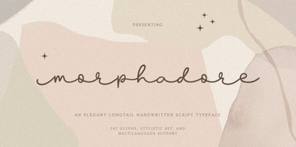 The Morphadore font brings elegance and luxury by offering a longtail monoline handwritten style. With Morphadore you can create elegant luxury logos, greeting cards, illustrations, quotes, charming branding, book covers, packaging, and much more. Features: Total 247 Glyph Uppercase & Lowercase Numerals & Punctuation Alternates Multilanguage Supports 60+ Latin based languages
 - Gordon by Letterbox,
$50.00 Although appearing at first as a no-nonsense bold titling face, Gordon actually offers a much greater complexity through the addition of a wide range of special superscript ornaments. This adds an element of spice and depth to the face, creating a wide variation of creative typographic possibilities.
 - Ashley Crawford AT by Monotype,
$29.99Designed by Ashley Havinden, Ashley Inline is a monoweight all-capitals typeface with a hand-crafted look, suggesting European decorative wood-cut letters from the twenties and thirties. The term inline refers to the fine reversed-out line in the centre of the characters of the Ashley Inline font. - Slazer by João Henrique Lopes,
$20.00 Slazer is a futurist font designed for a dynamic and powerful effect when it comes to science, technology, games, web, cellphones and electronics. All glyphs are open, straight and smooth, enhancing their connection with images. Slazer’s lines never touch or split: they always go somewhere… and go fast!
 - Junior Detective JNL by Jeff Levine,
$29.00 A 1930s kids' premium booklet from Post cereals called "Inspector Post's Junior Detective Corps Manual #2" offered up some great hand lettering in an Art Deco sans serif style. Bold, authoritative and perfect for headlines or titling, Junior Detective JNL now recreates this hand lettering in digital form.
 - Ralyne Script by Mindtype Co.,
$15.00 Introducing Ralyne, a stylist lovely calligraphy font with handwritten, sophisticated flows. Ralyne offers beautiful typographic harmony for a diversity of design projects, including logos & branding, wedding designs, social media posts, advertisements & product designs. Ralyne includes full set of lovely uppercase and lowercase letters, multilingual symbols, numerals, punctuation and ligatures.
 - Emphasis by ITC,
$29.00Emphasis is the work of lettering artist Martin Wait. Its eye-catching double line effect highlights any display in an authoritative, contemporary style. Emphasis is an all caps alphabet which offers an alternative to conventional brush lettering styles, giving a casual yet robust look wherever it is used. - Summer Program JNL by Jeff Levine,
$29.00 The WPA (Works Progress Administration) posters on file at the Library of Congress have been a treasure trove of classic hand-lettered type designs. Summer Program JNL is based on one such poster offering free arts and crafts classes in New York City sponsored by the Federal Art Project.
 - Commentary JNL by Jeff Levine,
$29.00Commentary JNL is a serif treatment of Jeff Levine's popular Stylor JNL sans serif font. Offered in two weights—regular and light—Commentary is a perfect alternative to formal text fonts and has just a touch of hand-made design to make for a more casual reading experience. - Quick Baseball by Nirmana Visual,
$22.00 Quick Baseball, contemporary of Serif font, Insipired by Baseball Club Logo, Quick Baseball it's retro, bold, and playful. Perfect if you need a dose of fun in your project. offers beautiful typographic harmony for a diversity of design projects, including logos & branding, social media posts, advertisements & product designs.
 - Alderamind by Differentialtype,
$10.00 Alderamind is a modern-themed san serif font with alternates and ligatures in it. You will get as if two fonts from Alderamind, because Alderamind has a full alternate in the uppercase. This font is perfect for logos, as well as other needs. immediately get our best offer.
 - Loco by Juraj Chrastina,
$39.00 Loco is an impacting display typeface playing with simple geometric forms perfect for posters, flyers, magazines and everything that needs to look bold, noticeable and up-to-date. Loco was created to perfectly match Ambassador Plus Sans Light. Their combination offers a flexible tool for your creative designs.
 - Visage LP by LetterPerfect,
$39.00 Visage is a contemporary text family designed by Garrett Boge in 1988. Its delicate serifs, subtly tapered stems, and generous proportions offer both distinction and readability to the text at any size. The family consists of five weights - Light, Book, Medium, Bold and Black, with corresponding oblique styles.
 - Casual Font Bundle by Konstantine Studio,
$12.00 Please welcome, Casual Font Bundle. A pack of fun and variative fonts for your playful design. Every single fonts have their own personality and characters. Would be a perfect mate for your fun and casual design projects. Pair up each of them and you'll never disappointed at all!
 - Naveid Arabic by NamelaType,
$29.00 Naveid Arabic is new version of Naveid with the addition of Arabic glyphs, for Arabic, Urdu, and Farsi. Basic form for arabic font is refers to the arabic kufi style, with combining the cuppped serif on top and the tinny Subtle Flaring on the terminal, to harmony with Latin.
 - Diegeometrische by Michael Browers,
$25.00Diegeometrische is an all uppercase geometric-based serif typeface featuring Latin, Extended Latin and Cyrillic character sets. - Latin, Extended Latin and Cyrillic character sets offer multilingual support. - Over 1000 kerning pairs for optimal letter spacing. - Unique combination of serif, geometric, and stencil design elements provides a distinct design. - Good Summer by Sipanji21,
$15.00 Good Summer is a handwritten font with playfull touch. It offers support of English Language. Standard punctuation glyphs are included. Great for crafters and graphics artist alike. Compatible with all operation systems. Its playfulness make it great for creative projects, be inspirational wall posters, logo, branding, and more.
 - Ebisu by Thinkdust,
$10.00 Ebisu is a sans serif family consisting of 10 different weights. Designed by Alex Haigh in 2010, and influenced by one of his original designs from 2008 Hiruko - Ebisu loses the soft sans serif curves, for a more robust geometric styling. But it’s much more than a geo-replica. The lowercase characters also have a more exaggerated sharpness that gives the whole family a unique look and feel. The kerning has been individually crafted for each letter, with vigorous attention - to ensure that each letter from is produced in a way that works with every member of the set, for a tightly knit sans serif family. It speaks many languages too. The open type features have an extended character set to support Eastern and Western European languages. With each weight conveying a different personality, Ebisu is set to become the modern new sans serif family to sit alongside you classics for versatility, cleanliness and a crafted edge.
 - Adagio Serif by Borutta Group,
$25.00 The Adagio Family is a part of Mateusz Machalski’s, Warsaw Academy of fine arts Master Degree Diploma in multimedia studio, conducted by Professor Stanisław Wieczorek and his brave PHD Jakub Wróblewski. Adagio is a modern type family. It consists of 3 main varieties: sans, serif and slab. Each one of them has its own “true italic” set. All of the styles together have over 400 characters in 9 different thicknesses. The Adagio family was created mostly for company identities. The idea was to create a wide range of different varieties which are stylistically consistent. Adagio Serif - Characterises with strong contrast and high detail in calligraphic character cuts, what gives it a light feeling. Unlike the Slab version, serif variety has asymmetrical serifs. Thanks to large X length, and highly stretched descenders, it also works correct in longer text, while its strong detail is good for headlines. The Serif version is a great complement for Adagio Sans and Adagio Slab.
 - Adagio Sans by Borutta Group,
$25.00 The Adagio Family is a part of Mateusz Machalski's, Warsaw Academy of fine arts Master Degree Diploma in multimedia studio, conducted by Professor Stanisław Wieczorek and his brave PHD Jakub Wróblewski. Adagio is a modern type family. It consists of 3 main varieties: sans, serif and slab. Each one of them has it's own “true italic” set. All of the styles together have over 400 characters in 9 different thicknesses. The Adagio family was created mostly for company identities. The idea was to create a wide range of different varieties which are stylistically consistent. Adagio Sans - In its character, inspired by classical English typefaces. Sharp chamfers add a strong character. Thanks to delicate contrast and proportions of capitals, this variety has features of humanist grotesque. Thanks to large x length, and highly stretched descenders, it also works correct in longer text, while it’s strong detail is good for headlines. The Sans version is a great complement for Adagio Serif and Adagio Slab.
 - Adagio Slab by Borutta Group,
$25.00 The Adagio Family is a part of Mateusz Machalski’s, Warsaw Academy of fine arts Master Degree Diploma in multimedia studio, conducted by Professor Stanisław Wieczorek and his brave PhD student Jakub Wróblewski. Adagio is a modern type family. It consists of 3 main varieties: sans, serif and slab. Each has its own “true italic” set. All of the styles together have over 400 characters in 9 different thicknesses. The Adagio family was created mostly for company identities. The idea was to create a wide range of different varieties that are stylistically consistent. Adagio Slab - Slab variety combines qualities of the Sans and Serif varieties. It has the same contrast as Sans. As distinct from Serif, Adagio Slab contains strong, beamy and symmetrical serifs in the form of pillows. Thanks to large X height, and highly stretched descenders, it also works correctly in longer text, while its strong detail is good for headlines. Slab version is a great complement for Adagio Serif and Adagio Sans.
 - Allumi Std by Typofonderie,
$59.00 Technology in mind in 12 fonts Allumi is a different font. Different from anything Jean François Porchez has designed in the past. Allumi is a sleek typeface designed with technology in mind. It’s a perfect font family for any communication concerning design, robotics, or functionality. Pushed to its extreme limits, the Allumi shapes are neither perfectly round or geometrically square. It’s a human design with a high tech touch. Allumi can be described as the Eurostyle (designed by Aldo Novarese in 1964) of the new century, mixed with Frutiger. Allumi is a serious typeface because of the unique design and sturdy form. The pure shapes can create a global presence today with an eye on the world of tomorrow. Two widths The Allumi family has been built around two series of widths, standard and extended. Italics have been carefully designed as slanted roman with all necessary optical and human corrections to create a perfect and neat italic. I Love Typography 2009
 - Core Escher by S-Core,
$30.00 Core Escher is an optical illusion type family which has two sub-families: Core Escher A and B. Core Escher A has impossible shapes inspired by the optical illusion works of artist M.C. Escher. The letterforms in this type family are structurally twisted and complicated but it looks simple because of its simple strokes. And for easy color variations, it split into two fonts, Core Escher A Left and Right. Core Escher B has a different kind of optical illusion. The letters of Core Escher B look like three dimentions by just putting thin lines on bold letters. Also B has two sub-families that have different viewpoints. Core Escher Family supports complete Basic Latin, Cyrillic, Central European, Turkish, Baltic character sets. Each font includes proportional figures, tabular figures, numerators, denominators, superscript, scientific inferiors, subscript, fractions and case features. This family is really nice for book titles, headlines, logotypes and any artworks.
 - Majora Pro by Latinotype,
$29.00 Majora Pro is a slab serif typeface which derives its name from a Portuguese historical toy manufacturer. The font comes in 8 styles, ranging from a delicate Thin to a robust Black, with matching italics and an upright version of stencil fonts, resulting in a total of 24 weights. Majora Pro is well-suited to a wide range of design projects which include packaging, editorial design, screen use, etc. Its humanistic features and moderate contrast between thick and thin strokes make it also suitable for long block of texts while having a high degree of legibility. The font includes a set of alternate glyphs which help give your compositions a different and unique look. The Stencil version was specially designed for use in signage, packaging, titles and headings. Majora Pro contains an extensive set of 750 characters (including small caps, different figure styles, etc.) that support over 200 Latin-based languages. Majora is the previous version of Majora Pro.
 - Rally Symbols 2D by 2D Typo,
$24.00 The Rally Symbols 2D font family has been developed for integrated graphical motor racing design. First of all that includes rally, rally raid, cross-country rally and hill climb. With the Rally Symbols 2D - Signs font one can create quality road maps with rally routes and various symbol books. The font also includes symbols that can serve as workpieces to create competition logos and other design solutions. The Rally Symbols 2D - Arrow font has been specially developed for building tulip diagram road books. It includes various ready-made combination of traffic direction indicators and individual elements that can be combined together. The Rally Symbols 2D - Picto font can be used for the same purposes but also contains a range of convention that can help to find one’s bearings on the ground. This is a a wide range of icons or pictograms of various scenery, for example: different buildings, churches, cemetery, bridges, tunnels, different types of trees, posts, etc.
 - Distillery by Sudtipos,
$39.00 The Distillery Set is a collection of 5 fonts: Display, Strong, Script, Caps, and Icons. The fonts' influences are in lettering from different eras and styles. They reflect forms from the Arts & Crafts movement, the Roman majuscules, artistic printing, traditional tattoo lettering, sing painting and showcards from the early XX century and some typography trends started from 1970s America and being used today like chalkboard art or handmade labels in packaging. This is collection of fonts that strongly hints of the spontaneous ways of pencil on paper, the dynamic rebellion and simultaneous imperfection and elegance of DIY. This set contains a wide range of characters, including alternates, ligatures, variations on ascenders and descenders, initials and terminals, icons and ornaments, providing endless application possibilities. The different fonts can be used individually, but of course it is their combination in use that creates the magic. The Distillery Set was designed by young talent Carolina Marando. Alejandro Paul produced and expanded the digital work.
 - Normatica by CarnokyType,
$42.00 Normatica is a neutral typeface inspired by advertising letters used as letterings on shop windows during period of Normalization (the 60s–90s) in former Czechoslovakia. The complete font family consist of 24 styles in 6 weights (Thin–Black) with matching Italics where every style is followed by his Display counterpart. The difference between default and display styles is tighter spacing in Display fonts and different design of punctuation and diacritics accents. Beside the complete set of Latin, Normatica includes Cyrillic characters as well. Each font contains of alternative variation of some characters (j, t, y, Q) and includes a wide range of the Opentype features (for more details see pdf Specimen in Gallery section). Mixture of Normatica and Normatica Display can be effectively used for both text and display usage. It can be used in advertising, signage, corporate identities and various situations of editorial design. You can try two Demo styles in Medium weight fully for free.
 - Vida Pro by Storm Type Foundry,
$55.00 The new typeface family Vida was specifically designed for Czech Television in the framework of a competition for a new logo in summer 2006. The drawing of each letter form differs finely in its logic, which is a feature invisible at first. It is constructed on a puristic base, but it doesn't reject the natural anomalies already known from ages of experience with latin alphabet. That's why e. g. upper left section of 'n' is constructed differently from that of 'r', similarly as 'd' doesn't repeat right-bottom ending after 'u', '9' is not inverted '6'. Such details improve reading in continuous text. The behavior of all weights is consistent on CRT, plasma or LCD screens due to monolinear design; the lightest weight doesn't fade, the darkest isn't blurred, all is legible and clear in smallest sizes. Stem connections and endings were adjusted to avoid undesirable optical darkening. The goal we desired was to achieve balance appearance in both electronic and printed form.
 - Honeydrop by insigne,
$17.00 Honeydrop is a script that mimics the action of a heavily-laden inky pointed brush, dancing across the page . Designed by Jeremy Dooley, its unique form is great for branding and packaging, especially for all-natural food items. The typeface also has a bit of Eastern flavor to it. Five different distressed variants make Honeydrop stand out. Its many alternatives help to advance your project. These variants allow you to change the final character of the lowercase letters. Besides, there are ligatures that extend the natural writing feel. Opentype override options round out the fonts, including random replacements to create a unique look and feel; each time you use the font you get a unique result. Each font has sixty five alternate characters. Also included are many unique textures that help the typeface adapt to different situations; you will find them of great use. Grab the extra sweet and flavorful typeface Honeydrop today.
 - Framealot by Ingrimayne Type,
$14.95 Framealot is a frame or border or page divider construction kit. By choosing and mixing various elements, a wide variety of different geometric borders or frames or dividers are possible. The largest set is on the upper-case keys. There are two other sets on the lower case keys (plus the comma and period.) The characters above the number keys (the whole top row with shift, plus {}| keys are another set. And there are a couple of other small sets. Not all the sets allow vertical dividers. Outlined versions are available on the outline style, and the filled style either inverts the pattern or removes white interior sections for the outline version (and has some other differences compared to the other two versions). Use a character map to find all the parts of a set, type them out on your document, and then copy and paste to construct your border or frame. Have fun with it!
 - Peoni Pro by Emily Lime,
$89.00 Peoni is sweet and quirky… and distinctly different. Her hand-lettered glyphs have retained their original textured appearance for an even more authentic custom-lettering feel. With over 1200 glyphs, Peoni is robust and full of open-type features. She’s designed to select the most ideal characters as you type. But feel free to make changes via your open-type panel, glyphs panel or character map. Have fun with it! There are plenty of options to allow you to create something truly unique and special. Peoni’s Open-Type features include: Stylistic Sets*, including 6 different Caps Styles Contextual Alternates Standard Ligatures Discretionary Ligatures Swashes Contextual Swashes Tabular Numbers Proportional Old Style Numbers Extras- Stylized words (i.e. and, the, from, etc), Roman Numerals (I, V and X), Ordinals (1st, 2nd, 3rd) *Stylistic Sets (ss01-ss18) & alternate glyphs aren't accessible with all programs. If your design software doesn't support open-type, you may need to use your computer’s character map to access other characters.
 - Scala Pro by Martin Majoor,
$49.00 The award-winning Scala family (1990-1993) is a worldwide bestseller and has established itself as a ‘classic’ among digital fonts. It was one of the first serious digital text fonts to support small caps, ligatures and different set of numbers. In fact Scala and Scala Sans (1990-1993) are two different typefaces sharing a common form principle: the skeletons of both Scala and Scala Sans are identical. Scala’s dark colour and low contrast works to prevent the thin parts from breaking up. The generous length of Scala italic’s serifs gives it a strong rhythm. The bold weight has the same character widths as the normal weight, so changing a text from normal into bold does not affect the set width. Another part of Scala is very popular among its users: Scala Hands, containing more than one hundred decorative hands and pointers, is a free bonus. Scala Jewels is a set of four highly decorative typefaces, based on the bold capitals of Scala.
 - Milayu by Twinletter,
$17.00 Introducing our newest font called Milayu, a Groovy Display font that will turn your every project into a bold and vibrant masterpiece. If you are looking for a way to give a strong, bold, and classic touch to your designs, Milayu is the perfect choice. Milayu comes in three different variants: Regular, Outline, and Shadow. This means you have the flexibility to bring different styles to each of your projects. Whether you want a strong, bold message, or a lighter look with an outline effect, Milayu has everything you need. What makes Milayu truly special are its abundant character ligatures and alternatives. This gives you the freedom to be creative and create unique and stylish designs. With multilingual support, Milayu is also ready to bring your message to the world. Milayu is the perfect choice for projects that require a bold, vibrant look. Let Milayu inspire your creativity and deliver your message in an unforgettable style.
 - Compatil Exquisit by Linotype,
$50.99 Compatil from Linotype is the first comprehensive type system which enables all typographical elements to be used to full effect in order to reproduce the message conveyed by text information. Four different type styles with a total of 16 weights including italics have been merged into a unique typographical network. There are now no limits to the font user's creativity.The system is a product of technical innovation and constitutes a new design approach which meets the highest aesthetic standards. Compatil is a typeface family from the Platinum Collection. This series was created for the highest quality demanded by professional typography and includes complete families digitized using the newest technology, serving the specific needs of corporate design and similar projects. This Value Pack contains four different type styles of the Compatil type system: Linotype Compatil Exquisit Pro Regular, Italic, Bold and Bold Italic. These Pro fonts include the small caps and Adobe Central European character set for OpenType-supporting applications like Adobe InDesign.
 - Bandoengsche by Gumpita Rahayu,
$14.00 Bandung is home to numerous examples of Dutch colonial architecture, most notably the tropical Art Deco architectural style. This typeface was adapted from the finest Art Deco landmarks and signage in Bandung, Indonesia and strongly added native elements of traditional Art Deco typefaces style. The main character is an example of a harmonious mixture between West and East architectural styles, repackaged into the Art Deco type design. With two different styles, it comes as regular and Deco styles, the regular style is constructed with all caps setting, with some different characters between uppercase and lowercase. The Deco style uses more stripes in the right shapes, it was naturally inspired with the most common art deco typefaces. The additional Opentype Features loaded in this typeface; some stylistic alternates, accessible catchwords in the discretionary ligatures, and the art deco ornaments, This typeface is highly usable with large scaling size and will fit with posters, movie titles, and signage designs.
 - Sympathetic by Bülent Yüksel,
$19.00 “Sympathetic Font” multi-purpose use is an open designed font. It is possible to produce unlimited designs using this font. “Sympathetic Font” is made up of 24 different forms. Hearts, square, triangle, circles, moon and stars, horizontal and vertical lines, sloping inner lines and wavy lines. Shading and decorations are also available. Ideally suited for advertising and packaging, logo, branding, slogans and creative industries, poster and billboards as well as web and screen design. You can create unique designs using fonts in layers. TECHNICAL: Sympathetic provides advanced typographical support for Latin-based languages. An extended character set, supporting Central, Western and Eastern European languages, rounds up the family. “Sympathetic” has 24 different forms and italics total 48 types. The family contains a set of 321 characters. Stylistic Alternates, Localized Forms and Old Style Figures just one touch easy In all graphic programs. Sympathetic is the perfect font for web use. You can enjoy using it.
 - Corporative Sans Rounded by Latinotype,
$26.00 Corporative Sans Rounded is the rounded version of Corporative Sans. Its curved terminals provide it with a marked personality and distinctive traits, but turn it into a friendly face at the same time. The font works well at both display and small sizes. Corporative Sans Rounded is the perfect choice for logotypes, posters, signs, branding, packaging and so on! Corporative Sans Rounded comes with Latinotype’s standard set of 350 characters, making it possible to use the font in 128 different languages. Corporative Sans Rounded provides users with a wide range of characters, weights and widths for every project. By combining different variants, designers can achieve the best results. The family consists of 32 fonts: a basic family that includes 8 weights plus italics and an alternative family of 8 weights with matching italics as well. Corporative Sans Rounded was created by LatinotypeTeam and developed by Elizabeth Hernández and Rodrigo Fuenzalida, under the supervision of Luciano Vergara and Daniel Hernández.
 - Brosse by Greater Albion Typefounders,
$12.95 Brosse is a family of slabserif faces which emphasise clarity and geometric cleanliness of line, in a 'Brave New World' sprit that harks back to the 1930s and possibly also to postwar rebuilding in the 1950s. Its clear legibility makes it ideal for poster work and titles, as well as for signage of any kind. Eight faces are offered, regular and italic, bold and bold italic, as well as a condensed face and a bold weight thereof. There are also two decorative forms- outline and embossed faces. All faces include a large character set and extensive Opentype features. A Demonstrater version of the regular face is also offered free of charge-this is fully licensed but has a signnificantly reduced character set.
 - Humana by Linotype,
$29.99The story of Humana begins with an exclusive volume about some manuscripts in Biblioteca Palatina in Parma, Italy. The title page uses the characters upon which I designed Humana. I suppose they were drawn for that volume. Examining the reproductions in the book I found that the characters on the title page immitate the lettering in a manuscript from the 15th century with Petrarca's Rime volgari". Not bad as origin! But I cannot free myself from the thought that there may be a typeface with that looks, not just a few characters drawn for that volume. My reference books could not give me any answer about that. The name Humana refers to the humanistic era from which the characters originate. Humana was released in 1994. - Borest by Flavortype,
$20.00 Borest, a new carefully crafted roman sans serif display font. The ideas for this font has a wide range of reference, from vintage, classic, art deco, until the modern era. So the looks of this font must be in the wide range of the reference above. Borest has a versatile and luxury feel as you can see in our creations on the display, such as Branding, Header, Logotype, Poster, Magazine, Packaging, Wedding Invitation with art deco style, and more. It shows that Borest can accommodate various design style. Borest comes with OpenType Features. such as Stylistic Alternates as an Ascender swash and Descender Swash and Ligatures. Every glyphs for alternates are curated for the best and without eliminating the characteristics of this font.