10,000 search results
(0.051 seconds)
- MC Rectila by Maulana Creative,
$17.00 Rectila is a simply semi-geometric sans serif font. With medium low contrast stroke, fun character with a bit of ligatures and alternates. To give you an extra creative work. Rectila font support multilingual more than 100+ language. This font is good for logo design, Social media, Movie Titles, Books Titles, a short text even a long text letter and good for your secondary text font with script or serif. Make a stunning work with Rectila font. Cheers, Maulana Creative
 - Decour Soft by Latinotype,
$26.00 Decour Soft is the rounded-edged version of Decour. It is a slab serif humanist low contrast typeface. The overall design also features strong curves, making it a very friendly face. The font retains the original elegant features of Decour—based on Art Deco design—such as high contrast between upper and lower case characters. Decour Soft is a suitable font for logotypes and packaging. Its design also allows it to be used with certain elegance in book titles and magazines subheadings.
 - Schadenfreude by Comicraft,
$19.00 We don't mean to gloat, but we have to say that it gives us immense, malicious pleasure and joy to supplant other popular germanesque letterforms with this, remarkably superior font. This successful addition to our DEAD cool POOL of ACHTUNG BABY alphabets will, no doubt, make you feel that your own library of teutonic fonts is now severely lacking. We're that mercenary, we're Mercs with Mouths, you might say. Wait, did we say that we DON'T mean to gloat? Actually, we do.
 - Pocket Swash Px by Letradora,
$18.00 Check out other members of the Pocket family: Pocket and Pocket Serif This hand drawn font has a subtle rough texture, and lots of alternate swash characters to start and end words. It is perfect to give an extravagant but whimsical look to your projects. It has support for most western and central European languages, and has alternates for most letterforms accessible through Opentype features, allowing for variations that make it look authentically hand-drawn. It also has extra ligatures, swashes, and catchwords.
 - Elbow Grease by Hanoded,
$15.00 Elbow Grease was made with, yes, you’ve guessed it: Elbow Grease! It started off as a grungy font, but it didn’t look right, so I reworked all the glyphs. Then I forgot to save the font, so I had to start all over again. Naming a font was never this easy! Elbow Grease is a didone-ish font with some seriously warped glyphs, a lot of panache and a ‘get-it-done’ attitude. Also comes with a toolkit full of diacritics.
 - Toony Line by Mans Greback,
$59.00 Toony Line is a comic font that feels like a delightful throwback to the golden age of cartoons. Funny and loony, the font channels playful tunes while its sharp, sans-serif characters dance on the page with a joy reminiscent of our favorite animated classics. There's a hint of Mickey's magic, a dash of Disney dreaminess, and the unapologetic boldness of comic strips and street art. But what sets Toony Line apart is its intricate overlapping effect, made possible by sophisticated OpenType.
 - BD Roylac by Typedifferent,
$30.00 The BD Roylac typeface has its roots in some lowercase glyphs drawn by Jacques Loison in 1972. Some of these characters are included in the use of stylistic alternates. Filed under a retro-futuristic design the font separates two filled shapes by a thin and curvy line; sometimes following to the path leaning readability and sometimes interfere with it. The font is dedicated to the BD fanboy Monsieur «Eric de Broche des Combes» aka «Roy La Combe» to his fiftieth anniversary.
 - Grandtown by Putracetol,
$28.00 Introducing Grandtown - retro bold script style font. Inspired from retro typography and lettering in the 70's and 80's combine with bold typography style. With this font will bring you back to 70s feel. Grandtown is perfect for vintage and retro design, badge, logos, t-shirt, poster, branding, packaging, signage, book cover and so much more! Come with Opentype feature with a lot of alternates, its help you to make great lettering. This font is also support multi language.
 - Liner Notes by AdultHumanMale,
$20.00 Liner Notes is a fun scrawly, marker felt, ALL CAPS display font. I wanted it to look fun, loud, and to have hints of School graffiti, so it can wail from Posters and Headlines. It has over 260 glyphs and several variations on the standard alphabet and all those extra pésk¥ foreign features. It also has various letters with extra ligatures and flourishes available through OpenType or your Glyphs palette. OMG, LOL I also added some web slang to the glyphs.
 - Dotage by ParaType,
$30.00 This decorative caps-only type family was designed in 2004 by Vladimir Pavlikov and licensed by ParaType. Its letterforms are imitating low resolution display letters used at railway stations, airports, and other public places. Regular, Inline, Shadow Left, and Shadow Right styles are available. An additional set of symbols and pictograms is included in each style to increase its decorative abilities. The face is good in magazine advertising, posters, and industrial graphic design in the fields of science and technology.
 - Sometimes Rough by Arterfak Project,
$26.00 Sometimes Rough, a new brush font with a real hand-lettered brush in solid ink. The letterforms have many personalities; sometimes strong, feminine, sometimes elegant, or manly. The modern-vintage design, flexible for a lot of needs. Create a natural typographic with this font, including 150+ alternate characters that give you more variations. Ideal for logos, merchandise, craft, poster, flyer, books, menu, packaging, advertising and more. Features: Uppercase Lowercase Numbers Symbols Accented characters Stylistic alternates Stylistic set 01-07 Contextual Alternates
 - Tahiti Sans by Sharkshock,
$100.00 Tahiti Sans is a playful, all caps display sans available in 2 versions. At first glance it appears to be the offspring of a rather uniform font and a wacky one. The variations of letterforms as well as random angles are minimal. They’re tall by nature so squeezing text into tight spaces should be easy. Characters are slightly jumbled in a childlike manner and misaligned with varying degrees of spacing. Use it for youth sports, social media, toy packaging or advertising.
 - Matricule 59 by designdefontes,
$24.00 Matricule 59 is a typeface whose design is inspired by license plates and by the deformations due to the stamping in the metal plates. These deformations give a very specific style, especially concerning the hairlines. It is the Ultra Condensed version of Matricule, a Typeface designed by Loïc Choquet. It consists of 4 fonts : Light, regular, bold and black. For Mac or PC. Well-suited for edition, logotypes, posters, etc. Each font contains 359 glyphs and supports up to 89 different languages.
 - Tudor Perpendicular by Greater Albion Typefounders,
$12.00 Tudor Perpendicular is Greater Albion's seasonal Black letter release (not that we rule out the possibility of non-seasonal ones...) for 2012. As the name suggests, it is a design which emphasises, and yes, exaggerates for effect, the perpendicular up and down nature of Black Letter typefaces. There's no particular historical basis for this one - straight out of our own minds, just as a lot of Black letter 'revivals' have been over the years. Come and visit 'Ye Olde' world today...
 - AT Move Strano by André Toet Design,
$39.95 STRANO Like the name indicates it’s a strange typeface. Just capitals (including punctuation marks and numbers), composed from early sketches for a corporate identity in 2005 by André Toet. The complete font was restyled and translated to a Monospaced version. It’s a quite versatile font: it can be used in a lot of different cases, not only in print but also in architecture and street furniture. Think about lettering on benches, bridges, buildings. Concept/Art Direction/Design: André Toet © 2017
 - Andora by Letterara,
$12.00 Introducing Andora, a beautiful, full-featured modern calligraphic font with tons of alternate characters and OpenType features. Andora hand-lettered is particularly well-suited for invitations, branding and editorial design. Perhaps the most fun thing about Andora is that it includes multiple versions of all ascending and descending letters, making it lots of fun to play with layouts and compositions. The OpenType features can be very easily accessed by using OpenType-savvy programs such as Adobe Illustrator and Adobe InDesign.
 - MC Forka by Maulana Creative,
$18.00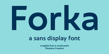 Forka is a minimal modern fun sans serif font. With medium low contrast stroke, fun character with a bit of ligatures and alternates. To give you an extra creative work. Forka font support multilingual more than 100+ language. This font is good for logo design, Social media, Movie Titles, Books Titles, a short text even a long text letter and good for your secondary text font with script or serif. Make a stunning work with Forka font. Cheers, Maulana Creative
 - Miller by FoxType,
$50.00 Introducing Miller Display new generation Decorative Typeface. Miller Typeface created with the vision of to attract the audience to your brand . The finest details of this typeface are methodically and mathematically created. Miller is created with all the tasks of a corporate font and also for the usage in a variety of projects, including branding, logos, titles, headlines, posters, screens, display, digital ads, and everything else. We are putting a lot of effort on this font as a long-term project.
 - Anko by Eko Bimantara,
$22.00 Anko is a mix of Old Style Roman Serif styles. The glyphs are formed in extend width, smooth strokes, moderate stem contrast and soft edges to pursue clarity, quick recognizable text and warm personality. The italics style is 8 degree low slanted with redrawned lowercase which shown in more organic and flowy forms. Anko contains 8 weights with more than 450 glyphs that support extended latin language and opentype features such as standard and discretionary ligature and a variation of numeral figures.
 - Cover Up by Hanoded,
$15.00 Cover Up is a roughish font with a lot of character. Its edges are slightly jagged, there is no real baseline and it looks like the whole thing has been sand blasted. When you get to know Cover Up, you’ll find that it comes with a hidden agenda, because underneath the rough exterior lives an oh-so sweet heart. Use it for your product packaging, book covers and posters - it won’t disappoint you. Comes with an illegal amount of diacritics.
 - Promethium by Mysterylab,
$17.00 Promethium is an elegant vintage-style condensed font with lots of ornate detailing. Ideal for western, cowboy and rodeo graphics, as well as circus & carnival themes. Additionally, Promethium can trace some of its design roots to the well established Argentine graphic style known as Fileteado, as well as to Victorian poster and book arts. The stacking & layering of the 4 different versions of the font can yield a great range of eye-catching diverse looks and color schemes that can fit many purposes.
 - Sultan Ruqah by Sultan Fonts,
$50.00 Sultan Ruqah is a attracting font, Designed by Sultan Maqtari. This is one font of the Sultan Fonts families that supports a variety of scripts including Arabic, Persian, Urdu, Uthmani, and Kurdish. The Sultan Ruqah has its own family with 8 unique fonts varying in weights and width. All characters, punctuation and styling have all been improved keeping in mind the required feel and beauty of the font for a wide corporate use, The 8 fonts include lots of styles.
 - Macklany by madeDeduk,
$16.00 Macklany is a display sans, come with single weight, legible and expressive shapes. A lot of stylish alternates characters will makes this font suitable for your any project design. Feature Uppercase & Lowercase Number & Symbol International Glyphs Multilingual support Alternative ligature Feel free to drop us a message any time and follow my shop for upcoming updates Shoot me on email at: dedukvic@gmail.com and find more previews on my Instagram here : https://www.instagram.com/acekelgondolayu/?hl=en Hope you enjoy it.
 - Hyperon by ParaType,
$30.00 Hyperon is a text typeface, which is especially useful for math and physics literature. Its nature is defined by austere and humanist features that show the most in italic. The typeface includes weights from Regular to Black and widths from Condensed to Semi Expanded. What stands out for Hyperon is the extended character set, with added Greek and lots of mathematical signs. Some styles have small caps. The typeface was designed by Natalia Vasilyeva and released by Paratype in 2020.
 - Matricule 57 by designdefontes,
$24.00 Matricule 57 is a typeface whose design is inspired by license plates and by the deformations due to the stamping in the metal plates. These deformations give a very specific style, especially concerning the hairlines. It is the Condensed version of Matricule, a Typeface designed by Loïc Choquet. It consists of 4 fonts : Light, regular, bold and black. For Mac or PC. Well-suited for edition, logotypes, posters, etc. Each font contains 359 glyphs and supports up to 89 different languages.
 - Zoomber Display by FoxType,
$50.00 Introducing Zoomber Display new generation Decorative Typeface. Zoomber Typeface created with the vision of to attract the audience to your brand . The finest details of this typeface are methodically and mathematically created. Zoomber is created with all the tasks of a corporate font and also for the usage in a variety of projects, including branding, logos, titles, headlines, posters, screens, display, digital ads, and everything else. We are putting a lot of effort on this font as a long-term project.
 - Trinculo by Scriptorium,
$12.00Trinculo is a cursive font which combines traditional letter forms with ridiculously ornate embellishments and flourishes. It's rather like what an 18th century clerk might have done with his lettering if he was bored to distraction with writing the same old letters again and again. The upper case characters are more complex with simpler versions of the same characters in the lower case. Trinculo is a lot of fun, though if you use it too much it may become overwhelming. - Cathyna Display by FoxType,
$35.00 Introducing Cathyna Display new generation Decorative Typeface. Cathyna Typeface created with the vision of to attract the audience to your brand. The finest details of this typeface are methodically and mathematically created. Cathyna is created with all the tasks of a corporate font and also for the usage in a variety of projects, including branding, logos, titles, headlines, posters, screens, display, digital ads, and everything else. We are putting a lot of effort on this font as a long-term project.
 - Utendo - Personal use only

- FALLING SKIES - Personal use only

- Kingthings Serifique - 100% free

- Web Serveroff - 100% free

- Mahamaya - Unknown license

- Averia Sans - Unknown license

- Green Mountain 3 - Unknown license

- Certified - Unknown license

- Rainier by Kimmy Design,
$10.00 I was inspired to create the Rainier type family during my summer back home in the Pacific Northwest. The concept behind it may be simple - a hand crafted font family - but what it delivers is quite complex! Here is a breakdown of everything you get: FONT FAMILIES: Two sub-families with unique styles - Rainier North and Rainier West WEIGHTS: 4 weights per family, broken down numerically - 100 (light), 300 (regular), 500 (bold), 700 (black) OPENTYPE: In each family, there are tons of OpenType options, offering lots of customizable opportunities (in order to access all these goodies, you must be using Illustrator, Photoshop, Indesign or Publisher). Because Rainier is 100% handmade, contextual alternatives allow each letter has three subtle variations, this way it keeps that authentic hand-drawn look. Additionally, a full alphabet with special descending swashes, as well as start and end swashes for capitals and small caps. Titling alternatives offer a full character set just to help with readability! Meant for captions or smaller text, these letterforms are easy on the eye and a great complement to the regular alphabet. Stylistic Alternatives add a little fun, providing a unified cap height, no matter what case you are using (all caps, small caps or lowercase.) Discretionary Ligatures are created only for capitals, and takes specific letter pairs and creates a unique ligature between them To get a better understanding of everything, please check out the quicker user guide (http://bit.ly/1W0Bfma) and print if you so desire (http://bit.ly/23W9ZV6) that helps you navigate your way around and get the most out of Rainier! Unfortunately those links aren't working right now and soon I will have them fixed. So sorry! ORNAMENTS: In addition to the font, you get a set of awesomely rustic ornaments designed and drawn to go specifically with Rainier! - Rustic Northwest Illustrations - Banners & Flags - Frames - Flourishes - Lines & Line Breaks - Arrows There are a lot of extras packed in this set, so make sure you check out the Ornaments User Guide to get the most out of it! Check it out here: http://bit.ly/1rRVJRx And that’s all folks! Hope you enjoy Rainier!
 - Donita by MrLetters,
$15.00 Donita Script is a soft and beautiful font that has a connection to the upper part of the letter, this is something unique but very beautiful, luxury and charming. This font is to complement your design needs in making amazing works. Donita Script is perfect for branding, wedding invitations, magazines, mugs, business cards, quotes, posters, and many more that you can use on your big project will be very beautiful. Donita Script has been equipped with the OpenType feature and has many glyphs. and of course having a lot of flying machines will be able to choose letters to your liking, lots of variations and choices for each letter, so you can adjust your design choices and also have other languages supported.which you will get in this package: This font is very suitable for use with programs that support OpenType features such as Adobe Photoshop Cs / Adobe Photoshop CC, Adobe Illustrator CS / Adobe Illustrator CC, Adobe Indesign, and Corel Draw and many more programs that support OpenType. If you have any questions, don't hesitate to contact me via email at: hello.mrletters@gmail.com Thank you and happy designing :-)
 - Edgar No 9 by Type Innovations,
$39.00 Edgar No. 9 is an original design by Alex Kaczun. Edgar No. 9 is a derivative work based on his Big Boy typeface series. It was designed specifically for display headlines, logotype, branding and similar applications. Primarily a display, this extremely versatile font has generous proportions, large counters and loose fitting which also allow the font to work well across a wide range of text sizes. Edgar No. 9 is a heavy baroque slab serif and although it shares the underling skeleton of 'Big Boy', it is a much more compact in overall proportions and spacing. A handsome bold headline font that works well in text as well as display sizes—ideally suited for publications and advertising. Alex plans to expand the font series to include a large range of weights along with corresponding italics numbering 1 thru 9, as well as, true small capitals and old style figures. Distressed version(s) will also be available in upcoming releases. Stay tuned, more to come soon. The large Pro font character set supports most Central European and many Eastern European languages.variations to expand this 'hip' new font series. Groovin' baby.
 - Lido STF by Storm Type Foundry,
$39.00Times with a Human Face: In my article of the same name which appeared in the magazine Font, volume 2000 I described the long and trying story of an order for a typeface for the Czech periodical Lidové noviny (People’s Newspaper). My task was to design a modification of the existing Times. The work, however, finally resulted in the complete re-drawing of the typeface. The assignment, which was on the whole wisely formulated, was to design a typeface which would enable “a smooth flow of information in the reader’s eye”, therefore a typeface without any artistic ambitions, from which everything which obstructs legibility would be eliminated. A year later Lidové noviny had a different manager who in the spring of 2001 decided to resume the cooperation. The typeface itself definitely profited from this; I simplified everything which could be simplified, but it still was not “it”, because the other, and obviously more important, requirement of the investor held: “the typeface must look like Times”. And that is why the above-mentioned daily will continue to be printed by a system version of Times, negligently adjusted to local conditions, which is unfortunately a far cry from the original Times New Roman of Stanley Morison. When I was designing Lido, the cooperation with the head of production of Lidové noviny was of great use to me. Many tests were carried out directly on the newspaper rotary press during which numerous weak points of the earliest versions were revealed. The printing tests have proved that the basic design of this typeface is even more legible and economical than that of Times. The final appearance of Lido STF was, however, tuned up without regard to the original assignment – the merrier-looking italics and the more daring modelling of bold lower case letters have been retained. The typeface is suitable for all periodicals wishing to abandon inconspicuously the hideous system typefaces with their even more hideous accents and to change over to the contemporary level of graphic design. It is also most convenient for everyday work in text editors and office applications. It has a fairly large x-height of lower case letters, shortened serifs and simplified endings of rounded strokes. This is typical of the typefaces designed for use in small sizes. Our typeface, however, can sustain enlargement even to the size appropriate for a poster, an information table or a billboard, as it is not trite and at the same time is moderate in expression. Its three supplementary condensed designs correspond to approximately 80% compression and have been, of course, drawn quite separately. The intention to create condensed italics was abandoned; in the case of serif typefaces they always seem to be slightly strained. I named the typeface dutifully "Lido" (after the name of the newspaper) and included it in the retail catalog of my type foundry. In order to prevent being suspected of additionally turning a rejected work into cash, Lido STF in six designs is available free of charge. I should not like it if the issuing of this typeface were understood as an “act out of spite” aimed against the venerable Times. It is rather meant as a reminder that there really are now alternatives to all fonts in all price categories.


