10,000 search results
(0.029 seconds)
- GM Exp Norm - Unknown license

- Al Manverse Norm by Aluyeah Studio,
$95.00 Hallo Aluyeaholic! Introducing Manverse, a bold manly typeface. Inspired by the things that make up the world of men. With a bold, strong, and firm vibe. Coming with 2 styles, all caps and multilingual support. Very suitable for magazine, headline, website, ads, product package and all type of design project you have. Thanks for checking out my font. I really hope you enjoy using it! If you have any questions I'd be more than happy to answer them, just send me a message!
 - Al Bavistage Norm by Aluyeah Studio,
$150.00 Hallo Aluyeaholic! Introducing Bavistage, a broken smile typeface. Inspired by the vintage vibe of a girl's broken smile. It gives you past memories, disappointments and happiness at the same time. Coming with 3 styles, and each style has stunning 130+ alternatives, 30+ ligatures and it's super easy to use. Very suitable for magazine, headline, website, ads, product package and all type of design project you have. Features: OpenType support Multilingual support (15 languages) PUA Encoded Super Easy to Use alternates - It's OpenType support but you can easily call alternates character using special combination like A.2 R.3 h.5 etc. so you don't need special software. To get results like the preview just type B.4av.3is.2.tag.2e.3 You will receive: Al_Bavistage_Normal Al_Bavistage_Stamp Al_Bavistage_Vintage Thanks for checking out my font. I really hope you enjoy using it! If you have any questions I'd be more than happy to answer them, just send me a message!
 - Noale Dak MF by Masterfont,
$59.00 - TT Norms Pro by TypeType,
$39.00 Introducing TT Norms® Pro, version 3.200! The updated font now supports more languages and boasts a larger character set. These implementations have made the typeface even more advanced and convenient. TT Norms® Pro is a functional geometric sans serif for aesthetic design choices and TypeType studio's bestseller. It has been a massive success since its release, and rightfully so! This stylish, elegant, and versatile font will become the full-fledged core of your collection. TT Norms® Pro is ideally suited for products in any domain: streaming services, banking, clothing brands, or the automotive industry. It's equally convenient to use in both web and printing. Now, the TT Norms® Pro typeface includes the most extensive font package, both in terms of font styles and character sets. The base version of TT Norms® Pro consists of 22 fully redesigned font styles and 4 additional subfamilies. Besides, this font boasts the most comprehensive language support in the TypeType collection. We've added the characters of extended Cyrillic and Latin writing systems to the updated TT Norms® Pro and configured the new languages support. The character set has become more extensive—we've added currency symbols with their minuscule version and minuscule mathematical symbols. The 3.200 version of TT Norms® Pro includes: 44 roman font styles, 44 italics, and 2 variable fonts; 7 roman and 7 italic font styles in TT Norms® Pro Mono; 2 variable fonts: TT Norms® Pro Variable with three parameters of variation (weight, width, and slant) and TT Norms® Pro Mono Variable with weight and slope axes of variation; 1993 characters in each font style, including an extended set of punctuation marks, symbols, and currencies; 5 widths: TT Norms® Pro with classic proportions, monospaced TT Norms® Pro Mono, narrower-proportioned TT Norms® Pro Compact and TT Norms® Pro Condensed, and wider TT Norms® Pro Expanded; 38 OpenType features, including a large number of ligatures, fractions, numerators, and denominators; 17 stylistic sets; - 280+ languages support, counting in new symbols for French, Norwegian, Bulgarian, Uzbek, Abkhaz, and more; Flawless kerning and manual TrueType hinting. TT Norms® Pro has already become the signature font of Intercom, Inc., Sartorius AG, CSN, CBSN, Shieldex, and many other global brands. Customization is available for TT Norms® Pro upon request—we adjust the font to suit your project. Learn more about customization options in the corresponding website section. In addition to the TT Norms® Pro, we've designed the TT Norms® Pro Serif typeface. These fonts complement each other perfectly, making an ideal typeface pair.
 - Lost at sea GM - Unknown license

- KR Mad Tea Party - Unknown license

- Pen Nib Western JNL by Jeff Levine,
$29.00 Inspired by the hand lettered phrase “the pen is mightier than the sword” in a 1923 promotional blurb for Speedball lettering pens, Pen Nib Western JNL recreates the decorative style of this vintage artistic gem in both regular and oblique versions.
 - Sea of Japan JNL by Jeff Levine,
$29.00 A 1922 piece of sheet music entitled “Japanese Sailor” had its title hand lettered in a Far Eastern motif. This design is now available as Sea of Japan JNL, in both regular and oblique versions.
 - Bold Pen Lettering JNL by Jeff Levine,
$29.00 The title on the cover of Street & Smith’s “Wild West Weekly” for Jan. 27, 1934 made for an interesting contrast in terms. Here was a pulp magazine dedicated to stories of the Old West, but its title was hand lettered in an extra bold, squared shape style using a round pen nib – not exactly an alphabet that represented cowboys and desperados… This aside, this type style made for a good digital font revival, and it is now available as Bold Pen Lettering JNL in both regular and oblique versions.
 - Pen Tip DT Lefty by DTP Types,
$49.00 - M Felt Pen PRC by Monotype HK,
$523.99 To blend a handwritten style with a graphical aesthetic, Monotype designers paid attention to the balance between the two, hence harmoniously combine their qualities like a mix of tradition and modern. M Felt Pen references the unified stroke thickness and rounded terminals of rounded Heiti typefaces, imitating the fluidity of marker writing. The linked strokes are vivid and suggest the presence of the human hand.
 - Pen Nib Square JNL by Jeff Levine,
$29.00 The idea started with the 1934 sheet music of “Mazurka Amabile”. Its hand drawn title had most of the letters rendered in a rectangular shape [‘square’ in the sign trade] that featured rounded corners and terminals made by the shape of the lettering pen nib. A few letters were rounder in design than others, so those were scrapped in favor of a more consistent character shape throughout the font. Pen Nib Square JNL is available in both regular and oblique versions.
 - Tea Chest Stencil EF by Elsner+Flake,
$35.00 - VTG Watson Steel Pen by Voltage Ltd,
$35.00 If you're regularly compelled to scrawl fiery French poetry, declare independence, or design indie folk albums, then Chris Watson's romantic Steel Pen typeface is for you. With old-school edge and spirited opentype alternates, it's as gallant as type gets.
 - M Felt Pen HK by Monotype HK,
$523.99 To blend a handwritten style with a graphical aesthetic, Monotype designers paid attention to the balance between the two, hence harmoniously combine their qualities like a mix of tradition and modern. M Felt Pen references the unified stroke thickness and rounded terminals of rounded Heiti typefaces, imitating the fluidity of marker writing. The linked strokes are vivid and suggest the presence of the human hand.
 - Show Card Pen JNL by Jeff Levine,
$29.00 The 1920 edition of “How to Paint Signs and Sho’ Cards” by E. C. Matthews offered a number of examples of then-modern lettering styles for sign painters and show card writers. A bold display alphabet made with a round lettering nib is now available as Show Card Pen JNL, in both regular and oblique versions.
 - Dip Pen Deco JNL by Jeff Levine,
$29.00 The hand lettered title on the cover of the 1938 sheet music for “If It Rains – Who Cares” featured a condensed Art Deco typeface made with a round nib pen. The square shaped characters with rounded corners were a perfect subject for a digital font revival, and are now available as Dip Pen Deco JNL, in both regular and oblique versions.
 - Pen Tip DT Infant by DTP Types,
$49.00 - Pen Lettering Sans JNL by Jeff Levine,
$29.00 A 1935 song with the unusual title of "Dinner for One Please, James" had its title hand lettered on the cover of the sheet music with simple, condensed letters made by a round point dip pen. This has been reproduced in a digital font as Pen Lettering Sans JNL, and is available in both regular and oblique versions.
 - Geoffrey - Personal use only

- 1925 My Toy Print Deluxe Pro by GLC,
$42.00 This family was created inspired from two French (one so common and a very rare large one) "toy print" boxes, named Le petit imprimeur, with rubber stamp characters from the 1920's. The big difference from our 1920 My Toy print is that this font is complete, with upper and lower cases, accented, complete punctuation and some symbols. The doubly of each usual character in each style (A-Z/a-z and numerals) allow to give a rich and variously uneven appearance, looking like the results of the real use of those old rubber stamps, with bad kernings and alignement. The font is containing West (including Celtic), Central, East European, Turkish and Cyrillic characters. The bold style may be used as a reinforcement, mixed with normal style without disadvantage, allowing finally four choices for each usual letter... The original size is 6mm (about 17 pts).
 - KR Love Lies Bleeding - Unknown license

- Dia De Los Muertos by Intellecta Design,
$21.90 Dia de los Muertos is a colorful collection of skulls based on the lively Mexican fiesta celebration where skulls are used as humorous epitaphs of people still alive, besides being a symbol of celebration. A work of Iza W that can be used for children in arts, arts crafts, among other applications. Buying "Dia de los Muertos" you get FREE a amazing set of eps vectors : 39 naive, intrincated and colored funny skulls, ready to use."
 - Fiesta De Los Muertos by Mvmet,
$10.00 Fiesta De Los Muertos is a fun and festive display font! Not only can be used for Halloween theme needs, you can use it too for other things for daily needs. Use it on t-shirts and clothing, book designs, greeting cards, stickers, posters, banners, or anything that needs a fun touch. Try it to create fabulous designs and feel the fun and cool vibes with it!
 - H74 Viva Los Vatos by Hydro74,
$25.00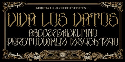
- TT Norms Std Condensed by TypeType,
$35.00 TT Norms® Std Condensed useful links: Specimen | Graphic presentation | Customization options TT Norms® Std Condensed is the logical development of our bestselling TT Norms®. Since the release of TT Norms®, we received a bunch of requests to create its narrow version and even managed to make several custom projects of the narrow TT Norms® before we decided to start creating a full-fledged commercial version of the typeface. At the very beginning of the project, we did some research and tested several options for the possible width of the typeface. Despite the fact that TT Norms® Std Condensed has narrower proportions than the original family, it inherited the classic proportions of characters, attention to detail and meticulous elaboration of each character in the typeface. The TT Norms® Std Condensed font family consists of 18 faces (9 upright and 9 italics). Each style includes a sufficient set of characters that allow you to solve most of the problems that arise in the field of graphic design, branding, packaging design or website design.
 - TT Norms Pro Serif by TypeType,
$39.00 Introducing TT Norms® Pro Serif, version 1.100! The updated font now has new OpenType features and localization for the Serbian and Bulgarian languages. TT Norms® Pro Serif is a functional serif based on our studio's main bestseller—the versatile sans serif TT Norms® Pro. Together, they form an ideal font pair. Although these typefaces are made for each other, they can easily be used independently and paired with other fonts. So, TT Norms® Pro Serif is a self-sufficient and elegant serif, neutral at the same time. It is easy to recognize due to its gentle proportion dynamics, open aperture, slanted oval axis, and low stroke contrast. Another distinctive feature of this font is brutal serifs that adjust in length according to the weight of the font. As well as TT Norms Pro, there are Italic font styles in TT Norms® Pro Serif. However, for this serif, we have designed true italics instead of simple slanted font styles. Their key feature is the ability of the lowercase letterforms to change in reference to the roman font styles. They become more rounded, moving towards handwritten shapes. The nature of the italics turned out sharper than that of the roman font styles. It can be used to place accents that would attract attention without interfering with the process of reading. TT Norms® Pro Serif is capable of solving multiple design tasks. It is highly readable, which makes it convenient for small point sizes. This serif's application range is broad and diverse: it can be used for websites, printed materials, and packaging design. The font is well-suited for projects in the domains of culture, art, history, or literature and can be implemented into the designs of signs, posters, or premium products and services. TT Norms® Pro Serif, version 1.100, consists of: 24 font styles: 11 roman, 11 italic, and 2 variable fonts (one for the roman font styles and another—for italics); 1380 glyphs in each font style; 31 OpenType features, including options for localization.
 - Skolar Sans PE by Rosetta,
$70.00 Any prototype you can imagine, Skolar Sans can materialise. This industrious type family is more than just a versatile partner for our award-winning Skolar collection: it is a true sans-serif type system envisioned for the age of responsive design. We developed Skolar Sans to accommodate contemporary typographers and the challenges they confront: an ever-changing spectrum of outputs and devices, in which serious typography can get lost. Skolar Sans is engineered to cope with complex editorial texts and data-rich layouts alike. Its construction is designed for easy reading, and its subtle personal style and a touch of flourish. From gently thin to black, the finely-tuned weight variants will fit any composition from wide-screen dashboards to compact mobile editorial designs. Its four subtly graded width variants allow you to fit any page context with comfort. The 72 styles; 36 weight and width variants in uprights and true italics with ligatures, arrows, scientific figure variants, and fleurons. The two variable fonts (one for uprights and one for the italics) allow user precise navigation of the Skolar Sans design space and streamline delivery. The linguistic scope of Skolar Sans PE is an exact match to Skolar PE: Latin, Cyrillic, and Greek (including polytonic) scripts and support for hundreds of languages and transliterations.
 - Gridlite PE Variable by Rosetta,
$290.00 The two great technical constraints a type designer can tackle are low resolution, which limits detail and dictates proportions between negative and positive shapes, and uniform width, which restricts each letter to a fixed horizontal space. Wrestle with both at once, and each letter becomes a black-and-white chessboard that challenges every design decision. Sometimes battling these constraints gets in the way of a good idea, but other times, tinkering with fewer options can make the job irresistibly easy and lead straight to a grid addiction. Gridlite, an experiment with a modular negative space, is the side effect of such an addiction. It’s simplified, monospaced, and variable: foreground and background alike are ready to be animated, typed, scaled up, scaled down, rounded, or otherwise deformed. Gridlite is primarily a variable font with axes that control the size of the elements, their shape, and the background (one for the rectangular field and one for the compact envelope around the letters). The fonts cover Cyrillic, Greek, and Latin scripts. Small caps are included, for no apparent reason ... and there is a monospaced elephant, too.
 - Clone Rounded PE by Rosetta,
$70.00 Clone Rounded is a retrofuturist typeface by Lasko Džurovski from Macedonia, fusing the vintage look of CRT monospaced forms with the organic mutability of a multi-weight, proportional family fit for reading. This lovechild of cyber-culture and genetic font modification takes inspiration from coding, technology, and architecture. Its quasi-monospaced design gives a nod to the quirkiness of engineered fonts but bends enough to never sacrifice a natural reading experience. Biomechanical morphology augmenting a laboratory-built frame.
 - LCT Ragnarök PE by LCT,
$29.90 The LCT Ragnarök is inspired by the cinematographic universe. Its thick and generous shape makes this typeface naturally stand out. In addition, its lines embody soft serifs thus adding elegance to it. This original font endows two styles; regular and slant. It is an asset for the creation of titles, logos or even generics. LCT Ragnarök encompasses a rich alphabet going from Latin PRO going to Greek , Polytonic Greek and Cyrillic.
 - Faux Pas JNL by Jeff Levine,
$29.00 The lettering found on an 1878 Salt Lake City advertisement for the Forepaugh’s Circus inspired Faux Pas JNL, which is a bit of a pun on the circus’ name and also a commentary on how this unusual lettering style seems to break all of the rules on stroke width and balance. According to Wikipedia: “Adam John Forepaugh (February 28, 1831 - January 22, 1890) was an American entrepreneur, businessman, and circus owner. Forepaugh owned and operated a circus from 1865 through 1890 under various names including Forepaugh's Circus, The Great Forepaugh Show, The Adam Forepaugh Circus, and Forepaugh & The Wild West. In 1889, Forepaugh sold his circus acts to James Anthony Bailey and James E. Cooper and he sold his railroad cars to the Ringling Brothers. The Ringlings used the equipment to transform their circus from a small animal-powered production to a huge rail-powered behemoth, which later purchased the Barnum & Bailey Circus. Thus, in liquidating his circus assets, he indirectly contributed to the demise of his arch-rival.” Faux Pas JNL is available in both regular and oblique versions.
 - KR Down By The Sea - Unknown license

- KR A Time For Peace - Unknown license

- Fundevogel by Hanoded,
$15.00 Fundevogel is a Brothers Grimm fairytale about a boy who was found in a tree. The story, of course, has all the obligatory characters in it: a fair maiden, a wicked cook, an old forester and lots and lots of shapeshifting. And, yes, a happy end! Fundevogel font is a handmade fairytale font. It comes with extensive language support and all the cuteness you could wish for.
 - BitchSlap - Unknown license

- Aceituna by Hanoded,
$15.00 Aceituna means ‘olive’ in Spanish. It comes from the Arabic Al-Zeitoun. I am multi-tasking today: finishing this font and thinking about what to cook for my family tonight (yes, I am the one who cooks!). We normally eat Asian food, but I was toying with the idea of serving something Mediterranean and realised we had run out of olives. So there you have it: the super simple trick of naming a new font! But enough of cooking: Aceituna font was made with a Japanese brush pen. It is a very versatile font: tall and thin, elegant and a little messy. A hint of texture and, like olives, it goes with almost anything.
 - Mophend by Typebae,
$16.00 Mophend is a beautiful and elegant serif font crafted with joy and luxury. For those of you who are needing a touch of stylish, classy, chic and modernity for your designs, this font was created for you! Features: Multilingual Ligatures Alternates PUA encoded
 - Elicit Script by Monotype,
$40.99 Elicit Script is a hybrid script family, that can be as casual or formal as the occasion demands. Created by Laura Worthington and Jim Wasco, the design is based on pointed pen Spencerian Script handwriting. “It’s like one of those German italics from the early 20th century, that have beautiful shapes that hold their own,” says Wasco. Elicit Script spans five weights, from Extra Light to Bold, and three styles – Formal, Normal and Casual. This makes it an incredibly versatile script design, easily paired with other typefaces and able to be dressed up or down, depending on what it’s used for. The monoline Casual style offers a more relaxed tone of voice, while Formal sits at the more decorative end of the spectrum. Designers can keep things straightforward, tidy and practical with the typeface’s simple caps, or add in swash caps if they need more exuberance and expression. Generous spacing means Elicit Script works well at smaller sizes as well. Elicit Script Variable Set is a single font file that features two axes: Weight and Contrast. The Weight axis has instances from Extra Light to Bold. The Contrast axis has instances from Casual (low contrast) to Formal (high contrast).


