10,000 search results
(0.153 seconds)
- Sweet Missy by Olivetype,
$18.00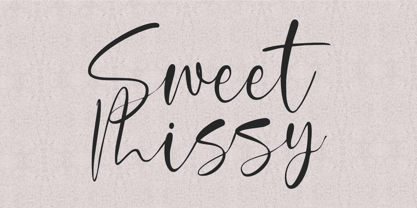 With its modern calligraphy script style, Sweet Missy is perfect for adding a touch of elegance to logos, branding, and more. Its stylish yet simple design makes it versatile and easy to use for a variety of projects. So what’s included : Basic Latin Uppercase and Lowercase Numbers, symbols, and punctuations Ligatures. Multilingual Support. PUA Encoded and fully accessible without additional design software Simple Installations Works on PC & Mac Thank You.
 - Visigoth by Linotype,
$29.00Visigoth font was created in 1988 by Arthur Baker for AlphaOmega Typography. He designed it specifically for setting the text of A Dante Bestiary published in 1989 for Ombondi Editions in New York. Highly expressive and unusual letter shapes make Visigoth unique among script faces: it has bold, pen written lines, a slight incline, and a distinct variation in stroke weights, making it ideal for advertising and other display work. - Chakie by Garisman Studio,
$20.00 Just call me CHAKIE. I'm born from the old natural brush chalk look from the 60's and 70's. Use meto create very bold and strong design! Great for posters, t-shirt designs, branding, packaging, labels, and more. Bring back me to the 60's brother! :D And why you must grab me? - Simple installation - Support for 23 languages (WOW!) - Compatible with MAC or PC - PUA encoded - Lots of fun!
 - Brendria Signature by Rometheme,
$22.00 Brendria – Signature is a handwritten signature script font, this font looks classy, luxury, elegant, romantic, wedding, lovely, girly and awesome. Highlights: Standard glyphs (Uppercase, Lowercase, Numeral & Punctuation) Work on PC or Mac PUA Encoded Support Fonts include multilingual support for; ä ö ü Ä Ö Ü ß ¿ ¡ No special software is required, The fonts can be opened and used in Adobe Illustrator, Adobe Photoshop, Adobe InDesign, even work on Microsoft Word.
 - FF Carina by FontFont,
$68.99 Carina is based on the Modern serifs from the 18th and 19th centuries. With high contrast and proportions, the font has a pronounced feminine nature tailored by its stylish details and ornamental swashes and ligatures. The round letter shapes evoke the impression of pointed pen calligraphy. Carina s most striking feature is the Cyrillic glyph set (together with swashes and ligatures) that is created by a native Russian designer.
 - Soundgarden by HIRO.std,
$17.00 Soundgarden is a Display Typeface. This font describes about stylist, modern, psychedelic look, and easy to use. Soundgarden Display Typeface inspired from the modernity, psychedelic art and natural beauty. FEATURES - Uppercase and Lowercase letters - Numbering and Punctuations - PUA Encoded Characters - Multilingual Support - Works on PC or Mac - Simple Installation USE Soundgarden Display Typeface works great in masthead, Logo, T-shirt/ Apparel, Poster and Magazine. Enjoy using! Thanks. HIRO.std
 - Heart Grow by Olivetype,
$18.00 Love is in the air—or at least it should be! Get that perfect, happy feeling with Heart Grow. This font is great for adding some personality to all your occasions, making it perfect for logos, cards, labels, and more. So what’s included : Standard Latin Numbers, symbols, and punctuations Multilingual Support. Accented Characters : ÀÁÂÃÄÅÆÇÈÉÊËÌÍÎÏÑÒÓÔÕÖØŒŠÙÚÛÜŸÝŽàáâãäåæçèéêëìíîïñòóôõöøœšùúûüýÿžß PUA Encoded and fully accessible without additional design software Simple Installations Works on PC & Mac Thank You!
 - Agreable Modern Script Font by sizimon,
$20.00 Hello thanks for visiting our font Agreable Script! Since the font made it on the scent of luxury. Suitable to create beautiful hand-made typography in an instant. It is free-flowing & bouncy curves. Agreable is perfect for logos, printed quotes, invitations, cards, product packaging, headers and whatever your imagination holds. Agreable Includes: Uppercase,lowercase,numeral,punctuation & Symbol Multilingual support Stylistic alternates PUA Encoded Characters Fully accessible without additional design software.
 - Zn Branch by Zeenesia Studio,
$15.00 Introducing BRANCH - Elegant Serif Typeface BRANCH is a beautiful and smooth serif font created by a romantic and lovely look. I created some natural ligatures to make this font very elegant and look so classy. It is perfect for greeting cards, wedding invitations, posters, logotypes, product branding, and much more. This font is PUA encoded, which means you can access all of the glyphs and swashes with ease!
 - Malihah by Abo Daniel,
$11.00 introducing MALIHAH - Lettering Font Pack- MALIHAH is great for lettering, quotes, wedding card, logo, t-shirt designs, mugs, interior ornaments, tote bag designs, cards, banners, social media, and anything about craft projects. It came with 4 different fonts with extra doodle font. Features: - Uppercase - Lowercase - Numeral - Multilingual - doodles - PUA encoded Let's create your own quote to be beauty lettering art. I hope you love it. regards, Abo Daniel Studio
 - Molliquam by Garisman Studio,
$20.00 Molliquam font starts from a brush stroke with a script style and also follows the times. Molliquam is very suitable for use in various media such as; packaging, logos, labels, posters, shirt design, quote of wisdom, hand-lettering, typography and many other media. - Ligature - Natural brush touch - PUA Encoded open - Support for MAC or PC - Simple installation for Adobe Illustrator, Corel Draw, Photoshop, or other software design Thanks Garisman Studio
 - Mugello by Bluestudio,
$18.00 Introducing our newest product Mugello. Mugello is a classy,modern and clean calligraphy font. Mugello is suitable for all your design project needs such as: logo design, branding, covers, posters, magazines, wedding invitations, greeting cards, quotes and more. Includes: - Mugello TTF - Titling - Swash - Stylistic Alternate Set 01, 02, & 03 -Multilingual support - spread your message globally: AÀÁÂÃÄÅCÇDÐEÈÉÌÍÎÏIÌÍÎÏNÑOØÒÓÔÕÖUÙÜÚÛWYÝŸÆßÞþ - Encoded PUA Characters. Fonts are fully accessible without additional design software. Happy designing!
 - Heartbear by HRDR,
$16.00 Say hello to HEARTBEAR! A new handwritten bold script font with a simple and classy style! Really befit to all your design project,like invitation card,product logo,quotes, business card, food brand logo and much more. Heartbear coming with open type features like stylistic set 01and stylistic alternates and support PUA Encoded font files for use with software that doesn't support OpenType features such as Silhouette, Inkscape, etc
 - Atonement by Hanoded,
$15.00 Atonement is a splattery, scratchy font. I made it with a steel nibbed pen, a brush and some Chinese ink. I based it on my fonts Ravenheart, Qilin and American Grunge - mostly because I really like them. Of course, all of these fonts are influenced by the work of the great Ralph Steadman - someone I greatly admire. Atonement comes with ligatures for double letter combinations and a stash of diacritics.
 - Flottenheimer by PizzaDude.dk,
$20.00 Flottenheimer was done with a semi dry pen, that leaves the strokes quite rough. Some letters are more rough than other, giving a very realistic overall look to the text. To add more spice to the realistic look, I have added several versions of each letter. That means that there is 5 different versions of each letter that automatically cycles as you type! Packed with loads of accented characters!
 - Bertie by ITC,
$29.99Bertie was designed by Alan Meeks in 1986, an ornamented typeface with a light and elegant look. Such typefaces were at their peak in the middle of the 19th century, when they were created for the advertisements of booming industries. The sophisticated Bertie is based on forms of the transitional period and is best used in headlines with point sizes of 18 or larger to highlight its unique details. - Felt-Tip Futhark by Thomas Käding,
$1.00The vikings searched in vain for hundreds of years over much of the northern hemisphere, but their dreams of writing with felt-tip pens went unfulfilled--until now! This is a novelty font containing the 24 runes of the Futhark, but with a modern bent. In addition to regular, bold, oblique, and bold oblique, we have included two outline styles. Also included is a PDF page identifying the characters. - Wamelo by Groen Studio,
$16.00 Wamelo, a work that is purely a result of handwriting and writing by using a liquid ink pen, has a natural characteristic. This is perfect for invitations, signatures, blogs, social media, business cards, product brands. OpenType features can be accessed by using OpenType smart programs such as Adobe Photo Shop, Adobe Illustrator, Adobe Indesign, Corel Draw and Microsoft Office. They can also be accessed through the character map.
 - Gafegus by Sealoung,
$19.00 Introducing the new classy Modern style Serif!!! Gafegus is a modern, elegant and classy serif typeface, best used for displaying titles, logos, branding, magazines, product packaging and invitations. Gafegus has unique alternates and ligatures, all of which can be accessed by the OpenType control or directly from the Character or Glyphs window. This font is PUA encoded so you can use additional glyphs in most graphic design software
 - FDI Mainzer Initialen by FDI,
$18.00 Based on a letterpress typeface using the same name, FDI Mainzer Initialen is a carefully crafted set of German blackletter initials using three colors per style. 10 palettes are available as individual styles and can be used in design applications such as Photoshop, Illustrator, InDesign and Affinity Designer. Make sure your operating system and apps already support OpenType SVG fonts before buying a license for FDI Mainzer Initialen.
 - Andasia by Din Studio,
$20.00 Andasia Script beautiful calligraphy with natural and handwritten style. It brings a beautiful and modern typeface that best used for weddings, branding, logotype, and quotes. Features: Beautiful Ligatures PUA Encoded Multilingual Support Numerals and Punctuation Swash (a-z) Note: Every swash and ligatures already included in Andasia Script (ttf, otf, woff) I hope your project design would be more beautiful with this Andasia Script. Happy Design :) Thank You!
 - ITC Noovo by ITC,
$29.99ITC Noovo is from British designer Phill Grimshaw and grew out of his work on ITC Rennie Mackintosh. He says, I still had 'Nouveau' coming out of my ears" and he drew it after a series of computer-intensive projects, "when I was missing the smell of permanent marker pens and the feel of paper." ITC Noovo is highly stylized yet works as both a text and display typeface." - Osmosis by HIRO.std,
$17.00 Osmosis is Display Font This font describes about modern life, stylist, modern, retro, vintage and easy to use. Osmosis inspired by modern life, retro and vintage. FEATURES - Uppercase and Lowercase letters - Numbering and Punctuations - Support Ligatures - PUA Encoded Characters - Multilingual Support - Works on PC or Mac - Simple Installation USE Osmosis Display Font works great in Logotype, T-shirt/ Apparel Design, Title, Poster and Magazine. Enjoy using! Thanks. HIRO.std
 - Crafty Beach by Abo Daniel,
$13.00 CRAFTY BEACH -craft font with summer clipart- it is a simple, natural, and fun handwritten font. This font is designed for crafters. It is great for branding, packaging, quotes, t-shirt design, card, banner, cutting, silhouette, and anything of craft project. I create the summer clipart to complete this font. The clipart is very easy to use. Features: - Uppercase - Lowercase - Number & punctuations - Multilingual - Summer Clipart - PUA encoded regards, Abo Daniel Studio
 - Motteka by Arterfak Project,
$17.00 Introducing Motteka, a playful display font inspired by children's books and handwritten font. This font designed with a bouncy layout of the letters that give a very playful look, childish, and funny impression. Complete with some OpenType features. Motteka is a great choice for display, poster, flyer, headline, craft, educational/storybook, kids theme, fantasy, family, and more! Fonts featured: Uppercase Smallcaps Numbers Symbol & punctuations Ligatures Stylistic alternates Multilingual PUA Encoded
 - Caress by Rometheme,
$18.00 Caress is a handwritten Sans serif for cartoons, kids stuff, and that feels fun, fancy, and cool. Highlights: Standard glyphs (Uppercase, Lowercase, Numeral and Punctuation) Work on PC or Mac PUA Encoded Support Fonts include multilingual support ä ö ü Ä Ö Ü ß ¿ ¡ No special software is required, The fonts can be opened and used in Adobe Illustrator, Adobe Photoshop, Adobe InDesign, even works on Microsoft Word.
 - Christmas Worship by Letterara,
$14.00 Christmas Worship is an enchanting natural handwritten font. This versatile script font has a wide spectrum of applications ranging from greeting cards, logos to headlines and is guaranteed to add an elegant or romantic feel to your next project. Add it confidently to your projects, and you will love the results. This font is PUA encoded which means you can access all the beautiful glyphs and swashes with ease!
 - Leafing by Illushvara,
$15.00 Leafing is a modern script font mix featuring leaf and florals with a natural vibe. The script is suitable for a wide range of products, including headlines, logotype, wedding invitations, Valentine’s Day, branding, packaging, advertising, watermark, and much more! This font is PUA encoded which means you can access all of the magical glyphs and swashes with ease! It also features a wealth of special features including alternate glyphs and ligatures.
 - DIN Next Arabic by Monotype,
$155.99 DIN Next is a typeface family inspired by the classic industrial German engineering designs, DIN 1451 Engschrift and Mittelschrift. Akira Kobayashi began by revising these two faces-who names just mean ""condensed"" and ""regular"" before expanding them into a new family with seven weights (Light to Black). Each weight ships in three varieties: Regular, Italic, and Condensed, bringing the total number of fonts in the DIN Next family to 21. DIN Next is part of Linotype's Platinum Collection. Linotype has been supplying its customers with the two DIN 1451 fonts since 1980. Recently, they have become more popular than ever, with designers regularly asking for additional weights. The abbreviation ""DIN"" stands for ""Deutsches Institut für Normung e.V."", which is the German Institute for Industrial Standardization. In 1936 the German Standard Committee settled upon DIN 1451 as the standard font for the areas of technology, traffic, administration and business. The design was to be used on German street signs and house numbers. The committee wanted a sans serif, thinking it would be more legible, straightforward, and easy to reproduce. They did not intend for the design to be used for advertisements and other artistically oriented purposes. Nevertheless, because DIN 1451 was seen all over Germany on signs for town names and traffic directions, it became familiar enough to make its way onto the palettes of graphic designers and advertising art directors. The digital version of DIN 1451 would go on to be adopted and used by designers in other countries as well, solidifying its worldwide design reputation. There are many subtle differences in DIN Next's letters when compared with DIN 1451 original. These were added by Kobayashi to make the new family even more versatile in 21st-century media. For instance, although DIN 1451's corners are all pointed angles, DIN Next has rounded them all slightly. Even this softening is a nod to part of DIN 1451's past, however. Many of the signs that use DIN 1451 are cut with routers, which cannot make perfect corners; their rounded heads cut rounded corners best. Linotype's DIN 1451 Engschrift and Mittelschrift are certified by the German DIN Institute for use on official signage projects. Since DIN Next is a new design, these applications within Germany are not possible with it. However, DIN Next may be used for any other project, and it may be used for industrial signage in any other country! DIN Next has been tailored especially for graphic designers, but its industrial heritage makes it surprisingly functional in just about any application. The DIN Next family has been extended with seven Arabic weights and five Devanagari weights. The display of the Devanagari fonts on the website does not show all features of the font and therefore not all language features may be displayed correctly.
 - DIN Next Devanagari by Monotype,
$103.99DIN Next is a typeface family inspired by the classic industrial German engineering designs, DIN 1451 Engschrift and Mittelschrift. Akira Kobayashi began by revising these two faces-who names just mean ""condensed"" and ""regular"" before expanding them into a new family with seven weights (Light to Black). Each weight ships in three varieties: Regular, Italic, and Condensed, bringing the total number of fonts in the DIN Next family to 21. DIN Next is part of Linotype's Platinum Collection. Linotype has been supplying its customers with the two DIN 1451 fonts since 1980. Recently, they have become more popular than ever, with designers regularly asking for additional weights. The abbreviation ""DIN"" stands for ""Deutsches Institut für Normung e.V."", which is the German Institute for Industrial Standardization. In 1936 the German Standard Committee settled upon DIN 1451 as the standard font for the areas of technology, traffic, administration and business. The design was to be used on German street signs and house numbers. The committee wanted a sans serif, thinking it would be more legible, straightforward, and easy to reproduce. They did not intend for the design to be used for advertisements and other artistically oriented purposes. Nevertheless, because DIN 1451 was seen all over Germany on signs for town names and traffic directions, it became familiar enough to make its way onto the palettes of graphic designers and advertising art directors. The digital version of DIN 1451 would go on to be adopted and used by designers in other countries as well, solidifying its worldwide design reputation. There are many subtle differences in DIN Next's letters when compared with DIN 1451 original. These were added by Kobayashi to make the new family even more versatile in 21st-century media. For instance, although DIN 1451's corners are all pointed angles, DIN Next has rounded them all slightly. Even this softening is a nod to part of DIN 1451's past, however. Many of the signs that use DIN 1451 are cut with routers, which cannot make perfect corners; their rounded heads cut rounded corners best. Linotype's DIN 1451 Engschrift and Mittelschrift are certified by the German DIN Institute for use on official signage projects. Since DIN Next is a new design, these applications within Germany are not possible with it. However, DIN Next may be used for any other project, and it may be used for industrial signage in any other country! DIN Next has been tailored especially for graphic designers, but its industrial heritage makes it surprisingly functional in just about any application. The DIN Next family has been extended with seven Arabic weights and five Devanagari weights. The display of the Devanagari fonts on the website does not show all features of the font and therefore not all language features may be displayed correctly. - DIN Next Cyrillic by Monotype,
$65.00DIN Next is a typeface family inspired by the classic industrial German engineering designs, DIN 1451 Engschrift and Mittelschrift. Akira Kobayashi began by revising these two faces-who names just mean ""condensed"" and ""regular"" before expanding them into a new family with seven weights (Light to Black). Each weight ships in three varieties: Regular, Italic, and Condensed, bringing the total number of fonts in the DIN Next family to 21. DIN Next is part of Linotype's Platinum Collection. Linotype has been supplying its customers with the two DIN 1451 fonts since 1980. Recently, they have become more popular than ever, with designers regularly asking for additional weights. The abbreviation ""DIN"" stands for ""Deutsches Institut für Normung e.V."", which is the German Institute for Industrial Standardization. In 1936 the German Standard Committee settled upon DIN 1451 as the standard font for the areas of technology, traffic, administration and business. The design was to be used on German street signs and house numbers. The committee wanted a sans serif, thinking it would be more legible, straightforward, and easy to reproduce. They did not intend for the design to be used for advertisements and other artistically oriented purposes. Nevertheless, because DIN 1451 was seen all over Germany on signs for town names and traffic directions, it became familiar enough to make its way onto the palettes of graphic designers and advertising art directors. The digital version of DIN 1451 would go on to be adopted and used by designers in other countries as well, solidifying its worldwide design reputation. There are many subtle differences in DIN Next's letters when compared with DIN 1451 original. These were added by Kobayashi to make the new family even more versatile in 21st-century media. For instance, although DIN 1451's corners are all pointed angles, DIN Next has rounded them all slightly. Even this softening is a nod to part of DIN 1451's past, however. Many of the signs that use DIN 1451 are cut with routers, which cannot make perfect corners; their rounded heads cut rounded corners best. Linotype's DIN 1451 Engschrift and Mittelschrift are certified by the German DIN Institute for use on official signage projects. Since DIN Next is a new design, these applications within Germany are not possible with it. However, DIN Next may be used for any other project, and it may be used for industrial signage in any other country! DIN Next has been tailored especially for graphic designers, but its industrial heritage makes it surprisingly functional in just about any application. The DIN Next family has been extended with seven Arabic weights and five Devanagari weights. The display of the Devanagari fonts on the website does not show all features of the font and therefore not all language features may be displayed correctly. - DIN Next Paneuropean by Monotype,
$92.99DIN Next is a typeface family inspired by the classic industrial German engineering designs, DIN 1451 Engschrift and Mittelschrift. Akira Kobayashi began by revising these two faces-who names just mean ""condensed"" and ""regular"" before expanding them into a new family with seven weights (Light to Black). Each weight ships in three varieties: Regular, Italic, and Condensed, bringing the total number of fonts in the DIN Next family to 21. DIN Next is part of Linotype's Platinum Collection. Linotype has been supplying its customers with the two DIN 1451 fonts since 1980. Recently, they have become more popular than ever, with designers regularly asking for additional weights. The abbreviation ""DIN"" stands for ""Deutsches Institut für Normung e.V."", which is the German Institute for Industrial Standardization. In 1936 the German Standard Committee settled upon DIN 1451 as the standard font for the areas of technology, traffic, administration and business. The design was to be used on German street signs and house numbers. The committee wanted a sans serif, thinking it would be more legible, straightforward, and easy to reproduce. They did not intend for the design to be used for advertisements and other artistically oriented purposes. Nevertheless, because DIN 1451 was seen all over Germany on signs for town names and traffic directions, it became familiar enough to make its way onto the palettes of graphic designers and advertising art directors. The digital version of DIN 1451 would go on to be adopted and used by designers in other countries as well, solidifying its worldwide design reputation. There are many subtle differences in DIN Next's letters when compared with DIN 1451 original. These were added by Kobayashi to make the new family even more versatile in 21st-century media. For instance, although DIN 1451's corners are all pointed angles, DIN Next has rounded them all slightly. Even this softening is a nod to part of DIN 1451's past, however. Many of the signs that use DIN 1451 are cut with routers, which cannot make perfect corners; their rounded heads cut rounded corners best. Linotype's DIN 1451 Engschrift and Mittelschrift are certified by the German DIN Institute for use on official signage projects. Since DIN Next is a new design, these applications within Germany are not possible with it. However, DIN Next may be used for any other project, and it may be used for industrial signage in any other country! DIN Next has been tailored especially for graphic designers, but its industrial heritage makes it surprisingly functional in just about any application. The DIN Next family has been extended with seven Arabic weights and five Devanagari weights. The display of the Devanagari fonts on the website does not show all features of the font and therefore not all language features may be displayed correctly. - Dress by Typesenses,
$39.00 Influenced by the ornamented capitals found in late nineteenth century specimens, this layered font was designed to decorate publication covers, labels, stationery or any other piece that needs to be embellished. This family intends to dress any work. Started up by the author’s hand, Dress is a professional work, accurate, well spaced, with ligatures and alternates for uppercases, initials, endings and figures. Each variable contains more than 1200 glyphs with plenty of OpenType features and extensive Western, Central and Eastern European language support. Use professional software that widely support Open Type features. Otherwise, you may not have access to some glyphs. For further information about features and alternates, see the User Guide The main member of this family is the Base font which can be used alone or decorated with the layers: Shade One or Shade Two, Inline One or Inline Two and Outline. In this way, experienced designers will create their own combinations. On the other hand, there are multi-layered fonts that make Dress easier to use: Dress Combo One to Five. Additionally, Dress Deco adorns the beginning and the ending of the words, while the Ornaments decorates the whole design. The family package contains all this thirteen options. Dress matches very well with Limon Script Let’s Dress your work!
 - Glance Slab by Identity Letters,
$29.00 Dynamic and sportive. A well-balanced experiment for sparkling headlines. Glance Slab is an experimental design that plays on the tension between connection and detachment. In this typeface, serifs may be detached and some strokes may not connect to their stems. This creates a dynamic impression of balance and movement. The elegance of an ice skater and the determination of a quarterback: Glance Sans has it all. Where a curve meets a stem and where serifs seem to “hover” near their respective letters, the nonjoining elements create an impression similar to a stencil typeface. But here, the function of the gaps differs from strictly stencil designs: while the gaps provide a “sparkling” effect in Glance Slab that’s clearly visible in large sizes, they take on the role of ink traps when set smaller, making for surprisingly legible body copy. With its strong visual character, this font family is quickly recognizable, making it perfectly suitable for branding and any large-scale application, such as posters, billboards, and event signage. Glance Slab consists of seven weights from Thin to Black. Each style has a character set of about 570 glyphs, which includes circled numbers and arrows (positive and negative versions), ligatures, extended language support, and many other features.
 - Silver Linings by Clevus,
$14.00 Proudly present Silver Linings Typeface. Say hello to Silver Linings A classy eighties magazine inspired serif condensed - with a complementary lowercase version. In true Eighties style, they also come in varying degrees of Condensed form - mix and match them to create eye-catching effects. Don't forget to use all caps too in your mixing and matching - it adds contrast and impact to your type design. Design tips! : Tighten your letterspacing for larger titles to create a range of looks. Comes with alternatives and ligatures, and helps to create stunning magazine imagery, quotes, posts, blog posts, branding projects, logo, poster and much more. Font Features : Lettres, numbers, symbols, and punctuation 20+ alternates and ligatures No special software required they may be used even in canva, any basic program /website apps that allows standard fonts That's it folks! Multilingual Support Language Support: Danish, English, Estonian, Filipino, Finnish, French, Friulian, Galician, German, Gusii, Indonesian, Irish, Italian, Luxembourgish, Norwegian Bokmål, Norwegian Nynorsk, Nyankole, Oromo, Portuguese, Romansh, Rombo, Spanish, Swedish, Swiss-German, Uzbek (Latin). Follow My Shop For Upcoming Updates Including Additional Glyphs And Language Support. And Please Message Me If You Want Your Language Included or If There Are Any Features or Glyph Requests, Feel Free to Send me A Message. Have a Good Day !
 - Le Monde Sans Std by Typofonderie,
$59.00 Humanist sans in 8 styles Designed by Jean François Porchez, Le Monde Sans is a sanserif based on Le Monde Journal — a practice that become commonplace from early nineties. Designed originally in 1994 for the Le Monde newspapers, it was expended over the years to the large family we know today. Le Monde Sans features a “traditional g” in addition to the usual 1994’s g. Le Monde Sans is offered in numerous weights — in roman, italic to meet all kinds of situations. It will help designers to select the best weights depending their needs, from glossy paper printing to high resolution screen. Superfamily The design of Le Monde Sans continues the basic common structure found in the members of the Le Monde family: its proportions, a relatively narrow width, a fairly oblique axis, etc. The typographer can, at all times, switch between Sans & Journal or Courrier without any disruption in the composition. The verticals metrics and proportions of Le Monde Sans are calibrated to match perfectly others Typofonderie families. This family was designed in 1994 as bespoke typeface family for the French newspaper Le Monde. The family is not used any more by this newspaper from November 2005. Type Directors Club .44 1998 European Design Awards 1998
 - Pobla by Tipo Pèpel,
$22.00 Optimum readability in small bodies with scarce interlining, under poor printing conditions such as in newspapers, where velocity and bad quality’s irregular surface papers, truly distort strokes was the challenge taken. Pobla was designed with this in mind, hence Patau present a hybrid between the conventional strokes of a serif’s classical roman type and markedly “fractured” forms inside, providing a unique personality to this typographic family, where calligraphic’s humanistic axis is visibly broken with the straight axis of the fabricated letters. Subtle details in the serifs, give it a modern look to a classic skeleton. Very pronounced ink traps get the shapes rounded in the printed product to artificially increase the average medium-eye and promote reading in the small sizes it was designed for. An absolutely handwriting look for the italics, where the rupture of the stroke marks a white’s subtle change to only whisper in the printing surface a slight difference, but without fuss and so not to break the rhythm of reading. And as we are used to, a complete set of OpenType features, where you will find small caps, fractions, ligatures, old numerals and tabular, discretionary ligatures and support for 220 languages; and all available in twelve weights to meet the needs of any newspaper printing.
 - Wooden Nickel NF Pro by CheapProFonts,
$10.00 A nice, black display face - for a retro/western poster look. I have kept the quirky “t”, increased the dot above “i” and “j” slightly, improved the spacing/kerning and modified/added all the usual diacritics. A pretty easy reworking of a good quality font. Nick Curtis says: "An old favorite, Bernhard Antique Bold Condensed, cleaned up and fattened up. Warm, charming, personable … suitable for any occasion." ALL fonts from CheapProFonts have very extensive language support: They contain some unusual diacritic letters (some of which are contained in the Latin Extended-B Unicode block) supporting: Cornish, Filipino (Tagalog), Guarani, Luxembourgian, Malagasy, Romanian, Ulithian and Welsh. They also contain all glyphs in the Latin Extended-A Unicode block (which among others cover the Central European and Baltic areas) supporting: Afrikaans, Belarusian (Lacinka), Bosnian, Catalan, Chichewa, Croatian, Czech, Dutch, Esperanto, Greenlandic, Hungarian, Kashubian, Kurdish (Kurmanji), Latvian, Lithuanian, Maltese, Maori, Polish, Saami (Inari), Saami (North), Serbian (latin), Slovak(ian), Slovene, Sorbian (Lower), Sorbian (Upper), Turkish and Turkmen. And they of course contain all the usual “western” glyphs supporting: Albanian, Basque, Breton, Chamorro, Danish, Estonian, Faroese, Finnish, French, Frisian, Galican, German, Icelandic, Indonesian, Irish (Gaelic), Italian, Northern Sotho, Norwegian, Occitan, Portuguese, Rhaeto-Romance, Sami (Lule), Sami (South), Scots (Gaelic), Spanish, Swedish, Tswana, Walloon and Yapese.
 - Logos - Unknown license

- Ptarmigan - Unknown license


