10,000 search results
(0.037 seconds)
- Copperplate Classic Light by Wiescher Design,
$88.00 Copperplate was the classic nineteenth century engraver's typeface, consisting of capitals and small caps only. Among others (for example Deberny & Peignot) F. W. Goudy's cut for ATF around 1901 is probably the most widely known. Copperplate typefaces are traditionally used for business cards and all that "serious" stuff. My Copperplate Classic is a completely new design, based on some old samples. To make it look more up-to-date and elegant, I gave it some extra swings here and there. The old fonts were all designed with clogging corners or points that can break off in the minds of its designers. Today we do not have those problems any longer, so I could give my Copperplate Classic real sharp pointed serifs. To give you more choice I now added this light cut in three variations, light, sans and rounded! Enjoy! Gert Wiescher
 - Kebroon by Twinletter,
$18.00 Introducing the Kebroon font, a stylish and unique retro condensed font perfect for all design themes. With its tall and distinctive form, Kebroon is sure to make a statement in your designs. This font features a stylistic set of alternates and unique ligatures that add a touch of sophistication to any project. Whether you’re creating a film title, a logo, or any other design project, Kebroon is the perfect font to make your work stand out. Get your hands on Kebroon today and elevate your design game! What’s Included : - File font - All glyphs Iso Latin 1 - Alternate, Ligature - Simple installations - We highly recommend using a program that supports OpenType features and Glyphs panels like many Adobe apps and Corel Draw so that you can see and access all Glyph variations. - PUA Encoded Characters – Fully accessible without additional design software. - Fonts include Multilingual support
 - VLNL Mais by VetteLetters,
$30.00 The design of VLNL Mais started out as a thought experiment – "How would it look if you dressed up FuturaBlack in LatinWide serifs?” DBXL drew up the first sketches on graph paper in 2014. Although the concept looked promising enough, it ended up dormant in a desktop folder. To be resurfaced recently when covid-19 started spreading and we were asked to all stay home. The final design ended up with a distinct latino flavour due to the long spikey serifs. They look like tortilla chips. And as maize is the main ingredient in many South-American and specifically Mexican dishes – tortillas, burritos, nachos, tamales, tacos – a name was quickly found. VLNL Mais was designed by DBXL, and can be used for logos, headlines, flyers or posters (and not just for Mexican restaurants). It can be found in the VetteLetters vegetable section.
 - Mawur by Twinletter,
$18.00 Introducing the Groovy font called Mawur. This font is the perfect way to add style and flair to your designs! The unique, sophisticated shapes and amazing mix of shapes in this font will automatically add a touch of class and sophistication. ideal for use in greeting cards, posters, product packaging, or just to add a little flair to your designs. Its simplicity will make it easy to read and you can use it anywhere you like. Grab your copy now and start making the most of it today! What’s Included : Standard glyphs Iso Latin 1 Simple installations We highly recommend using a program that supports OpenType features and Glyphs panels like many Adobe apps and Corel Draw, so you can see and access all Glyph variations. PUA Encoded Characters – Fully accessible without additional design software. Fonts include Multilingual support
 - Radilen Aveline by Dora Typefoundry,
$18.00 Introducing a fancy serif font with italics. Radilen Aveline is a series of elegant serif fonts that give traditional design elements a modern feel with their clean lines, smooth curves and sharp details making them suitable for a variety of your design projects making them ideal for titles, headlines, editorial designs, monograms, branding, logos, poster designs, and more. The regular Radilen Aveline has 47 Ligatures and 28 Alternatives. WHAT'S INCLUDED: Radilen Aveline Regular Radilen Aveline Italic We highly recommend using a program that supports OpenType features and Glyphs panels like Adobe apps and Corel Draw, so you can see and access all Glyph variations. This type of family has become the work of true love, making it as easy and fun as possible.I really hope you enjoy it! Thank you Enjoy the font and go get creative :)
 - Sutixo by Twinletter,
$17.00 Sutixo is the font for speed enthusiasts. Designed with the sports racing theme in mind, this font is perfect for creating bold and attention-grabbing designs. It comes with four variations, each with its own distinct style, and various alternate characters and ligatures to take your plans to the next level. Whether you’re creating graphics for a motorsport event or simply want to add a touch of excitement to your branding, Sutixo is the font you need. So gear up and get ready to race with Sutixo! What’s Included : - File font - All glyphs Iso Latin 1 - Alternate, Ligature - Simple installations - We highly recommend using a program that supports OpenType features and Glyphs panels like many Adobe apps and Corel Draw so that you can see and access all Glyph variations. - PUA Encoded Characters – Fully accessible without additional design software. - Fonts include Multilingual support
 - Geon Soft by cretype,
$20.00 Geon Soft is the rounded version of Geon. Geon Soft Family is a modern sans-serif typeface that is clean, simple, soft and highly readable. Letters in this type family are designed with geometric shapes without any decorative distractions. The spaces between individual letter forms are precisely adjusted to create the perfect typesetting. Geon Soft is a versatile type family of 54 fonts. Geon Soft family consists of 9 weights (Thin, ExtraLight, Light, Regular, Medium, Bold, ExtraBold, Heavy & Black) & 3 widths (Condensed, Normal & Expanded)with their corresponding italics. The Open Type fonts contain complete Latin 1252, Cyrillic, Central European 1250, Turkish 1254 character sets. Each font includes proportional figures, tabular figures, numerators, denominators, superscript, scientific inferiors, subscript, fractions and case features. We highly recommend it for use in books, web pages, screen displays, and so on.
 - Worthe Numerals by House Industries,
$33.00 Worthe Numerals come out of a time-tested development cycle where House Industries employees ask “What if this could be just a little more…”. After pushing traditional didot forms to the limit, these digits were originally applied to a set of wood blocks. But, who says replenishable Michigan-grown basswood should have all the fun? So we added everything one needs to stylishly set their current currency and credit default swap hedges, while also being able to set the appropriate fractional take from their blog’s micropayment structure. Made to be large, attract attention, and —when needed— drop a shadow, Worthe Numerals brighten the daily drumbeat of numerical gloom. Like all good subversives, House Industries hides in plain sight while amplifying the look, feel and style of the world’s most interesting brands, products and people. Based in Delaware, visually influencing the world.
 - The Northland & Southland Combinations by Almeera Studio,
$10.00 Introducing The Northland Combinations. is a pair of Northland script and Southland sans font that perfectly. The classic feel is really perfect for you who needs a typeface for especially logotype, apparel, invitation, branding, packaging, advertising etc. This typeface is comes in uppercase, lowercase, punctuations, symbols & numerals,swashes, 05 stylistic set alternate, ligatures,underlines and also support multilingual and already PUA encoded. to access the underlines you simply press numbers 1-5 followed by an underscore after the last letter. For example: 1_ 2_ 3_ 4_ 5_ We highly recommend using a program that supports OpenType features and Glyphs panels like many of Adobe apps and Corel Draw, so you can see and access all Glyph variations. HOW TO ACCESS ALTERNATE CHARACTERS Open glyphs panel: -In Adobe Photoshop go to Window - glyphs -In Adobe Illustrator go to Type - glyphs
 - Tourist by Solotype,
$19.95MacKeller, Smiths and Jordan had a font called Giraffe Wide which we liked, but like many Victorian display fonts it had no lowercase. We fixed that! - Leidener by Talavera,
$40.00 This font family is inspired by printed work made by the Elzevir family back in the XVIIth century at Leiden (NL). They worked with material from several type designers, but further investigations sends us to the tracks of one in particular: Robert Granjon. Granjon italics were way ahead of his time, making some really beautiful signs like swashy ampersands and minuscule v letters. This font also contains old style figures in the same fashion as they were printed, like the flipped number 8 and open forms in 6 and 9. This is as much a revival as an original design, because of their weights bold and heavy (both with italics) that were inspired on some titles. In this font you can also find a lot of ligatures, small caps, diacritics and even a fleuron for each weight and variation. Leidener came up from two books: Constantini Imperiatoris (1611) and Exercitationum Mathematicarum (1657), printed by Louis and John Elzevir on their Leiden Workshop, back in the day.
 - Hudson NY Pro by Arkitype,
$15.00 It's here and it's a major upgrade to Hudson NY. Weight variations and alternate glyphs were some of the requests that were being received for Hudson NY and these have all been taken care of in the Pro Edition of Hudson NY. Hudson NY Pro still comes in Regular, Serif and Slab styles now with completely re-drawn glyphs, there are now six weights as well as italics for each style. Some of the additional features included in the Pro Edition is Small Caps, Stylistic Sets and Alternate Glyphs. Hudson NY is now loads more versatile, it is the perfect Display family for sports, beverage and entertainment. Press versions have been dropped in the Pro Edition as these were the lesser used and sluggish fonts of the original Hudson NY family so the focus was to create a cleaner family with more usability options. Each Hudson NY style now also includes a Variable font which saves you the hassle of installing multiple font files.
 - Rough Print JNL by Jeff Levine,
$29.00 The Superior Marking Equipment Company was originally located in Chicago, Illinois and over the years produced a line of both commercial and toy rubber stamp printing sets which were used for making signs, posters, tickets and other printed items. Rough Print JNL reproduces the scanned images printed from one of the toy rubber stamp sets. The sample characters were smaller than one half inch in height and were further reduced during scanning. This gives the end result of a typeface which looks like rubber stamp imprints at small sizes, and very angular, distorted, somewhat grunge type when printed at larger sizes. There is a limited character set consisting of alphabet, numerals, some punctuation and currency symbols. No kerning was added to keep the hand-made appeal. Rough Print JNL is an all caps font with the letters and numbers jogged randomly on both the caps and lower case keystrokes. For a similar design with lower case, Amateur Printer JNL is recommended.
 - Arzeti Script by Konstantine Studio,
$15.00 I have enough jewellery - Said no one ever. In every wedding proposal, jewel is a number one thing (after love) that man present to their woman with “Will you marry me?” sentence following. If that’s the way it works, let me show you Arzeti. A present for the one you love. I'm not gonna say its a font cause its a jewel. A sparkling beautiful things for your wedding projects, never get any wrong with any of your wedding invitations, greeting cards, bridal stuff, signs, logo, fashion branding, rustic theme, sweet stuff, as long as love involved, please, give it a go and enjoy it more. Arzeti Script is a beautiful skinny monoline script font (okay its still a font tho) with implementation of handwriting and carefully crafted to lookin lovely in every letters that they have. There’s a Stylistic Alternates for the Uppercase of each letters to make your name sparkling more than before. Available in OTF and TTF files and Multilanguage Support.
 - Simplicity Angela by Ahmad Jamaludin,
$15.00 Say hello to Simplicity Angela! Simplicity Angela is an elegant modern calligraphy font inspired by delicate inky hand lettering, a gorgeous wedding calligraphy for trending minimal branding designs. This beautiful font is for those who are needing elegance for their designs and is particularly well suited for wedding invitations, cards and feminine branding. I have wanted to create such combination a long time and can’t believe that it is here. I’m super excited and hope you’ll like it too. Now all you need for perfect wedding invitation design is in one product. I think this decision will help you to save your time What's included? - More than 100 beautiful swashes in this font - Works on PC & Mac - Simple Installations - Accessible in the Adobe Illustrator, Adobe Photoshop, Adobe InDesign, even work on Microsoft Word. - PUA Encoded Characters - Fully accessible without additional design software. Multilingual Support : ÁĂÂÄÀĀĄÅÃÆĆČÇĊÐĎÉĚÊËĖÈĒĘĞĢĠ ÍÎÏÌĪĮĶĹĽĻŁŃŇŅÑ ÓÔÖÒŐŌØÕŔŘŖŚŠŞŤŢÚÛÜÙ ŰŲŮẂŴẄẀÝŶŸỲŹŽŻ áăâäàāąåãæćčçċďđéěêëėèēęíîïìīįĺľļłńňņñóöòőōøõŕřŗśšşßúûüùűūųůẃŵẅẁýŷÿỳźžż I hope this font is suitable for your project.
 - Panton by Fontfabric,
$47.00 NEW! Update 3.0 What’s New: • New Narrow version of 18 weights • Bulgarian Localization Support • Tabular Figures • Case-Sensitive Punctuation • Extended Glyph Case • Icon Sets PDF Specimen available: http://myfonts.us/suAc3K Panton has been expanded with Panton Narrow! It has 9 uprights and 9 matching italics ranging from Thin to Heavy. The Panton font family includes 54 fonts - 19 uprights with 19 matching italics and 16 icon sets as a bonus! It is characterized by excellent legibility in both web & print design areas, well-finished geometric designs, optimized kerning, excellent web-font performance and legibility etc. Inspired by the classic grotesque typefaces - Panton has his own unique style, expressed in perfectly softened geometric forms. The font family is most suitable for headlines of all sizes, as well as for text blocks that come in both maximum and minimum variations. Panton font styles are applicable for any type of graphic design in web, print, motion graphics etc and perfect for t-shirts and other items like posters and logos.
 - Nazare Exuberant by Ndiscover,
$39.00 Nazare Exuberant is the Poster version of Nazare. This version makes the vintage design more elegant and luxurious. It has super high contrast and the semi-serifs were turned into opulent serifs. Some shapes were redesigned by adding a slight calligraphic feel, making it even more vibrant. This way this design got more organic, more human, more serious, more trustworthy and more luxurious. This is the design for your posters, headlines and actually anything where the letters have a big point size. If you need a more text suitable version you can always use the original Nazare. Another feature is the insertion of some Opentype features: Ligatures were added as well as old style numbers. With its six weights you will have plenty of room for many variations. From the Regular that focus more on elegance to the Heavy that focus more on the lavishness. Regardless of which style you choose Nazare Exuberant is so unique that your designs will not remain unnoticed.
 - Kaat by ChrisNuijen.com,
$29.00 Kaat is a new type (2013). It was designed by Chris Nuijen and named after his daughter Kaat. It represents the period in which everyone has their face behind the latest mobile phone screen or interactive games console. "Kaat"is slick, modern and progressive, to reflect our busy immediate life style, whilst providing the essentials in a period where people can be judged on television. Kaat is here to stay and to evolve. Everyone wants to try to be that little bit different, but essentially we are all the same, with the same inherent needs, just like babies or children. We need to be fed, watered, nurtured and loved, the only difference is in today's world you can do all that from behind a screen. "Kaat" bridges that gap, transcending the basic needs of type, with the sophistication and fast paced sharpness of today, everyone wants to be different but we all stay the same, this is a reflection in the thickness and shape of each glyph. The font represents how we are molded and cast differently in yet we still stay the same, because we need the repetition! Everything needs to be done quicker, simpler and cheaper. We eat we sleep we communicate.
 - 99 Names of ALLAH Complete by Islamic Calligraphy75,
$12.00 We have transformed the “99 names of ALLAH” into a font. That means each key on your keyboard represents 1 of the 99 names of ALLAH Aaza Wajal. The fonts work with both the English and Arabic Keyboards. We call this Calligraphy "complete" because this is the only calligraphy where the complete set of decorative letters have been used. The calligraphy is more on the traditional side, letters don't overlap, the "ye" at the end of the names doesn't have the two dots, and a decorative "ye" has been included. The first "Alef" doesn't have a "hamzit wasel" nor a "fatha", this indicates to skip the pronunciation of that first letter. So instead of saying "AR-RAHMAAN" you say "R-RAHMAN". (in the zip file you will find a pdf file explaining the differences in the "harakat", pronunciation and spelling according to the Holy Quran). In other calligraphy you don't usually find the decorative letters: "Dal, Ra & Ye" but we like them and we use them. Decorative letters used in this calligraphy: "Mim, Aain, Sin, HHe, He, Kaf, Tah, Dal, Ra, Alef, Ye & Saad". Purpose & use: - Writers: Highlight the names in your texts in beautiful Islamic calligraphy. - Editors: Use with kinetic typography templates (AE) & editing software. - Designers: The very small details in the names does not affect the quality. Rest assured it is flawless. The MOST IMPORTANT THING about this list is that all the names are 100% ERROR FREE and you can USE THEM WITH YOUR EYES CLOSED. All the “Tachkilat” are 100% ERROR FREE, all the "Spelling" is 100% ERROR FREE, and they all have been written in accordance with the Holy Quran. No names are missing and no names are duplicated. The list is complete "99 names +1". The +1 is the name “ALLAH” 'Aza wajal. Another important thing is how we use the decorative letters. In every font you will see small decorative letters, these letters are used only in accordance with their respective letters to indicate pronunciation & we don't include them randomly. That means "mim" on top or below the letter "mim", "sin" on top or below the letter "sin", and so on and so forth. Included: Pdf file telling you which key is associated with which name. In that same file we have included the transliteration and explication of all 99 names. Pdf file explaining the differences in the harakat and pronunciation according to the Holy Quran. Here is a link to all the extra files you will need: https://drive.google.com/drive/folders/1Xj2Q8hhmfKD7stY6RILhKPiPfePpI9U4?usp=sharing
 - Dupla by Tipo Pèpel,
$22.00 When Dupla was designed, its DNA shown the best of the typographic heritage from the XIX century types, the oldest san serif known, also named as “Grotesk”, a soft synonym for bizarre, unnatural weird. XIX century Germans' eyes were surprised, astonished by the formal strangeness that provoked the mutilation of the well known serifed types. But the skeleton and DNA are barely perceptible, an invisible part of the nature of objects. We are interested in the epidermis, the outer, the visible, which directly speak to the eyes, and Dupla tells us with overwhelming presence, that is a formal, traditional type, covered with a childlike sweetness, with slight curves, epidermic, sweetening even ink’s traps up. Frutiger said that Latin alphabet letter’s minimum skeleton is like a lock where you should fit all the letters you see, but that skeleton allows many skins. We use a different skin for every specific use. And Dupla’s skin points to how generous, how friendly it is; the sweetness of the big and good-natured. They do not feel very comfortable in low-cost airplanes company’s seats, but in the proper location with enough room, they'll fill the atmosphere with kindness. Do not ask for narrow columns, or terse captions in squalid sizes; do not ask for ridiculous “small print” in dark contracts where «The party of the first part shall be known in this contract as the party of the first part …» That’s not for Dupla. Large headlines, generous width columns to cover, rude pullquotes half-breaking columns, loud exclamations, great sizes, with black weights. It’s in the insultingly generous, almost obscene use where Dupla is felt. And if you consider this a obscene, gargantuan, typographical feast, Dupla brings you everything to demonstrate that quantity does not mean less quality. Multi-language support, Latin plus full coverage, complete sets of small caps, fractions, old numerals, modern, tabular, bonds and all the “gourmet” paraphernalia that Patau has accustomed us, after many years of work. If you want to be obscene and pass the censorship, use Dupla. Hedonism is just a venial sin.
 - Chleona by Handpik,
$13.00 Hello, on this occasion, we would like to introduce a new font. which we named him "CHLEONA", a font that we design with an elegant, stylish and simple shape at a relatively affordable price but has good quality. This font has the following advantages. Featured Uppercase Lowercase Numeral Functional Stylistic Ligature Multilingual
 - Compendium by Sudtipos,
$99.00 Compendium is a sequel to my Burgues font from 2007. Actually it is more like a prequel to Burgues. Before Louis Madarasz awed the American Southeast with his disciplined corners and wild hairlines, Platt Rogers Spencer, up in Ohio, had laid down a style all his own, a style that would eventually become the groundwork for the veering calligraphic method that was later defined and developed by Madarasz. After I wrote the above paragraph, I was so surprised by it, particularly by the first two sentences, that I stopped and had to think about it for a week. Why a sequel/prequel? Am I subconsciously joining the ranks of typeface-as-brand designers? Are the tools I build finally taking control of me? Am I having to resort to “milking it” now? Not exactly. Even though the current trend of extending older popular typefaces can play tricks with a type designer’s mind, and maybe even send him into strange directions of planning, my purpose is not the extension of something popular. My purpose is presenting a more comprehensive picture as I keep coming to terms with my obsession with 19th century American penmanship. Those who already know my work probably have an idea about how obsessive I can be about presenting a complete and detailed image of the past through today’s eyes. So it is not hard to understand my need to expand on the Burgues concept in order to reach a fuller picture of how American calligraphy evolved in the 19th century. Burgues was really all about Madarasz, so much so that it bypasses the genius of those who came before him. Compendium seeks to put Madarasz’s work in a better chronological perspective, to show the rounds that led to the sharps, so to speak. And it is nearly criminal to ignore Spencer’s work, simply because it had a much wider influence on the scope of calligraphy in general. While Madarasz’s work managed to survive only through a handful of his students, Spencer’s work was disseminated throughout America by his children after he died in 1867. The Spencer sons were taught by their father and were great calligraphers themselves. They would pass the elegant Spencerian method on to thousands of American penmen and sign painters. Though Compendium has a naturally more normalized, Spencerian flow, its elegance, expressiveness, movement and precision are no less adventurous than Burgues. Nearing 700 glyphs, its character set contains plenty of variation in each letter, and many ornaments for letter beginnings, endings, and some that can even serve to envelope entire words with swashy calligraphic wonder. Those who love to explore typefaces in detail will be rewarded, thanks to OpenType. I am so in love with the technology now that it’s becoming harder for me to let go of a typeface and call it finished. You probably have noticed by now that my fascination with old calligraphy has not excluded my being influenced by modern design trends. This booklet is an example of this fusion of influences. I am living 150 years after the Spencers, so different contextualization and usage perspectives are inevitable. Here the photography of Gonzalo Aguilar join the digital branchings of Compendium to form visuals that dance and wave like the arms of humanity have been doing since time eternal. I hope you like Compendium and find it useful. I'm all Spencered out for now, but at one point, for history’s sake, I will make this a trilogy. When the hairline-and-swash bug visits me again, you will be the first to know. The PDF specimen was designed with the wonderful photography of Gonzalo Aguilar from Mexico. Please download it here http://new.myfonts.com/artwork?id=47049&subdir=original
 - IRONGATE - Unknown license

- Shadows Into Light - Personal use only

- Delusion - Unknown license

- Nema by Hurufatfont,
$29.00 Nema is a sans serif family built in calligraphic structure. It consists of 14 styles including 7 weights and italics. Even if the character structure is constructed in classical geometric proportions, some letters were treated flexibly.
 - Hookline by WAP Type,
$15.00 HOOKLINE Font will be perfect for a variety of projects such as logo & branding, headlines, invitations, posters, flyers, wedding designs, social media posts, advertisements, product packaging, product designs, labels, photography, watermarks, special events or poster titles.
 - Confirmation JNL by Jeff Levine,
$29.00An old set of brass stencils spotted for sale on eBay were the inspiration for this font from Jeff Levine. Redrawn completely from scratch, Jeff retained the narrow "M" and angled corners found in the original. - Flower and Theory by Adita Fonts,
$14.00 Flower and Theory is a modern and elegant serif font. Perfect for us on your logos, quotes social media, business cards, web designs and so much more. COMPATIBILITY Windows Apple/Mac Linux Easily convert to webfont
 - Quosm by Scannerlicker,
$44.00 Quosm is a soft and friendly geometric sans, initially designed to introduce children to typeset letterforms. To achieve this goal, the letterforms were kept as simple and unambiguous as possible, while relying on a modular construction.
 - Carolyn by Fauzistudio,
$15.00 Introducing Carolyn Casual handwritten script typeface. With a modern and Feminine look, Carolyn brings a luxurious and clean style to websites, modern logos, branding identities, social media quotes, wedding stationery and anything else you dream of!
 - Galaxia by Mevstory Studio,
$25.00 Galaxia created by Muhammad Afif Ersya is a futuristic modern font that features characters, multilingual, numbers & punctuation. It’s well suited for use in the tech & gaming space for logos, titles, packaging, web design, apps & much more.
 - Cool Mind by Seemly Fonts,
$12.00 An adorable and straightforward handwritten typeface is called Cool Mind. Add it to your original ideas to see how it helps them stand out since it can be readily suited to a huge range of projects.
 - Packed JNL by Jeff Levine,
$29.00One of six fonts inspired by old stencil lettering guides, Jeff Levine has drawn a font which captures the feel of simpler times when signs and posters were stencilled by school children, teachers, librarians and shopkeepers. - Ralexin by Mifiq,
$14.00 Ralexin is an excellent and elegant signature font for writing. Ralexin is suitable for social media posts, advertisements, logos & branding, invitations, product design, photography, watermarks, labels, wedding designs, product packaging, any event that requires a handwriting.
 - Honey Spring by Selvia Design,
$14.00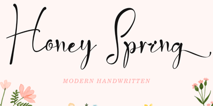 "Honey Spring" is a very natural and elegant handwritten modern font. This font is equipped with lowercase, uppercase, swashes, titling, numerals, punctuations, and multilingual support. Suitable for invitations, weddings, engagements, spring, valentines, and other special occasions.
 - Control spirit by Sulthan Studio,
$12.00 Introducing Control spirit - Bold typeface handwritten font It is suitable for all types of work that you do with various purposes such as logos, wedding invitations, titles, t-shirts, letterheads , signboards, labels, news, posters, badges, etc.
 - Old galaxy by Turto Studio,
$10.00 Old Galaxy is an old fashioned interstellar sci-fi with a twist of good humor geometric display font. It is perfectly suited for traditional media and the web. Great for logos, banners, posters, and graphic artists.
 - Longbranch by Solotype,
$19.95A modern cutting designed to give the appearance of an old wood type. The letters were cut as linoleum blocks about 2 inches high, then duplicated as copper electrotypes. Used for some Ringling Bros. circus work. - John Davidson by Mindtype Co.,
$35.00 Introducing the John Davidson, a beautiful modern calligraphy font with handwritten, sophisticated flows. John Davidson offers beautiful typographic harmony for a diversity of design projects, including logos & branding, wedding designs, social media posts, advertisements & product designs.


