10,000 search results
(0.05 seconds)
- Hermush by Letterhend,
$19.00 Hermush Display is a condensed unique typeface with unusual anatomy. This type of font perfectly made to be applied especially in logo, headline, signage and the other various formal forms such as invitations, labels, logos, magazines, books, greeting / wedding cards, packaging, fashion, make up, stationery, novels, labels or any type of advertising purpose. Features : numbers and punctuation multilingual alternates / swashes and ligatures PUA encoded We highly recommend using a program that supports OpenType features and Glyphs panels like many of Adobe apps and Corel Draw, so you can see and access all Glyph variations. How to access opentype feature : letterhend.com/tutorials/using-opentype-feature-in-any-software/ Email us to letterhend@gmail.com if you need something! Happy Designing!
 - Chevin Pro by G-Type,
$72.00 Chevin is a contemporary rounded type family in 6 weights which was designed with functionality and legibility in mind. With its open counters and slightly condensed style, Chevin can be used for text and is particularly suited to signage. Erik Spiekermann is a fan, noting that Chevin “is charming without being cute, and very legible even in small sizes because of its restrained shapes and simple construction.” Chevin is named after a hill on the outskirts of Otley in West Yorkshire. Since 2007, the type family has been highly prominent in the UK as Royal Mail’s corporate font and the typeface that adorns every Post Office in the country. The Chevin Pro set includes additional Greek and Cyrillic layouts.
 - Nachinta by Letterhend,
$19.00 Nagintha is a handwritten script with natural look and feel. You can use also for headline or signature. This type of font perfectly made to be applied especially in logo, and the other various formal forms such as invitations, labels, logos, magazines, books, greeting / wedding cards, packaging, fashion, make up, stationery, novels, labels or any type of advertising purpose. Features : uppercase & lowercase numbers and punctuation multilingual alternates and ligatures PUA encoded We highly recommend using a program that supports OpenType features and Glyphs panels like many of Adobe apps and Corel Draw, so you can see and access all Glyph variations. How to access opentype feature : letterhend.com/tutorials/using-opentype-feature-in-any-software/
 - Krostenia by Letterhend,
$19.00 Introducing, Krostenia - a monoline script with a touch of vintage look and feel. You will also get 12 detailed hand drawn objects ready to use. This type of font perfectly made to be applied especially in logo, headline, signage and the other various formal forms such as invitations, labels, logos, magazines, books, greeting / wedding cards, packaging, fashion, make up, stationery, novels, labels or any type of advertising purpose. Features : uppercase & lowercase numbers and punctuation multilingual alternates / swashes and ligatures PUA encoded 12 hand drawn objects We highly recommend using a program that supports OpenType features and Glyphs panels like many of Adobe apps and Corel Draw, so you can see and access all Glyph variations.
 - Carton by Nowak & Degeilh,
$45.00 Carton is a font family whose origin comes from his Display version, which is made up of a parallelepiped in isometric projection on a large grid. The Carton type family boasts an entire range of original forms with a number of different constraints other than calligraphic strokes or modular construction techniques. The constraints chosen in the process of creating this alphabet allowed us to give it specific features which would lead to the development of a coherent family of type. The design of the Bold and Regular departs from the earlier strict geometrical forms and increases in contrast and complexity. It paved the way for the creation of a thinner character for the reading of ordinary texts.
 - Hinzatis by Aga Silva,
$39.99 It is up to you how big and voluptuous statement you will be making with this font, as Hinzatis is about old Hollywood glamour and attitude. With lots of options encoded in handy open type files you can easily fine-tune your text for best visual effect. Looks perfect when placed as: titles, headers, labels, names, business cards, just to name a few. Open-type Pro version features 1200 + characters including initial and terminal letters, numerous caps styles, ligatures and alternates. Other versions feature over 1000+ characters and focus mostly on foreign languages with accented letters (incl. Vietnamese); So depending on option you choose you can create realistic and multilingual hand-calligraphy on all of your creations!
 - MFC Brass Rules Grand by Monogram Fonts Co.,
$9.95 The inspiration source for Brass Rules Grand is a collection of the brass rules from the 1889 “Convenient Book of Specimens” from Franklin Type Foundry in Cincinnati. This is a collection of basic utilitarian brass rules that has been created as combinable and endlessly expanding. Filling the Numerals and all Capital and Lowercase glyph slots are a total of 62 traditional Brass Rule designs, all extendable by combining with other rules, or by extending the pin line by simply typing a dash "-" or ".". A truly sleek and simple utilitarian font for invitations, menus, business cards, and whatnot. Download and view the “MFC Brass Rules Grand Guidebook” if you would like to learn a little more.
 - Stano Sans by Letterhend,
$17.00 Stano is a strong and bold sans serif with a touch of vintage look and feel. This type of font perfectly made to be applied especially in logo, headline, signage and the other various formal forms such as invitations, labels, logos, magazines, books, greeting / wedding cards, packaging, fashion, make up, stationery, novels, labels or any type of advertising purpose. Features : uppercase & lowercase numbers and punctuation multilingual alternates / swashes and ligatures PUA encoded We highly recommend using a program that supports OpenType features and Glyphs panels like many of Adobe apps and Corel Draw, so you can see and access all Glyph variations. How to access opentype feature : letterhend.com/tutorials/using-opentype-feature-in-any-software/
 - Nero by Skinny Type,
$19.00 Nero is built on the Nero framework, our popular family of geometric types. Like the sans-serif Nero letterform, it has two contemporary look and feel styles. Echoing late 20th-century modernism, the Rounded's overall look is clean and sleek, more ephemeral and dynamic than pared-down bourgeois asceticism. Nero's place in font history is a complex one. Praised for their readability and also at the same time their fashionable qualities, they look very modern and nostalgic, easy to read and very stylish, authoritative and fun. Nero and Nero Rounded when combined, offer 2 styles to suit all text types and sizes. Both are excellent for short texts that require a sense of urgency or playfulness.
 - Skiltmaler by Imagi Type,
$15.00 Skiltmaler is the typeface that refers to the style of decorative arts during the Victorian era 1837 to 1901, the Victorian era was the period in which fly poster typography emerged. The large amount of colour in combination with large font sizes were created from movable metal type. As well as being made from wood, this was used to create the two-coloured typefaces. You would imagine this would be specific to the '3D' styled type seen on the poster to create the drop shadow. Skiltmaler works well with normal size text, but it works even better for large displays, short words, or even just to incorporate a few or single characters in a design.
 - Edgeriver by Letterhend,
$16.00 The Edgeriver is a serif display typeface with a touch of vintage look and feel. it was made hand drawn, so it makes looks more natural. it comes with regular and slant version. This type of font perfectly made to be applied especially in logo, headline, signage and the other various formal forms such as invitations, labels, logos, magazines, books, greeting / wedding cards, packaging, fashion, make up, stationery, novels, labels or any type of advertising purpose. Features : uppercase & lowercase numbers and punctuation multilingual alternates / swashes and ligatures PUA encoded We highly recommend using a program that supports OpenType features and Glyphs panels like many of Adobe apps and Corel Draw, so you can see and access all Glyph variations.
 - Chevin Std by G-Type,
$60.00 Chevin is a contemporary rounded type family in 6 weights which was designed with functionality and legibility in mind. With its open counters and slightly condensed style Chevin can be used for text and is particularly suited to signage. Erik Spiekermann is a fan, noting that Chevin “is charming without being cute, and very legible even in small sizes because of its restrained shapes and simple construction.” Chevin is named after a hill on the outskirts of Otley in West Yorkshire. Since 2007 the type family has been highly prominent in the UK as Royal Mail’s corporate font and the typeface that adorns every Post Office in the country. The Chevin Pro set includes additional Greek and Cyrillic layouts.
 - Chillday Script by Letterhend,
$19.00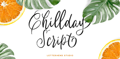 Introducing, Childay Script. A beautiful and unique modern calligraphy script typeface. This type of font perfectly made to be applied especially in logo, and the other various formal forms such as invitations, labels, logos, magazines, books, greeting / wedding cards, packaging, fashion, make up, stationery, novels, labels or any type of advertising purpose. Features : uppercase & lowercase numbers and punctuation multilingual swashes and ligatures alternates PUA encoded We highly recommend using a program that supports OpenType features and Glyphs panels like many of Adobe apps and Corel Draw, so you can see and access all Glyph variations. How to access opentype feature : letterhend.com/tutorials/using-opentype-feature-in-any-software/ Email us to letterhend@gmail.com if you need something! Happy Designing!
 - Monstain by Letterhend,
$19.00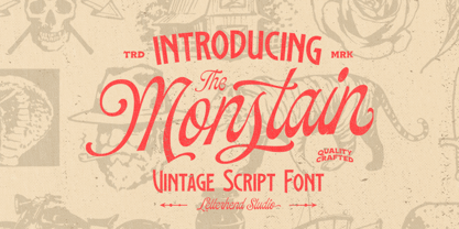 Introducing, The Monstain - a script with a touch of vintage look and feel. You will also get several detailed hand drawn objects ready to use. This type of font perfectly made to be applied especially in logo, headline, signage and the other various formal forms such as invitations, labels, logos, magazines, books, greeting / wedding cards, packaging, fashion, make up, stationery, novels, labels or any type of advertising purpose. Features : uppercase & lowercase numbers and punctuation multilingual alternates / swashes and ligatures PUA encoded hand drawn objects We highly recommend using a program that supports OpenType features and Glyphs panels like many of Adobe apps and Corel Draw, so you can see and access all Glyph variations.
 - Schwennel by Linotype,
$29.00Linotype Schwennel is part of the Take Type Library, selected from the contestants of Linotype’s International Digital Type Design Contests of 1994 and 1997. This prize-winning font was designed by the German artist Svenja Voss. The figures seem to have been somehow eroded, parts of some strokes are completely missing, contours seem washed away. The eye works to put the pieces together to form a meaningful series of figures. The second weight, lila+negro, completes the letter fragments of the lila weight. Missing pieces are filled in and contours completed, making the resulting text stronger and a bit more legible. Linotype Schnwennel is intended exclusively for headlines in larger point sizes. - Gladick Display by Dora Typefoundry,
$17.00 Gladick is a modern take on a sans style typeface but mixes in the added contrast of serifs to make the font contemporary and memorable. Each letter is crafted with care to make your text unique yet stylish. Soft curves make for a bold type Now with the addition of italics. Great for fashion branding and editorial design. Features: All Uppercase and Lowercase Number & Symbol Supported Languages Alternates and Ligatures PUA Encoded This type of family has become the work of true love, making it as easy and fun as possible.I really hope you enjoy it! if you have any questions or problems please contact email:doratypefoundry@gmail.com Thank you and good job.
 - The Randi by Letterhend,
$19.00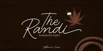 Introducing, The Randi - A monoline handwritten script with classy look. This type of font perfectly made to be applied especially in logo, and the other various formal forms such as invitations, labels, logos, magazines, books, greeting / wedding cards, packaging, fashion, make up, stationery, novels, labels or any type of advertising purpose. Features : uppercase & lowercase numbers and punctuation multilingual swash and ligature alternates PUA encoded We highly recommend using a program that supports OpenType features and Glyphs panels like many of Adobe apps and Corel Draw, so you can see and access all Glyph variations. How to access opentype feature : letterhend.com/tutorials/using-opentype-feature-in-any-software/ Email us to letterhend@gmail.com if you need something! Happy Designing!
 - Dountyland by Letterhend,
$19.00 The Dountyland is a bold monoline script with a touch of vintage look and feel. This type of font perfectly made to be applied especially in logo, headline, signage and the other various formal forms such as invitations, labels, logos, magazines, books, greeting / wedding cards, packaging, fashion, make up, stationery, novels, labels or any type of advertising purpose. Features : uppercase & lowercase numbers and punctuation multilingual alternates / swashes and ligatures PUA encoded We highly recommend using a program that supports OpenType features and Glyphs panels like many of Adobe apps and Corel Draw, so you can see and access all Glyph variations. How to access opentype feature : letterhend.com/tutorials/using-opentype-feature-in-any-software/
 - Celebrity by Canada Type,
$24.95 Celebrity is a new execution of a film type concept put forth by Willy Wirtz in 1971. The original idea, called Latus, had many irregularities and unfit characters that are now fixed and expanded in this digital version. Celebrity's construct combines extreme thicks with hairline thins to build forms that contribute to a type totality that is at once modern and techno, as well as retro-deco. Eye catching and memorable, Celebrity is ideal for use on posters, book covers, media sleeves and packaging. It also has enough geometric appeal to inspire unique logos and set attractive titling. Celebrity comes in all popular font formats, and includes a very expanded Latin character set.
 - Redberries by Letterhend,
$19.00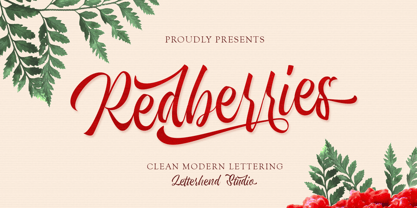 Introducing, Redberries Script. A beautiful and unique modern calligraphy script typeface. This type of font perfectly made to be applied especially in logo, and the other various formal forms such as invitations, labels, logos, magazines, books, greeting / wedding cards, packaging, fashion, make up, stationery, novels, labels or any type of advertising purpose. Features : uppercase & lowercase numbers and punctuation multilingual swashes and ligatures alternates PUA encoded We highly recommend using a program that supports OpenType features and Glyphs panels like many of Adobe apps and Corel Draw, so you can see and access all Glyph variations. How to access opentype feature : letterhend.com/tutorials/using-opentype-feature-in-any-software/ Email us to letterhend@gmail.com if you need something! Happy Designing!
 - Alternate Gothic by Linotype,
$20.99 Alternate Gothic was designed by Morris Fuller Benton for American Typefounders Company in 1903. All three weights of Alternate Gothic are bold and narrow. In fact, this face is essentially a condensed version of Benton’s other well-known sans serif types, Franklin Gothic and News Gothic. In the early twentieth century, the modern concept of type “families” had not yet been formed — and though Benton designed these sans serifs to harmonize with each other, the foundry gave them different names. Robust, dark, and coolly competent, Alternate Gothic is a good choice when strong typographic statements must fit into tight spaces. As a modern usage, it is currently the font of YouTube’s homepage logo.
 - Stay Strong by Letterhend,
$15.00 Stay Strong is a hand drawn dry brush script which is purposely made for headline, display or logotype, and signature. This type of font perfectly made to be applied especially in logo, and the other various formal forms such as invitations, labels, logos, magazines, books, greeting / wedding cards, packaging, fashion, make up, stationery, novels, labels or any type of advertising purpose. Features : uppercase & lowercase numbers and punctuation multilingual alternates & ligatures PUA encoded We highly recommend using a program that supports OpenType features and Glyphs panels like many of Adobe apps and Corel Draw, so you can see and access all Glyph variations. How to access opentype feature : letterhend.com/tutorials/using-opentype-feature-in-any-software/
 - ALS Gross Kunst by Art. Lebedev Studio,
$63.00 Gross Kunst is a humanist sans-serif with an open aperture, sharp outlines, and eye-catching details that make this full of character typeface very recognizable. The type family has three fonts based on wide pen strokes. Depending on its purpose the styles differ in expressiveness and the level of ornamentation. Regular style—low-contrast and neutral—is the most natural choice for body-text. The display face is more dynamic and gets higher contrast. It's very legible from a distance and would do its best on navigational and warning signage, plates, and such. Eloquent straight italics will adorn titles, announcements, and pages with ads. This typeface was acknowledged at the international type design competition Modern Cyrillic '99.
 - Journal by ParaType,
$25.00 Journal type family is a low-contrast text face of the Ionic-Legibility group. It was designed at the Polygraphmash Type Design Bureau in 3 styles in 1951–53 by Lev Malanov and Elena Tsaregorodtseva. The fonts were based on Cyrillic version of Excelsior that was developed in 1936 in Moscow by professor Michael Shchelkunov, Nikolay Kudryashev et al., that in its turn was based on Excelcior by Chauncey H. Griffith, 1931, Mergenthaler Linotype. Digital version was developed in ParaGraph (ParaType) in 1991. In 2012–13 designer Natalia Vasilyeva made some corrections in original digital data, extended character set and add bold italic style. The family was rereleased in ParaType in 2013.
 - Dry Erase by Zap Studio,
$20.00 This font is my first attempt at typeface design. It is based on my own handwriting and I tried to maintain the natural quality, where the letters are quite loose, some going in different directions, thickness and position. It has Open Type features including contextual alternatives, stylistic sets and ligatures. Trying to maintain natural quality of handwriting each glyph has four styles which randomly appear when you type. For example, when there are double letters, the two letters are slightly different. You may also switch off the random feature and use the four styles on their own. The many alternates are best activated in OpenType-aware programs, such as Word 2010, Illustrator CS4+, InDesign CS4+ and QuarkXpress 7+.
 - Istoria by Hooper Type,
$12.00 New foundry on the block, Hooper Type, kicks off it's catalogue with a versatile, story-telling serif font. With a love of the magical and a yearning for adventure, Istoria pushes away from the static, drawing in whisps and whirls that entice and excite, without distracting. Unassuming in it's long form, with delicate strokes that draw the eye, it commands attention when used in short punchy titles, or set in caps. Istoria (meaing both history and story in Greek) delights in having unusual curves, curvy straights and twisty feet which emulate those adventures and myths from days gone by. Type shouldn't interfere with the content, but it absolutely can enhance it. Hope you enjoy it!
 - FS Industrie Variable by Fontsmith,
$279.99Changing nature of work FS Industrie is an extraordinarily versatile new type system, with 70 variants built around five different widths and seven different weights. Type in the future will be increasingly variable, and FS Industrie is specifically designed to address the changing needs of brands. As more of the things we make exist primarily in a digital space, so our need to create type that can adapt within that space grows. It is the spirit of variable design, adaptation and flexibility that drove us to create FS Industrie. A typeface for future work in a future world. FS Industrie is a response to the changing nature of type, for brands that are responding to the changing nature of work. Industrial style Stylistically, FS Industrie feels direct and simple without sacrificing its humanity. It takes inspiration from German fonts of the 1930s, with their roots in manufacturing and signage. A classic sense of functional utility combined with a progressive view of where type is heading. Expressions in width A fundamental challenge with variable type is to ensure that craft and precision is preserved at every interval. Each width and weight is drawn by hand, with subtle variations in terminals and angles as you progress through the system. This ensures each variant can play to its unique strengths, while also pairing perfectly with its siblings. From the closed terminals of the Condensed and the open terminals of the Extended. FS Industrie is a design system that maintains a practical, grounded and robust tone throughout every variable style. Variable nature The 70 styles offer a range of expression. Each width contrasts with the next to clearly define typographic roles in graphic layouts. Every glyph is crafted with adaptability and scalability in mind, creating a pliable design space for the user. The proportions of each letterform flex as weight scales up, stem weights increase as letter width broadens. These subtle design changes create an optically consistent visual impression. - FS Industrie by Fontsmith,
$50.00 Changing nature of work FS Industrie is an extraordinarily versatile new type system, with 70 variants built around five different widths and seven different weights. Type in the future will be increasingly variable, and FS Industrie is specifically designed to address the changing needs of brands. As more of the things we make exist primarily in a digital space, so our need to create type that can adapt within that space grows. It is the spirit of variable design, adaptation and flexibility that drove us to create FS Industrie. A typeface for future work in a future world. FS Industrie is a response to the changing nature of type, for brands that are responding to the changing nature of work. Industrial style Stylistically, FS Industrie feels direct and simple without sacrificing its humanity. It takes inspiration from German fonts of the 1930s, with their roots in manufacturing and signage. A classic sense of functional utility combined with a progressive view of where type is heading. Expressions in width A fundamental challenge with variable type is to ensure that craft and precision is preserved at every interval. Each width and weight is drawn by hand, with subtle variations in terminals and angles as you progress through the system. This ensures each variant can play to its unique strengths, while also pairing perfectly with its siblings. From the closed terminals of the Condensed and the open terminals of the Extended. FS Industrie is a design system that maintains a practical, grounded and robust tone throughout every variable style. Variable nature The 70 styles offer a range of expression. Each width contrasts with the next to clearly define typographic roles in graphic layouts. Every glyph is crafted with adaptability and scalability in mind, creating a pliable design space for the user. The proportions of each letterform flex as weight scales up, stem weights increase as letter width broadens. These subtle design changes create an optically consistent visual impression.
 - Mikanu by Twinletter,
$17.00 Mikanu is ideal for projects with a classic modernism serif vibe. This font’s exquisite and refined features can bring a touch of sophistication to your designs. Mikanu includes complex features such as ligatures and alternates to make your text more intriguing and unique. Not only that, but the Mikanu typeface supports multilingualism, allowing it to be utilized in a variety of languages around the world. As a result, you can quickly modify this typeface for other projects. By selecting Mikanu as the font for your project, you will receive a high-quality product that will enhance the visual message you want to portray. Use Mikanu right away to add aesthetic value to your design! What’s Included : - File font - All glyphs Iso Latin 1 - Alternate, Ligature - Simple installations - We highly recommend using a program that supports OpenType features and Glyphs panels like many Adobe apps and Corel Draw so that you can see and access all Glyph variations. - PUA Encoded Characters – Fully accessible without additional design software. - Fonts include Multilingual support
 - Airport Cyr - Unknown license

- Tent Show JNL by Jeff Levine,
$29.00 Call the lettering French Clarendon Condensed, call it circus lettering, wanted poster type or Old West letters, the style of this typeface is one of the most recognizable and evokes all of the above images and more. Tent Show JNL was re-drawn from examples of a vintage set of wood type, and contains all of the eccentricities that are present in these hand-routed classic letter forms.
 - Old Claude LP by LetterPerfect,
$39.00 Old Claude was drawn by Paul Shaw to simulate an old cut of the classic (Claude) Garamond type designs of the 16th & 17th centuries. The pronounced rough edges and coarse letter shapes create the effect of letterpress printing with old foundry type onto handmade paper. The companion Old Claude Expert includes small caps and old-style figures. This "antiqued" design works equally well for both text and display.
 - Library Book Initials JNL by Jeff Levine,
$29.00 Library Book Initials JNL was modeled from examples of Sidney Gaunt's Publicity Initials; originally sold in metal type by Barnhart Brothers and Spindler as a companion to the Publicity Gothic typeface. The smoothed-down lines of the original characters allow for these initials to balace better when set against complementary type faces. A regular version is on the upper case keys, with an oblique version on the lower case keys.
 - Wood Rounded JNL by Jeff Levine,
$29.00 This reinterpretation of Caslon Rounded showcases one of the early attempts of type foundries to create a novelty ‘rounded’ typeface for general use. While the lettering might easily convey a more modern look of 1960s or 1970s pop typography, its roots definitely lay in the later part of the 19th Century and the heyday of wood type design. Wood Rounded JNL is available in both regular and oblique versions.
 - Barnum by Victory Type,
$9.00 Victory Type is proud to present the release of another classic American typeface. Originally a wood-type, Barnum evokes circus wagons and wanted posters from the wild west. Rugged, rustic, old-fashioned and full of character, Barnum is a charming blast from the past and great for headlines and signage. This chunky slab-serif alphabet was digitized and expanded to include full punctuation and European characters by Noah Rothschild.
 - Beer Joint JNL by Jeff Levine,
$29.00 A vintage photograph of the Man at the Wheel Saloon in San Pedro, CA [circa 1895] provided an excellent type design source with the unusual lettering on the bar’s sign. Basically a spurred serif design, the unusual characteristic of the type style is the ‘bumps’ or ‘dots’ on the tops of each letter. This has been redrawn digitally as Beer Joint JNL, and is available in both regular and oblique versions.
 - Hoosegow JNL by Jeff Levine,
$29.00Sagebrush John, your bank robbin' days are over. I'm throwin' you in the hoosegow! Hoosegow JNL isn't a small town jailhouse, but it is Jeff Levine's take on a classic wood type that brings out the Old West in any design layout. The beauty of many of these vintage wood type alphabets is their "imperfect" letter forms - giving your work a touch of the old days of letterpress printing. - Align Vertical Mono by Mom,
$89.00 Align Vertical Mono has an innovator construction which gives to the designer the ability to align the letters creating beautiful patterns on the page. It was design by the Tyner (typography Designer) Pedro Mascarenhas to fill a gap in type design. With Align Mono Family type will be the leading role of the design. The final result of the art work depends of the choices designer makes for each glyph.
 - Suerte by Resistenza,
$39.00 Say hello to Suerte. This new typeface with inverted contrast and bifurcated serifs was inspired by Caslon’s Italian type and by Aldo Novarese’s Estro, published by the turinese foundry Nebiolo. Our aim was to develop a wood type typeface adding a new personality incorporating Tuscan serifs. The complete alphabet was designed with a flat long brush and Indian ink and then vectorized. Suerte contains a big set of icons and dingbats.
 - Graffick by Graffiti Fonts,
$12.99 Graffick is a mechanical style created by merging a little traditional type design & typography with a little basic graffiti lettering theory. Extra ascenders and descenders have been added to many of the capital letters to add a more varied & specialized appearance. This layered type system provides for the easy creation of outline/fill effects with regular, italic, wide and outline styles as well as baseline & caps-height alignment options.
