5,419 search results
(0.013 seconds)
- Midas Style by Sensatype Studio,
$15.00 Midas Vintage Retro Ligature Font is a well-balanced contemporary font with a fancy, unique, and versatile vintage serif, font that you can combine to get any variations and unique shapes easily just in seconds with choose alternates of them. I What's Included: Character set A-Z Uppercase & Lowercase Numerals & Punctuation Accented Characters (West Europe) Stylistic alternates Works on PC & Mac Recommended using Adobe Illustrator or Adobe Photoshop. Wish you enjoy our font. :)
 - Balloon Duwoor by Sealoung,
$12.00 Balloon Duwoor is a cute and playful display font. It looks wonderful on a variety of designs, both formal and informal. Whether you’re using it for crafting, digital designS, presentations or greeting cards, it’s perfect! What's Included: - glyphs - Works on PC & Mac - Simple installation - Can be accessed in Adobe Illustrator, Adobe Photoshop, Affinity Design. - Fonts include multilingual support. Thank you very much, this font will make your project easier. Saiful Anwar - Sealoung studio
 - Cotton Kindly by Clevus,
$14.00 Proudly present Cotton Kindly Typeface, created by ClevUs, A serif modern and classic typeface that has own unique style & modern look. This typeface is perfect for an elegant & luxury logo, book or movie title design, fashion brand, magazine, clothes, lettering, quotes, and so much more. Product Content : Features : Uppercase and Lowercase Numerals Punctuations (OpenType Standard) Accents (Multilingual Characters) Ligatures and Alternative Style Stylistic Set Works on PC and Mac Simple installations Thank You.
 - Baby Cakes NF by Nick's Fonts,
$10.00This robust, roly-poly typeface is patterned after a 1974 release from the Ludwig & Mayer foundry of Frankfurt am Main named Big Band, and designed by Karlgeorg Hoefer. The type color is even darker than the original, and the result is a delightful face that will definitely attract attention. The PC Postscript, Truetype and Opentype versions contain the complete Latin language character set (Unicode 1252) plus Central European (Unicode 1250) languages as well. - Whale Show by Olivetype,
$18.00 Whale Show is a fun display font with a youthful, whimsical, and bubbly feel, great if you need to create a friendly, playful mood in your design. This font is also quite versatile and easy to work with. You can use it for logos, posters, headlines, etc. So what’s included : Basic Latin Uppercase and Lowercase Numbers, symbols, and punctuations Multilingual Support. Fully accessible without additional design software Simple Installations Works on PC & Mac Thank You.
 - Dynamic Wave by EKNOJI,
$15.00 DYNAMIC WAVE - Display Retro Font It is perfect Bold Display Font for branding, logo, every other design which needs a Dsiplay. What you get? Character set A-Z Character set a-z Support multi-language glyphs Works on PC & Mac Simple installations Accessible in the Adobe Illustrator, Adobe Photoshop, Adobe InDesign, even work on Microsoft Word. Please kindly message us for any question or issue about our product. Hope you love it!!
 - Wild Game by Olivetype,
$18.00 Wild Game is a bold and playful typeface to add a playful edge to your design. It’s dynamic, modern, and instantly recognizable, making it ideal for posters, headlines, and branding. With its bold letterforms that stand out from the crowd, Wild Game creates an impactful statement for your project. Features : Basic Latin Uppercase and Lowercase Numbers, symbols, and punctuations Multilingual Support. Fully accessible without additional design software Simple Installations works on PC & Mac Thank You
 - Welth Catritz by Typetemp Studio,
$16.00 Welth Catritz Serif Typeface is a stylish font It has both Classic Modern look. Comes with alternatives and ligatures, helps to create stunning logos, quotes, posts, blog posts. branding projects, magazine imagery, wedding invitations, and much more. WHAT YOU GET: Unique Letterforms Works on PC & Mac Simple Installations Accessible in the Adobe Illustrator, Adobe Photoshop, Microsoft Word Fully accessible without additional design software. To generate all ligatures, please open Adobe Ilustrator/Photoshop - Type - Glyphs.
 - Sergel by T4 Foundry,
$21.00Tobias Sergel was the greatest Swedish sculptor and draughtsman of the 18th century. The typeface that carries his name has a sculptural quality, with the white line decorating the stems and curves of the letters. "However," says Bo Berndal, the designer of Sergel, "the general shape of the typeface is timeless". The Sergel fontpack includes four fonts: Regular, Italic, Semibold and Semibold Italic, and is an OpenType typeface for both PC and Mac. - Fierce by Sensatype Studio,
$15.00 Fierce is a Futuristic Sport Font that special created for Sport and Technology design needs with Modern style. A New Sport font that we created special for Modern branding needs, with Futuristic style that ready to add value of your brand. Fierce Futuristic Sport Font ready with: Uppercase and Lowercase characters Numbers and Punctuations Preview as a inspirations that you can do with Fierce font Available for PC and Mac Wish you enjoy our font. :)
 - Buttershine Serif by Typestory,
$25.00 Buttershine is a bold, beautiful and versatile duo font (serif and script). It looks beautiful on a variety of designs requiring a personalized style, such as wedding invitations, thank you cards, weddings, greeting cards, logos and so on. What’s Included : Ligature, Alternate & Swashes Works on PC & Mac Simple installations Accessible in the Adobe Illustrator, Adobe Photoshop, Adobe InDesign, even work on Microsoft Word. PUA Encoded Characters – Fully accessible without additional design software.
 - Debaya by Sensatype Studio,
$15.00 Debaya is an Old Retro Vintage Font An Old Retro Vintage font that special created with Display style for Headline Vintage Retro Project, Unique branding needs, with extra alternates in unique style that ready to add value of your brand. Debay Old Retro Vintage Font ready with: Lowercase and Uppercase characters Numbers and Punctuations Preview as a inspirations that you can do with Montainous font Available for PC and Mac Wish you enjoy our font.
 - Solvetta by Grezline Studio,
$12.00 Solvetta is a light and charming handwritten font with a unique feel. It will add a bold feel to any design project! You can use Solvetta font to make a logo for branding, typography design, magazine or book cover, website header, product packaging, invitation, quotes, t-shirt design, label poster and more. Feature : - Multilingual Language - Works on PC & Mac - Simple installations - Accessible in the Adobe Illustrator, Adobe Photoshop, Adobe InDesign, even works on Microsoft Word.
 - Squid Ninja by Epiclinez,
$18.00 Squid Ninja is a bold, fun display font with unique characters and playful vibes. It's a good choice for creating exciting logotypes, eye-catching headlines, catchy titles, and more. Squid Ninja offers a wide range of possibilities to make your work look dynamic and more enjoyable. Squid Ninja font includes : Basic Latin Uppercase and Lowercase Numbers, symbols, and punctuations Multilingual Support. Simple Installations & Works on PC & Mac Thank You and happy designing!
 - Archapolago by HIRO.std,
$16.00 Archapelago is semi casual bold script This font describes about boldy, stylist, fun and elegant, catchy, dynamic, sporty, readable, easy to use FEATURES - Support Opentype Features - Stylistic alternates - Swash alternates - Numbering and Punctuations - PUA Encoded Characters - Multilingual Support - Works on PC or Mac USE Archapelago works great in any logotype, magazines, apparel, poster, advertisements, product packaging, product designs, label, and any projects that need semi casual and bold style. Enjoy using! Thanks. HIRO.std
 - Discolicious by Hanoded,
$15.00 Put the needle in the groove and jive baby! Discolicious brings back the golden age of moustaches and sideburns, psychedelic tie-dyes and bell bottoms. Use this ‘bubblegum’ disco font for your product packaging, magazines and party posters and they’ll look off the hook! Comes with a primo amount of diacritics, so you can let it all hang out! Word!
 - Jefferson Pilot NF by Nick's Fonts,
$10.00One in the series of fonts called Whiz-Bang Wood Type, intended to be set large and tight. Jefferson Pilot’s unusual letter treatment isn't for every project, but for projects that need a great "old-timey" look, it’s perfect. Named for a city in East Texas that was a port city on the late 1800s, but today is landlocked. Both versions of this font contain the Unicode 1252 Latin and Unicode 1250 Central European character sets, with localization for Romanian and Moldovan. - Kingbirds by Letterhend,
$14.00 Kingbirds! The 6 styles of monoline script! Tired of ordinary monoline script? Now we are proudly presenting you a one-of-a-kind monoline script that has six styles of monoline which will satisfy all your design needs. Playful theme? Elegant theme? Vintage theme? you name it. This typeface comes with many opentype features such as ligatures, stylistic set alternate, etc and also support multilingual. You also will get ready to use logo template that you can edit the text easily.
 - Litto by VladB,
$12.00 The name of the font is taken from the concept "Littoral zone" - this is the part of the sea that is close to the shore. The width of the shore varies as a result of the tides. Hence the idea of my font family — changing the width of a character from condenced to extra expanded. Litto is a modern sans serif geometric font, includes upper and lower case characters, Latin and Cyrillic. Graphically, the characters have uniform thickness for all family.
 - BLT Heirloom by Black Lab Type,
$19.00 Heirloom grew from an interest of soft and friendly forms from the 1970s, with respect to the time's chill vibes and natural earthy roots. Its refined approachable characteristics allow it to be very readable carry a modern relaxed attitude. Available in 3 weights: Light, Regular and Bold. Any weight can be used as a display type, logotype and/or headlines, and lighter weights would work in bodies of text. The font pairs well with natural, historical or vintage graphic elements.
 - Palitura by Michael Rafailyk,
$9.00 Palitura is a display typeface designed to translate Cyrillic flavor into the Latin script. Palitura means lacquered book cover in Old Ukrainian. The design of letter shapes is inspired by Early Cyrillic handwritten letters and Ukrainian patterns that are conveyed through the sharpness of form, vertical strokes that are narrower at the bottom, stylized oblique hooks at the top, and triangular accents. Languages: 480+. Scripts: Latin, Greek, Cyrillic. Specimen: michaelrafailyk.com/typeface/specimen/Palitura.pdf The promo images used photo of Tima Miroshnichenko from Pexels.
 - Rigor Mortis by Comicraft,
$19.00 Here's a Collector's Item Classic for all our fiends! Sit up in your Caskets and we'll help you spin a Shocking, Suspense-filled Tale of Terror with a font Bad Bad Leroy "JG" Brown found in the Vault! Give us your grimy little dimes and come down into the Crypt with us. We call this rotten little font... RIGORMORTIS! AHAHAHHAHHHAHHHHAHA-HAH-haa... Features: Four weights (Regular, Italic, Bold & Bold Italic) with alternate uppercase characters. Includes Western and Central European international characters.
 - Hollyhock by Angie Makes,
$32.00 Meet Hollyhock, a modern and messy calligraphy font with wild, tall letterforms that refuse to be tamed. Inspired by calligraphy the breaks the rules and hollyhocks that grow rebelliously where they please. This font includes two full sets of capital letters… a set that is tall, energetic, and wild as well as a set a bit more tame and subdued. Open type features in this font include contextual alternates, fractions, ordinals, discretionary ligatures, and swashes. Use contextual alternates to add subtle swashes to the beginnings and ends of your letters. Use your open type swashes panel to use the many and various doodles, swirls, and swashes to manually add flare and flavor to your text. Or, install the separate Hollyhock Ornaments font to access the swashes and doodles more easily. Most Diacritics included for various language support. Message me if there’s one you're not sure is included. This font works best in OpenType aware software (ie. Adobe Applications) so that you can take advantage of its many features. Comes as two .otf (OpenType font) files. See this tutorial for more on how to add the various swashes and doodles to this font! http://angiemakes.com/add-swashes-fonts-photoshop/
 - Smart Casual by Scholtz Fonts,
$21.00 The name "Smart Casual" says it all. This is the font to use when you want to create that smart impression without being too formal. It is based on the font "Black Tie" but it is less formal than "Black Tie". It conveys an impression of relaxed elegance without being either sloppy or too intimate. Smart Casual is ideal for invitations to stylish but relaxed events, for advertisements that are intended to create that special ambience, for posters and for announcements. Smart Casual has a full character set and has been carefully letter-spaced and kerned. It comes in two styles: Baseline and Staggered. In "Baseline" all characters refer to the same baseline (the lower part of the characters are in line), while in "Staggered" the capitals are placed lower than the lower case characters, creating a slightly more dramatic, yet formal and retro look.
 - Zebramatic by Harald Geisler,
$14.99 Zebramatic - A Lettering Safari Zebramatic is a font for editorial design use, to create headlines and titles in eye-catching stripes. Constructed to offer flexible and a variety of graphical possibilities, Zebramatic type is easy to use. The font is offered in three styles: POW, SLAM and WHAM. These styles work both as ready-made fonts and as patterns to create unique, individualized type. The font design’s full potential is unleashed by layering glyphs from two or all three styles in different colors or shades. Working with the different styles I was reminded of the late Jackson Pollock poured paintings—in particular the documentation of his painting process by Hanz Namuth and Paul Falkernburg in the film Jackson Pollock 51. In Pollock’s pictures the complex allure arises from how he layered the poured and dripped paint onto the canvas. Similar joyful experience and exciting results emerge by layering the different styles of Zebramatic type. Texture In the heart of the Design is Zebramatics unique texture. It is based on an analog distorted stripe pattern. The distortion is applied to a grade that makes the pattern complex but still consistent and legible. You can view some of the initial stripe patterns in the background of examples in the Gallery. Zebramatic POW, SLAM and WHAM each offer a distinct pallet of stripes—a unique zebra hide. POW and WHAM use different distortions of the same line width. SLAM is cut from a wider pattern with thicker stripes. The letter cut and kerning is consistent throughout styles. Design Concept Attention-grabbing textured or weathered fonts are ideal for headlines, ads, magazines and posters. In these situations rugged individuality, letter flow, and outline features are magnified and exposed. Textured fonts also immediately raise the design questions of how to create alignment across a word and deal with repeated letters. Zebramatic was conceived as an especially flexible font, one that could be used conveniently in a single style or by superimposing, interchanging and layering styles to create a unique type. The different styles are completely interchangeable (identical metrics and kerning). This architecture gives the typographer the freedom to decide which form or forms fit best to the specific project. Alignment and repetition were special concerns in the design process. The striped patterns in Zebramatic are carefully conceived to align horizontally but not to match. Matching patterns would create strong letter-pairs that would “stick out” of the word. For example, take the problematic word “stuff”. If Zebramatic aligned alphabetically, the texture of S T and U would align perfectly. The repeated F is also a problem. Imagine a headline that says »LOOK HERE«. If the letters OO and EE have copied »unique« glyphs - the headline suggests mass production, perhaps even that the designer does not care. Some OpenType features can work automatically around such disenchanting situations by accessing different glyphs from the extended glyph-table. However these automations are also repeated; the generated solutions become patterns themselves. Flip and stack To master the situation described above, Zebramatic offers a different programmatic practice. To eliminate alphabetic alignment, the letters in Zebramatic are developed individually. To avoid repetition, the designer can flip between the three styles (POW, SLAM, WHAM) providing three choices per glyph. Stacking layers in different sequences provides theoretical 27 (3*3*3) unique letterforms. A last variable to play with is color (i.e. red, blue, black). Images illustrating the layering potential of Zebramatic are provided in the Gallery. The design is robust and convenient. The font is easily operated through the main font panel (vs. the hidden sub-sub-menu for OpenType related features). The process of accessing different glyphs is also applicable in programs that do not support OpenType extensively (i.e. Word or older Versions of Illustrator). International Specs Zebramatic is ready for your international typographic safari. The font contains an international character set and additional symbols – useful in editorial and graphic design. The font comes in OpenType PostScript flavored and TrueType Format.
 - Posterama by Monotype,
$40.99 The Posterama™ typeface family contains 63 fonts and is a true journey through space and time. Designed by Jim Ford, each Posterama family contains 7 weights from Thin to Ultra Black, in 9 distinct families. What makes Posterama so unique and versatile are the eight alternative display families. By making use of a collection of alternative glyphs, Posterama sets an evocative flavor to visualize an entire century of futuristic reference points from art, architecture, poster design and science fiction into one family. Posterama Text is the base family. It has the most robust character set including upper and lowercase glyphs and pan-European language support (including Greek and Cyrillic). Note: all the other Posterama variants described below do not have lowercase letters or Greek and Cyrillic support. Posterama 1901 recalls the decoratively geometric style of Art Nouveau from the turn of the 20th century. Letterforms such as the slender, snaking ‘S’, the high-waisted ‘E’ and the underlined ‘O’ revive the spirit of Charles Rennie Mackintosh and the designers of the Viennese Secession. Posterama 1913 pays homage to the Armory Show, or 1913 Exhibition of Modern Art, which brought the revolutionary work of European artists such as Picasso, Duchamp and Kandinsky to the US for the first time to the shock and astonishment of press and public. Near-abstract, angular characters such as the ‘A’, ‘E’ and ‘N’ hint at cubism’s jagged and clashing planes. Posterama 1919 uses a small, but important, variation to set a tone when the Bauhaus was founded, and the surge in radical European typography that followed. The straight-sided, roundheaded ‘A’ adds a flavor of 1919 – this style of ‘A’ can still be seen in the Braun logo, designed in 1934. Posterama 1927 captures the year of Metropolis, The Jazz Singer and Paul Renner’s pioneering, geometric Futura typeface from 1927, which had a profound influence on design in the US and Europe. Posterama 1933 – With its low-waisted, sinuous designs, the Posterama 1933 typeface family echoes lettering of the Art Deco period, which in turn had its roots in Art Nouveau, the key influence on Posterama 1901. The two fonts make a great team and can be used interchangeably. Posterama 1945 features a few Cyrillic characters to conjure up an era when Russian art and political posters made their mark in cold war propaganda, espionage and also giant aliens and monsters. Posterama 1984 takes its typographic influences from George Orwell’s classic novel, publicity for the dystopian action and sci-fi movies (Blade Runner, Videodrome and Terminator) and games like Space Invaders and Pac-Man that made an impact at that time. Posterama 2001 was inspired by Stanley Kubrick’s science fiction masterpiece, which made extensive use of the Futura typeface. Posterama 2001 finds its cosmic orbit with its nosecone-style ‘A’ from NASA’s much-missed ‘worm’ logotype. There’s an echo, too, in Bauhaus designs from as early as 1920, whose minimalist, geometric lettering also featured a crossbar-less ‘A’.
 - Prillwitz Pro by preussTYPE,
$49.00 Johann Carl Ludwig Prillwitz, the German punch cutter and type founder, cut the first classic Didot letters even earlier than Walbaum. The earliest proof of so-called Prillwitz letters is dated 12 April 1790. Inspired by the big discoveries of archaeology and through the translations of classical authors, the bourgeoisie was enthused about the Greek and Roman ideal of aesthetics. The enthusiasm for the Greek and Roman experienced a revival and was also shared by Goethe and contemporaries. »Seeking the country of Greece with one’s soul«. All Literates who are considered nowadays as German Classics of that time kept coming back to the Greek topics, thinking of Schiller and Wieland. The works of Wieland were published in Leipzig by Göschen. Göschen used typefaces which had been produced by until then unknown punch cutter. This punch cutter from Jena created with these typefaces master works of classicist German typography. They can stand without any exaggeration on the same level as that of Didot and Bodoni. This unknown gentleman was known as Johann Carl Ludwig Prillwitz. Prillwitz published his typefaces on 12th April 1790 for the first time. This date is significant because this happened ten years before Walbaum. Prillwitz was an owner of a very successful foundry. When the last of his 7 children died shortly before reaching adulthood his hope of his works was destroyed, Prillwitz lost his will to live. He died six months later. His wife followed him shortly after. The typeface Prillwitz as a digital font was created in three optical styles (Normal, Book and Display). The typeface Prillwitz Press was created especially for a printing in small sizes for newspapers. »Prillwitz Press« combines aesthetic and functional attributes which make written text highly readable. It was originally designed for a newspaper with medium contrast to withstand harsh printing conditions. Its structure is quite narrow which makes this typeface ideal for body text and headlines where space is at premium. For the Normal – even more for the Book – a soft and reader-friendly outline was created through a so-called »Schmitz« and optimized in numerous test prints. The arris character and the common maximal stroke width contrast of the known classicist typefaces (Didot/Bodoni) were edited by the study of the original prints. This was also done in order to reach a very good readability in small type sizes. This typeface is perfectly suited to scientific and belletristic works. Accordingly it has three styles: Regular, Bold and Italic as Highlighting (1). The typeface Prillwitz is a complete new interpretation and continuing development of the conservated originals from 1790. They have been kept in the German Library in Leipzig. It was always given the priority to keep the strong roughness and at the same time optimizing the readability of this striking font. The type family has all important characters for an efficient and typographic high quality work. ----------- (1) Accentuation of particular words or word orders (e.g. proper names, terms etc.). Typographic means for Highlighting could be Italic, SmallCaps or semi-bold.
 - Prismatic Spirals by MMC-TypEngine,
$93.00 PRISMATIC SPIRALS FONT! The Prismatic Spirals Font is a decorative type-system and ‘Assembling Game’, itself. Settled in squared pieces modules or tiles, embedded by unprecedented Intertwined Prismatic Structures Design, or intricate interlaced bars that may seem quite “impossible” to shape. Although it originated from the ‘Penrose Square’, it may not look totally as an Impossible Figures Type of Optical Illusions. More an “improbable” Effect in its intertwined Design, that even static can seem like a source of Kinetical Sculptures, or drive eyes into a kind of hypnosis. Prismatic Spirals has two related families, its “bold” braided version Prismatic Interlaces and the Pro version. While the default is simpler or easier to use, as all piece’s spin in same way, PRO provides a more complex intricate Design which requires typing alternating caps. Instructions: Use the Map Font Reference PDF as a guide to learn the 'tiles' position on the keyboard, then easily type and compose puzzle designs with this font! All alphanumeric keys are intuitive or easy to induce, you may easily memorize it all! Plus, often also need to consult it! *Find the Prismatic Spirals Font Map Reference Interactive PDF Here! (!) Is recommended to Print it to have the Reference in handy or just open the PDF while composing a design with this typeface to also copy and paste, when consulting is required or when it may be difficult to access, depending on the keyboard script or language. As a Tiles Type-System, the line gap space value is 0, this means that tiles line gaps are invisibly grouted, so the user can compose designs, row by row, descending to each following row by clicking Enter, same as line break, while advances on assembling characters. Background History: The first sketches of my Prismatic Knots or Spirals Designs dates back then from 2010, while started developing hand-drawn Celtic Knots and Geometric Drawings in grid paper, while engage to Typography, Sacred Geometry and the “Impossible Figures” genre… I started doing modulation tests from 2013, until around 2018, I got to unravel it in square modules or tiles from the grid, then idealized it as fonts, along with other Type projects. This took 13 years to come out since the first sketches and 6 months in edition. During the production process some additional tiles or missing pieces were thought of and added to the basic set, which firstly had only the borders, corners, crossings, nets, Trivets connectors or T parts and ends, then added with nets and borders integrations. Usage Suggestions: This type-system enables the user to ornate and generate endless decorative patterns, borders, labyrinthine designs, Mosaics, motifs, etc. It can seem just like a puzzle, but a much greater tool instead for higher purposes as to compose Enigmas and use seriously. As like also to write Real Text by assembling the key characters or pieces, this way you can literarily reproduce any Pixel Design or font to its Prismatic Spirals correspondent form, as Kufic Arabic script and further languages and compose messages easily… This Typeface was made to be contemplated, applied, and manufactured on Infinite Decorative Designs as Pavements, Tapestry, Frames, Prints, Fabrics, Bookplates, Coloring Books, Cards, covers or architectonic frontispieces, storefronts, and Jewelry, for example. Usage Tips: Notice that the line-height must be fixed to 100% or 1,0. In some cases, as on Microsoft Word for example, the line-height default is set to 1,15. So you’ll need to change to 1,0 plus remove space after paragraph, in the same dropdown menu on Paragraph section. Considering Word files too, since the text used for mapping the Designs, won't make any literal orthographical sense, the user must select to ignore the Spellcheck underlined in red, by clicking over each misspelled error or in revision, so it can be better appreciated. Also unfolding environments as Adobe Software’s, the Designer will use the character menu to set body size and line gap to same value, as a calculator to fit a layout for example of 1,000 pts high with 9 tiles high, both body size and line gap will be 111.1111 pts. Further Tips: Whenever an architect picks this decorative system to design pavements floor or walls, a printed instruction version of the layout using the ‘map’ font may be helpful and required to the masons that will lay the tiles, to place the pieces and its directions in the right way. Regarding to export PNGs images in Software’s for layered Typesetting as Adobe Illustrator a final procedure may be required, once the designs are done and can be backup it, expanding and applying merge filter, will remove a few possible line glitches and be perfected. Technical Specifications: With 8 styles and 4 subfamilies with 2 complementary weights each (Regular and Bold) therefore, Original Contour, Filled, Decor, with reticle’s decorations and 2 Map fonts with key captions. *All fonts match perfectly when central pasted for layered typesetting. All fonts have 106 glyphs, in which 48 are different keys repeated twice in both caps and shift, plus few more that were repeated for facilitating. It was settled this way in order for exchanging with Prismatic Spirals Pro font which has 96 different keys or 2 versions of each. Concerning tiles manufacturing and Printed Products as stickers or Stencils, any of its repeated pieces was measured and just rotated in different directions in each key, so when sided by other pieces in any direction will fit perfectly without mispatching errors. Copyright Disclaimer: The Font Software’s are protected by Copyright and its licenses grant the user the right to design, apply contours, plus print and manufacture in flat 2D planes only. In case of the advent of the same structures and set of pieces built in 3D Solid form, Font licenses will not be valid or authorized for casting it. © 2023 André T. A. Corrêa “Dr. Andréground” & MMC-TypEngine.
 - Prismatic Interlaces by MMC-TypEngine,
$93.00 PRISMATIC INTERLACES TYPEFACE! Prismatic Interlaces is a decorative system and ‘Assembling Game’, itself. Settled in squared pieces modules or tiles, embedded by unprecedented Intertwined Prismatic Structures Design, or intricate interlaced bars that may seem quite “impossible” to shape. Although it originated from the ‘Penrose Square’, it may not look totally as an Impossible Figures Type of Optical Illusions. More an “improbable” Effect in its intertwined Design, that even static can seem like a source of Kinetical Sculptures, or drive eyes into a kind of hypnosis. Prismatic Interlaces has two related families, both as a kind of lighter weight versions Prismatic Spirals Default & Pro. While Default is simpler or easier to use, same way as Prismatic Interlaces, Pro provides a more complex intricate Design that requires typing alternating caps. Instructions: Use the Map Font Reference PDF as a guide to learn the 'tiles' position on the keyboard, then easily type and compose puzzle designs with this font! All alphanumeric keys are intuitive or easy to induce, you may easily memorize it all! Plus, often also need to consult it! *Find the Prismatic Interlaces Font Map Reference Interactive PDF Here! (!) Is recommended to Print it to have the Reference in handy or just open the PDF while composing a design with this typeface to also copy and paste, when consulting is required or when it may be difficult to access, depending on the keyboard script or language. As a Tiles Type-System, the line gap space value is 0, this means that tiles line gaps are invisibly grouted, so the user can compose designs, row by row, descending to each following row by clicking Enter, same as line break, while advances on assembling characters. Background History: The first sketches of my Prismatic Knots or Spirals Designs dates back then from 2010, while started developing hand-drawn Celtic Knots and Geometric Drawings in grid paper, while engage to Typography, Sacred Geometry and the “Impossible Figures” genre… I started doing modulation tests from 2013, until around 2018, I got to unravel it in square modules or tiles from the grid, then idealized it as fonts, along with other Type projects. This took 13 years to come out since the first sketches and 6 months in edition. During the production process some additional tiles or missing pieces were thought of and added to the basic set, which firstly had only the borders, corners, crossings, nets, Trivets connectors or T parts and ends, then added with nets and borders integrations. Usage Suggestions: This type-system enables the user to ornate and generate endless decorative patterns, borders, labyrinthine designs, Mosaics, motifs, etc. It can seem just like a puzzle, but a much greater tool instead for higher purposes as to compose Enigmas and use seriously. As like also to write Real Text by assembling the key characters or pieces, this way you can literarily reproduce any Pixel Design or font to its Prismatic Spirals correspondent form, as Kufic Arabic script and further languages and compose messages easily… This Typeface was made to be contemplated, applied, and manufactured on Infinite Decorative Designs as Pavements, Tapestry, Frames, Prints, Fabrics, Bookplates, Coloring Books, Cards, covers or architectonic frontispieces, storefronts, and Jewelry, for example. Usage Tips: Notice that the line-height must be fixed to 100% or 1,0. In some cases, as on Microsoft Word for example, the line-height default is set to 1,15. So you’ll need to change to 1,0 plus remove space after paragraph, in the same dropdown menu on Paragraph section. Considering Word files too, since the text used for mapping the Designs, won't make any literal orthographical sense, the user must select to ignore the Spellcheck underlined in red, by clicking over each misspelled error or in revision, so it can be better appreciated. Also unfolding environments as Adobe Software’s, the Designer will use the character menu to set body size and line gap to same value, as a calculator to fit a layout for example of 1,000 pts high with 9 tiles high, both body size and line gap will be 111.1111 pts. Further Tips: Whenever an architect picks this decorative system to design pavements floor or walls, a printed instruction version of the layout using the ‘map’ font may be helpful and required to the masons that will lay the tiles, to place the pieces and its directions in the right way. Regarding to export PNGs images in Software’s for layered Typesetting as Adobe Illustrator a final procedure may be required, once the designs are done and can be backup it, expanding and applying merge filter, will remove a few possible line glitches and be perfected. Technical Specifications: With 8 styles and 4 subfamilies with 2 complementary weights each (Regular and Bold) therefore, Original Contour, Filled, Decor, with reticle’s decorations and 2 Map fonts with key captions. *All fonts match perfectly when central pasted for layered typesetting. All fonts have 106 glyphs, in which 49 are different keys repeated twice in both caps and shift, plus few more that were repeated for facilitating. It was settled this way in order for exchanging with Prismatic Spirals Pro font which has 96 different keys or 2 versions of each. Concerning tiles manufacturing and Printed Products as stickers or Stencils, any of its repeated pieces was measured and just rotated in different directions in each key, so when sided by other pieces in any direction will fit perfectly without mispatching errors. Copyright Disclaimer: The Font Software’s are protected by Copyright and its licenses grant the user the right to design, apply contours, plus print and manufacture in flat 2D planes only. In case of the advent of the same structures and set of pieces built in 3D Solid form, Font licenses will not be valid or authorized for casting it. © 2023 André T. A. Corrêa “Dr. Andréground” & MMC-TypEngine.
 - Taylor Julianne by Grezline Studio,
$15.00 Taylor Julianne is a bold display font with vintage charm. This font was created to give your headlines and logotype projects a strong and confident touch. Taylor Julianne font is also usable in a wide range of works such as logos, covers, posters, quotes, product packaging, merchandise, social media and much more! Feature : - Accompanied by aesthetic ornaments - Multilingual Language - Works on PC & Mac - Simple installations - Accessible in the Adobe Illustrator, Adobe Photoshop, Adobe InDesign, even works on Microsoft Word.
 - Ignazio by Figuree Studio,
$18.00 Ignazio is a powerfull sans serif font family with modern touches. A balance of hard lines and smooth curve makes them able to stand on their own dynamically Ignazio includes all-caps fonts Features - Support for MAC or PC - Simple installation for Adobe Illustrator, Corel Draw, Photoshop, or Procreate (New Updated) - Support Multi-language Ignazio works great in any branding, logos, magazines, films. The different styles give you a full range to explore a whole host of applications.
 - Jekatep by ActiveSphere,
$30.00 Jekatep is a sans-serif display font and works best in text and display applications, such as posters, headline, magazine, logos, titles, product branding, corporate branding and publishing. Jekatep font has three weights; light, regular, and bold, each available in italic, making a total of six styles. Each style has a full upper and lower-case, accents, punctuation and a selection of monetary symbols. Currently Available for Mac and PC, in Open Type, PostScript or TrueType.
 - Rose Malow by Attype Studio,
$15.00 Introducing Rose Malow, a Modern Script Font. Rose Malow is a lovely font: it is perfect for branding, logos, invitations, stationery, wedding designs, social media posts, handwritten quotes, product packaging, merchandise, blog design, Book/Cover Title and more. What's Included : - Rose Malow (.otf/.ttf) - Multilingual Support - More than 50 ligatures - Works on PC & Mac - Simple installations - Accessible in the Adobe Illustrator, Adobe Photoshop, Adobe InDesign Thank you for your purchase! Hope you enjoy with our font!
 - Fiddle Sticks NF by Nick's Fonts,
$10.00The roly-poly serifs, inspired by West Banjo, designed by Dave West, add such irrepressible charm to this typeface that you just want to pinch its little cheeks, if you are so inclined. Equally at home in the 1960s, when it was originally released, as the 1860s, from which it drew its inspiration. The PC Postscript, Truetype and Opentype versions contain the complete Latin language character set (Unicode 1252) plus support for Central European (Unicode 1250) languages as well. - Amanllor by Juncreative,
$15.00 Amanllor is a thin lettered and graceful script font. Fall for its ravishing style and use it to create gorgeous wedding invitations, beautiful stationary art, eye-catching social media posts, and much more! Amanllor is PUA encoded which means you can access all glyphs and swashes with ease! FEATURES Alternate Characters Uppercase and Lowercase letters Numbering and Punctuations Multilingual Support Works on PC or Mac Simple Installation Support Adobe Illustrator, Adobe Photoshop, Adobe InDesign, also works on Microsoft Word
 - Mollies by ErlosDesign,
$10.00 Mollies is an elegant and luxurious sans serif font. Trendy and stylish, this font will elevate each of your creations. Mollies is PUA encoded which means you can access all of the glyphs and swashes with ease! The file you will get is: • Works on PC & Mac • Simple installation • Can be accessed in Adobe Illustrator, Adobe Photoshop, Adobe InDesign, and even works in Microsoft Word. • Encoded PUA Character - Can be accessed completely without additional design software. Enjoy!
 - Julietta Madelyne by Grezline Studio,
$17.00 Julietta Madelyne is a delicate brush script font. You can use this font in a wide range of works such as logos, covers, posters, quotes, product packaging, merchandise, social media and much more! This font is already PUA encoded so you can access the alternate glyph very easily. Feature : Alternate Glyphs Multilingual Language Works on PC & Mac Simple installations Accessible in the Adobe Illustrator, Adobe Photoshop, Adobe InDesign, even works on Microsoft Word. Thank you for your support.
 - Wallgain by Keristyper Studio,
$14.00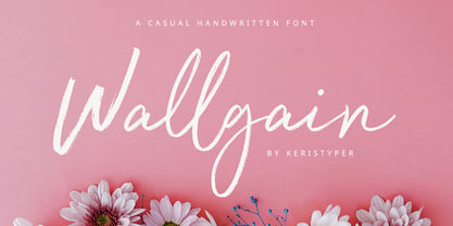 Introducing Wallgain A rustic, dapper handwritten font with a personal touch. With quick dry strokes and a signature style. Wallgain Handwriting Font multilingual support: Afrikaans, Albanian, Catalan, Danish, Dutch, English, Estonian, French, Finnish, German, Icelandic, Indonesian, Italian, Malay, Norwegian, Portuguese, Spanish, Swedish, Zulu, and many more. What’s Included : Standard & Multilingual glyphs Ligature Works on PC & Mac Simple installations Accessible in Adobe Illustrator, Adobe Photoshop, Adobe InDesign, and even work on Microsoft Word. Hope you enjoy our font!
 - Hello Tiffany by HIRO.std,
$21.00 Hello Tiffany is a funny & elegant font. This font describes about elegant, dynamic, stylish, funny, feminine, easy to use and will bring a good harmony when the letters are connected and paired each other. FEATURES - Support Opentype Features - Variation Swash - Support Ligatures - Numbering and Punctuations - PUA Encoded Characters - Multilingual Support - Works on PC or Mac USE Hello Tiffany works great in any wedding invitations, branding, logotype, quotes and any projects that need funny and elegant taste.
 - Kneehole by Ahmad Jamaludin,
$13.00 With two styles available for each type - Regular and Script, KNEEHOLE is your ideal choice for crafting logos, signboards, or elegant wordmarks. This font draws inspiration from the iconic typography trends of the late 60s and throughout the 70s, adding a touch of nostalgic flair to your creative projects. Features: Kneehole Main File Has 2 Families: Regular and Script Instructions (Access special characters, even in Cricut Design) Unique Letterforms Works on PC & Mac Enjoy Designing! Dharmas Studio