5,419 search results
(0.012 seconds)
- Corvus by Artisticandunique,
$40.00 Corvus is a display serif font family, stylized with elegant soft turns that soften the sharp ends. Due to its structure, this font can meet your needs in all your modern or classic creative projects. Corvus is ideal for creating your creative projects on similar subjects with its gloomy and Modern Gothic stance. Absolutely perfect for titles, magazines, books, invitations, logos, packaging design, branding and more! Character Ranges: Basic Latin, Latin-1 Supplement, Latin Extended-A, Latin Extended-B, General Punctuation, Currency Symbols, Letter like Symbols,Arrows, Mathematical Operators, Miscellaneous Technical, Geometric Shapes, Miscellaneous Symbols, CJK Symbols And Punctuation, Private Use Area (plane 0), Alphabetic Presentation Forms Uppercase typeface Lowercase typeface Numbers Symbols Multilingual With this font you can create your unique designs. If you have a question, please contact me. Have a good time.
 - Moron by Barnbrook Fonts,
$30.00 Moron is a distinctive and idiosyncratic display typeface: a winsome-but-nasty, old-and-yet-new drawing of Victorian sans-serif letterforms (with some 1970s sausage fonts thrown in). Moron started life as a sans-serif redrawing of Nylon but developed into a unique typeface with a character all its own. It is based, very loosely, upon Victorian Tuscan and Grotesque type found in the churches and cemeteries of the city of Glasgow. These letterforms originated before the dawn of modernism and at a time when the Arts and Crafts Movement was flourishing. In this age of early mass production and mechanisation, the Victorian ability to balance functionality with ornamentation had fascinating results. The typography of that period displays a unique combination of industrial heft and romantic decoration.
 - Asherah by Artisticandunique,
$50.00 Asherah - Serif font family - Multilingual support, 12 Style - OTF Asherah is a modern serif font family. This font family is multilingual supported and 12 different styles. With different character designs in its structure, it can meet your needs in innovative pursuits. It has a timeless structure where you can create your modern-elegant or classic design alternatives. Well suited for books and magazines, editorials, headlines, websites, logos, branding, advertising and more. Asherah font family can meet your needs in all modern and classic creative projects. CHARACTER RANGES : Basic Latin, Latin-1 Supplement, Latin Extended-A, Latin Extended-B, General Punctuation, Currency Symbols, CJK Symbols And Punctuation, Private Use Area (plane 0), Alphabetic Presentation Forms With this font you can create your unique designs. If you have a question, please contact me. Have a good time.
 - Telemark by Juri Zaech,
$20.00 Telemark is a monolinear slab serif influenced by the wide serif typefaces of the 19th century. The name refers to the vintage form of skiing which was introduced in Norway at the same period of time and allowed more fluid turns. After the Telemark style was replaced by newer techniques in the Alpine countries it has experienced a rise in popularity in recent years. The Telemark type family features the three weights in an additional label style which allows an uncomplicated creation of editable pointers, banners and cartouches. Different combinations of end pieces result in a great variety of designs. Telemark is suitable for headlines and logotypes and complements script typefaces as well as any neutral grotesque. Details include 207 characters in three weights, a total of six styles and manually edited kerning.
 - Hi Maria by Piece of Cake Typework,
$17.00 Hello World, Introducing, Hi Maria is a beauty script font suitable for your design project needs, such as; wedding themes, Christmas themes, social media posts, quotes, overlays on images, tagline logos, posters, print needs, website banners, and more. Features A set of uppercase and lowercase glyphs Number, symbol, and punctuation Multilingual Support Some Swashes and Ligatures So Easy to Use Access Swashes by keyboard key parenleft ' ( ' to feature beginning swash 1 key bracketleft ' [ ' to feature beginning swash 2 key plus ' + ' to feature middle swash 1 key equal ' = ' to feature middle swash 2 key parenright ' ) ' to feature ending swash 1 key bracketright ' ] ' to feature ending swash 2 For Example: type [love+you] Thank you a million times for downloading and using this font for your projects. Enjoy this font and happy creating!
 - Cake Shop by Chank,
$20.00 Cake Shop has a lengthy history. Originally designed during the Eighties by Aussie artist David Art Wales, the font was inspired by the awkward but charming hand-lettered signs in a Maltese cake shop near his Sydney home. "These signs were hand-drawn by someone who clearly had no experience but who'd really put their heart and soul into the job. There was a real sincerity to the characters that I wanted to capture." For a brief time during the early Nineties, MTV used Cake Shop for all their on-air interstitials. Since then, it's become a go-to font for everything from children's books to album covers and ice cream branding. In a recent update, Wales added airier spacing to more closely resemble the original signs the font was based on.
 - Kapelka New by ParaType,
$30.00 Kapelka New is a soft and friendly display face based on the principles of writing with a soft pointed brush. Kapelka is suitable for packaging design, children's books headlines and any other domestic and informal purposes. The typeface was designed by Zakhar Yaschin and released by ParaType in 2015. Inspired by the sweetie paper and soft pointed brush writing Zahar Yaschin designed the first version of Kapelka in 2001. It wasn’t on the shelf all these years and even served some time as a corporate identity of “Domashniy” TV channel. But with the benefit of hindsight the author decided to improve, modernize and extend Kapelka. The result was even better than you would expect. The font became even more soft and gentle and also gained some inward nobility due to more evident calligraphic base.
 - Stoutface SC - Personal use only

- Plantin Infant by Monotype,
$29.99Plantin is a family of text typefaces created by Monotype in 1913. Their namesake, Christophe Plantin (Christoffel Plantijn in Dutch), was born in France during the year 1520. In 1549, he moved to Antwerp, located in present-day Belgium. There he began printing in 1555. For a brief time, he also worked at the University of Leiden, in the Netherlands. Typefaces used in Christophe Plantin's books inspired future typographic developments. In 1913, the English Monotype Corporation's manager Frank Hinman Pierpont directed the Plantin revival. Based on 16th century specimens from the Plantin-Moretus Museum in Antwerp, specifically a type cut by Robert Granjon and a separate cursive Italic, the Plantin" typeface was conceived. Plantin was drawn for use in mechanical typesetting on the international publishing markets. Plantin, and the historical models that inspired it, are old-style typefaces in the French manner, but with x-height that are larger than those found in Claude Garamond's work. Plantin would go on to influence another Monotype design, Times New Roman. Stanley Morison and Victor Larent used Plantin as a reference during that typeface's cutting. Like Garamond, Plantin is exceptionally legible and makes a classic, elegant impression. Plantin is indeed a remarkably accommodating type face. The firm modelling of the strokes and the serifs in the letters make the mass appearance stronger than usual; the absence of thin elements ensures a good result on coated papers; and the compact structure of the letters, without loss of size makes Plantin one of the economical faces in use. In short, it is essentially an all-purpose face, excellent for periodical or jobbing work, and very effective in many sorts of book and magazine publishing. Plantin's Bold weight was especially optimized to provide ample contrast: bulkiness was avoided by introducing a slight sharpening to the serifs' forms." - FS Conrad by Fontsmith,
$50.00 Art into type In 2008, Fontsmith were approached by their friend, Jon Scott, to investigate whether a typeface could assume the aesthetic of one artist’s body of work. Jon’s not-for-profit charity, Measure, was organising an event for the artist, Conrad Shawcross, whose giant mechanical installation, entitled Chord, was going on public display in the long-disused Kingsway tram tunnel in Holborn. Chord explores the way we perceive time, as either a line or a cycle. Two enormous machines with dozens of rotating arms and moving in opposite directions, weave rope with almost infinite slowness. An unusual brief Phil Garnham visited Conrad in his Hackney studio to get a feel for his work and ideas. “Conrad is a very clever and philosophical guy. He struggled to see how typeface design had any relevance to him and his art. This was going to be a challenge.” The artist presented the type designer with a pile of rope and a huge diagram of sketches and mathematical workings. “This was, in essence, my brief.” Phil developed three concepts, the simplest of which ticked all the boxes. “The idea of the strokes in the letterforms appearing and ending at peaks or points of origin fitted perfectly with Conrad’s idea of time occurring and ending at two ends of the sculpture.” Two versions Phil planned modules for two versions of the typeface: one with five lines in the letterforms and one with seven. He then drew the modules on-screen and twisted and turned them to build the machine that is FS Conrad. “This is not a simple headline typeface,” says Phil. “It’s not a rigid structure. It has varying character widths, and it’s informed by real typographic insight and proportions so that it actually works as piece of functioning, harmonious type.”
 - Ongunkan Archaic Etrusk by Runic World Tamgacı,
$50.00 Etruscan was the language of the Etruscan civilization, in Italy, in the ancient region of Etruria (modern Tuscany, western Umbria, northern Latium, Emilia-Romagna, Veneto, Lombardy and Campania). Etruscan influenced Latin but was eventually completely superseded by it. The Etruscans left around 13,000 inscriptions that have been found so far, only a small minority of which are of significant length; some bilingual inscriptions with texts also in Latin, Greek, or Phoenician; and a few dozen loanwords. Attested from 700 BC to AD 50, the relation of Etruscan to other languages has been a source of long-running speculation and study, with its being referred to at times as an isolate, one of the Tyrsenian languages, and a number of other less well-known theories. The consensus among linguists and Etruscologists is that Etruscan was a Pre–Indo-European,and a Paleo-European language and is closely related to the Raetic language spoken in the Alps, and to the Lemnian language, attested in a few inscriptions on Lemnos. Grammatically, the language is agglutinating, with nouns and verbs showing suffixed inflectional endings and gradation of vowels. Nouns show five cases, singular and plural numbers, with a gender distinction between animate and inanimate in pronouns. Etruscan appears to have had a cross-linguistically common phonological system, with four phonemic vowels and an apparent contrast between aspirated and unaspirated stops. The records of the language suggest that phonetic change took place over time, with the loss and then re-establishment of word-internal vowels, possibly due to the effect of Etruscan's word-initial stress. Etruscan religion influenced that of the Romans, and many of the few surviving Etruscan language artifacts are of votive or religious significance.
 - Jantar Flow by CAST,
$45.00 Jantar Flow is a humanist sanserif type family tailored for continuous reading for both printing and screen. With its large x-height and low contrast it also performs very well in captions, side notes, and short paragraphs set in small sizes. Jantar Flow Italic is distinct and readable. Following a proper italic construction, it shows the fun side of the family yet keeps the features of the upright. Jantar Flow – as well as its teammate Jantar Sharp – comes in seven weights from ExtraLight to Heavy, each with accompanying italics. It has a tabular and proportional set of figures in both old style and lining options, and also a special set of hybrid figures sitting between x-height and capitals. Superscripts and subscripts are provided together with a vast collection of diacritics covering all European languages as well as a set of case-sensitive characters. Jantar, the pairing superfamily. ‘Jantar’ is an old Polish name for ‘amber’, a fossilised resin – a substance that is robust and organic at the same time. These qualities somehow reflect the feeling behind the Jantar families, ‘Flow’ and ‘Sharp’. Jantar Flow was designed along with Jantar Sharp. As part of the Jantar superfamily these two faces are perfectly paired: though not based on the same skeleton, they share the same design parameters and the same character set, but each one works independently with its peculiar features. Designed for publishing for print and web, as well as for branding, the Jantar superfamily was inspired by common font pairings of the digital age like Helvetica/Times or Verdana/Georgia. Jantar Flow and Jantar Sharp communicate with individual yet complementing voices, just like two trained acrobats can perform alone but also know well how to perform together.
 - Albireo by Cory Maylett Design,
$25.00 Albireo is a typeface for those times when you have more to say than space to say it. It also looks fantastic spread out across the page as though space doesn’t matter. Expertly crafted with a high level of attention to detail, Albireo is an immensely practical and flexible typeface that’s neutral enough to be used almost anywhere a highly condensed, sans-serif face is needed. Despite its down-to-earth functionality, this is a typeface that definitely isn’t lacking in style. It really shines when used for headlines or subheadings in magazines, brochures, posters, newspapers, flyers or on the web. With 42 weights, widths and italics, there’s enough flexibility to make every word fit perfectly. You may buy one font at a time or save money by purchasing packages consisting of the 14 fonts in each width (Extra Condensed, Condensed or Semi Condensed). Save even more by purchasing the entire collection and, in addition to the 42 separate fonts, you'll receive two variable fonts (upright and italic) that cover all the weights, widths and everything in between. So where does the name come from? Well, look upwards at night. Albireo is a binary star in the constellation Cygnus. Through a backyard telescope, Albireo (the star) resolves into two brilliant component stars — one orange and one blue. The beginnings of the typeface were the result of me needing a newspaper feature headline about space exploration. I couldn’t find the right typeface, so I drew my own letters and eventually expanded it out into an entire mega-family. Given its origins, naming it after my favorite star seemed totally appropriate. Check it out. I think you’ll love it. Albireo deserves its place as a shining star in everyone’s font collection. It’s that good — really.
 - Atocha by Sudtipos,
$49.00 It was expected that Joluvian’s third type font would be inspired by the city where he currently resides: Madrid, Spain. His previous creations had originated in Venezuela (Zulia) and The Philippines (Salamat), both, places where he had once lived. Joluvian believes “now is the time to pay tribute and show gratitude towards a city that has bestowed me with so many fortunes.” He considers that Madrid’s people, streets, scents, flavor and sounds are gift enough to awaken the creative urgency in any artist. This time around, it is being expressed through the crafts of the Typographic industry. Since his arrival in Spain, Joluvian has been attached to the city’s central area, specifically to the renowned Atocha Street and its railroad station. It was precisely on that street that Joluvian and Mauco Sosa, his friend and partner, decided to establish the Patera Studio: a charming creative space that birthed the concept for this new font which they proudly named Atocha Script. The artists where still in the final phases of their previous script, Salamat, when the idea for Atocha came about. This dynamic is actually very typical of the artistic process, in which every finished product spawns the need to create its next level offspring. “Working on Atocha and Atocha Caps has been a very pleasant journey. We have given our best efforts, for we wanted to offer a typeface that was both versatile and user-friendly on a number of applications, showing a wide scope of alternatives in our glyphs,” says the artist. The illustrations were created by Mauco, to ensure visual integration that would showcase the work of both members of the Patera Studio and their complementing aesthetic voices. Atocha, as Salamat and Zulia before, was digitized by Alejandro Paul.
 - CoffeeBreak by Andinistas,
$36.00 The coffee made typography. CoffeeBreak is a typefamily designed by Carlos Fabian Camargo G. Its purpose is to communicate similar feelings to the ones you get when you first try the best roasted Colombian coffee early in the morning. That is the reason of the waiting, accompanied, or when you only want to be, nuances your design with its fonts full of flavor, texture and passion. For each time, every time, it gives you hints of flavor to design your day. It unleashes your artistic streak mixing possibilities as you wish, to your taste or the taste of your friends or that special someone. From handwriting to every warm drop of your first mug of the morning, we've always got something for you. Eye catching, modern, beautiful, cool and adventurous styles in the CoffeeBrwak shop ready for you to purchase. - CoffeeBreak A & B: 2 typographic tools with countless swashes and ligatures ideal for use at the beginning, in the middle or end of words that need italics, flavored dancers and rhythm masterfully expressed in gestural strokes for his calligraphic experimental logic. - Coffee Break Script 1 & 2: write them you can easily with decorative letters advocating a return to the artisan product ingenuity of the primacy of man over machine so your upper and lower case letters travel in a single line. - CoffeeBreak Words & WordsBold: It contains words specially designed to attract attention. - CoffeeBreak Dingbats: They are figurative silhouettes with textures that add warmth and a highly communicative environment. All are easily activated glyphs using the Glyphs panel in Illustrator, InDesign and Photoshop. Special thanks: Ilustrations: Eduardo Gomes. Photos: Karen Salvatierra. Texts: Javier Lineares- Description: Ernesto Googolplex. French translation: Marta Cano
 - Rae's Monogram Family by Outside the Line,
$19.00 Rae's Monogram Family is a contemporary take on monograms. Rae's Monogram One letters are best used as the right and left letters. You can add Rae's Monogram Two for the middle letter. Rae's Monogram Doodles One are 50 small illustrations to use with the monogram. If you don't see the one you want take a look at over 1,000 others in Outside the Line's Doodle font library. Of course just because it was planned this way doesn't mean you have use them this way. Use your imagination! You can use just one font, or two or all three. Commercial Licensing: Rae's Monogram Doodles One uses Outside the Line's normal licensing if you are using an illustration alone or not in a monogram on commercial goods. Plz read the http://www.outside-the-line.com/license/ Rae's Monogram One and Two offers Impression Licensing. If you don't intend to sell any items made from these fonts you don't need an additional license. But if you do, to make it easier Outside the Line offers the added ability to buy this license upgrade at the time you place your order. Plz contact Rae directly to do that. By default, you're allowed to sell 250 items in total without any additional licensing required and should you intend to sell more items, additional levels of licensing can be purchased now or at any time in the future. To be clear, 250 items doesn't refer to how many different items you may create but rather refers to the number of total sales of any item or items created with these fonts. If you have any questions or need additional commercial licensing feel free to contact Rae at hello@outside-the-line.com She is always happy to hear from you.
 - ITC Sportbet by ITC,
$40.99Looking for something new for setting powerful headlines? Need a font that can create logos with ease? How about something masculine, a design with authority and panache? Then ITC’s newest typeface, ITC Sportbet™, may be the perfect choice. ITC Sportbet is a design that should be set tight, creating an arresting graphic image as well as words. Although a capital-only typeface, it benefits from a large suite of alternate characters that enable individual words and headlines to be customized with a distinctive personality. In addition to the obvious power of ITC Sportbet’s square-jawed character shapes, it’s fun to use. Exchange one or two letters with their alternative designs and a brand new headline or logo appears. ITC Sportbet was designed by Dane Wilson, the principal of the London-based design firm of Dane Design. Although this is his first commercial typeface design, Wilson has ample experience creating logos and custom typefaces for corporate branding. In fact, Sportbet grew out of such a project. “The idea initially came from wanting to provide a client with a stylish, modern and graphically impactful corporate identity logo font,” recalls Wilson. “Although the first sketches looked promising as a typeface, because of time and budget constraints, developing an entire alphabet would be overambitious.” Not to be deterred, Wilson continued to work on the design when time permitted. He eventually completed the font and started final application tests. The results looked good to Wilson, but he felt that the design was missing something. “I hit upon the idea of breaking out the left side of all the closed counters,” Wilson wrote about the design. “This simple device gave Sportbet the kick it needed.” Although one weight and a capital-only typeface, Wilson’s ITC Sportbet should prove to be a powerful and versatile communicator. - Le Havre Titling by insigne,
$24.00 Throughout time, history’s architects have incorporated some of the finest illustrations of type into their great works--cuneiform on Mesopotamian ziggurats; Greek etched into the temples of the gods; inscriptions marking the monuments of mighty Rome. From these Roman inscriptions specifically, we take our capital letters of today; and while we've lost the need for serifs over time, our current characters maintain the classical foundations, even after being distilled to their simplistic forms. Here’s where we have the basis for Le Havre Titling. This updated face is a carefully optimized version of Le Havre that uses purely capital lettering. Originally inspired by the golden period of the passenger ship and the French port that bid a rich bon voyage to so many famed, luxurious ocean liners of the Roaring Twenties and Thirties, the typeface includes an exciting array of ligatures that brings it into the present day and gives designers a tremendous amount of versatility in their work. With its seven weights, Titling looks equally at home on the side of a building as it does in a finely crafted invitation. With over five hundred glyphs, Le Havre Titling offers a multiplicity of options for your projects. Combine ligatures, play around with two sets of art deco forms, use original caps, and more; every one of these is obtainable with the OpenType functionality. The new design also shares five weights with the original Le Havre, allowing you to maximize your potential through its interchangeability. Titling’s Thin weights are delicate but not too fragile, and its geometric forms give each individual composition you create an exquisite and beautiful sense of emotion. Without a doubt, this fresh, fashionable take on the classical forms offers your reader refined, yet unanticipated approach as he or she travels through your text.
 - Plantin Headline by Monotype,
$29.00Plantin is a family of text typefaces created by Monotype in 1913. Their namesake, Christophe Plantin (Christoffel Plantijn in Dutch), was born in France during the year 1520. In 1549, he moved to Antwerp, located in present-day Belgium. There he began printing in 1555. For a brief time, he also worked at the University of Leiden, in the Netherlands. Typefaces used in Christophe Plantin's books inspired future typographic developments. In 1913, the English Monotype Corporation's manager Frank Hinman Pierpont directed the Plantin revival. Based on 16th century specimens from the Plantin-Moretus Museum in Antwerp, specifically a type cut by Robert Granjon and a separate cursive Italic, the Plantin" typeface was conceived. Plantin was drawn for use in mechanical typesetting on the international publishing markets. Plantin, and the historical models that inspired it, are old-style typefaces in the French manner, but with x-height that are larger than those found in Claude Garamond's work. Plantin would go on to influence another Monotype design, Times New Roman. Stanley Morison and Victor Larent used Plantin as a reference during that typeface's cutting. Like Garamond, Plantin is exceptionally legible and makes a classic, elegant impression. Plantin is indeed a remarkably accommodating type face. The firm modelling of the strokes and the serifs in the letters make the mass appearance stronger than usual; the absence of thin elements ensures a good result on coated papers; and the compact structure of the letters, without loss of size makes Plantin one of the economical faces in use. In short, it is essentially an all-purpose face, excellent for periodical or jobbing work, and very effective in many sorts of book and magazine publishing. Plantin's Bold weight was especially optimized to provide ample contrast: bulkiness was avoided by introducing a slight sharpening to the serifs' forms." - Meow Zilla by Putracetol,
$22.00 Introducing “Meow Zilla” - a Display Cat Theme Font that is as playful and fun as a kitten! This unique font, inspired by the whimsical world of cats and kittens, is designed to add a touch of charm to any project. With 10 distinct variations, each reflecting the delightful themes of paws, playful kittens, and more, Meow Zilla is versatile and adorable. Crafted with care and precision, it’s perfect for children’s themes, crafting projects, logos, branding initiatives or any design enriched by a touch of feline grace. Whether you’re creating invitations, packaging or personalized stickers – Meow Zilla shines in its versatility. Every stroke embodies the essence of fun making it an excellent choice for titles in children’s books or playful branding.
 - Rabbit Escape by Hanoded,
$15.00 Lately I have been thinking about rabbits. Not that I have a particular love for rabbits - they’re cute, but also kind of stupid. But as Christmas dinner is approaching, I see more rabbit carcasses lining the shelves of supermarkets. These poor animals never saw the light of day, never felt the grass between their paws and never had a ‘true life’. In honour of the hundreds of thousands of rabbits being slaughtered for Christmas this year, I have named this font: Rabbit Escape. Rabbit Escape is a slightly back-slanted typeface - handmade with a permanent marker I bought in Japan. It is quite unusual, maybe a bit weird, but it will serve you well. Comes with a generous stuffing of diacritics.
 - CircuitBoredNF is a distinctive font created by Nick Curtis, a designer known for his prolific work in the world of typography. This font stands out due to its unique inspiration and design, which cl...
- Transistor, an evocatively named font, conjures imagery of technology, innovation, and connectivity. This font, with its futuristic yet retro vibe, bridges the gap between the golden years of analog ...
- Wienerlinien by Wannatype,
$26.00 Versatile pixel fonts inspired by underground LEDs in Vienna. 4 styles (Pro, Poster, Caption, Mosaique) with different shapes and proportions are bound to one pixel grid to be combined perfectly in 5 pixel shapes: Square, Rounded, Dots, Hatch, Polaris. Pro: strong emphasis, wide proportions, best for legible text. 400+ symbols, greek alphabet. Poster: strong + compressed for large text use. Caption: legibilty for small text use. Mosaique: monospaced tiles with letters and pattern.
 - Rodfat by Rizki Permana,
$15.00 Rodfat is a gorgeous, old-timey display font with a modern feel! Inspired by the industrial revolution, It will bring back the early days of the 20th century. This collection comes in two styles: One and Two. It is possible to be paired perfectly when used together. Perfectly suited for any display use. It could easily work for design product names, posters, signage, packages, logos, labels, and eye-pleasing typographic designs and more.
 - GHEA Aram by Edik Ghabuzyan,
$40.00 GHEA Aram is a super family font. It has 10 upright weights and their Italics. GHEA Aram supports Central European, Armenian and Cyrillic language systems. The weights from Regular to Bold and their Italics can be used as text fonts. The weights thinner than Regular and thicker than Bold can be used as Display fonts. It is an easily readable two side serif high contrast font but the eyes don't get tired while reading.
 - Park West JNL by Jeff Levine,
$29.00 The thin, stylish Art Deco slab serif lettering featured on the cover of the 1934 sheet music for “Then I’ll be Tired of You” inspired the digital type face Park West JNL, which is available in both regular and oblique versions. Central Park West has always been the upscale area for affluent New Yorkers, but in the Great Depression years of the 1930s the mystique of the well-to-do held an even stronger significance.
 - Etruscan by ITC,
$29.00British designer Tim Donaldson created the lively typeface Etruscan in 1995. Based on Etruscan letters from ancient Italy, this unusual and condensed sans serif face whimsically mixes soft lowercase characters with more angular capitals. Etruscan brings light and airy classical form into contemporary documents, and a sunny Mediterranean flair and jollity into your projects. - Neuzeit Office Soft Rounded by Linotype,
$29.99 Every year, more and more text is read directly on a computer screen in office applications, or from freshly printed sheets from a copier or laser printer. Clear, legible text faces are more imperative to office communication than ever before. Yet every worker desires a small bit of personality in the corporate world. Most office environments are only equipped with a few basic fonts that are truly optimized for use in text, with laser printers, and on screen. The Linotype Office Alliance fonts guarantee data clarity. All of the font weights within the individual family have the same character measurements; individual letters or words may have their styles changed without line wrap being affected! All numbers, mathematical signs, and currency symbols are tabular; they share the same set character width, ensuring that nothing stands in the way of clear graph, chart, and table design. In addition to being extremely open and legible, the characters in this collection's fonts also share the same capital letter height and the same x-height. The production and reading of financial reports is duly streamlined with the Linotype Office Alliance fonts. The Neuzeit Office family is designed after the model of the original sans serif family Neuzeit S, which was produced by D. Stempel AG and the Linotype Design Studio in 1966. Neuzeit S itself was a redesign of D. Stempel AG's DIN Neuzeit, created by Wilhelm Pischner between 1928 and 1939. Intended to represent its own time, DIN Neuzeit must have struck a harmonious chord. DIN Neuzeit is a constructed, geometric sans serif. It was born during the 1920s, a time of design experimentation and standardization, whose ethos has been made famous by the Bauhaus and De Stijl movements in art, architecture, and design. Upon its redesign as Neuzeit S in the 1960s, other developments in sans serif letter design were taken into account. Neuzeit S looks less geometric, and more gothic, or industrial. Separating it from typefaces like Futura, it has a double-storey a, instead of a less legible, single-storey variant. Unlike more popular grotesque sans serifs like Helvetica, Neuzeit S and especially the redesigned Neuzeit Office contain more open, legible letterforms. Neuzeit Office preserves the characteristic number forms that have been associated with its design for years. After four decades, Neuzeit has been retooled once again, and it is more a child of its age than ever before. Akira Kobayashi, Linotype's Type Director, created the revised and updated Neuzeit Office in 2006. His greatest change was to retool the design to make its performance in text far more optimal. Additionally, he created companion oblique to help emphasize text. The other three families in the Office Alliance system include Metro Office, Times Europa Office and Trump Mediaeval Office.Some weights of the Neuzeit Office are availabla as soft rounded versions. "
 - Neuropol X by Typodermic,
$11.95 In the world of graphic design, there are some typefaces that stand the test of time and become ingrained in the collective creative consciousness. Neuropol is one of those typefaces, and Neuropol X is the enhanced version that takes things to the next level. With its broad, futuristic letterforms, Neuropol X is a true classic of the Y2K design era. The smooth, plastic strokes evoke images of a time when technology was exploding with possibilities, and designers were eager to incorporate these visions into their work. The truncated, rounded strokes of Neuropol X bring to mind the shapes of lasers, circuit boards, and oscilloscope vectors—all hallmarks of the Y2K design aesthetic. This expanded version of the original Neuropol, first released in 1996, comes in a bigger family, with five weights, three widths, and italics. This range of options allows designers to create a diverse array of looks, from sleek and modern to bold and attention-grabbing. Whether you’re creating a website, a brochure, or a brand identity, Neuropol X has the versatility and timeless appeal to elevate your design to the next level. If you’re looking to tap into the iconic design trends of the Y2K era, look no further than Neuropol X. It’s a typeface that’s been tried and tested by generations of designers and has stood the test of time for a reason. So why not add it to your toolbox and see how it can help take your designs to new heights? Most Latin-based European, Vietnamese, Greek, and most Cyrillic-based writing systems are supported, including the following languages. Afaan Oromo, Afar, Afrikaans, Albanian, Alsatian, Aromanian, Aymara, Azerbaijani, Bashkir, Bashkir (Latin), Basque, Belarusian, Belarusian (Latin), Bemba, Bikol, Bosnian, Breton, Bulgarian, Buryat, Cape Verdean, Creole, Catalan, Cebuano, Chamorro, Chavacano, Chichewa, Crimean Tatar (Latin), Croatian, Czech, Danish, Dawan, Dholuo, Dungan, Dutch, English, Estonian, Faroese, Fijian, Filipino, Finnish, French, Frisian, Friulian, Gagauz (Latin), Galician, Ganda, Genoese, German, Gikuyu, Greenlandic, Guadeloupean Creole, Haitian Creole, Hawaiian, Hiligaynon, Hungarian, Icelandic, Igbo, Ilocano, Indonesian, Irish, Italian, Jamaican, Kaingang, Khalkha, Kalmyk, Kanuri, Kaqchikel, Karakalpak (Latin), Kashubian, Kazakh, Kikongo, Kinyarwanda, Kirundi, Komi-Permyak, Kurdish, Kurdish (Latin), Kyrgyz, Latvian, Lithuanian, Lombard, Low Saxon, Luxembourgish, Maasai, Macedonian, Makhuwa, Malay, Maltese, Māori, Moldovan, Montenegrin, Nahuatl, Ndebele, Neapolitan, Norwegian, Novial, Occitan, Ossetian, Ossetian (Latin), Papiamento, Piedmontese, Polish, Portuguese, Quechua, Rarotongan, Romanian, Romansh, Russian, Rusyn, Sami, Sango, Saramaccan, Sardinian, Scottish Gaelic, Serbian, Serbian (Latin), Shona, Sicilian, Silesian, Slovak, Slovenian, Somali, Sorbian, Sotho, Spanish, Swahili, Swazi, Swedish, Tagalog, Tahitian, Tajik, Tatar, Tetum, Tongan, Tshiluba, Tsonga, Tswana, Tumbuka, Turkish, Turkmen (Latin), Tuvaluan, Ukrainian, Uzbek, Uzbek (Latin), Venda, Venetian, Vepsian, Vietnamese, Võro, Walloon, Waray-Waray, Wayuu, Welsh, Wolof, Xavante, Xhosa, Yapese, Zapotec, Zarma, Zazaki, Zulu and Zuni.
 - Gundrada ML by HiH,
$12.00 Gundrada ML was inspired by the lettering on the tomb of Gundrada de Warenne. She was buried at Southover Church at Lewes, Sussex, in the south of England in 1085. The Latin inscription on her tomb, STIRPS GUNDRADA DUCUM, meaning “Gundrada, descendant of the Duke” may have led to the speculation that she was the daughter of William, Duke of Normandy and bastard son of Robert the Devil of Normandy and Arletta, daughter of a tanner in Falaise. In 1066 William defeated Harold at the Battle of Hastings and was crowned William I of England. More commonly known as William the Conquerer, he commissioned a string of forts around the kingdom and charged trusted Norman Barons to control the contentious Anglo-Saxon population. William de Warenne, husband of Gundrada, was one of these Barons. There has also been the suggestion that Gundrada may have been the daughter of William’s wife, Matilda of Flanders, by a previous marriage. According to the Dictionary of National Biography (Oxford University Press, Oxford, England 1921-22), both of these contentions are in dispute. Searching the past of a thousand years ago is like wandering in a heavy fog: facts are only dimly in view. Regardless, I know that I found these letterforms immediately engaging in their simplicity. Unadorned and unsophisticated, they have a direct honesty that rests well in the company of humanistic sans serifs like Franklin Gothic or Gill Sans, appealing to a contemporary sensibility. The lettering on the tomb is in upper case only. Although Gundrada does not sound Norman French to me, her husband certainly and her father probably were Norman French. Nonetheless, the man that carved her tombstone was probably Anglo-Saxon, like most of the people. For that reason, we are quite comfortable with a fairly generic lower case from an Anglo-Saxon document of the time. The time was a time of transition, of contending language influences. This font reflects some of that tension. Features 1. Multi-Lingual Font with 389 glyphs and 698 Kerning Pairs. 2. OpenType GSUB layout features: onum, dlig, liga, salt & hist. 3. Tabular Figures and Alternate Old-Style Figures. 4. Alternate Ruled Caps (line above and below, matching to brackets). 5. Central Europe, Western Europe, Turkish and Baltic Code Pages. 6. Additional accents for Cornish and Old Gaelic. 7. Stylistic alternates A, E, y and #. 8. Ligatures ST, Th, fi and fl. 9. Historic alternate longs. The zip package includes two versions of the font at no extra charge. There is an OTF version which is in Open PS (Post Script Type 1) format and a TTF version which is in Open TT (True Type)format. Use whichever works best for your applications.
 - Carrot and Strawberry by HIRO.std,
$17.00 Carrot and Strawberry is a Playful Serif Font. This font describes about fun, cute, easy going, and easy to use. FEATURES - Support Opentype Features - Support Ligatures - Numbering and Punctuations - PUA Encoded Characters - Multilingual Support - Works on PC or Mac USE Carrot and Strawberry works great in craft, any product packaging, book, logotype, magazine, editorial, quotes and any projects that need all about cute and fun taste. Enjoy using! Thanks. HIRO.std
 - Reward by Sensatype Studio,
$15.00 Reward is Modern Display Elegant Font is a well-balanced contemporary font with a fancy, unique, and versatile Luxury serif. It is a serif display font with moderate contrast that perfect for branding projects, logo, wedding designs, social media posts, advertisements and other What's Included: Character set A-Z , Numerals & Punctuation Accented Characters (West Europe) Works on PC & Mac Recommended using Adobe Illustrator or Adobe Photoshop. Wish you enjoy our font. :)
 - Rockstage by Mozatype,
$17.00 Rockstage Calligraphy Font is an incredibly distinct, delicate and timeless handwritten font. It looks stunning on wedding invitations, thank you cards, quotes, greeting cards, logos, business cards and every other design which needs a handwritten touch. What’s Included : – Works on PC & Mac – Easy to use ( Installations ) – Easy Convert to webfont – Compabilty Windows, Apple, Linux, Cricut, Silhouette and Other cutting machines Thanks for downloading, and I hope you enjoy it!
 - Natalie Caydence by Grezline Studio,
$12.00 Natalie Caydence is an incredibly distinct, delicate and timeless script font. It looks stunning on wedding invitations, thank you cards, quotes, greeting cards, logos, business cards and every other design which needs a handwritten touch. Feature : - A lot of Alternates ( With a Total of 620+ Glyphs ) - Multilingual Language - Works on PC & Mac - Simple installations - Accessible in the Adobe Illustrator, Adobe Photoshop, Adobe InDesign, even works on Microsoft Word.
 - Magelove One by Garisman Studio,
$15.00 Magelove a handlettering font is a natural & beautyful handwritten font to get natural and natural writing. I'ts Perfect for logo, invitation, stationery, wedding designs, social media posts, advertisements, product packaging, product designs, label, photography, watermark, special events or anything INCLUDED FEATURE: - Stylistic Sets (SS01-SS08) & Ligature - PUA Encoded open - Support for MAC or PC - Simple installation for Adobe Illustrator, Corel Draw, Photoshop, or Procreate (New Updated) Thanks and Regards Garisman Studio
 - New Ancient by HIRO.std,
$19.00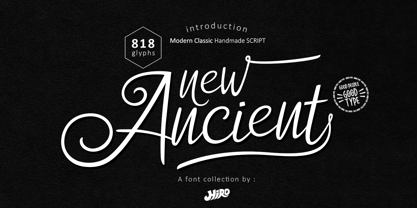 New Ancient is a Modern Classic Handmade Script. New Ancient has more than 818 Glyphs, with (82 Glyphs Uppercase), (427 Glyphs Lowercase and 65 Glyphs Ligatures. This font template contains Modern Classic, Classy, Elegant, readable, stylish, cool, catchy and easy to use. FEATURES - Ligatures - Stylistic Alternates - Stylistic Set - Uppercase and Lowercase letters - Numbering and Punctuations - Multilingual Support - Works on PC or Mac - Simple Installation Hope you like it. thanks. HIRO.std
 - Cotane Beach by EKNOJI,
$17.00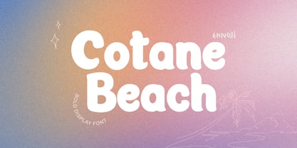 Cotane Beach It is perfect monoline Font for branding, logo, every other design which needs a Display. What you get? - Character set A-Z - Character set a-z - Support multi-language glyphs - Works on PC & Mac - Simple installations - Accessible in the Adobe Illustrator, Adobe Photoshop, Adobe InDesign, even work on Microsoft Word. Please kindly message us for any question or issue about our product. Hope you love it!!
 - Felicidade by IKIIKOWRK,
$17.00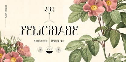 Introducing Felicidade - Oldfashioned Typeface, created by ikiiko. A classy decorative type with vintage touch. This typeface is perfect for an luxury brand logo, books cover, ancient or vintage product, packaging design, magazine header, poster, quotes, and so much more. What's included? Uppercase & Lowercase Number & Punctuation Multilingual Support Works on PC & Mac Enjoy our font and if you have any questions, you can contact us by email : ikiikowrk@gmail.com
 - Helvair Graffiti by Sipanji21,
$16.00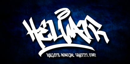 Helvair is a Handwritten font with a Realistic monoline graffiti style, with awesome swash perfect for your awesome urban designs. It will elevate a wide range of design projects to the highest levels, be it branding, headings, designs, invitations, signatures, logos, labels, and much more! Features: Uppercase Punctuation Swash PUA Encoded open Support for MAC or PC Simple installation for Adobe Illustrator, Corel Draw, Photoshop, or Procreate (New Updated)
