10,000 search results
(0.038 seconds)
- Jawbreak by BoxTube Labs,
$24.00 A modern sports font with classic roots. Jawbreak's three distinct styles and alternate cuts makes it incredibly versatile and perfect for logotypes, sports branding, posters, apparel design, magazine headlines, labels and so much more. Jawbreak features a full Adobe Latin 1 character set, with support for most western languages including: Afrikaants, Basque, Breton, Catalan, Danish, Dutch, English, Finnish, French, Gaelic, German, Icelandic, Indonesian, Irish, Italian, Norwegian, Portuguese, Sami, Spanish, Swahili and Swedish.
 - Hobo Symbols Mod by SymbolMinded,
$29.99 During the period of the Great American Depression, “hobos” created a system of symbols to communicate and assist fellow travelers. These symbols would mark a home, farm, fence or other structure to indicate what to expect in the area. They would tip off travelers on how to find food, stay safe and what to avoid and more. In some areas of the USA, these symbols are still visible and have also become part of the American popular culture. These 96 symbols are accompanied by the what the symbol was used to indicate. The meanings and symbols are by no means the complete list andther may be additional or alternative meanings. These are for casual use and not historical or anthropologically completely accurate
 - La Taqueria by Sudtipos,
$39.00 Mexico’s storied culture is one of the most recognizable today. Its amazing vibrant art and delicious foods have made the leap to influence many parts of the world in recent years. This proud, intense and diverse identity was the inspiration behind La Taqueria, a set of four fonts that express different characteristics of Mexican pop culture. The heavy and spicy, the light and gentle, the constant dynamism, all come together with one rhythm to produce an explosion of personality. Just like its predecessors Distillery and Scrapbooker, the La Taqueria set contains down-to-earth alphabets perfect for chalkboard art and handmade design. All the fonts include alternates and ligatures, providing plenty of variation for that spontaneous appearance everyone is looking for these days.
 - Originator by TEKNIKE,
$39.00 Originator is a display modular monospace font. The typeface has a distinct technical geometry using sharp angled corners. "Originator" name is derived from Latin and means 'one who first creates or initiates something into existence.' Originator is recommended for display work, branding, logos, technical writing, team sports, aerospace, aviation, automotive, racing, fashion, cinema, architecture, invitations, posters and headings.
 - Eastern Harrogate by Lemonthe,
$15.00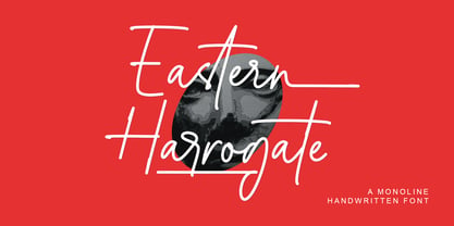 Eastern Harrogate is a beautiful handwritten font, with a monoline style. Is perfect for many different project such as logos & branding, invitation, stationery, wedding designs, social media posts, advertisements, product packaging, product designs, label, photography, watermark, special events or anything.This font is PUA encoded which means you can access all of the glyphs and swashes with ease!
 - PT Medievil by Paupe Type,
$10.00 PT MEDIEVIL is a new display font inspired by artefacts of the dark middle-ages with a contemporary twist. It contains 195+ meticulously crafted glyphs characterized by: -Upper part indented inward to be true to imperfect handwritten medieval typography -Smooth curve shapes -Rounded intersections between shape sections -Rounded serif Easily create headlines, display titles, subheadings, body copy.
 - Monosign by Lemonthe,
$14.00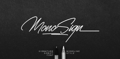 Monosign is a Beautiful Signature font, with a Monoline Style. Is perfect for many different project such as logos & branding, invitation, stationery, wedding designs, social media posts, advertisements, product packaging, product designs, label, photography, watermark, special events or anything.This font is PUA encoded which means you can access all of the glyphs and swashes with ease!
 - Petroles by Punch,
$9.50 Petroles was designed to transform from an elegant lightweight into a funky heavyweight to create a more casual attitude, giving it the ability to perform in all sorts of designs, coming with several OTF features to adjust it to your likings. Each weight has a complimenting set of almost monoweight small caps to easily bring contrast & variation.
 - Choriza by Huy!Fonts,
$5.00 Choriza is a multilayered font and a kind of spicy spanish sausage. With three layers you can colour any salami, salchichen, sausage, wurst or pudding. Chorizo also means burglar in spanish, so it's some sort of typographical joke about the today's spanish politicians. It comes with Choriza Sans, with its cutted ends to make a sans serif version.
 - Hookward by Garisman Studio,
$20.00 Hookward Condensed Hookward is a very cool font for a design with modern display headline: magazine, poster, branding, labels, music, and minimalism styles. With a strong display and clean nodes make a text in a design become more character and great. Inspired by the current trend of sports texts with a very modern and cool headline style.
 - Corvone by Greater Albion Typefounders,
$16.95 Corvone is a heavy bullnosed display family, inspired by the post war era's ideas of modernity. Two faces are offered, plain—a solid black face, and regular—which employs a three-dimensional pipeline effect to add real emphasis. Use Corvone to give work a retro feel, and/or where you want to really drive your point home.
 - Grold by Typesketchbook,
$55.00 Grold is a post-geometric typeface made up of 40 fonts across 10 weights with normal and slim options. It’s a unique and modern sans typeface, which is well suited for a variety of typographic applications such as headlines and small texts. The Grold font family supports multiple languages and is available as both webfont and desktop font.
 - Attention Seeker by Hanoded,
$15.00 Attention Seeker does seek attention: it looks like a stencil font, and it sort of is, but it wasn’t made with stencils. It was made with a brush and ink on paper - just like that! Use Attention Seeker for your revolutionary posters, your books, your products or your posters, I am sure the end result will make heads turn.
 - Arinttika Signature by Namara Creative Studio,
$20.00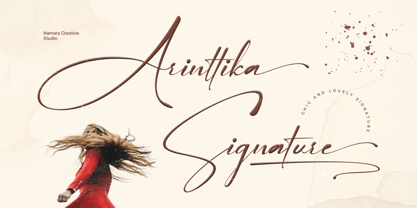 Arinttika is a natural and stylish signature font with a sense of elegant souls. perfect for many different project such as logos & branding, invitation, stationery, wedding designs, social media posts, advertisements, product packaging, product designs, label, photography, watermark, special events or anything. Including uppercase, lowercase, swashes, numerals, punctuations, multilingual support and the alternates of lowercase with ending swashes.
 - Karika Hearts by Deniart Systems,
$20.00 Say it with all your heart! Karika Hearts is part of the Karika Collection of fonts and was inspired by our love of swirly patterns that say i love you. These 52 hand drawn, heart-inspired swirls are a splendid choice for all your romantic designs such as valentine cards, wedding invitations, love notes, or stationery.
 - Demonic Rhapsody by Hun Liszt,
$50.00 Demonic Rhapsody is a unique typeface inspired by Codex Gigas, featuring Gothic, handwritten glyphs. Perfect for adding mystique to projects such as book covers, album artwork, or unique branding. It's part of the Demonic Rhapsody NFT project, symbolizing marginalized voices. A narrative tool, it pairs well with minimalist typefaces for contrast or textured fonts for an immersive experience.
 - Minebold by ahweproject,
$9.00 Minebold is a retro bold handwritten font that will bring you back to the 70s. Fall in love with its unique character and use it to create gorgeous wedding invitations, beautiful stationery art, eye-catching social media posts, and much more! Minebold is PUA encoded, which means you can access all glyphs and swashes with ease!
 - Dhaelzot by Aisyah,
$12.00 Dhaelzot is a stylish, modern handwriting font with a relaxed, informal feel. With its unique, flowing letters, Dhaelzot adds a personal touch to any design project, making it perfect for use in greeting cards, invitations, and social media posts. The font is highly legible and easy to read, making it ideal for body text as well.
 - Employed by Prioritype,
$23.00 Presents a new typeface. Say hello to the "EMPLOYED" font. A serif font display with a modern and classic style, perfect for you to use in your projects such as branding, logos, or social media posts. A clean and attractive typeface with some awesome alternative character features. Features: Uppercase, Lowercase, Numeral, Punctuation, Multilingual, Ligatures, Alternates & PUA Encoded. Thanks!
 - Tact by Pesic,
$35.00 Tact is a geometrically sans serif font, black and condensed looking glyphs, with an alternative glyph set to improve its use in different graphic contexts. It is suitable for use in the fields of science, art, architecture, urban planning, techniques, electronics, advertising, futuristic themes, sport, film, computers, phones, video games, magazines... Contains all Latin and Cyrillic glyphs.
 - und4 by URW Type Foundry,
$39.99 The rasterized square (clear, therefore 4 as part of the font name) was the constructive basis. The intention was to put all characters within this grid and produce a highly structured, yet lively, resting in itself, display font. Relaxed but exciting, just. An absolutely noteworthy detail are the classical construction principles (based on a typography book from the 50's for poster designers), the so-called optical weighting, derived and slightly exaggerated character elements: The characters are not purely symmetrical and the curve shapes do not close justified with the surrounding square. Loops and tongues slightly hang over; the upper bows are slightly less protruding than lower ones, etc. The kerning is tuned to fit these design details: the white space between the characters match the same filling space.
 - TX Signal Signifier by Typebox,
$39.00Eight designers present a set of icons that indicate the fun and fantastic world of signage. Each collaborator's solution represents a completely different interpretations on signage vernacular. Akira Kobayashi's "Subsumption", obscured by foliage, offers a perspective that signs on Japanese roads can be vague and beautiful. M.A.D.'s "People Signs" is a graphical association of people signage with a variety of well known situation symbols. Cynthia Jacquette's "Honest Arrows" are a series of arrows that attempts to honestly tell you how to get from point A to Point B in a big, confusing city. Mike Kohnke's "Road Kill" and the "Bump & Bruise" highlight how signs make for perfect targets when unloading a round of buckshot, and the licking a contruction barrier often endures. Joachim Muller-Lance's "Traffic Blends" places faces on things! Hey, didn't you give your first car a nickname? Cars are alive, you know - they guzzle and smoke all day. Jean-Benoît Lévy's "Inner-State" was inspired while reading the California driver handbook to pass a driver's test. Kevin Roberson's "Tail Lighting" reminds us to drive carefully and not to forget to signal. Diana Stoen's "Drivers Out There" shows us "driver personality archetypes", including the lil'ol lady that everyone tries to avoid. - Dark Garden - 100% free

- Feminous by Invasi Studio,
$17.00 Introducing Feminous, the latest font that'll give your designs a fresh and fun twist! This brush script font has got the perfect blend of sophistication and playfulness, making it the perfect choice for all your creative projects. The brush script style gives Feminous a unique, hand-drawn look that sets it apart from the crowd. Its elegant texture adds a touch of class, while the playful and youthful vibe will keep your designs fresh and fun. Whether you're designing logos, social media posts, invitations, or anything else, this font will bring the perfect amount of style to your work. So say goodbye to boring and generic fonts and hello to Feminous! This font is versatile, easy to use, and perfect for any project that needs a youthful and sophisticated touch. Get ready to add some spark to your designs with this fun and playful brush script font!
 - Culoare by Luxfont,
$18.00 Introducing space-bright COLORED hologram font. Soft color transitions combined with minimalistic clean glyphs. Ideal for modern web and print design. Excellent readability of glyphs for both the title and the large volume of text is preserved. Multi-colored modern family with different types of coloring - a highlighted gradient border of letters or fully hologram glyphs - a large selection of 11 ready-made font styles. Originality of the font will fit well into the fashionable logo, headline in the magazine or on the website, emphasize the trend of the product in branding and complement web advertising on social media. This font family is based on the Regular font Boldini - which means that if necessary you can combine these two families and they will be absolutely stylistically identical and complement each other. Check the quality before purchasing and try the FREE DEMO version of the font to make sure your software supports color fonts. Features: Free Demo font to check it works. 11 OTF SVG color fonts in the family Free Demo font to check it works. Gradient and hologram fonts Kerning IMPORTANT: - OTF SVG fonts contain vector letters with gradients and transparency. - Multicolor OTF version of this font will show up only in apps that are compatible with color fonts, like Adobe Photoshop CC 2017.0.1 and above, Illustrator CC 2018. Learn more about color fonts & their support in third-party apps on www.colorfonts.wtf -Don't worry about what you can't see the preview of the font in the tab "Individual Styles" - all fonts are working and have passed technical inspection, but not displayed, they just because the website MyFonts is not yet able to show a preview of colored fonts. Then if you have software with support colored fonts - you can be sure that after installing fonts into the system you will be able to use them like every other classic font. Question/answer: How to install a font? The procedure for installing the font in the system has not changed. Install the font as you would install the classic OTF | TTF fonts. How can I change the font color to my color? · Adobe Illustrator: Convert text to outline and easily change color to your taste as if you were repainting a simple vector shape. · Adobe Photoshop: You can easily repaint text layer with Layer effects and color overlay. ld.luxfont@gmail.com
 - VTC Elmwood by Vintage Type Company,
$12.00 VTC Elmwood is a modernized blackletter font family from Vintage Type Company. What's old is new again. Elmwood comes in 4 styles, including regular, 8-bit, outline, and spurred. Drawing inspiration from calligraphic techniques of the past, Elmwood strips away any flourishes that would typically be found in a similar textura typeface, and offers a more modern, stylized old english font. The styles that come included save you a bit of time from having to stylize the regular version yourself, and allow you to tailor the font to more niche and customized projects. Saving time is good, and you're sure to love these options. VTC Elmwood makes the perfect font for branding & logo projects, package design, title design, print & e-publications, and the list goes on.
 - Wild Kinder by Flawlessandco,
$9.00 Wild Kinder - Modern Boho Retro Font Introducing our "Wild Kinder" Modern Retro with Fun and Elegant Style is perfect for branding, logos, invitation, master heads, and more. Features : Multilingual Uppercase alphabet A-Z Lowercase alphabet a-z Alternate Character Numbers 0-9 Some punctuation NOTE: For all the characters are also available, accessible in the Adobe Illustrator Glyphs Panel, or in Adobe Photoshop Character Open Type Panel. If you need help, just write me! Thanks so much for checking out my shop ! HOW TO USE FONT : (connected letters, swirls, heart, swashes, diamond) for the first, install the .otf file and open fontbook/character map, find the font and you can copy and paste the heart letters from fontbook/character map to your text. Thanks, Flawless and co.
 - Mr Orange by Hipopotam Studio,
$28.00 Mr Orange is a typeface based on our handwritten letters which we used in some of our books H.O.U.S.E, D.E.S.I.G.N and Who Eats Whom. It has up to three alternate glyphs for each character, even for every diacritic letter. We do use our fonts in our books so we know that switching alternate glyphs can be a pain in the ass. Thats why we’ve created a very cool Contextual Alternates feature. It automatically sets alternate glyphs depending on frequency of appearance of the same character. The script doesn’t throw random glyphs. It’s checks if lets say letter “A” appears more then once in a sequence of characters. For example in the word “ANAKONDA”, the third “A” and the second “N” would be changed to glyphs from first stylistic set, the second “A” would also be changed but to glyph from second stylistic set. We’ve designed different rules for basic characters and different for diacritics and punctation. It really works great but of course you can always fine tune it by hand. This option has one obvious advantage for web fonts. Browsers that support OpenType calt feature will be able to display alternate characters. And since you can’t put by hand alternate glyphs on your website this is the only way to use them.
 - Nougat Script by Sudtipos,
$59.00 The first glyphs of Nougat Script were born in 2010 to honor the birth of my first chubby and charming daughter, Siena. The ongoing project with significant progress was presented at Tipos Latinos, the biennal of Latin America typography where Nougat Script was selected among 70 of the best fonts. After a long pause, the project had a powerful restart at the begining of 2018. In those days, it not only grew in number of signs but in complexity of behavior. There are 4 different types of writing within the same font file accesible via opentype features: Script (base or normal), two glyphic alternatives with well differentiated swashes and finally a small cap version. Nougat Script has a fresh and relaxed lettering attitude combined with the typographic harshness for elegant text compositions.
 - Antique by Storm Type Foundry,
$26.00The concept of the Baroque Roman type face is something which is remote from us. Ungrateful theorists gave Baroque type faces the ill-sounding attribute "Transitional", as if the Baroque Roman type face wilfully diverted from the tradition and at the same time did not manage to mature. This "transition" was originally meant as an intermediate stage between the Aldine/Garamond Roman face of the Renaissance, and its modern counterpart, as represented by Bodoni or Didot. Otherwise there was also a "transition" from a slanted axis of the shadow to a perpendicular one. What a petty detail led to the pejorative designation of Baroque type faces! If a bookseller were to tell his customers that they are about to choose a book which is set in some sort of transitional type face, he would probably go bust. After all, a reader, for his money, would not put up with some typographical experimentation. He wants to read a book without losing his eyesight while doing so. Nevertheless, it was Baroque typography which gave the world the most legible type faces. In those days the craft of punch-cutting was gradually separating itself from that of book-printing, but also from publishing and bookselling. Previously all these activities could be performed by a single person. The punch-cutter, who at that time was already fully occupied with the production of letters, achieved better results than he would have achieved if his creative talents were to be diffused in a printing office or a bookseller's shop. Thus it was possible that for example the printer John Baskerville did not cut a single letter in his entire lifetime, for he used the services of the accomplished punch-cutter John Handy. It became the custom that one type founder supplied type to multiple printing offices, so that the same type faces appeared in various parts of the world. The type face was losing its national character. In the Renaissance period it is still quite easy to distinguish for example a French Roman type face from a Venetian one; in the Baroque period this could be achieved only with great difficulties. Imagination and variety of shapes, which so far have been reserved only to the fine arts, now come into play. Thanks to technological progress, book printers are now able to reproduce hairstrokes and imitate calligraphic type faces. Scripts and elaborate ornaments are no longer the privilege of copper-engravers. Also the appearance of the basic, body design is slowly undergoing a change. The Renaissance canonical stiffness is now replaced with colour and contrast. The page of the book is suddenly darker, its lay-out more varied and its lines more compact. For Baroque type designers made a simple, yet ingenious discovery - they enlarged the x-height and reduced the ascenders to the cap-height. The type face thus became seemingly larger, and hence more legible, but at the same time more economical in composition; the type area was increasing to the detriment of the margins. Paper was expensive, and the aim of all the publishers was, therefore, to sell as many ideas in as small a book block as possible. A narrowed, bold majuscule, designed for use on the title page, appeared for the first time in the Late Baroque period. Also the title page was laid out with the highest possible economy. It comprised as a rule the brief contents of the book and the address of the bookseller, i.e. roughly that which is now placed on the flaps and in the imprint lines. Bold upper-case letters in the first line dramatically give way to the more subtle italics, the third line is highlighted with vermilion; a few words set in lower-case letters are scattered in-between, and then vermilion appears again. Somewhere in the middle there is an ornament, a monogram or an engraving as a kind of climax of the drama, while at the foot of the title-page all this din is quietened by a line with the name of the printer and the year expressed in Roman numerals, set in 8-point body size. Every Baroque title-page could well pass muster as a striking poster. The pride of every book printer was the publication of a type specimen book - a typographical manual. Among these manuals the one published by Fournier stands out - also as regards the selection of the texts for the specimen type matter. It reveals the scope of knowledge and education of the master typographers of that period. The same Fournier established a system of typographical measurement which, revised by Didot, is still used today. Baskerville introduced the smoothing of paper by a hot steel roller, in order that he could print astonishingly sharp letters, etc. ... In other words - Baroque typography deserves anything else but the attribute "transitional". In the first half of the 18th century, besides persons whose names are prominent and well-known up to the present, as was Caslon, there were many type founders who did not manage to publish their manuals or forgot to become famous in some other way. They often imitated the type faces of their more experienced contemporaries, but many of them arrived at a quite strange, even weird originality, which ran completely outside the mainstream of typographical art. The prints from which we have drawn inspiration for these six digital designs come from Paris, Vienna and Prague, from the period around 1750. The transcription of letters in their intact form is our firm principle. Does it mean, therefore, that the task of the digital restorer is to copy meticulously the outline of the letter with all inadequacies of the particular imprint? No. The type face should not to evoke the rustic atmosphere of letterpress after printing, but to analyze the appearance of the punches before they are imprinted. It is also necessary to take account of the size of the type face and to avoid excessive enlargement or reduction. Let us keep in mind that every size requires its own design. The longer we work on the computer where a change in size is child's play, the more we are convinced that the appearance of a letter is tied to its proportions, and therefore, to a fixed size. We are also aware of the fact that the computer is a straightjacket of the type face and that the dictate of mathematical vectors effectively kills any hint of naturalness. That is why we strive to preserve in these six alphabets the numerous anomalies to which later no type designer ever returned due to their obvious eccentricity. Please accept this PostScript study as an attempt (possibly futile, possibly inspirational) to brush up the warm magic of Baroque prints. Hopefully it will give pleasure in today's modern type designer's nihilism. - Kush by Our House Graphics,
$17.00 Kush is what happens when you let your fonts sit around watching cartoons and eating cake and ice-cream all day�When their vectors are freed from all constraints and allowed to follow their bliss. Kush has filled its insides to just the other side of contentment and comes to you on a sugar high and with a head full of Looney Tunes. And... It�s two ply! A two-layered display face from Our House Graphics with a plush, organic feel, Kush has 370 glyphs, over two dozen standard and discretionary ligatures, stylistic alternates and a few surprises. Kush Fat and Kush Shade work well independently but together they become a two colour, two layer font. Simply type some text in Kush Shade, copy it and paste it back on top of your original text. Then change the top layer to Kush Fat and adjust the colours to your liking. For best results, use default settings for kerning and tracking (letter spacing).
 - Varstate by Alphabet Agency,
$15.00 The Varstate font family is a versatile collection of fonts inspired by the varsity team name lettering often seen on apparel such as Letterman jackets, t-shirts and hoodies. The fonts can be used in combination to provide a variety of design options and different looks in genres such as sports, leisure and industry. The family contains fonts in 4 weights; Normal, Semi Light, Light and Extra Light. Each font includes Latin basic characters which includes uppercase, lowercase, numbers, punctuation and much more.
 - Coastline by Surplus Type Co,
$9.00 Introducing Coastline - A textured script typeface which features regular & alternate fonts in both .otf and SVG format! You can choose whether you want the heavily textured result with the SVG version, or a more solid design with the .otf font, and also interchange your letters using the Alternates for a more natural handwritten look. Coastline is great for countless areas of design and works equally well for creating quotes, posts & advertisements as well as physical goods like apparel, posters & housewares.
 - Matthia by Linotype,
$29.99Linotype Matthia is part of the Take Type Library, which features the winners of Linotype’s International Digital Type Design Contest from 1994 to 1997. Dieter Kurz designed Matthia as a slender, flowing brush font. Its characters are in a handwritten style yet stand almost straight, making Matthia a mixture of reserved and lively, of static and dynamic. The font is reminiscent of advertisement typefaces popular in the 1950s and extremely versatile, suitable for short texts in small point size or headlines on posters. - Linotype Graphena by Linotype,
$29.99Linotype Graphena is part of the Take Type Library, selected from the contestants of Linotype’s International Digital Type Design Contests of 1994 and 1997. It is a handwriting font designed by the Italian artist Giancarlo Barison. Consciously irregular and erratic, the letters dance across a page, large and small, tilted and erect. Linotype Graphena could be described as angular, restless, even mischievous. It should be set in point sizes no smaller than 12 and is best used for headlines and displays. - Grafilone by Linotype,
$29.99Linotype Grafilone is part of the Take Type Library, which features winners of Linotype’s International Digital Type Design Contest. In creating his font, Bo Berndal combined elements of the constructed and Art Deco styles. Slender and angular, Grafilone is mechanically exact and coolly resesrved. A distinguishing characteristic is the combination of angular and sloping strokes, which give the font a dynamic feel. Grafilone is particular good as a headline font and for initials when combined with constructed sans serif fonts. - Pickatoon by Colllab Studio,
$14.00 "Hi there, thank you for passing by. Colllab Studio is here. We crafted best collection of typefaces in a variety of styles to keep you covered for any project that comes your way! Pickatoon is a fun display font that we made because we knew what people wanted. Pickatoon has the look of your favorite childhood markers. It's not just for comic books, it's for EVERYTHING. It's for your Instagram selfies, it's for school projects, it's for your business logo, it's for your coloring books—it even works great with watercolors! We put a lot of time into making Pickatoon perfect. We knew you'd need it to be thick and thin and fat and skinny, so we did our best to make sure all those variations were available in every letter. And when you're drawing, you don't just want to draw the same thing over and over again—you want to be able to change things up with some simple tools. So we made sure that Pickatoon had different ways you could vary the thickness and give your work some character. Start create with this font!! A Million Thanks www.colllabstudio.com
 - Blindness Graffiti by Colllab Studio,
$14.00 "Hi there, thank you for passing by. Colllab Studio is here. We crafted best collection of typefaces in a variety of styles to keep you covered for any project that comes your way! What if you could have a graffiti font collection? Or a street-inspired font collection? What if you want something clean, legible, yet still playful and fun? Searches online turn up nothing. Those popular sites only provide typical graffiti fonts. Well don't worry. What you’re looking for lies right here. We combine art and technology to bring the most extensive graffiti font collection around to your doorstep easier, faster, and cheaper than anywhere else. Introducing, Blindness Graffiti font is more than just random lettering. Its structured strokes and grungy strokes ooze its strong characteristic, inspired by urban style or cyberpunk design. It’s out of this world yet the balance between action and serenity keeps the font grounded. Blindness Graffiti is available in uppercase, lowercase, numerals, punctuations and lots of variations on each character include OpenType features, alternates, common ligatures and also additional swash to let you customize your designs. A Million Thanks www.colllabstudio.com
 - Kinemon by Mightyfire,
$10.00 Kinemon is a font that has modern minimalist looks but still has an uniqueness on it. Look at the letters, each letter has their own characteristic. Firm, clean and modern. Kinemon perfectly use for a magazine, book, headline or even a poster. We have three styles that can cover your needs. We hope and be honored if Kinemon can be the part of your special moment. Thank you! :)
 - Demarus by Zamjump,
$15.00DEMARUS originally designed for use in e-Sports related projects, logotype, quotes, wordmark, magazine, t shirt etc. The downloadable file contains the font in ttf, woff, font license. Includes: Uppercase Numbers Punctuation Symbols multilingual support PUA Encoded Characters Fully accessible without additional design software. To access alternative glyphs, you'll need a program that supports OpenType features such as Adobe Illustrator CS, Adobe Photoshop CC, Adobe Indesign, and Corel Draw.
