10,000 search results
(0.026 seconds)
- Soccer SS by Sensatype Studio,
$15.00 Soccer is a Modern Sport Logo font that created special for Logo, Title and more stand out typography for sport and action. It's so perfect to add your style and headline overview for sport, technology, actions, and fighting theme. And specially for this font, we crafted for bold action style and modern feels so enjoy to create any project that will show your main idea out. Soccer Modern Sport Logo font ready with: Creative characters prepared to get best results Preview as a inspirations that you can do with Soccer font Ready with All Uppercase characters Wish you enjoy our font. :)
 - Ultimate College Team by Fontscafe,
$39.00 College styles fonts are a "must have" for any designer just because of their really vast possibilities of uses. With our "Ultimate College Team" pack we're giving a whole range of "College style" fonts where you'll be able to select in any moment the perfect characteristic necessary for your next project. The pack includes 9 hand crafted fonts that capture these very emotions of team work and campus life. Our college fonts speak largely of sports activities, but also of those strong emotions that combines force, discipline, determination, confidence and that feeling to be “in the Team”. The "Hot Sports Elements" font, which consists of handy sports related graphic elements, is the last touch to reinforce and add meaning of a piece of text and create the best balance to your layout and it comes free when you buy the packs available!
 - PR8 London Ads - Unknown license

- Gundrada ML by HiH,
$12.00 Gundrada ML was inspired by the lettering on the tomb of Gundrada de Warenne. She was buried at Southover Church at Lewes, Sussex, in the south of England in 1085. The Latin inscription on her tomb, STIRPS GUNDRADA DUCUM, meaning “Gundrada, descendant of the Duke” may have led to the speculation that she was the daughter of William, Duke of Normandy and bastard son of Robert the Devil of Normandy and Arletta, daughter of a tanner in Falaise. In 1066 William defeated Harold at the Battle of Hastings and was crowned William I of England. More commonly known as William the Conquerer, he commissioned a string of forts around the kingdom and charged trusted Norman Barons to control the contentious Anglo-Saxon population. William de Warenne, husband of Gundrada, was one of these Barons. There has also been the suggestion that Gundrada may have been the daughter of William’s wife, Matilda of Flanders, by a previous marriage. According to the Dictionary of National Biography (Oxford University Press, Oxford, England 1921-22), both of these contentions are in dispute. Searching the past of a thousand years ago is like wandering in a heavy fog: facts are only dimly in view. Regardless, I know that I found these letterforms immediately engaging in their simplicity. Unadorned and unsophisticated, they have a direct honesty that rests well in the company of humanistic sans serifs like Franklin Gothic or Gill Sans, appealing to a contemporary sensibility. The lettering on the tomb is in upper case only. Although Gundrada does not sound Norman French to me, her husband certainly and her father probably were Norman French. Nonetheless, the man that carved her tombstone was probably Anglo-Saxon, like most of the people. For that reason, we are quite comfortable with a fairly generic lower case from an Anglo-Saxon document of the time. The time was a time of transition, of contending language influences. This font reflects some of that tension. Features 1. Multi-Lingual Font with 389 glyphs and 698 Kerning Pairs. 2. OpenType GSUB layout features: onum, dlig, liga, salt & hist. 3. Tabular Figures and Alternate Old-Style Figures. 4. Alternate Ruled Caps (line above and below, matching to brackets). 5. Central Europe, Western Europe, Turkish and Baltic Code Pages. 6. Additional accents for Cornish and Old Gaelic. 7. Stylistic alternates A, E, y and #. 8. Ligatures ST, Th, fi and fl. 9. Historic alternate longs. The zip package includes two versions of the font at no extra charge. There is an OTF version which is in Open PS (Post Script Type 1) format and a TTF version which is in Open TT (True Type)format. Use whichever works best for your applications.
 - Brookvale Retro Condensed by Get Studio,
$25.00 Brookvale - Retro Condensed Font is a nostalgic typeface that channels the essence of the past with a contemporary twist. It's condensed letterforms and retro flair evoke a sense of vintage charm, making it an ideal choice for projects seeking a dash of retro coolness. Perfect for posters, branding, and designs that celebrate the enduring appeal of yesteryears.
 - Zapped by Cool Fonts,
$24.00 Zapped is a grungy font with a sort of extruded look. I was working on a poster for the punk band MAXILLA (they are hot check'm out). It looks like it came out of a war zone. Abuse it!
 - Neo Phalanx by Zenmurai,
$18.00 Neo Phalanx is a rectangular, circular & curvy modern display sans inspired by Ancient Greek mass military formation. The difficulty of make this font is balancing rounded corner & sharp edge. There are letters like "M W A H R N K S Z" provides a unique personality in the title display. Numbering and punctuations also designed in unique styles to deliver different visual language. This font is suited for variety of applications from poster to branding, advertising, digital.
 - Urbanhive by Jaetwo Type,
$45.00 Urban Hive : reinterpreting three-dimension to the typeface A blueprint consists of two-dimensional elements changes into a three-dimensional structure. What works would be created by reversing the process? The building components were divided into three parts : Facade, Inside space and Construction materials to apply all the features to the typeface. This is Facade version.
 - Old Songs JNL by Jeff Levine,
$29.00 Hand lettering of the song title on the 1914 sheet music for “Dear Old Girl” was the working model for Old Songs JNL. A condensed Roman typeface available in both regular and oblique versions, this titling font exhibits a casual, nonconformist design that isn’t quite traditional, nor is it part of the Art Nouveau movement popular at the time.
 - Vulgat by Typogama,
$29.00 Vulgat is a uncial inspired typeface that offers a vibrant personality while staying clear and legible in all applications, a contemporary style modeled by the past. Designed for use in editorial and branding situations, Vulgat can be used for titles but equally longer passages of text. This typeface features an extended Latin support for all European languages plus Cyrillic support.
 - Modern Monarch by RagamKata,
$16.00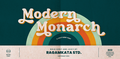 Modern Monarch is a retro display serif font that exudes a classic charm and bold character. With its design inspired by retro styles, this font brings an elegant touch and evokes a sense of the past. Modern Monarch Features: • Uppercase And Lowercase • Alternates And Ligatures • Numerals & Punctuation • Accented characters • Multilingual Support • Unicode PUA Encoded Thanks and have a wonderful day .
 - Linotype Clascon by Linotype,
$29.99Linotype Clascon is part of the Take Type Library, which features winners of Linotype’s International Digital Type Design Contest. Designed by the British artist Rachel Godfrey, the constructed forms of the capitals are reminiscent of sketches of many famous 16th century artists, Albrecht Dürer and Nicolas Jaugeon among them. This style emphasizes the mathematic construction of the letters, based on the circle, rectangle and triangle, but Clascon’s historical roots lie in Transitional and Modern Face styles. This font is particularly suited to very short texts, headlines and initials. - P22 Afton by IHOF,
$24.95 A cursive font with a curvilinear feel, named for the Scottish stream immortalized by the poet Robert Burns. Useful for menus, certificates, display lines, short paragraphs or poetry setting.
 - ReadySteadyGo by Volcano Type,
$19.00 ReadySteadyGo is a display font that refers to the look of stadium tracks. The font was actually created for Sports Bible, a book about sportswear, published by Sportswear International.
 - Borough Park JNL by Jeff Levine,
$29.00 Borough Park JNL is named for a neighborhood in the southwestern part of the borough of Brooklyn, NY and was modeled from hand lettering found on vintage sheet music.
 - Kidszania by Nirmalagraphics,
$14.00 I'm Andrea, creator at Nirmalagraphics and I want to present my latest font called "Kidszania". I took the name from a children's playground filled with writings posted on the wall. I found a child's writing style that is funny, looks clean and natural. I tried a rough sketch of a font that resembled the writing of the child, then I modified it to become the "Kidszania" font. This font can be used for any needs, especially children-themed designs.
 - Loxley by Canada Type,
$24.95 Drawn shortly before Jim Rimmer's passing in 2010, Loxley was designed to be used in a fine press edition of the folklore story of Robin Hood. It was named after the cited birthplace of the story's classic hero. Loxley's shapes were inspired the same early Roman faces (such as Subiaco from the late 1400s) that influenced Frederick Goudy's Aries, Franciscan and Goudry Thirty types. It exhibits the preculiarities of Jim's left-handed calligraphy, as well as his outside-the-box thinking with exit strokes and serif variations. Loxley was remastered for the latest technologies in 2013. Now it comes with a character set of over 450 glyphs, including plenty of stylistic alternates, a full compliment of f-ligatures, a Th-ligature, basic fractions, ordinals, a long s for historic setting, comprehensive class-based kerning, and extended Latin language support. 20% of this font's revenues will be donated to the Canada Type Scholarship Fund, supporting higher typography education in Canada.
 - SteamCourt by insigne,
$22.00 Think smart. Think regal. Think SteamCourt, a new font designed specifically for the card game SteamCourt. A bit of background if you will: In early 2014, some friends from my college days banded together to form their own game company. Their first launch? A current Kickstarter they named SteamCourt. I love Kickstarter. It’s a fantastic platform, a great way for individuals to introduce the public to their visions. I've started a couple of them myself--both including fonts designed specifically for the projects. The first is Chatype, a font created exclusively for the city of Chattanooga. The second: Cabrito, a font developed as part of the children’s typeface book, The Clothes Letters Wear. It’s wonderful to work with so many others who come alongside to help you vision become reality. Naturally, hearing of my friends' project, I contacted them about adding a new face to their venture as well. I gave them carte blanche. They wanted steampunk. It was a great challenge, the result of which is now SteamCourt, an unforgettable display typeface that draws from the mix of Victorian regals, metallic and brass engineering, cogs, clocks and blackletter typography. It evokes a time of skillfully forged metalwork and an era of intrigue and excitement, filled with audacious feats of engineering and innovation and the perilous journeys of the airship. While influenced by the era of blackletter, SteamCourt is an unmistakable departure from the style of two centuries past, yet it still shines in its given display roles with a distinct regal twist. The serifs are asymmetrical, yet the characters are all specially and delicately balanced. It’s an eye-catching alternative to blackletter with modern steampunk touches. The game’s signature typeface has sizeable language support on top of 90 alternate characters as well. In addition to a generous number contextual alternates, SteamCourt features stylistic alternates that allow for buyers to customize its visual appearance for their preferences, helping to make it a superior option for packaging, branding and enormous typesetting logotypes as well as shorter textual content. Check out the game, but grab the font, too, to be a part of that crib created as a companion for the new game in court. It'll be the ace up your sleeve for many rounds of design ahead.
 - Federico by Olga Umpeleva,
$30.00 Federico is a typeface based on the handwriting of Federico Garcia Lorca, the eminent Spanish poet and playwright (1898-1936). Original version was designed for a book about Lorca. The face has two styles. One looks like an original poets writing, the second looks like if Lorca would write with a ball pen. Federico includes many alternative glyphs and ligatures, which make it look like a real writing of an emotional, negligent, creative man. Despite the fact that Garcia Lorca has written in spanish, the font has western and eastern european, cyrillic, turkish letters.
 - HU Makingfilm by Heummdesign,
$15.00 HU Makingfilm gives a solid feeling of a full module, and it is a font that adds softness by rolling the angled part.
 - Resiliency3 by Alphabet Agency,
$15.00 Resiliency3 font family was designed for use in sports and fitness themes. Gaming is another genres that the font family pairs well with.
 - Bender Script by Dear Alison,
$29.00 Would you hire one of the top hand lettering artists that worked for companies like Max Factor for your designs? Of course you would! Chas Bluemlein passed away many years back, and you couldn't have afforded his services anyway, but his lettering prowess which graced many advertisements, primarily cosmetic ads, has been pulled together from numerous samples to make this font. Bender Script comes with BONUS Swash alternates to mix up the flavor a bit, and exudes passion and confidence! Now you can own not only a piece of his lettering legacy, but you can also put it to work for you! This beauty is a sure fit into any font collection, so what are you waiting for, buy it today!
 - Bill Hiffith Handwritten by Colllab Studio,
$19.00 "Hi there, thank you for passing by. Colllab Studio is here. We crafted best collection of typefaces in a variety of styles to keep you covered for any project that comes your way! Bill Hiffith is an Organic Script, a gorgeous font that can be used for making multiple things. it includes smooth brush stroke, simple and soft. Its elegant taste is one of the most gorgeous fonts. This typography is reflected in this exquisite font family. The type is clean and simple yet fun and stylish. It is beautiful, better for headlines style design or logo design. Or you can have it on your website’s body style. Grab it now, Bill Hiffith could elevate your elegance brand design. A Million Thanks Colllab Studio www.colllabstudio.com
 - NoraPen by sugargliderz,
$40.00 This font is influenced by Walbaum. However, I did not just trace the design, but sort of had the image in my head while I drew the letters. This font is balanced by not being entirely Walbaum, but still basically is. I've named it "NoraPen." Nora comes from the name of the main character in Ibsen's "A Doll's House," and Pen means a cage for livestock.
 - P22 Lindum by IHOF,
$24.95 Lindum is a classically-proportioned Roman font that is almost a sans serif, the serifs appearing only on the upper part of the letterform. The lowercase features a large x-height and very short descenders.
 - New Future by Luhop Creative,
$17.00 New Future is a cutting-edge font designed to elevate your digital projects. With its sleek and futuristic design, this font is perfect for tech-related content, software interfaces, and website headers. comes in tre variations, regular, Outline, and outline Dc. and also equipped with italic oblique. New Future is a Modern Sport Technologies Sans Serif font that special created for Sport and Technology design needs with Modern style.
 - Evening Wear JNL by Jeff Levine,
$29.00 Evening Wear JNL, drawn from the elegant monoline lettering used as titling on the sheet music for "Smoke Gets In Your Eyes", conjures up images of 1930s New York at its apex. Fine restaurants, elegant night clubs and couples decked out in their best evening apparel were of a time long past when "doing the town" meant really dressing up for the occasion.
 - Komsomol by Hanoded,
$15.00 Komsomol (short for Kommunisticheskii Soyuz Molodyozhi) was the youth division of the Communist Party of the Soviet Union. Komsomol font was modeled on several Soviet propaganda posters which all had one thing in common: a very loud message in a very clear typeface. Komsomol is an all caps typeface which comes with extensive language support in order to educate the masses.
 - Block by Stefan Stoychev,
$29.88 Block Font Family is display font inspired by the forms of communist mass housing architecture (called blocks - resembling straight geometric shapes arranged symmetrically) started in the mid 70's in the 20th century. It comes in 4 weights and its matching italics and rounded options. The Light weight is a free of charge, so you can used to your projects.
 - Librum Sans by Hackberry Font Foundry,
$24.95 This is the companion sans family to make the Librum serif families work as well as they do. By companion, I do mean stylistically compatible. But mainly, they have the same vertical metrics. So they work very well for run-in heads, inline character styles, and all the rest of the needs in large books with complex formatting. They are designed for use in InDesign, and they work very well in that environment. The fonts use the same OpenType feature files as the rest of the Librum families. The feature files for the italic and bold are more limited—as I have rarely used things like that [over the past 20+ years]. The character shapes are a bit whimsical. The original ancestor of this book design sans was a very playful font I released as Aerle. It’s been calmed down a lot but is still loose and friendly. For a great deal, see Librum Book Design Group , for a package containing all fifteen fonts!
 - Chellora by Picatype,
$15.00 I am very happy to finally release Chellora Typeface. Chellora is a bevelled, layered font which gives simple effects to letters. The effect allows it to be plated, giving it a smoother and smoother appearance. Chellora comes with 3 different styles: Regular, Shadow, Filled Outline, Chellora is a bold Sans that is perfect for Logos, Signage, Apparel, Headlines, Etc. This typeface is a great addition to any collection because it saves time with post-production effects, this allows you to easily measure effects. To enable the OpenType Stylistic alternates, you need a program that supports OpenType features such as Adobe Illustrator CS, Adobe Indesign & CorelDraw X6-X7, Microsoft Word 2010 or later versions. How to access all alternative characters, using Windows Character Map with Photoshop: https://www.youtube.com/watch?v=Go9vacoYmBw How to access all alternative characters using Adobe Illustrator: https://www.youtube.com/watch?v=XzwjMkbB-wQ Chellora Typeface is coded with PUA Unicode, which allows full access to all the extra characters without having special designing software. Mac users can use Font Book , and Windows users can use Character Map to view and copy any of the extra characters to paste into your favorite text editor/app. Thanks so much for looking and please let me know if you have any questions.
 - Natural Born Designer by Fonts of Chaos,
$10.00 True bold font, only available in uppercase but with different styles. This font of 106 characters is really easy to use in your design and takes his inspiration from the old school post graffiti. The name comes from the movie "Natural Born Killers" by Oliver Stone. UPPERCASE lowercase Numerals Punctuation 106 characters
 - ZP Lycan by Illustration Ink,
$3.00 This hand-crafted font is sporting scary claw marks throughout for a scary, haunted feeling.
 - Quiroga Serif Pro by TipoType,
$29.00 Quiroga Serif began in 2007 with the name Quadratta Serif. This typography was designed for continuous text, legible at medium and small sizes, with great saving of space, optimized for 6, 8, 10 and 12 points. The morphology is a mix between tradition and innovation; it has a vertical axis, thick serifs, tall x-height, light modulation and a lot of internal space between letters: key to improve legibility at small sizes. Formally, my idea was to make a serif type that had a unique color, this is visible due to the light modulation. This is also complemented with the incorporation of not common, alternative signs. Some parts of the letters that are usually curb or diagonal where made horizontal (for example: a, q, p, etc.), this makes the eye of each character to be wide and unique. The serifs (wedge type) suffered diverse variations during the process. At the begining they where thicker and ended vertically, but this caused a great deal of printing errors. And so we decided to modify them by giving them an angle to avoid visible errors in medium and small sizes. The ch, and ll ligatures where rescued because they are a part of our current spanish alphabet. The historic ligatures and stylistic alternates give different options to users who want different alternatives within a text. The accentuation signs were composed in a middle line above all signs to avoid visual shock. We also gave plenty of importance to small caps numbers, mathematical signs and currency signs so that the could interact well.
 - Venice Initials by Wiescher Design,
$39.50 Venice Initials are my redesign of a 15th century venetian original by an unknown calligrapher. Unfortunately only parts of the letters existed, so I had to design about half of them myself. Of course I enjoyed doing that. Yours Gert Wiescher
 - Rennie Mackintosh Artlover by CRMFontCo,
$29.00Charles Rennie Mackintosh's artwork has an art deco feel that has been reproduced on fabrics, jewellery and all sorts of household items. Now, with this font, you can add Mackintosh icons and letter tiles with just the touch of a key. - Exelancer by Popskraft,
$19.00 We are proud to present the futuristic Excelancer font. This font was inspired by passion for space stories. The uniqueness of this font lies in the rare combination of a wibrant style of decorative capital letters and perfectly balanced lowercase charachters that read well in any massive text. Thus, you get a universal font kit with which all the tasks of futuristic design are solved. However, this font will become a decoration not only for fantastic stories, but also for everything related to technology, development, progress and even sports. In short, this is the pure energy of the future!
 - Smith Premier NF by Nick's Fonts,
$10.00In ye olden days, nothing said “personalized business correspondence” like a typewritten letter, and several type foundries cast simulated typewriter fonts so authentic-looking “personal” letters could be mass-produced. This typeface is based on one such font from a href="/foundry/atf/">American Type Founders, which was patterned after the letters of the Smith Premier No. 3. Both versions of the font include 1252 Latin and 1250 CE (with localization for Romanian and Moldovan) character sets. - Keretro by RagamKata,
$12.00 Get ready to groove with our latest creation, Keretro font! Keretro transports you to the golden era of the past, evoking a sense of nostalgia that resonates with pop culture enthusiasts. Seamlessly blending boldness and authenticity, they captivate the hearts of your audience, adding a unique and irresistible touch to your brand identity. Keretro has 2 widths: Regular and Outline so can be perfect for any retro project like logotype, branding, title, packaging, and many more.
 - Futurex Striped - Unknown license


