5,135 search results
(0.013 seconds)
- Rollinkland by Almarkha Type,
$29.00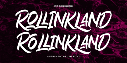 Rollinkland is a Authentic brush font with a clear style and dramatic movement this font is great for your next creative project such as logos, printed quotes, invitations, cards, product packaging, headers, Logotype, Letterhead, Poster, Apparel Design, Label, and etc. Rollinkland comes with uppercase, lowercase, numerals, accents (Multilingual characters), punctuations and so many variations on each character include OpenType alternates, swash to let you customize your design
 - Lomatic by Rochart,
$25.00 Lomatic Celtic typeface is a captivating font inspired by the enchanting world of Celtic art and symbols. With its beautifully crafted knots and intricate patterns, this font brings a touch of ancient mysticism to your designs. Perfect for projects related to mythology, folklore, or any Celtic-inspired theme. Embrace the magic of Lomatic Celtic typeface and let your creativity weave mesmerizing tales of the Celtic heritage.
 - Quote Note by PizzaDude.dk,
$16.00 With Quote Note I did my best to make a simple and unsophisticated font. I wanted the letters to come out as if they were made with a fat marker on a note. Well, I'll let you be the judge on how I succeeded. I've added 4 different versions of each lowercase letter and even did a simple complimentary dingbat. And of course there is multilingual support!
 - Samsara by W Type Foundry,
$15.00 Samsara is a cursive typeface inspired by calligraphy tools. Its shapes and gestures convey an organic-modern style which generates the texture of a brush tip. Samsara not only has a great versatility, but also is suitably to create short texts such as branding and short messages. It comes with OpenType features, stylistic sets, special ligatures, and swashes, which were designed specially to let your imagination fly.
 - Morton by Deltatype,
$59.00 Morton, another modern grotesque typeface which deliver a extraordinary unique within typeface with the style of condensed let you create more impact with your design. Morton Type Family available in nine weights, the Thin weight deliver you a simple hair line stem until you reach the bold weight, you will get more dynamic with three stem weights which give you a modern, old school look and feel.
 - Queensila by Zamjump,
$23.00 Queensila is a comely styled serif font with beautiful ligatures, lots of custom alternative glyphs, and multilingual support. This is a very versatile font that works well in large and small sizes. Queensila is a perfect fit for your project and lets you create beautiful designs, headlines, posters, logos, badges, t-shirts and more. It's also best used for posts, logos, posters, certificates, labels and more.
 - VLNL TpLlum by VetteLetters,
$35.00 TpLlum is a typeface designed by TwoPoints for a festival in Barcelona called ‘Montjuïc de Nit’. Llum means light in Catalan. In the Montjuïc de Nit project the font was used in white over a dark grey background, letting the light of a backlit poster shine through. For this purpose the typeface had to be very bright, which was made possible by its heavy cut.
 - Ritz Stencil JNL by Jeff Levine,
$29.00Browsing online auctions and other webs sites often unearths wonderful examples of lettering from the past. A perfect example is Ritz Stencil JNL, modeled after a page from a 1930s-era lettering book. Although this font has similar characteristics to other better-known designs, there are enough unique differences to let it stand on its own as a great example of the Art Deco era. - Sweetgum by Daily Studio,
$15.00 Sweetgum is an elegant and modern curved font with beautiful alternates. It is easy to use and suitable for headlines, invitations, quotes, business card, posters, etc. You can have fun combining each letter with the alternates. Let yourself explore and use it to create something wonderful. This font includes full uppercase, lowercase, punctuation, and standard multilingual support. With 289 glyphs and in OTF file.
 - Bugatine by Typebae,
$15.00Bugatine is a captivating handwritten monoline signature script font. With its graceful curves and fluid strokes, this font exudes an air of elegance and sophistication. Bugatine perfect for branding, logos, invitations, and more. Let your words dance across the page with this mesmerizing font that effortlessly captures the essence of hand-drawn beauty.Handwritten, Handwriting, Script, Monoline, Signature, Vintage, Stylish, Calligraphy, Wedding, Logo, Fashion, Feminine, Magazine, Branding, Elegant - DBE-Rigil Kentaurus - Personal use only

- Scrapbooker by Sudtipos,
$29.00 After previously collaborating on the bestselling Distillery Set, Carolina Marando and Alejandro got together once again to create this Scrapbooker Set, a new series of fonts that multiply the possibilities. One reason scrapbookers became a kind of design demographic is the appeal of what they do. They make albums of memories, diaries composed of different elements that converge together to lead the viewer to a special moment in time. A paper, a photo, a letter, an event ticket, or a dry petal — everything ends up being part of a collage that tells a story. Words have a key role in such a collage. They use different shapes and forms and combinations to state what cannot otherwise be expressed. They make the collage stronger by clarifying a concept, defining an image, and solidifying a memory. These words for memory albums are the reason for this Scrapbooker Set, six different fonts with different impressions and different personalities — so each part of the memory can have its own identity. People tell you to write your own history. Now you can do that in style.
 - Futura Headline EF Pro by Elsner+Flake,
$103.00 The design of Futura seems to be timeless. This typeface family which had been developed in 1926 by Paul Renner for the Bauer Type Foundry in the style of constructivism and as part of the Bauhaus movement, experienced, however, in the course of the past 90 years, repeated time-appropriate revivals which guaranteed its on-going popularity. The version of the Futura EF Pro contains the original character constructions which Dennis Megaw described as the “first designs of Futura” in 1938 in “20th century sans serif types, Typography no. 7” (See: Dr. Christopher Burke: Paul Renner, Princeton Architectural Press, New York 1998). What makes it exceptional is the extension into three weights: “Text”, “Headline” and “Index” which came about as part of a degree dissertation at the Hochschule für Bildende Künste (HFBK) in Hamburg. In this context, the accompanying documentation “Die Kritik der reinen Futura” (“The Critique of the Pure Futura”) by Katharina Strauer was published by the Materialverlag, Hamburg, in 2003. Some copies are still available at Elsner+Flake.
 - Futura Text EF Pro by Elsner+Flake,
$103.00 The design of Futura seems to be timeless. This typeface family which had been developed in 1926 by Paul Renner for the Bauer Type Foundry in the style of constructivism and as part of the Bauhaus movement, experienced, however, in the course of the past 90 years, repeated time-appropriate revivals which guaranteed its on-going popularity. The version of the Futura EF Pro contains the original character constructions which Dennis Megaw described as the “first designs of Futura” in 1938 in “20th century sans serif types, Typography no. 7” (See: Dr. Christopher Burke: Paul Renner, Princeton Architectural Press, New York 1998). What makes it exceptional is the extension into three weights: “Text”, “Headline” and “Index” which came about as part of a degree dissertation at the Hochschule für Bildende Künste (HFBK) in Hamburg. In this context, the accompanying documentation “Die Kritik der reinen Futura” (“The Critique of the Pure Futura”) by Katharina Strauer was published by the Materialverlag, Hamburg, in 2003. Some copies are still available at Elsner+Flake.
 - Infantometric Pro by CheapProFonts,
$10.00 The unicase height, condensed forms and playful mix of geometric construction and childish letterforms gives these fonts a naïve and charming expression. Part infantile, part geometric - it's Infantometric! ALL fonts from CheapProFonts have very extensive language support: They contain some unusual diacritic letters (some of which are contained in the Latin Extended-B Unicode block) supporting: Cornish, Filipino (Tagalog), Guarani, Luxembourgian, Malagasy, Romanian, Ulithian and Welsh. They also contain all glyphs in the Latin Extended-A Unicode block (which among others cover the Central European and Baltic areas) supporting: Afrikaans, Belarusian (Lacinka), Bosnian, Catalan, Chichewa, Croatian, Czech, Dutch, Esperanto, Greenlandic, Hungarian, Kashubian, Kurdish (Kurmanji), Latvian, Lithuanian, Maltese, Maori, Polish, Saami (Inari), Saami (North), Serbian (latin), Slovak(ian), Slovene, Sorbian (Lower), Sorbian (Upper), Turkish and Turkmen. And they of course contain all the usual "western" glyphs supporting: Albanian, Basque, Breton, Chamorro, Danish, Estonian, Faroese, Finnish, French, Frisian, Galican, German, Icelandic, Indonesian, Irish (Gaelic), Italian, Northern Sotho, Norwegian, Occitan, Portuguese, Rhaeto-Romance, Sami (Lule), Sami (South), Scots (Gaelic), Spanish, Swedish, Tswana, Walloon and Yapese.
 - ITC Spirit by ITC,
$29.99While designing ITC Spirit, Patty King was influenced by classic typeface styles. The letter forms are clearly based on those of the Unziale, which, like ITC Spirit, is also composed of only capital letters. Hints of the Asian brush script style also show in this font. The irregular outer contours are best highlighted in larger point sizes and give the font the look of handwriting. ITC Spirit with its calligraphic style is best used for headlines and short texts in point sizes of 12 and larger. - Correspond by Create Big Supply,
$17.00 Create beautiful invitations, eye-catching logos, engaging social media posts, and more with Correspond. Its seamless integration of uppercase and lowercase characters, along with its extensive range of numbers and punctuations, ensures a harmonious and cohesive look throughout your design. One of the key features of Correspond is its multilingual support, allowing you to express your creativity in various languages and reach a global audience. No matter the project, Correspond has you covered with its wide array of characters and symbols. Unlock the full potential of Correspond with its PUA encoding, granting you easy access to a wealth of alternate glyphs and ligatures. This enhances your design possibilities and lets you add your personal touch to every project. Experience the power of Correspond Script Font and elevate your typography game. Its seamless curves and elegant flourishes make it a timeless choice for any design. Discover the beauty of Correspond and let your creativity shine.
 - a sogra Ruth - Personal use only

- Diorite by Three Islands Press,
$24.00Diorite is modern face built on classical letterforms -- but left with a bit of residual roughness. Some might call Diorite forthright, others brutal. (It reminded the designer of the dark, hard igneous rock of the same name, treasured by the ancient Egyptians for statuary.) The typeface has a relatively chunky, four-style family; the italics are true cancellaresca corsiva, also writ heavy. "The cancellaresca is of course a Gothic design," notes the designer. "Just use a broader pen, and you'll see!" Has four styles: regular, bold, cursive, and cursive bold. - Moritat by Comicraft,
$39.00 It's unpredictable! It's enigmatic! It has a winning smile and a devil-may-care personality. It can be charming and obliging and yet also elusive and impractical. It is the doer of deadly deeds, it is the dextrous hand of ELEPHANTMEN artist Justin Norman. It is swift and decisive, hesitant but packed with Talent. Ladies and... uh, More Ladies... Moritat has entered the building. Whoops, actually Moritat has LEFT the building. Moritat is the alias of Justin Norman, comic book artist and illustrator. The font is based on his pen lettering.
 - Initial Seals JNL by Jeff Levine,
$29.00 Initial Seals JNL was created by utilizing the typeface from Gummed Letters JNL and one of the decorative dingbats from Miscellany JNL. On the capital A-Z keys, the letters are black on a white on black seal design, while the lower case a-z keys have a seal version in solid black with white letters. Corresponding blank versions of the seals are on the left and right parenthesis keys, and the period key has a fill oval for overlaying background colors onto the black and white set.
 - Decalcomania JNL by Jeff Levine,
$29.00 Decalcomania JNL is based on examples of gold and black water-applied initial decals made by the Transfer Monogram Company of Chicago circa the 1940s. It is presumed the patterns for the letters were hand cut, possibly explaining the variations in line widths and character shapes. These eccentricities were left intact and followed through to the other characters in order to represent a more "authentic" digital version of these vintage decals. Decalcomania JNL is available in both the regular (outline) version, and a solid black version, as well as obliques of both styles.
 - Hurdagif by Twinletter,
$14.00 Hurdagif is a feminine typeface that is lovely, graceful, and appealing. includes a range of letterforms integrated into OpenType alternatives, making your job more efficient. Let’s use this typeface to make your project seem great. This font is designed with a natural touch of handwriting which is refined to create a portion and composition that suits your needs. So this font is suitable for craft, children’s writing, adventure posters, food banner titles, wedding invitations, product packaging logos, quotes, social media page covers, furniture banner headlines, book covers, and much more.
 - Honey Bear by Letterara,
$12.00 Honey Bear is inspired by honey and cartoon fonts and features an incredibly fun and cute feel! Get inspired by its childlike charm. The features: • The style in this font includes: Regular & Italic • Works both on Mac & PC • Simple installations • Ligature • Support Silhouette • Accessible in the Adobe Illustrator, Adobe Photoshop, Adobe InDesign, CorelDraw, even work on Microsoft Word. • Multilingual Support: ä ö ü Ä Ö Ü ß ¿ ¡ To stay up to date for my latest job, follow me and let’s be friends because there will be many promos.
 - Shary by Alit Design,
$12.00 Inspired by the modern and futuristic sans serif concept, the Shary font is bold and cool. Shary font has 54 families from thin to heavy. Besides that, the urban concept is very cool when combined with the Shary font. Apart from using capital letters for the display font, Shary also contains small letters which are cool and suitable for text. Multilingual various languages are also supported. For logotype or esport, the logo fits perfectly with this font style. Let's make Shary font as your cool font collection for future and current projects.
 - Rollbox by Owl king project,
$37.00 Rollbox Rollbox is a font inspired by the development of technological modernization in the world of the digital visual industry, By adopting a modern style and a little combined with the beauty of the monospace style that can be found in small letters, Rollbox with 20 font weights & the addition of several alternative letters, this will be more enriching & more extensive exploration. Not only that rollbox letters can also be used in logo characters, writing short paragraphs will all work well with beautiful combination portions. Let's start design. With love & be happy.
 - Spekulatus by Bogstav,
$18.00 Spekulatus is a made up name, and that was what I needed for a font like this. I am not sure which category it fits in: grunge, square, handmade, rough or maybe even graffiti? Well, let's just say that it fits in all 5 - or perhaps even more? All letters are handdrawn, and messed up a bit with a thin fine white liner, leaving a gentle grungy and worn effect. I've added 5 different versions of each letter, which is quite nice - not having the same letters repeating all the time!
 - Kareny by Craft Supply Co,
$20.00 Introducing Kareny – Brush Script Font A Vibrant Beginning Firstly, let’s dive into the world of Kareny – a delightful brush script font. Bursting with charm, Kareny initiates a journey where each letter dances with playful creativity. Right from the start, its enchanting style captivates the eye, setting a tone of warmth and friendliness. Effortlessly Versatile Moving forward, Kareny’s versatility becomes unmistakably evident. Seamlessly transitioning from one application to another, it proves to be the ideal companion for a multitude of display needs. Consequently, it crafts a space where readability coexists with a distinctive visual appeal.
 - Rock It by Fenotype,
$29.95 Rock it! is a type family that let's you create instant graphic design for any ROCK, PUNK, HARDCORE, HORROR and so on -gig, poster, logo, and whatever you need. Just type your texts and combine all the tree versions for authentic look! Rock It! includes three ultra condensed sans fonts with different eroded textures and partially different letter shapes. Different versions of Rock It! are set as "Light," "Regular," and "Bold", where Light and Regular have eroded holes in them whereas Bold has "dirty print stains" all over the characters.
 - Larch by Mans Greback,
$29.00 Larch is a clear and crisp high quality script typeface. It consists of five weights: White, Bright, Shaded, Dark & Black. Each style is working great separately, but they make the perfect combination together. Larch is designed by Måns Grebäck in 2016. The font supports hundreds of languages. It contains contextual and stylistic alternates, swashes and ligatures. Write # after any lowercase letter to make swashes! You can also write % after the following letters to make left swashes: b d f h i j k l t Example: Black% Lar#ch
 - Le Brond by Fateh.Lab,
$20.00 Le Brond is a sporty, strong and elegant typeface, in a college style. Inspired by design styles that are currently popular, and this is the answer to every need for ideas that you will pour in this modern era, with a thick and sturdy style in each letter as if this font has a soul in it. It excels in posters, social media, headlines, headlines, large format print - and anywhere else you want to get noticed. What are you waiting for get Le Brond soon. Let's play basketball!
 - Gatsby SF by Scholtz Fonts,
$19.00Gatsby SF portrays the formal elegance of Art Deco, using the rounded shapes typical of the Art Deco movement. The upper case characters are decorated with a classical Art Deco motif, while lower case characters have been left unadorned for increased readability. Gatsby SF functions well as a display font and creates attention-attracting headers and subheaders. Fully professional, Gatsby SF contains a full character set - Upper and Lower case, all numerals, punctuation, symbols and accented characters. It is suitable for layout work in all major European languages. - ITC Florinda by ITC,
$29.99 ITC Florinda was designed by Luis Siquot in 1997 and consists exclusively of capital letters. The basic forms were influenced by old favorites like Franklin Gothic, but Siquot ornamented the classic forms with symmetrical knobs which look like pieces of lead left over after pouring the forms. This gives the figures a playful, constructed look. When used in a text, the horizontal lines seem to come together to draw a fine line through the middle of the lines of text, giving it an ornamented character. ITC Florinda should be used exclusively for headlines or display.
 - Ollivette Elite by Chank,
$59.00Fly your inner geek flag with this cool new "Eleet" typewriter font. It's kinda like a wonky internet translator that converts normal text into leet-speak, so you can exchange encoded love notes with cyber-hackers and goofy-gamers. The actual glyphs in this font are interchangeable with the more logical Ollivette typewriter font, but here the characters have all been moved around to create stylized interpretation of similar glyphs. So "ELEET" could also be typed "31337". Except you don't have to think about it. Get it? Got it? Good! 3NJ0¥ TH15 ƒØÑ+ & U53 !† 0FT3N. - Funks Bosko by Genesislab,
$18.00 Funks Bosko is a sharp and bold display font, a trendy font that is very unique with a blend of modern character ligatures, and in my opinion, this product matches the theme of the teaser display in every headline design, business card, leaflet, magazine, children's event, and brand screen printing. Available Fonts: Let's take a look and be happy to hear the reviews. If you have any suggestions about this product, tell your work environment if this product is good for them. Thank you so much for all!!
 - Nouveau Techno JNL by Jeff Levine,
$29.00 The French publication “La Lettre Dans le Decor et La Publicite Modernes” (“The Letter in the Modern Décor and Advertising”) was a 24-page booklet showcasing the then-current trends of the time (circa late 1930s-early 1940s). On one page was found a squared, extra bold sans serif alphabet set with strong Art Nouveau influences, yet it was ahead of its time by taking on the look and feel of 1980s techno typography. They say “everything old is new again”, and Nouveau Techno JNL is now available digitally in both regular and oblique versions.
 - French Kiss by Robert Arnow,
$25.00 French Kiss is an expressive brush font that was drawn by hand on paper to ensure that it captured an intimate and personal quality. The texture of the brush has been left in, and can be seen when displayed at large sizes. French Kiss contains 28 alternates and ligatures for enhanced diversity and legibility. Unfortunately, the MyFonts display engine does not show the contextual alternates. Additionally, the entire font has been meticulously kerned, letter by letter to ensure a smooth flow, in spite of the expressiveness of the letters.
 - Destain by Twinletter,
$12.00 This beautiful font will be perfect to incorporate into your designs. with this family script making it suitable to be combined with other sans and serif letters. let's use this font to create your own extraordinary designs This font is designed with a natural touch of handwriting which is refined to create a portion and composition that suits your needs. So this font is suitable for craft, children's writing, adventure posters, food banner titles, wedding invitations, product packaging logos, quotes, social media page covers, furniture banner headlines, book covers, and much more.
 - Cafelatte by Sudtipos,
$59.00 It's not everyday that you want to have dark chocolate with your favorite latté. But sometimes, as out of the ordinary as it is, it can be just the ticket. Cafelatte's design offers a somewhat unpolished calligraphic concept, reminiscent of wooden type, but done with the unique brush of Angel Koziupa and Bezier wizardry of Alejandro Paul. The discerning packaging designer will certainly find it refreshing to be able to put a darker, unconventional touch on his or her design. And who says primal instincts can't express themselves elegantly?
 - Quarter Braille by Echopraxium,
$20.00 Presentation QuarterBraille (Abbreviated as "QB" thereafter) is a decorative, steganographic and lattice font. Its core design concept is that Braille dots are represented as "quarters of a square"[1]. This is illustrated by posters 1 and 2 (NB: these glyph parts will be called "QB dots" thereafter). The other glyph parts (see poster 3) are purely decorative and meaningless in terms of Braille dots encoding[2]. All glyph parts are meant to generate a wide variety of patterns from horizontal and vertical combinations of glyphs. There is also a graphic convention to differentiate uppercase from lowercase letters with the presence or absence of shape subparts (in the "endings", "quarter of a circle with a ring" and "quarter of a diamond with a small square in the middle") like shown by poster 4. This font is suitable for very short texts (e.g. logos, acronyms, quotes, ambigrams, pangrams, palindromes, etc...) but on the other hand it may be used for steganographic purpose like geocaching as well as fictive alphabets (e.g. Alien/SciFi/Fantasy/Antique civilizations). Posters 1. Font Logo: the displayed text is " Quarter " followed by " Braille". There's a rainbow layer above the text to highlight the "QB dots", this is achieved by A..Z glyphs with "only QB dots" (codes 230..255) 2. Anatomy of a Glyph (L) and "QB Dots" (quarters of a square) 3. Glyphs Parts: Square and Cross (Inverted square), Circle and Inverted Circle (with or without the small circle in the middle), Diamond (with or without the small square in the middle), Inverted Square and Circle, Shape combos, Ending 4. Uppercase vs Lowercase (tiny shape subparts are shown in red) 5. Sample 1: Bathroom sink with QB tiles on the credence 6. Sample 2: Hands knuckle tatoos: "LOVE/HATE"[4] 7. Sample 3: Poker Hand: pocket Aces. It's an Ace of Hearts (Ah) on the left and an Ace of Spades (As) on the right. Like in regular cards, the card value (e.g. Ah) is displayed twice: at the top and rotated by 180 degrees at the bottom. This poster also illustrates that QB could be used to print embossed playing cards with tactile and visual display of card values. 8. Sample 4: Pangram: "Adept quick jog over frozen blue whisky mix" 9. Sample 5: Latin Magic Square: "SATOR AREPO TENET OPERA ROTAS" (NB: for compensation of the 2/3 glyph ratio, letters on each line are separated by a space: "S A T O R", ...). 10. Sample 6: Quote of Mahatma Gandhi: "Learn as if you will live forever, live like you will die tomorrow.". This is also a demonstration of border glyphs combinations. 11. Sample 7: Steganography use case: the text is a sequence of 64 aminoacids (1 Letter notation), this protein was described in a research paper "The complete Aminoacid sequence of an amyloid fibril protein AA of unusual size (64 residues) 1975". 12. Sample 8: Border Glyphs with the provided styles and mixed styles. The words are the same than in poster 9 ("SATOR AREPO TENET OPERA ROTAS"). Despite the 2/3 glyph ratio, the "TENET cross" was achieved by both inserting spaces in horizontally ("T ENE T") and by using the "thin borders glyphs". Notes a. Border glyphs[3] are meant to enhance the esthetics of text samples displayed with QB b. Special characters (e.g. *$()[].,;:&@# ...) are provided and follow the NABCC (North American Braille Computer Code) convention. c. A..Z Glyphs with only the "QB dots" are provided as demonstrated by posters 1 and 2 (A/N: this was very useful to create them). d. Glyph Map: 32..64: Special characters - 161..187: "Thin variant" of Border glyphs, 192..229: Border glyphs, 230..255: A..Z with only the "QB dots" - Codes 176 an 181 are "regular SPACE" (empty glyph). Footnotes 1. There is indeed two shapes which represent the braille dot: the "quarter of a square" and the "quarter of a cross". It's because a cross may be considered as an "inverted square" because the square corners are merged in the center. 2. That's why the SPACE glyph is only made of decorative/meaningless glyph parts (i.e. no "QB dots"). 3. For other fonts with border glyphs, please take a look at my other "decorative Braille fonts" (GoBraille, HexBraille, KernigBraille, StackBraille, MaBraille, DiamondBraille, LorraineBraille). 4. LOVE/HATE knuckle tatoos are inspired by the anthology scene from "The Night of the Hunter" movie (Charles Laughton 1955), it also appearead in "Do The Right Thing" movie (Spike Lee 1989). Disclaimer This font is not appropriate and not meant to print text documents in Braille for the blind readers audience.

