10,000 search results
(0.021 seconds)
- Linotype Dropink by Linotype,
$29.99Linotype Dropink, from German designer Christine Voigts, is part of the TakeType Library, chosen from the entries of the Linotype-sponsored International Digital Type Design Contest 1999 for inclusion on the TakeType 3 CD. A spirited font, Linotype Dropink may remind you of your first attempts with a broad-tipped pen or of schoolwork in days of yore. However, the blots of ink are in this case done on purpose, are indeed the highlight of the font, large and small, round and irregularly sheped. Linotype Dropink is intended exclusively for headlines/display and should be used in point sizes of 18 or larger. - Breitkopf Fraktur by profonts,
$39.99Breitkopf Fraktur was designed by Johann Gottlob Immanuel Breitkopf (1719-1794), the well-known type designer and printer of Leipzig. Breitkopf's high reputation is based on a system of printing musical notes which was developed by him. 1793, in the final stage of his life, he designed this beautiful broken script named after himself.Breitkopf Fraktur is classified as broken", something created by the German renaissance. Broken, because all round parts of the lower case characters in such typefaces look broken.Ralph M. Unger redrew and digitized this font exclusively for profonts in 2003. His work is based on artwork taken from old font catalogues." - HS Future Sans by Hiba Studio,
$59.00 HS Future Sans is the sans serif version of HS Future. It has three weights and was converted to OpenType to support Arabic, Persian and Urdu to be compatible with the various operation systems and modern software. The smoothing of this font and the combination of straight and curved parts without the serif gave the user additional option beside HS Future family. It made it a beautiful typeface appropriate to the titles, and able to meet the desire of the user in the design of ads and modern designs of various types of audio and visual.
 - Linotype Sjablony by Linotype,
$29.99Linotype Sjablony is part of the Take Type Library, chosen from the entries of the Linotype-sponsored International Digital Type Design Contests of 1994 and 1997. Designed by Dutch artist Mark van Wageningen, the typeface with its interrupted strokes has the characteristics of the stencils seen on crates and barrels. The difference lies in the raw contours of this font, which make the characters look as though they were slowly eroded away by water and wind. Linotype Sjablony is composed exclusively of heavy capital letters and is particular suitable for initials and headlines with point sizes of 18 and larger. - Linotype Laika by Linotype,
$29.99Linotype Laika is part of the Take Type Library, chosen from the entries of the Linotype-sponsored International Digital Type Design Contests of 1994 and 1997. This fun font was created by Dutch designer Mark van Wageningen, who based its forms on those of a sans serif font but gave them wavy, irregular contours. They look almost as though they lie just under the surface of a pool and the movement of the water gives them their undulating appearance. The dynamic Linotype Laika is especially good for headlines in larger point sizes or shorter texts in point sizes of 14 or larger. - Linotype Irish Text by Linotype,
$29.99Linotype Irish Text is part of the Take Type Library, chosen from the contestants of Linotype’s International Digital Type Design Contests of 1994 and 1997. German artist Torsten Weisheit designed this font based on Irish scripts of the 5th century. Characteristic of this style is the mixture of upper case letters in the mostly lower case alphabet and vice versa. The letters look as though written with a broad tipped pen and have triangular serifs, displaying a decorative tendency akin to that of Irish calligraphy. Linotype Irish Text is intended exclusivley for headlines in large point sizes. - Neue Frutiger Vietnamese by Linotype,
$29.00 Neue Frutiger Vietnamese''' was developed by a team of designers and font engineers from the Monotype Studio under the direction of Monotype type director Akira Kobayashi. The family is available in 10 weights from Ultra Light to Extra Black, with matching italics. Neue Frutiger Vietnamese embodies the same warmth and clarity as Adrian Frutiger's original design, but allows brands to maintain their visual identity, and communicate with a consistent tone of voice, regardless of the language. It is part of the Neue Frutiger World collection, offering linguistic versatility across environments – suited to branding and corporate identity, advertising, signage, wayfinding, print, and digital environments.
 - Linotype Scott by Linotype,
$29.99Linotype Scott Mars, from German designer Hellmut Bomm, is part of the TakeType Library, chosen from the entries of the Linotype-sponsored International Digital Type Design Contest 1999 for inclusion on the TakeType 3 CD. Bomm constructed this typeface from a consciously limited repertoire of forms, producing a strictly constructed font with a cool, technical look. Worthy of note are also the exalted numeral forms and the unusual size relation of the lower case and capital letters. Scott Mars is best used for headlines and short to middle length texts in point sizes of 10 or larger. - Swing Vote JNL by Jeff Levine,
$29.00 A 1964 piece of sheet music entitled “Old Soldiers Never Die (They Just Fade Away)” was based on the farewell speech General Douglas MacArthur gave to Congress on April 19, 1951. This particular edition of the song sheet had part of his speech (as well as its title) hand lettered in a free-form sans serif reminiscent of the lettering done by such noted lettering artists as Paul Coker and Saul Bass. The casual and playful style of this type design became the inspiration for Swing Vote JNL, which is available in both regular and oblique versions.
 - PF Synch Pro by Parachute,
$79.00 An industrial strength slab-serif typeface which performs equally well with headlines as well as longer text. It differs from the stiff almost mechanical structure of other slabs, by introducing distinct letterforms in characters like ‘f’, ‘r’ and managing at the same time to combine effectively the typeface’s round parts with deep cuts and sharp inner corners, which add an interesting character to this otherwise contemporary series. PF Synch Pro consists of 4 fonts from black to regular. It is loaded with 3 special OpenType features and offers multilingual support for all European languages including Greek and Cyrillic.
 - Authority by RetroSupply Co.,
$19.00 Inspired by public fonts in New York in the 1970s. Authority pays tribute to the almost unnoticed but powerful effect type have on our lives. From waiting on a cold morning to catch the 307 to Morton West High School, to the rain and snow worn stencil on a postal box. Public typography is a part of the little spaces in your lives where life actually happens. Government designed fonts were chosen to communicate authority and help grease the gears of the day-to-day grind. Authority beckons back to these days with it's mildly condensed feel, squared corners and weight presence.
 - Merlin by Linotype,
$29.00Linotype Merlin is part of the Take Type Library, which features the winners of Linotype’s International Digital Type Design Contest from 1994 to 1997. This font was designed by Anne Boskamp and its alphabet consists exclusively of capital letters. At the same time aggressive and sensitive, Merlin looks as though it were scratched onto paper with a pen tip saturated with ink. Like characters from another time, the letters fall into place and make an impression which is both vulnerable and strong, lively and reserved. Merlin’s historical roots lie in the archaic pictograms in the caves of Stone Age civilizations. - DXAngelus Mediaval by DXTypefoundry,
$45.00 The font DXAngelusMediaval was developed on the basis of the Angelus Mediaval font, which was issued by Russian type foundry from the beginning of the 20th century (type foundry of G. Bertgold, St. Petersburg and Moscow, before 1904). Probably, the font is a reworking of the DeVinne font (1892 (?), Designer Nicholas J. Werner) of the American Central Type Foundry. For the reconstruction, we used examples of font prints: Cyrillic from the catalog "Art Fonts", 1929, Latin part - Chicago font, from the catalog "La Fonderie Typographique Francaise" (FTF) 1924. In addition, in the font are available Digits of the old style and ligature.
 - The Jakarta by XdCreative,
$29.00 Say hi to "The Jakarta" a stylish display sans typeface is the latest collection from @faldykudo "The Jakarta" basic technical and anatomy comes from the genetics of the "Magnify" family (Geometric classification of typefaces) with several stroke modifications and a combination smooth curves for a minimalist, elegant and modern sans serif. The Jakarta is perfect for the logo, product, headline or any of display design. The Jakarta has a complete characters A-Z, a-z (including stylistic Alternates), Numeral, Punctuations, and standard ligature. thanks, hope you would like and accept "The Jakarta" as part of your family. thank you in advance
 - Grimmig by Schriftlabor,
$40.00 Grimmig draws inspiration from solid and angular blackletter shapes and the idea of cutting letters out of paper. The interaction between curves, sharp edges, and partially unconventional serif placement makes it an excellent typeface for impactful headlines. The vivid details fade into the background in smaller sizes and provide an enjoyable reading experience for continuous text. Open counters and a large x-height contribute to Grimmig’s legibility in text sizes. It was developed as part of the MA Typeface Design in the University of Reading but had started before as a graduation project for Tamara Pilz.
 - Go Home JNL by Jeff Levine,
$29.00 Sheet music for another one of those songs from the early part of the 20th Century with a wonderfully wordy hand lettered title was the model for the Art Nouveau flavored Go Home JNL, which is available in both regular and oblique versions. 1908's "I Used to be Afraid to Go Home in the Dark (Now I'm Afraid to Go at All)" is comprised of eighteen words. It may have been a mouthful to request from the local sheet music shop, but the lettering on its cover made it a great candidate for preserving as a digital typeface.
 - Praho Pro by Picador,
$29.00 Praho Pro is a part of Warsaw Types – a project based on Warsaw’s local typographic heritage. The project, presented at the Museum of Praga, is a collaboration of 12 young Polish typographers. Praho Pro is a multilingual family inspired by the unique, historical character of Praga district of Poland's capital - Warsaw. High contrast, thin serifs, sharp terminals and large x-height are key features for distinctive headlines. The whole family consist of 9 weights and real italics, small caps, superscript and subscript letters, oldstyle, tabular figures and fractions. It covers latin and cyrillic script. Every weight has almost 2000 glyphs.
 - Lark by Shana Hu,
$20.00 Lark is a modern calligraphic sans inspired by a rich history of broad-edge and translation contrast calligraphy. By combining its sharp geometry with flared curves, Lark exhibits a nice warmth as a display face. Lark was initially conceived as a final project as part of the Type@Cooper West Extended Program's post-graduate certificate program in typeface design, so its journey has benefitted from routine feedback from experienced typeface designers. Comes in Bold, Medium, Regular, and Light weights for both roman and italic, and supports multiple languages including Danish, Dutch, English, French, German, Italian, Portuguese, Spanish, Swedish, and more.
 - Centim by Tour De Force,
$25.00 Centim is contemporary sans with sharp top endings of stems that give a bit technical charm to typeface. With a squarish look, it can be used widely in all modern publications or become a part of an corporate identity. In smaller sizes, Centim offers good readability due to its simple and good balanced lines. Centim is available in Regular and Bold weights, as an ideal high-contrasted combination where all characteristics of the typeface are purely effective. Centim is the archaic Serbian word for Centimeter, a word that was mostly used in tailoring during XIX and XX century.
 - Neue Frutiger Arabic by Linotype,
$79.00 Neue Frutiger Arabic was created by Nadine Chahine and a team of designers and font engineers from the Monotype Studio, under the direction of Monotype type director Akira Kobayashi. The family is available in 10 weights from Ultra Light to Extra Black. Neue Frutiger Arabic embodies the same warmth and clarity as Adrian Frutiger's original design, but allows brands to maintain their visual identity, and communicate with a consistent tone of voice, regardless of the language. It is part of the Neue Frutiger World collection, offering linguistic versatility across environments – suited to branding and corporate identity, advertising, signage, wayfinding, print, and digital environments.
 - Linotype Killer by Linotype,
$29.99Linotype Killer is part of the Take Type Library, selected from the contestants of Linotype’s International Digital Type Design Contests from 1994 and 1997. Designed by German artist Andre Nossek, the font seems to describe the Technosound of the 1990s with its electronically produced sights and sounds. It represents repetition, mass production and conformity. The alphabet consists exclusively of capital letters, all based on a rectangular form, all of the same height, and, with the exception of the I’, all of the same width. The cool and distant Linotype Killer is best suited to short headlines. - Linotype Russisch Brot by Linotype,
$29.00Linotype Russisch Brot is part of the Take Type Library, chosen from the entries of the Linotype-sponsored International Digital Type Design Contests of 1994 and 1997. The inspiration of German designer Markus Remscheid is not hard to see for those who are familiar with the chocolate cookies in the form of letters which are called Russisches Brot. The font is available in six weights. The basic weight is perfectly legible and is good for both headlines and shorter texts and from there the weights become more and more nibbled away, leaving the basic form of the characters and a few crumbs. - MyPimp by Type Associates,
$45.00 The concept of a bold connected script with a hand lettered feel has been on my bucket list for decades. I imagined a pretentious, ornate, swashy look, a variety of word-end embellishments, heaps of ligatures and underscores. It took a weekend workshop on Python Scripting at Type@Cooper in San Francisco reinforcing the smarts of Opentype to make it happen. Hand drawn on paper using broad pen strokes for reference, the design was the easy part. The real work was in the back-end and self-imposed rigorous testing. Download a comprehensive pdf User Guide at this link.
 - Tabulamore Script by Tabular Type Foundry,
$25.00 Tabulamore is a monospaced script typeface with two goals: to make a script face that looks as natural as possible within the limitation of monospace, and to offer better all-cap solution where many script typefaces fail to address. The typeface style is generally a loosely spaced casual script, whose spacing allows big letters like M W m to fit comfortably. The automatic small cap part is based on so-called Architect�s Casual style, and shows up automatically depending on the context. As the name suggests, it is perfect for someone who likes to express their love in monospace format.
 - Linotype Sketch by Linotype,
$29.99 Linotype Sketch is part of the Take Type Library, chosen from the contestants of Linotype’s International Digital Type Design Contests of 1994 and 1997. German designer Dieter Kurz gave his display font a calligraphic character. The forms lean slightly to the right and have a spontaneous and individual look. This light, cheerful font also displays a harmony among the forms and gives text a personal touch. Linotype Sketch combines well with modern text fonts which have the same narrow proportions. This font is well-suited for headlines and short and middle length texts with point size 12 or larger.
 - Duc de Berry by Linotype,
$29.99Duc de Berry is a part of the 1990 program Type before Gutenberg, which included the work of twelve contemporary font designers and represented styles from across the ages. Linotype offers a package including all these fonts on its web page, www.fonts.de. The design of Duc de Berry was influenced by those of typefaces created between the 13th and 16th centuries. The font was named after Duc de Berry, whose beautiful missals inspired typefaces of the 15th century. The capital letters are especially elegant and can be used either as initials or as contrast to the much more reserved lower case letters. - Linotype Not Painted by Linotype,
$29.99Linotype Not Painted is part of the Take Type Library, chosen from the contestants of Linotype’s International Digital Type Design Contests of 1994 and 1997. This fun font from German designer Robert Bucan grabs attention immediately. The forms are made up of multiple layers. The upper case’ alphabet forms, numerals and punctuation are two different styles of the same character, one over the other, and the lower case’ letters are composed of the lower case and upper case of the same letter superimposed. Linotype Not Painted is particularly good as a headline font in larger point sizes. - Ingleby II by David Engelby Foundry,
$25.00 Ingleby II is a typeface with firm roots in the classic stroke of the pen. The digital design of Ingleby II is legible and distinct in small sizes as well as expressive when used for larger display design. It contains small caps, an innovative range of subtle ligatures, dingbats and adjusted variations of numerals. The glyphs have many detailed designs for better legibility and precise kerning. Also, the italic glyphs are designed with optical accuracy in relation to the skewing of stem width and height. I hope you will welcome the Ingleby II family as a part of your personal font toolbox.
 - Grimmig Variable by Schriftlabor,
$200.00 Grimmig draws inspiration from solid and angular blackletter shapes and the idea of cutting letters out of paper. The interaction between curves, sharp edges, and partially unconventional serif placement makes it an excellent typeface for impactful headlines. The vivid details fade into the background in smaller sizes and provide an enjoyable reading experience for continuous text. Open counters and a large x-height contribute to Grimmig’s legibility in text sizes. It was developed as part of the MA Typeface Design in the University of Reading but had started before as a graduation project for Tamara Pilz.
 - Bunken Tech Sans by Buntype,
$49.00 The Bunken Tech Sans superfamily: A reminiscence of constructed fonts of the modern age designed with considerably cleaner forms. Bunken Tech Sans follows in the best tradition of the straight-lined and somewhat angular structures of its predecessors while offering a much more open and mild design. The shapes of the letters are therefore reduced to the most essential elements: The spurs on a, b, n and other lower case letters occur just as little as decorative or style details, the lightly rounded inside edges are more pleasing to the eye than certain historic role models and make for a harmonic, flowing style. Use In particular Bunken Tech Sans stands out as an easy, distinctive headline font with its straight-lined, technical design. Open counters and large x-height make it equally suited for use in shorter texts. It is also perfectly complemented by Bunken Sans or Bunken Slab in longer texts (available soon). Features Available in 10 styles with widths ranging from Light to ExtraBold with associated Italics. All of the styles are very extensive: Support for at least 58 languages, Small Capitals, 9 number sets (e.g. Lining, Oldstyle, Tabular and Small Cap Figures), ligatures, alternate characters, numerous Opentype functions, and lots of other small features that make it more pleasant to work with the font on a daily basis as well as fulfilling typographic desires. Each style contains more than 870 characters! Each style is available in a professional (Pro) and standard (Std) edition with a reduced range of functions. (Language support, OpenType features and number of glyphs). Details can be found on the respective pages. Bunken Tech Sans is part of the Bunken Tech superfamily and is available in Condensed, Normal and Wide. Also of interest: The slab serif variation Bunken Tech Slab Features in Detail: 12 Weights: -Light -Book -Medium -SemiBold -Bold -ExtraBold and corresponding Italics 3 Widths: -Condensed -Normal -Wide Alternate Characters: A, E, F, L, S, e, f, t, s, y, etc. Small Capitals 5 Sets of Figures: -Lining Figures -Old Style Figures -Tabfigures -Old Style Tabfigures -Small Cap Figures Automatic Ordinals Automatic Fractions Extended Language Support and more...
 - ITC Panache by ITC,
$29.99Typefaces, like most other works of art, provide a small window into the personalities and sensibilities of the artists who create them. ITC Panache not only provides this window, it is also aptly named. Mr. Edward Benguiat the dreator of ITC Panache, has all the dash, verve (and panache) hinted at in the design, Creative, capable and prolific, Ed Benguiat has drawn hundreds of exciting and popular typeface designs. Benguiat's design goal was to create a sans serif typestyle that is versatile, utilitarian - and distinctive. We think he has succeeded admirably. ITC Panache's three weights mix exceptionally well to complement each other or provide emphasis where necessary. Extensive testing at text sizes and design fine-tuning has produced a typeface family which is remarkably homogenous and consistent in color. Text set in ITC Panache is inviting without dissapointment. It is exceptionally easy to read, even in long text blocks of copy or small point sizes. When set in larger sizes or used for headlines, ITC Panache's character traits becomes more apparent and pronounced to the reader. They help to create graphics with distinction and style. Big or small. a little or a lot. it's hard not to use ITC Panache well. If you could pigeonhole ITC Panache, it would probably be classified as a stressed sans", but this would not completely describe, or do justiceto, the design. There is a slight contrast in stroke weight, which becomes more pronounced as the familiy weight increases; but there is a more to distinguish ITC Panache from ather sans serifs. Perhaps most obvious is its high waist and correspondingly slight condensation of the top half of the "round" capitals. Both of these traits link ITC Panache with the sensuous forms of art nouveau creations. In contrast are the typicall old style "e" found in designs like Cloister and ITC Berkeley Old Style, and the two storied "g" common to the early 20th century sans serif designs. The capital "A" even has the cupped top found in Caslon designs. Part of the beauty of ITC Panache is that all of these seemingly unrelated desig traits are melded into a design of exceptional continuity." - Spooky Adventure by AEN Creative Studio,
$15.00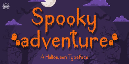 Spooky Adventure is a cool-lettered and spooky decorative font. It is perfectly suitable for any Halloween-related project or crafty idea. Add it confidently to your favorite creations and let yourself be amazed by the outcome generated!
 - Diane Script by GroupType,
$27.00 In 1995, FontHaus came upon a rare opportunity to create a revival of Aries, a little known and previously unavailable typeface by the legendary Eric Gill. Discovering a lost typeface by one of the major designers of the 20th Century, was the discovery of a buried treasure, and being the first type company to release it was an honor. Thirteen years later, FontHaus came across another little known typeface treasure: Diane. Designed by the legendary French designer Roger Excoffon in 1956, this remarkable script has never been faithfully recreated until now. In close collaboration with Mark Simonson, FontHaus and Mr. Simonson painstakingly researched rare type books, publications, European metal type services, and period showings from the United States, England, Germany and from the University of Groningen in the Netherlands. Finding full specimens of the font turned out to be quite a challenge. In most cases, only the caps and lowercase were shown. Furthermore, the more we researched Diane, many curious facts came to light. The caps in earlier specimens of Diane are completely different from specimens published later, suggesting that the face was redesigned at some point, perhaps in the mid-1960s. So we are left with two different sets of caps. The original had very elaborate, swirly strokes, very characteristic of Excoffon¹s gestural designs for posters and logos. Later on, these appear to have been replaced by a set of simpler, more traditional script caps. The original caps are criticized in one source Mark found (Practical Handbook on Display Typefaces, 1959) as being "exquisite" but "not highly legible". Perhaps this is what led to the simpler caps being introduced. Nevertheless, FontHaus's release includes not only both sets of caps, but a range of alternates and a number of new characters not originally available such as the Euro, and a magnificent alternate Ampersand to name a few.
 - Summer Loving by Nicky Laatz,
$17.00 Throw on some shades and get summer ready with the new Summer Loving Font Family! Summer Loving consists of 3 fonts, 2 of which are brush scripts, one textured and a solid version, and a smooth-edged all caps sans serif font. Packed with opentype ligatures and handy alternate letters, the script fonts have natural hand brushed strokes to give your project that ultra-realistic and natural look. 4 Handy Swashes can by created simply by typing out bracket pairs with your opentype ligatures setting active : () {} []
 - Leaden Skies by Kitchen Table Type Foundry,
$16.00 A ‘Leaden Sky’ is a dark grey sky without clouds. We don’t see too many of them here in Holland, as we usually have lots of clouds. Yesterday, however, the sky turned a sinister greyish green and it spewed out an an enormous amount of hailstones the size of walnuts. Leaden Skies is a handmade, all caps display font. I made it with a brush and Chinese ink. It comes with extensive language support and a set of alternates for the lower case glyphs.
 - Amorinda OT by Sudtipos,
$59.00 Amorinda is a connected script that manages to be wild and disciplined at the same time. It can scream wildly within a design or smoothly blend in to make it more human. With its versatile character and a complete set of alternates, Amorinda is the perfect display face for everything from product branding to signage. This 2007 version of Amorinda is now available in OpenType format to expand possibilities of use with lots of alternates when used with OpenType-aware applications such as Adobe Creative Suite.
 - Walpurga by Julia Bausenhardt,
$28.00 Walpurga is a witchy display font that comes in two variants - regular & bold - and with four glyphs for each letter. There is a set of ornaments and the in-built open type features produce a random, natural looking effect when activated through the "contextual alternates" feature. Walpurga was created with stylized brush ends that become visible at larger font sizes. A fresh, versatile font that is usable for a wide range of design applications. Please activate Open Type Features to get the most out of this font.
 - Romanson by Larin Type Co,
$15.00 Romanson - a modern display serif font with a lot of alternates and ligatures. This font can look more classic (conservative) serif, which is perfect for texts. So same he can be more expressive, playing and more modern with alternative substitutes and ligatures, try to play with them and you will get the uniqueness in your project. Just try to create a logo from uppercase, change them to create the best and harmonious and inimitable design. This font includes 205 Uppercase, 27 Lowercase alternates and 51 Ligatures.
 - Brandon Printed by HVD Fonts,
$25.00 Brandon Printed is based on the famous Brandon Grotesque typeface. It has an eroded, printed look with variations of every letter by using different styles. With several different styles like a shadowed version, an inline version and a double printed version you can create a lot of lovely combinations. The Brandon Printed package also contains a set with 95 Extras like arrows, catchwords, stars, emblems numbers & lines. Brandon Printed has a high level of detail, so it may process more slowly in some applications.
 - Spacia by Designova,
$15.00 Spacia is a unique & modern Sans-Serif typeface specially designed for headlines, big text, branding, logotypes & display usage. The typeface could be the perfect choice for logo/logotype design, branding, marketing graphics, banners, posters, signage, corporate identities as well as for editorial design that can bring freshness and professionalism. Please see the examples shown above to get an idea of the capability of this typeface. Handcrafted and designed with powerful OpenType features in mind, each weight includes extended language support including Western European & Central European sets.