10,000 search results
(0.016 seconds)
- Dussa by Attype Studio,
$12.00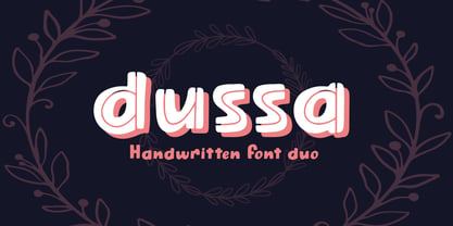 Dussa is a Handwritten summer font duo, make an amazing combination between Display and Regular style. Dussa is perfect for summer event, summer party, branding, logo, invitation, quotes, apparel design, product packaging, merchandise, game titles, cute style design, Book/Cover Title and more. What's Included : - Multilingual Support - Font Duo --- Hope you enjoy with our font! Attype Studio
 - Vallino by Stefani Letter,
$12.00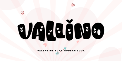 Vallino is a fresh & modern playful font. It has a bold cute style and will add an upscale to all your designs. This Font is perfect for many different projects such as logos & branding, invitations, birthday party, valentine, fashion, stationery, wedding designs, social media posts, advertisements, product packaging, product designs, photography, watermarks, special events, and much more!
 - Pana Summer by Attype Studio,
$12.00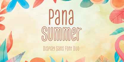 Pana Summer is a Display summer font duo, make an amazing combination between outline and regular style. Pana Summer is perfect for summer event, summer party, branding, logo, invitation, quotes, apparel design, product packaging, merchandise, game titles, cute style design, Book/Cover Title and more. What's Included : - Multilingual Support - Font Duo --- Hope you enjoy with our font! Attype Studio
 - XLaserTrain by Ingrimayne Type,
$14.95 The first release of XLaserTrain, a toy train font, was constructed by taking bits from the four LetterTrain fonts. Version 2, released in late 2010, added a great many cars with holiday and party themes. The bold version has smoke over the cars and you may have to adjust line spacing (leading) to have it display properly.
 - Diamond Jim JNL by Jeff Levine,
$29.00Diamond Jim JNL was inspired [in part] by an image of a 1970s Letraset® dry transfer typeface made entirely of small stars. By creating his own layout using tiny diamond shapes, Jeff Levine has produced a font that takes on multiple appearances. At 24 point it resembles dot matrix printing; at 48 point the diamonds are clearly visible; and overall, the design has a distinctive 70s retro feel. Limited character set. - BAR SADY by Borutta Group,
$- BAR SADY is a revival of a typeface based on famous lettering from "BAR SADY". The project was implemented as part of the Warsaw Participatory Budget 2023. Mateusz Machalski & Małgorzata Bartosik were responsible for the new digital version of the typeface. In the first phase, the original lettering was lifted, then extended to a full set of characters (A-Z). Finally, the bold style was created. The whole family is available under a free license.
 - Empire by Font Bureau,
$40.00 In 1937, Morris Fuller Benton designed Empire, titling capitals that became the headline style for Vogue magazine. In 1989, David Berlow revived it for Publish magazine, adding an italic and a lowercase, both unavailable in the original. He revisited Empire in 1994 with Kelly Ehrgott Milligan, adding two heavier weights, small caps, and an elegant set of Art Deco–flavored oldstyle figures, ultimately expanding it to a seven-part series; FB 1989–94
 - 1741 Financiere by GLC,
$38.00 This family was inspired by the Fournier's font named "Financière". It is a looking like manual font, carved in 1741 by Pierre Simon Fournier (le jeune) and published in his Manuel Typographique... in Paris (1764-1766). We offer 1741 Financière" as a rich complement to our 1786 GLC Fournier. The font is enriched by numerous ligatures and OTF specifications to make it attractive and offer a lot of various typographic possibilities in a text.
 - ASTYPE Ornaments Christmas A2 by astype,
$28.00 Christmas A2 uses the following OpenType features to set up to four different color layers. - Superscript/Superior (Trees) - Subscript/Inferior (Stars) - Numerator (Candles) - Denominator (Light, Bells) Note: Due to the complexity of some parts of the font, some printers may have problems of rendering it smoothly. To avoid this problem you should always outline the font data for the final documents. On lower systems turn font antialiasing off for faster screen redrawings.
 - Kette Pro by Tilde,
$39.75 The design of Kette evolved from searching new ways to make cool and semi-formal type. Study of aspects of legibility was part of the process when designing Kette. It suits posters, slogans. Condensed, Regular and Extended styles of Kette allow fitting variable long text in headlines retaining the style and feel of the original design. This Pro font is packed with all European and Cyrillic alphabets, small caps, variable figure sets and features.
 - Miss McGee by The Ampersand Forest,
$35.00 Miss McGee is equal parts Grotesque and Geometric, which gives here a no-nonsense, midcentury feel. Her letterforms are strong, wide in profile, and legible, making her a great choice for both text and display! She supports Western European, Cyrillic, and monotonic Greek, and has a full set of true small caps in each. She also has useful ligatures and alternates! Miss McGee is a companion typeface to Mr Chips, also from The Ampersand Forest!
 - Friedrichsfeld by Otto Maurer,
$17.00 Friedrichsfeld is a small town near there where I live. Friedrichsfeld, Voerde and Wesel was Part of the Preussen Kingdom till 1912. Friedrichsfeld was a Parade ground of the preussen troops and get the name of the King Friedrich II (the old Fritz). Today there is a Preussen Museum near Friedrichsfeld in Wesel. The Font comes in two ground Version, one in the history Letters and old Ligatures and a modern Version.
 - ASTYPE Ornaments Christmas A by astype,
$28.00 Christmas A uses the following OpenType features to set up to four different color layers. - Superscript/Superior (Trees) - Subscript/Inferior (Stars) - Numerator (Candles) - Denominator (Light, Bells) Note: Due to the complexity of some parts of the font, some printers may have problems of rendering it smoothly. To avoid this problem you should always outline the font data for the final documents. On lower systems turn font antialiasing off for faster screen redrawings.
 - Xanakee by Chank,
$39.00 Xanakee is a curvacious bubbly fun font, with equal parts pleasant approachableness and a swaggerish strut. Xanakee features large, leisurely curves controlled by the consistency of the monoline stroke. All with a friendly, human voice and confident gait. OpenType versions have a few special features, like some smallcaps and some fanciful swash figures. Purchase it from MyFonts and you'll get TrueType format in your download as well. Also available as web type, too, of course.
 - Filo Pro by URW Type Foundry,
$49.99 Filo Pro is a very beautiful and highly legible typeface family as regular, medium and bold. It is a quite characteristic, modern interpretation of the humanistic serif. The serifs of Filo Pro are not too dominant, and its forms are soft and organic. The font family renders extremely well in text sizes but can equally well be used for headlines. The OpenType Pro family of Filo Pro comes with an extended Latin character set including a large number of beautiful ligatures as well as small caps and different sets of figures. Filo Pro has been chosen to be part of the URW++ SelecType.
 - 1565 Renaissance by GLC,
$20.00 This set of initial letters was inspired from French renaissance decorated letters. It is a typical pattern, one among dozen quite similar, but this one was in use in Paris, unchanged, for centuries, and was still in use in the beginning of 1900s. This explains the difference between I and J, U and V. These characters were engraved years after the original set. Our font was inspired from a late 1800s publication. It can be used as well with Humane fonts (like our 1543 Humane Janson or 1592 GLC Garamond) as with modern fonts like our 1820 Modern or 1906 French News.
 - Magneton by Melvastype,
$32.00 Magneton is a brush script typeface that contains three weights and two slant angles. Three weights simulates the pressure of the brush pen; light is written with a gentle pressure and the bold one with more pressure. Two slant angles gives Magneton two natures; the more casual one and the more dynamic one. So with this script you have lots of options to choose from. You can adjust the look and feel just like when writing with a real brush pen! Magneton has lots of alternates and swash characters. It has two sets (and more) of upper case letters. The more basic one and the more flamboyant one. It also has lots and lots of lower case alternates: two styles of end swashes, underlines, a few different ascender and descer swashes and much more. Please explore the images and glyhp set to get the idea. I hope you like what you see and use Magneton in logos, lettering compositions, t-shirts etc. there are lots of opportunities with this one. Thank you and please enjoy!
 - Betterlove by Good Java Studio,
$21.00 Betterlove is a beautiful script font with many swashes at the beginning and end strokes, which let you make beautiful swash characters. This font includes full set of swash heart lowercase letters, numerals, and punctuation. Also it includes OpenType ligatures and stylistic set. This is so perfect for invitations, monograms, weddings, fashion, branding, labels, or logotype.
 - Artificial Flavour by Kitchen Table Type Foundry,
$15.00 I do groceries a couple of times a week. When I am shopping for food, I always read the ingredients list; I don’t want too much sugar, nor palm oil, trans fats or a lot of E numbers. It used to be quite hard finding products that didn’t contain artificial flavours or colouring, but it is getting better. Artificial Flavour is an anti-ode to the time we couldn’t get enough of the stuff - it is a handmade, all caps font which comes with extensive language support and a sweet set of alternates.
 - Kubrick by Quadrat,
$25.00 Kubrick is an experiment in extremes. The Light font is very tall and slender, the Black font is very massive, and Kubrick's slender counters push some of its glyphs to the edge of recognition. The thin counters and negative spaces also give text set in Kubrick a definite visual sparkle, especially in all-uppercase settings. Because of its extreme letterforms, Kubrick is recommended only for large display use. The default letterspacing is set fairly wide to keep text legible. Kubrick was a double-experiment. One part of it was to see how heavy and massive a typeface I could make while still keeping it legible. The other part was to develop a Multiple Master font. Multiple Master fonts were a format developed by Adobe that allowed the user to change things like the weight and width of a typeface. Monollith started as just such a Multiple Master typeface, but when Adobe discontinued the Multiple Master format, I stopped work on the typeface. Later I decided to continue work on it, but as five separate font weights: Light, Medium, Bold, ExtraBold and Black. Very rectilinear letterforms with extremely narrow counters and negative spaces. The five fonts go from very thin and condensed to very heavy and extended. Use in large display settings where unornamented high visual impact is desired.
 - Conthey Inline by ROHH,
$29.00 Conthey Inline™ is your new retro-display best friend! The one and only, unique IN-AND-OUT typeface with strong personality and outstanding flexibility. This display sans features amazing variable fonts letting you adjust not only width of the letters, but also let you fluently transition from thin inline styles to thin outline ones. This mechanics opens a world full of layering possibilities as well as a great fine-tuning ability. The family consists of 39 OpenType fonts - 18 pure inline/outline styles in 3 widths (Narrow, Condensed, Normal) and 21 styles carefully prepared and tuned for layering. For even greater flexibility 3 variable fonts are included in the set. In addition to flexible width and inline-outline transitioning, this playful typeface features 4 different inline styles to spice up things even more! All styles were meticulously crafted with the highest attention to detail in the letterforms as well as spacing. Conthey Inline is a sibling of Conthey, a display unicase family as well as Lutschine, a versatile modern narrow display typeface. Conthey Inline composes perfectly with its family members, covering a very broad range of design scenarios. All these typefaces are a part of big type system containing also a workhorse sans serifs such as Rothorn and Montreux Grotesk. You will have a lot of success using Conthey Inline for any kind of playful, vintage/retro, organic, friendly and stylized designs. Especially, industries such as food & beverage, travel, hospitality, fashion, healthcare, sports, lifestyle, music, art, entertainment and products for youth are perfect areas to make Conthey Inline shine with all its charm.
 - Cirkus Fantastiko by PizzaDude.dk,
$17.00 The other day I was at a market with my kids and they had this really retro kind of circus thing. The signs and posters there, were designed in a really sloppy and poor manner - but they all had a lot of naive charm! I was really fascinated by all these uneven letters and I was immediately inspired to do a font like that! And out of the magic hat comes...ta-da-da-da...Cirkus Fantastiko! Planning on throwing a party with a circus theme? Then Cirkus Fantastiko is ready to play the juggling clown while riding the elephant! Play around with the 3 different layers to create that low budget hand painted cirkus posters! :)
 - Stealing Hearts by Nathatype,
$29.00 Looking for a beautiful font to captivate your audience, clients, or party guests? If you need to create invitations, have a t-shirt branding company, or whatever it is - then this is the perfect font for you. Stealing Hearts-A Handwritten Script Font Stealing Hearts is a elegant script typeface. Designed primarily as a captivating handcrafted with style. Every swash, stroke, and curve was created to entice happiness and elegance. Ideal to create amazing headings, invitations, logos, and social media graphics. Our font always includes Multilingual Support to make your branding reach a global audience. Features: Ligatures Stylistic Sets PUA Encoded Numerals and Punctuation Thank you for downloading premium fonts from Nathatype
 - Musty Scoot by Bogstav,
$15.00 Got a pair of jeans that goes well with both party and casual living? A shirt that would fit well to a Hollywood movie premiere and would be suitable to pick up the kids from the kindergarten? If so, you know exactly what I mean, when I say that the Musty Scoot font is suitable for anything! Well, almost anything...maybe not that highway sign, or that security sign at the airport!!! But suitable for anything for children, toys, adventures, handcraft, invitation, restaurants, playgrounds, libraries...etc etc Each letter has 7 slightly different versions, which automatically cycles as you type. There is even a version of right/left sided arrow to choose from!
 - Newkids Crew by IKIIKOWRK,
$17.00 Proudly present New Kids Crew - Graffiti Type, created by ikiiko. New Kids Crew is a raw and expressive brush font with touch of street style. This type has a freestyle shape that has the characteristics of freedom, youth and is filled with unique characters. This type is very suitable for making a poster, magazine layout, brand logo, sleeve cover, party flyer, quotes, or simply as a stylish text overlay to any background image. What's Included? 2 Weight : Regular & Oblique Uppercase & Lowercase Numbers & Punctuation Alternates & Ligature Multilingual Support Get also a good offer & FREEBIE at our site : www.ikiiko.com Enjoy our font and if you have any questions, you can contact us by email : ikiikowrk@gmail.com
 - Samplex by Tipo Pèpel,
$22.00 Neutral and universal are two words that could describe a kind of perfection. The search for neutrality and universality is part of history in type design; it was specially important in the so-called Swiss Style. Samplex is a typeface that joins this particular search. The design gets rid of unnecessary elements and stays away from style conflicts. The large and slightly condensed body of lowercase letters makes Samplex a good choice for long paragraphs, and especially appropriate for screen devices. Letters with a blocky appearance give shape to a text in perfect order, ideal for grid lovers and layouts with a strict structure. The design of Samplex is clean and efficient. The diagonal cuts are reserved to the italic letterforms, setting some distance between the solid upright characters and the dynamic oblique forms.
 - 1651 Alchemy by GLC,
$38.00 This family is a compilation created from a Garamond set in use in Paris circa 1651, but similar to those, eroded and tired, that were in use during centuries to print cheap publications, as well as in Europe than in America, and from a large choice of printed symbols—all specially redrawn—used for alchemical, pharmaceutical and astrological books, covering 1550 to late 1800s period. Each alphabet is doubled by a slightly different one, and a special OTF encoding allows to give an irregular effect with never the same twin letters in a single word. The Normal style is enriched by small caps, and the Italic style by Swashes. A lot of symbols, too, are given twice with differences. This font may be used with our calendar specialized 1689 Almanach.
 - Roadhouse by Kimmy Design,
$10.00 Roadhouse is a layering typeface family that is part of the greater Evanston type collection, which is inspired by American typefaces commonly used at the turn of the century leading up to Prohibition. Roadhouse reflects the style of lettering used on tavern signage and printed ephemera during the early 20th century. The family comes with 31 layering fonts, from top layers like bevels, highlights, stripes, outlines, as well as extruding and drop layers. It also includes 2 script fonts, upright and oblique, as well as 9 complimentary text fonts for smaller text settings. Either get the entire family of extrusions, bevel angles or the basic family with ready to use fonts that don’t need to be layered. Roadhouse is a great display typeface for logos, branding, packaging, and advertising.
 - SpiderishFS - 100% free

- Pi Travel+Transportation by Scangraphic Digital Type Collection,
$26.00PI Travel + Transport is part of the Scangraphic Collection and designed 1985 by Schriftatelier Scangraphic Dr. Böger GmbH. - GroovinUpSlowly by Haiku Monkey,
$10.00A serifed handwriting font with equal parts fun and flair. Wide spacing gives the font a festive feel. - Pi Signs+Symbols by Scangraphic Digital Type Collection,
$26.00 PI Signs + Symbols is part of the Scangraphic Collection and designed 1985 by Schriftatelier Scangraphic Dr. Böger GmbH.
 - MHF Gothic by MetalHead,
$14.95 Equal parts Sabbath and Blackletter. Its distinctive serifs will make any metalhead want to stand up and shout!
 - Sun-kissed by Krafted,
$10.00 “Live in the sunshine. Swim in the sea. Drink the wild air.” ― Ralph Waldo Emerson Hey there sun-kissed beauties! Are you looking for a gorgeous handwritten font that’ll captivate your viewers and make your branding shine as bright as the sun? Introducing Sun-kissed - A Handwritten Font. With every hand-drawn stroke and curve, Sun-kissed will delight and add brightness, modernity, and fun to wherever it’s placed. Impress your party guests with gorgeous invitations, make a statement on your social media banners, and add a little bit of sunshine to your corporate identity. This stylish Handwritten font is also can be used for headings, logos, business cards, printed quotes, cards, packaging, and presentations. What you’ll get: Multilingual & Ligature Support Full sets of Punctuation and Numerals Compatible with: Adobe Suite Microsoft Office KeyNote Pages Software Requirements: The fonts that you’ll receive in the pack are widely supported by most software. In order to get the full functionality of the selection of standard ligatures (custom created letters) in the script font, any software that can read OpenType fonts will work. We hope you enjoy this font and that it makes your branding sparkle! Feel free to reach out to us if you’d like more information or if you have any concerns.
 - Arkeo BT by Bitstream,
$50.99Arkeo BT is designer Brian Sooy's first typeface family published by Bitstream. Given very few design elements to work with, Brian has designed a bitmap font that is unique and very readable. There are three widths, Condensed, Regular and Extended. In our opinion, pixels never looked so good. Arkeo performs equally well on screen and as on paper. The OpenType versions include an extended character set featuring oldstyle figures, fractions and additional f-ligatures. Design was begun in late 2001 and completed in 2002. Sooy asked Bitstream to critique, which we did gladly. We also added additional characters for OpenType. This included alternate figure set, an extended set of fractions and additional f-ligatures. Sooy used preliminary versions for setting parts of the TypeCon 2002 material and website. - Legendary Legerdemain by Comicraft,
$29.00 Are you watching closely? We know what you're looking for -- the secret. Comicraft’s magic formula, our Legendary Legerdemain. But you won't find it because of course, you're not really looking. You don't really want to work it out. You want to believe in the magic. Every great Comicraft font consists of three parts. The first part is called “The Pledge”. Comicraft shows you an ordinary looking font: A through Z, nothing more than the letters of the alphabet, unaltered, normal. But of course... they aren't. The second part is called “The Turn”. Comicraft takes the ordinary letters of the alphabet and makes them look extraordinary. Now you are peering closely -- you convince yourself you're looking for the secret... even though you really don't want to know. You want to be fooled. And you are! But don't applaud yet. Because making something extraordinary isn't enough... That’s why every Comicraft font has a third part, the hardest part, what we call “The Prestige”. That''s when we have to SELL the font. And that’s the real trick. See the families related to Legendary Legerdemain: Legendary Legerdemain Leggy.
 - Sardo by SD Fonts,
$34.00 Not serif, nor sans, partly soft, partly crude, but highly individual. Sardo comes with a vivid slanted look resulting from the contrast of its common classic stroke difference and straight thin serifs, adding a rigid component to its appearance. Thus Sardo shows a strong character projecting a huge amount of individuality. A new display font made to draw attention where classic serifs and sans serifs appear just dull. So please meet Sardo, a cosy wild cat showing Sharpe claws.
 - CAL Bodoni Terracina by California Type Foundry,
$47.00 Bodoni Terracina is a legible, fun-formal script face, with lots of curls. Sometimes script faces are hard to read. Sometimes being formal means that there’s no personality and there’s no fun. Enter Terracina: one of the masterpieces of font design. Some of the most personable italics ever carved. Includes powerful new features for: • Dates • Pricings • Addresses Not is only Terracina formal but fun, it’s also fun to use! In a program like Adobe Indesign or Illustrator, just highlight a word and see lots of fun options. Bodoni himself etched these symbols, and his fun-loving personality shines through. As a semi-script, it can go together with many script fonts, but it is more readable. When you need something equal parts elegant and whimsical, Terracina strikes a perfect balance to let the fun shine through, such as for holiday designs or fairytales. Terracina is a subheads font, but Bodoni also used it for paragraphs. So Terracina works well doing subhead paragraphs, especially when contrasting with the mood of the first font. And because of the swash variety, it works well for setting German and other European languages. CAL Bodoni Terracina is a member of our Origins Series. Origin Fonts are designed to be true to the original designer's intentions and fonts. Our Bodoni origin fonts ARE Bodoni fonts, not imitations or interpretations. They were drawn by Bodoni, our team just expanded it for modern use. For Terracina, Bodoni's original weight is the "Quasi-Lite" option, all other weights have been meticulously matched by the CAL Origins Team.
 - Ginza Narrow by Positype,
$22.00 Here's what I said about the original Ginza: Sometimes you get an idea stuck in your head and the only way to get rid of that demon is to put something down on paper. A year later the doodles became a skeleton, and then the skeleton had a body, then the body had a name, then the name got a personality. What was left was a clean set of fonts that encompass a very simple skeleton with a lot of visual appeal. And now with Ginza Narrow: Once Ginza was released, I immediately wanted to commit the time to create a narrower version—if for nothing else but to add additional versatility to the skeleton, but my schedule just would not allow it until a client recently asked me to. There was no need to ask twice as I had already started and then shelved the initial builds. I also had the opportunity to expand the localization of the fonts by adding Cyrillic.
 - Futurex Phat - Unknown license


