10,000 search results
(0.025 seconds)
- Heanffe by Letterara,
$12.00 Heanffe is a one-of-a-kind handwritten font with a beautiful feel. To maintain a true, hand lettered experience, this font includes the following ligatures: Alu, at, ch, dd, ee, ff, ll, oo, pp, ss, tt, ef, es, et, eth, ily, it, ith, om, ot, on, ou, ont, th, ov, ow, sh, st, ut, zz Just use your imagination, your project will become more alive and look Elegant than ever with one of the Heanffe font. Feel free to play with all the whole alternates! Heanffe also includes full set of uppercase and lowercase letters, multilingual symbols, numerals, punctuation. The font has smooth wet ink texture, so would be perfect for all designs. You can make a greeting card or a package design, or even a brand identity, craft design, any DIY project, book title, wedding invitation, identity card, packaging, Website or any purpose to make your art / design project look pretty and trendy.
 - Zabatana Poster - 100% free

- Contempo Elan by Poole,
$36.00Where's the party? Don't forget Contempo Elan! This stunning new font comes with it's own party ornaments. The right solution for any festive occasion, this super innovative face comes in two flavors. Contempo Elan Grand Script is a surprisingly elegant alternative to a more traditional formal script. Designed by Wesley Poole of Hawaii, this alphabet is definitely a hip script. Early reviews call this font "remarkable" and "a masterwork". Contempo Elan Ornamental is elegant and fun! Just perfect for those last minute Holiday announcements or any use that requires a classy, celebratory typeface, Contempo Elan Ornamental fits the bill. Equally at home on board the Enterprise or beckoning revelers at Mardi Gras, Contempo Elan belongs in every type library, just for fun. Party on. - Amalitha by Attype Studio,
$12.00 Amalitha is a Layered script font with stylistic set. Combine Amalitha with extrude & outline version to get amazing 3D letterform! Fall in love with its incredibly versatile style and use it to create spectacular designs! Amalitha is perfect for branding, logo, invitation, quotes, apparel design, product packaging, merchandise, game titles, cute style design, Book/Cover Title and more. What's Included : - Amalitha - Extrude.otf - Amalitha - Outline.otf - Stylistic Set character - Multilingual Support
 - Ascendant by Ef Studio,
$10.00 Ascendant is a font duo, with contemporary serif family font and script. It’s so versatile to mix and match. Perfect for branding, editorial design, logo, book, poster, magazine, and so on. You will get : Ascendant Serif font with full set of lowercase and uppercase letters, numerals and punctuation, multilingual characters, standard ligature. Ascendant Script font with full set of lowercase and uppercase letters, numerals and punctuation, multilingual characters, ligatures, and alternate.
 - Cotane Beach by EKNOJI,
$17.00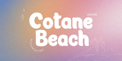 Cotane Beach It is perfect monoline Font for branding, logo, every other design which needs a Display. What you get? - Character set A-Z - Character set a-z - Support multi-language glyphs - Works on PC & Mac - Simple installations - Accessible in the Adobe Illustrator, Adobe Photoshop, Adobe InDesign, even work on Microsoft Word. Please kindly message us for any question or issue about our product. Hope you love it!!
 - Hearty Chintya by Attype Studio,
$10.00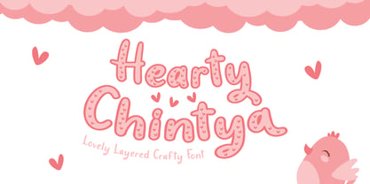 Hearty Chintya is a Lovely Layered Crafty font with stylistic set. Combine Hearty Chintya with display & outline version to get amazing 3D letterform! Fall in love with its incredibly versatile style and use it to create spectacular designs! Hearty Chintya is perfect for branding, logo, invitation, quotes, apparel design, product packaging, merchandise, game titles, cute style design, Book/Cover Title and more. What's Included : - Stylistic Set character - Multilingual Support
 - Printing Press Elements JNL by Jeff Levine,
$29.00 Printing Press Elements JNL contains an eclectic assortment of printer's elements. From a set of dice (in both black and white faces) to cartoon embellishments to border and decorative elements there's something to fit numerous uses. Also included is an extendable bracket. The left-facing elements are on the (greater than) keys. The right-facing elements are on the [ (left bracket), \ (backslash) and ] (right bracket) keys.
 - Halau Serif by Vintage Voyage Design Supply,
$10.00 Introducing mid-century modern font family – Halau Serif. Classic mid-century serif with characteristic cartoon look. Straight for your summer projects. More fun, more sun and more retro-modern! Play with it and get really cool retro-lettering style. Also, you can use some alternates (A, E, K, R, Y, a, g, l, k). Also, you get Mid-Century Modern style graphic objects set as letters and numerals alternates (36 Total).
 - Dyer - Unknown license

- Dead Hardy - Personal use only

- Kimbiso by Yukita Creative,
$14.00 Kimbiso is one of the most advanced fonts on the market. Its clean lines and ultra-modern style make it perfect for high fashion branding, cinematic videos, social media posts, and more. Best of all, it's easy to read and looks sophisticated and stylish. What do you get when you get this font? - Modern Sans is one font you need - Affordable and versatile - Multilingual support and complete characters set - Designed by a Typeface Designer - Get one font for any occasion - Multilingual support in this modern sans serif font - Well known for its exceptional readability
 - Smoothing by Hanzel Space,
$25.00 Smoothing is a stylish modern calligraphic font in an original handwriting style. It's perfect for branding, wedding invitations and cards, and maybe for red wine labels. Smoothing includes a full set of beautiful upper and lower case letters, numbers, a wide variety of punctuation marks and 46 ligatures. All lowercase letters include initial and final strokes, giving a realistic handwritten style. What did you get, honey? Full Set of standard alphabet and punctuation Extra set of ending swashed lowercase Handwritten ligatures Thanks so much for checking out my shop! Happy creating! Cheers! Hanief - Hanzel Space
 - Cloudbusting by Ana's Fonts,
$15.00 Cloudbusting is a playful sans serif font with a bubble letters look, lots of variations and an extra set of drawings. Perfect for any design that needs a bold font, such as logotypes, quotes and social media posts, website and magazine layouts, and poster designs. Cloudbusting includes: An outline font A filled font A set of 62 outline drawings A set of 62 filled drawings Cloudbusting is an all caps font, with two versions for each letter, which makes it fun to use in animations and designs with a handmade look.
 - Hopeful Giraffe by JBFoundry,
$18.00 Long legs, long neck, low x-height, it’s Hopeful giraffe. Each of both styles of this family of font contains two stylistic sets. With its ornamental capitals and its varied numerals, you can modulate the aspect of your texts as you want it.
 - Bluettelli by Letterara,
$12.00 Bluettelli is a fantastic font trio that combines three beautiful script calligraphy. It has a feminine and elegant look which is great for logos, invitations, and blogs, but can also be used to make a striking headline. Get inspired by this extraordinary set!
 - Sangre BB by Blambot,
$20.00A handwriting font with a decidedly sexy, Mediterranean flair. Perfect for restaurant signage, menus, party invitations and more. Sangre includes a plethora of European characters. - Freunlaven JNL by Jeff Levine,
$29.00Freunlaven JNL is a wild and partying font with a name inspired by the nonsense verbage often uttered by Jerry Lewis in his comedy classics. - Yin Yang Messages by Ingrimayne Type,
$9.00 YinYangMessages contains two sets of letters, those on the upper-case keys that fit on the left side of a yin-yang symbol and those on the lower-case keys that fit on the left side of a yin-yang symbol. One can alternate the two sets manually but the OpenType contextual alternatives feature does this automatically in any program that supports this feature. The family contains two fonts. In one the filled half is on the left and in the other the filled half is on the right. The slash and backspace keys contain blank halves of the symbol, which are useful for completing words with an odd number of letters. The two styles can be used in layers. YinYangMessages is a fun and playful family that every once in a while may be the ideal typeface for some unusual situation.
 - Busted by Canada Type,
$24.95 Busted is the very strange and out-of-character outburst of Bill Troop, a guy who was classically trained in everything, from classical piano and literature to classical photography and type design. As far as we could tell, Bill Troop is the kind of guy whose appearance and voice instantly trigger thoughts of black and white photos, fedoras, and pre-industrial age Europe. A few years ago, he even moved from the United States to England, where it took him less than a week to feel at home and start sounding like a Norwich native. Then something happened and the poor dude just snapped. Busted is the controversial result of the blood rushing to his head. If you know what exactly happened to him, please let us know. Concern, consideration and human interest story aside, Busted is a fascinating thing. It is a set of four interchangeable thick outline fonts where the same letter forms turn from wild to wilder to broken to somewhat clean. Mix them up in a setting and you have words that snarl with a sneer. Life's too short. Take it all with a grain of salt. Scream whenever you feel like it. Busted Pro is a single font combining all four character sets, and rigged with an OpenType pseudo-randomizer in the contextual alternates feature, which you can disable or enable anywhere in your setting for maximum visual shock just the way you like it. Works just as well in PAL or SECAM. Don't be fooled by imitations, and don't get caught with your drawers down.
 - Food Doodles Too by Outside the Line,
$19.00 Food Doodles Too is a 31-picture clipart font of food. Use them as dingbats or enlarge the small pictures and use them as clipart. Lots to choose from… from soup to nuts OK no nuts. But there is pizza, pasta, soup, eggs, sushi, sandwich, hot dog, hamburger, fish, kabobs, toast, breads, cheese, pickles, shrimp, soufflé, and desserts galore… cake, pie, cookie, cupcake, trifle, sundae, banana split, milk, tea and more. Food Doodles Too works nicely with Coffee & Tea Doodles. If you need some fancy cakes check out Party Doodles. All in the same line drawing style to mix and match.
 - Interrupt Display Pro by T4 Foundry,
$21.00Torbjörn Olsson's Interrupt is a salty dog of a sanserif, harboring memories of freighters unloading their cargo in a run-down port. Interrupt works great for signs, and looks just fine painted on the side of a wooden crate or stencilled on an old tarpaulin. Interrupt is recommended for use over 36 points. You have run out of packing crates and would like to use it on paper? Sure, Interrupt can add its sturdy sailor's gait to any medium... just don't set any novel in Interrupt. Not even Melville. Interrupt is an OpenType typeface for both PC and Mac. - Plain Stupid by PizzaDude.dk,
$17.00 Really, there is nothing stupid about this font. In some strange and weird way, I just thought that the name sounded like something eye-catching - in the same way that the font is eye-catching! It may look like your average comic font, but it's not! I carefully put a lot of funk, twist, comic and a spoonful of pizzadude into each and every letter. The result is a bouncy crazy looking comic font. Oh, I almost forgot - I topped the letters with a spoonful of grafitti mixed with the sounds of a party...that's the recipe for this lovely multilingual font! :)
 - CA Magic Hour by Cape Arcona Type Foundry,
$19.00 You remember the time when the Concorde was the fastest passenger plane on earth? When it was possible to travel from Paris to New York in 3 3/4 hours? Those were cool times. Times when cocktails tasted good and you didn’t think of an eventual headache afterwards. Times when you didn’t have to think how to dress because there was only one way. Straight from that time comes CA Magic Hour. A vintage font from a time from which we could learn a lot today. Optimistic and straight forward, it will speed up your designs.
 - Kiwi by Atlantic Fonts,
$26.00 Kiwi gives natural energy to every project with its sweet and spirited forms and a variety of tasty options. Be bold using it as all-caps including its fun set of discretionary double-letter ligatures, or be distinctly playful, combining upper-lower, with bushels of loosely interlocking ligatures. Kiwi font family also includes delicious Kiwi Fruits, a striking and juicy collection of graphic fruit illustrations by illustrator, Amy Dietrich. For inviting packaging, magazine, and books, or say, a cool-looking apple for your cider pressing party invite, Kiwi is a great pick. Shown here with Quince font, also by Atlantic Fonts.
 - Femi SRF by Stella Roberts Fonts,
$25.00 People often come into your life and make a significant impression that lasts a lifetime. Be they friend, family member or relationship partner, such people are rare and endearing. Sadly, we lose many of these individuals before their time. Femi SRF is dedicated to one such person who was in Stella's life and whose memory will live on long past the duration of his mortal existence. Like Femi himself, this typeface offers a touch of bold elegance and discipline. The net profits from my font sales help defer medical expenses for my siblings, who both suffer with Cystic Fibrosis and diabetes. Thank you.
 - Old Stefan by 066.FONT,
$9.99 Old Stefan is a display font that simulates the appearance of typewritten text. Each letter in Old Stefan has been carefully designed to resemble the effect you get with a typewriter. This effect adds a sense of nostalgia to the text, as if it were from a bygone era, adding an authentic charm to the designs. Old Stefan retains its varied and extravagant style, giving the text a lightness and a certain nonchalance. Its distinctive and daring letters make it ideal for projects that strive for a unique look, while harking back to the typewriter vibe of the past. Remastered in 2022.
 - Kaelorin by RagamKata,
$14.00 Say hello to new serif font, Kaelorin! Introducing Rosalind, a stunning modern retro serif font that effortlessly combines aesthetic charm with captivating alternate characters. This typeface falls into the category of modern retro serif fonts and is designed to bring a touch of nostalgia and elegance to your design projects. What sets Rosalind apart are its intriguing alternate characters. These alternates offer a wealth of creative possibilities, allowing you to experiment with various letter combinations and create unique and eye-catching typographic compositions. Each alternate has been thoughtfully designed to ensure visual coherence and seamless integration within the font.
 - Rostema by RagamKata,
$16.00 Rostema - Display Serif Introducing Rostema, a captivating blackletter serif display font that seamlessly bridges the gap between tradition and modern design. This typeface is a testament to the timeless beauty of blackletter fonts, infused with a contemporary twist that makes it perfect for a wide range of creative applications. Whether you're designing posters, branding materials, invitations, or any other creative endeavor that demands a bold and distinctive typeface, Rostema is your go-to font. Its blackletter serif display style adds a touch of drama and sophistication to your designs, setting them apart and leaving a lasting impression.
 - Cardillac by Hoftype,
$49.00 Cardillac, named after E.T.A. Hoffmann’s literary figure, refers back to classical Didonesque, yet presents unique details which set it apart from historic models by adding a new flavour. Its clarity, noble appearance and cool elegance predestine it for magazines and newspapers. The Cardillac Family consists of 14 styles, provides many features which allow its application for ambitious typography. It comes in OpenType format with extended language support. All weights contain small caps, ligatures, superior characters, proportional lining figures, tabular lining figures, proportional old style figures, lining old style figures, matching currency symbols, fraction- and scientific numerals, matching arrows and alternate characters.
 - Ingrid Mono by Jörg Schmitt,
$35.00 The birth of the monospaced types dates back to the past. There was a need for the creation of typesets for typewriters. The difficulty was to align the different glyphs in the same width. This led to particular problems with letters like "M" and "l"; the former seemed to be squeezed into the same width of all letters and the second one appeared way too stretched. Despite - or perhaps because of - the impression of the typewriter it is still popular with Graphic Designers. The Ingrid Mono font family with a high range of glyphs and symbols has that special appearance.
 - Quirky Kurlz by Scholtz Fonts,
$22.00 Quirky Kurlz is a cute, curly, vintage font. It's light hearted and funny, rounded and retro. Rounded characters, curly loops and undulating baseline work together to give a lively, look-at-me impression. Use Quirky Kurlz for branding, packaging, girls stuff, kids fashion, greeting cards, party invitations, retro postcards and advertising. Quirky Kurlz has all the features usually included in a fully professional font. Language support includes all European character sets, Greek symbols and all punctuation. Quirky Kurlz makes use of OpenType features to avoid the mechanical look caused by two identical characters side by side.
 - Moonspace by Jafar07,
$17.00 Moonspace is a unique display sans-serif font with a captivating wave-like character on each letter. Despite its slightly taller height, this font remains highly legible and suitable for a wide range of designs. With its distinctive design that sets it apart from other sans-serif fonts, Moonspace adds an artistic touch to your designs. It's perfect for use on posters, magazines, brochures, and other creative projects. Crafted with precision and balanced letter proportions, Moonspace delivers a professional and eye-catching look. It's suitable for use in a variety of designs, from modern to classic.
 - Roller Poster by HiH,
$12.00 Roller Poster is named after Alfred Roller. In 1902, Roller created a poster to advertise the 16th exhibit of Austrian Artists and Sculptures Association, representing the Vienna Secession movement. The exhibit was to take place in Vienna during January & February 1903. The location is not mentioned because everyone in Vienna knew it would be held at the exhibit hall in the Secession Building at Friedrichstraþe 12, a few blocks south of the Opernring, near the Naschmarkt. Designed by Joseph Maria Olbrich in 1897, the buiilding has been restored and stands today as one finest of the many fine examples of Art Nouveau architecture in Vienna (see vienna_secession_bldg.jpg). Because of its dome, it is called “the golden cabbage.” The poster itself is unique. The word “secession” is in one type style and takes up two-thirds of the elongated poster. At the bottom of the poster are the details in a different lettering style. It is this second style at the bottom that is the basis for the font Roller Poster. In keeping with our regular naming conventions, we were going to call it Roller Gezeichnete (hand-drawn), but the wonderful play on both words and the shape of the three S’s in secession was too compelling. In November 1965 there was an exhibit of Jugendstil and Expressionist art at the University of California. Alfred Roller’s Secession Poster was part of that exhibit. Wes Wilson was designing promotional material at Contact Printing in San Francisco. Among their clients was a rock promoter named Bill Graham, staging dance-concerts at Fillmore Auditorium. Wilson saw the catalog from the UC exhibit and Roller’s lettering. Wilson adapted Roller’s letter forms to his own fluid style. The result was the poster for the August 12-13, 1966 Jefferson Airplane/Grateful Dead concert at Fillmore put on by Graham (BG23-1). Wilson continued to use Roller’s letter forms on most of the posters he did for Graham through May 1967, when he stopped working for Graham. The posters were extremely successful and the lettering style along with Roller’s letter forms were picked up by other artists, including Bonnie MacLean, Clifford Charles Seeley, James Gardner, and others. The Secession poster and the Fillmore posters have inspired a number of fonts in addition to ours. Among them are JONAH BLACK (& WHITE) by Rececca Alaccari, LOVE SOLID by Leslie Carbarga and MOJO by Jim Parkinson. Each is different and yet each clearly shows its bloodlines. Our font differs in two ways: 1) the general differences in the interpretation of the letter forms and 2) the modification of the basic letter form to incorporate the diacriticals within the implied frame of the letter, after the manner of the original design by Roller. We borrowed Carbarga’s solution to the slashed O and used it, in a modified form, for other characters as well to accomplish the same purpose. We recommend that you buy ours and at least one of the other three. According to Alaccari, a version called URBAN was released by Franklin Lettering in the 70’s (and is shown on page 51 of The Solotype Catalog). For comparison of our font to original design, see image files roller_poster_2s.jpg of original poster and roller_poster_2sx.jpg showing reconstruction using our font for the lower portion (recontructed area indicated by blue bar). Please note the consistency of character width. In the lower case, 23 of the basic 26 letters are 1/2 EM Square wide. The ‘i’ is an eighth narrower, while the ‘m’& ‘w’ are one quarter wider. All the Upper Case letters are 1/8 EM wider than the lower case. This is to make it easier to fill a geometrical shape like a rectangle, allowing you to capture a little of the flavor of Wes Wilson’s Fillmore West poster using only a word processor. We have also included a number of shapes for use as spacers and endcaps. If you have a drawing program that allows you to edit an ‘envelope’ around the letters to distort their shape, you can really get creative. I used Corel Draw for the gallary images, but there are other programs that can accomplish the same thing. The image file “roller_poster_keys.jpg” shows the complete character set with the keystrokes required for each character (see “HiH_Font_readme.txt” for instruction on inserting the non-keyboard characters). The file “roller_poster_widths.jpg” shows the exact width of each character in EM units (based on 1000 units per EM square). You will notice that the font is set wide for readability. However, most programs will allow you to tighten up on the character spacing after the manner of Roller & Wilson. In MS Word, for example, go to the FORMAT menu > FONT > CHARACTER SPACING. Go to the second Drop-Down Menu, labeled ‘Spacing’ and select "condensed' and then set the amount that you want to condense ‘by’ (key on the little arrows); two points (2.0) is a godd place to start. Let your motto be EXPLORE & EXPERIMENT. Art Nouveau has always been one of my favorite movements in art -- I grew up in a home with a couple of Mucha prints hanging on the living room wall. Perhaps because of that and because I lived through the sixties, I have enjoyed researching and designing this font more than any other I have worked on. Let’s face it (pardon the pun), Roller Poster is a FUN font. You owe it to yourself to have fun using it.
 - Chubs by Type.p,
$24.00 "Chubs," a typeface specifically designed for large display sizes, perfect for making a bold statement. Each letter in Chubs has been meticulously crafted to possess a thick and prominent appearance, ensuring that your designs leave a lasting impact on viewers. Chubs's distinctive weight and blackness make it an ideal choice for a wide range of applications, including posters, packaging, and logos. Whether you want to create eye-catching promotional materials or design a powerful brand identity, Chubs has got you covered. Within the Chubs typeface family, you'll find two distinct styles, each with its own personality and visual appeal. The first style, "Chubs Black," features letters with a captivating slit, reminiscent of a belly that overlaps. This distinctive groove adds an extra layer of visual interest and uniqueness to your designs. On the other hand, "Chubs Filled" offers a solid and plump appearance, without the characteristic slit. This style amplifies the chubby nature of the letters, resulting in a bold and impactful display. To further enhance your creative options, both styles within the Chubs family include an alternate character set featuring a wink shadow in every letter. These additional characters provide a touch of fanciness and playfulness, allowing you to experiment and add unique elements to your designs. Choose "Chubs" for your next big project, and witness the boldness and charm that sets your designs apart from the rest. Let Chubs bring your ideas to life and make a powerful visual statement that captures attention and leaves a lasting impression.
 - Lexington by Canada Type,
$24.95A revival and major expansion of a 1926 Ludwig Wagner Schriftgiesserei typeface called Titanic, Lexington is the ultimate art deco expression of the high times of signage and theater during the first half of the twentieth century. Big feminine caps and cozy direct minuscules make for a unique combination rarely found in other deco faces. Topped off with the humorous and quite suave tall and pointy ascenders and descenders of the alternates, Lexington makes for a versatile and uniquely eye-catching display face beneficial to poster art, book covers, classy menus, product packaging and music paraphernalia. The original specimen Hans van Maanen worked from showed the majuscules, minuscules, figures, and 4 alternates of some ascending minuscules. This new digital version includes all of the above, plus many more additions: - Plenty more alternates, for some caps as well as for all the ascending and descending lowercase. - Three different size variations for the comma and the period. - Oldstyle figures. - A full complement of accented characters to support more Latin-based languages than ever, including Baltic, Celtic, Turkish, and Central/Eastern European languages. - A Handtooled style variation that covers both the main character set and the alternates. Lexington was named after Manhattan's Lexington Avenue, home of the some of the most famous and polished art deco architecture of the 1920s and 1930s. Lexington and Lexington Handtooled come in all popular font formats. The OpenType versions combine their respective alternates with the main character sets, for ease of use within OpenType-savvy applications. - Carpellon by Creativemedialab,
$16.00 Carpellon is inspired by tattoo scripts, and features nice curves to represent the combination of art and beauty. It is unique and easy to read, and includes both regular and ornament styles. It is best for use with gothic art themes, tattoo lettering, posters, logos and more.
 - Coliseu by Hanoded,
$15.00 Coliseu is a gorgeous, all caps Art Deco style font. Clean lines, rounded edges and an appealing style make Coliseu a very useful font. It was named after the beautiful Coliseu do Porto - an art deco landmark in that Portuguese city. Coliseu font comes with all diacritics.
 - Shinn Kickers JNL by Jeff Levine,
$29.00 Conrad X. 'Cobb' Shinn (Sept. 4, 1887- Jan. 28, 1951) was a Fillmore, Indiana-born post card illustrator who sold a series of successful novelty postcard lines which included (among others) Charlie Chaplin, automobiles and the Dutch culture in the beginning years of the 20th Century. After serving in World War I, Shinn found the market for novelty postcards dwindling, and he also lent his artistic skills to cartoon features and illustrating many children's books [including his own, under the nickname 'Uncle Cobb'] which taught easy step-by-step drawing methods. Some time in the 1920s, he eventually migrated into the field of supplying electrotypes and stereotypes of 'stock cuts' of photos and line art to the printing trade. In the days of letterpress printing, this was the forerunner of paper clip art and its successor, electronic clip art. Purchasing many of his designs from 'journeyman' artists of the time, the diversity of Cobb Shinn's stock cuts library grew with the passing years, reflecting changing times, styles and topics. Some of the illustrators whose signed works were presented in Shinn's 'CUTalogs' [as he called his stock cuts catalogs] include Mary Clemmitt, Louis H. Hippe, E.C. Klinge, Nelson White, Harvey Fuller, Bess Livings, Lois Head, Harvey Peake and Van Tuyl. Upon his passing in 1951, it's not known how long the Indianapolis-based company existed before finally closing its doors. One of the more popular series of cartoons were the line illustrations of men and women affectionately called 'little big head guys' by many modern fans of these cuts because the heads of the characters were drawn somewhat larger than the rest of their bodies. Shinn Kickers JNL is a collection twenty-six of these illustrations, and just like a kick in the shin (as the pun in the name implies), these charming cartoons get your attention.
 - Fruitypops by Set Sail Studios,
$16.00 Introducing Fruitypops! A friendly, versatile script font ready for any project. Hand drawn with a real marker pen on paper, Fruitypops is bold and standout yet maintains large counter spaces with its large loops and carefully crafted letterforms. With 56 ligatures, a full set of unconnected lowercase alternates, and a bold version included, it’s designed to be a go-to script font for any design brief in need of a personal touch. The Fruitypops family includes; 1. Fruitypops Regular • A handwritten script font containing upper & lowercase characters, numerals and a large range of punctuation. 2. Fruitypops Bold • A bold version of Fruitypops with thicker letterforms, great for use at smaller sizes. Lowercase Alternates • A full set of a-z lowercase alternates are included with unconnected strokes. These can be accessed by turning on ‘Stylistic Alternates’, via a Glyphs panel, or pasted via Font Book/Windows Character Map. 56 Ligatures • 56 ligatures are included for lowercase letters (see image). These are uniquely designed double and triple letter combinations designed to create realistic handwriting and fix tricky character pairings. These can be accessed by turning on ‘Standard Ligatures’, via a Glyphs panel, or pasted via Font Book/Windows Character Map. Language Support • English, French, Italian, Spanish, Portuguese, German, Swedish, Norwegian, Danish, Dutch, Finnish, Indonesian, Malay, Hungarian, Polish, Croatian, Turkish, Romanian, Czech, Latvian, Lithuanian, Slovak, Slovenian.


