10,000 search results
(0.068 seconds)
- KooRear - Unknown license
- RaggMoppRegular - 100% free
- Balloons - Personal use only
- Rx-OneZero - Unknown license
- KelmscottRoman - 100% free
- Ryp fiestaB - Unknown license
- IrishJig - Unknown license
- alienation - Unknown license
- Steletto by Jonahfonts,
$42.00 - Steletto Neue by Jonahfonts,
$42.00 - Cornerstone Flair by Jonahfonts,
$35.00 - Steletto Oldstyle by Jonahfonts,
$42.00 - Cornerstone by Jonahfonts,
$35.00 - Getboreg Slab - Personal use only
- AringtonDemo - Personal use only
- Boldstrom - Personal use only
- Brontoburger - Personal use only
- Funkrocker - Unknown license
- The Tiki Tooka BV font by Blue Vinyl Fonts is an enchanting and playful typeface that immediately transports you to a world of whimsy and adventure. Inspired by the theme of tropical islands and the ...
- Syntha - Personal use only
- Syntha - Personal use only
- Neues Bauen - Unknown license
- Syphon Spritz - Personal use only
- pks-masry - 100% free
- Mayonaise - Personal use only
- 2 Lines - Personal use only
- Futurex Slab - Unknown license
- Futurex Metal-gear Bold - Unknown license
- VTC Krinkle-Kut - Unknown license
- VTC Krinkle-Kut - Unknown license
- VTC Letterer Pro - Unknown license
- VTC Bad DataTrip - Unknown license
- VTC Bad DataTrip - Unknown license
- VTC Optika - Unknown license
- VTC Optika - Unknown license
- VTC SubwaySlam Caps - Unknown license
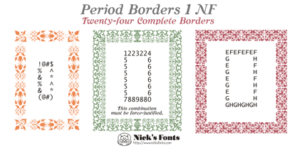
- Period Borders NF by Nick's Fonts,
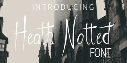
$10.00 - Heath Notted by YuliusParyadi,
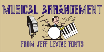
$11.00 - Musical Arrangement JNL by Jeff Levine,
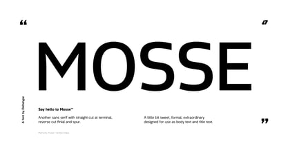
$29.00 - Mosse by Deltatype,
$49.00


