10,000 search results
(0.021 seconds)
- Rattnugidari by Stringlabs Creative Studio,
$29.00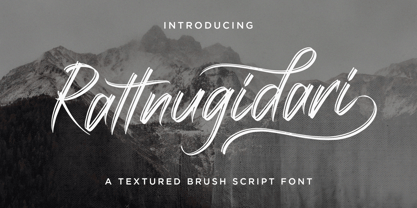 Rattnugidari is a stylish and incredibly elegant script font. It looks stunning on wedding invitations, thank you cards, quotes, greeting cards, logos, business cards and every other design which needs a handwritten touch. This font is PUA encoded which means you can access all of the glyphs and swashes with ease! It features a varying baseline, smooth lines, gorgeous glyphs and stunning alternates.
 - Cute Fire by Mvmet,
$15.00 Cute Fire is a cute display font with a fire decorative twist for your everything needs! You can use it for anything ranging from t-shirts and clothing, kid’s book designs, kid’s party needs, greeting cards, stickers, posters, banners, or anything that needs a decorative and fun touch. Try it to create fabulous designs and feel the fun and cheering vibes with it!
 - Brookside JNL by Jeff Levine,
$29.00 The 1920s were part of an era in songwriting where snappy wordplay and clever (if not long) titles prevailed. The lettering on one such piece of sheet music with the song title "In A Shady Nook by A Babbling Brook" offered up a bold, condensed sans serif design which is now available digitally as Brookside JNL. Available in both regular and oblique versions.
 - Derailer by Aerotype,
$29.00 Derailer’s eclectic character set is comprised mainly of disparate sans serif characters that claim to play well together. OpenType users also benefit from 52 ligature features that automatically substitute a unique pairing of letters when any upper or lower case character is keyed twice in a row. Derailer Pro extends the character set to support Eastern European Latin, Baltic, Greek and Turkish.
 - Sunset Waves by Epiclinez,
$18.00 Welcome to Sunset Waves, a fun display font that adds a playful touch to your project. This font is the right choice for creating graphics with an eye-catching and unique style. Whether you want a creative edge for your party invitations or looking to jazz up a logo design, this funky font is here to make a difference. Thank You
 - Hashiba Japanese Font by IbeyDesign,
$16.00 Hashiba Japanese Font is a cool, Japanese-inspired display font. It will look stunning on any food menu, poster flyer, or print. Use this font for your designs and explore its endless possibilities. Hashiba Japanese Font can pair with calligraphy Japanese font, Japanese font brush, Japanese calligraphy font, or Japanese brush font. Hope you enjoy, and happy designing :-) Thank You
 - Suomi Hand Script by Suomi,
$60.00 This script is made for mimicking handwriting with a fair amount of ligatures: there are more than 700 ligature pairs (or even more characters; I never really counted them) to help you to make very, very convincing lines of text without ever lifting a pen! It’s been a bestseller in FontShop for years, and now it’s available here as well!
 - Hybi14 Boldie by Hybi-Types,
$9.00 The Hybi14-Boldie is a bold Script in two styles. It’s lack of excessive details makes it appropriate for all oportunities of headlines, slogans and advertising. It’s friendly and charming character makes it pleasant to look at. The fonts are offering a huge character set for usage in many languages. Also thousands of kerning pairs within each style are obligatory.
 - Becka Script by ITC,
$29.00Becka Script was designed by David Harris in 1985 and is a wide running typeface with varying stroke contrasts. This font looks as though written with a broad tipped pen and its slight slant to the right makes clear its similarity to callipgraphy fonts. Becka Script is reminiscent of the 1950s and its strong strokes make it best for headlines or shorter texts. - Raeling by Volcano Type,
$19.00Raeling is a display font inspired by a visit to Luxembourg, capturing shadows falling intricately from park railings appearing as broken-script lettering. A mixture of manmade / natural, traditional / new, ugly / beautiful reflecting the paradox and contradictions of the city. A single curve and stroke developed into a grid block from which characters emerged and broke free of their barriers and conformity. - Delysian NF by Nick's Fonts,
$10.00If you wanted to send out a party invitation in 1923, Barnhart Brothers & Spindler recommended this typeface, which was originally called, simply, "Greeting Card". It also appears to be suitable for greetings from Mars. Available in two weights, regular and bold. Both versions of the font include the 1252 Latin and 1250 CE character sets (with localization for Romanian and Moldovan). - Hjem by Hanoded,
$15.00 Hjem, in Danish, means ‘at home’ or ‘home’. I made this font ‘hjem’, so I thought the name was quite appropriate! Hjem is a rounded, handmade display font that comes with extensive language support and cute swashes. Use this versatile font for your packaging designs, book covers, party posters or whatever you want. I am sure this font will feel right hjem!
 - Precious Serif by G-Type,
$60.00 Precious Serif is a distinctive, modern slab serif typeface, first released in 2003 and now refreshed in 2017. This contemporary, chunky gem is the sister typeface to our Precious Sans family, both sets designed with similar metrics and characteristics to ensure they pair together seamlessly in print & digital applications. Mix Precious Sans & Serif together in a block of text to wonderful effect!
 - Angelissa by Rockboys Studio,
$28.00 Angelissa. This beautiful script is for those who are needing of elegance and stylish for their designs and particularly well suited for wedding invitations, save the date cards and feminine branding. This font is PUA encoded which means you can access all of the glyphs and swashes with ease! It features a varying baseline, smooth lines, gorgeous glyphs and stunning alternates.
 - Nexomuki by Java Pep,
$17.00 Proudly present the fresh from the oven, modern bold sans serif font. Nexomuki made with rising feel modern, bold, but still looks elegant too. Perfect pairing among uppercase and lowercase characters is suitable for your project design such as logotype, branding, headline text, advertising, slogan, qoute, magazine, publishing, and more. This font is already with multilingual support more than 20 leanguanges too.
 - Garp Miska by madeDeduk,
$11.00 Gary Miska is a cute font with two style neu and regular fun happiness look and will makes this font suitable for your any project design. Feature Uppercase & Lowercase Number & Symbol International Glyphs Multilingual support ligature Feel free to drop us a message any time and follow my shop for upcoming updates Shoot me on email at: dedukvic@gmail.com Hope you enjoy it.
 - Hybi15 Ronja by Hybi-Types,
$9.00 The Hybi15-Ronja is a characterful 4-style font family. It’s high recognition factor makes it appropriate for all oportunities of headlines, slogans and advertising. Though, it’s straight-line and well-balanced look makes it friendly and charming. The fonts are offering a huge character set for usage in many languages. Also thousands of kerning pairs within each style are obligatory.
 - Croasian by MKGD,
$13.00 The main reason I wanted to design this font was because I really didn’t like how poorly some fonts tried to mimic an Oriental appearance. Trying to make western words appear Asian with a font composed of brush strokes is almost always doomed to failure. However, I find Croasian works extremely well with one syllable words that are Asian sounding. A good font to have if you want to express an Asian name or business phonetically in a western alphabet while still retaining an Asiatic feel. Croasian has a glyph count of 397 and supports the following languages Afrikaans, Albanian, Asu, Basque, Bemba, Bena, Bosnian, Catalan, Chiga, Colognian, Cornish, Croatian, Czech, Danish, Embu, English, Esperanto, Estonian, Faroese, Filipino, Finnish, French, Friulian, Galician, German, Gusii, Hungarian, Icelandic, Indonesian, Irish, Italian, Kabuverdianu, Kalaallisut, Kalenjin, Kamba, Kikuyu, Kinyarwanda, Latvian, Lithuanian, Low German, Lower Sorbian, Luo, Luxembourgish, Luyia, Machame, Makhuwa-Meetto, Makonde, Malagasy, Malay, Maltese, Manx, Meru, Morisyen, North Ndebele, Norwegian Bokmål, Norwegian Nynorsk, Nyankole, Oromo, Polish, Portuguese, Romanian, Romansh, Rombo, Rundi, Rwa, Samburu, Sango, Sangu, Scottish Gaelic, Sena, Shambala, Shona, Slovak, Slovenian, Soga, Somali, Spanish, Swahili, Swedish, Swiss German, Taita, Teso, Turkmen, Upper Sorbian, Vunjo, Walser, Zulu
 - Riposte by Scholtz Fonts,
$15.00 Riposte is a powerful and carefully-integrated handwriting font. You should use it where you want to create a strong impact but want to avoid heavy, boxy, formal fonts. The characters were designed for excellent letter-spacing without kerning, but you can switch kerning on to add some subtle enhancements to the letter-spacing. Riposte is readable, even at quite small sizes. It was designed to be used as a mix of upper and lower-case letters. Do not make text using only uppercase letters since the spacing of the uppercase letters was optimized for use together with lowercase letters. So remember, when you want your text to have the powerful impact of the master swordsman with his balanced stance and vigorous movement -- try Riposte. The font is fully professional: carefully letterspaced and kerned. It contains over 235 characters - (upper and lower case characters, punctuation, numerals, symbols and accented characters are present). It has all the accented characters used in the major European languages. Riposte works well in professional layout application packages as well as in word-processing packages such as Microsoft Word® that do not support professional kerning.
 - Dealova by HKL Studio,
$19.00 Dealova Script is the font of choice for writing things beyond words. This typeface is designed with great detail to convey stylish elegance. So, it can be said, the character of the transformation is very beautiful, a kind of classic ornamental copper script. Dealova Script provides alternative variants of most fonts, binders and many calligraphy tips, ideal for elegant labels, high-end packaging, stationery and composition for specific brands, beautiful titles, paragraphs, fonts and short text intended for read only with the eye or intended to be whispered into someone's ear. Dealova Script has 691+ glyphs and 440 alternate characters, including multiple language support. It features OpenType with alternate styles and elegant binding. The OpenType features don't work automatically, but you can access them manually and for best results your creativity will be required in combining variations of these Glyphs. And also a touch of ornament makes this font look elegant. To enable the OpenType Stylistic alternative, you need a program that supports OpenType features such as Adobe Illustrator CS, Adobe Indesign & CorelDraw X6-X7, Microsoft Word 2010 or later. (Windows), Font Book (Mac) or a software program such as PopChar (for Windows and Mac).
 - Seinna Grace by Tegaki,
$15.00 Hi all, This beautiful modern lettering named Seinna Grace, its created with lovely and stylistic characters. This Elegant font was PUA encoded. Seinna Grace is a modern lettering typeface that comes with Extended Latin Characters. This fonts works properly and perfectly for logos, wedding invitation card, stationary, packaging, clothing, flyer, apparel, magazines, brochures, headings, signature, lable, news, posters, badges, etc. Seinna Grace features 327 glyphs and 82 alternate characters contain with opentype features. Seinna Grace has many stylistic alternate characters that allowing you to make each word look completely clean and elegant. The Standard Ligatures are also included to bring up your creativity. You can access all those alternate characters by using OpenType savvy programs such as Adobe Illustrator, Adobe InDesign and CorelDraw X6-X7, Microsoft Word 2010 or later versions. There are additional ways to access alternates/swashes, using Character Map (Windows), Nexus Font (Windows), Font Book (Mac) or a software program such as PopChar (for Windows and Mac). For other programs that doesn't support OpenType features or Glyphs Panel such as Photoshop, you can use Character Map in Windows to access the alternate characters.
 - Cyber Graph by Digitype Studio,
$16.00 Cyber Graph is a rounded futuristic font with 2 styles light and regular. This font is very suitable for headlines, logos, movie titles, game titles, labels, sci-fi magazines, packaging, or all kinds of advertising purposes. This font is equipped with PUA Encoded so that the OpenType feature (ligatures & Stylistic alternates) can be accessed on design software such as Adobe Illustrator, Adobe Photoshop, Adobe InDesign, and even work on Microsoft Word. To access all characters in Microsoft Word "click Insert-Symbol-More Symbols" If you have any questions, don't hesitate to contact us; we will be happy to help. Support for 82 languages Afrikaans, Albanian, Asu, Basque, Bemba, Bena, Breton, Catalan, Chiga, Colognian, Cornish, Croatian, Danish, Dutch, Embu, English, Esperanto, Estonian, Faroese, Filipino, Finnish, French, Friulian, Galician, German, Gusii, Hungarian, Indonesian, Irish, Italian, Kabuverdianu, Kalenjin, Kamba, Kikuyu, Kinyarwanda, Lithuanian, Lower Sorbian, Luo, Luxembourgish, Luyia, Machame, Makhuwa-Meetto, Makonde, Malagasy, Manx, Meru, Morisyen, North Ndebele, Norwegian Bokmål, Norwegian Nynorsk, Nyankole, Oromo, Polish, Portuguese, Quechua, Romansh, Rombo, Rundi, Rwa, Samburu, Sango, Sangu, Scottish Gaelic, Sena, Serbian, Shambala, Shona, Soga, Somali, Spanish, Swahili, Swedish, Swiss German, Taita, Teso, Turkish, Upper Sorbian, Uzbek (Latin), Volapük, Vunjo, Walser, Zulu.
 - Jannson Map by RM&WD,
$35.00 For best results, use of OpenType features is strongly recommend. This font is inspired by Johannes Janssonius, well know as Jan Janszoon o Jan Janssonius (Arnhem, 1588 – Amsterdam, 1664), was a Dutch cartographer, publisher and engraver. Married to Hondius's daughter. He was the author of many masterpieces of cartography of the 1700s like Willem Blaeu and Hondius, famous maps with heavy use of decorations in the letterig to fill the spaces of oceans, seas, lakes and scrolls. Now you can easily recreate not just ancient maps without effort, but you can use this font creatively, to make unique, modern logos, product names, fresh packaging, hip fashion outfits, refined labels, signs, coordinated images ... Hundreds of alternatives to choose from and maybe to combine with other fonts in an original way. One extra font with 27 castles in Janszoon style are also usefull for map, of course, but also for many different creative artworks. Warning: Jannson Map having oversized swashes compared to the normal standards cannot be used with Windows Word because Word does not give the possibility to manage the line spacing professionally. Jannson Map works great with applications like Illustrator, In Design, quark Xpress, mac Text etc ...
 - Funboy by Typodermic,
$11.95 Introducing Funboy—the typeface that brings the bold, wild style of San Francisco’s graffiti right to your fingertips. With its thick lines and natural, flowing strokes, Funboy is perfect for adding an edgy, old-school hip hop vibe to any design. But this font isn’t just about style—it’s also about customization. With custom pairs and substitute characters, you can elevate your writing to a new level of polish and sophistication. And if you’re looking for even more personalization, simply play around with the uppercase and lowercase variants to create a unique look that’s all your own. Whether you’re designing a flyer for a block party or creating album art for your latest mixtape, Funboy is the typeface that will make your work stand out. So why settle for a boring, generic font when you can add some graffiti-inspired flair to your designs? Try Funboy today and see the difference for yourself. Most Latin-based European writing systems are supported, including the following languages. Afaan Oromo, Afar, Afrikaans, Albanian, Alsatian, Aromanian, Aymara, Bashkir (Latin), Basque, Belarusian (Latin), Bemba, Bikol, Bosnian, Breton, Cape Verdean, Creole, Catalan, Cebuano, Chamorro, Chavacano, Chichewa, Crimean Tatar (Latin), Croatian, Czech, Danish, Dawan, Dholuo, Dutch, English, Estonian, Faroese, Fijian, Filipino, Finnish, French, Frisian, Friulian, Gagauz (Latin), Galician, Ganda, Genoese, German, Greenlandic, Guadeloupean Creole, Haitian Creole, Hawaiian, Hiligaynon, Hungarian, Icelandic, Ilocano, Indonesian, Irish, Italian, Jamaican, Kaqchikel, Karakalpak (Latin), Kashubian, Kikongo, Kinyarwanda, Kirundi, Kurdish (Latin), Latvian, Lithuanian, Lombard, Low Saxon, Luxembourgish, Maasai, Makhuwa, Malay, Maltese, Māori, Moldovan, Montenegrin, Ndebele, Neapolitan, Norwegian, Novial, Occitan, Ossetian (Latin), Papiamento, Piedmontese, Polish, Portuguese, Quechua, Rarotongan, Romanian, Romansh, Sami, Sango, Saramaccan, Sardinian, Scottish Gaelic, Serbian (Latin), Shona, Sicilian, Silesian, Slovak, Slovenian, Somali, Sorbian, Sotho, Spanish, Swahili, Swazi, Swedish, Tagalog, Tahitian, Tetum, Tongan, Tshiluba, Tsonga, Tswana, Tumbuka, Turkish, Turkmen (Latin), Tuvaluan, Uzbek (Latin), Venetian, Vepsian, Võro, Walloon, Waray-Waray, Wayuu, Welsh, Wolof, Xhosa, Yapese, Zapotec Zulu and Zuni.
 - Tight by Typodermic,
$11.95 Get ready to boogie down with Tight, the typeface that channels the groovy vibes of vintage tee shirt lettering. Inspired by the iconic disco era of the mid to late 1970s, Tight is the perfect way to celebrate those dancing days. Our retro disco t-shirt typeface is based on old, worn-out samples of Dean Morris’ Quicksilver, the Helvetica of disco. With its misaligned characters and distressed texture, Tight captures the spirit of the era in all its glory. To achieve an even more authentic look, Tight features custom letter pairs that mimic the way real vintage tees looked. And with OpenType-savvy programs, you can swap out certain letter combinations to achieve the perfect look. Just be sure to turn off the “standard ligatures” function to disable the effect and get that true vintage feel. So whether you’re designing a poster for a disco-themed party, creating a retro-inspired logo, or just looking to add some funk to your designs, Tight is the typeface for you. Most Latin-based European writing systems are supported, including the following languages. Afaan Oromo, Afar, Afrikaans, Albanian, Alsatian, Aromanian, Aymara, Bashkir (Latin), Basque, Belarusian (Latin), Bemba, Bikol, Bosnian, Breton, Cape Verdean, Creole, Catalan, Cebuano, Chamorro, Chavacano, Chichewa, Crimean Tatar (Latin), Croatian, Czech, Danish, Dawan, Dholuo, Dutch, English, Estonian, Faroese, Fijian, Filipino, Finnish, French, Frisian, Friulian, Gagauz (Latin), Galician, Ganda, Genoese, German, Greenlandic, Guadeloupean Creole, Haitian Creole, Hawaiian, Hiligaynon, Hungarian, Icelandic, Ilocano, Indonesian, Irish, Italian, Jamaican, Kaqchikel, Karakalpak (Latin), Kashubian, Kikongo, Kinyarwanda, Kirundi, Kurdish (Latin), Latvian, Lithuanian, Lombard, Low Saxon, Luxembourgish, Maasai, Makhuwa, Malay, Maltese, Māori, Moldovan, Montenegrin, Ndebele, Neapolitan, Norwegian, Novial, Occitan, Ossetian (Latin), Papiamento, Piedmontese, Polish, Portuguese, Quechua, Rarotongan, Romanian, Romansh, Sami, Sango, Saramaccan, Sardinian, Scottish Gaelic, Serbian (Latin), Shona, Sicilian, Silesian, Slovak, Slovenian, Somali, Sorbian, Sotho, Spanish, Swahili, Swazi, Swedish, Tagalog, Tahitian, Tetum, Tongan, Tshiluba, Tsonga, Tswana, Tumbuka, Turkish, Turkmen (Latin), Tuvaluan, Uzbek (Latin), Venetian, Vepsian, Võro, Walloon, Waray-Waray, Wayuu, Welsh, Wolof, Xhosa, Yapese, Zapotec Zulu and Zuni.
 - Rival Sans by Mostardesign,
$25.00 A sans serif with a dynamic look for complex typographic work. Rival Sans is a sans serif font family possessing many strengths. Its 32 fonts and 2 styles, make Rival Sans a very versatile family and suitable for many graphic design projects such as branding, signage, editorial creation, advertising, packaging, broadcasting or logo creation. With the endings cut at 10 degrees and sharp cuts on the top of the stems of certain characters (like the l, b or the d) Rival Sans gives dynamism and readability to the lengthiest of editorial content. This beveled font design also gives rhythm to a text's sentences as well as a very functional look. All these design details give this new font family a modern, energetic and humanistic look. Rival Sans also has many powerful OpenType features such as case sensitivite forms, small capitals, old style and tabular figures, slashed zero, ligatures, fractions,and alternative characters to give personality to graphic design projects. Designed also for complex editorial content, this typeface has a powerful home kerning system called "Pro Kerning". With more than 2500 pairs of glyphs and many languages, Pro Kerning optimizes headlines, subtitles, texts as well as long paragraphs in real time. In addition to these extended features, the italic styles of this fonts family have been drawn as fully-fledged styles with different designs from their regular version so that the italic texts look like calligraphic phrases. Rival Sans has an extended character set with over 930 glyphs. This family covers over 130 languages from Western Europe, Eastern Europe and Central Europe. In addition to all the features of its kind, Rival Sans is part of a very complete "type system" with style variants such as the serif version Rival Serif or the slab version Rival Slab. With all these typefaces, you have 62 styles to make your own vibrant and professional graphics or web creations while maintaining consistency in your creations.
 - Glance Sans by Identity Letters,
$29.00 Geometric, stylish, and not quite a stencil face: Glance Sans is the urban alter ego of Glance Slab—a strong-willed sans-serif with no frills but a few unique character traits. Glance Sans follows the design principle of nonjoining parts that made Glance Slab successful. Some strokes may not connect to their stems, creating visible gaps and thus, a dynamic impression of balance and movement. However, Glance Sans has a calmer appearance due to the lack of detached serifs. If Glance Slab’s home territory are large, crowded stadiums and massive sports events, Glance Sans prefers streetball courts, well-used skate parks, and underground clubs. It also adapts to urban work environments from finance to high-tech. Whenever a more toned-down look is called for while retaining the elegance of an athlete, Glance Sans is ready to roll. In the city environment, versatility is key. That’s why Glance Sans sports 7 weights as well as a complete set of italics. These are not just sloped romans but individually drawn letterforms, subtly referencing classic italic construction for more effective emphasis. Among the 600+ glyphs of Glance Sans, you’ll find goodies such as six sets of figures, circled numbers, circled arrows, and all kinds of currency symbols in two stylistic versions. Glance Sans is a great tool for industrial and high-tech branding, for wayfinding systems in contemporary or modernist architecture, for corporate identities in arts, crafts, medicine, culture, and education, and for all kinds of sports-themed design. Both members of the Glance superfamily are easily and effectively combinable; both are able to stand on their own feet. With its powerful italics, you might opt for Glance Sans as your text typeface and use Glance Slab for headlines. Or you set large, clean, display-sized lines in Glance Sans and spice them up with a bit of sportive Glance Slab. It’s up to you to decide how to bring out the best in both of them.
 - Koomerang by Type Associates,
$21.95 I arrived this concept as a means to fulfil a need for a simple yet radical semi-sans with rounded terminals. My concept called for a modular approach so a single weight font family resulted, the monoline stroke weights being one-eighth of the cap height and the x-height five-eights, the descent two units. Within these constraints I found it was simple to devise an alphabet which met my need for quirkiness whilst retaining its legibility. As for the outline, shadow and contour variants - well they just seem to work. If you are wondering - and you don't hail from the "Land Downunder" - Canberra is our nation's capital; Bondi - "water breaking over rocks" a beautiful beach in Sydney; Uluru is the name given to the world's largest pebble, (formerly known as Ayers Rock); Kakadu is a national park in the "Top End" and Koomerang means "hill of clouds" - all place names in their respective Australian indigenous languages. Come on down - the natives are friendly.
 - Varia Display by Tomtype,
$6.00 Introducing Varia Display, a font that emerged from the renowned challenge of 36 Days of Type. In the 2023's edition, I embarked on a journey to explore a wide variety of styles, leading to infinite possibilities for crafting unique letterforms. The result is a meticulously crafted variable font with a single weight axis, designed to push the boundaries of typographic aesthetics across all characters. With each letter and number embodying a distinct and innovative approach, this font offers a captivating typographic experience. With its distinctive and varied letterforms, this font is ideally suited for eye-catching main headlines and complementary typography. Whether you seek diversity or a touch of uniqueness, this font is sure to meet your creative needs. Embrace the world of possibilities it presents and elevate your designs to new heights. Key features: Meticulously designed Variable Font Single Weight Axis Multilingual support 374 glyphs Contact: If you have any doubts or questions please ask me via mail or Instagram hello@tomascastiglioni.com @tomtype
 - Supertuba by Tipos Pereira,
$10.00 Supertuba is a :) geometric sans vernacular humanist :) display type family with 6 weights. There's literally dozens of ligatures in this font so It works very well for flyers, package, stickers and posters, also you can use it as a text font if you're looking for something slightly bold. Supertuba has multilingual support and useful open type features. Letter boards that used to be seen in churches, dive bars and butcher shops are the main inspiration for this typeface. The name Supertuba came from an old supermarket that no longer exists in the city of Indaiatuba , I just believe this name is super fun (at least in Portuguese) and wanted to keep it alive. I was in Indaiatuba when I get started designing this typeface so this is fair enough. Supertuba the third piece of a particular trilogy of fonts that Stubby and Stubby Rough take part, from the lazy vernacular drawing to an unusual geometry. Enjoy!
 - Adagio Serif by Borutta Group,
$25.00 The Adagio Family is a part of Mateusz Machalski’s, Warsaw Academy of fine arts Master Degree Diploma in multimedia studio, conducted by Professor Stanisław Wieczorek and his brave PHD Jakub Wróblewski. Adagio is a modern type family. It consists of 3 main varieties: sans, serif and slab. Each one of them has its own “true italic” set. All of the styles together have over 400 characters in 9 different thicknesses. The Adagio family was created mostly for company identities. The idea was to create a wide range of different varieties which are stylistically consistent. Adagio Serif - Characterises with strong contrast and high detail in calligraphic character cuts, what gives it a light feeling. Unlike the Slab version, serif variety has asymmetrical serifs. Thanks to large X length, and highly stretched descenders, it also works correct in longer text, while its strong detail is good for headlines. The Serif version is a great complement for Adagio Sans and Adagio Slab.
 - Adagio Sans by Borutta Group,
$25.00 The Adagio Family is a part of Mateusz Machalski's, Warsaw Academy of fine arts Master Degree Diploma in multimedia studio, conducted by Professor Stanisław Wieczorek and his brave PHD Jakub Wróblewski. Adagio is a modern type family. It consists of 3 main varieties: sans, serif and slab. Each one of them has it's own “true italic” set. All of the styles together have over 400 characters in 9 different thicknesses. The Adagio family was created mostly for company identities. The idea was to create a wide range of different varieties which are stylistically consistent. Adagio Sans - In its character, inspired by classical English typefaces. Sharp chamfers add a strong character. Thanks to delicate contrast and proportions of capitals, this variety has features of humanist grotesque. Thanks to large x length, and highly stretched descenders, it also works correct in longer text, while it’s strong detail is good for headlines. The Sans version is a great complement for Adagio Serif and Adagio Slab.
 - Smashed Display by Raquel Fernandes,
$17.49 Smashed Typeface is a reversed-contrast, slab serif, display font. Was inspired by the old west days that we can often see in printing, circus posters and wanted notices in western movies, even tho the style was really used in many parts of the world during that period. This style is sometimes called as "circus letter" too. Was designed to have a modern look, using straighter lines and an extended style, can be used on various situations like posters, logos for restaurants, alternative business like an old washing station (as you can see on the next images), music bands etc. I believe that is a promising typography that can be used by various designers in a lot of diverse project. It counts with 226 multi language characters, one weight on version 1.0, on a next version I hope to take this project to another level, creating a variable typeface from condensed to really extended weights. It would complete this typography and eliminate the limits of use.
 - Gloria Monoline by IM Studio,
$15.00 Gloria Monoline is a text serif with an editorial focus designed by Ikhsan Maulana. The idea for a typography job came from a design school letter-making exercise: Get a pair of scissors and some large sheets of paper, and start cutting. The resulting letters and the act of cutting them from paper inform the type design process, resulting in strong, simple shapes and open, inviting textures. The tone is crisp and straightforward. The classic letterforms, with a playful touch, give the design a personality that is both practical and spontaneous. The text weight is capable of adjusting copies at various sizes to print and render clearly on screen. Its lightest and heaviest weights work best at display sizes. Great care has been taken to save typists time with OpenType features including contextual punctuation and symbols to match case-sensitive, lower-case, and all-caps settings, as well as set images set for each use.
 - Adagio Slab by Borutta Group,
$25.00 The Adagio Family is a part of Mateusz Machalski’s, Warsaw Academy of fine arts Master Degree Diploma in multimedia studio, conducted by Professor Stanisław Wieczorek and his brave PhD student Jakub Wróblewski. Adagio is a modern type family. It consists of 3 main varieties: sans, serif and slab. Each has its own “true italic” set. All of the styles together have over 400 characters in 9 different thicknesses. The Adagio family was created mostly for company identities. The idea was to create a wide range of different varieties that are stylistically consistent. Adagio Slab - Slab variety combines qualities of the Sans and Serif varieties. It has the same contrast as Sans. As distinct from Serif, Adagio Slab contains strong, beamy and symmetrical serifs in the form of pillows. Thanks to large X height, and highly stretched descenders, it also works correctly in longer text, while its strong detail is good for headlines. Slab version is a great complement for Adagio Serif and Adagio Sans.
 - Comicade by LetterStock,
$20.00 Comicade Font This pair was inspired by the retro cartoon poster design that i saw on some coffee shop, It was crafted by hand specially to add natural handmade feeling in its brand identity than i make it clean with pentool. Opentype features Comicade font has 205 character set included Comicade Font is very good looking in logo, labels, product packaging, invitations, advertising and others. What includes * Multilingual support (Western European characters). This fonts works with folowing languages: Afrikaans, Albanian, Asu, Basque, Bemba, Bena, Chiga, Cornish, Danish, English, Estonian, Filipino, Finnish, French, Friulian, Galician, German, Gusii, Indonesian, Irish, Italian, Kabuverdianu, Kalenjin, Kinyarwanda, Low German, Luo, Luxembourgish, Luyia, Machame, Makhuwa-Meetto, Makonde, Malagasy, Malay, Manx, Morisyen, North Ndebele, Norwegian Bokmål, Norwegian Nynorsk, Nyankole, Oromo, Portuguese, Romansh, Rombo, Rundi, Rwa, Samburu, Sango, Sangu, Scottish Gaelic, Sena, Shambala, Shona, Soga, Somali, Spanish, Swahili, Swedish, Swiss German, Taita, Teso, Vunjo, Zulu Thank you for using this font. LS
 - Interlaken by ROHH,
$20.00 Interlaken™ is a modern display & branding typeface allowing to design creative logotypes, posters and headlines with ease. It is an uppercase family of six OpenType fonts and one 2-axis variable font, packed with features such as stylistic alternates and tons of original ligatures. The family’s purpose is to make the creative process of designing logotype a blast. It has a wide set of OpenType features crafted especially to make your life easier, allowing you to accomplish your projects in less time. Interlaken has a powerful and very modern character, it comes in three width variants, making it a good fit in various design scenarios. Its cutout details make it look unique and create an impression of inner shadows when set on a dark background. Interlaken is a great typographic tool for such industries as sports, fitness, modern technology, fashion and gaming. It works perfect as a pairing typeface with Rothorn, Conthey and Conthey Inline and Axalp Grotesk.
 - Geogrotesque Condensed Series by Emtype Foundry,
$69.00 The popular Geogrotesque family becomes an extended system with the inclusion of three new members to the family; Geogrotesque Condensed, Geogrotesque Compressed and Geogrotesque Extra Compressed. The condensed series keep the spirit of the original one, and give way to a superfamily up to 56 styles. This new system fluidly varies between widths, ranging from the original width to a 55% of it in the narrower one. As their original partner, the new fonts are great headline families for publications, but will also work in text of intermediate length and point size. The Geogrotesque superfamily offers now one font for each design need. It is available in Open Type format and includes Ligatures, Tabular Figures, Fractions, Numerators, Denominators, Superiors and Inferiors. All of them with support for Central and Eastern European languages. This type family consists of 42 styles, 7 weights plus italics in 3 widths. For more details see the PDF.
 - Jaguar Jugglers by LetterStock,
$12.00 Jaguar jugglers Font This pair was inspired by the esport gaming logo design that i saw on some coffee shop, It was crafted by hand specially to add natural handmade feeling in its brand identity than i make it clean with pentool. Opentype features Jaguar jugglers font has 177 character set included Jaguar jugglers Font is very good looking in logo, labels, t-shirt prints, product packaging, invitations, advertising and others. What includes Multilingual support (Western European characters). This fonts works with following languages: Afrikaans, Albanian, Asu, Basque, Bemba, Bena, Chiga, Cornish, Danish, English, Estonian, Filipino, Finnish, French, Friulian, Galician, Gusii, Indonesian, Irish, Italian, Kabuverdianu, Kalenjin, Kinyarwanda, Low German, Luo, Luxembourgish, Luyia, Machame, Makhuwa-Meetto, Makonde, Malagasy, Malay, Manx, Morisyen, North Ndebele, Norwegian Bokmål, Norwegian Nynorsk, Nyankole, Oromo, Portuguese, Romansh, Rombo, Rundi, Rwa, Samburu, Sango, Sangu, Scottish Gaelic, Sena, Shambala, Shona, Soga, Somali, Spanish, Swahili, Swedish, Swiss German, Taita, Teso, Vunjo, Zulu. Thank you for using this font. LS
 - Khian Shantang by LetterStock,
$25.00 **Khian shantang Font** This pair was inspired by the vintage motorbike poster design that i saw on some coffee shop, It was crafted by hand specially to add natural handmade feeling in its brand identity than i make it clean with pentool. **Opentype features** Khian shantang font has 238 character set included Khian shantang Font is very good looking in logo, labels, t-shirt prints, product packaging, invitations, advertising and others. **What includes** * Multilingual support (Western European characters). This fonts works with folowing languages: Afrikaans, Albanian, Asu, Basque, Bemba, Bena, Chiga, Cornish, Danish, English, Estonian, Filipino, Finnish, French, Friulian, Galician, German, Gusii, Indonesian, Irish, Italian, Kabuverdianu, Kalenjin, Kinyarwanda, Low German, Luo, Luxembourgish, Luyia, Machame, Makhuwa-Meetto, Makonde, Malagasy, Malay, Manx, Morisyen, North Ndebele, Norwegian Bokmål, Norwegian Nynorsk, Nyankole, Oromo, Portuguese, Romansh, Rombo, Rundi, Rwa, Samburu, Sango, Sangu, Scottish Gaelic, Sena, Shambala, Shona, Soga, Somali, Spanish, Swahili, Swedish, Swiss German, Taita, Teso, Vunjo, Zulu.