10,000 search results
(0.017 seconds)
- Township JNL by Jeff Levine,
$29.00 Township JNL is based on French Antique Condensed [a classic wood design] and is available in both regular and oblique versions. Reminiscent of Old West wanted posters and circus broadsides, this ultra-condensed typeface allows for more word copy to fit into a single line’s space.
 - Buffallo by Rockboys Studio,
$23.00 Buffallo is a unique and interesting handwritten font. Incredibly versatile, this font will fit a wide pool of designs. What you get: PUA encoded = Accessible in the Adobe Illustrator, Adobe Photoshop, Adobe InDesign, even work on Microsoft Word. PUA Encoded Characters - Fully accessible without additional design software.
 - Staylist by Jos Gandos,
$15.00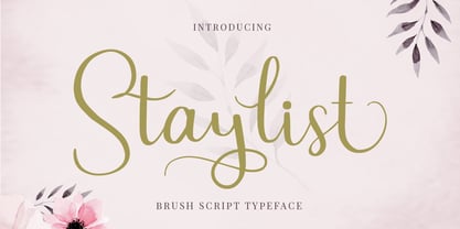 Staylist is a beautiful and cute script for any awesome projects such as wedding cards, watermarks, quotes, social media, posters, invitations, and more. This font is PUA encoded so it will be accessible in the Adobe Illustrator, Adobe Photoshop, Adobe InDesign, even work on Microsoft Word.
 - Bitmax by ITC,
$29.00Bitmax is the work of British designer Alan Birch, who was inspired by the look of fax transmissions. He took Helvetica medium and used controlled distortions to create this commanding, high-tech style. Bitmax is best used in large display sizes for a limited number of words. - Roronoa by Gienlee,
$15.00 Yo! Welcome to gienlee cartoon, design, and other artworks Roronoa is Japanese Font. Commonly used for communication in the Japanese or Chinese language for Universal Words. Item Description Standard Glyphs (Uppercase, Lowercase, Numeral & Punctions) Works on PC & Mac No Special Software is required Do enjoy your download
 - Origami by Monotype,
$29.99In spite of its angular appearance, Origami is composed almost exclusively of curves. Designer Carl Crossgrove derived the typeface from experiments in designing a low resolution type. The resulting face is reminiscent of Eastern European expressionist designers such as Oldrich Menhart and Vojtech Preissig. It is paired with an equally angular chancery italic. Origami works effectively for short blocks of text or at display sizes, while the capitals are especially suitable for titles. - Spindletop NF by Nick's Fonts,
$10.00One in the series of fonts called Whiz-Bang Wood Type, intended to be set large and tight. Spindletop’s ultra-condensed letterforms allow a lot of information to be packed into little horizontal space. Named for a famous East Texas oil field that made a lot of people rich in the early part of the twentieth century. Both versions of this font include the complete Unicode 1252 Latin and Unicode 1250 Central European character sets. - Steffyray by Maulana Creative,
$12.00 Steffyray is a fancy Signature font, has slanted and fun characters. It has Opentype features of ligatures, makes it a perfect choice for branding and digital designs. Use this font for logos, social media, websites, blogs, instagram, social media, business cards, branding, and more! Steffyray font support multilingual more than 100+ language. and good pair for your secondary text font with sans or serif. Make a stunning work with Steffyray signature font. Cheers, MaulanaCreative
 - Yuletide Doodles by Outside the Line,
$19.00 Yuletide Doodles is the perfect font for that quickie Christmas party flyer, menu, or invitation. Or make your own gift tags. The uses are endless. This font includes gifts, ornaments, snow globe, snow man, holly, olive branch, lots of trees and stars, a light bulb, deer, moose, wreaths, pine boughs, skate, stocking and crown. This font works well with Christmas Doodles and Christmas Doodles Too . Mix and match to your heart's desire.
 - Spooky Frights by Sealoung,
$15.00 Spooky Frights celebrates all things scary: It’s the ideal display typeface for any spooky Halloween-themed creative project. Add it to your most creative ideas and notice how it makes them come alive. This is an installable font that will work great with your Halloween party invitations, web graphics, and other halloween decor. This font is cuttable! what’s inside : Uppercase & Lowercase Numerals and Punctuations (OpenType Standard) Accents (Multilingual Characters) PUA encoded Ligatures
 - Shoebox by Atlantic Fonts,
$26.00 Shoebox font is crafty and sweet. It’s hand-drawn with double letter ligatures for upper and lower case. It works great in all-caps, and the lower case is a funky mix up with some interlocking ligatures too. Shoebox is rough with an occasional curl, and is paired with Shoebox Shapes; a unique picture font of Amy Dietrich illustrations (featuring boxes, bags, cats, stars, familiar household items, and for some reason, a forgetful octopus).
 - Early Edition JNL by Jeff Levine,
$29.00 A bold, classic wood type newspaper headline was the inspiration for Early Edition JNL. The source of the type design was actually a dummy newspaper with the headline “Thursby and Archer Murders Linked” [which was used in the 1941 film noir classic “The Maltese Falcon” featuring an all-star cast headed by Humphrey Bogart, Mary Astor, Peter Lorre and Sidney Greenstreet]. Early Edition JNL is available in both regular and oblique versions.
 - Mylestock by Maulana Creative,
$13.00 Mylestock is a handwritten script font, With fancy slanted and fun characters. It has Opentype features of ligatures, makes it a perfect choice for branding and digital designs. Use this font for logos, social media, websites, blogs, instagram, social media, business cards, branding, and more! Mylestock font support multilingual more than 100+ language. and good pair for your secondary text font with sans or serif. Make a stunning work with Mylestock script font. Cheers, MaulanaCreative
 - Sandwich Shop JNL by Jeff Levine,
$29.00 A 1930s WPA (Works Progress Administration) poster promoting national parks depicts Native Americans overlooking the land with the tag line "his hunting ground of yesterday". The hand lettering of that text is reminiscent of Futura Black and similar Art Deco stencil-influenced type designs, but is rendered in an oblique lower case with no capitals. Re-drawn as Sandwich Shop JNL, the typeface is now available in both regular (vertical) and oblique versions.
 - Ownttys by Maulana Creative,
$14.00 Ownttys is a handwritten script font, With fancy slanted and fun characters. It has Opentype features of ligatures, makes it a perfect choice for branding and digital designs. Use this font for logos, social media, websites, blogs, instagram, social media, business cards, branding, and more! Ownttys font support multilingual more than 100+ language. and good pair for your secondary text font with sans or serif. Make a stunning work with Ownttys script font. Cheers, MaulanaCreative
 - Rodfat by Rizki Permana,
$15.00 Rodfat is a gorgeous, old-timey display font with a modern feel! Inspired by the industrial revolution, It will bring back the early days of the 20th century. This collection comes in two styles: One and Two. It is possible to be paired perfectly when used together. Perfectly suited for any display use. It could easily work for design product names, posters, signage, packages, logos, labels, and eye-pleasing typographic designs and more.
 - Sandborg by Mightyfire,
$15.00 Looking for a font which has a modern futuristic looks? Yes, you come to the right place. We have Sandborg to cover your needs. The characteristic of Sanborg is the digital looks of each letter. If you want to write a headline or title about technology or digital content, we suggest you to try this font. We're honored and proud if we can be the part of your special works. Thank you.
 - Flower Hill by Olivetype,
$18.00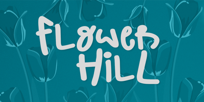 Introducing Flower Hill, a fun and quirky display font! With its vibrant and playful design, Flower Hill will instantly bring a touch of fun to any project. Whether you're designing a party invitation or creating social media graphics, this font can adapt to any theme or style effortlessly. Flower Hill Font features : Standard Latin Numbers, symbols, and punctuations Multilingual Support. Fully accessible without additional design software Simple Installations Works on PC & Mac Thank You.
 - Amberlayton by Maulana Creative,
$14.00 Amberlayton Signature Font, with monoline stroke, condensed and fun characters. It has Opentype features of ligatures, makes it a perfect choice for branding and digital designs. Use this font for logos, social media, websites, blogs, instagram, social media, business cards, branding, and more! Amberlayton font support multilingual more than 100+ language. and good pair for your secondary text font with sans or serif. Make a stunning work with Amberlayton signature font. Cheers, MaulanaCreative
 - Arnold Böcklin by URW Type Foundry,
$35.00 Arnold Boecklin is a true Art Nouveau font, evocative of outdoor cafes in the years prior to World War l. Arnold Boecklin seems to be telling a story, with its decorative curves and varying emphasis of strokes. The Arnold Boecklin font should be used for specific copy as in headlines or advertisements, bearing in mind its strong design. Arnold Boecklin is a trademark of Linotype GmbH and may be registered in certain jurisdictions.
 - Povetarac Sans by Tour De Force,
$25.00 Povetarac Sans font family is part of Povetarac Superfamily together with Povetarac Didone and Povetarac Didone. Available in 6 weights with matching italics, Povetarac Sans relays on lively uppercase proportions that took inspiration from vintage typefaces. It is well balanced, elegant and fully recognizable sans serif family. With sharp overhang, Povetarac Sans works pretty well in all situations – from editorial use to branding, websites or just titles. Comes with Fractions and extended Latin character map.
 - Cashwoots by Maulana Creative,
$12.00 Cashwoots is a handwritten script font, With fancy and fun characters. It has Opentype features of ligatures, makes it a perfect choice for branding and digital designs. Use this font for logos, social media, websites, blogs, instagram, social media, business cards, branding, and more! Cashwoots font support multilingual more than 100+ language. and good pair for your secondary text font with sans or serif. Make a stunning work with Cashwoots handwritten script font. Cheers, MaulanaCreative
 - Articulat CF by Connary Fagen,
$25.00 Articulat® CF is a streamlined, updated take on midcentury type design. Strong, sharp, and well-spoken, Articulat was built from scratch to be bold, clean, and clear. Articulat® CF pairs well with itself, as it has many weights to choose from. It also works well with fonts that contrast strongly, such as Wayfinder® CF and Olivette CF. All typefaces from Connary Fagen include free updates, including new features, and free technical support.
 - Pigalle Swing by Autographis,
$39.50 Pigalle Swing is a very elegant script from the 1950s which I found some time ago in a similar but not so elegant version on Place Pigalle in Paris. I designed lots of alternate capitals and lowercase letters to make the font more usable and interesting. Enjoy!
 - Paradiso AOE by Astigmatic,
$19.95 Inspired by logotype of the Paris Resort and Casino in Las Vegas comes the Paradiso typeface, complete with an unusual array of leaning and unusually large capitals versus a petite lowercase that have a loosely drawn feel. Definitely a typeface with capitals to be used in moderation!
 - Seginoly by Shakira Studio,
$28.00 Introducing Seginoly - Your Groovy Retro Font for the Ultimate Vintage Vibe! Seginoly is the font that's turning heads in the design world, capturing the essence of retro coolness that's all the rage right now. Each letter in Seginoly is a work of art, inspired by the iconic styles of the past and carefully crafted to exude retro vibes that are currently in high demand. With Seginoly, you have the power to transform your designs into eye-catching, retro masterpieces. Whether you're working on a funky poster, a nostalgic logo, or a retro-inspired website, this font adds that extra touch of vintage authenticity that's currently a hit in design trends. Here's what you get: Seginoly Regular All Multilingual symbol Opentype features ( ligature, alternate ) Accessible in the Adobe Illustrator, Adobe Photoshop, Adobe InDesign, even work on Microsoft Word. PUA Encoded Characters - Fully accessible without additional design software. Multilingual character supports : (Afrikaans, Albanian, Catalan, Croatian, Czech, Danish, Dutch, English, Estonian, Finnish, French, German, Hungarian, Icelandic, Italian, Lithuanian, Maltese, Norwegian, Polish, Portuguese, Slovenian, Spanish, Swedish, Turkish, Zulu) Follow my shop for upcoming updates, and for more of my work, Thank you!
 - Miyagi by Thinkdust,
$10.00 Miyagi brings the classic Yagi Link Double to the digital world, a modern form for a timeless typeface. Miyagi pays tribute to the decade it was created while pushing it into the boundaries of the future as well, a double image to match its double lines. Complex in design but easy to read, Miyagi embodies the stylistic ideas inherent in typeface design.
 - DOORLEY HAND by John Doorley & Associates Pty. Ltd.,
$25.00Doorley Hand is a unique new font based on the handwriting of Australian advertising man and creatist John Doorley. The font's character and personality sits somewhere between charming child-like handwriting and classic contemporary calligraphy. It pays homage to simpler times when more organic and personalised forms of communication reigned. A perfect counterpoint to the fast-forward, hi-tech world today. - Koufiya by Linotype,
$187.99 Koufiya is designed by Nadine Chahine in 2003 as part of her MA project at the University of Reading, UK and later released by Linotype in 2007. It is the first typeface to include a matching Arabic and Latin designed by the same designer at the same time with the intention of creating a harmonious balance between the two scripts. The Arabic part is based on the Early Kufi style popular in the 7th to 10th century AD. It is characterized by a strong horizontal baseline, horizontal stacking order, clear and open counters, and a general open feeling. Though based on the earliest styles on Arabic manuscript, the design paradoxically appears quite modern and fresh. The Latin part of Koufiya recalls a Dutch influence in its shallow top arches and rather squarish proportions. Both Arabic and Latin parts have been carefully designed to maintain the same optical size, weight, and rhythm. However, no sacrifices were made to make them appear closer to each other. They are designed so that they work well together on the printed page, and to make sure that the two scripts are harmonious when they are mixed together even if within the same paragraph. The font includes support for Arabic, Persian, and Urdu. It also includes proportional and tabular numerals for the supported languages.
 - Marlin by Komet & Flicker,
$15.00 NEW! Includes a set of 42 connecting word character glyphs along with 23 alternate lowercase glyphs. MARLIN is a condensed vintage style serif display font that works great for logos, packaging, branding, menus, advertising, and posters. The lowercase letter set has different letterforms allowing you to mix and match upper and lowercase for a variety of looks. In Illustrator, the custom connecting word set can easily be accessed in the "Type → Glyphs" panel and in Photoshop through "Type → Panels → Glyphs Panel".
 - Aphrodite Slim by Typesenses,
$57.00 Aphrodite Slim Pro is not just a lighter version of its sister Aphrodite Pro. Aphrodite Slim Pro has duplicated the quantity of characters of its partner, and that means more than 500 new glyphs, reaching a total of more than 1000. More delicate and meticulous, Aphrodite Slim Pro is once more a new typography with deep calligraphic ideals: We immersed ourselves into the world of each calligraphy ductus and each calligraphy masters by studying from decoration to lettering books. This was the key for the logic of Aphrodite Slim’s behavior. The new concept of Aphrodite Slim Pro was to join diverse styles of calligraphy in one in order to achieve an autonomous expressiveness, in fact, this is what calligraphy aims to, and we agreed to bring those ideals to the world of typography: It is justifiable to be inspired in hundred-year-old calligraphies, but it is even better if the results you obtain have a plus. A personal plus. During the creation process we were wondering whether it was possible to mix certain strokes of such rigid styles as uncial, (Li·n’s favourite style), with strokes of the copperplate, (Sav’s favourite style), and also to take and mix cualities of cancelleresca cursiva, formata and moderna; finally giving our creation a roman-transition italic look. So Aphrodite Slim takes ideals and aspects from those formal styles, following its own logic though, and emphasizing the fact of being a decorative typography. Calligraphy masters of our past are who we are in debt with. They are the cause we have lovely letters now. They have been spontaneous at the moment of creation, what differs from the type-designers of nowadays, whose spontaneity is more limited. Digital faces that we are used to see these days are a result of long hours of optical adjustments, grids, macros and inspirations of other existing typography, but without personal contributions. Aphrodite Slim wants to refute this. Its mission is to rescue de spontaneity of the artesanal lettering in order to obtain unique words; those which only calligraphy masters of our past or lettering artists of our present could give us. We have worked hard to achieve this, making Aphrodite the most universal font we could: It was necessary to study the most common words, focalizing more in the ones referring to “sensitivity”, of four of the most spoken languages in the world. Aphrodite Slim has an enormous quantity of decorative characters and special ligatures for phrases and words in English, French, Spanish and German. (See English, Français, Español, Deutsch PDF in the gallery section). We promise there is no existing type that decorates/ligates glyphs and words like Aphrodite Slim does: It is the first time a font like this really considers its purpose. -The way glyphs are ligated is insane- : Aphrodite Slim rescues some ideals of persons like Jan van den Velde (Italian cancilleresca writing of XVI Century) who understands ascenders and descenders as possibilities to beautify the lines of writing with curved strokes that seem to be dancing above and below of the words. This master also creates ascenders and descenders even where they are not necessary, on letters that do not actually need them: Aphrodite Slim takes this ideal. The font counts with a wide range of glyphs that seem not to be satisfied with its more primitive form and prefer to extreme their parts to be decorative. It also existed masters of calligraphy like José de Casanova of XVII Century, who, with a magnificant skill and a really personal mark, had the particularity of ligating words that were actually separated with spaces. This is another innovative feature in Aphrodite Slim. An investigation of the most common beginnings and endings words of the English language was done. Having that feature activated (discretionary ligatures), common words will start to ligate or to be decorated even when they are separated by spaces. Impossible to forget Francesco Periccioli of XVII Century and our experience us designers to face with works of him: His letters, that today are included in the group of cancellerescas modernas, have been a direct inspiration to the oldstyle figures and historical forms variables in Aphrodite Slim. Giovanni Antonio Tagliente (XVI Century) and his particular way of making tails and diagonals longer than usual, qualities that our creation reflects too. Finally, our adventures in Biblioteca Nacional and Barrio San Telmo, Buenos Aires, were essential for us to make Aphrodite Slim more complete and interesting: Sav did an excellent work when studying how the decorative miscellanea and swirls of early XX century were. She also investigated what particularities made those roman titling characters look antique so she could rescue some ideals for the oldstyle figures and historical forms variables. This also leaded her to create the ornaments variable in Aphrodite Slim. We are really proud of presenting Aphrodite Slim Pro, a typography that was the result of days and nights of working hard, because we do love what we do; and we are glad we are living in a present that gives us the possibility to spread this kind of art, because that is the way we consider our job: Aphrodite Slim Pro is Art. Hope you can appreciate the enormous work this type has. Features. Aphrodite Slim Pro is the most complete variable. It includes more than 1000 glyphs. Thanks to the Open-Type programming, it counts with a easy way to change/alternate glyphs if the application in which the font is used supports this. The variables contained in Aphrodite Slim Pro are also offered separately. Aphrodite Slim Text: It is the variable for lines and paragraphs. Thus it is the least ornamental and the most accurate to achieve a satisfying legibility. It has the Standard Ligatures feature in order to improve the possible conflicts some glyphs could have by others. Aphrodite Slim Contextual: It is the one that makes emphasis in decorating. It has the particularity of ligating/decorating words of common use in English, French, Spanish and German. It also has the quality of ligating common beginnings and endings of the common words in English. Aphrodite Slim Stylistic: With similar features of Slim Contextual. It includes a set of decorative numbers for a display use. Aphrodite Slim Swash: This one has special beginnings and endings to decorate words. Aphrodite Slim Endings: It makes words look as a signature. Aphrodite Slim Historical: It adds an antique look to the written word. It also has the special historical ligature function. Aphrodite Slim Titling: This one is the most decorative. Its copperplate inspired ornaments give words a special color, in order to handle the quantity of decoration, it comes with the standard ligature feature, which has the most common ligatures plus others that make decorative swirls not to be conflictive. Aphrodite Slim Ornaments: A set of 52 ornaments. Aphrodite Slim Pro includes all this features plus the Stylistic Set 1; Stylistic Set 2 and the possibility of Slashed Zero. We recommend you to check out the gallery in order to see all these features in action.
 - Burgues Script by Sudtipos,
$99.00 Burgues Script is an ode to the late 19th century American calligrapher Louis Madarasz, whose legendary pen has inspired schools of penmanship for over 100 years. His talent has caused some people to call him “the most skillful penman the world has ever known.” I use the word ‘ode’ in a colloquially ambitious manner. If I was an actual poet, my words would be about things I desire but cannot attain, objects of utter beauty that make me wallow in humility, or people of enormous talent who look down at me from the clouds of genius. But I don’t write poems. My work consists of letters drawn to fit together, that become an element of someone’s visual poetry. I am the poet’s assistant, so to speak. Once in a while, the assistant persists on what the subject of the poem will be. And occasionally, the poet gives in to the persistence. I hope you, visual poet, find my persistence justified in this case. The two main sources for Burgues were the calligraphy examples shown in Zaner Bloser’s The Secret of the Skill of Madarasz: His Philosophy and Penmanship Masterpieces, and C. W. Jones’s Lessons in Advanced Engraver’s Script Penmanship by L. Madarasz. These two references were the cornerstone for the concept I was trying to work with. I did have to change many of the letters in order to be able to produce digital calligraphy that can flow flexibly and offered the user a variety of options, while maintaining its attractive appearance. To this end, many ligatures and swashes were made, as well as full flourished sets of letters for use at the beginnings or endings of words and sentences. All of this has been tied together with OpenType and tested thoroughly within today’s standard design and desktop publishing software. After working with digital scripts for so long, at one point I thought that Burgues Script would become a bit of a chore to complete. I also thought that, like with most other scripts, the process would regularize itself after a while and be reduced to a mechanical habit. Surprisingly, and fortunately for me, this did not happen. The past holds as many surprises as the future. Madarasz’s method of penmanship was fascinating and challenging to translate into the strict, mathematically oriented language of the computer. It seems that the extremely high contrast of the forms, coupled with the required flow and connectivity of such lettering, will always be hard work for any visual artist to produce, even with the aide of a powerful machine. I can only imagine what steady nerves and discipline Madarasz must have had to be able to produce fully flourished and sublimely connected words and sentences on a whim. When I think of Madarasz producing a flourished calligraphic logotype in a few seconds, and try to reconcile that with the timelines of my or my colleagues’ work in identity and packaging design, the mind reels. Such blinding talent from over a hundred years ago. Burgues is the Spanish word for Bourgeois. In the end, I hope Burgues Script will serve you well when a flourished word or sentence is required for a design project. One of the wonders of the computer age is the ability to visually conjure up the past, serving both the present and the future. With Burgues, you have a piece of “the most skillful penman the world has ever known,” at your service. Burgues received important awards such as a Certificate of Excellence TDC2 2008 and a Certificate of Excellence at the Bienal Tipos Latinos 2008.
 - Futurex Arthur - Unknown license

- Border Twins by Deniart Systems,
$15.00 Add flair to your designs with border-twins! The BorderTwins typeface offers a unique assortment of border elements - great for any project requiring decorative accents. The twin pairs can be used in repeated patterns on their own, paired with other complimentary twins or simply to surround your text with charms. The combination possibilities are endless so we've included a PDF guide showing many of the pairing options. Have fun and experiment to create your own unique designs!
 - 1742 Civilite by GLC,
$38.00 In the late medieval period appeared a "semi-cursive" writing, the French "écriture de civilité". Quickly, it is carved and melted down in lead for printing. It is a very elegant running font, with numerous variants, both final than initial characters, many of the accented small characters were present in the model I was inspired by, after “Fournier Le jeune ”, in his catalogue "Modèles des caractères de l'imprimerie et des autres choses nécessaires au dit art nouvellement gravés par Simon-Pierre Fournier le jeune" published in 1742 in Paris. A render sheet, included in the font file, makes all characters easy to identify on keyboard. This font, very attractive and decorative may be used for web-site titles, posters and flyer designs, editing ancient texts, labels, greeting cards... and anything you want! It supports as easily enlargement as small size, remaining elegant and pretty.
 - Daphne by Ahmet Altun,
$20.00 In the beginning, this font had been designed for an affiche work as wood pattern which includes one font and medium weight. The stylish design of this font had been inclined us to create more weights and more styles. Daphne Font Family comes in three weights; normal and italic. Plus two additional styles which are wood pattern and shadow. You can get great wood pattern results with Daphne Font Family; also with colored shadows, you can get gorgeous results in poster works and t-shirt prints. Even in very small type sizes, it can be legible.
 - De Alandia by Dora Typefoundry,
$17.00 Introduce my new font De Alandia is a unique blend of classic and modern fonts with a variety of beginning and ending swashes, I hope you are drawn to a beautiful and aesthetic font to perfect your extraordinary project. It features varied baselines, smooth lines, gorgeous glyphs and stunning alternatives. De Alandia is suitable for today's growing market designs, this font has a trendy, natural and soft style, with this font you can use. opportunities at every moment of an extraordinary way to highlight your best party celebration, because this font will support needs such as weddings, events, invitations, side cards, table numbers, header menus, displays, logos, blog sliders, addresses specialty, stamps, packaging, greeting cards, etc. Please send a message if you have any questions.
 - Troubador JNL by Jeff Levine,
$29.00The charm of wood type -- especially in reproductions from worn specimens -- is the combination of hand-crafted letters and numbers and a connection with the past. - Merciful by Create Big Supply,
$17.00 Introducing Merciful, a charming and playful sans serif font that brings a touch of fun and uniqueness to your designs. With its cute and lively style, Merciful adds a playful and vibrant element to any project. Whether you're designing greeting cards, children's books, party invitations, or any other creative work, Merciful is sure to capture attention and spread joy. This font features both uppercase and lowercase letters, making it versatile for various design purposes. It also includes numbers and punctuations, allowing you to create engaging typography and eye-catching headlines. Merciful supports multilingual characters, enabling you to express your creativity in different languages. With the added convenience of PUA encoding, accessing all the font's glyphs and swashes is effortless. You can unlock a world of creative possibilities by exploring the various ligatures and alternate characters available in Merciful.
 - Atsuka Montreal by Grezline Studio,
$17.00 Atsuka Montreal is a display font family with elegance and luxury aesthetic. It's a perfect use for any fashion design project. This font is accompanied by signature script to make your creation be more appealing and beautiful. Atsuka Montreal font is also usable in a wide range of works such as logos, covers, posters, quotes, product packaging, merchandise, social media and much more! Feature : - A lot of Alternates - Multilingual Language - Works on PC & Mac - Simple installations - Accessible in the Adobe Illustrator, Adobe Photoshop, Adobe InDesign, even works on Microsoft Word.
