10,000 search results
(0.028 seconds)
- My Puma Outlined - Unknown license

- My Puma Oblique - Unknown license

- Sweden Funkis StraightOutlined - Unknown license

- Sweden Funkis Outlined - Unknown license

- Sweden Funkis Regular - Unknown license

- Sweden Funkis StraightOblique - Unknown license

- Sweden Funkis RegularOblique - Unknown license

- Show Card Casual JNL by Jeff Levine,
$29.00 Alf Becker graced the pages of "Signs of the Times" magazine month after month for decades, presenting attractive and unusual hand lettered alphabets as inspiration for other sign painters and show card writers. From straightforward text faces to novelty ideas, Becker's talent as a master sign crafter was constant in his work. Show Card Casual JNL is one example of what is referred to as a "one stroke" alphabet (utilizing a single brush stroke in each direction to form the letter or number). Its casual look and playful charm allow for a message to be presented in an informal format that is pleasing to the eye. The type design is available in both regular and oblique versions. Special thanks to Tod Swormstedt of ST Publications for providing the reference material.
 - Di Mare by Ksenia Belobrova,
$49.00 Di Mare is a layered script inspired by Italian restaurant and cafe signs. It’s about delicious food and the joyful atmosphere of traveling: freedom, sea, fresh wind and warm sun. This font family has three styles: Regular, Line, Shadow. You can combine and overlay them to get different effects. Di Mare works well for menu, packaging, clothes, signs, magazines, and as a starting point for lettering and logos. Di Mare is designed with hundreds of contextual alternates and ligatures. It makes all connections look natural and harmonious. Di Mare supports most European languages, has small capitals, numbers, fractions, currency and mathematical signs. All contextual alternates are built into the “Liga” feature that is turned on by default. However, when your work with typeface, please make sure that “Liga” is turned on.
 - Cake Shop by Chank,
$20.00 Cake Shop has a lengthy history. Originally designed during the Eighties by Aussie artist David Art Wales, the font was inspired by the awkward but charming hand-lettered signs in a Maltese cake shop near his Sydney home. "These signs were hand-drawn by someone who clearly had no experience but who'd really put their heart and soul into the job. There was a real sincerity to the characters that I wanted to capture." For a brief time during the early Nineties, MTV used Cake Shop for all their on-air interstitials. Since then, it's become a go-to font for everything from children's books to album covers and ice cream branding. In a recent update, Wales added airier spacing to more closely resemble the original signs the font was based on.
 - Girltalk by Scholtz Fonts,
$10.00 Cute, curly, & very "little missy", Girltalk was specially designed for the pre-teen & young-teen market. Its design was inspired by the kind of curly handwriting that junior school girls use for notes to each other, diary entries, autograph books etc. Pretty & feminine, with a large dose of cheek, Girltalk is a must for all marketing media aimed at the 7-14 age group: -- “girl style” stationery -- diary covers -- clothing hang-tags -- party invitations -- greeting cards -- book covers -- movie posters -- CD covers -- toy and game advertising media Girltalk can also be used for "big girls"! Great for hen parties, baby showers, pamper parties and other occasions that bring out the "girl in" women. Think pink, think hearts & flowers, think ribbons & bows, add Girltalk to the mix, and you have a winner! Girltalk has been carefully letterspaced and kerned. All upper and lower case characters, punctuation, numerals and accented characters are present.
 - Phoebus by Linotype,
$29.99Phoebus is one of Adrian Frutigers first typefaces which he made for the Deberny & Peignot foundry in Paris. The intention was to create a shadowed type with extra ordinary impression. - Lapoya by Cuchi, qué tipo,
$9.95 “LAPOYA” (meaning in english “the coolest”) is a large slab serif typeface family, with a certain Italian inverted contrast touch. Specially designed for advertising big shows and commerces, Lapoya has 36 variables and four axes, including a text and decorative versions, where the drawing and width of its counterforms vary. It also has icons that remember the old aesthetics of wood types from the early 20th century, and more than 400 characters with a multitude of signs and ligatures, that make Lapoya ideal for up to 89 languages. It is clearly inspired by the large wood types designed for posters, advertisements and newspapers. Since they were introduced in the 19th century, slab serifs have become extremely popular. In fact, serifs are often enlarged, not so much to look like beautiful or balanced letters, but to be more graphic and visual powerful than others. Furthermore, in the case of this typeface, this idea has been applied not only to capital letters, but also to the lowercase, numbers and signs of all kinds. “That’s why this typeface is LAPOYA!” Designed by Carlos Campos in 2023. cuchi@cuchiquetipo.com OPENTYPE FONT 426 GLYPHS 388 CHARACTERS 4 AXES 36 INSTANCES 9 LAYOUT FEATURES 89 LANGUAGES
 - Wayfinding Sans Symbols by FDI,
$29.00 Placing pictograms as single vector images makes designing signage a time-consuming task. But with Wayfinding Sans Symbols and its built-in OpenType intelligence using pictograms becomes as easy as typing words. With Wayfinding Sans Symbols you don’t need to scroll through endless glyph palettes to look for one symbol among hundreds of symbols. Just active ligatures and type in the mnemonic codes like #wheelchair, #parking, #toilet and so on. An overview of these codes can be found in the type specimen PDF. Each pictogram is available in 4 different versions and you can easily assign an additional background color or turn the symbol into a prohibition sign. Wayfinding Sans Symbols has a full coverage of the Unicode range “Transport & Map symbols” and a lot of additional signs that are missing in the typical wayfinding symbol sets. Beside the pictograms, Wayfinding Sans Symbols also has a huge set of arrows for every possible situation and you can easily switch between the different sets using OpenType feature controls. The enclosed letters and figures make it easy to set transport line numbers, room & storey numbers and much more. Wayfinding Sans Symbols is the perfect addition to Ralf Herrmann’s signage typeface Wayfinding Sans Pro, but it can also be used with any other typeface.
 - CAL Bodoni Ferrara by California Type Foundry,
$47.00 Bodoni Ferrara™ Fashionable, Luxury Heritage: The Original Bodoni Ferrara Sculpted from hi-res photos and scans of Bodoni's original Ferrara Font—his 1818 Manuale Tipografico and 1768 specimens. It has never before been available. This cut of Bodoni specially selected by Dave Lawrence from rare book specimens. Part of the California Type Foundry Origin Series. 3 Display Fonts in One!! And 6+ style mixes. Bodoni's 1st Draft - Transitional Serif Bodoni was often inspired by French type designs. His first draft of Ferrara was inspired by Pierre Simon Fournier. But Bodoni added his own Italian sensibilities. Bododni’s first, transitional style can pair with humanist sans, and transitional fonts. Bodoni's Rework - Modern Serif Later, Bodoni reworked Ferrara to match the later neo-classic style or modern serif of Firmin Didot¹. Bodoni’s modern style can pair with geometric sans, grotesque sans, neo-grotesque sans, gothic sans, copperplate script, . Informal On™ - Informal Mode by CAL Type Foundry This can pair with “infant” fonts. Geometric sans, and other sans or serifs with one-storied a’s. + Bodoni’s Tivoli a for another option! Works great with Fournier¹ fonts and grotesques, since the terminals will match. Font Pairing Guide This font includes a 78 page Ferrara Pairing Guide. This book shows you 131 pairings with text fonts. 47 pairings with subheader fonts! We want to help you get more out of your font collection. Design Features • Subtle forward angle (0.5-1.5°) makes Ferrara more lively and engaging than most Bodoni or Didot fonts. • Round curves make this font feel letter-pressed. • Bodoni's original tall x-height and slightly condensed proportions: great for headlines, where space is at a premium. • Better uppercase. Uppercase punctuation for design apps. • Proportional oldstyle and lining figures, both modern style and transitional numbers. Every pair of numbers is kerned for display sizes: no unsightly gaps! • Multiple special symbols for whenever you need a design to pop, including 3 of Bodoni’s amazing ampersands. Language Features Latin standard for western European and other languages. +Advanced support for: German, French, Spanish, Portuguese, Italian, and French. Special, uppercase umlauts for titles! Compare to metal Bauer¹ Bodoni! Special context kerning for French, Spanish, Portuguese, Italian, and French, to allow better better words like L'Angelique & “¿Nosotros?”. This kerning gets rid of unsightly gaps between “¿ and other combinations. Can’t Find the Pairing Guide? Can't find the pairing guide? Google “California Type Foundry” and grab the pairing guide. Get another free pro font while you’re there! Ferrara: many sizes, styles, moods and situations. It's a classic, fashionable font for display, headlines, and titles. Grab Ferrara today! ----------- ¹Trademarks of their respective owners. Ferrara™ is a trademark of the California Type Foundry.
 - PM Outpost by Paper Moon Type & Graphic Supply,
$17.00 Part pirate, part BBQ, all fun. Our new adventure inspired retro showcard font. Outpost was inspired by retro hand-lettered type used on vintage movie tiles, midnight movie posters, and pulp adventure magazines. But don't let that limit your creativity. Part pirate, part BBQ, all fun. Outpost is perfect for gaming titles, casual food packaging, and of course, Halloween projects.
 - Simoncini Garamond by Linotype,
$29.99Opinion varies regarding the role of Claude Garamond (ca. 1480–1561) in the development of the Old Face font, Garamond. What is accepted is the influence this font had on other typeface developments from the time of its creation to the present. Garamond, or Garamont, is related to the alphabet of Claude Garamond (1480–1561) as well as to the work of Jean Jannon (1580–1635 or 1658), much of which was attributed to Garamond. In comparison to the earlier Italian font forms, Garamond has finer serifs and a generally more elegant image. The Garamond of Jean Jannon was introduced at the Paris World’s Fair in 1900 as “Original Garamond”, whereafter many font foundries began to cast similar types. Simoncini Garamond was designed by Francesco Simoncini to be true to the Original. - Bing by Pelavin Fonts,
$20.00 The sinuous, organic forms of Bing first came into being on a poster for a Smithsonian Institution exhibit on Siegfried Bing, a German art dealer in Paris who figured prominently in the development of Art Nouveau towards the end of the nineteenth century. Inspired by the natural forms of Antonio Gaudi, and the Paris Metro stations of Hector Guimard, Bing can be used effectively in the modernist style of Art Nouveau and is equally at home in the 1960s psychedelic rejuvenation of that genre.
 - My Puma Oblique Outlined - Unknown license

- Abudabi by Etewut,
$20.00 Abudabi is a connected script typeface that includes 3 font styles: • REGULAR for signs and basic text • BOLD for titles and highlights • STONE for single words or backgrounds
 - Beauty Salon by Thomas Käding,
$10.00 Inspired by the sign outside a beauty salon, it is an art-deco all-caps font. This font will NOT make you more attractive to the opposite sex.
 - Moonshire by KA Designs,
$12.00 Moonshire is a script font with an authentic, handwritten look! This font is perfect for logos, branding, shirts, invitations, signs, home decor, wedding decor and more! Thank you!
 - Cirflex by Greater Albion Typefounders,
$10.00 Cirflex was inspired by a 1930s shop sign, and makes an ideal typeface for Streamline Era and Art Deco design. Cirflex is offered in regular and bold weights.
 - Printers Stuff JNL by Jeff Levine,
$29.00 A generous assortment of cartoons, catch words, ornaments, embellishments and even a pointing hand tourist sign modeled from an actual vintage metal one round out Printers Stuff JNL.
 - Gangfield by Slex Studio,
$18.00 Based on lettering with a sharp pen, Gangfield features a rather solid character and a measured rhythm. This is named after my nephew who has an optimistic and disciplined style. Gangfield is available in upright variants, with regular, italic and bold weights. Gangfield's bright and cheerful energy shines through either in the form of short blocks of text, or enhanced on display sizes with over 1,100 wildcards and swashes that vary in size and complexity. Gangfield includes 134 alternates with various variations plus several variants of ligatures which make it ideal for special dates such as weddings and parties.
 - Cold Snowflake by Putracetol,
$16.00 Cold Snowflake - Quirky Ice Cream And Candy Theme Font is a delightful typeface designed to capture the essence of ice cream and candy in a playful and fun manner. The font features quirky, bold, and chubby letterforms, mirroring the sweet and indulgent theme it represents. It can be effectively used alone or in combination with its twelve charming variations. With twelve distinctive variations inspired by ice cream, candy, cones, sprinkles, sticks, melting treats, and chocolate, Cold Snowflake is the perfect choice for children's projects, crafting, and any design that seeks to evoke a sense of fun, playfulness, and a vibrant, colorful aesthetic. This font suits a wide range of applications, including logos, crafting projects, invitations, packaging, posters, titles, businesses, greeting cards, stickers, children's books, magazines, and any design related to the delightful world of ice cream and candy. With its sweet and cheerful theme, Cold Snowflake adds a touch of whimsy to your creative work, making it perfect for all things sweet and playful.
 - Jantar Flow by CAST,
$45.00 Jantar Flow is a humanist sanserif type family tailored for continuous reading for both printing and screen. With its large x-height and low contrast it also performs very well in captions, side notes, and short paragraphs set in small sizes. Jantar Flow Italic is distinct and readable. Following a proper italic construction, it shows the fun side of the family yet keeps the features of the upright. Jantar Flow – as well as its teammate Jantar Sharp – comes in seven weights from ExtraLight to Heavy, each with accompanying italics. It has a tabular and proportional set of figures in both old style and lining options, and also a special set of hybrid figures sitting between x-height and capitals. Superscripts and subscripts are provided together with a vast collection of diacritics covering all European languages as well as a set of case-sensitive characters. Jantar, the pairing superfamily. ‘Jantar’ is an old Polish name for ‘amber’, a fossilised resin – a substance that is robust and organic at the same time. These qualities somehow reflect the feeling behind the Jantar families, ‘Flow’ and ‘Sharp’. Jantar Flow was designed along with Jantar Sharp. As part of the Jantar superfamily these two faces are perfectly paired: though not based on the same skeleton, they share the same design parameters and the same character set, but each one works independently with its peculiar features. Designed for publishing for print and web, as well as for branding, the Jantar superfamily was inspired by common font pairings of the digital age like Helvetica/Times or Verdana/Georgia. Jantar Flow and Jantar Sharp communicate with individual yet complementing voices, just like two trained acrobats can perform alone but also know well how to perform together.
 - Shalleh by Akifatype,
$14.00 Shalleh is a bold script font, featuring Arabic Style. Designed expertly to make your project or work more modern, this font can be used for various projects such as: greeting cards, branding, logos, screen printing, and many others.
 - Syltica GT by Gartype Studio,
$15.00 A good sign certainly requires a good identity to be a good sign, as well as your signature. Of course, with our font named Syltica GT, you can make your signature or watermark on the work or product that you issue interesting and of course cool with the addition of swashes. Syltica GT is very suitable to be applied to media such as books, signatures, logos, logotypes, ads on digital or printed products too, or whatever it can complement your needs
 - Basecoat by Jonathan Ball,
$19.00 Basecoat is a handcrafted, geometric sans serif inspired by sign painting and influenced by modern gothics. It has a subtle organic feel without sacrificing legibility. The design of the uppercase began with chalk marker lettering for a side project and eventually grew into a small type family. Basecoat comes in three weights and includes more than 500 glyphs with European language support. It has popular OpenType features plus catchwords in multiple languages and arrows for all your sign making needs.
 - Bungker by Alit Design,
$12.00 The Bunker Typeface is inspired by the glamorous and cool nightlife in big cities. Designed with a retro sign concept, this font looks different and cool to use for making neon retro lettering designs. classic slab serif like “Bunker Typeface” are very easy to apply to any design, especially those with an retro and sign concept, apart from that this font is very easy to use in both design and non-design programs because all alternates and glyphs are supported by Unicode (PUA).
 - Casual Signage JNL by Jeff Levine,
$29.00 Alf Becker was a talented sign writer and a prolific contributor of unique alphabets to Signs of the Times magazine. More than one hundred of his designs were showcased in monthly installments with each new issue of the publication. One in particular is a casual, free form sans serif design which has been recreated digitally as Casual Signage JNL, and is available in both regular and oblique versions. Thanks to Tod Swormstedt of ST Publications for providing the reference material for this font.
 - Feltboard JNL by Jeff Levine,
$29.00Feltboard JNL was drawn from images of letters and numbers contained in a felt board (also known as a flannel board) sign kit from the 1940s or 1950s. The irregularity of stroke widths and character shapes is representative of the actual shapes of the die-cut pieces found within this kit. Note: The cap height is slightly smaller than normal for the respective point size. This will give the effect of wider line spacing - similar to that of hand-made signs. - Bubblegum Cartoon by WAP Type,
$20.00 Bubblegum is a font made in styles: With its nice and sweet appeal, it is perfect for scrapbooking, print design, stationery, blog header, greeting cards, posters, blog header and art quote.
 - VVDS London Oatmeal by Vintage Voyage Design Supply,
$15.00 London Oatmeal - a new stylish font duo, an elegant modern art-deco inspired sans with a lot of ligatures with retro look stylish brush script. It's nice font pair for use it in blogs, posters, magazines, logo’s or greeting/wedding cards. The sans has caps lowercase, so you can combine them in many ways. More than 100 OpenType features as Alternates, Swashes and Ligatures.
 - Casually Nouveau JNL by Jeff Levine,
$29.00 The 1930 sheet music for “A Peach of a Pair” from Paramount Pictures’ “Follow Through” listed the stars and production credits in a wonderfully casual, free-form Art Nouveau hand lettering. This has been recreated digitally as Casually Nouveau JNL, and is available in both regular and oblique versions. For another Art Nouveau typeface with a free-form look, try the similarly named Casual Nouveau JNL.
 - Merlandio by FadeLine Studio,
$14.00 Introducing! Merlandio is a hand painted font with a style natural, sweet and simple. Made with great care to provide the natural and modern elements. This font will look great if used single even with other pairing fonts. The great thing about this font is you can find some style when you use it, examples such as natural handwriting style, unique, simple, elegant, and bold.
 - Alayla by Ghuroba Studio,
$15.00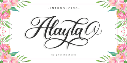 Alayla is modern calligraphy. It's feels both magical and elegant. It looks stunning for your design such as on wedding invitations, thank you cards, quotes, greeting cards, logos, business cards and every other design. This font is PUA encoded which means you can access all of the glyphs and swashes with ease! It features a varying baseline, smooth lines, gorgeous glyphs and stunning alternates.
 - Musical Score JNL by Jeff Levine,
$29.00 A number of pieces of antique sheet music utilizing the same Roman typeface were the inspirational basis for Musical Score JNL. This antique design closely resembles pen lettering and its hand-made charm due to the rounded stroke ends and varying character widths. Informal, yet attractive - the character design evokes the feeling of the turn of the previous century and simplicity of life at that time.
 - Ajuslly by Stringlabs Creative Studio,
$29.00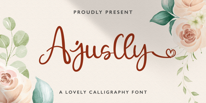 Ajuslly is an incredibly distinct, delicate and timeless handwritten font. It looks stunning on wedding invitations, thank you cards, quotes, greeting cards, logos, business cards and every other design which needs a handwritten touch. This font is PUA encoded which means you can access all of the glyphs and swashes with ease! It features a varying baseline, smooth lines, gorgeous glyphs and stunning alternates.


