5,714 search results
(0.011 seconds)
- ReadMyHand by Linotype,
$29.99Linotype Read My Hand is part of the Take Type Library, selected from contestants in Linotype’s International Digital Type Design Contests of 1994 and 1997. It is the digitalized handwriting of its Dutch designer, Leon Hulst. As is common of handwriting fonts, the forms of the letters seem spontaneous and individual. Read My Hand is a dynamic font suitable for texts with point sizes larger than 12 and particularly good for documents which should have a personal touch. - Linotype Gneisenauette by Linotype,
$29.99 Linotype Gneisenauette is part of the Take Type Library, selected from the contestants of Linotype’s International Digital Type Design Contests of 1994 and 1997. The handwriting font was designed by Latvian artist Gustavs A. Grinbergs and is available in eight weights. Linotype Gneisenauette is a dynamic font which also reflects a bit of the optimistic spirit of the 1950s. The font is best used for headlines or middle length texts with a point size 12 or larger.
 - Abdo Misr by Abdo Fonts,
$29.50 Abdo Misr is a geometrical style. This is an OpenType Font supporting Arabic, Persian, Urdu, abd English to and compatible with the various operation systems and modern software. The combination of modern Kufi and Geometrical styles and varying between straight and curved parts made it a beautiful typeface appropriate to the titles and slogans, and able to meet the desire of the user in the design of ads and modern designs of various types of audio and visual.
 - Zalea by Eurotypo,
$42.00 Zalea script is an expressive and dynamic font. It has an appealing "punch" characteristic that gives it its charm and strong visual impact. Zalea was specially thought for labelling and packaging design. It has also good legibility for body text, useful in magazines and web pages. We recommended it for headlines, logos or where a friendly script is needed. Zalea font includes a full international character compliment, alternate characters, swash and ligatures to allow flawless typesetting in OpenType format.
 - Maryam by Outras Fontes,
$24.00 Maryam is an Outras Fontes type family designed by Ricardo Esteves Gomes. With moderate contrast, these fonts have elegant and very legible forms even in small x-height sizes. There are more then 70 ligatures in each font, providing a lot of letterform variations that make this type family looks like a real handwriting on a page. It is currently available in two versions (Regular and Alternate) that you can combine with each other as you wish.
 - Millesa by Muflihin Nurhabib,
$18.00 Introducing Millesa: An elegant and modern serif typeface. With its modern and elegant appearance, Millesa brings a luxurious and clean style to your projects such as websites, modern logos, branding identities, social media quotes, wedding stationery and various other needs! Millesa displays capital letters A to Z which are unique and classy, of course because they are made with great care so that they become beautiful fonts and can be adapted to various large projects that you want.
 - Nitrous by Angga Mahardika,
$20.00 Nitrous is a script and serif typeface with elegance and vintage looks. This font has some of alternate characters, swashes and ligatures. You can design beautiful, elegant and diverse typographic elements with it. This font duo is effective on product packaging, particularly for wares that prefer a handcrafted, artisan approach to their finished presentation. Nitrous is ideal for strong branding, identity, and logo design, as its letter forms effortlessly express a tone of familiarity, reliability, and timelessness.
 - Fustier by Nathatype,
$29.00 Fustier is a script font that captures the beauty of handwriting with a mesmerizing twist. The curves and loops dance across the page, evoking the sensation of ink flowing seamlessly from a skilled hand. With an abundance of swinging details, Fustier ensuring a harmonious flow from letter to letter. The generous spacing between letters maintains readability and legibility, You can use this font in headlines, logos, posters, flyers, invitations, name cards, branding materials, and many more.
 - Bourgeois Slab by Barnbrook Fonts,
$75.00 Bourgeois Slab is built upon the framework of Bourgeois, our popular geometric type family. As with the sans-serif Bourgeois, Slab’s letter forms are thoroughly contemporary in look and feel. Echoing mid-century modernism in style, Slab’s overall look is friendly and businesslike, more expansive and expressive than Bourgeois’s pared-down asceticism. The slab-serif’s development and vigorous uptake during the early-Victorian-era Industrial Revolution, means that we endow slab-serif faces with characteristics of sturdiness, durability and trustworthiness. At the same time, we appreciate the slab-serif’s raison d’etre: They’re made to grab your attention. Bourgeois Slab and Slab Condensed when combined, offer 24 styles suited for text of all kinds and sizes. Both are particularly good for for text-heavy projects and for designers seeking a robust, authoritative-but-genial voice for branding and logo work.
 - ITC Pino by ITC,
$29.99The ITC Pino™ typeface family is Slobodan Jelesijevic’s second suite of commercial fonts. Although a small family of three weights, it is remarkably versatile. Like many typefaces, Pino grew out of a desire for a particular kind of design. Jelesijevic was creating a series of illustrations for a children’s magazine and needed a typeface that was lighthearted, legible and would complement his illustrative style. Unable to find exactly what he needed, he decided to make his own font. “I spent the better part of a day looking for just the right typeface,” he recalls. “Of course, the hard part was finding something that would harmonize perfectly with my drawings. A custom font was not part of the project brief or budget, but I thought that perhaps I could use it again.” The regular weight of Pino became the solution to Jelesijevic’s problem. Jelesijevic did use the font again, but quickly realized that the single weight needed companion designs. Pino Bold and Black followed in quick succession. Before licensing the designs to ITC, the three-weight family provided headlines, book cover titles and even short blocks of text copy in several of Jelesijevic’s design projects. Born in Gornji Milanovac, Serbia, in 1951, Jelesijevic graduated with a degree in graphic communication and lettering from the Faculty of Applied Arts in the University of Arts in Belgrade. Currently, in addition to typeface design, he is sought out as a graphic designer and illustrator. When not working on design projects, he teaches graphic communications at the Faculty of Art in the University of Niš, Serbia. Pino is a stressed sans of slightly condensed proportions. Pino’s generous x-height, clearly defined counters and distinctive character shapes enable it to fulfill a wide variety of typographic applications. Friendly without being sanguine, the Pino type family will communicate with charm and vitality. - Charpentier Renaissance Pro by Ingo,
$42.00 A very legible Renaissance Antiqua This typeface is based on the desire to create an Antiqua like those which might have existed at the beginning of the »printing age« — the basic form oriented on the classical Roman and early Middle Ages models, the ductus defined completely by writing with a wide pen and much individual expression in detail. In the spring of 2005 I had the opportunity to closely examine a few pages in the famous book »Hypnerotomachia Poliphili« from 1499. The script used here from Aldus Manutius is exemplary. Most of the book, however, is not very carefully printed. The characters do not stay on the line; the print is at times too strong and at times much too weak. And on these imperfect pages the true character of the letters is recognizable; that is, that they are cut with lively detail which is a result of the patterns provided by full-time writers. After all, around 1499 script was written as a rule and the printed type was oriented on this pattern. I prefer the typeface on the lightly printed pages. The characters are not placed neatly on the line, but the distinct and emerging lively ductus of the individual characters automatically presents harmonious word formations in the eye of the beholder, with the non-perfect line stepping into the background. Also in Charpentier Renaissance, the strokes of the wide pen are still noticeable. The font has very defined softly bent serifs. The forms are powerful and stand solidly on the baseline. Charpentier Renaissance is very legible and yields a solid and yet still lively line formation. The accompanying italic, like its historical models, has almost no inclination. The lower case characters of Charpentier Renaissance Oblique have such idiosyncratic figures that they can also form a font of their own. Please visit www.ingofonts.com
 - P22 Stickley Pro by IHOF,
$39.95 Stickley Optical Family is an expansion of P22 Stickley Text, a humanist, Oldstyle-rooted design with a contemporary execution and full OpenType abilities. The font contains ten distinct cuts across four optical masters—in addition to Text for page content, the optical family includes Display for titling; Headline for emphasis; and Caption for footnotes and small sizes. Typefaces were originally designed for the physical size at which they were to be printed, with subtle variations in proportion, detail, contrast, and visual weight to ensure they were as clear at 6 pt. as they were elegant at 68 pt. This created a unified design as the various sizes were set together on a page. Text is the foundation of this typeface family and is built for use in extended reading. Its proportions are carefully balanced for visual clarity while retaining its character; designed for use at 9 to 13 pt. Caption is a sturdy, simplified interpretation of the Text letterforms, with ink traps, generous letters and spacing, and hefty proportions to give balance to the smallest content on a page; designed for use at 5 to 8pt. Headline is a complement to the Text master size. It is a gently modified version with larger small caps to add visual strength and has a greater delicacy; designed for use at 14 to 26 pt. Display is an elegant refinement with stylized details. It harmonizes with the smaller optical masters as a more intricate manifestation of the typeface. Designed for use at 34 pt. and above. Opentype features include ligatures, oldstyle and lining figures, alternates, Central European characters and diacritics, and Swash Caps for the Italics. Stickley Optical Family is a feature-rich workhorse with international functionality.
 - Quarter Braille by Echopraxium,
$20.00 Presentation QuarterBraille (Abbreviated as "QB" thereafter) is a decorative, steganographic and lattice font. Its core design concept is that Braille dots are represented as "quarters of a square"[1]. This is illustrated by posters 1 and 2 (NB: these glyph parts will be called "QB dots" thereafter). The other glyph parts (see poster 3) are purely decorative and meaningless in terms of Braille dots encoding[2]. All glyph parts are meant to generate a wide variety of patterns from horizontal and vertical combinations of glyphs. There is also a graphic convention to differentiate uppercase from lowercase letters with the presence or absence of shape subparts (in the "endings", "quarter of a circle with a ring" and "quarter of a diamond with a small square in the middle") like shown by poster 4. This font is suitable for very short texts (e.g. logos, acronyms, quotes, ambigrams, pangrams, palindromes, etc...) but on the other hand it may be used for steganographic purpose like geocaching as well as fictive alphabets (e.g. Alien/SciFi/Fantasy/Antique civilizations). Posters 1. Font Logo: the displayed text is " Quarter " followed by " Braille". There's a rainbow layer above the text to highlight the "QB dots", this is achieved by A..Z glyphs with "only QB dots" (codes 230..255) 2. Anatomy of a Glyph (L) and "QB Dots" (quarters of a square) 3. Glyphs Parts: Square and Cross (Inverted square), Circle and Inverted Circle (with or without the small circle in the middle), Diamond (with or without the small square in the middle), Inverted Square and Circle, Shape combos, Ending 4. Uppercase vs Lowercase (tiny shape subparts are shown in red) 5. Sample 1: Bathroom sink with QB tiles on the credence 6. Sample 2: Hands knuckle tatoos: "LOVE/HATE"[4] 7. Sample 3: Poker Hand: pocket Aces. It's an Ace of Hearts (Ah) on the left and an Ace of Spades (As) on the right. Like in regular cards, the card value (e.g. Ah) is displayed twice: at the top and rotated by 180 degrees at the bottom. This poster also illustrates that QB could be used to print embossed playing cards with tactile and visual display of card values. 8. Sample 4: Pangram: "Adept quick jog over frozen blue whisky mix" 9. Sample 5: Latin Magic Square: "SATOR AREPO TENET OPERA ROTAS" (NB: for compensation of the 2/3 glyph ratio, letters on each line are separated by a space: "S A T O R", ...). 10. Sample 6: Quote of Mahatma Gandhi: "Learn as if you will live forever, live like you will die tomorrow.". This is also a demonstration of border glyphs combinations. 11. Sample 7: Steganography use case: the text is a sequence of 64 aminoacids (1 Letter notation), this protein was described in a research paper "The complete Aminoacid sequence of an amyloid fibril protein AA of unusual size (64 residues) 1975". 12. Sample 8: Border Glyphs with the provided styles and mixed styles. The words are the same than in poster 9 ("SATOR AREPO TENET OPERA ROTAS"). Despite the 2/3 glyph ratio, the "TENET cross" was achieved by both inserting spaces in horizontally ("T ENE T") and by using the "thin borders glyphs". Notes a. Border glyphs[3] are meant to enhance the esthetics of text samples displayed with QB b. Special characters (e.g. *$()[].,;:&@# ...) are provided and follow the NABCC (North American Braille Computer Code) convention. c. A..Z Glyphs with only the "QB dots" are provided as demonstrated by posters 1 and 2 (A/N: this was very useful to create them). d. Glyph Map: 32..64: Special characters - 161..187: "Thin variant" of Border glyphs, 192..229: Border glyphs, 230..255: A..Z with only the "QB dots" - Codes 176 an 181 are "regular SPACE" (empty glyph). Footnotes 1. There is indeed two shapes which represent the braille dot: the "quarter of a square" and the "quarter of a cross". It's because a cross may be considered as an "inverted square" because the square corners are merged in the center. 2. That's why the SPACE glyph is only made of decorative/meaningless glyph parts (i.e. no "QB dots"). 3. For other fonts with border glyphs, please take a look at my other "decorative Braille fonts" (GoBraille, HexBraille, KernigBraille, StackBraille, MaBraille, DiamondBraille, LorraineBraille). 4. LOVE/HATE knuckle tatoos are inspired by the anthology scene from "The Night of the Hunter" movie (Charles Laughton 1955), it also appearead in "Do The Right Thing" movie (Spike Lee 1989). Disclaimer This font is not appropriate and not meant to print text documents in Braille for the blind readers audience.
 - Gamboge by Hanoded,
$15.00 Gamboge is a deep saffron to mustard yellow pigment which is extracted from a tree. Its name comes from gambogium, the latin word for the pigment. Gambogia font is a beautiful all caps typeface with a pre-war feeling to it. Upper and lower case differ and can be mixed freely. Use Gamboge for your product packaging, book covers and websites.
 - Store Tags JNL by Jeff Levine,
$29.00 Store Tags JNL is a collection of vintage-style store price tags that are great for a multitude of purposes. Print them with a color fill and overlay them on product photos in ad fliers. Enlarge them and print them out on card stock to create pre-printed tags, or print them out poster-size and use them for point-of-sale displays.
 - Rabiosa - Personal use only

- Little Miss - Personal use only

- Saturday Script by Nicky Laatz,
$16.00 Say hello to Saturday Script! A a care-free, casual, handwritten script with authentic tell-tale dry brush imperfections. Saturday Script has the added bonus of having 'multiple personalities'! Saturday Script has 2 sets of lowercase stylistic sets, allowing you to make each word look completely unique to the next. Whether you need "flaunty & loud" or "soft & romantic" Saturday Script has the look for you. There are 2 variants of Saturday Script, to add even more flexibility to your designs: Regular, and Oblique
 - Linotype Venezia by Linotype,
$29.99Linotype Venezia Initiale is part of the Take Type Library, selected from the contestants of Linotype’s International Digital Type Design Contests of 1994 and 1997. Designed by German artist Robert Kolben, the font is based on the classic forms of Roman writing in the 1st and 2nd centuries found chiseled on countless buildings and monuments. Linotype Venezia Initiale is a timeless, elegant font particularly well-suited to headlines or as initials in combination with other fonts, working especiall well with sans serif alphabets. - Bogesta by Mantype Studio,
$14.00 Bogesta Typeface - Stylish OpenType rich serifs with letters that seem to dance and swirl harmoniously together - to form unique & elegant typographic designs. The wide selection of interwoven binders and Opentype alternatives means lots of choice and variety in your final look. To access these OpenType features, you need Opentype-enabled software such as: Word, Textedit, Photoshop, Sketch, Pages, Keynote, Numbers, iBooks Author, QuarkXPress, Indesign and Illustrator. A wide variety of useful glyphs are included - see preview images of all glyphs.
 - Symbah by Hashtag Type,
$19.00 Symbah is fun, a carefree hand drawn typeface with a child-like spirit. Made with a brush and ink, and then converted into a digital format for you to enjoy. The design is fresh, organic and produced purely by hand and brush, a technique not replicated by digital methods alone. Symbah is full of personality and is ideal for projects that need creativity with an imaginative, and unique feel. Details include manual edited kerning and spacing, ligatures and case-sensitive punctuation.
 - Biscuits Delight by Balpirick,
$15.00 Biscuits Delight is a monoline handdrawn font that's perfect for adding a personal touch to your design projects! With its natural, organic feel and unique character. Crafted with care and attention to detail, this font is incredibly versatile and can be used for a range of design projects, including logos, branding, invitations, and more. Its modern, handwritten style gives it a unique character that's sure to make an impact. - also multilingual support Enjoy the font! Feel free to comment or feedback! Thank you!
 - Orange Garden by Balpirick,
$15.00 Orange Garden is a Modern handwritten typeface that's perfect for adding a touch to your design projects! With its natural, organic feel and unique character. Crafted with care and attention to detail, this font is incredibly versatile and can be used for a range of design projects, including logos, branding, invitations, and more. Its modern, handwritten style gives it a unique character that's sure to make an impact. - also multilingual support - Ligatures Enjoy the font! Feel free to comment or feedback! Thank you!
 - Corbert Compact by The Northern Block,
$- A compact geometric sans serif typeface influenced by Bauhaus and the early modernist era. Precise shapes are optically adjusted to create a clear, natural typeface with excellent legibility across various applications. Corbert compact is part of the popular Corbert type system; other widths include Normal, Condensed and Wide. Details include over 590 characters; OpenType features consist of five variations of numerals, including inferiors, superiors, fractions, alternative lowercase a, e and g, and language support covering Western, South, and Central Europe.
 - Gorodets by Alexandra Korolkova,
$25.00 Gorodets is a symbol font based on traditional wood-painting style from the town Gorodets on Volga river, Russia. The main motifs of it are decorative flowers, birds, horses and even people, drawn in special way and painted in black, red, blue and green. The Gorodets typeface consists of 60 manually traced images divided into two parts: filled and empty ones. The typeface can be suitable in greeting cards and other printed materials to make them look decorative in a traditional Russian way.
 - ALS Ekibastuz by Art. Lebedev Studio,
$63.00 ALS Ekibastuz is a contemporary urban-style typeface extremely suitable for periodicals and advertising. It has defined, open, clear-cut letterforms and modern proportions. Originally designed to work well for headings, Ekibastuz was developed further to give a distinct energetic feel when used at large sizes and be highly readable and neutral at small sizes. It consists of six font styles and offers a wide choice of weights, which is useful for creating contrast between boxes of text on a page.
 - Bell Centennial by Bitstream,
$29.99 Designed specifically for AT&T by Matthew Carter at Mergenthaler to replace Bell Gothic with a typeface that made effective use of digital typesetting technology, Bell Centennial gets several more lines per page than Bell Gothic, reduces calls to information because of its significantly higher legibility under adverse printing conditions, saving AT&T many millions of dollars per year. Although intended for use at small sizes, Mazda UK used Bell Centennial at huge sizes to striking effect in a mid-1990s ad campaign.
 - United White by Balpirick,
$15.00 United White is a modern handwritten typeface that's perfect for adding a personal touch to your design projects! With its natural, organic feel and unique character. Crafted with care and attention to detail, this font is incredibly versatile and can be used for a range of design projects, including logos, branding, invitations, and more. Its modern, handwritten style gives it a unique character that's sure to make an impact. - also multilingual support Enjoy the font! Feel free to comment or feedback! Thank you!
 - Dharma Gothic P by Dharma Type,
$19.99 Dharma Gothic P font family is designed based on Dharma Gothic and a distressed offshoot from the original. The glyphs that damaged by printing the original had been tweaked by hand work with great care. This family contains basic Roman, Italic, Bold and it’s Italic to suit a wide range of creative works. g, r & y have their alternative glyphs that can be used with OpenType salt feature. This font will be one of the most powerful solutions for printing and web.
 - Rainquote by Balpirick,
$15.00 Rainquote is a Modern Calligraphy Font that's perfect for adding a personal touch to your design projects! With its natural, organic feel and unique character. Crafted with care and attention to detail, this font is incredibly versatile and can be used for a range of design projects, including logos, branding, invitations, and more. Its modern, handwritten style gives it a unique character that's sure to make an impact. - also multilingual support Enjoy the font! Feel free to comment or feedback!
 - Monster Sprinkle by Balpirick,
$15.00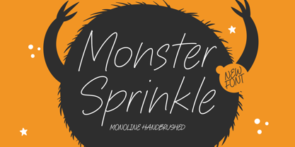 Monster Sprinkle is a monoline handbrushed font that's perfect for adding a personal touch to your design projects! With its natural, organic feel and unique character. Crafted with care and attention to detail, this font is incredibly versatile and can be used for a range of design projects, including logos, branding, invitations, and more. Its modern, handwritten style gives it a unique character that's sure to make an impact. - also multilingual support Enjoy the font! Feel free to comment or feedback! Thank you!
 - Linotype Bariton by Linotype,
$29.00Linotype Bariton is part of the Take Type Library, chosen from contestants of Linotype’s International Digital Type Design Contests of 1994 and 1997. Designer Alexej Chekoulaev designed his font in one weight to mirror the Zeitgeist of the early 1930s. The characters of this extremely bold font are based on the form of a rectangle though its rounded edges soften its look a bit. Linotype Bariton should be used only in larger point sizes in headlines which should really catch the eye. - Wood Fancy Reverse JNL by Jeff Levine,
$29.00 Amongst some pages scanned and posted online of old wood type alphabets comes this lovely, ornamental design in a reversed style of white lettering on black rectangular boxes. This classic set of wood type is now available digitally as Wood Fancy Reverse JNL. There is a narrow blank box on the “less than” key for use as an end cap, and a wider blank box on the “greater than” key to use between words as a blank space if so desired.
 - Sovett by Twinletter,
$12.00 Introduces our new "Sovett" handwriting script font which is flexible in every typeface. This beautiful font you should use to create your perfect design work This font is designed with a natural touch of handwriting which is refined to create a portion and composition that suits your needs. So this font is suitable for craft, children's writing, adventure posters, food banner titles, wedding invitations, product packaging logos, quotes, social media page covers, furniture banner headlines, book covers, and much more.
 - Ishtar by Hanoded,
$15.00 Ishtar was the Babylonian goddess of war, fertility, love and sex - all in all a lethal combination. She wasn't the sweetheart her lovers had hoped for; I guess the 'war' part in her resume is a dead give-away. Ishtar font is no sweetheart either: it doesn't have a real baseline and its spooky character might not be everyone's cup of tea. It does have a certain charm, however, and befitting a Babylonian goddess, it comes with Babylonian language support!
 - So Lovely by Positype,
$20.00 Effortless, personal, nonchalant. So Lovely just slides into the room, without a care in the world, flowing from one letter to the next. This simple typeface has a secret—behind that nonchalant attitude is a ton of Stylistic, Swash, and Titling Alternates. It even contains 44 special ligature combinations to insure you have the smoothest entrance possible. So Lovely is the third release of the Positype Relaxed Script Collection of typefaces—all focused on fluid, effortless script fonts for simple use.
 - Tiny Titans by Mili + Wise,
$10.00 Proudly introducing Tiny Titans - a heartwarming hand-drawn display font with plenty of ligatures and stylistic alternatives. Perfect for creating posters, logos, greeting cards, packaging and so much more! Its charming and warm character will help you give your project a truly unique feel. Designed and kerned with care and love to make using it a breeze. What you will get Tiny Titans is packed with lovely features: many stylistic alternates plenty of ligatures multilingual support with accented characters for international designers
 - LollyandJoys by Gioia Silvia Buracchini,
$19.99 LollyandJoys is a font born from the hand of a young illustrator and cartoonist. It arises from the need to be able to create your own font to make your illustrations and comics more linear; above all it is at the service of everyone to be able to create simple and essential projects with a handwritten font. Careful research was carried out on glyphs with ligatures to make the font more homogeneous and versatile. Research is the first fundamental step!
 - Barking Frenzy by PizzaDude.dk,
$18.00 Barking Frenzy may look as if it was cut out of paper or cardboard, but it's not! It was drawn with a rugged pen, leaving rough edges here and there. It's great for children's books and toys or maybe handcraft or other handcrafted activities. I've added 5 different versions of each lowercase letter and these appear randomly as you type. That way your text looks really natural and organic, because the letters rarely repeat themselves. Also the font has multilingual support!
 - Quadrat Grotesk New by ParaType,
$30.00 Designed for ParaType in 2004 by Vladimir Pavlikov. It is a new version of popular type Quadrat Grotesk by the same author. Letters of the new version in contradistinction to the old one are clean and have no traces of exploitation. Quardat Grotesk New due to its rectangular proportions is extremely readable in small sizes and can be successfully used in Web pages and in documents with long lists where critical aspect is a number of lines rather then length of a line.

