10,000 search results
(0.03 seconds)
- Shall Blossom by Din Studio,
$29.00 Shall Blossom is a lovely brush font. The handwritten combined with brush font will make your design project more attractive. Made for any professional project branding. It is the best for logos, branding and quotes. Includes: Shall Blossom (OTF) Features: Stylistic Set Beautiful Ligatures Multilingual Support PUA Encoded Numerals and Punctuation Thank you for downloading premium fonts from Din Studio
 - Besterline by Skinny Type,
$15.00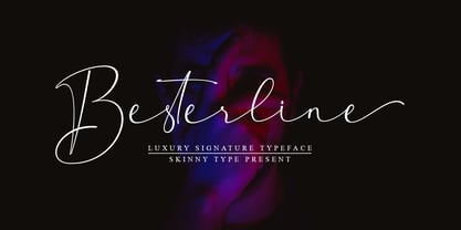 Besterline is a signature Font with a handwritten and script style make this font looks elegant, natural, stylish and perfect for any awesome projects that need signature taste. Besterline would perfect for photography, watermark, social media posts, advertisements, logos & branding, invitation, product designs, label, stationery, wedding designs, product packaging, special events or anything that need signature taste. What’s include : - Besterline OTF Happy Designing
 - Sri Kandi by Arendxstudio,
$20.00 Sri Kandi is a stylish and effortlessly cool handwritten font with a contemporary twist. It will add a unique spin on any design project! You will find font in OTF formats. No special software is required to use Sri Kandi, just install it as you normally do on your system. Includes: - Uppercase - Lowercase - Numerals - Punctuation - Symbols - Ligatures - Alternates - Multi-language Characters
 - Wieynck Gotisch by RMU,
$25.00 Wieynck Gotisch, a 1920s font family created by Heinrich Wieynck, was completely redrawn and redesigned for modern usage. Use this remarkable and eye-catching fonts in an appropriate context. This font contains a bunch of useful ligatures, and by typing 'N', 'o' and period plus activating the OT feature Ordinals you get an oldstyle numbersign. The round ‚s‘ lies on the #-key.
 - The Moniktun by Ditatype,
$29.00 The Moniktun is a monoline script font. Made for any professional project branding that need a modern and attractive typeface. It is the best for logos, branding and quotes. Every letter has a unique and beautiful touch. Includes: The Moniktun (OTF) Features: Standart Ligatures Stylistic Set Multilingual Support PUA Encoded Numerals and Punctuation Thank you for downloading premium fonts from Dita Type
 - Butterfly Wingz by Ingrimayne Type,
$5.00 IngrimayneType has put letters inside a variety of objects, including bowling pins, book covers, coffee mugs, teapots, pumpkins, Christmas ornaments, train cars, tombstones, old bottles, circles, and rectangles. In each case the letters were placed on a single shape. The use of the Opentype feature of contextual alternatives makes it easy to use two different but alternating shapes. ButterflyWingz puts its letters on the right and left wings of a butterfly. The wings provide a large surface for drawing letters, but they have a odd shape so letters must be distorted to fit. The wings are symmetrical but some letters are not, so the right and left wing versions of the same letter are sometimes quite different. Without the contextual alternative feature one could design a typeface like ButterflyWingz but the user would have to alternate upper and lower case keys. With contextual alternatives turned on, the computer automatically alternates the letters creating a line of complete butterflies. Turning on the Opentype feature stylistic styles one (ss01) replaces the empty spaces with empty wings. However, sometimes an empty wing at the end of a line is unwanted and it can be removed by changing the typeface or by turning off the stylistic style for that character. The family contains two styles, a filled style and an outline style. They can be used separately or together in layers to add color. (Empty wings are on the logicalnot and registered characters.) ButterflyWingz is hard to read and should be used in small doses for decorative effects.
 - Cheltenham Pro by SoftMaker,
$15.99 Where most typefaces are designed by just one individual, quite a few people have been involved in perfecting Cheltenham over the times. In 1896, the architect Bertram Grosvenor Goodhue created the initial design for Ingalls Kimball at the Cheltenham Press. Just a few years later, Morris Fuller Benton devised a full family of Cheltenhams for ATF. This is the basis of the design we have today. In 1975, Tony Stan revived this classic typeface and did what was customary at the time: increase the x-height and make the Cheltenham family more regular. SoftMaker updated the design yet again in 2012. The result is Cheltenham Pro, a typeface that is exceptionally readable and holds up even in adverse printing conditions. SoftMaker’s Cheltenham Pro typeface family contains OpenType layout tables for sophisticated typography. It also comes with a huge character set that covers not only Western European languages, but also includes Central European, Baltic, Croatian, Slovene, Romanian, and Turkish characters. Case-sensitive punctuation signs for all-caps titles are included as well as many fractions, an extensive set of ligatures, and separate sets of tabular and proportional digits.
 - Finest Vintage by Din Studio,
$20.00 Choosing fonts for design projects can be a daunting task because there’s thousands of fonts out there all over the web that you could use. Here it is. A font that can add touch of magic whether you’re looking to create a big, bold logo for your business, work on a poster for an event, or whatever your project may be. Finest Vintage-A Retro Script Font Finest Vintage is a beautiful font, employing the iconic bubble style with strong outlines and fat strokes. This font features thick and angular letters that easy on the eyes and nice to look while it’s also easy to read. It is well suited for making your logos really stand out. The font comes with a range of multilingual glyphs and is one of those bubble fonts styles that’s hard to take your eyes off. Finest Vintage becomes more special with extruding version option. Perfect to create amazing headings, logos, menus, social media graphics, and many more. Our font always includes Multilingual Support to make your branding reach a global audience. Features: Ligatures Stylistic Alternates Swashes PUA Encoded Numerals and Punctuation Thank you for downloading premium fonts from Din Studio
 - Goudy Two Shoes by Canada Type,
$24.95Goudy Two Shoes is a digitization and expansion of a 1970s type called Goudy Fancy, which originated with Lettergraphics as a film type, then was released into the dry transfer (rub-on) arena, where it became really popular. This digital expansion of the original design contains many additional characters, including "plain" variants on the caps, as well as extra alternates and swashes, and even a few curly ornaments. Goudy Two Shoes comes in all popular font formats. The Postscript and True Type versions ship as 2 fonts, while the OpenType version is a single font programmed with features for OT-savvy applications. - Unger Fraktur by RMU,
$25.00 In the wake of the Enlightenment and the French Revolution there was a desire for a clear classical blackletter font without frills. That is why in 1793 the famous printer and editor Johann Friedrich Unger and his partner Johann Christian Gubitz accomplished their own fraktur. Now you will be able to use both regular and bold styles of this highly readable blackletter font. It is recommended to activate both OT features Standard and Discretionary Ligatures to access all ligatures in both these fonts. Typing N-o-period and activating the ordinal feature gives you the numero sign.
 - FP København Sans by Fontpartners,
$35.00 Copenhagen has been in need of a typeface that unites the city’s many visual expressions. The three designers Morten Rostgaard Olsen, Henrik Birkvig and Ole Søndergaard have designed and developed the typeface FP København. Now available from MyFonts in 44 styles: Serif & sans serif, uprights & italics, small caps, pictos-characters, stencils, sprayed style, OT-features, ligatures, contextual alternates etc. The shapes of the letters are inspired by the city’s culture and the visual environment and design in Denmark in the 20th century. It is relatively low and wide as the city itself and with rounded corners that give it a warm visual mood.
 - Bilfanny by ryan creative,
$10.00 Hi creative greetings... Introducing the latest fonts. Bilfanny is a script typeface with digitally drawn strokes with a brush preasure that give the font a natural, realistic look Get a simple and fun digital script font touch with glyphs and open type features a Swash binding style, plus Added Ornament, Alternate and Ligature . This font is more decorative and artistic suitable for art or fashion brands. It can be used for various purposes. such as brand name, Wedding, Invitation, product promotion business, etc. FEATURES; -Uppercase, Lowercase, Foreign Support, Numbers and Punctuation. -Otf, Ttf & Woff files -Alternative, Swash, Ligature & Ornament. -Works on PC. -Simple installation. -Accessible in Adobe Illustrator, Adobe Photoshop. Adobe InDesign, it even works in Microsoft Word. -Fully accessible without additional design software. Bilfanny is encoded with Unicode PUA, which allows full access to all additional characters without having to design any special software. Mac users can use the Font book, and Windows users can use the Character map to view and copy any extra characters to paste into your favorite text editor/app. Thank you for visiting;)
 - Canting by Omotu,
$16.00 Canting is a decorative serif font. It perfectly represents vintage esthetics in a modern and minimalist way. The font includes special uppercase letters and alternate characters. The font is perfect for elegant logo design, product packaging, quotes, poster design, brand identity, lettering, and many more. What's Include? 1. Uppercase characters with 3 styles (regular, outline, and rough) 2. Supports international languages 3. Opentype features: stylistic alternates with beautiful swashes 4. Accessible in the Adobe Illustrator Glyphs panel, or under Stylistic Alternates in the Adobe Photoshop OpenType menu, Adobe InDesign, Corel Draw, even work on Microsoft Word. 5. TTF and OTF files PUA Encoded Characters - Fully accessible without additional design software. Don't forget to visit our other products: Crown: https://fontbundles.net/omotu/218250-crown Sweet Candy: https://fontbundles.net/omotu/200017-sweet-candy Alitta: https://fontbundles.net/omotu/194813-alitta Sattay: https://fontbundles.net/omotu/188296-sattay Thanks for looking, and I hope you enjoy it! Please don't hesitate to drop me a message if you have any issues or queries. Regards, Omotu (ibnu.blawong2@gmail.com)
 - Helliya Signature by Balevgraph Studio,
$14.00 Helliya Signature is a lovely and timeless handwritten font. It is the best choice for creating eye catching logos, branding and quotes. Every letter has a unique and beautiful touch, which will make your design come alive! This font is PUA encoded which means you can access all of the glyphs and swashes with ease! What's Included : TTF Uppercase, Lowercase, Numerals & Punctuations Ligature & Alternate Works on PC & Mac Simple installations Multilingual support Compatible with Silhouette Studio, Cricut Design Space, Scan N Cut, Adobe Illustrator and other cutting and design programs.
 - String Theory by Ampersand Type Foundry,
$20.00 String Theory has been a 10+ year project in the making which originated from a type workshop in Graduate School at Otis College of Art & Design. The workshop was hosted by Dutch designer Hansje Van Halem, and we were tasked to play with string to create letterforms. Thus String Theory was born, and slowly migrated from yarn, to an illustrator file, to what it is today as a type family. Each glyph has it’s own custom string set up, along with each weight. Experimental in nature, edgy, with subliminal angst and grittiness.
 - Kolorans by Ronny Studio,
$19.00 Kolorans is a cute comic display font. Funny comic fonts are characterized by their whimsical and playful designs, which are meant to evoke a sense of lightness and humor. It features bold, slightly exaggerated letterforms that have a cartoonish feel to them. The letters are cute and quirky, giving off a friendly and approachable look. This font is perfect for comic books, titles, poster designs, and more. Features : - All Caps - Alternate & Ligature - numbers & punctuation - Multilingual - PUA encoded Please contact us if you have any questions. Enjoy Crafting and thanks for supporting us! :) Thank you
 - Bright Ideas by Ingrimayne Type,
$9.00 The BrightIdeas family contains two novelty fonts that have letters on light bulbs. The fonts have some characters on standing bulbs and some on hanging bulbs and these two sets are made to alternate with the OpenType contextual alternatives (calt) feature. To use only one set of bulbs, this feature must be turned off and character spacing adjusted. The family contains a style with clear bulbs and one with filled bulbs. They can be used in layers to add color. Both are monospaced. The characters on the bulbs are derived from the font Myhota-Bold.
 - Freak by HiH,
$10.00 Freak was originally released by The Great Western Type Foundry in 1889. According to Maurice Annenberg, Great Western became Barnhart Brothers & Spindler when the Barnhart brothers bought out the Toepfer family in 1868.The plant superintendent, Charles Spindler, became Secretary of the new firm. Specimen books as late as 1899 show the name Great Western alongside the BB&S name. At some point, prior to 1925, Freak was renamed “Bamboo” by BB&S. It was delisted when BB&S was absorbed by ATF in 1929. Listed in McGrew under “Bamboo”.
 - Appleyard by Red Rooster Collection,
$45.00 Appleyard is a transitional serif font family that combines the elements of a modern serif and old-style typefaces. It is loosely based on an old Monotype design called ‘Prumyslava.’ Appleyard was designed by A. Pat Hickson (P&P Hickson) exclusively for the Red Rooster Collection and produced by Steve Jackaman (ITF) in 1992. The typeface’s rounded serifs give it a sophisticated, warm, and friendly feel; it excels in projects that need a delicate touch. Appleyard was designed with legibility in mind, and is ideal in children’s books and for young readers.
 - Knobbly Knees by Comicraft,
$- Comicraft's latest joint has us swollen with pride! This one caps 'em all! Yes, it may look a little bony and stick out at right angles to our shins, but we reckon we'll win the a whole bunch of contests with this one... if we get up off our haunches and hobble up on stage. Trust your knee jerk reaction and download KnobblyKnees now, they look good on Kate and Angelina, they'll look good on you too! Features: Five fonts (Regular, Bold, Light, Broken & Open) with upper and lower case characters.
 - Straight Angles by Celebrity Fontz,
$24.99Straight Angles is a precisely designed three-dimensional font with a clean and futuristic look. The predominant angles are 90 degrees and 180 degrees with parallel and perpendicular lines. Each character is surrounded by a crisp black border of even thickness throughout the font. Upper- and lower-case letters are the same, providing a constant maximum top height while the stems extending below are allowed to show off their distinct personalities in order to spice things up. The 3D extrusion effect makes text appear to stand out from the page. - Chelsea by Red Rooster Collection,
$45.00 Designed by Les Usherwood. Chelsea is a ‘modern’ Old Style serif font family designed by Les Usherwood (Typsettra) in the early 1980’s. Steve Jackaman (ITF) digitally engineered the family exclusively for ITF’s Red Rooster Collection in 1993. Usherwood drew influence from Frederic Goudy’s 1911 creation ‘Kennerley Old Style’ when designing Chelsea; Chelsea, however, tends to be wider with a taller x-height. Chelsea has the clean and upscale feel that is present in all Usherwood creations, and its legible design lends itself to projects of any size.
 - Ratatatat by Comicraft,
$19.00 So y'think youse gonna whack me, huh? Y'think that font o' yours is packin' enough heat to finish me off? Huh? Is that what youse is thinkin'? Well go ahead, but if y'whack me then every two bit hood in Alphabet City is gonna hunt youse down and kern youse like the rat you are! So go ahead, show them you're the Big Boss, the Kingpin of Crime, the Godfather... but you won't see me beggin' for my life, 'cause I got pride, see? I got --RATATATATATATTATATATATTATAT... Ahhh... fuggedaboutit!!
 - Ashtronaut by Chank,
$20.00 Like a phoenix rising from the ashes, the new Ashtronaut font is on fire and blasting off into outer space. This futuristic new font combines basic geometric forms like circles and dashes to form uppercase shapes that are softer and more traditional and lowercase letters with sharp and abstract characteristics. The result is a minimalist style that creates distinct and innovative new glyphs and letter combinations. The basic Bold variety is the strongest of the bunch. Try overlapping it with the other styles — Inlines, Outlines, and Bulbs — in different colors for dramatic and exciting effects.
 - Oxford Street by K-Type,
$20.00 Oxford Street is a signage font that began as a redrawing of the capital letters used for street nameplates in the borough of Westminster in Central London. The nameplates were designed in 1967 by the Design Research Unit using custom lettering based on Adrian Frutiger’s Univers typeface, a curious combination of Univers 69 Bold Ultra Condensed, a weight that doesn’t seem to exist but which would flatten the long curves of glyphs such as O, C and D, and Universe 67 Bold Condensed with its more rounded lobes on glyphs like B, P and R. Letters were then remodelled to improve their use on street signs. Thin strokes like the inner diagonals of M and N were thickened to create a more monolinear alphabet; the high interior apexes were lowered and the wide joins thinned. The crossbar of the A was lowered, the K was made double junction, and the tail of the Q was given a baseline curve. K-Type Oxford Street continues the process of impertinent improvement and includes myriad minor adjustments and several more conspicuous amendments. The stroke junctions of M and N are further narrowed and their interior apexes modified. The middle apex of the W is narrowed and the glyph is a little more condensed. The C and S are drawn more open, terminals slightly shortened. The K-Type font adds a new lowercase which is also made more monolinear so better suited to signage, loosely based on Univers but also taking inspiration from the Transport typeface both in a taller x-height and character formation. The lowercase L has a curled foot, the k is double junctioned to match the uppercase, and terminals of a, c, e, g and s are drawn shorter for openness and clarity. A full repertoire of Latin Extended-A characters features low-rise diacritics that keep congestion to a minimum in multiple lines of text. The font tips the hat to signage history by including stylistic alternates for M, W and w that have the pointed middles of the earlier MOT street sign typeface. Incidentally, Alistair Hall (‘London Street Signs’, Batsford, 2020) notes that when the manufacturer of signs was changed in 2007, Helvetica Bold Condensed was substituted in place of the custom design, “an unfortunate case of an off-the-peg suit replacing a tailored one” and a blunder that has happily since been rectified, though offending nameplates can still be spotted by discerning font fans.
 - Bodoni Classic Ad by Wiescher Design,
$55.00 I became interested in designing Bodoni Classic because of a lazy graphic designer at Jacques Damase publishing house. He had to change a single letter on a bookcover about J. B. BODONI. The French call him Jean Baptiste instead of Giambattista! And that unknown graphic designer just took any old “J” from some newly cut Bodoni. All the new Bodoni cuts have square serifs, whereas the originals had rounded serifs and slightly concave feet. The single letter “J” with the squared off serif was for me like a road sign to start redesigning the entire Bodoni family. That’s exactly what I started in 1993 and a dozen years later I am finished. Okay, I am still adding new Bodoni Classics, but those are my personal additions. Yours very retro, Gert Wiescher
 - Bodoni Classic Initials by Wiescher Design,
$55.00 I became interested in designing Bodoni Classic because of a lazy graphic designer at Jacques Damase publishing house. He had to change a single letter on a bookcover about J. B. BODONI. The French call him Jean Baptiste instead of Giambattista! And that unknown graphic designer just took any old “J” from some newly cut Bodoni. All the new Bodoni cuts have square serifs, whereas the originals had rounded serifs and slightly concave feet. The single letter “J” with the squared off serif was for me like a road sign to start redesigning the entire Bodoni family. That’s exactly what I started in 1993 and a dozen years later I am finished. Okay, I am still adding new Bodoni Classics, but those are my personal additions. Yours very retro, Gert Wiescher
 - Bodoni Classic Chancery by Wiescher Design,
$55.00 I became interested in designing Bodoni Classic because of a lazy graphic designer at Jacques Damase publishing house. He had to change a single letter on a bookcover about J. B. BODONI. The French call him Jean Baptiste instead of Giambattista! And that unknown graphic designer just took any old “J” from some newly cut Bodoni. All the new Bodoni cuts have square serifs, whereas the originals had rounded serifs and slightly concave feet. The single letter “J” with the squared off serif was for me like a road sign to start redesigning the entire Bodoni family. That’s exactly what I started in 1993 and a dozen years later I am finished. Okay, I am still adding new Bodoni Classics, but those are my personal additions. Yours very retro, Gert Wiescher
 - Bodoni Classic Text by Wiescher Design,
$55.00 I became interested in designing Bodoni Classic because of a lazy graphic designer at Jacques Damase publishing house. He had to change a single letter on a bookcover about J. B. BODONI. The French call him Jean Baptiste instead of Giambattista! And that unknown graphic designer just took any old “J” from some newly cut Bodoni. All the new Bodoni cuts have square serifs, whereas the originals had rounded serifs and slightly concave feet. The single letter “J” with the squared off serif was for me like a road sign to start redesigning the entire Bodoni family. That’s exactly what I started in 1993 and a dozen years later I am finished. Okay, I am still adding new Bodoni Classics, but those are my personal additions. Yours very retro, Gert Wiescher
 - Volterra by Blank Is The New Black,
$25.00 In today's typographic landscape, few would still consider Bodoni to have a "modern" feel, but there was once a time when it's vertical axis and thinned horizontal strokes were considered radical. Volterra—inspired by the forms of Bodoni—finishes what Bodoni started and eliminates the horizontal stroke altogether, breathing an elegant new energy into a 200-year-old classic. Named for the artist hired to paint loincloths over Michelangelo's "Last Judgement" when nudity in religious art was condemned, Volterra acknowledges that it is no easy feat picking up where a master left off. Volterra takes what has grown to feel traditional and transforms it into a delicate mixture of classic and modern, with razor-edged serifs and ultra-sharp strokes. Strictly a display face, the larger Volterra is used, the better it looks.
 - Bodoni Classic Hand by Wiescher Design,
$55.00 I became interested in designing Bodoni Classic because of a lazy graphic designer at Jacques Damase publishing house. He had to change a single letter on a bookcover about J. B. BODONI. The French call him Jean Baptiste instead of Giambattista! And that unknown graphic designer just took any old “J” from some newly cut Bodoni. All the new Bodoni cuts have square serifs, whereas the originals had rounded serifs and slightly concave feet. The single letter “J” with the squared off serif was for me like a road sign to start redesigning the entire Bodoni family. That’s exactly what I started in 1993 and a dozen years later I am finished. Okay, I am still adding new Bodoni Classics, but those are my personal additions. Yours very retro, Gert Wiescher
 - Vinila by Plau,
$30.00 Grotesques can answer a really wide variety of design problems and go from small sizes to large without missing a beat. Vinila is Flora de Carvalho's take on the genre. The family’s multi-purpose intention comes from having 4 widths - from compressed to extended, each with 6 weights and obliques. Rhythm and music played an important part in the design of this font, which started off as the lettering for a Brazilian Music album. Its distinctiveness comes from having powerful ink traps that go from elegant and supple in the lighter styles to commanding and impactful in the heavier styles. A distinct rhythm is achieved, making it a strong face for editorial design, branding projects and so much more. Vinila is the ideal companion to expressive display faces, where it serves a supporting role with a marked presence. We use Vinila every day in our own brand identity. We've had some of the best designers use it and test it in many different environments, printed, digital, mobile and more (they really like it!). Also in the package, Vinila Variable is an experimental version of Vinila, where you can have a virtually infinite mix of weights, widths and slant, all from a single font file. Available when you license the complete family. Vinila pairs happily with our cheerful Manteiga , elegantly with our organic didone Tenez and mechanically with our monospaced Odisseia . What other matches can you think of?
 - Eclectic One by Altered Ego,
$45.00STF Eclectic One is a visual cornucopia of symbols, like the junk drawer in your kitchen. Stuff you'll need someday for a graphic element, bullet or dingbat application. Perfect for website icons! The Eclectic family is legendary, with a cult-like following among the inititated. As one of the first dingbat fonts available on the web, it gain popularity after its design in the early 1990s. With over 150 characters in the complete set, you'll find yourself using Eclectic One almost daily to add spice to your otherwise san-serif typographic existence. This font is essentially a soap opera of typographic image elements, created for projects when I couldn't find the "thingbat" I needed. Almost more of a collection of illustrations, there are many characters which connect to form patterns, and of course it's like a "small neutral European country" army knife for the creative community. EcOne features complete hour, quarter, and half-hour notations in an analog clock design glyph, recycled/recyclable symbols, a registration mark, a toaster, globes, sideways diamond arrows, spaceships, stoplights, the "running man," several atomic references, da buzz saw, target icons, the unusual smiley face floating in a ball (with a drop shadow, no less!), and the fish skeleton which complements the fallout shelter symbol, and more. Make your own juxtapositions! One reviewer proclaims "for whatever you do, Eclectic One is an excellent dingbat source." Available in Mac and PC formats. License it today! - PykesPeakZero - 100% free

- PB Carolingian Xc by Paweł Burgiel,
$32.00 PB Carolingian Xc is a font face designed for imitate Carolingian minuscule (from the region of the German southeastern scribal schools) found in 10th century manuscripts. All characters are handwritten by use ink and quill pen, scanned, digitized and optimized for best quality without lost its handwritten visual appearance. Character set support codepages: 1250 Central (Eastern) European, 1252 Western (ANSI), 1254 Turkish, 1257 Baltic. Include also additional characters for Cornish, Danish, Dutch and Welsh language, spaces (M/1, M/2, M/3, M/4, M/6, thin, hair, zero width space etc.), historical characters (overlined uppercase Roman numerals, many mediaeval abbreviations, d-rotunda, r-rotunda, I-longa, e-caudata, historical ligatures for “nomina sacra”) and wide range of ancient punctuation. OpenType TrueType TTF (.ttf) font file include installed OpenType features: Access All Alternates, Localized Forms, Fractions, Ordinals, Superscript, Tabular Figures, Proportional Figures, Case-Sensitive Forms, Stylistic Alternates, Contextual Alternates, Stylistic Set 1-11, Historical Forms, Historical Ligatures, Standard Ligatures. Include also kerning as single ‘kern’ table for maximum possible backwards compatibility with older software. Historical ligatures for additional glyphs are mapped to Private Use Area codepoints. OpenType features automatically exchange some default glyphs by stylistic alternates and create ligatures for better historical appearance.
 - Textapoint - Unknown license

- Shilia by Linotype,
$103.99 SHILIA – AN ARABIC FONT THAT LIVES HAND IN HAND WITH LATIN TEXT CHARACTERS A special design principle underlies the Arabic font Shilia created by Mamoun Sakkal: the form of the characters means that they harmonise happily with sans serif Latin fonts, such as Univers. Because of this, Shilia is the ideal choice for any bilingual project and for use in international corporate branding. Shilia™ had its beginnings in the 1970s. Taking one of the oldest variants of Arabic script, the minimalist Kufic, as his inspiration, Mamoun Sakkal fashioned simple stroke shapes that are combined according to a geometric grid. Shilia is at home in both worlds, that of the East and that of the West. And although Shilia has been primarily designed to be used as a display font, it is also ideal for setting shorter texts. Before being published by Linotype, Shilia underwent major adaptation and updating, and is now available in the modern OpenType format. Mamoun Sakkal increased the characters available per individual typeface variant to over 1,800, and his daughter, Aida Sakkal, worked on programming the extensive OpenType features for the font. There are numerous ligatures that can be used to provide suitable variation and avoid repetition within a given context, and many special features such as the dots under the initial and final segments of words being automatically centralised. Shilia not only supports Arabic, but also Persian and Urdu. Special character combinations for setting texts in these languages, particularly Urdu, are provided through OpenType. And there are a total of 19 stylistic sets with additional character variants available to the user. An example of Urdu text Shilia is available in eight weights, from UltraLight to Black. The corresponding condensed versions are in the course of preparation. Along with the Arabic characters, all of the typeface versions include matching Latin alphabet letters of Adrian Frutiger’s Linotype Univers® family, making Shilia intrinsically suitable for setting bilingual texts. A set of ornaments carefully designed to allow for numerous compositions of bands and decorative patterns rounds off the range of characters on offer. With its 21 weights, Shilia is one of the most extensive of Arabic typeface families that is currently on the market. Its clear and well-balanced forms emphasise the linear nature of the font without allowing it to appear sterile or artificial. Shilia not only cuts a good figure as a display font for signage or in artistic projects, thanks to its substantial range of features, the font family can also be used to set texts, such as corporate and administrative documents. In addition, but the full compatibility between the Arabic and Latin characters makes Shilia the perfect choice for international and multilingual design projects.
 - Midsole SC by Grype,
$16.00 Geometric/Technical style logotypes have been developed for car chrome labels since the early 1980’s, but automobile companies don't monopolize the style by any means. Shoe companies have a foothold in the geometric sans serif styles as well, and range from straightforward to full of techno styled play. Nonetheless, these logotypes all lack an expansive family which shows off all the logotypes are and what they "could" be and do. And that's where we come in. The Midsole SC Family finds its origin of inspiration in the CONVERSE shoe company logo, or an older version of their logo, and from there we expanded it into a 40 font family of weights, widths, and obliques. Midsole pays homage to the styling of the earlier logotype, including unicase variations to match the original look, while further evolving beyond the brand inspiration to yield a family that pulls on modern and historical styles. It adopts a sturdy yet approachable and recognizable style with its uniform stroke forms and curves, and goes on to include smallcaps, numerals, and a comprehensive range of weights, creating a straightforward, uncompromising collection of typefaces that lend a solid foundation and a broad range of expression for designers. Here’s what’s included with the Midsole SC Family bundle: 489 glyphs per style - including Capitals, SmallCaps, Numerals, Punctuation and an extensive character set that covers multilingual support of latin based languages. (see the 10th graphic for a preview of the characters included) Stylistic Alternates - alternate characters and unicase variants for a less standardized text look. 4 weights in the family: Light, Regular, Medium & Bold. 4 obliques in the family, one for each weight: Light, Regular, Medium & Bold. Here’s why the Midsole SC Family is for you: - You’re in need of stylish sans font family with a range of weights and obliques. - You’re love that older CONVERSE letter styling, and want to design anything within that genre. - You’re looking for an alternative to Eurostile & Handel Gothic. - You’re looking for a clean techno typeface for your rave poster designs. - You just like to collect quality fonts to add to your design arsenal.
 - Radium by Typespec,
$32.00 Radium is a futuristic display face with a robust attitude and sharp geometric ideals. Drawing inspiration from computer games, graffiti and nineties dance music, Radium is a versatile typeface for branding, posters, packaging and point of sale. Radium is available in three weights and comes in OpenType (.otf) format for Mac and Windows. Features: Radium supports the following OpenType features: Standard ligatures, discretionary ligatures, ordinals, custom fractions, numerators, denominators, superscript, scientific inferiors, proportional and tabular lining figures, and a slashed zero. Supported Languages: Each weight has a 528 glyph character set for use in the following Latin languages: Albanian, Afrikaans, Basque, Bosnian, Breton, Catalan, Croatian, Czech, Danish, Dutch, English, Esperanto, Estonian, Faroese, Finnish, French, Gaelic, German, Greenlandic, Hungarian, Icelandic, Indonesian, Irish, Italian, Latvian, Lithuanian, Luxembourgish, Maltese, Norwegian, Occitan, Polish, Portuguese, Romanian, Sami, Serbian (Latin), Slovak, Slovene, Sorbian, Spanish, Swedish, Swahili, Turkish, Walloon and Welsh.
 - Morris Sans by Linotype,
$40.99 Morris Sans is a newly revised and extended version of a small geometric family of typefaces originally produced by Morris Fuller Benton in 1930 for ATF. His initial design consisted of an alphabet of squared capital letters with a unique twist that characterized its appearance: corners with rounded exteriors and right-angle interiors. The types were intended for use in the fine print found on business cards, banking or financial forms, and contracts. But over the ensuing decades, this design became a popular element in all sorts of design environments, and several foundries revived the typeface in digital form. Since digital fonts are bicameral, with slots for both upper and lowercase letters, new cuts of the type opted filled the lowercase slots with small caps. In 2006, Linotype commissioned its own version of the typeface-an extension for 21st century use. Under the advisement of Linotype's type director Akira Kobayashi, Dan Reynolds redrew the uppercase and added an original lowercase for the first time. Additionally, a number of extras were brought into the fonts, including six figure styles (tabular and proportional lining figures, tabular and proportional oldstyle figures, and special tabular and proportional small cap" figures). Small caps, which have become an iconic element over time, are accessible in each font as an OpenType feature. To differentiate this version from the original, Linotype's new family is named Morris Sans, in honor of Morris Fuller Benton. All fonts in the Morris Sans family are OpenType Com fonts; they include a character set capable of setting 48 European languages that employ the Roman alphabet, including all Central and Eastern Europe languages, those from the Baltics, and Turkish. This glyph coverage extends to the small caps as well. Morris Sans is a wide typeface, especially in its regular widths; the condensed faces set a more conventional line of text. The new lowercase letters are less geometric than the uppercase, except for those that share the same basic forms (e.g., c, o, and s). Instead of following this geometric trend, the new lowercase tends to strengthen the humanist elements that were present in several characters from the original type, including the uppercase D and the figures 5, 6, and 9. Morris Sans also sports a number of glyphic flares, like the stroke found on the original uppercase Q. Morris Sans is a clean, modern design best suited for headlines, advertising, posters, expressive signage (especially on storefronts), and corporate identity work."

