2,480 search results
(0.01 seconds)
- Linotype Really by Linotype,
$29.99Linotype Really, designed by Gary Munch, is a typeface family of six weights with italics and small capitals that offers a broad palette of expressions to draw from, sensibly light to brightly stentorian. The moderate-to-strong contrast of the vertical to horizontal strokes recalls the Transitional and Modern styles of Baskerville and Bodoni, and the subtly obliqued axis of the stoke weight recalls the old-style faces of Caslon. A strong belt of sturdy serifs completes the Realist sensibility of a clear, readable, no-nonsense text face whose clean details offer the designer a high-impact display face. - Rooney Sans by Jan Fromm,
$45.00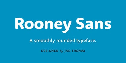 RooneySans is a humanist sans-serif typeface, and the latest addition to the Rooney family. It shares the same attributes as its seriffed companion – softly rounded terminals and a moderate contrast, thoughtfully applied to classical sans-serif proportions. Although RooneySans was developed as a stand-alone typeface family, it combines well with Rooney since both typefaces share the same stem weights and an equal gray value. RooneySans is suitable for any task in branding and packaging design and gives long texts a warm and inviting feel. All six weights from Light to Black come with matching real italics.
 - Simplo Soft by Durotype,
$49.00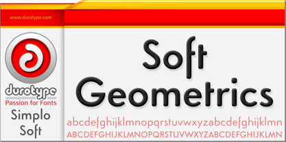 Simplo Soft is the soft companion of Simplo. In Simplo Soft, Simplo’s original sharp geometrics have been tempered by the moderate rounding of the edges of its characters — creating a softer and friendlier geometric typeface. Simplo Soft is ideal for use in display sizes. It is also quite legible in text, and is well suited for graphic design and corporate identity design. Simplo Soft has sixteen styles, extensive language support, eight different kinds of figures, sophisticated OpenType features — so it’s ready for advanced typographic projects. Free demo font available. For more information about Simplo Soft, download the PDF Specimen Manual.
 - Lithium by FSD,
$40.00Lithium is a set of symbols coming from different communicative context but designed to be used together. It's like turning on 5 radios trying to understand the mixture of sounds. Lithium was created, above all, to present this kind of sensation using images. Obviously, the result is chaos in lowercase text. Lithium represents the overload of images we are subjected to. With advertising no longer working like in past years, we end up seeing nothing but noise. FF Mode 01 is created with similar concept. - Odradeck by Harvester Type,
$20.00 Odradeck is a typeface that originated from the idea of creating a tall, but narrow font, while combining brutalism and technogenic. The difficulty was not to go to extremes and make the font moderately neutral in order to significantly increase the range of font applications. Odradeck came out with a strict, industrial, geometric, but moderately neutral semi-mono font with two axes of variability: height and slant. To all this, + 300 glyphs were added and, as a result, support for +80 languages. The structure of the font allows you to use it in a limited space, and its flexibility will allow you to fill and use this space to the maximum. You can apply it in a very wide range of designs. Whether it's a logo, packaging, banner, title, text, poster, merchandising, identity, branding or product design. Language support: Afrikaans, Albanian, Asu, Basque, Bemba, Bena, Breton, Catalan, Chiga, Colognian, Cornish, Croatian, Danish, Dutch, Embu, English, Esperanto, Estonian, Faroese, Filipino, Finnish, French, Friulian, Galician, Ganda, German, Gusii, Icelandic, Inari Sami, Indonesian, Irish, Italian, Jola-Fonyi, Kabuverdianu, Kalenjin, Kamba, Kikuyu, Kinyarwanda, Lower Sorbian, Luo, Luxembourgish, Luyia, Machame, Makhuwa-Meetto, Makonde, Malagasy, Manx, Meru, Morisyen, North Ndebele, Norwegian Bokmål, Norwegian Nynorsk, Nyankole, Oromo, Portuguese, Quechua, Romansh, Rombo, Rundi, Rwa, Samburu, Sango, Sangu, Scottish Gaelic, Sena, Serbian, Shambala, Shona, Soga, Somali, Spanish, Swahili, Swedish, Swiss German, Taita, Teso, Uzbek (Latin), Volapük, Vunjo, Walser, Zulu.
 - Tichy by NoCommenType,
$20.00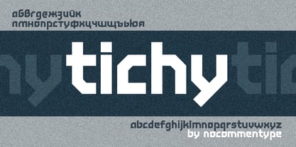 The "Tichy" typeface is intended for use in titles, headlines and in short text blocks, like citates. However, the typeface is legible even in larger text blocks. It's strong appeal allows the typeface's usage mixed with other graphic elements of the layout without compromising it's readability and it's presence. The typeface's simple initial module (double braked at 135 degrees straight line), the strict rules of forming the letters lead to an unique typeface - masculine, strong and still legible. The Cyrillic glyphs are influenced by the work of the great Bulgarian typographers Boris Angelushev, Vassil Yonchev and Alexander Poplilov, who developed Cyrillic further in 60-s and 70-s of the XX century. Western, East European, Cyrillic, Baltic and Turkish codepages are supported. The font file contains all the basic ligatures, alternate glyphs and kern pairs. It can be used both on Windows and MacOS based computers. The history of "Tichy" typeface began many years ago with a project for logotype design for a small company. It was a kind of designer's game to try making some letters just using one single module. Development of the other glyphs of the latin alphabet was for many years a mandatory exercise for the young colleagues in our studio. Suddenly we realized that this project matured and creation of a new typeface started.
 - HiH Firmin Didot by HiH,
$10.00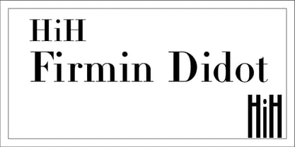 Before Bodoni, there was Didot. With the publication by Francois Ambroise Didot of Paris in 1784 of his prospectus for Tasso’s La Gerusalemme Liberata, the rococo typographical style of Fournier de Jeune was replaced with a spartan, neo-classical style that John Baskerville pioneered. The typeface Didot used for this work was of Didot’s own creation and is considered by both G. Dowding and P. Meggs to be the first modern face. Three years later, Bodoni of Parma is using a very similar face. Just as Bodoni’s typeface evolved over time, so did that of the Didot family. The eldest son of Francois Ambroise Didot, Pierre, ran the printing office; and Firmin ran the typefoundry. Pierre used the flattened, wove paper, again pioneered by Baskerville, to permit a more accurate impression and allow the use of more delicate letterforms. Firmin took full advantage of the improved paper by further refining the typeface introduced by his father. The printing of Racine’s Oeuvres in 1801 (seen in our gallery image #2) shows the symbiotic results of their efforts, especially in the marked increase in the sharpness of the serifs when compared to their owns works of only six years earlier. It has been suggested that one reason Bodoni achieved greater popularity than Didot is the thinner hairlines of Didot were more fragile when cast in metal type and thus more expensive for printers to use than Bodoni. This ceased to be a problem with the advent of phototypesetting, opening the door for a renewed interest in the work of the Didot family and especially that of Firmin Didot. Although further refinements in the Didot typeface were to come (notably the lower case ‘g’ shown in 1819), we have chosen 1801 as the nominal basis for our presentation of HiH Firmin Didot. We like the thick-thin circumflex that replaced the evenly-stroked version of 1795, possible only with the flatter wove paper. We like the unusual coat-hanger cedilla. We like the organic, leaf-like tail of the ‘Q.’ We like the strange, little number ‘2’ and the wonderfully assertive ‘4.’ And we like the distinctive and delightful awkwardness of the double-v (w). Please note that we have provided alternative versions of the upper and lower case w that are slightly more conventional than the original designs. Personally, I find the moderns (often called Didones) hard on the eyes in extended blocks of text. That does not stop me from enjoying their cold, crisp clarity. They represent the Age of Reason and the power of man’s intellect, while reflecting also its limitations. In the title pages set by Bodoni, Bulmer and Didot, I see the spare beauty of a winter landscape. That appeals to a New Englander like myself. Another aspect that appeals to me is setting a page in HiH Firmin Didot and watching people try to figure out what typeface it is. It looks a lot like Bodoni, but it isn't!
 - The font named Paper-Mache by SpideRaY is a fascinating and playful typeface that captures the imagination with its unique aesthetic influenced by the craft it's named after. Designed with a creative...
- Homework Dashed by DAAZ,
$9.00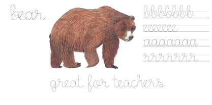 Homework Dashed font was specially conceived/designed for teaching cursive writing. This resource allows tutors and parents to create worksheets for individual or class teaching. Associated with the Homework font, students can learn and exercise their handwriting abilities. All capital letters, excluding I, F, T and P, link to any following small letter: the sequence of the previous letter stroke always follows the angle of the initial stroke of the subsequent letter. This, in the real world, means that words built with the font can be handwritten without having to lift the pen from the paper (except to cross t and f and dot i and j) or interrupt the writing flow. All the letters are base aligned and all small letters have the same ‘x’ height. Homework Dashed font is a tool with which teachers and tutors can create repetitive alphabetical writing exercises that can be printed on lined sheets.
 - Diverda Serif by Linotype,
$29.99Diverda Serif is a contemporary typeface that is free from ornament. Created by Swiss designer Daniel Lanz, Diverda Serif is optimized for maximum legibility. In contrast to many other modern typefaces, which try to squeeze the traditional rounder forms of the alphabet into square designs, and which often attempt to equalize the widths of the capital letters, Diverda Serif remains true to the proper proportions of the Roman alphabet. The x-heights of Diverda Serif's characters are low, and the differences between curved, square, and triangular elements are very clear. Like the more calligraphic typefaces of the past, Diverda Serif's strokes exhibit contrast that is inspired by movements of the pen on paper; down strokes are heavier than up strokes. Possible applications for the Diverda Serif include magazine design, as well as advertising for fashion, design, or architectural products. Diverda Serif is also a good fit for Corporate Identity solutions. - FranklinGothicHandLight by Wiescher Design,
$39.50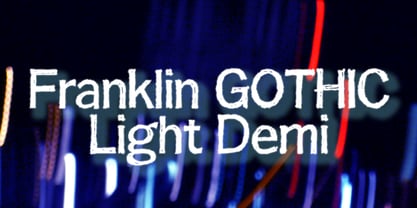 FranklinGothicHandLight is part of a series of hand-drawn fonts from way back in time – before computers changed the way we worked. When I was in advertising – before computers – a very time consuming part of my daily work was sketching headlines. I used to be able to sketch headlines in Franklin Gothic, Times, Futura, Helvetica and several scripts. We had a kind of huge inverted camera – which we called Lucy. We projected the alphabet onto a sheet of transparent paper, outlined the letters with a fineliner and then filled them in. It was very tedious work, but the resulting headline had its own charm and we had a permanent race going on who was best and fastest. I won most of the time! They used to call me the fastest "Magic Marker" this side of the Atlantic. Great days, just like today! Your sentimental type designer from the past Gert Wiescher
 - Fulgora by Sudtipos,
$39.00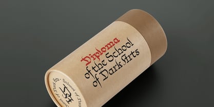 Fulgora is a sort of ‘calligraphic typography’ or ‘typographic calligraphy’, depending on the point of view. Inspired by late-medieval Bâtarde and Civilité blackletter styles, the Kannada and Sinhala writing systems from Southern India, Celtic uncials, and diverse vernacular Mexican scripts, Fulgora was created straight from pen on paper as a personal calligraphic style where fantasy in the chief ingredient. The idea to take it to the digital realm came later, as an extension of the creative process. To this end, originals for each character were made, directly traced with the nib with no retouching, then vectorized to be digitally assembled. Work has been done on spacing and kerning with the aim to digitally reproduce an utterly calligraphic outcome keeping the natural, imperfect, manual finish of all signs. Fulgora has two variants: Blanca (white) and Negra (black), executed with different nib widths but the same style and proportions.
 - FranklinGothicHandDemi by Wiescher Design,
$39.50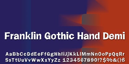 FranklinGothicHandDemi is part of a series of hand-drawn fonts from way back in time – before computers changed the way we worked. When I was in advertising – before computers – a very time consuming part of my daily work was sketching headlines. I used to be able to sketch headlines in Franklin Gothic, Times, Futura, Helvetica and several scripts. We had a kind of huge inverted camera – which we called Lucy. We projected the alphabet onto a sheet of transparent paper, outlined the letters with a fineliner and then filled them in. It was very tedious work, but the resulting headline had its own charm and we had a permanent race going on who was best and fastest. I won most of the time! They used to call me the fastest "Magic Marker" this side of the Atlantic. Great days, just like today! Your sentimental type designer from the past Gert Wiescher
 - Scandinavian Cyrillic by Ira Dvilyuk,
$17.00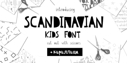 The Scandinavian Cyrillic kids font is stylish and laconic as famous Scandinavian monochrome design. Each letter of the font was carefully cut out of paper with scissors by little childish hands. And now it's turned into a font :) The Scandinavian Cyrillic kids font includes main uppercase, alternative uppercase, and double letters for uppercase and lowercase. It will be perfect for use in all your fun design projects: logos, labels, packaging design, blog headlines. Also, it will look great on mugs, cards, kid's books headlines, or other typographic projects. Multilingual Support for 32 languages: Latin glyphs for Afrikaans, Albanian, Basque, Bosnian, Catalan, Danish, Dutch, English, Estonian, Faroese, Filipino, Finnish, French, Galician, Indonesian, Irish, Italian, Malay, Norwegian Bokmål, Portuguese, Slovenian, Spanish, Swahili, Swedish, Turkish, Welsh, Zulu. And Cyrillic glyphs support for Russian, Belorussian, Bulgarian, Ukrainian and Kazakh languages. Works perfectly on the Canva platform. For Cricut & Silhouette recommended.
 - Super School by Putracetol,
$16.00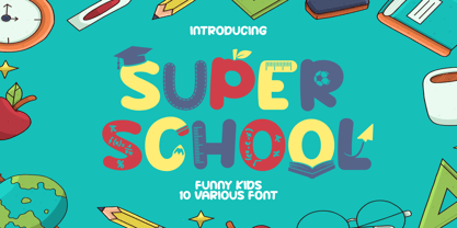 Super School - Funny Kids 10 Various Font is a delightful and quirky display font with a school and kids' theme. This font embodies a playful and fun spirit with its rounded and bold letterforms, making it perfect for designs aimed at children and school-related projects. It features 10 alternative font versions, each inspired by various school-related motifs, including dots, stitches, rulers, math symbols, balls, books, graduation caps, paper planes, apples, and pencils. Crafted with a specific focus on the school theme, Super School is the go-to choice for designs revolving around education, kids, and toddlers. Whether you're creating educational materials, posters for school events, or any project targeting young audiences, this font adds a whimsical and child-friendly touch to your work. With its crafty and playful style, Super School helps you infuse a sense of joy and learning into your creative endeavors, making them engaging and delightful.
 - Crushine Brush by Siwox Studios,
$49.00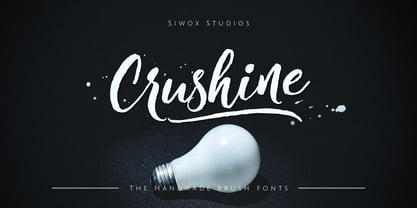 Crushine is a casually and quickly written brush script Fonts. Letters are made with brush pen on a paper. Then scanned and carefully drawn into vector format. There is just a handmade typeface so it looks good in small and big sizes. These elements gives Crushine its organic, authentic and laid-back characteristics. Crushine is not textured brush font. It's contemporary approach to design, handmade natural with an less regular baseline. Suitable for use in title design. Such as apparel, invitations, books tittle, stationery design, quotes, branding, logos, greeting card, t-shirt, packaging design, poster and more. Crushine includes a complete set of uppercase and lowercase letters, as well as multi-language support, numbers, punctuation, ligatures. Crushine has 2 versions. Crushine Brush Script & Crushine Brush Alternative. It has small differences in each character to add natural nuances on fonts. This is not a family typeface. Thank you!
 - Athena Rustic by Tigade Std,
$25.00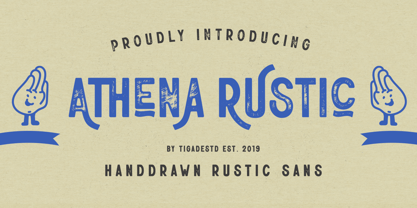 Athena is a handdrawn rustic sans serif font yet still looks elegant. It offers a professional look in one way and you serve in a retro look in another occasion. It is beautifully handdrawn on a paper to give the natural feeling to the shape for each characters. The texturized rustic effect give a retro and vintage style to your design. Athena Rustic features upper cases only at the moment but will have the lowercase update in the roadmap. It also standard International Characters. Of course it comes with bunch of alternates, numeral as well as the punctuations. The font family includes 2 styles: Athena Rustic Regular Athena Rustic Italic Athena Regular Athena Italic That's a wrap! I do really hope you like this font, and please don't hesitate to contact me if you have any questions. Also, drop by to our instagram! www.instagram.com/tigadestd Tigadestd | Doli Harahap
 - Cal Uncial Rough by Posterizer KG,
$19.00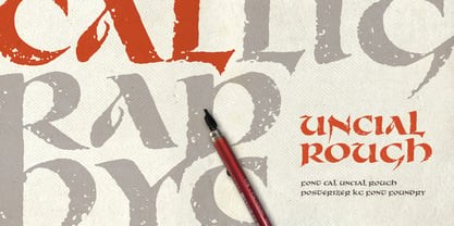 Cal Uncial Rough is a calligraphic font based on sketches written with cane calligraphy pen and ink on coarse-textured paper. Because of the fact that the Uncial don't have lowercase letters, there are small capitals instead of the lowercase. As the Latin version of the Uncial was created from the Greek Uncial script (translating the Bible from Greek into Latin), in addition to the standard Latin graphemes, the font contains the Greek alphabet (and also the Cyrillic letters (Ustav), derived from the Greek Uncial too). Regardless of the stylistic connection, there is a difference between the morphology of related Greek, Latin and Cyrillic letters. Most of the graphemes are based on traditional roman and insular uncial calligraphy. Cal Uncial Rough is suitable for the preparation of calligraphic sketches as well as an application in typography that should bring us closer to historical topics (European literature, quotes, history, film ...).
 - Designer Notes Pro by FontFuel,
$12.00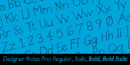 Designer Notes Pro solves a design problem. When you are looking for that ‘handwritten’ look? Now you can typeset your handwritten notes using Designer Notes Pro. This font matches the look of a handwritten note, a diary entry, post-it note or sketchbook comment. The letter shapes are based on handwriting created using a Pilot Precise V5RTpen. There’s something special about how it puts ink on paper. This font falls in the script/handwriting font style. Designer Notes Pro Includes 4 versions: regular, italic, bold and bold italic. 4 font family includes Designer Notes Pro regular, italic, bold and bold italic -Mac & Win TrueType (.ttf) -Classification - script/handwriting -Each member of the this font family is a full Latin set of 228 characters/glyphs -Letters A-Z and a-z -Numerals 0-9 -Complete punctuation -Latin language glyphs -Mathematical symbols -Careful spacing and kerning
 - Ondine by Linotype,
$29.99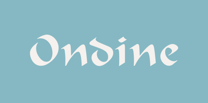 Ondine is one of the early typefaces of Adrian Frutiger. It looks as though it were written with a broad tipped pen, however, Frutiger actually cut the forms out of a piece of paper with scissors. The forms of Ondine are reminiscent of the humanist period, the high point of the Italian Renaissance text typefaces of the 15th century. This movement was centered in Florence, the base of the Humanist movement overall, and the home of a famous type school of the time. The main goal of the educated writers was to faithfully recreate the writing of the admired literary works, whose aesthetic was as important as their content. Ondine displays a regular and open character. Texts set in this typeface give the impression of being hundreds of years old. Ondine should be used in point sizes of 12 and larger and is best for short texts and headlines.
 - The Roletta by Almarkha Type,
$29.00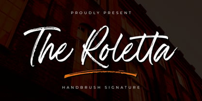 Introducing The Rolleta – Handbrush Signature is a brush script that is written casually and quickly. Letters are made with brushes on paper. Then scanned and carefully drawn into vector format. That is why The Rolleta has charming, authentic and relaxed characteristic,has 4 styles of regular, slant, Alternate , and Alternate Slant variations with a more natural look to your text with a more natural look to your text. The Rolleta is perfect for homeware designs, branding projects, Logo, design, Quotes, Product packaging, Photography, Watermark What’s Included : + Standard glyphs + Ligatures + Web Font + Works on PC & Mac + Simple installations Accessible in the Adobe Illustrator, Adobe Photoshop, Adobe InDesign, even work on Microsoft Word. PUA Encoded Characters – Fully accessible without additional design software. Fonts include multilingual support Image used : All photographs/pictures/vector used in the preview are not included, they are intended for illustration purpose only. Cheers! Thank You
 - Eksperiment by PizzaDude.dk,
$18.00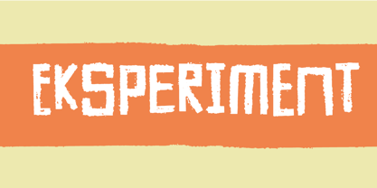 Eksperiment is danish for experiment. Without much guessing or knowledge to danish, you probably already knew that! I like those danish words containing a "k" - is it because my name is spelled with a "k"? I don't know - maybe it's because it kind of represents the danish language, which is full of words with "k"s. Anyway, the reason for the name is that I wanted a font looking like it had gone through tough times, a bad copy machine and perhaps even crumpled paper...but the experiment is that the font is 100% made using digital media. I used my MacBook and my iPad creating this font. I find it quite amusing, that something 100% digital looks like something organic. I've added 5 different versions of each letter, which is really helpful when working with grunge fonts. It looks more natural, when the same letter rarely repeats itself.
 - Bigticy by Présence Typo,
$36.00Bigticy is a typeface with a "new-retro" feeling. Its square outline is tempered by rounded angles. This makes it suitable for a large range of applications in the domains of magazine headlines and posters. The Narrow version has been drawn from a title found in an example (dated from the 50's) of the French newspaper "Le Dauphiné Libéré". For the Maxi style, I have tried to reduce to their minimum the inner white spaces. I had in mind those amazing stone walls that one can see in the antique Inca cities in Peru. The stones are so tightly joined that it is impossible to slip a sheet of paper between them. The Plain version is an interpolation of the two other ones. It is a very useful style since I keeps the main quality of each parent: the weight of the Maxi and the narrowness of the Narrow. - Sumergible Script by Andinistas,
$39.95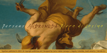 Sumergible Script is a striking font that simulates it has been written with a dry pointed brush on textured paper. Its purpose is to decorate and accompany photos, illustrations and textures by letters designed with a generous horizontal spacing between lowercase which reinforces the idea of hurriedly and interrupted cursive calligraphy. In that sense it is spontaneous and useful to form vibrant words and sentences, shining short messages on book covers, posters and other graphic design media. Sumergible Script has new alternative letter forms that are activated with OpenType features creating hierarchy changes in writing. With Swash for example, you can change the character case with metric and similar proportions. With Titling it becomes even more expressive capitalization. Other OpenType features are: Fractions and Superscript. In short, Sumergible Script is designed to mix and match words and short phrases with a vital and expressive handwritten feel.
 - Eydis by Eurotypo,
$63.00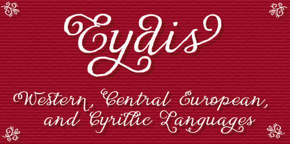 Eydis Regular is a casual script font that retains the original texture of the stroke on the paper. This font has good legibility as body type and strong expressiveness to be used as headlines or logotypes in all media requirements. These calligraphy fonts have already an extended character set to support Central and Eastern, Cyrillic as well as Western European languages. It has several especial alternatives for all letters that offer an infinity of design’s combinations. There are plenty of options to allow you to create something unique and special: standard and discretionary ligatures, several swashes and stylistics alternates for each letter, catchwords and much more. You may enrich your design using the Eydis Ornament set, with his 91 glyphs, tails and ornaments, whatever allows even more combinations. Eydis was made for turn your project more expressive, beautiful, and attractive! Have fun and be successful with it!
 - Leaf by Journey's End,
$12.00This "Leaf" font has been swirling in my head for years - I remember my sister and I making letter formations like these when I was young. It was exciting to see the lettering look even better on paper than it did in my mind! "Leaf" surprised me by having two distinct looks: in size 24 or smaller, the look is delicate, because your eye doesn't see any space in the letters. In size 28 or larger, the eye can discern spaces, which gives a different facet to its personality. As much as I like this font when viewed on a monitor screen, it really shines when printed. The "Leaf" font is a perfect blend of quaint hand-written style mixed with crisp letter formations. This font has a very "happy" quality to it. May using it bring a little more happiness to your day! - Banco by Linotype,
$40.99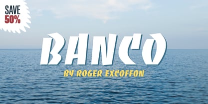 Designed for Linotype Library GMBH and the International Typeface Corporation in 1997 by Phil Grimshaw. Based on bold script Banco designed by French graphic and poster designer Roger Excoffon and released in 1952 by the Fonderie Olive. Originally Banco was an all-caps bold typeface, and the lower case and the corresponding light weight were created for ITC. The tapering slightly slanted strokes of Banco made by sharp-edged flat brush. The face has the effect of being quickly sketched by a powerful hand. For use in advertising and display typography. Cyrillic version developed for ParaType in 2000 by Tagir Safayev.
 - Breasto Display by Tebaltipis Studio,
$15.00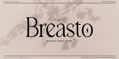 Breasto - Display Serif is a stylish font It has both modern and retro look. Comes with alternatives and ligatures, helps to create stunning logos, quotes, posts, blog posts. branding projects, magazine imagery, wedding invitations, and much more. WHAT'S YOU GET ? Permola TTF, OTF Unique Letterforms Works on PC & Mac Simple Installations Accessible in the Adobe Illustrator, Adobe Photoshop, Microsoft Word Fully accessible without additional design software. I really hope you'll get pleasure using Pagers font and it will be perfect addition to your font collection! Contact me with an inbox message If you have any question. Thank you! Happy Creating.
 - Nettle Sans by Duck Soup Design,
$11.00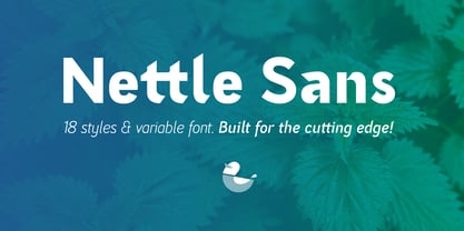 Influenced by Blackletter type and highway fonts, the Nettle Sans font family sets out to be both a quirky and confident headline font (at the heavier weights), and an easily legible body font for print or screen (at the lighter weights). Careful attention was taken in choosing distinct shapes for each letter to maximise legibility, and to balance a daring experimental form with function. Through its brutal angled cuts out of the ends of tapered links, ink-traps, ascenders and descenders, Nettle Sans' defining motif offers a visual language that communicates speed, efficiency, advancement and the "cutting edge".
 - Kuenstler 165 by ParaType,
$30.00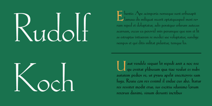 Bitstream typeface based on Koch Antiqua by Rudolph Koch (Klingspor, 1922). Koch Antiqua, also known as Locarno and Eve, is the most popular face of one of the great lettering artists of the 20th century. This delicate display face has a small x-height, very tall ascenders, and main strokes that taper gracefully downward. Koch-Antiqua appeared extensively in advertising between the wars. A refined letterform, it is best used sparingly for a distinctive look in advertising, book, and job work. Two weights of Cyrillic version including alternative lc characters were developed by Isabella Chaeva and released in 2008 by ParaType.
 - Permola Display by Tebaltipis Studio,
$15.00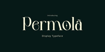 Permola - Modern Serif Font is a stylish font It has both modern and retro look. Comes with alternatives and ligatures, helps to create stunning logos, quotes, posts, blog posts. branding projects, magazine imagery, wedding invitations, and much more. WHAT'S YOU GET ? Unique Letterforms Works on PC & Mac Simple Installations Accessible in the Adobe Illustrator, Adobe Photoshop, Microsoft Word Fully accessible without additional design software. I really hope you'll get pleasure using Pagers font and it will be perfect addition to your font collection! Contact me with an inbox message If you have any question. Thank you! Happy Creating.
 - Hoban by District,
$40.00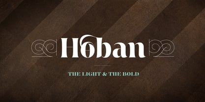 The light and the bold. The thick and the thin. Laverne and the Shirley. Peanut Butter and the Jelly. Hoban is about contrast. Hoban wants to be noticed, but only after a second glance. A friend of a friend to the didones, it has smaller, tapering serifs, slightly calligraphic traits, and spindly little terminals that go where they please. It’s a headline face. Period. Set it big and bold. Or light and airy. But preferably next to something with flair. Cuff links, canapés, or corvettes–it’s up to you. Distinct ligatures, ornaments, and swashy alternates provide plenty of character to tailor your style.
 - Ingleby Regular is part of the Ingleby typeface family, designed by David Engelby, a typeface designer who brings a detail-oriented and thoughtful approach to his creations. This particular font, Ing...
- Blackguard by Scratch Design,
$9.00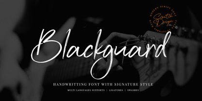 Introducing.. Blackguard modern handwriting with signature style. This is a beautiful handwriting font so natural and casual charm with the brush textured make this font look authentic but still readable and incredibly versatile. Blackguard will look outstanding in any occasion design concept, whether it’s being used on colorful backgrounds or as a stand as a headline in the minimalist background! Blackguard has multi-language support, swashes, and ligature dan you can apply in OpenType mode at adobe photoshop or adobe illustrator. Please enjoy the Blackguard font and makes some stunning designs.
 - Modern Elvish by Typelove Fontworks,
$9.00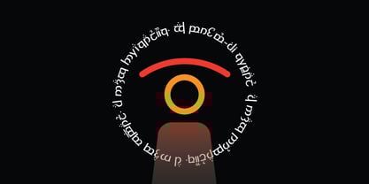 Modern Elvish is a humanist sans serif typeface created for the Tengwar “English” mode as popularized in the Lord of the Rings books and films. I imagined the famous elves of this lore living in contemporary times and needing a no nonsense modern typeface for their branding, communications and UX design. Use this typeface for your RPG, LARPing or Cosplay needs. This typeface uses advanced font features such as ligatures and contextual alternates to convert any English text. I would recommend typing in English first, then converting to a font of this typeface.
 - Mondice by Flawlessandco,
$9.00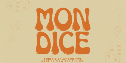 Mondice is a Groovy Retro Font that made with an additional shiny mode in each character, so it's fitted for some retro project. There's some connected letters and some alternates that suitable for any graphic designs such as branding materials, t-shirt, print, business cards, logo, poster, t-shirt, photography, quotes .etc This font support for some multilingual. Also contains uppercase A-Z and lowercase a-z, alternate character, numbers 0-9, and some punctuation. If you need help, just write me! Thanks so much for checking out my shop!
 - Crusthy by Scratch Design,
$10.00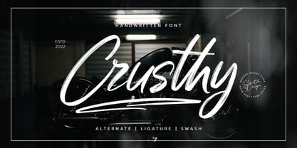 Introducing, Crusthy modern handwriting with signature style and brush texture. This font comes with textured handwriting font so natural and this font looks authentic but still readable and incredibly versatile. This font will look outstanding in any occasion design concept, whether it’s being used on colorful backgrounds or as a stand as a headline in a minimalist background! Crushty has multi-language support, swashes, alternate and ligature dan you can apply it in OpenType mode in adobe photoshop or adobe illustrator. Please enjoy the Crushty Font which makes some stunning designs.
 - Sunshine Formula by PizzaDude.dk,
$17.00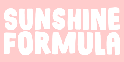 Imagine having a formula for sunshine. I mean, in a way to make the sun shine when you want it, or really need it. That could be for a day at the beach, or for the plants in your garden - or even better: make someone happy with a little bit of sunshine! I made this font on the first day of summer in Denmark 2020 - the rounded corners and the soft and easy look of Sunshine Formula, really got me into the "this-is-going-to-be-a-great-summer" mode! :)
 - Revoxa by Almarkha Type,
$29.00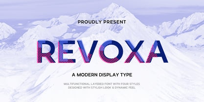 Revoxa – Modern Sans, Display Sans made specifically developed for contemporary design styles, made with three styles; Regular- Cut – line. These styles have been carefully designed to coat each other, creating an alternative third style. This feature allows you to adjust opacity and blending modes and different color settings, giving various possible results. very good for combining your design work with a clear line and a circle with several different weights that are very comfortable in the design area you are easy to read and as a title on a blog or magazine page
 - Renaf by Flawlessandco,
$9.00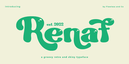 Renaf is a Groovy Retro Font that made with an additional shiny mode in each character, so it's fitted for some retro project. There's some connected letters and some alternates that suitable for any graphic designs such as branding materials, t-shirt, print, business cards, logo, poster, t-shirt, photography, quotes .etc This font support for some multilingual. Also contains uppercase A-Z and lowercase a-z, alternate character, numbers 0-9, and some punctuation. If you need help, just write me! Thanks so much for checking out my shop!