2,480 search results
(0.022 seconds)
- Bookman Old Style Paneuropean by Monotype,
$92.99The origins of Bookman Old Style lie in the typeface called Oldstyle Antique, designed by A C Phemister circa 1858 for the Miller and Richard foundry in Edinburgh, Scotland. Many American foundries made versions of this type which eventually became known as Bookman. Monotype Bookman Old Style roman is based on earlier Lanston Monotype and ATF models. The italic has been re drawn following the style of the Oldstyle Antique italics of Miller and Richard. Although called Old Style, the near vertical stress of the face puts it into the transitional category. The Bookman Old Style font family is a legible and robust text face. - Rama Slab by Dharma Type,
$19.99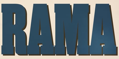 Rama Slab is an antique slab serif designed inspired by 1800s-style wood type. All glyphs have been designed carefully to be retro-looking to fill the viewer with nostalgia. This condensed font family with 18 styles is a great solution for posters, titles and anywhere you need impact. To complete your work perfectly, Gothic Extras family is ready for free. They include borders, ornaments and frames designed using vintage catalog of Hamilton in 1800s as a model. Incidentally, -r- has its alternative glyph that can be used with OpenType salt feature. Be sure to check out the sans serif style of this Rama series named Rama Gothic.
 - Rydhesti by Twinletter,
$14.00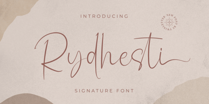 Rydhesti is an enchanting and charming signature font, the beautiful and smooth curves of each letter make this font seem luxurious, clean and beautiful. not only that, this font is equipped with a flexible choice of letters to produce the right words according to your needs. Use it to add an authentic, heartfelt vibe to any design project. This font is perfect for business cards, photography studios, autographs, interior designs, model names, coffee late, travel, weddings, cosmetics, jewelry, social media posts, product packaging, watermarks, special events, or anything else. Start using this font to add an authentic and heartfelt vibe to any design project.
 - Bossthy by Twinletter,
$14.00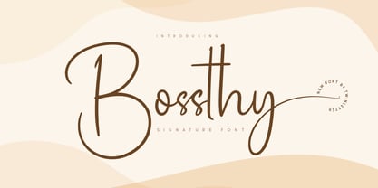 Bossthy is a signature font with a simple modern theme and has a unique curve in each letter, which is written in natural hand strokes making this font more natural, This font in addition to having a dazzling and elegant shape is also equipped with various alternative options that make it easier for you to create beautiful and extraordinary designs This font is perfect for business cards, photography studios, autographs, interior designs, model names, coffee late, travel, weddings, cosmetics, jewelry, social media posts, product packaging, watermarks, special events, or anything else. Start using this font to add an authentic and heartfelt vibe to any design project.
 - Rombusa by Suza Studio,
$14.00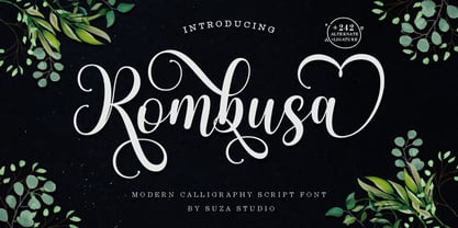 I am proud to introduce the new Rombusa Font! This is a unique and fun calligraphy model with feminine and elegant letters, specially made for business cards, wedding events, posters, books, magazines, fashion, etc. Feature; • Full set of uppercase, lowercase letters • 428+ glyphs and 237 alternate characters • Characters with accents • Multiple Languages Supports • PUA encoded This kind of Rombusa has become a work of true love, making it heartwarming and delightful. I can't wait to see what you do with Rombusa! Feel free to use the #Suza Studio tag and the #Rombusa font to show what you've been up to, I really hope you enjoy it! Thank You!
 - Campuni by Identity Letters,
$29.00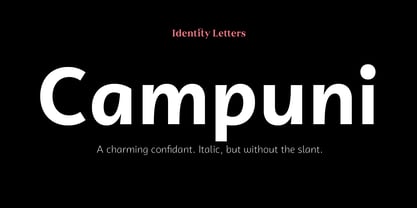 A charming confidant. Italic, but without the slant. Campuni is a sans-serif typeface that can be described as an “upright italic”: its letters are modeled on the handwritten forms of italics—but without the slant. This gives Campuni a contemporary, charming, and trustworthy character. As with most modern sans-serif typefaces, Campuni’s design is based on low-contrast, almost monolinear strokes with a neat and clear appearance. This is where Campuni’s steep and tapered joints come in: with a bit of contrast, they provide the perfect foundation for a steady rhythm between characters—just like you’d find in meticulous handwriting. Careful spacing ensures that this rhythmic character is preserved on the page and on screen, making for a pleasant reading experience. It’s not just the letterforms that gain from Campuni’s calligraphic heritage, though. This typeface is packed with calligraphy-style swash capitals and end swashes on lowercase letters, as well as discretionary ligatures. These are available via OpenType, allowing you to spice up your logo or headline with a hint of calligraphy in a breeze. Despite its flawless legibility in body text, Campuni is definitely eye-catching in display sizes. (Decrease letterspacing for some additional punch.) Besides logo design, Campuni is a great choice for branding, advertising, packaging, corporate design, or even signage and wayfinding. The range of topics that Campuni excels in varies from food, leisure, retail, e-commerce, music, and travel to games, toys, childcare, and family-themed events. Campuni has got an Extended Latin character set, seven sets of figures, case-sensitive forms, arrows, and a few other advanced typographic features—622 glyphs in total. Its eight weights span from Thin to Black.
 - Bartholeme by Galapagos,
$39.00The four weight semi-condensed Bartholemé family came into existence as a family expansion based on the designer's earlier concept, Bartholemé Open. This hybrid family was inspired by and loosely based on a number of contemporary mid-twentieth century type concepts having Old Face or Modern influence. Those inspirational type designs were primarily designed for various proprietary photolettering technologies of the time. The award-winning* Bartholemé Open and its companion design Bartholemé small capital open were inspired by various Shaded, Inline and Handtooled type models from the nineteenth and twentieth centuries. Most of those inspirational type designs were designed as titling fonts with all capital sets only. To set it apart from the earlier models, Bartholemé Open is semi-condensed intentionally designed with a lowercase. Design qualities include a large x- height, tightly curved ample counters, crisp serifs and tight bracketing. The overall plan of the family was originally intended for display usage in titling and short passages of text. At higher output resolutions all fonts read well at smaller point sizes. The Bartholemé family works well on its own, but also is compatible with type styles possessing qualities that complement or enhance its own. The Bartholemé family consists of a Regular weight complementing a Bold weight, along with Medium complementing an Extra Bold weight. The companion true-drawn italics are based on the Bartholemé roman design. * Award for Design Excellence bukva: raz! Type Design Competition of the Association Typographique Internationale, 2001 - Gosent by NamelaType,
$19.00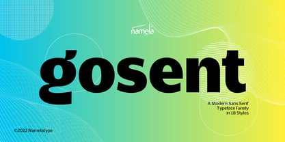 Gosent is a Modern Sans serif typeface that has larger x-height size, it will give great performance in small text sizes. Features moderate contrast and lots of special details like the unusual ink trap, giving a modern feel. Gosent is great your various design, both serious and fun projects. Consists of 9 Weight variants from Thin to Black and comes with Oblique version
 - Brasilica by CAST,
$45.00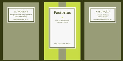 Brasílica is a robust design, with wide proportions, that assimilates influences both from old style and modern types. This wide shapes, as well as the moderate contrast and sturdy serifs make it suitable to different conditions of printing. The sharp corners, as well as the abrupt connections and terminals are remarkable features of this typeface, that renders a sturdy and crisp texture, with a distinct aspect.
 - Segno Brush by FSdesign-Salmina,
$39.00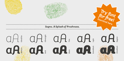 Segno. A Splash of Freshness. Cool, young and fresh, Segno surprises with his informal character and convinces for its careful execution. Its rounded forms and serifs evoke discretely the flow of a brush. Due to its moderate inclination Segno is easily readable and suits to more typographic purposes than you probably would expect from an informal typeface. Add a splash of freshness to your artwork, with Segno.
 - Stannum by Eko Bimantara,
$21.00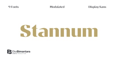 Stannum is a modulated display sans font family. It enriched by letterforms that shown a simple, classic and elegant impression. Its a compact font family that consist of 9 style of weight, from thin to black. It consists of 380s of glyphs which support broad latin languages. This font is fit for display, large usage, brand, titles, short text, web headlines and ample of other possibilities.
 - Delko by Minor Praxis,
$20.00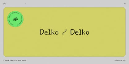 Inspired by a scrolling banner led lamp display and monospace fonts like OCR-A/B. A modular typeface that come from an arranged octagonal shape module, with 45 degrees sides slope which can gives it a casual digital-look font. Designed for headlines, posters, and medium size body copy. Delko come with 2 styles, regular and lined. Languages support, ligatures, stylistic alternates, and symbols are available.
 - Quebra by Vanarchiv,
$55.00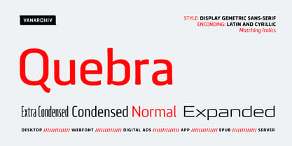 Quebra is an extend display sans-serif font family with four widths (Extra Condensed, Condensed, Normal and Expanded) and ten weights, italics versions are available. The main strokes contain small breaks simulating modulated variations on the letterforms, these details are more present on large body sizes. All font versions contain Latin and Cyrillic encoding characters and also ligatures, case-sensitive forms, fractions, oldstyle and finally tabular figures.
 - HU Malrang KR by Heummdesign,
$50.00 'HU Malrang KR' is a font that gives a round and soft feel to its tightly packed modules. This font has a variable function, allowing users to fine-tune the thickness they want. (Available only in Adobe programs.) Six basic weights are provided so that they can be used even in programs that do not apply the variable function. This fonts contain Hangul, Korean.
 - Acaraje by Latinotype,
$39.00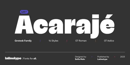 Acarajé is a grotesque font that stands out thanks to its versatility. Its personality blossoms through its particular modulation, which grows with weights; making it a rather jovial typeface that does not abandon the characteristics of more classic grotesques. With two styles available: normal and italic, and a variety of 7 weights that range from "Black" to "Regular", this font offers incredible flexibility for your designs.
 - Cambalache by JVB Fonts,
$35.00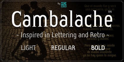 The idea for Cambalache was conceived back in 2008 and was to create a geometrical font based on tangential modules into structure. The serif would be arranged, looking to approach to the lettering shapes. The creative concept has a feel from the mid-30s of last century, reaching a taste of retro and vintage style. Includes oldstyle numbers, slashed zero, standard and discretional ligatures.
 - Serifa by Bitstream,
$29.99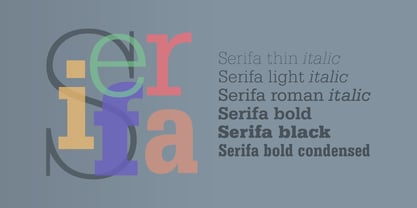 Developed by Adrian Frutiger for Bauer in 1966, Serifa is a slabserif based on the principles that led to the success of Frutiger’s 1956 sanserif, Univers. Glypha, designed by Frutiger for Stempel in 1979, is a version of Serifa with a moderately larger x-height; Stempel has paid royalties on Glypha to Neufville since 1984. Serifa® font field guide including best practices, font pairings and alternatives.
 - Rassetta NF by Nick's Fonts,
$10.00The pattern for this graceful, subtly modulated Art Deco typeface was designed by Willard T. Sniffin for American Type Founders in the 1930s. True to the original design, the Swash Caps version features Sniffin's twelve decorative variants. The Postscript and Truetype versions contain a complete Latin language character set (Unicode 1252); in addition, the Opentype version supports Unicode 1250 (Central European) languages as well. - Tristero by Illuminaut Designs,
$10.00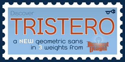 “Behind the hieroglyphic streets there would either be a transcendent meaning, or only the earth.... Another mode of meaning behind the obvious, or none.” Tristero is an expansive geometric sans with letter forms that are both classic and quirky. There are over 550 characters in 3 weights. A versatile typeface with a friendly character.
 - WL Dot Matrix by Writ Large,
$5.00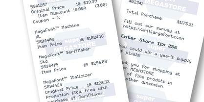 WL Dot Matrix is another typographic flashback to computing of the mid 1980s, when 9-pin dot-matrix printers were the state of the art. Compatible with the cleaner WL Rasteroids family, WL Dot Matrix explores some of the common failure modes of old printers: smudging ribbons, slipped tractor feeds, and gummed up print heads.
 - Mozer by Fontfabric,
$29.00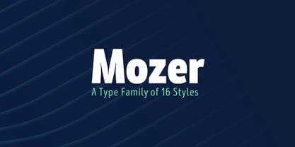 Mozer is a semi-condensed neo-grotesque type family of 16 styles ranging from Thin to Black matched with true italics. With a generous x-height, economical width, moderate contrast and overall solid appearance this typeface shows an uncompromising legibility merged with a contemporary spirit that has not lost its individuality, even in the small details like the discreet ink traps. Mozer covers Extended Latin, Cyrillic and Greek and is suited with plenty of OpenType features, such as localisations, ligatures; four type of numerals including figures and tabular; case-sensitive forms; alternatives etc. Mozer comes accessible and closer to all designer’s needs. Features: • Over 790 glyphs in 16 styles (Thin to Black); • Extended Latin, Cyrillic and Greek scripts for more than 130 languages; • Tall and balanced x-height; • Semi-condensed width proportions; • Moderate contrast and vertical stress; • Neo-grotesque characteristics and terminals with humanistic flavor. Designers: Ani Petrova, Mirela Belova, Nikolay Petroussenko
 - Gilman by Miller Type Foundry,
$29.00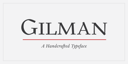 The idea for Gilman started simple enough, a serif typeface that works well for large amounts of text. However, after many struggles creating a quality typeface digitally, I decided to first draw the complete alphabet by hand on paper, and then trace that digitally. The result is a unique workhorse typeface with a subtle “human touch” that is very rare in this modern technological age. Gilman has extensive language support and comes with many opentype features like true small caps, tabular lining figures, stylistic alternates, ligatures and more. Gilman Sans (derived from the serif) is an excellent compliment and works together harmoniously with Gilman on the page.
 - Orbi Sans by ParaType,
$30.00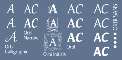 Orbi Sans was designed as an extension of the font system Orbi released on the end of 2010. It’s a low contrast humanist sans serif of open design with the elements of dynamic nature that inherited from Orbi its elegance and clearness. The faces were coordinated with Orbi on metrics, proportions, weights, and design features. Orbi Sans consists of 4 roman weights with corresponding true italics. It can be used together with Orbi and separately. Due to wide variety of styles the family is very good for books, periodicals, and business papers. The fonts were designed by Natalia Vasilyeva. Released by ParaType in 2011.
 - Dro by KC Fonts,
$25.00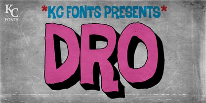 The Dro family is an all uppercase handmade font that resembles cut-out construction paper; Both fonts have 6 glyphs for each letter & 2 per number which are accessed by uppercase, lowercase, small caps & Contextual Alternates. Each font has 550+ glyphs total. When using Opentype applications Dro and Dro Fill take the handmade look further by cycling through Contextual Alternates, Small Caps & Double Letter Ligatures for a unique and authentic look to your creative. When not using the Contextual Alternates feature, you can still alternate between uppercase and lowercase letters and using Stylistic Sets to switch up the flow. The Dro family has an extended character set for multilingual support.
 - Obvia by Typefolio,
$29.00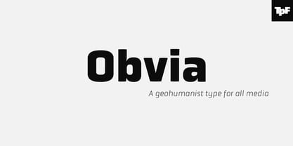 Obvia, a geohumanist type for all media. Obvia appeared as a result of direct observation on typefaces classified as geometric and the plan to explore for the first time width axes - to be published soon - expanding its usability. The idea behind Obvia’s design was to create a distancing from geometrically pure shapes, in this case, square shapes. Then some details were added, such as subtle inktraps, concave endings of the stems and carefully drawn alternate characters, giving a ‘geohumanist’ tone to the font. This first family of Obvia has 9 weights ranging from Thin to Black with their respective italics, delivering a strong typographic identity, from the paper to the pixel.
 - Stencil Package JNL by Jeff Levine,
$29.00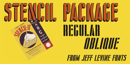 Stencil Package JNL has its design roots in the brand name hand-lettered on the paper sleeves for the short-lived Stencil-It line of lettering guides produced in 1955 as a direct competitor to Stenso Lettering Guides. Formed by Bernie Aronson [a relative of the Libauers who owned the Stenso Lettering Company and who once worked for them] along with a financial partner (noted artist) Sidney Levyne, the company was soon put out of existence by a court action. It re-emerged in 1956 as the E-Z Letter Stencil Company and existed until the 1990s. Stencil Package JNL is available in both regular and oblique versions.
 - Yagi by Ably Creative,
$25.00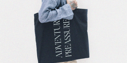 Yagi is a serif typeface that contrasts with old-fashioned proportions creating a more defined texture than your usual sans-serif, and Yagi is elegant enough for fashion, art, and luxury; yet sincere enough for serious business. And at 2 styles, ready for complex typographic demands. When we started this project, we wanted to try drawing modern serifs with accurately verified shapes and detailed elaboration of each character, making your text look great both on paper and on screen. Yagi creates unique and organic characters, with different sets of styles, you can change the feel of your designs from more organic to more standard. Let your designs fly!
 - Rumpled by Ingrimayne Type,
$9.00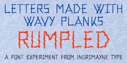 TapedUp, Tinkerer, and Rumpled are based on the template I used for several letterbat fonts—fonts made of wrenches and bolts, hammers, or paper clips. TapedUp can be thought of as a font made from masking tape, and Rumpled is the same design but the tape pieces are wavy. Tinkerer is the same design but with elements that resemble what might happen if one constructed letters from Tinker Toys. All are caps only, but some of the shapes on the lower-case keys differ from the corresponding shapes on the upper-case keys. The Rumpled family has four members, the regular, an oblique, a shadowed, and an oblique shadowed.
 - ITC Tempus Sans by ITC,
$29.99ITC Tempus is the work of British designer Phill Grimshaw. He claims that every calligrapher's aspiration is to draw perfect roman capitals with a pen, but admits that this is extremely difficult. For this typeface, Grimshaw used a fountain pen on cheap, porous paper and, of course, the ink bled. The resulting forms are classic but their rugged edges deviate from the perfection of roman type. And Tempus Sans is just Tempus with the serif surgically removed, yet the proportions of the characters work nicely," says Grimshaw. Because of its rough quality, the typeface works best in larger point sizes, yet maintains its characters even in smaller sizes." - Koya Sans by JAM Type Design,
$15.00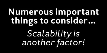 Koya Sans is a contemporary, humanist sans with a friendly yet clear and distinct personality. It is designed for excellent legibility, particularly for long continuous reading. The sharp terminals add liveliness and variety to the carefully crafted letterforms. Koya Sans, a highly versatile type family consisting 12 styles that are designed to work equally well on paper and on screen. The family ranges from Thin to Black variations, with complimenting italics. Inspired by a trip to the Buddhist temple of Kōyasan south of Osaka, Japan, this carefully crafted sans serif typeface with its sharp terminals loosely emulating the sharp corners of the temple’s pagoda roof.
 - Monocto by Lafonts,
$29.00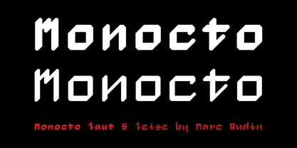 Monocto is an upright italic, clearly evidenced by the lowercase letters a, e, f, g, i, k, l, v, w, x, y and several capitals. On one hand, the design is inspired by an historical German running hand written with a pen angle of 45°, and on the other, by rational, utilitarian monospace types, similar to those designed for the mechanical typewriter during the Industrial Revolution. As the writing tool touches the paper, a double-square with broken corners is produced, which then, according to ductus, transforms itself into letter components that are either 90°-verticals or 45°-diagonals. The systematic geometry of Monocto offers unexpected design possibilites.
 - Uncle Edward by Hanoded,
$15.00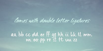 First of all, I don’t have an uncle called Edward, nor do I know anyone by that name. When I had finished this font, it had a strong ‘Uncle Edward’ feeling to it, so the name stuck. Uncle Edward is a handmade script font. I used a Japanese brush pen and some rough paper to create that ‘vintage’ look. Use Uncle Edward for your book covers, your invitations or your product packaging. Create labels for your vintage record collection with it, or print a guest list for your Christmas dinner party. Uncle Edward gives you his blessing. Comes with ligatures for double letters and a whole bunch of accents.
 - Basic Sans Cnd by Latinotype,
$29.00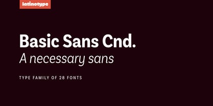 Basic Sans Cnd: A new sans. Designed by Daniel Hernández Basic Sans Cnd is a narrower version of Basic Sans. It is a family of Grotesque features with a functional, neutral and seeming clean style that looks to keep a neutral (or basic) appearance on paper, but including lots of details that give it a unique personality. Basic Sans Cnd is a sans-serif typeface well-suited for publishing projects, medium-sized text, branding, posters, headlines and more! This font family comes in 7 weights—ranging from Thin to Black—plus matching italics and it has a set of 416 characters that support 206 different languages.
 - Bell Gothic by Linotype,
$40.99C.H. Griffith was commissioned by the American telephone company, Bell, to design a typeface which would be particularly suited to small, compressed sentences and inferior paper quality. The font was intended for use in the company’s telephone books. Griffith had already had experience with the conception of newsprint fonts and was interested in legibility issues. In 1922 Griffith created the Legibility Group, which contained particularly legible fonts predestined for newspapers. Bell Gothic has all the typical characteristics which optimize a font’s legibility. The modern heir of Bell Gothic is Bell Centennial, designed by Matthew Carter in 1974 in celebration of the Bell Company’s 100th birthday. - Venis by Chank,
$99.00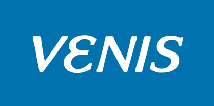 On first impression, Venis is a traditional text typeface: clean, simple and elegant with nice contrast. On closer inspection, you'll notice nuances that add charm and wonder, much like its name (rhymes with "tennis"). Is this font a serif or sans serif? Hmmmm, it never really commits. Further design liberties were taken to create unique qualities in its characters, which are best exemplified by the signature lowercase y. This font family is optimized for print, and has worked beautifully for letterpress projects including wedding invitations and birth announcements. Venis will also work well in newsletters, brochures, proposals, magazines, books, and other text-heavy paper products, bringing creative elegance to your designs.
 - Exo Slab Pro by Polimateria,
$35.00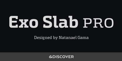 Exo Slab Pro is a slab serif with a technological and futuristic tone. Even though it has a very peculiar look and many distinct shapes that pop out in an headline, it also works well as whole creating a nice shade of text. Large x-height, ink-traps and a modest contrast ensures that this font will work well even on small font sizes. Loaded with opentype features Exo Slab provides a huge versatility. You can use it on rigorous work as well as on more funny projects. From Branding to Editorial, from Paper to Screen, from Today to the Future. Please see our promotional video.
 - Stamped Brass Stencil JNL by Jeff Levine,
$29.00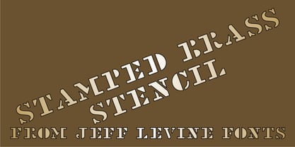 Up until the advent of modern packing and shipping methods, the common way to mark merchandise or other items to be transported was through the use of a brass stencil. These marking devices were hand stamped (or punched) using metal dies that were struck against sheets of brass to create the letters, numbers and other symbols [unlike the steel rule die cutting method used for manufacturing paper stencils]. One such example of an antique marking stencil had letters and numbers approximately one quarter of an inch in height, and Stamped Brass Stencil JNL recreates the design complete with the unusual variations of character shapes and widths.
 - Beneta by Linotype,
$29.99Karlgeorg Hoefer designed Beneta in 1991, inspired by the Littera beneventana, the script of the Benedictine scribes from the 10th to the 12th century. During this time, scribes began to use wider pens and set them at a 45 degree angle to the paper, which caused their scripts to have radical stroke contrasts. This script was mainly used for books and certificates but disappeared by the end of the 13th century. Beneta revives the characteristics of this historic script, changing a line of text into an almost ornamental space. Beneta should be used in middle to larger point sizes for shorter texts and headlines. - Reluctant Aviator by Hanoded,
$15.00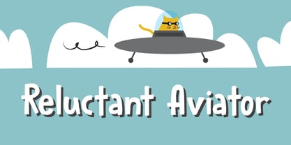 I read something interesting the other day: in 1910 a cat called Kiddo snuck on board an airship and was found by aeronaut Walter Wellman - after he had already taken off in an attempt to cross the Atlantic Ocean. Wellman and Kiddo spent 71 hours aboard the airship, but never completed the journey, due to engine problems and foul weather. Luckily, they were both rescued. It was a funny story, so I decided to name a font after it. Reluctant Aviator is a handmade font (pen and paper). It has a rough edge, some shaky glyphs and a lot of bravado. Comes with diacritics and swashes.
 - Rockness by MlkWsn,
$19.00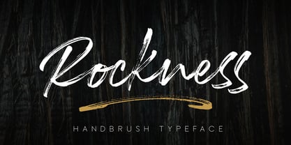 Rockness is a brush script that is written casually and quickly. Letters are made with brushes on paper. Then scanned and carefully drawn into vector format. That is why Rockness has charming, authentic and relaxed characteristics. It has 2 styles, regular and slant variations, with a more natural look to your text. You can activate Ligature and Alternates in the OpenType panel to make these two styles. It also has many alternatives and underlines that make your text and design more interesting. Rockness perfect for homeware designs, branding projects, logo design, quotes, product packaging - or simply as a stylish text overlay to any background image