2,480 search results
(0.009 seconds)
- Ancient Totem Two by Putracetol,
$24.00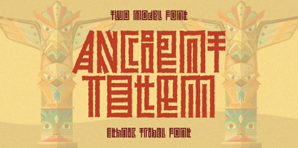 Ancient Totem is Ethnic Tribal Font With Two Model Font. Ancient Totem has a fun character and display typeface. Ancient totem is a font inspired by traditional tribal and ethical styles. This font is perfect for projects with tribal and ethnic themes. But this font is also suitable for logos, branding, greeting cards, invitation cards, advertisements, titles, healines, book titles, stickers, packaging, quotes, posters, t-shirts/apparel, billboards and others. This font can be used and supported in various programs and OS, such as procreate, cricut, windows, macOS and others. This font is also support multi language.
 - Centrale Sans Condensed by Typedepot,
$29.00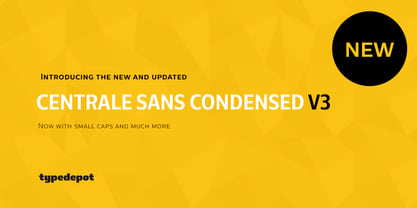 Centrale Sans Condensed is not just a "squished" version of our Centrale Sans family, it's designed as a stand alone typeface with the family characteristics in mind. It bears all the qualities of the normal width being even friendlier because of the closer relation it has with the humanist model. The condensed width is with 15% narrower than its normal sibling, which makes it precious space-saving tool. Centrale Sans Condensed also have 9 weights from Hairline to Extra Bold plus their matching italics. It includes Some OpenType features like discretional ligatures, tabular figures and stylistic alternatives.
 - Eckhardt Relaxed JNL by Jeff Levine,
$29.00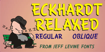 Eckhardt Relaxed JNL was modeled from an example of a casual, hand lettered alphabet from a page of a vintage textbook. This style of freehand lettering always lends itself well to posters, show card and sign work, but is equally at home in ad design or titling. The typeface is an addition to the group of type styles inspired by sign lettering, and is named for Jeff Levine's good friend, the late Al Eckhardt; whose shop turned out quality hand lettering from 1959 until his passing in 2005. Eckhardt Relaxed JNL is available in both regular and oblique versions.
 - Legend by Nandatype Studio,
$10.00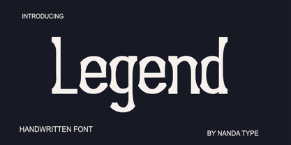 Legend font with simple models of natural and comic, you can take advantage of the opportunity at any time one wonderful way to highlight the celebration of the feast of your best, because these fonts will be a driving force for purposes such as cover design, wedding invitations, party , graduation, birthday, gathering, etc. Font Legend if you want to use for your work this font can be used to easily and simply because there are a lot of features in it contains a complete set of letters lower and uppercase letters, assorted punctuation, numbers, and multilingual support.
 - Alvin Zilon by Gatype,
$14.00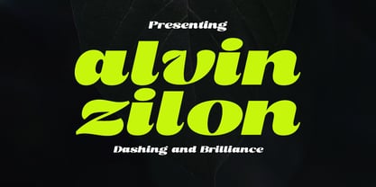 Alvin Zilon is a fancy yet elegant display font. characters that are suitable for today's style will be very interesting for you to create any design work with a classy model that maintains a calm and classy style to look at. you must already have the inspiration to be combined with the creativity you have! Multilingual Support. . Alvin Zilon. To be able to access the alternative letter, please make sure the software you are using can support the opentype feature. https://support.creativemarket.com/hc/en-us/articles/360037478813--Using-Fonts-with-Special-Features-OpenType- Free updates for many more versions in the future.
 - Fou Pro by URW Type Foundry,
$49.99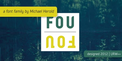 The Fou typeface family was designed as an alternative to Trade Gothic condensed bold. During the design process of a normally wide font variant a system developed that responds to white space and changing proportions. Thus, round transitions become rectangular and vice versa, space is made and space is taken away. This system and the associated changes are continued on a model with semi-serifs. Fou can also be used as an alternative to Din or the wider Q-Type, but in comparison offers more room for emphasis with its italics, expert sets and numerous special characters.
 - Marydale by Three Islands Press,
$29.00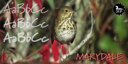 While helping produce a trade magazine years ago, I admired the hand-lettering of the art director -- a woman named Marydale -- and suggested she let me model a font after her penmanship. She agreed and drew out the alphabet, and I launched an old copy of Fontographer and (to shorten a long story) ended up developing my very first digital typeface. Which has since, astonishingly, become famous worldwide. So now the real Marydale gets the mixed blessing of seeing her handwriting (and name) plastered all over the planet. Full release has regular, bold, and black weights.
 - Sakamoto by Gatype,
$10.00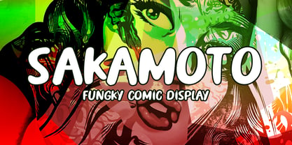 Sakamoto font with simple models of natural and comic, you can take advantage of the opportunity at any time one wonderful way to highlight the celebration of the feast of your best, because these fonts will be a driving force for purposes such as cover design, wedding invitations, party , graduation, birthday, gathering, etc. Font Sakamoto if you want to use for your work this font can be used to easily and simply because there are a lot of features in it contains a complete set of letters lower and uppercase letters, assorted punctuation, numbers, and multilingual support.
 - Ritz Slab Serif JNL by Jeff Levine,
$29.00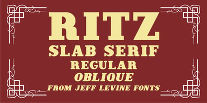 Ritz Slab Serif JNL is a bold display face which shares a lot of similar design traits to Stymie and other similar metal type of the 1930s and 1940s, but in actuality was modeled from only four letters. On the sheet music for the 1937 song "Sweet Varsity Sue" [from the 20th Century Fox Film "Life Begins in College"], there is a picture of the Ritz Brothers - a popular comedy team from 1925 through the late 1960s. The hand lettered name "Ritz" became the basis for Ritz Slab Serif JNL, which is available in both regular and oblique versions.
 - Go Home JNL by Jeff Levine,
$29.00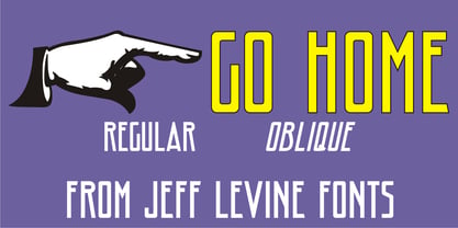 Sheet music for another one of those songs from the early part of the 20th Century with a wonderfully wordy hand lettered title was the model for the Art Nouveau flavored Go Home JNL, which is available in both regular and oblique versions. 1908's "I Used to be Afraid to Go Home in the Dark (Now I'm Afraid to Go at All)" is comprised of eighteen words. It may have been a mouthful to request from the local sheet music shop, but the lettering on its cover made it a great candidate for preserving as a digital typeface.
 - Vidal by Blackmoon Foundry,
$24.00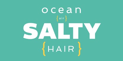 The Vidal is a display typeface designed in 2016 by Elena Albertoni. It comes in three styles: Regular, Bold and Black. This wide sans-serif with low contrast is inspired by French and British Art Deco lettering and it is suitable for use in medium to large sizes, where it offers good legibility and all its friskiness. The attitude of Vidal when set in all caps derives from the models that inspired the design: mainly capital-only lettering pieces; the essential addition of lowercase letters distinguishes Vidal from similar revivals and makes it a great modern choice.
 - Foro by Hoftype,
$39.00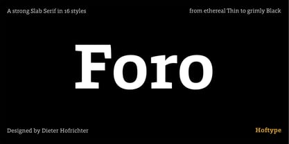 Foro was designed in 2012 to be a slab serif with an appealing flow, warm, and less harsh than many slab serifs. It evinces an attachment to humanistic shapes, models and proportions. Foro’s demonstrated strength renders it excellent for texts, and its clear and distinct details are an advantage in display sizes. Foro comes in 16 styles and in OpenType format. All weights contain standard ligatures, proportional lining figures, tabular lining figures, proportional old style figures, lining old style figures, matching currency symbols, fraction- and scientific numerals and arrows. Foro supports Western European, Central and Eastern European languages.
 - Hagemann JNL by Jeff Levine,
$29.00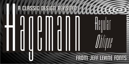 One of the most enduring type styles of the Art Deco era is Huxley Vertical. Its clean lines and stylish appeal have transcended changing times and tastes. Many typefaces have been inspired by the original, including the model used to create this font. The design was found in the book "Lettering and Alphabets", first published in 1946 by J. Albert Cavanagh. By re-drawing it from scratch, the missing numerals, punctuation, special characters and accents were added. Hagemann JNL and its oblique version are named in honor of one of Jeff Levine's friends within the type design community -- Michael Hagemann of Font Mesa.
 - Willow by Adobe,
$29.00Willow is an Adobe Originals typeface designed in 1990 by Joy Redick for the Adobe Wood Type series. Willow is a condensed typeface modeled on nineteenth-century wood types known as Clarendons (wood type Clarendons do not resemble the English metal types of that name). Clarendon condensed faces were originally so well-designed that words or a line of display type have an even color that is remarkable for wood types. Taken from proofs of type in the Rob Roy Kelly Collection housed at the University of Texas at Austin, Willow can be used for display work such packaging, advertising, and posters. - Narrow Deco JNL by Jeff Levine,
$29.00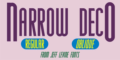 The hand lettered word ‘puzzles’ from the box cover of a 1940s set of metal “connected” puzzle pieces manufactured by the A.C. Gilbert Company was the initial typographic model, but some additions and changes were made. Instead of the right side of the ‘P’ being a semi-circle, it was changed to a more conservative ‘’squared’ look. After drawing out all of the necessary glyphs, the overall height of the characters was extended to make the letters and numbers appear taller and narrower. The end result is Narrow Deco JNL, which is available in both regular and oblique versions.
 - Telegramo by Volcano Type,
$35.00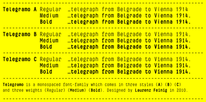 Telegramo is modeled on a historic telegraph from Belgrade to Vienna 1914. The original archetypal character set consists of lowercase letters and numerals only. Uppercase letters and special characters were added after careful research. Contact pressure variations of the rudimentary type writing machine are directly imitated in the three weights: the regular weights edges are sharp, medium edges are rounded and the bold letters can nearly be called soft. Since the original typeface did not seem perfectly suitable for modern desktop publishing purposes, two additional stylistic sets were created for each weight, improving certain issues in rhythm, legibility and quirkiness.
 - Cardillac by Hoftype,
$49.00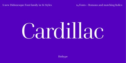 Cardillac, named after E.T.A. Hoffmann’s literary figure, refers back to classical Didonesque, yet presents unique details which set it apart from historic models by adding a new flavour. Its clarity, noble appearance and cool elegance predestine it for magazines and newspapers. The Cardillac Family consists of 14 styles, provides many features which allow its application for ambitious typography. It comes in OpenType format with extended language support. All weights contain small caps, ligatures, superior characters, proportional lining figures, tabular lining figures, proportional old style figures, lining old style figures, matching currency symbols, fraction- and scientific numerals, matching arrows and alternate characters.
 - Quartz by ITC,
$29.99The figures of Quartz font are based on those on digital clocks and LCD displays. All strokes are set at right angles to one another to create abstract characters. Fonts created for electronic displays gained in popularity at the same time as the computer became an everyday object. The standard is still around today and is the model for numerous interpretations. Fonts like Quartz have already won a firm position in trend typography. They embody the spirit of the late 20th century. Quartz font is a good choice whenever a marked contrast to everyday alphabets is the goal. - Monotype Ionic by Monotype,
$29.99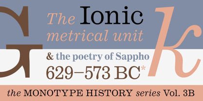 The earliest form of Ionic was brought out by Vincent Figgins in 1821 and was intended for display work. In 1863 a more refined version appeared which had more contrast between thick and thin strokes and the serifs were bracketed. Further developments were made, however the robustness of the Egyptian style was retained making the face suitable for newspaper text setting. With a large x-height and strong hairlines and serifs, the Ionic font family became widely used by the newspaper industry as a body type and provided a model for many twentieth century newspaper typefaces.
 - Antiquarian by Three Islands Press,
$39.00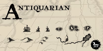 The titles struck me as handsome -- the titles and captions and place labels on a page I have of Henri Abraham Chatelain's Atlas Historique. I'd already modeled Antiquarian Scribe after the neat, slanted penmanship used in the body text of Chatelain's famous old world atlas; now I felt compelled to digitize this legible roman handlettering, as well. The letterforms are strong and handsome. They've got a certain deft, organic character. A personality. I can't fully explain it. But this antique alphabet seems suitable for many applications. Antiquarian is a full-featured font that works well with Antiquarian Scribe.
 - Chromosome by Three Islands Press,
$19.00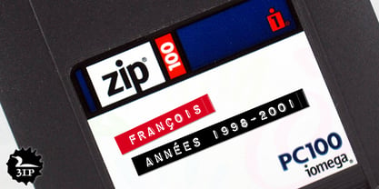 It hit me one day that the '60s-vintage labelmaker I had lying around might make an interesting display face. I began playing with it -- clicking out letters at various pressures, scanning the results, going over the scans in a vector-graphics program. Looked pretty good. To my chagrin, however, I soon afterward got a glimpse of someone else's label-tape font. Though modeled after a more modern device, its rocketing popularity prompted me to set Chromosome aside for a year or so. Finally finished it up in late-1995. Full release has light and heavy weights, regular and reversed styles.
 - Beluga LT by Linotype,
$29.99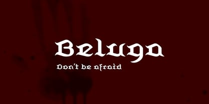 Linotype Beluga is a part of the Take Type Library, winners of Linotype’s International Digital Type Design Contest. The font was designed by Hans-Jürgen Ellenberger to suggest the writing of the Middle Ages but without any specific models from that time. A distinguishing characteristic of the font is its pointed, effusive serifs, which give Beluga its feel of the Middle Ages or of mysticism. In spite of its dynamic character, Beluga is legible even in smaller point sizes, which makes it equally good for headlines as for shorter texts. Beluga combines well with sans serif, slab serif and constructed fonts.
 - Fou Serif CN by URW Type Foundry,
$49.99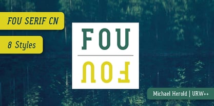 The "Fou" typeface family was designed as an alternative to "Trade Gothic condensed bold". During the design process of a normally wide font variant a system developed that responds to white space and changing proportions. Thus, round transitions become rectangular and vice versa, space is made and space is taken away. This system and the associated changes are continued on a model with semi-serifs. "Fou" can also be used as an alternative to Din or the wider Q-Type, but in comparison offers more room for emphasis with its italics and condensed styles, expert sets and numerous special characters.
 - Cottonwood by Adobe,
$29.00Cottonwood is a group effort of the typeface artists K.B. Chansler, B. Lind and J. Redick and displays the unmistakable look of the Wild West. It is stylistically modelled on the typefaces used in advertisements and signage toward the end of the 19th century. Typical for these capital alphabets are the split serifs which emphasize the markedly decorative character. Cottonwood is a kind of homage to the Western typefaces (woodtypes) which became popular through their use on Wanted signs in Western films. Cottonwood is best used sparingly in headlines to best emphasize its decorative, 'wild' character. - Lalibela by CyberGraphics,
$43.00My motivation for designing the Lalibela family (which is based on Bodoni) was to pay homage to Ethiopic script. The script has been around for about 3 000 years, but I took artistic licence to deviate from the original model and add personal touches. I chose Bodoni as a historical model because of its display value and not its text size use because the extreme contrast made it difficult to read at small sizes. A Modern typeface characterized by consistently horizontal stress, flat and un-bracketed serifs, and a high contrast between thin and thick strokes, were the final step in typography two-hundred-year journey away from calligraphy. The austerity, simplicity and greater contrast style was perfected.Contrary to all the refinements in Bodoni, I have revisited calligraphy with the font Lalibela that mimics Ethiopic Script. It was drawn with a much larger x height and less geometric than Bodoni for its primary use as a display font. For example, a lot of italic serifs were added to the roman face as well as 16 additional ligatures to obtain more a feel of calligraphy. I made the serifs thicker and bracket one side with straight steps obtaining a reduced contrast to withstand breaking up at smaller sizes.An additional variant, "Lalibela Alternate" was designed to provide an interesting mixing possibilities with the Bold face for more expressive headlines. - Wendy LP by LetterPerfect,
$39.00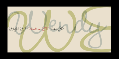 The Wendy family is a cursive script provided in three weights -- Light, Medium and Bold. The design is an upright, casual handwriting style, with natural joins and connecting strokes. Wendy, in her various modes, projects a friendly persona, adding an approachable quality to headlines and short runs of text.
 - Organon Sans by G-Type,
$60.00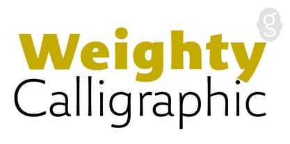 The six weight Organon Sans typeface is a stylish and feature-laden OpenType family which complements its sister Organon Serif, both components working in tandem to create an elegant, legible and thoughtfully designed suite of fonts which share similar cap & x heights, stem widths and ascender/descender values. Tapered stems give the Organon Sans fonts an attractively robust appearance.
 - Aragon Condensed by Canada Type,
$24.95The condensed version of Hans van Maanen's Aragon is a headline star. The elements that made Aragon a popular "Dutch Garamond" text repeat here, with the slight stress shifts and tapering stems optimized for headline use. Aragon Condensed also comes in bold and italic variations. All three fonts contain extended language support, superiors and inferiors, and class-based kerning. - Interrupt Display Pro by T4 Foundry,
$21.00Torbjörn Olsson's Interrupt is a salty dog of a sanserif, harboring memories of freighters unloading their cargo in a run-down port. Interrupt works great for signs, and looks just fine painted on the side of a wooden crate or stencilled on an old tarpaulin. Interrupt is recommended for use over 36 points. You have run out of packing crates and would like to use it on paper? Sure, Interrupt can add its sturdy sailor's gait to any medium... just don't set any novel in Interrupt. Not even Melville. Interrupt is an OpenType typeface for both PC and Mac. - Holingston by HansCo,
$12.00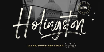 Holingston is a Handwritten brush script that is written casual and naturaly. the letters are made with brushes on paper and then scanned carefully drawn into vector format. This typeface is ideal for use in any professional project, such as blog titles, posters, wedding elements, t-shirts, clothing, book covers, business cards, greeting cards, branding, merchandise etc. It has 4 styles, regular, regular slant, clean and clean slant variations, this package is also has many alternatives underlines that make your text and design more interesting. Tutorial how to Install & use Alternate / Special Character : https://hanscostudio.com/tutorial/ Enjoy !
 - Obvia Wide by Typefolio,
$29.00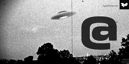 'Obvia' appeared as a result of direct observation on typefaces classified as geometric and the plan to explore for the first time width axes Condensed, Narrow (soon), Normal and new Wide and Expanded. The idea behind 'Obvia's design was to create a distancing from geometrically pure shapes, in this case, square shapes. Then some details were added, such as subtle inktraps, concave endings of the stems and carefully drawn alternate characters, giving a 'geohumanist' tone to the font. This first family of 'Obvia' has 9 weights ranging from Thin to Black, delivering a strong typographic identity, from the paper to the pixel.
 - Basic Sans Narrow by Latinotype,
$29.00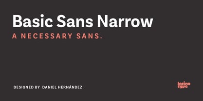 Basic Sans Narrow is a narrower version of Basic Sans. It is a family of Grotesque features with a functional, neutral and seeming clean style that looks to keep a neutral (or basic) appearance on paper, but including lots of details that give it a unique personality. Basic Sans Narrow is a sans-serif typeface well-suited for publishing projects, medium-sized text, branding, posters, headlines and more! This font family comes in 7 weights—ranging from Thin to Black—plus matching italics and it has a set of 416 characters that support 206 different languages.
 - Cerebri Sans by Hanken Design Co.,
$30.00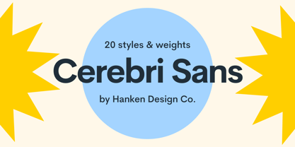 Cerebri Sans is a design inspired by early geometric and grotesque typefaces. Subtle humanist details provide an undercurrent of warmth that simmers just beneath the bones of its contemporary simplicity. Cerebri Sans’ concept involved the development of a hybrid appearance. Its soft elegance and finely-tuned legibility make it appropriate for a vast range of applications including headlines, editorials, publishing, advertising, corporate communications, white papers, educational texts, web content, and mobile applications. Cerebri Sans' multilingual support is extensive, covering Basic Latin, Western European, Euro, Baltic, Turkish, Central European, Romanian, Vietnamese, Pan African Latin, Pinyin and Igbo Onwu for global accessibility.
 - ITC Berranger Hand by ITC,
$29.99Controlled casualness is the watchword in this new handwriting script from the prolific young French designer Éric de Berranger, who also designed the sans serif type family ITC Octone. ITC Berranger Hand has its roots in chancery calligraphy, yet its surface looks like contemporary informal lettering that was written quickly with a felt-tip pen on slightly absorbent paper. The counters of some letters appear to almost fill in from ink spread, yet Berranger Hand is admirably readable at small sizes. The capital letters are restrained, without swashes, so they can be used together in all-caps combinations. - Odaiba Script by Hanoded,
$15.00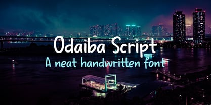 I have been to Japan many times, but I have to admit that I have not (yet) been to Odaiba, so this font is a reminder that I should go there one day. Odaiba is a large artificial Island in the bay of Tokyo. It is a popular shopping and sightseeing destination and its sights include a copy of the Statue of Liberty and a mega-sized Gundam Robot. Odaiba Script is a handwritten font. I used a Sharpie pen on paper, so it is nice and thick. It comes with double letter ligatures and all diacritics.
 - Obvia Expanded by Typefolio,
$29.00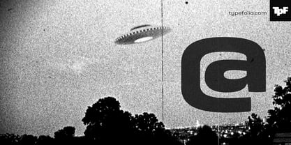 'Obvia' appeared as a result of direct observation on typefaces classified as geometric and the plan to explore for the first time width axes Condensed, Narrow (soon), Normal and new Wide and Expanded. The idea behind 'Obvia's design was to create a distancing from geometrically pure shapes, in this case, square shapes. Then some details were added, such as subtle inktraps, concave endings of the stems and carefully drawn alternate characters, giving a 'geohumanist' tone to the font. This first family of 'Obvia' has 9 weights ranging from Thin to Black, delivering a strong typographic identity, from the paper to the pixel.
 - Gene Condensed JNL by Jeff Levine,
$29.00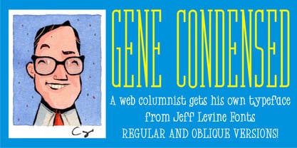 Gene Gable is known to many graphic artists from his on-line column 'Scanning Around with Gene', which was on the Creative Pro website for a number of years, covering a variety of topics ranging from printing techniques to paper ephemera; water applied decals to lettering stencils. Gene has also been a great help in providing vintage source material to Jeff Levine, which resulted in many additional font designs. It seems only fitting that he should be bestowed with his own-named font as well. Gene Condensed JNL is offered in both regular and oblique versions.
 - Telegraph by ParaType,
$25.00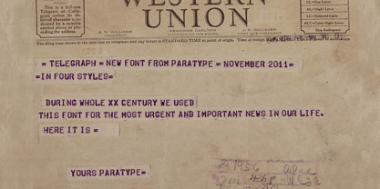 Telegraph font family was developed on the base of scanned images of telegraph printing machines. It consists of 4 styles: Natural is the most close to original scans with all defects of positioning and dirty print on the rough telegraph paper tape; Clean style uses cleaned contours, but keeps disorder in positioning; Straight is straightened along base line; Clean Straight style has self-explaining name. The fonts can be used for imitation of wire texts and in advertising and display typography. Upgraded version with extended character set was released in 2011 by ParaType. Designer Gennady Fridman.
 - Linotype Vision by Linotype,
$29.99Linotype Vision is part of the Take Type Library, chosen from the entries of the Linotype-sponsored International Digital Type Design Contests of 1994 and 1997. Created by German designer Dan-André Neimeyer, the font contains five weights. The characters look as though they are constructed of fragments fitted only loosely together. Just enough of each character is put onto paper so that the eye of the reader can complete the conventional form. Based loosely on sans serif forms, the font has a futuristic, mathematical feel. Linotype Vision is exclusively for headlines in point sizes of 18 and larger. - Letro by Thinkdust,
$10.00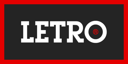 Letro’s sturdy, slab serif form and sleek alternates make it perfect for any sort of display, whether it’s professional or personal, casual or serious, big, small, on a computer screen or on paper. Letro does everything: elegant while slightly blocky, stylised while legible, solid but full of finesse, this font isn’t the jack of all trades, it comes close to being the master. Letro comes in two weights, light and regular, with support for a multitude of languages. When you need a font with serifs to get the job done, Letro is your go to type.