2,480 search results
(0.015 seconds)
- Alfreda by Monotype,
$30.00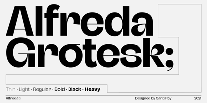 Alfreda grotesque is not just another grotesque typeface. Its morphology mixes modulated and unmodulated strokes, and natural and reverse contrast. All that with a humanistic touch and subtle ink traps. Weird. Alfreda comes in 6 weights, it has open type features, more than 400 glyphs and 18 stylistic sets.
 - Vecchia by Talavera,
$75.00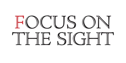 This font looks forward to the humanist venetian oldstyle flavor. With high contrast and nice modulation, it has low x height wich is ideal for reading and to design books or long texts. Vecchia has a calligraphic basis and counts with small caps, ligatures and open face titling capitals.
 - Mastro Sans by Ndiscover,
$39.00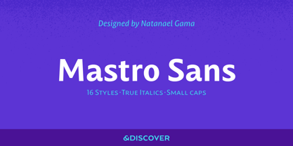 Mastro™ Sans is a contemporary humanist sans serif and the sans version of Mastro. The lowercase shapes are simple yet distinct, its organic design (specially the italic) are based on different stroke modulation ideas combined into a coherent whole. The uppercase is inspired in roman capital proportions yet keeping the lowercase stroke modulation. Mastro™ Sans has a total of 16 styles and it covers a large set of languages. It also has many Opentype features, such as small caps, superscript numbers and letters, old style and lining figures, tabular figures, case sensitive forms, fractions and more. It is a design with a lot of personality while being versatile. You can use it in branding, editorial, web and video.
 - Fontology by FSD,
$2.46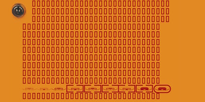 Fontology-E is an experimental font designed by Fabrizio Schiavi. It was created for the cover of the Fontology catalogue. Schiavi's need was to build an optical false modulation effect with versions of the logotype and typical rectangles of an empty font chart. The basic idea was to create a page that contained many rectangles in order to demonstrate the modulation. At the same time, it was important to understand that Schiavi inserted 8 versions of the same logotype each time the corresponding letter is digitized in e, a, d, f, g, h, c and b. The inside of the catalogue has the same layout and text, which is revealed by fanning the pages. Schiavi confess that Fontology-E is a highly experimental typefont.
 - Panther Black by Device,
$39.00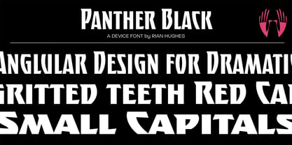 Developed from Rian Hughes’ Black Panther logo for Marvel, Panther Black is a sharp and stylish three-weight headline sans. Built from sweeping curves and tapered crossbars, its bold, dynamic design is seen to best effect in shorter settings. Available in condensed, normal and extended variants.
 - Blue Typewriter by Ana's Fonts,
$16.00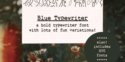 Blue Typewriter is a bold typewriter font and scans pack (with graphics, text, paper) sampled from old documents, for an authentic vintage look. Use this set in any designs that needs a vintage touch: in long or short texts, in digital collages, branding and packaging, social media posts, logotypes, etc. Included in this product: Blue Typewriter font with variations: underlined, dashed, crossed-out and dashed underline, in SVG and vector versions (with the vector versions created separately, so that the two versions include subtle differences)
 - infringe by fawich,
$20.00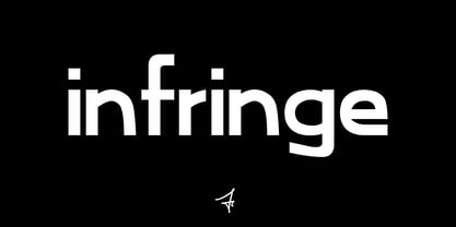 Inspired and derived from the serial numbers printed on United States paper currency, the tongue-in-cheek infringe typeface has grown from the alphanumeric set of characters that sit reservedly aside the faces of dead presidents. Taken out of their bright-green element, the characters have been given a life of their own, and have been joined by a one-hundred percent unique set of lowercase characters. The font stands out in both formal and informal uses and can be used for both headlines and supporting text.
 - Rip TAPE by TypoGraphicDesign,
$19.00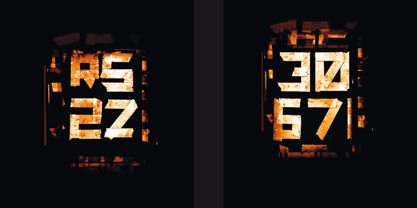 CONCEPT/CHARACTERISTICS The handmade, dirty and yet modern character of the font was designed with analog tape on paper and later digitized. The motto is sticky, wrinkled and rough APPLICATION AREA The dirty, rough and fancy font „rip TAPE“ would look good at display size for poster, flyer, comics and graphic novel lettering and logos. Headlines in magazines or websites, packaging, music covers or webbanner etc. TECHNICAL SPECIFICATIONS Headline Font | Display Font | Grunge/DIY Font „rip TAPE“ OpenType Font with & 78 glyphs & 2 styles (regular, fixed).
 - Let's Go Green by Atom,
$15.00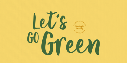 Let's Go Green is a natural, organic, casual, uneven touch font! Made naturally using brush strokes with ink on paper, giving a very unique and distinctive impression. It is ideal for logos, quotes, print media, product packaging, merchandise, advertising, social media and your design projects. Let's Go Green comes as a single font that is packed with OpenType Features. It contains the complete set of lowercase & uppercase letters, various punctuation marks, numbers, and multilingual and ligature support. Thanks for using this font! Happy Design :)
 - Montague Script Bold by Stephen Rapp,
$59.00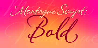 Montague Script Bold is a beefed up version of the 2009 Type Directors Club Award winning Montague Script. The added weight makes it more ideal for display purposes like book titling, packaging, and headlines. Like the original award winning version, it features an energetic rhythm with loads of swashes and ligatures. Having its origin in fine sable brush lettering done on smooth vellum paper, both versions are ideal for greeting card and invitation text. There are beginning, ending, and alternate versions for almost every letter.
 - Puchiflit by sugargliderz,
$44.00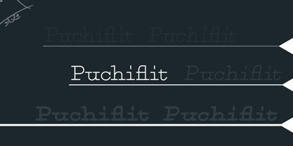 Puchiflit is a typeface disguised as a pen script. I didn't create this typeface by importing the letters on paper and tracing them into a computer with a draw application. So I think it's a pseudo-pen script typeface. By the way, I used a famous Japanese maker's felt-tip pen as a reference for line widths. I thought, "Isn't this what it would look like if I wrote with this pen? I drew a line in the draw application while fantasizing about this.
 - Antique Packaging JNL by Jeff Levine,
$29.00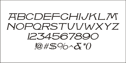 The box cover of “Drawing Stencils No. 3 for Use on Slate or Paper” [a children’s drawing set produced by Montgomery, Ward & Company of Chicago circa the 1890s] had its title in an elegant spurred Roman type face. Working from the few letters available, a complete character set was created that resulted in Antique Packaging JNL, which is available in both regular and oblique versions. To note, this is the 1500th font release from Jeff Levine Fonts since its inception in January of 2006.
 - Smack by ITC,
$29.99Smack, from American designer Jill Bell, is oriented toward a young generation who does not want to mind the rules. The font invites unconventional and playful use. The figures seem to be almost coincidentally shaped. Letters alternate between thin and thick strokes alternate and are accompanied by fine dots which almost look like accidental drops of ink on the paper. Smack is an illustrative font with unmistakable handwriting character and is perfect for cartoons, comics and anything else which is not supposed to take life too seriously. - Dinosaur Cake by Hanoded,
$10.00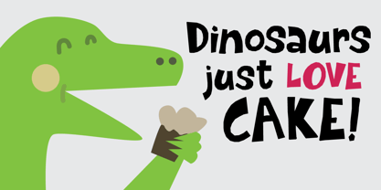 My son Sam’s birthday is coming up and we need to think of a cake. He’s old enough not to want a themed cake, but I suddenly remembered that we gave him a dinosaur cake for his second birthday! Dinosaur Cake? That’s a totally cool name for a font! So here it is: Dinosaur Cake - The Font. It’s a cute little handmade font, which looks like it was cut out of paper, but I have to disappoint you this time: it was not cut out.
 - Capricious by Hanoded,
$15.00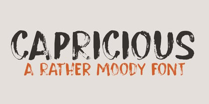 I don’t think I’m a capricious person, but right now, due to the enormous amount of renovation work on our home, I do get bad moods quite often! Capricious is a hand painted all-caps font: I used my favourite Chinese ink, a brush and very rough paper to get the desired ‘eroded’ effect. It is quite a heavy display font, so I wouldn’t really set a text in it, but it works really well for headlines, catching titles and products that need some pepper!
 - Gripewriter by Elemeno,
$20.00Typewriters are becoming scarce, but fonts designed to look like they came from typewriters aren't. In this case, however, Gripewriter is meant to look as if it were typed on a textured paper and enlarged, emphasizing flaws and lending it a funkier, grungier look than your average typewriter face. This was originally called Hypewriter until it was pointed out that a font already existed with that name. The current name is a better fit, anyway, since Gripewriter looks like it might hold a grudge. - Tabac Big Slab by Suitcase Type Foundry,
$39.00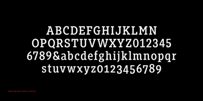 Eleven out of ten typographers have confirmed that Tabac Big Slab can be used both on the facades of majestic villas and on the most ordinary typesetting of labels and medication package inserts, where it saves both space and tired eyes. Even width compression doesn’t take away from the typeface’s well-distinguished characters, while its huge x-height optically enlarges typesetting in small sizes. Aside from the lightest weights, we can recommend Tabac Big Slab for all applications where there is a lack of space or paper.
 - ITC Gema by ITC,
$29.99ITC Gema is the work of Brazilian graphic designer Claudio Rocha. It was first written in a small size to keep the surface irregularity of a non-coated paper when enlarged for use as a display font," says Rocha. Many strokes do not quite join, giving Gema the visual effect of a stencil typeface, the distinguishing characteristic of the font. "Some characters have my own handwriting gestures," says Rocha, like elongated endings and angular shapes. Gema comes complete with an unusual variety of ligatures and alternate characters." - Lumios Brush by My Creative Land,
$29.99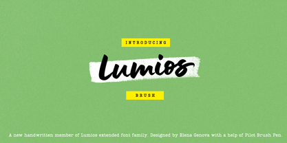 Lumios Brush is a new addition to the Lumios Extended Font Family. It was written with Pilot Brush Pen on a glossy paper (which allows a really smooth brush movements) and then carefully digitized. Just like Lumios Marker, its Brush sibling has multilingual (including basic cyrillic) support. The font also benefits from 2- and 3-letter ligatures (again, multilingual), stylistic alternates and swashes, underlines, arrows and a few symbols. If you already own Lumios Design Elements, you can used them with the Lumuis Brush font.
 - Gizmo by G-Type,
$46.00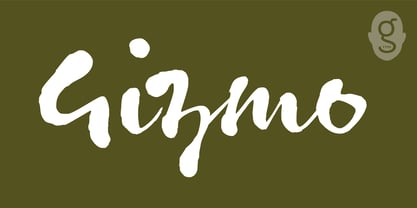 Gizmo was created by writing with a brush pen on fairly porous paper, selecting the best characters, then scanning and tracing with precision to maintain maximum character integrity. Clever programming ensures an even flow when set as text, enabling Gizmo to appear as quickly-written handwriting. The inclusion of multiple ligatures, which automatically kick in as you type, give Gizmo a truly authentic brush script appearance and hand-drawn dynamic. Gizmo works especially well at large sizes when the characteristically blobby and uneven edges become more evident.
 - Remontoire by MAC Rhino Fonts,
$36.00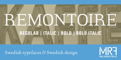 The original sketches who formed the base for Remontoire is known as one of the first typefaces drawn by Karl-Erik Forsberg . It was a result of a competition set up by various typographic organizations in the early 1930. The typeface was never completed and sketches are only to be found on paper. Made only as a single font but some the character can later on be found in other of examples of his work; Carolus and Ericus. MRF developed and expanded the family into 5 weights.
 - DF Riga by Dutchfonts,
$33.00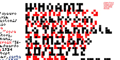 DF Riga is a minimal bitmap typeface which works very well in small sizes both on your screen and on paper. But... if you want to express its deep beauty, use it in display sizes and the smell of ink is there. These typefaces (DF-A BIT, DF-Riga and DF-Dudok) owe their existence to the excellent letterpress printing of Hanneke Briër at the Grafisch Centrum Groningen. Beyond ‘the perfect’ there is a lot to get, it is made, you can see that.
 - Brunette by DearType,
$29.00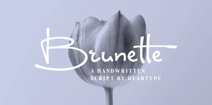 The Brunette font was created with the sole purpose to serve companies that want to express character, emotion, and personal touch through their logotypes (think Bakeries, Juice Bars, Cafes, Jewelry stores, etc.) Brunette was made entirely from scratch (handwritten letters on paper), which were then vectorized and tweaked to gain consistency. The charm of the font is in its irregularity and resemblance to real handwriting. Brunette is perfect for businesses that want to convey a casual and organic image while making their products more human and approachable.
 - Marianne by bb-bureau,
$60.00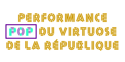 Marianne is a headline lineal designed by Benoît Bodhuin Protest writing (Caps only) made of tape modules joined by drawing a typical notch. 3 styles – Inline, Outline and Solid – each with variants Opentype, many original ligatures (including ‘HTTP’…) and alternative ‘A’ leaning on his right leg, allow many combinations and uses.
 - M Hei3 HK by Monotype HK,
$523.99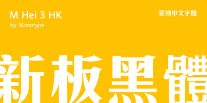 Monotype Hei3 HK is a modulated and transitional Chinese design with structure, diǎn, piē and nà carry Song style, while horizontal & vertical strokes are relatively simple. This mix of ancient and modern elements with low contrast is something that you can find in wood carving: rigid while balanced with softness.
 - WBP Helena by Studio Jasper Nijssen,
$15.00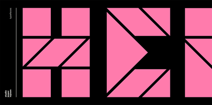 Helena derived her curves from the old Chinese Tangram puzzle. She sure is playful, though sometimes she bites furiously. No worries! Helena may seem to be a tad crazy, but all in good moderation. Don’t go overboard, use her well and I can assure you … she’ll be worth all your effort.
 - EB Corp by Eko Bimantara,
$21.00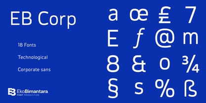 EB Corp designed to be fit for corporate nuances. its letterforms shaped in tune with technological feels. Its shown simplicity, minimal stroke contrast, moderate spacing. Its consist of 18 styles from Thin to Black, contain 470+ glyphs that support broad latin language, contain variation of linning figures, and some alternates glyphs.
 - M Hei3 PRC by Monotype HK,
$523.99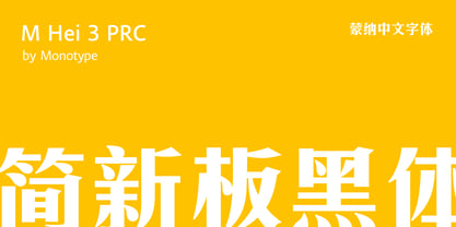 Monotype Hei3 PRC is a modulated and transitional Chinese design with structure, diǎn, piē and nà carry Song style, while horizontal & vertical strokes are relatively simple. This mix of ancient and modern elements with low contrast is something that you can find in wood carving: rigid while balanced with softness
 - Emporia JNL by Jeff Levine,
$29.00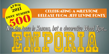 Emporia JNL is a wonderfully decorative and vintage wood type named for a city in Kansas, and modeled from just a dozen images of individual type blocks spotted for auction online. The release of this typeface is also a milestone for Jeff Levine Fonts. The foundry started in January, 2006 with only ten releases, and has now grown to be an impressive library of unique lettering designs from the past. The collection also contains numerous original and novelty creations. Emporia JNL is proudly released as the 500th font design to join this extensive library.
 - HS Ishraq by Hiba Studio,
$59.00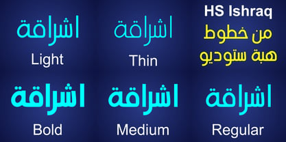 HS Ishraq introduces a modern OpenType Arabic Typeface that combines the features of Kufi and Naskh Style with noticeable both curvy and sharp segments beside the refinements of its letters that made it more readable. HS Ishraq can be used in both titles and text in modern graphic and publication projects. It supports Arabic, Persian, Urdu and Kurdish languages and contains five weights: Thin, light, regular, Medium and bold which can add to the library of Arabic fonts contemporary models that meet with the purposes of various designs for all tastes and all projects.
 - Charlemagne by Adobe,
$29.00The capital alphabet Charlemagne was designed in 1989 by Carol Twombly. The basic forms are modelled on those used in classical Roman engravings. They are distinguished by pointed serifs which sometimes extend beyond the bounds of the forms, for instance on the E, F and S. These serif forms have made other historial appearances, for example, in handwritten rectangular capitals of the 9th century. The serifs lend the typeface a light ornamental touch. Charlemagne is a typical titling typeface and is best used in large and very large point sizes to emphasize its classical elegance. - Classroom Stencil JNL by Jeff Levine,
$29.00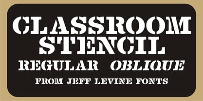 Roman-style stencil fonts have been around for much longer than most people realize - from the interlocking brass stencils of the 1880s to the laser-cut plastic stencils of today. A 1 inch Roman lettering guide [die-cut from oil board with spacing holes for correct alignment] made by the now-defunct Zipatone Corporation in the 1970s was a clone of an existing design of another company; but with variations in certain character shapes. This then became the working model for Classroom Stencil JNL, which is available in both regular and oblique versions.
 - Wolfsbane by Groen Studio,
$12.00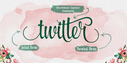 Wolfsbane is a brush script that is beautiful and unique, it is a model of modern calligraphy typefaces, in combination with a calligraphy writing style. Font features: - Contextual swashes - Contextual Alternates - Standart ligatures - Discretionary ligatures - Initial Forms - Terminal Forms - Stylistic Alternates - Stylistic sets Font file included: Wolfsbane OTF Can be used for various purposes.such as headings, logos, wedding invitation, t-shirt, letterhead, signage, lable, news, posters, badges etc. To enable the OpenType Stylistic alternates, you need a program that supports OpenType features such as Adobe Illustrator CS, Adobe Indesign & CorelDraw X6-X7.
 - Basile by Tipo,
$85.00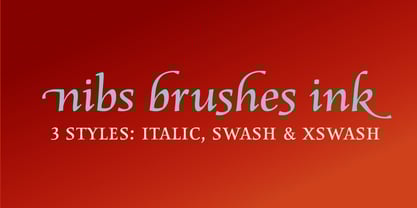 Basile is the conclusion of a process that began with the learning of italic handwriting in a roballos-Naab studio course. In this workshop I developed a variation of chancery handwriting which had a more pronounced wider than its historical model. While making the digitalization, the forms were modified to obtain a similar spirit to the one in the handwriting, but thinking about the text in small sizes. Also incorporating three sets of forms enlarged the family: italic, swash and extra swash. And the addition of initials and terminals sets.
 - Linotype Alphabat by Linotype,
$29.99Jan Tomáš studied at the Universität der Künste, Berlin. He is a multi-talent – the author of many ideas, a font creator, designer, modeller, technician and web designer. In 2011, he founded Future Typo, the first web portal for advanced typography with original design typefaces and 3D typefaces. When you look closely to Linotype Alphabat, the figures start to change from letters into flying bats and scary faces. Linotype Alphabat can be used for very short texts however it is particularly effective for headlines in larger point sizes so that its details are emphasized. - Supplier Stencil JNL by Jeff Levine,
$29.00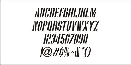 The design idea for this condensed sans serif stencil font was inspired by a post-World War II brass stencil spotted in an online auction. The United States was assisting Europe with much-needed goods, and the text in the middle of a “stars and stripes” shield used for marking the shipping containers read “For European Recovery supplied by the United States of America”. It was the first line (“For European Recovery”) that became the working model for Supplier Stencil JNL, which is available in both regular and oblique versions.
 - Personalization by Jeff Levine,
$29.00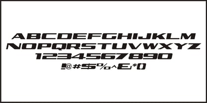 In the 1960s it was a popular trend to personalize one’s possessions with your initials. From wallets and handbags to eyeglasses; from luggage to even cars, initial personalization was the fad of the time. The British division of Gulf Oil offered for sale a set of gold metallic stick-on initials for 25 pence, complete with two Gulf logos so the company could get some extra advertising mileage out of the promotion. These extra-wide, bold initials served as the idea model for Personalization JNL, which is available in both regular and oblique versions.
 - Casual Deco JNL by Jeff Levine,
$29.00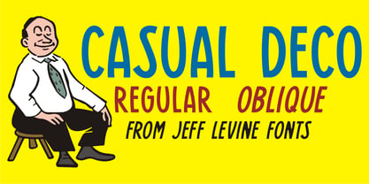 The hand lettered sans serif title on the1931 sheet music for “(Potatoes are Cheaper-Tomatoes are Cheaper) Now’s the Time to Fall in Love” presented another opportunity to create a typeface from the wealth of unusual alphabets found on the covers of vintage and antique song sheets. However, it seems that even as late as the 1930s, song writers had the urge to pen long-worded titles for their musical compositions. This thirteen word verbal excursion became the model for Casual Deco JNL, which is available in both regular and oblique versions.
 - Ultra Thin Stencil JNL by Jeff Levine,
$29.00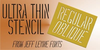 Online auctions offer a treasure trove of lost or forgotten merchandise, and many items pertaining to lettering just beg to be digitized into a typeface. Case in point is a partial set of brass stencils that were the visual model for Ultra Thin Stencil JNL. While most of the brass interlocking stencils available now and in the past have bold lettering for easy readability, this particular set consisted of condensed letters with thin lines. Available in both regular and oblique versions, they join a long list of stencil designs available from Jeff Levine Fonts.
 - Boostnia by Twinletter,
$14.00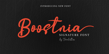 Introducing our newest font called Boostnia, a bold signature font written with abstract curves but still looking modern and elegant, This font in addition to having a charming and unique shape is also equipped with various options that support good results when you use it in your project. This font is perfect for business cards, photography studios, autographs, interior designs, model names, coffee late, travel, weddings, cosmetics, jewelry, social media posts, product packaging, watermarks, special events, or anything else. Start using this font to add an authentic and heartfelt vibe to any design project.