8,353 search results
(0.019 seconds)
- Corvinus Skyline by GroupType,
$15.00 Corvinus Skyline is an elegant retro 1920/30's looking font great for headlines in magazines, posters, signage and other design projects.
 - Cheese And Crackers by Comicraft,
$19.00 Don't forget the Cheese! CHEESE AND CRACKERS is a delightfully light and creamy font created for lettering Wallace & Gromit in Nickelodeon Magazine.
 - Stylish Title JNL by Jeff Levine,
$29.00 The cover title for the July, 1935 issue of Harper’s Bazaar magazine was hand lettered in a condensed, squared slab serif design with a few stylized characters. This is now available as Stylish Title JNL, in both regular and oblique versions. For many years, each issue of the magazine had its title rendered in different type styles; offering many unique variations to coincide with that month’s cover art.
 - Rhode White by Cititype,
$16.00 'Rhode White' is a natural calligraphy font. We created this font for modern brands. branding and branding only. The soft, unique and natural touch gives a different impression, it invites attention to take a closer look at your brand. This is a font favoured by agencies who like modern branding, you can make a large number of logos with one font because this font is suitable for use in web logos, personal signatures, portfolios, prints, header, magazine, book cover, t-shirt print, craft, and cosmetic packaging. Again, this is a font worthy of your collection. Thank you,
 - Rollgates by Cotbada Studio,
$5.00 Rollgates - An Modern Sans Serif and minimalist character! it's perfect for logos, name card, magazine layouts, invitations, headers, or even large-scale artwork.
 - Ultimate Victory by Epiclinez,
$18.00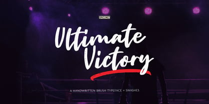 Ultimate Victory is an authentic handwritten brush typeface. This textured script font is suitable for posters, magazines, apparels, movie headlines, packaging and more.
 - Ript Cure by insigne,
$19.99RiptCure is a futuristic, but usable typeface for everything from logotypes to magazine headlines. Several weights are included, including an interesting Ultra Light. - La Pamalia by Fikryal,
$14.00 La Paloma is a handwritten font, and is perfect for your needs such as: logos, posters, handwriting, mockup, magazines, business cards and more.
 - Morning Violetta by Fortunes Co,
$19.00 Morning Violetta is modern contemporary display sans, and well suited for magazines, brochures, logos, headline or quotes, stand alone display, and short paragraphs.
 - Kona by Linecreative,
$14.00 Kona is a display font perfect for branding, homeware design, product packaging, magazine headers - or just perfect as display text against any background.
 - Andulka by Storm Type Foundry,
$44.00A universal typeface for books, magazines and newspapers must be economizing, quiet, strong in drawing, but original and peaceful at the same time. Type "for all weather" must resist also many difficulties of printing on different surfaces. Therefore, the basic design "Text" is slightly darker and legible from 6 point size even in a dim light, whereas "Book" reduces the effect of running ink and saves toner cartridge. In offices of smaller companies these lighter fonts are welcomed as toner-savers. Andulka also need less space on the page than other text typefaces and saves paper too. Medium and Bold designs keep the original grace, changing its weight only in shadows. Italics may remind humanistic inspiration and forcing the horizontal of x-height with robust horizontal serifs, whereas Roman lower case maintains the baseline. Basic numerals are non-aligning proportional, but there are available upper case figures as well as special numerals drawn for the same height as small caps, which is just about a hairline above the x-height. The characteristic feature of Andulka is a squinted eye in letters 'a', 'c', 'f', 'r', 's', 'k', and softened diagonals through all characters in family. Diagonals were always disturbing and gripping attention extensively. Serifs are stressed trapezoids reminding small beaks at curved endings, descenders 'j' and 'y' may evoke tail feathers of budgerigar. Andulka [budgerigar] sings lovely and is everyday quiet companion. The whole family consists of 24 separate fonts for graphic studio, office or home. - Capsbats by Typephases,
$25.00 Everything your head should not be or would rather not do is here. A complete collection of 225 illustrations (plus bonus shadows) in three fonts. The illustrations collected in the Capsbats keep the free-flowing lines of the ink-on-paper sketches. As a dingbat, or pictorial typeface, the Capsbats are very versatile: you can use them immediately in any application. The vectorial format of the font file means they are scalable with no loss of quality. And you can customize them in no time in your favourite graphics program. They can be used out of the box, as accents or spot illustration, or enlarged, combined, coloured, textured... to achieve an infinite variety of results easily. With Capsbats you have an incredible resource for your concept illustration needs: enlarge them and you can create a high impact page layout, posters, magazine covers and book jackets, advertising... The Capsbats Shadows are bonus silhouettes that you can use in very different situations. Use these shadows to fill them with your own patterns, or use them as a mask or clipping path, to paste the images you want inside them. The possibilities are endless. We didn't limit our imagination in drawing them, so why would you when using them? The book 1000 Heads is a compendium of the drawings featured in the Capsbats and Entestats and it gives a glimpse of the limitless applications of this collection.
 - Distefano Slab by Tipo,
$60.00 Designed from the perspective of a multi-purpose font family, comprehending the slab-serif and humanist-sans subtypes, the Distéfano typefaces were specifically developed and subsequently tested considering the needs of editorial products, for both print and digital media. Includes a comprehensive program where formal, style, thickness and slant attributes are especially indicated for the composition of text and headings in newspapers, journals and magazines. For that reason, in addition to the more traditional weights, others, ranging from Light to Black were added. The identity and systemic criteria of this font family doesn’t fall short on diversity of specific solutions, flair and quirks for each variant, especially noticeable in the contrast of the italics to the roman styles. The original drawings of Distéfano date back to 1983; embodied in pencil on paper, provided only the alphabetical characters and punctuation signs for Spanish, and the Sans Serif family. By digitalizing them, their possibilities of use were widened, the set of characters of each typeface were considerably completed considering the current requirements for the majority of the latin and germanic languages, and the slab-serif family was developed. This type family bears the name of the most notable argentinian designer, and it is a homage to his work, that influenced the youth of the 50’s decade of the 20th century, and especially to him, whom I have always recognized as a friend, and a teacher.
 - Distefano Sans by Tipo,
$60.00 Designed from the perspective of a multi-purpose font family, comprehending the slab-serif and humanist-sans subtypes, the Distéfano typefaces were specifically developed and subsequently tested considering the needs of editorial products, for both print and digital media. Includes a comprehensive program where formal, style, thickness and slant attributes are especially indicated for the composition of text and headings in newspapers, journals and magazines. For that reason, in addition to the more traditional weights, others, ranging from Light to Black were added. The identity and systemic criteria of this font family doesn’t fall short on diversity of specific solutions, flair and quirks for each variant, especially noticeable in the contrast of the italics to the roman styles. The original drawings of Distéfano date back to 1983; embodied in pencil on paper, provided only the alphabetical characters and punctuation signs for Spanish, and the Sans Serif family. By digitalizing them, their possibilities of use were widened, the set of characters of each typeface were considerably completed considering the current requirements for the majority of the latin and germanic languages, and the slab-serif family was developed. This type family bears the name of the most notable argentinian designer, and it is a homage to his work, that influenced the youth of the 50’s decade of the 20th century, and especially to him, whom I have always recognized as a friend, and a teacher.
 - Callgest by Martype co,
$15.00 Introducing Callgest serif display. A brand new font with tapered serif, made with love to make it more versatile and stylish. This font also suitable for Branding Design, Logotype, Wedding Invitation, Headline, Posters, Business Card and etc. You can combine with Montserrat, Gotham, or Helvetica to make awful fusion combo font! What's inculded? - Callgest Tall - Callgest Regular - Callgest Wide Multilingual Support support many different languages 60+ Thanks & Happy Designing!
 - Arkit by CAST,
$45.00 Arkit is a ‘constructivist’ sans with a humanistic taste. Its geometric look hides an organic soul that can be felt rather than seen, as for instance in the strokes that are slightly tapered. Arkit features a big x-height and is suitable for signage and for many display applications, but it also performs well as a book face both in body copy and in captions and small-size texts.
 - Donatello LP by LetterPerfect,
$39.00 Donatello is a classically proportioned design with subtly tapered strokes, inspired by the lettering on the fifteenth century cantoria by Luca della Robbia in the Museum of the Duomo, in Florence. The design, consisting of caps and small caps, also includes Donatello Alternates -- a compatible set of wider characters. It was designed by Paul Shaw and Garrett Boge in 1997. Donatello is part of the LetterPerfect Florentine Set.
 - Pure Psychedelia by Mysterylab,
$19.00 For a versatile timeless look that's sure to bring any groovy graphic idea to life, we have dubbed this offering: Pure Psychedelia. This condensed font is shot through with twin strands of modernized Art Nouveau and reimagined 1960s psych. This classic stylistic mélange is distilled down to a heady mix of hippy-trippy lava lamp blobs and assertively pointy end tapers, for a unique vibe and a dynamic linear flow.
 - Quiche Sans by Adam Ladd,
$25.00 Quiche Sans is a high-contrast, sans serif with monoline stroke endings, angled stems, and geometric proportions. A sibling to the Quiche family, with the ball terminal endings removed. The design is influenced by the serif didone genre, characterized by its elegance and extreme thick/thins, but it removes the serifs for a unique and modern expression and tapers out the stroke endings for a sophisticated monoline appearance.
 - Klothilde by Fontroll,
$20.00 Klothilde is a handwriting font which came to life in one of my doodling sessions (I must admit I still doodle with pen and paper). The idea was to create a font which resembles writing with a quill on paper with exaggerated ball terminals. Sometimes there is too much ink which makes the letters fat and the strokes uneven. The paper soaks the ink resulting in blurred line crossings. The form gets blurry. On the other hand, when the quill runs out of ink the stroke gets thinner looking like the light version of Klothilde. In order to emulate the different looks, I created six fonts with a common skeleton but different appearance which can be altered seamlessly by using the Variable Fonts technology (e.g. in latest Adobe apps or CorelDRAW Graphics Suite) along the Weight and Blurred sliders. But even without, Klothilde can be used even in longer copy. Use it from 18 pt upwards, flush left with tight leading and intersecting ascenders and descenders. Due to extensive manual kerning, it gives your text an even colour. To my knowledge, Klothilde is one of the first script Variable fonts in different weights. No, Klothilde’s letters are not connecting. But I added a whole bunch of connecting ligatures which are simply activated by the ligature feature of your app. Even Microsoft Word can do that. Thus Klothilde comes to life, as it should be expected from a handwriting font. In order to add to variety there are additional glyphs for some critical initial and standalone letters. Repeating letter combinations like nn, mm or rr are avoided by replacing the second letter by an alternative form. All features are activated by the standard ligature feature. Ligatures are available for most European languages, some even in Cyrillic (some special Serbo-Croat letters included and accessible through localization or Style Set 08 features). Romanian comma-accent characters and ligatures are accessible through the OpenType locl feature. For the topping on the cake, I added an alternate ampersand (stylistic set 1) and asterisk (ss04), an alternate Cyrillic b (ss02) and t (ss03), a few fleurons, arrows and a skull (OpenType feature ornm), fractions (frac feature), circled numbers (ss06) and an interrobang (ss07) which result in exactly 900 glyphs in each of the six fonts. There should be enough to play with. Should you be missing a special character, do give me a hint.
 - Rockinstead by PintassilgoPrints,
$35.00 Rockinstead counts 1, 2, 3, 4, 5, 6, 7, 8... Eight variations per letter, plus alternates for numbers and even for punctuation marks! It is equipped with some clever OpenType programming to make substitutions on-the-fly: the Contextual Alternates feature, with the help of a very careful kerning table, takes care of cycling the alternates in an amazing random-like way, impressively mimicking a true handwritten text. The Discretionary Ligatures feature manages the substitution of handy cursive catchwords, adding that charming twist. To put it more bluntly, this font AUTOMATICALLY alters your typing so that it substitutes glyph variations while you do nothing but type away! No need to use PopChar here to do the substitutions manually, the font itself takes care of that for you. This typeface was originally painted on paper, drawing inspiration from Ralph Steadman’s seminal lettering style. On a first glance it may look quite wild - and it proudly is, indeed. But look again: it is stylishly wild, it is strong, unpredictable, full of attitude and good energy. This multifaceted font will certainly strike its way for free-spirited design applications. Just please be warned: it’s seriously addictive!
 - HiH Firmin Didot by HiH,
$10.00 Before Bodoni, there was Didot. With the publication by Francois Ambroise Didot of Paris in 1784 of his prospectus for Tasso’s La Gerusalemme Liberata, the rococo typographical style of Fournier de Jeune was replaced with a spartan, neo-classical style that John Baskerville pioneered. The typeface Didot used for this work was of Didot’s own creation and is considered by both G. Dowding and P. Meggs to be the first modern face. Three years later, Bodoni of Parma is using a very similar face. Just as Bodoni’s typeface evolved over time, so did that of the Didot family. The eldest son of Francois Ambroise Didot, Pierre, ran the printing office; and Firmin ran the typefoundry. Pierre used the flattened, wove paper, again pioneered by Baskerville, to permit a more accurate impression and allow the use of more delicate letterforms. Firmin took full advantage of the improved paper by further refining the typeface introduced by his father. The printing of Racine’s Oeuvres in 1801 (seen in our gallery image #2) shows the symbiotic results of their efforts, especially in the marked increase in the sharpness of the serifs when compared to their owns works of only six years earlier. It has been suggested that one reason Bodoni achieved greater popularity than Didot is the thinner hairlines of Didot were more fragile when cast in metal type and thus more expensive for printers to use than Bodoni. This ceased to be a problem with the advent of phototypesetting, opening the door for a renewed interest in the work of the Didot family and especially that of Firmin Didot. Although further refinements in the Didot typeface were to come (notably the lower case ‘g’ shown in 1819), we have chosen 1801 as the nominal basis for our presentation of HiH Firmin Didot. We like the thick-thin circumflex that replaced the evenly-stroked version of 1795, possible only with the flatter wove paper. We like the unusual coat-hanger cedilla. We like the organic, leaf-like tail of the ‘Q.’ We like the strange, little number ‘2’ and the wonderfully assertive ‘4.’ And we like the distinctive and delightful awkwardness of the double-v (w). Please note that we have provided alternative versions of the upper and lower case w that are slightly more conventional than the original designs. Personally, I find the moderns (often called Didones) hard on the eyes in extended blocks of text. That does not stop me from enjoying their cold, crisp clarity. They represent the Age of Reason and the power of man’s intellect, while reflecting also its limitations. In the title pages set by Bodoni, Bulmer and Didot, I see the spare beauty of a winter landscape. That appeals to a New Englander like myself. Another aspect that appeals to me is setting a page in HiH Firmin Didot and watching people try to figure out what typeface it is. It looks a lot like Bodoni, but it isn't!
 - Regato by La Boîte Graphique,
$39.00 Regato is a hand made font ideal for your graphic project. Usage recommendations : Title, short text, children's book, poster, book cover, brochure, label, magazine
 - Yahukimo by ErlosDesign,
$17.00 Yahukimo is a serif font with a modern style, perfect for posters, web design, magazine covers, album covers, branding, and many other creative ideas.
 - Water by La Boîte Graphique,
$25.00 Water is a rounded hand-printed font ideal for graphic project. Usage recommendations : Title, short text, children’s book, poster, book cover, brochure, label, magazine
 - Gallegos by profonts,
$51.99 Gallego Pro is a classical, pen-drawn upright script useful for many applications, e.g. book titles, ads, magazines or any kind of display work.
 - Quadrica by Sesa Grafika,
$32.00 Quadrica is a stylish, retro script font. Its unique letterforms make this font perfect for logos, social media posts, packaging, magazine covers, and more.
 - Bloena by Fype Co,
$14.00 Introducing Bloena casual handwritten script. Great for magazine layouts, crafting, branding, posters, websites, social media, greeting cards, invitations, mugs, frames, and so much more.
 - Stereobytes by Stereo Type Haus,
$10.00 54 audio dingbats scoured from pages of vintage aural enthusiasts magazines and fontified just for you… from tubes to amps, turntables, headphones and more.
 - Life Of Apple by Typefactory,
$14.00 Life of Apples is a Fun Handwriting typeface, perfectly suitable for creating quotes, kids book, lifestyle design such as logos, title, magazine, and more.
 - Breston by Gian Studio,
$10.00 Breston Display is a contemporary display font designed with strong, sharp and dynamic. Perfect for any branding, magazine, posters, logos, titles, blogs, fashion brands, resorts, cosmetics, invitations, weddings, branding, packaging, magazines, boutiques, social media, restaurants, spas, greeting cards, headers, headlines and more . Breston comes with a full set of uppercase, lowercase letters, numbers, punctuation and multilingual support. Super Easy to Use Alternative - It supports OpenType etc so you don't need any special software. Happy Designing
 - Empire by Font Bureau,
$40.00 In 1937, Morris Fuller Benton designed Empire, titling capitals that became the headline style for Vogue magazine. In 1989, David Berlow revived it for Publish magazine, adding an italic and a lowercase, both unavailable in the original. He revisited Empire in 1994 with Kelly Ehrgott Milligan, adding two heavier weights, small caps, and an elegant set of Art Deco–flavored oldstyle figures, ultimately expanding it to a seven-part series; FB 1989–94
 - Taking Liberties JNL by Jeff Levine,
$29.00 Within the pages of the April 16, 1938 issue of Liberty Magazine was found a hand lettered condensed typeface with a fun attitude that’s perfect for casual and informal titling. Because the art of lettering allows for taking liberties with letterforms, and as this came from Liberty Magazine as an inspiration source, it was only fitting that the typeface would be named Taking Liberties JNL. It is available in both regular and oblique versions.
 - Bardi by ParaType,
$30.00 An original typeface designed for ParaType in 2004 by Armenian designer Manvel Shmavonyan. Based on the lettering created in 1970s by outstanding Armenian type designer Henrik Mnatsakanyan (1923-2001) of the same name. In Armenian 'Bardi' means 'Poplar'. Extra compressed decorative stenciled typeface. Its letterforms resemble many Neo-Classicism extra compressed faces and magazine lettering of the 1950s-60s. For use in advertising and display typography especially in magazine headlines and logos.
 - Audens by Artisticandunique,
$20.00 Audens - Sans Serif Font Family - Multilingual supports - 6 Styles Audens is a modern geometric sans serif font. Consisting of 6 styles designed for strong headlines, this font is suitable for use in different areas, from banners and posters, newspapers and magazines, logos and brand identities, to movie and game titles. If you are looking for a modern - geometric sans serif style that can be effective in branding, you can easily use this font. Whit these features, it will be effective in creating alternatives in your projects Ideal for posters, newspaper, movie title and magazines, magazine covers, editorials, headlines, websites, logos, branding, advertising and more. You can create your unique designs with this font. If you have a question, please contact me. Have a good time.
 - Boxed Round by Tipo Pèpel,
$18.00 Boxed Round is a rounded version of the popular Boxed font, a typeface whit 18 weights, brightly conceived and designed to look good on small screen devices, but offering also enlightened looks on paper. The semi-modular geometric font shapes seek to be fully responsive to the grid of screen’s pixels to deliver a crisp, fluid reading rate. The rounded version offers a more warm, sweet, edible appearance that will give more freshness to your texts. Due to its extensive range of weights and subtle difference in thickness, compensating for the stain of characters between different CSS styles is really easy. It offers an extensive set of Latin characters, even the Cyrillic.
 - Ginza Display Inline by Positype,
$22.00Sometimes you get an idea stuck in your head and the only way to get rid of that demon is to put something down on paper. A year later the doodles became a skeleton, and then the skeleton had a body, then the body had a name, then the name got a personality. What was left was a clean set of ten fonts that encompass a very simple skeleton with a lot of visual appeal. During the process, I saw ways to expand the typeface's display capabilities by producing inline styles as well as a down-and-dirty rough set. Each font has a full set of glyphs that include Central European and Small Cap characters. - Portiere by Cititype,
$14.00 "Portiere" is a natural handwritten font, we created this font using a marker pen, the natural emphasis of the pen makes the round size random. We write one by one on the paper and then we select each glyph to be the font. This is how we get a natural impression. To sharpen the natural impression we made several ligatures because in natural writing you will not find the same composition. Activate the ligature and feel a natural writing sensation. This font is very suitable for writing quotes and short sentences. Even more so for text animations such as on YouTube and other social media. Its unique shape also allows it to be used for logos.
 - Transcribed JNL by Jeff Levine,
$29.00 The term "transcribed" takes on many definitions. In sheet music (the source of this type face design) it means to set down onto paper. In the formative days of radio, and until the advent of the tape recorder, radio stations depended on 16 inch wide recordable discs known as transcriptions. These discs were generally aluminum base with a soft lacquer coating that was cut with a heated stylus. This was the only way a program could be recorded and preserved for later broadcast or copied for syndication. Transcribed JNL is a hand lettered sans in the chamfer style of block lettering, based on vintage sheet music displaying the name and address for Zenith Music Publications.
 - Manly Beard by Mightyfire,
$15.00 Introducing Manly Beard , the typewriter font. Typewriter font is a timeless and iconic typeface, seamlessly bridges the realms of nostalgia and functionality. Inspired by the mechanical simplicity of traditional typewriters, this font exudes a distinct charm that harks back to an era when the written word was synonymous with the rhythmic clatter of keys striking paper. Characterized by monospacing, each letter and symbol occupies the same amount of horizontal space, mirroring the uniformity of characters produced by the typewriter's fixed-width mechanical arms. The result is a text that maintains a deliberate and organized appearance, evoking a sense of order and precision. We're honored and proud if Manly Beard can be the part of your special masterpiece. Thankyou! :)