2,372 search results
(0.01 seconds)
- Dulcyna Hand by Michael Browers,
$25.00 Dulcyna Hand is a casual hand-drawn typeface developed by Michael Browers and his son Eli. Seeking to bond over a collaborative creative project, this father-son duo leveraged Eli’s emerging interest in lettering and Michael’s font development experience to create Dulcyna Hand. Embedded with Eli’s youthful energy and fun personality, Dulcyna Hand is ideal for greeting cards, invitations, scrapbooking, children’s books and other projects in need of a light-hearted touch.
 - Funkboy by PizzaDude.dk,
$20.00 Funkboy looks like something that was made 20 years ago. You know, when Grandmaster Flash was scratching to the beat and graffiti was totally underground. Funkboy was made to look 100% oldschool, and now you can make your own bad-boy oldschool graffiti, using your computer! Comes with two hard knock alternate letters: the peace 'o' + the heart dotted 'i' You will need to use OpenType supporting applications to use the autoligatures.
 - Bronwen by Hanoded,
$15.00 In Welsh mythology, Bronwen was the daughter of Llyr, the god of the sea. It is a popular girls name in Wales and it apparently means "white breast" or "pure heart". I really like this name and I think it fits the font. Bronwen is a fantasy font with a bit of roughness to it. It comes with some curly swashes and a handful of alternates. Use it for your books, cards and products!
 - Johanna Whimsy JF by Jukebox Collection,
$32.99 Johanna Whimsy is a fun light-hearted script font that is named after a friend of the designer who is a well known folk artist. The design was inspired by a hand lettered sample from the 1960s and has an engaging mid-century feminine style. The font features alternate versions of the h, i, n and m for some typographic variety. The typeface exudes delight and happiness and is perfect for a variety of designs.
 - Rosliyati by Sulthan Studio,
$14.00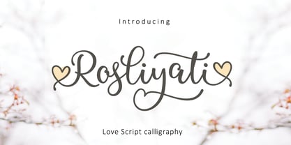 Rosliyati script -font that is fresh, funny, interesting, cute with lots of heart characters and also very beautiful with alternatives, this font looks natural, elegant, and perfect for extraordinary projects. Rosliyati script is suitable for various products such as invitations, product packaging, offers, product design, crafters, labels, photography, watermarks, logos & branding. Everything can be accessed using software that supports Opentype, such as Adobe Indesign, Adobe CS Illustrator, Adobe Photoshop CC, and Corel Draw.
 - Shinano by Hanoded,
$15.00 Shinano is an old province of Japan. Kobayashi Issa (1763 - 1828), a famous Japanese Haiku poet and Buddhist priest, was born here. Together with Bashō he is my favourite Haiku poet. Shinano font was hand made using a Japanese brush pen. At first glance it may look like a messy script, but underneath its rough appearance beats a poetic heart. Comes with some alternates and ligatures and a whole lot of diacritics.
 - JENKINE by Gatype,
$14.00 Jenkine casual and natural written handwritten brush strokes. Letters are made with brush on paper then scanned carefully drawn into vector format. This typeface is ideal for use in any professional project, such as blog titles, posters, wedding elements, t-shirts, clothing, book covers, business cards, greeting cards, branding, merchandise etc. Enjoy Jenkine fonts with passion and love for your awesome projects to make your projects quality!
 - VVDS The Bimbo by Vintage Voyage Design Supply,
$10.00 If you need a simple way to get hand written / drawing style graphics – VVDS The BIMBO Collection is for you. Absolutely hand drawn lettering style collection gives you many styles for your graphic projects. Easy way to give your poster, or gift cards, or gift paper or something else a hand touch for really short time. 25 typefaces, 248 hand drawn graphics and 124 catchwords.
 - Dogfight by Tigade Std,
$8.00 Dogfight is a hand-crafted brush font which created from scratch by using a brush pen on a paper. It is not too sharp with sharp edges, but rather with a softer rounded shape. It is suitable as a display font for printed or digital products. Mainly as an advertisement or video production. It comes with Regular and Italic Multilingual characters AllCaps Ligatures Alternate characters
 - EFCO Brookshire by Ephemera Fonts,
$45.00 Brookshire was inspired by the lettering seen on the Almanac ephemera paper when I visited the flea market in France. The result is a lovely piece of neo-Victorian fun that brings back the joy of 19th-century shop signs and flamboyant design ethos. Brookshire is ideal for poster work and signage, or anywhere that you want to bring back the joy of high Victorian design ethos.
 - Alpha by CTR,
$30.00 The initial designs for this font first came from the idea of creating a dynamic and visually appealing typeface just by using squares so throughout the development stages I had restricted myself to just the use of squared paper. The hardest thing that I found was overcoming the problems regarding letter forms that have diagonal lines and therefore defer from the ongoing style of the typeface.
 - Linotype Cerny by Linotype,
$29.99Linotype Cerny is part of the Take Type Library, selected from the contestants of Linotype’s International Digital Type Design Contests of 1994 and 1997. Dutch artist Mark van Wageningen designed an alphabet consisting exclusively of capital letters. The font’s most distinguishing characteristic is its irregular outer contour, almost as though they were ripped out of paper. Linotype Cerny is intended exclusively for headlines in larger point sizes. - Massiva GrotesQ by Dawnland,
$13.00 A massive grotesque in four weights + obliques! Perfect for your massive poster or news paper headlines as well as your massive text chunks. The four weights elegantly complete each other as the obliques add tension to your work. Each font consists of a 241 glyph character set with beautiful ligatures for ff ffi ffl fi fl st ts es tt ST ET TT and ES.
 - Svolta by Stefano Giliberti,
$15.00 SVOLTA is a font family designed by Stefano Giliberti — each character handwritten on paper to form something truly unreplicable, a reinterpretation and celebration of blackletter Germanic typefaces. But its uniqueness goes beyond form: SVOLTA integrates in its styles PARTITA 1990, a pixel typeface aiming in the opposite direction of time, the present and future, resulting in a duo that adds personality and depth to your designs.
 - Attention Getters JNL by Jeff Levine,
$29.00In the days of metal type or paper clip art, spot illustrations with stock phrases were used to embellish ads and fliers in order to grab the attention of potential customers. The convenience of digital type puts art like this at a designer's fingertips. Attention Getters JNL contains fifty-two such ad phrases, certain to add a nostalgic, yet functional appeal to your printed or online piece. - BMF Brohan Black by BuyMyFonts,
$25.00Brohan Black is a monospaced font: each character has the width of the piece of paper from which it was cut with a pair of scissors. The loss is minimal, as the counters are as small as possible while still retaining maximum legibilty. To save ink, print negative. Recommended for cement companies, post-industrial record sleeves and heavy poetry. Also great for temporary signage. - Frozen Memory by Hanoded,
$15.00 Frozen Memory is a heavy-boned cartoon display font. Even though it was completely made by hand (using a roller ball pen and some quality paper), it has a clean look, crisp lines and generous curves. Frozen Memory comes in three distinct styles, helping you to create versatile designs. Frozen Memory urges you to eat more ice-cream, but just beware of that brain freeze!
 - Dassitzt by Linotype,
$29.99Dassitzt is a family of two typefaces, Dassitzt LT Typos and Dassitzt LT Pictos. Dassitzt LT Typos is a heavy industrial-grunge display face, with dark, even letters that appear cut out of black paper or iron. Dassitzt LT Pictos is a whimsical collection of pictograms. The figures in this font are black silhouettes that show a minimum amount of detail, but a maximum amount of expression. - Ramkoers by Hanoded,
$10.00 Ramkoers means ‘Collision Course’ in Dutch. I made this font with a bit of salvaged plastic and thick black paint. I carved a wedge out of the plastic and used it as a spatula to apply the paint to the paper. Ramkoers is a bit of a rough & ready grunge font with some jagged edges and wobbly stems. Comes with an abundance of diacritics.
 - DF A Bit by Dutchfonts,
$33.00 DF A Bit is made for screen display which is the final form of a lot of information nowadays. But there is more in this BIT... in display sizes it unfolds it’s skin, a beautiful ink on paper structure caused by the letterpress printing of copper lines. Analogue BITS indeed. With all the wealth of the ‘non perfect’, to please the eye and to satisfy the mind.
 - Cut Along by Hanoded,
$15.00 I made Cut Along by stealing some red cardboard from my kids (red, because they didn’t have any black…) and cutting out the glyphs one by one with a pair of scissors. I then pasted the shapes onto white paper, scanned them and turned them into a font. Cut Along is a very nice font for ads, book covers, packaging and children’s books. Enjoy!
 - Note by Little Fonts,
$15.00 Note is a fresh and dynamic hand writing font. Inspired by graffitti and street style writing, executed using a flat tip calligraphy pen. The typeface is hand drawn on paper, then the resulting alphabets and punctuation scanned in and rendered to create the font. The resulting characters are bold yet energetic with an obvious human touch creating an interesting and original hand drawn typeface.
 - Goodnight Thahira by Josstype,
$13.00 hahira A hand brush to write a script, first drawn on paper and then remastered on a computer to provide free brush smooth flowing script, which looks perfectly on an image or as a classy logo. Thahira - A comic script font super clean, simple and elegant work of producing stand-alone pieces sophisticated typography or in combination with a script font. Mailinfo: joelpopon@gmail.com
 - Asian Sumi by Mvmet,
$15.00 Asian Sumi is a beautiful and playful sumi brush ink on paper handmade font. You can use it for anything ranging from t-shirts, book designs, and greeting cards to stickers and posters, packaging designs or anything that needs a casual touch, it will be your perfect font to pick. Fall in love with its incredibly versatile style, and use it to create lovely designs!
 - Punch Tape JNL by Jeff Levine,
$29.00 Punch Tape JNL emulates the old-style pin-punched paper tapes that were used in everything from ticker tapes to moving electronic signage to early digital typesetting equipment. Pin punch characters were also used in the early days of banking as a secure way of canceling a check so that it was rendered useless if re-submitted. In this version, the "dots" are square rather than round.
 - Yan 333 Pro by JY&A,
$45.00 JY&A’s most distinctive calligraphic font, Yan Series 333 is usable at all resolutions and remains legible. Even though it has a strong calligraphic influence, the Yan Series is ideal for text settings that have to appear special. Designed by Jack Yan, the family was developed between 1987 and 1993. Yan studied the effect of a nylon-tip, rather than steel-nib, pen on paper.
 - Gutenberg C by Alter Littera,
$25.00 A slightly roughened version of The Oldtype “Gutenberg B” Font, simulating irregularities and ink spreads associated with old metal types, papers and parchments. Apart from its rough appearance, which will be clearly noticed only at large point sizes, the font is identical to The Oldtype “Gutenberg B” Font. Specimen, detailed character map, OpenType features, and font samples available at Alter Littera’s The Oldtype “Gutenberg C” Font Page.
 - Murisa Paula by Murisa Studio,
$10.00 Do you want a unique and attractive display font?. Murisa Paula is the answer. This very attractive font will make you happy and excited. It has a unique shape with the edges of the letters torn to shreds, like torn paper. This type of lettering will make it easier for you to design a display product with a cracked effect or something else. Get it now.
 - Milonguita by Sudtipos,
$49.00 Milonga is one of the most characteristic dances of Argentina and it is usually compared to Tango. However, couples perform shorter and more energetic movements when dancing to the beat of Milonga. In addition, while Tango evokes the idea of nostalgia and reminiscence, Milonga conjures up more light-hearted memories in people's minds. Milonguita was designed so that readers can experience the passion and spontaneity of this dancing style through words. Users can play with the upwards and downwards patterns of the letters creating different images and textures and thus, making texts flow smoothly and naturally, just as a warm piece of Milonga would. The irregularity of the strokes conveys emotions and establishes a bond between the font and the sensitivity of the writer. The result will be a typographic combination of elegance, energy and rhythm which will surely reach the heart of the reader. Milonguita comes in all font formats, including a Opentype version plenty of built-in alternates and a simulated random code. Digitized by Alejandro Paul.
 - Celestina by Piñata,
$- Celestina is the lively spirit, just like drops of ink on a piece of paper or clouds in the sky. The same spirit is maintained by the rounded letters of the script and by the characters' small whorls. Celestina has come to life as a result of a peculiar game in which I tried to bring together the letters with different tempers with help of calligraphic instruments. I wanted to create a very light and playful font which would look like a quick inscription on a piece of paper, but would also be easy to read in a text array. As I was working on the font, my cat Celestina has been very interested in the brush painting process, and I had no other option but to name the font after her! Celestina works perfect for both Moomins stories and personal blogs, as well as for the design of hand-made things, and even just then when you want to put yourself into a good mood!
 - Gloria Monoline by IM Studio,
$15.00 Gloria Monoline is a text serif with an editorial focus designed by Ikhsan Maulana. The idea for a typography job came from a design school letter-making exercise: Get a pair of scissors and some large sheets of paper, and start cutting. The resulting letters and the act of cutting them from paper inform the type design process, resulting in strong, simple shapes and open, inviting textures. The tone is crisp and straightforward. The classic letterforms, with a playful touch, give the design a personality that is both practical and spontaneous. The text weight is capable of adjusting copies at various sizes to print and render clearly on screen. Its lightest and heaviest weights work best at display sizes. Great care has been taken to save typists time with OpenType features including contextual punctuation and symbols to match case-sensitive, lower-case, and all-caps settings, as well as set images set for each use.
 - Bennet Display by Lipton Letter Design,
$29.00 Bennet, Richard Lipton’s spirited serif superfamily, was inspired by Moth Design’s logotype and stationery system for the North Bennet Street School in Boston. Initially modest in concept, Bennet grew to an expansive suite of 96 fonts tuned for editorial use. The three widths of Bennet’s Display and Banner sizes—Regular, Condensed, and Extra Condensed—are ideal for precise fitting of newspaper and magazine headlines. Lipton developed graded text styles for the series, offering users precise variations to help compensate for varying degrees of ink spread on different types of paper stock during the printing process. For example, because of ink absorption, the lightest grade—Bennet Text One—printed on low-quality newsprint stock will have the same gray value as the darkest grade—Bennet Text Four—on superior coated paper. (Bennet Text Two is the default grade and offered here.) Bennet also provides for a stellar reading experience in digital media, its carefully considered details vibrant yet legible on-screen.
 - MVB Dovetail by MVB,
$79.00 MVB Dovetail is an editorially focused text serif designed by David Sudweeks. The working idea for the typeface came from a design school letter-making exercise: Take a pair of scissors and a few large sheets of paper, and start cutting. The resulting letters and the action itself of cutting them out of paper informed the type design process, producing strong, simple shapes and an open, inviting texture. Dovetail’s tone is crisp and straightforward. Its classic letterforms, set off with a touch of playfulness, give the design both a practical and spontaneous personality. The text weights capably set copy at a variety of sizes for print and render crisply on screen. Its lightest and heaviest weights perform best at display sizes. Care has been taken to save the typographer’s time with OpenType features including contextual punctuation and symbols to fit mixed-case, small-caps, and all-caps settings, as well as figure sets tuned to each use.
 - Bennet Text by Lipton Letter Design,
$29.00 Bennet, Richard Lipton’s spirited serif superfamily, was inspired by Moth Design’s logotype and stationery system for the North Bennet Street School in Boston. Initially modest in concept, Bennet grew to an expansive suite of 96 fonts tuned for editorial use. The three widths of Bennet’s Display and Banner sizes—Regular, Condensed, and Extra Condensed—are ideal for precise fitting of newspaper and magazine headlines. Lipton developed graded text styles for the series, offering users precise variations to help compensate for varying degrees of ink spread on different types of paper stock during the printing process. For example, because of ink absorption, the lightest grade—Bennet Text One—printed on low-quality newsprint stock will have the same gray value as the darkest grade—Bennet Text Four—on superior coated paper. (Bennet Text Two is the default grade and offered here. Additional grades are available upon request.) Bennet also provides for a stellar reading experience in digital media, its carefully considered details vibrant yet legible on-screen.
 - Solar by Andinistas,
$34.00 Solar is a font family designed by Carlos Fabian Carmargo G. Its members, together or separate, can be used in packaging, posters, cards, invitations and logos that need expressive letters with craft features. First, a set of arbitrary ideas were designed on rough paper, and through changes five styles resulted to mix and compose bright words and phrases. Solar Script comes from crossbreeding and the collusion of primitive visceral strokes and calligraphy on textured paper. This way its letters were planned for empty and full areas deteriorated sometimes simulating irregular ink clots. Therefore, the simulate trajectories with bold brushstrokes made that it works especially well in sizes larger than 12 points. Its rhythmic vitality and energy give personality, reflected in uninterrupted rapid and logical talics with strokes. Solar Words has more than 115 words unstable and inclined. Solar Dingbats has more than 100 brightness generating drawings, Solar Sans and Serif are capitals combined with other members of the family.
 - ITC Kendo by ITC,
$29.99 ITC Kendo is the work of British designer Phill Grimshaw, suggesting the dash and verve of quick, sketchy calligraphy, complete with splatters of ink. Grimshaw says he worked deliberately against his own habits to create the forms, drawing the letters with slow deliberation" and a pointed pen. He overloaded the pen with ink and drew on rough paper, "applying a lot of pressure at the beginning of a stroke and easing off towards the terminals. Accidental splashes occurred frequently owing to the nib catching the 'tooth' of the paper." Those splashes were refined into features which enhance but do not overwhelm the characters and carefully worked so as not to leave an obvious white strip of unsplattered space between lines and letters. The initial capitals can be used alone or combined with the lowercase alphabet, and the font includes a full set of f-ligatures and some extra ligatures as well as decorative elements."
 - Bennet Banner by Lipton Letter Design,
$29.00 Bennet, Richard Lipton’s spirited serif superfamily, was inspired by Moth Design’s logotype and stationery system for the North Bennet Street School in Boston. Initially modest in concept, Bennet grew to an expansive suite of 96 fonts tuned for editorial use. The three widths of Bennet’s Display and Banner sizes—Regular, Condensed, and Extra Condensed—are ideal for precise fitting of newspaper and magazine headlines. Lipton developed graded text styles for the series, offering users precise variations to help compensate for varying degrees of ink spread on different types of paper stock during the printing process. For example, because of ink absorption, the lightest grade—Bennet Text One—printed on low-quality newsprint stock will have the same gray value as the darkest grade—Bennet Text Four—on superior coated paper. (Bennet Text Two is the default grade and offered here.) Bennet also provides for a stellar reading experience in digital media, its carefully considered details vibrant yet legible on-screen.
 - Kings of Pacifica - Personal use only

- Pink - Unknown license

- Americana by Bitstream,
$29.99 An original design by Richard Isbell for ATF; in exaggerating the tapered stroke introduced eleven years earlier in Hermann Zapf’s Optima, Isbell created the first flareserif to achieve popularity in the United States.

