10,000 search results
(0.03 seconds)
- Soccerboy by Chank,
$99.00 1977 was a good year for soccer. Attendance for the North American Soccer League (NASL) grew 33%, to 13,000 per game. Brazillian soccer legend Pelé played his final match, kicking for both the New York Cosmos and Santos of Brazil. And a soccerboy named Charlie was crowned with the nickname Chanky. In honor of his soccer hero Pelé, Charlie insisted the neighbor kids call him Chelé. They laughed at him and called him Chanky after Spanky from the Little Rascals. As he grew into his manhood, he became Chank the internationally renowned font designer. Chank created this font Soccerboy, as filtered through the artistic eyes of his 1977 childhood. It's a tri-line font, hand-drawn in Chank's signature cartoon whimsy. Soccerboy encourages play with color and alternate characters. Create coloring effects yourself using layers and the magic wand and paint bucket tools in Adobe Photoshop or Illustrator.
 - VVDS Hickory Dickory by Vintage Voyage Design Supply,
$15.00 Glad to introducing you Hickory Dickory - a stylish serif with an eighties mood. I really love this old advertising from those magazines. It was a new era of minimalism in photography and typographic design. The playful, stylish and modern. This font will fit perfectly not only this type of design - you may use the alternates characters and get a really playful typography at your project. Hickory Dickory has a lot of alternates, some letters have them up to 17. More than 620 glyphs total! Also, there is a true italic for perfect pairing. Normal & True Italic A lot of stylistic alternates 620+ Glyphs total Decimal and fraction figures
 - Dirty Numbers by Coniglio Type,
$9.00 DIRTY NUMBERS LTD At $1 US dollar each: Dirty Numbers - Provides (9) individual sets of unique numerals [0 thru 9] and nothing else. That is all. Very limited character sets integrated into one font by Coniglio Type -and- a very inexpensive set of marketing numerals. They are revivals from type crafted images and they are monospaced, easy to use and to kern the way you wish. You will have to review your glyphs to locate them and they were pasted in the most logical and accessible places and made economical to you for your special design and crafts needs. Dirty Numbers by Joseph Coniglio, Coniglio Type 2021.
 - Midon by Khoir,
$15.00 Midon font type is a thick serif with an elegant appearance. Having a personality that dares to create feelings and expressions that are firm but gentle so that they can be used as work tools so that the communication conveyed will easily feel beautiful. Midon Uppercase 75+ Language Alternate & Ligature So what are you waiting for? immediately purchase this font, feel free to comment, or send me my PM or email at khoirtypework@gmail.com Thank you for seeing
 - 1815 Waterloo by GLC,
$38.00 This script font was inspired by a few manuscripts and letters written by French representatives or ministers after the defeat of Napoleon at Waterloo. It is an attempt to offer a typical handwritten script from this period. This font can be used variously as website titles, in the design of posters, fliers and greeting cards, as well as for menus, certificates and letters as a very decorative, elegant and unusual font. This font supports large sizes as well as small ones, remaining clear and easy to read.
 - American Spirit STF by Altered Ego,
$30.00American Spirit STF is a glorious collection of contemporary patriotic symbols: US Flags (traditional and contemporary), a variety of stars, eagles, torches, and combinations of them all. Designed for print and web, this collection is useful for embellishing your designs with a subtle (or not-so-subtle) patriotic touch. The flags have been designed for easy ungrouping in a drawing program, in order to colorize the union and stripes. And as a special feature, American Spirit™ splits the flags into two characters (the union and the stripes) that can be separately colored and will kern together based on the character chosen. Suggestions for doing this are included in every package. This versatile collection also contains a special contemporary version of the US Flag, with rounded corners on the union and stripes, and a five-pointed asterisk-like shape as the stars. (This allows the stars to appear as stars at smaller sizes.) Show your American Spirit! Sign up today for this contemporary collection of patriotic symbols! - Thalia by profonts,
$41.99 Thalia is a wonderful Artdeco typeface design reminiscent of 1900. Very likely, it was originally designed at that time. Unger redesigned the typeface based on old prints, completed the character set and expanded the typeface to cover the full Latin glyph set. Thalia is perfect for anything about theater, such as posters, programs, etc.
 - Dining Out JNL by Jeff Levine,
$29.00 A 1940s ad flier for the Los Angeles restaurant “Lucca Paris Inn” had its name hand lettered at the top of the page in a condensed Art Deco slab serif with some stylized characters. Given a more uniform look, the end result became Dining Out JNL and is available in both regular and oblique versions.
 - Quite Delicious by Bogstav,
$17.00 "It is quite delicious" - a quote by an English speaking kid, aged 3 in the kindergarten in which I work. Not only is that a very fine way of expressing your self (and remarkable at the age of 3!) But "Quite Delicious" also appear in the song "Why can't I be you" by The Cure.
 - Yugee Techno Sans by Pmfonts,
$10.00 Yugee Techno Sans are the fonts inspired by the pace of growth of our current technology. Created in a way that it works as display text as well as paragraph text. The fonts looks great at all sizes and with different spacing. The font family inlcludes 4 different font weights that suits your needs.
 - Million Orcids by Four Lines Std,
$15.00 Million Orchids Font: Where Script Meets Blooming Brilliance! Get ready to unleash your creativity and watch your designs blossom with this delightful script font. It's like having a million orchids at your fingertips, adding a touch of elegance and charm to every project. Let your imagination take root and let the million orchids font bring your designs to life!
 - Wrought by Jon Cartagena,
$10.00 Wrought is a bold geometric display font by Jon Cartagena. It's purpose is to give a rugged, heavy feeling to your designs. Wrought is available in four weights: Thin, Light, Regular, and Bold. Each character is carefully designed to be vertically aligned at the center. This gives Wrought a unique flair, while promoting a harmonious look through each word.
 - Diazy by Salamahtype,
$17.00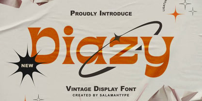 Diazy is a unique font with a modern or classic style, its beautiful shape makes the letters beautiful to look at. This font is perfect for branding projects, film/movie projects, logo designs, social media, advertising, product packaging, product designs, labels, photography, watermarks, invitations, stationery, or anything else where you want to add a touch of vintage class.
 - Snow Crystals 2 by Deniart Systems,
$20.00 Snow, snow and more snow! Deniart's Snow Crystals 2 typeface is an original design featuring 62 unique symbols. These charming snow crystals are sure to add elegance to all your winter designs - the set includes traditional style snow crystals. This font comes with a PDF guide to put all these special characters right at your fingertips!
 - Bantero by Viaction Type.Co,
$18.00 Bantero Typeface is a display font with a vintage theme and a victorian style. It’s perfect for vintage-themed projects. The font pack includes a bonus of 6 vintage ornaments which are very easy to edit. Font features include: Bantero File Multilingual Support. Punctuation & Symbol. Get this cool & interesting font collection right away at an affordable price.
 - Groove Town Sans by Dino Feed,
$20.00 Fonts should be living, breathing organisms. Dino Feed wanted to see a font with character, so we created Groove Town Sans. This hand-drawn font has 122 glyphs and is made for Latin-based languages. Play around with the font and make it original; we like to keep everything lowercase. See more @dinofeed on Instagram or at dinofeed.com.
 - Butterfly Ball by Hanoded,
$15.00 The Butterfly Ball and the Grasshopper's Feast is a 70's concept album/rock opera by Deep Purple's Roger Glover. The music video to Love Is All, featuring a lute playing frog in a cape, must be one of the best videos ever made. At least, I believe so. When working on this font, the song popped up in my head (it is still there), so I decided to name this cute, cartoonish font after the album. Butterfly Ball is a fun and happy typeface with rounded glyphs and an uneven baseline. Of course it comes with a hallucinatory range of diacritics.
 - CA Segundo by Cape Arcona Type Foundry,
$29.00 The inspiration for this font came from a wall-writing in Cuba. At first glance we thought: "There is something wrong with the wall-writing." But a closer look revealed, that it just mixed up different stroke-styles. That "feature" became the designing principle behind CA Segundo: Round characters like O, U or C are available either with a fat or a thin stroke, whereas other characters with orthogonal lines come in two different styles – uppercase characters emphasize the vertical strokes, while lower cases emphasize the horizontal strokes. This gives you the opportunity to design just while you type.
 - Copperplate Gothic by Linotype,
$40.99This American original was designed in 1901 by Frederic W. Goudy for the American Type Founders in Jersey City. Copperplate Gothic is an all caps font which looks like a sans serif at first glance. But closer examination reveals tiny, pointy serifs which almost seem to round off the letters. Designers rely on this font’s lofty and sublime impression and it is often seen in advertisements, but it has also made a place for itself in private and business correspondence and corporate design. The AB and BC designations in the style names refer to the relative sizes of the capitals and small capitals. - Sandglow by Burntilldead,
$14.00 Sandglow is a fancy hand lettered script typeface with a clear style, good mood, and dramatic movement. It allows you to create beautiful hand-made typography in an instant. It’s suitable for headlines, logotype, editorial design, branding, letterhead, poster, apparel design, product packaging, label or anything that need handlettering style. Comes with many variations on each character, including uppercase, lowercase, numerals & punctuation, stylistic styles, ligatures, discretionary ligatures, and titling. You will also discover extras swash added to give that finishing touch to your texts. Available in OTF and TTF format, Support Opentype features, Multilingual languages and PUA unencoded.
 - Slim Nouveau JNL by Jeff Levine,
$29.00 At times, one source of inspiration can generate more than one idea. This was the case with the 1918 sheet music for the song "You're Still an Old Sweetheart of Mine". The cover displays the title in a hand lettered narrow Art Nouveau Sans serif style. A number of characters were revised and the overall font was compressed by 25% to create a whole new look and feel. The end result became Slim Nouveau JNL. This was the same material used to originally model Easy Money JNL, which is truer to the original lettering design. The font is available in both regular and oblique versions.
 - Sequel Rounded by OGJ Type Design,
$35.00 Sequel Rounded is a post-Max Bill font, developed in close cooperation with the Max Bill Georges Vantongerloo foundation in Switzerland. MAX BILL Last universal scholar, most important design teacher of the 20th century: There are superlatives, always very enthusiastic, when the importance of Max Bill is discussed. The trained silversmith studied at the Bauhaus, with personalities such as Josef Albers, Paul Klee and Oskar Schlemmer. He worked as an architect, later as sculptor and designer.
 - Modern West JNL by Jeff Levine,
$29.00 Presenting… a Western style alphabet from the 1960 edition of Samuel Welo’s “Studio Handbook for Artists and Advertisers”… Extra bold, featuring slab serifs and concave corners, this type style could easily have been found on building signage in the Old West… but in redrawing it digitally, it’s been named Modern West JNL because at one time, this would have been considered a modern style of lettering. Modern West JNL is available in both regular and oblique versions.
 - Deconstructed JNL by Jeff Levine,
$29.00 Deconstructed JNL is another set of rubber stamp alphabet letters and numbers from a 1930s toy printing set. The original typeface of this set is Cheltenham Open. The stamps were printed out and scanned, creating this limited-character font with dual characteristics. At small point sizes it replicates inked rubber stamp impressions, but in larger format it shows angular lines and erratic character shapes as if made from cut paper or lettering that was intentionally made to look damaged.
 - FractalCaps by Haiku Monkey,
$10.00FractalCaps was inspired by the self-similar nature of fractal geometry. It's a strictly decorative font, without accented characters. FractalCaps shines at large point sizes, and would be a good choice for wild and wooly posters. - Kingthings Serifique Pro by CheapProFonts,
$10.00 This is what you get when you mix monoline rounded letters with some bracketed serifs and finish it off with a sprinkle of ornamental appendages. The result is very readable, rather original and quite charming. I have fixed some inconsistencies in serif designs across the weights, cleaned up the serif connections - and added a fourth weight. But I have kept all the wonky curves and slightly differing stroke thicknesses, as they are so integral to the charm. Kevin King says: "I guess all type designers at some point think 'Well, I'll just have a go at a standard text face...' There is a long story here somewhere, suffice it to say that I started with the thinnest version - typical. I wanted to make a standard serif text face - until I saw it in print and thought "Yuk! it looks like everything else!" - still does really but with twiddles and pooneys..." If you find the "twiddles & pooneys" too much you can tone them down with the OpenType Stylistic Alternate feature (which will make sure they don't appear on three consecutive letters) or remove them completely with the OpenType Swash feature. ALL fonts from CheapProFonts have very extensive language support: They contain some unusual diacritic letters (some of which are contained in the Latin Extended-B Unicode block) supporting: Cornish, Filipino (Tagalog), Guarani, Luxembourgian, Malagasy, Romanian, Ulithian and Welsh. They also contain all glyphs in the Latin Extended-A Unicode block (which among others cover the Central European and Baltic areas) supporting: Afrikaans, Belarusian (Lacinka), Bosnian, Catalan, Chichewa, Croatian, Czech, Dutch, Esperanto, Greenlandic, Hungarian, Kashubian, Kurdish (Kurmanji), Latvian, Lithuanian, Maltese, Maori, Polish, Saami (Inari), Saami (North), Serbian (latin), Slovak(ian), Slovene, Sorbian (Lower), Sorbian (Upper), Turkish and Turkmen. And they of course contain all the usual "western" glyphs supporting: Albanian, Basque, Breton, Chamorro, Danish, Estonian, Faroese, Finnish, French, Frisian, Galican, German, Icelandic, Indonesian, Irish (Gaelic), Italian, Northern Sotho, Norwegian, Occitan, Portuguese, Rhaeto-Romance, Sami (Lule), Sami (South), Scots (Gaelic), Spanish, Swedish, Tswana, Walloon and Yapese.
 - Verdana by Microsoft Corporation,
$49.00The Verdana™ Family of fonts was created specifically to address the challenges of on-screen display. Designed by world renowned type designer Matthew Carter, and hand-hinted by leading hinting expert, Tom Rickner, these sans serif fonts are unique examples of type design for the computer screen. The generous width and spacing of Verdana's characters is key to the legibility of these fonts on the screen. Despite the quality of the Verdana font family at small sizes it is at higher resolutions that the fonts are best appreciated. In the words of Tom Rickner, ‘My hope now is that these faces will be enjoyed beyond just the computer screen. Although the screen size bitmaps were the most crucial in the production of these fonts [their] uses should not be limited to on screen typography. Character Set: Latin-1, WGL Pan-European (Eastern Europe, Cyrillic, Greek and Turkish). - Verdana Ref by Microsoft Corporation,
$29.00The Verdana™ Family of fonts was created specifically to address the challenges of on-screen display. Designed by world renowned type designer Matthew Carter, and hand-hinted by leading hinting expert, Tom Rickner, these sans serif fonts are unique examples of type design for the computer screen. The generous width and spacing of Verdana's characters is key to the legibility of these fonts on the screen. Despite the quality of the Verdana font family at small sizes it is at higher resolutions that the fonts are best appreciated. In the words of Tom Rickner, ‘My hope now is that these faces will be enjoyed beyond just the computer screen. Although the screen size bitmaps were the most crucial in the production of these fonts [their] uses should not be limited to on screen typography. Character Set: Latin-1, WGL Pan-European (Eastern Europe, Cyrillic, Greek and Turkish). - Advertisers Gothic by HiH,
$12.00 Advertisers Gothic is bold and brash, like the city it comes from, Chicago. It was designed by the accomplished German-American matrix engraver, Robert Wiebking, for the Western Type Foundry in 1917. As its name suggests, it was designed for commercial headliner work, much as Publicity Gothic by Sidney Gaunt for BB&S the year before. See our Publicity Headline. Alternate letters ‘A’ & ‘S’ are provided. The most popular ad words “Free!”, “New!” and “Sale” (with both esses) are provided at an angle for dramatic tension. Advertisers Gothic became quite popular because it was effective. It can work equally well for a flyer advertising a non-profit event as for a magazine product ad. This font refuses to be a wimp. Use it boldly. Advertisers Gothic ML represents a major extension of the original release, with the following changes: 1. A total of 335 glyphs (compare) with added glyphs for the 1250 Central Europe, the 1252 Turkish and the 1257 Baltic Code Pages. 2. Added OpenType GSUB layout features: pnum, ornm, liga, hist & salt ˜ with total 13 lookups. 3. Added 209 kerning pairs. 4. Revised vertical metrics for improved cross-platform line spacing. 5. The most popular ad words “Free!”, “New!” and “Sale” (with both esses) are provided at an angle for dramatic tension The zip package includes two versions of the font at no extra charge. There is an OTF version which is in Open PS (Post Script Type 1) format and a TTF version which is in Open TT (True Type)format. Use whichever works best for your applications.
 - VLNL Vondelpark by VetteLetters,
$35.00 The Vondelpark is the famous Amsterdam city park, 47 hectares stretching out from Leidseplein to the Amstelveenseweg. It was founded in 1864 when a group of well-to-do Amsterdam citizens got together and bought land at the (then) edge of the city centre in order to create a park ‘for riding and strolling’. Designed by architect J.D. Zocher, it opened officially in 1865. The park received its name two years later when a statue of Dutch writer Joost van den Vondel was placed in the park. In the 1960s and 1970s the Vondelpark became a symbol and epicenter of the hippie flower power era. The park was declared a state monument in 1996. Donald DBXL was intrigued by the handmade iron nameplate lettering on the park’s entrance gates, and decided to design VLNL Vondelpark in its glory. The somewhat clumsy iron letters were not revived as is but optimized to turn it into a useful typeface. The all-caps serif with a deliberate constructed feel, contains a Positional Open Type feature that places half circles on the vertical stems, at the beginning and end of a word, to enliven the rhythm.
 - Juicer by Hanoded,
$15.00 We use an old hand juicer at home: a cheap plastic one that we bought a long time ago at a Swedish home appliances and furniture giant. We haven never considered upgrading to an electronic one, as it still works, it doesn’t use electricity and we don’t really use it that often. This font is called Juicer. It was not named after our manual juicer, or any juicer in particular. It was just a word that seemed to fit the font nicely. Juicer font is a handwritten, script-ish kinda font that comes in two great styles and contains a set of double letter ligatures.
 - Sgt Peppers by K-Type,
$20.00 SGT PEPPERS LONELY HEARTS CLUB is a typeface inspired by the capital letters on the bass drum in the Beatles' Sgt Pepper album cover. The original lettering was hand painted by fairground artist Joe Ephgrave during March 1967 in an art deco style he called 'futuristic'. The font completes the uppercase, adds a lowercase, and includes a full complement of over 400 characters. SGT PEPPERS OUTLINE and SGT PEPPERS OUTLINE FILL are two fonts with matching spacing and kerning that can be overlapped for creating bicolor/multicolor effects and faux drums. The Outline and Outline Fill fonts do not contain lowercase characters, instead they comprise two weights of outline capitals as painted on the Sgt Pepper drum. The uppercase letters are in the wider style from around the outer edge of the drum, and the lowercase keys deliver the more condensed 'Lonely Hearts' inline style from the middle of the drum. The uppercase Y has been flipped to produce a more conventionally acceptable character with the thicker diagonal arm on the left. However, Joe Ephgrave's reverse Y (with inline) is included in the Outline fonts at the Section keystroke § (Alt-0167 on Windows). A simplified vector image (mono) of the bass drum without lettering is also included within the Outline fonts at the PlusMinus keystroke ± (Alt-0177 on Windows).
 - ITC Portago by ITC,
$29.99 ITC Portago was designed by Luis Siquot, who admits to a tendency toward unusual typefaces that can be read in text yet also work well in display settings. ITC Portago is a robust alphabet of caps and slightly smaller caps. It is a stencil face, based on the lettering on crates and luggage. Siquot says that his intention drawing Portago was to obtain a neutral, classical, very condensed grotesque stencil shape that is readable in text sizes, showing at the same time the 'movement' produced by the nicked edges. And of course the more obvious rough effect in headline sizes." At small sizes, Portago is best set with slightly looser letterspacing, as capital combinations usually do. Portago includes numerals in both full and small caps proportions.
 - Cell by Type Minds,
$7.50 Cell is a sturdy, geometric typeface with many potential applications. Though it is best suited to display sizes, its construction is simple enough for use in smaller settings. Its octagonal, almost mechanical design is softened by rounded corners. The face is characterized by a single thick stroke in each letter, lending it a unique appearance. It also features an oblique counterpart with several italic-style glyphs. Both members of the family also include small capitals mapped to the Private Use Area. Cell was designed to be at once simple and unique. Its grid-based structure is enhanced by slight adjustments for optical consistency. Glyphs which are normally round instead have 45-degree angles at the corners, sticking to the grid system without losing legibility.
 - Brevier by CAST,
$45.00 Compact sans, ideal for setting long texts in small or very small type sizes: for packaging, instruction booklets, drug information leaflets and anything else that has to be legible at very small sizes. Lean and rhythmical, designed ideally to be used at less than 8 points (Brevier was the old typefounders’ name for 8-point type), Brevier holds up well even under adverse printing conditions. The apparently geometric letterforms hide Renaissance characteristics, the x-height and openings are very generous and the strokes slightly modulated. In order to offset ink spread – which is inevitable when printing very small sizes of type – Brevier has large white spaces between the letters. All internal angles have deep ink traps and many connections have been left open.
 - ATF Poster Gothic by ATF Collection,
$59.00 ATF Poster Gothic is an expansion of a typeface designed in 1934 by Morris Fuller Benton for American Type Founders. The one-weight design was a slightly condensed display companion to Benton’s ubiquitous Bank Gothic family. This new family of aggressively rectilinear headline types expands the design’s possibilities, offering 30 fonts. The all-cap design sports square corners in the counters, creating tension between angular and curved details; this feature, and the generally rectangular shape of the whole alphabet, makes ATF Poster Gothic distinctive on the page or screen, while its relationship to Bank Gothic makes it seem somehow familiar. Vertical strokes on the C, G, J, and S, as well as on several of the numerals, are cut off at an angle, which suggest the curves those strokes might typically display if the characters were less boxy in design and more along the lines of late-19th-century headline faces. Certain weights also recall the style of lettering used on athletic team jerseys, television crime dramas, action & adventure movie titles, and engraved stationery. With three widths and five weights, ATF Poster Gothic is distinctive and versatile at the same time. The full family is also available in a “Round” version, with corners subtly rounded for a softer, more “printed” feel.
 - American Auto by Miller Type Foundry,
$26.99 Hot Dogs, Apple Pie, Baseball and great TYPOGRAPHY are deeply rooted in American culture. American Auto is a Type Family that embodies that culture visually. It joins a robust workhorse sans with a playful script that brings you back to 70+ years ago, while at the same time remaining as contemporary as any new 2019 design. This unique pair work together in harmony to create wonderful designs for a variety of uses. From book covers to posters, web sites to apps, American Auto is an excellent choice to create striking designs that stand out from the crowd! American Auto also features many Opentype Features such as: Alternate Characters, Initial & Final Forms, Contextual Alternates, Old Style Figures, Lining Figures, Numerators & Denominators, Fractions, and more! This typeface has really been designed to meet any challenge that a designer can throw at it!
 - Eleganto Sans by Ardyanatypes,
$10.00 A Fashionable Modern Sans Serif with special alternative letters and multilingual support for elegant, upscale, chic, and classy branding designs Look at that curve shape as a sexy hip and legs walk out! This character set makes your designs more brave, eccentric, and fascinating Comes out with 6 weight as your wish for any needs. y es tan perfecto! Superfit with your design moods as beauty care, boutique, fashion sale promotion, villas, restaurants, and much more where your design style goes by Of course, the ligatures will make it all double perfects, be ready! this is the time to have all that ELEGANTO style nos vemos, mi amor A guide to accessing all alternatives can be read at: http://adobe.ly/1m1fn4Y Features: A – Z Character Set a – z Characters set Numerals & Punctuations (OpenType Standard) Multilingual Thank you and have a nice day
 - Honest Punch by Sarid Ezra,
$15.00 Honest Punch is a bold and strong quotable font that you can use for any purposes. This font is very suitable for tagline and branding. With readability and clear looks, this font is perfect for quote. Honest Punch contains unique lowercase and uppercase that you can use at the same times in a word that will make your design more attractive. This font also contains ligature, underline, and support multilingual.
 - Gluon by Harvester Type,
$10.00 Gluon is a font that is perfect for headlines, logos, posters, and much more. This font combines the minimalism, the futurism and aesthetics. We wanted you to feel the cosmos and its beauty when you look at the font. Three weights will help you choose the perfect combination with your design. Initially, the font was developed for the company's logo, but later the idea was slightly revised. The idea of the font is to convey the spirit of the future, but leave the beauty that we are used to seeing. The design was developed by Eugene Bunin and Beginskaya Christine.