5,538 search results
(0.036 seconds)
- Gothic Story by Mvmet,
$10.00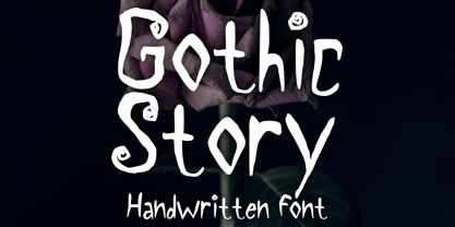 Gothic Story is a kid-friendly gothic handwritten display font, inspired by 90s gothic movies. It will be perfect for your gothic and Halloween-themed needs! You can use it for anything ranging from t-shirts and clothing, to your gothic book designs, Halloween party needs, greeting cards, stickers, posters, banners, or anything that needs a cool touch. Try it to create fabulous designs and feel the gothic and Halloween vibes with it!
 - P49 by dn.type,
$25.00 P—49 is a geometric, unicase sans-serif typeface inspired by the angular patterns found in modern suspension bridges. Each letter is constructed on a grid made up of 90° and 45° angles, drawn from the steel trusses supporting the imposing vertical towers of suspension bridges. Every letter, number and punctuation mark strictly follows the grid creating a uniform, contemporary industrial feel to the typeface making it ideal for display use in large point sizes.
 - ITC Static by ITC,
$29.99Static looks almost like it was stamped on paper: the black color is not evenly distributed and the background comes through the letters and consciously irregular forms reinforce the effect. The characters do not all have the same height, nor do they stand straight and regularly on the base line. Static is a robust font with bold, rounded serifs and is best used for headlines and short texts in point sizes of 12 and larger. - Soapy by PintassilgoPrints,
$20.00 Soapy is a decorative font family, naturally scented and dermatologically tested. With extended language coverage, Soapy fonts are all-caps with 2 design options for each letter. There are also stylistic alternates with bouncy baselines – simply turn on the feature to instantly put your words to float. Or to dance, depending on your point of view. Stack styles for easily add colors to your compositions. Put a smile in your headline! Get Soapy!
 - Bezura by Adam B. Ford,
$14.00 Bezura is a font designed with an emphasis on minimal nodes. All bezier curves in this font have reference points on 90° or 45°. All corners have a smooth curve to them. It would probably work great when used in vinyl-cutting applications on signage. While it has a very methodical construction, there is enough sway in the font to give it a loose feel for professional projects with an unprofessional feel.
 - Linotype Down Town by Linotype,
$29.99Linotype Down Town is part of the Take Type Library, chosen from the contestants of Linotype’s International Digital Type Design Contests of 1994 and 1997. The cheerful character of this fun font from German designer Critzler is perfect for comics or posters. The figures dance across the base line, swinging between thick and thin, big and small. Linotype Down Town is intended exclusively for headlines and short texts in at least 18 point. - PR Swirlies 05 by PR Fonts,
$10.50 Suitable for separating paragraphs, or framing text, this set of swirlies ornaments is drawn with a pointed brush, for a higher contrast appearance than swirlies 1 , 2, and 4. It also has a companion member, with a rough finish, called “Sand Drift”, suitable for natural, earthy subject matter. “Sand Drift” combines well with the following PR Fonts Items: Bramble Wood 2, Bramble Wood 1, Cauldron, Swirlies 1 Sand Drift, Hallow Doodles 1, Hallow Doodles 2.
 - P22 Festiva by IHOF,
$29.95 Festiva is based on lettering found on a 1960s kitchen appliance catalog. It evokes ’60s TV and pop culture while still having a contemporary feel. The fun exuberant flavor of this face is perfect for parties and celebrations. The letters dance across the baseline and the lower case wants to be an upper case but just can’t quite make it. P22 Festiva Regular includes a full unicode European Character set (Western, CE, Turkish, Romanian, etc).
 - Mozziano by Mostardesign,
$15.00 Created in 2010 by Olivier Gourvat, Mozziano is an elegant cross between geometric and round shapes. Its post-retro style opposes also fine and thick lines. This font can be used for very short texts however it is particularly effective for headlines in larger point sizes so that its details are emphasized. Mozziano best used in experimental designs. Mozziano contain an extensive character set that includes support for Central and Eastern European languages.
 - Mechanikschrift by Victory Type,
$12.00Mechanikschrift, roughly German for “mechanical writing”, is a typeface from Noah Rothschild and Victory Type. The aesthetic of this font is just what its name points towards: machine-like structure with a German flare. Minimalism is often associated with German design, and Mechanikschrift is a minimalist typeface. Furthermore, the designs of the characters, outside of the general theme of squared-off corners and angular appearance, are related to Herbert Bayer’s work at the Bauhaus. - Siabella Script by Dora Typefoundry,
$15.00 Introducing the charming Modern Siabella Script type of calligraphy inspired by love and joy! Siabella Script with various start and end swash, I hope you are interested in beautiful and aesthetic fonts to perfect your extraordinary project. This font can be used easily and simply because there are many features on in it to contain a complete set of lowercase and uppercase letters, various kinds punctuation marks, numbers, and multilingual support. The font also contains several binders and Stylistic Sets alternative styles for those of you who have software which is able to work OpenType (Photoshop / Illustrator / InDesign). Siabella Script is suitable for the market design developed today, this font has a model trendy, natural and soft, with this font you can use opportunities at every moment from one extraordinary way to highlight the celebration your best party, because this font will be a support for the purposes such as wedding invitations, parties, graduations, birthdays, meetings, and more Please send a message if you have questions. Thank you !
 - DeBorstel Brush Pro by Ingo,
$49.00 A personalized cursive written with the pointed brush The strange name of this font means nothing other than ”brush,“ but only the Dutch understand it. The typeface is spirited, amusing and flashy. I made the handwritten original of DeBorstel Brush quickly and without interruption with a pointed brush. In the capitals, DeBorstel Brush appears to be almost too balanced for handwriting. In contrast, the lower case letters are intentionally very individual and uneven. A bit more life is added to the typeface with ligatures activated which are constructed with alternative letter forms — and as a result, a number of problematic letter-combinations are improved. And if this typeface is still not lively enough for you, the additional alternative character forms a e g i j l n o s t u z are available with the Open Type-Function ”Discretional Ligatures“. DeBorstel Brush is suitable for all European languages. It includes ”Unicode Latin Extended-A,“ for Central and Eastern Europe incl. Turkish, and even Cyrillic and Greek, too.
 - Linotype Mega by Linotype,
$29.00Linotype Mega is part of the Take Type Library, chosen from the entries of the Linotype-sponsored International Digital Type Design Contests of 1994 and 1997. The fun schrift of German designer Till F. Teenck is available in three weights whose names are word plays in themselves. Mega in (which we hope the font will be) contains relatively light, somewhat irregularly-drawn characters which look as though they were printed by hand and the characters are set rather far apart from each other. This weight is good for short and middle length texts in point sizes of 10 and larger. Mega normal is anything but. The characters are the outline forms of Mega in and their larger width reduces the distance between them. This weight is generally a headline font. Mega out is a very heavy weight and is the filled-in version of Mega normal. The characters flow into each other and look almost like silhouettes. The reduced legibility makes this font suitable exclusively for headlines in larger point sizes. - Switched On by Type Innovations,
$39.00 Switched On and Switched Off where two fonts developed by placing points on a pre-defined square grid template. The experiment was to explore all the variations possible by just using straight connecting lines on a grid. I stumbled on the final concept, almost accidentally, and was amazed by the numerous possibilities. Both designs where created to work together. By adjusting the stroke and inline proportions between the two fonts, I was able to achieve a good overall color balance between 'Switched On' (dark letters on a light background), and the 'Switched Off' design as a knockout treatment (light letters on a dark background). Used in this way, both fonts visually appear similar in overall weight and proportion. They harmonize well together. Used separately, they make for some interesting visual effects and headline treatments. The fonts are best used at large point sizes, but they are still legible in a variety of smaller sizes. I think that by experimenting with these two fonts one can achieve some stunning visual effects. Explore and have fun.
 - De Fonte Plus by Ingo,
$39.00 A variation of ”Helvetica according to the blur principle.“ The underlying typeface is ”Helvetica“, the only true ”run-of-the-mill“ typeface of the twentieth century. The distortion principle used simulates the photographic effect of halation and/or overexposure. The light weight, »DeFonte Léger«, nearly breaks on the thin points, whereas on those points where the lines meet or cross, dark spots remain. The characters are ”nibbled at“ from the inner and outer brightness. On the normal and semibold typestyles, »DeFonte Normale« and »DeFonte Demi Gras«, the effect is limited almost exclusively to the end strokes and corners, which appears to be strongly rounded off. The bold version »DeFonte Gros« is especially attractive. As a result of ”overexposure“, counters (internal spaces) are closed in, while characters become blurred and turn into spots; new characteristic forms are created which are astoundingly legible. The fat version »DeFonte Gros« is particularly appealing. “Overexposure” leads to drifted counters, letters blur into spots; new characteristic forms emerge, which are surprisingly easy to read.
 - Merry Bright by Romie Creative,
$12.00 Hello everyone, I would like to introduce my newest font Merry Bright Script is a beautiful modern calligraphy typeface, I hope you will be interested in this font, if you want to use it for your work. This font can be used easily and simply because there are many features in it. contains a full set of lowercase and uppercase letters, a wide variety of punctuation marks, numbers, and multilingual support. font also contains a lot ligatures and contains many alternative Style Sets such as the stroke alternative of the heart to combine with two words, for example: Ashley-Haston. You can see an example in the image above. Merry Bright is perfect for today's emerging market design, this font has a stylish, trendy, natural and soft font, with this font you can take advantage of any opportunity is a great way to highlight the celebration the best of parties, because this font will be an advocate for the cause such as wedding invitations, branding, parties, graduations, birthdays, gatherings, etc. Thank You, Romie Creative
 - Sabre by Alias,
$60.00 I generally refer to our typefaces as ‘graphic’ rather than typographic. By that I mean their starting points are usually ways of constructing shapes and systems of shapes. As with other Alias typefaces, Sabre has stone and wood cut letterforms as a starting point. What is interesting about lettercutting is the connection between shape and material. These beautifully crafted letterforms have a particular sharpness which reflects, of course, how they were made. The idea of constructing letters from a kit of parts we first explored in early fonts Elephant and Factory. These are different in that they were very much grid-based, with a geometric structure. For Sabre I also had Fred Smeijers’ stencil construction drawings in mind. These show how a set of components can be the basis for a crafted, elegant typeface. Sabre is quite a loose interpretation of this idea. Sabre’s graphic shape means it works well at large sizes, with a dramatic, angular impact. Its aim is to be typographic enough to function for blocks of small-size text too.
 - PF Handbook Pro by Parachute,
$79.00 This typeface incorporates round smooth corners and distinct design elements in several characters like 'a, g, k, m', without compromising legibility. In order to retain its sharpness, inner corners as well as junction points were left steep. This is a balanced typeface which works very well in long texts at small point sizes. Since its first release it has been used in numerous magazines, advertising campaigns and corporate applications. Handbook Pro comes loaded with a number of special features. The family consists of 14 fonts -from black to extra thin- including true italics. It supports 21 special OpenType features like small caps, fractions, ordinals, etc. and offers multilingual support for all European languages including Greek and Cyrillic. There is also a set of very interesting stylistic alternates which can be used to add a refreshing flair to your designs. Finally, every font in this family has been completed with 270 copyright-free symbols, some of which have been proposed by several international organizations for packaging, public areas, environment, transportation, computers, fabric care and urban life.
 - Mont by Fontfabric,
$39.00 *Mont Specimen: http://bit.ly/montsp *Scroll down for the FREE DEMO fonts Features: • 744 glyphs in 20 styles; • Extended Latin, Cyrillic and Greek; • Perfect for headlines and logos; • Prominent x-height; • Distinctive pointed triangular bracketed “t”; • Coverage of multiple OpenType features; • Suitable for web, print, motion graphics etc. Mont is a geometric sans serif consisting of 10 weights ranging from Hairline to Black with matching italics. It supports Extended Latin, Cyrillic and Greek — more than 130 languages all together. The balanced characteristic of Mont with unique details, such as the pointed “t” and the prominent x-height makes it perfect for strong headlines and outstanding logos, but also suitable for long text. Mont comes with a range of OpenType features — including tabular figures, advanced typographic features such as ligatures, fractions, case-sensitive forms, superscripts, subscripts etc. The typefaceʼs versatility and merits make it easy to confront any graphic design challenge — web, print, motion graphics etc. Up with Mont to the top and beyond!Mont™ Font Field Guide including best practices, font pairings and alternatives.
 - Stars Stripes RH by Enrich Design,
$-The recent tragedies in America have resulted in a tremendous need for donations. This new font was created to benefit the victims in New York. This font is a great opportunity for artists, designers and computer users to show their support. The font needs to be big, 36 points or higher is recommended. It can be used at smaller point sizes, but there is little detail at smaller sizes. I felt a need to do something, ever since I saw those two beautiful buildings collapse in New York. You see, I went to school in New York, and I learned so much there. I truly love New York, and this is a way for me to show my support to the Big Apple. A $20.00 donation to the Twin Towers Fund is requested for those who download this font. Please send the donation to: Twin Towers Fund General Post Office P.O. Box 26999 New York, NY 10087-6999 Special thanks to those who reviewed my font and offered advice on what needed to be done to complete the font. - Ways by Fontfabric,
$30.00 Born at a crossroads, the collaborative sans family of 18 styles Ways is the latest arrival in our portfolio. The name is no coincidence, as Ways pulls out all the stops to bring you excellent legibility. Combined with brutal and elegant details for a distinct humanist flair, this sans offers perfect functionality across all weights. Visual compensations, extra white space, wider apexes, subtle tweaks, and moderate inktraps distinguish Ways among similar typefaces. Use over 690 glyphs, extended Latin and Cyrillic support, extensive OT features set, icon set of more than 60 navigation pictograms, and one variable style, to design full-fledged signage systems that get you from point A to point B without relying on G-Maps. Family overview: 9 weights (from Thin to Black) + italics Extended Latin Cyrillic 690+ glyphs languages 1 variable font (2 axes) 1 free font - Ways SemiBold OpenType Features: Localized Forms Standard Ligatures Contextual Alternates Lining Figures Tabular Figures Subscript Scientific inferiors Superscript (Superiors) Numerators Case-Sensitive Forms Standard and Discretionary Ligatures Stylistic Alternates Contextual Alternates
 - Mellow Serif by ParaType,
$30.00 Mellow Serif is a soft and friendly typeface. It looks compelling in large point sizes due to the rounded terminals and calligraphic details. Mellow Serif also works well in body text with a small leading size as it has even proportions and a large x-height. Mellow Serif includes ten styles—five upright and five italic, ranging from Light to Extra Bold. The typeface supports extended Latin, extended Cyrillic, and Greek. The character set also includes old style figures, small caps in the Light, Regular, and Medium upright styles as well as stylistic alternate sets that slightly change the way Mellow Serif looks in large point sizes. The Regular style also has alternative letterforms with swashes. Mellow Serif is great for book printing (from fiction and children’s books to science literature), headings, and large texts on the web as well as for toys and confectionary packaging. It also works perfectly with a rounded sans serif Mellow Sans. Mellow Serif was created by Natalya Vasilyeva, an expert in designing text and calligraphic typefaces, and released by Paratype in 2023.
 - Hey Magnolia by Mytha Studio,
$15.00 Hello everyone, I would like to introduce my newest font Hey Magnolia Script is a beautiful modern calligraphy typeface, I hope you will be interested in this font, if you want to use it for your work. This font can be used easily and simply because there are many features in it. contains a complete set of lowercase and uppercase letters, assorted punctuation, numbers, and multilingual support. font also contains multiple ligatures and many contain alternative Style Stylistic Sets such as a heart swash alternative to combine with two words, for example: Ashley-Haston. You can see an example in the image above. Hey Magnolia is very suitable for market designs being developed today, this font has a stylish, trendy, natural and soft font, with this font you can take advantage of opportunities every moment is a great way to highlight the celebration of the best of the party, because this font will be an advocate for the purposes such as wedding invitations, branding, parties, graduations, birthdays, gatherings, etc. Thank you, Mytha Studio
 - Operetta by Synthview,
$34.00 Operetta is a neo-didone display font family inspired on Bodoni, Didot (early 18th century) and Walbaum (19th century). Despite of this heritage, Operetta’s design meets contemporary taste and typesetting needs. With five optical sizes, masterfully navigate between contrast and legibility across various dimensions. The range of eight weights, from the weightless Extralight to the robust Extrabold, let you set your tone: from delicate to exuberant. Operetta's generous character set and opentype features let you meet the most demanding layout needs. And don’t forget swashes, arrows and other extra glyphs, seldom included in a didonesque font. The number displayed in the font family name signifies the recommended minimal print size in points. In web design you should double the minimum value for a retina screen, multiply by 4 for a 72dpi screen. Of course its rendering depends on the printing support, screen resolution etc. Therefore, take it as a suggestion or a starting point; make your own trials. And now, the pièce de résistance: Operetta unveils its italics, adding yet another layer of allure and sophistication.
 - Cabrito Didone by insigne,
$- A graceful kid if ever you’ve seen one, Cabrito Didone joins the Cabrito family of fonts--a family designed to provide young infants with clear recognition of letter forms. The original letters were released as part of the children’s book about fonts, The Clothes Letters Wear. Now, this latest addition brings a new Didone flavor to the table. But don’t judge the book by its cover. While Didones can be stodgy in the way they deliver a sense of luxury, this stubborn goat of a Didone bucks the stodgy stereotypes with its high-contrast, carefree, flowing fun, taking a more calligraphic direction than most. Cabrito Didone joins structure and handwriting to create a flowing balance of both characteristics. It’s a unique combination of functional and friendly. Its 42 well-designed fonts give you plenty of easy-going, highly readable options to work with as you craft your design. The typeface has unique serifs that give the sense of ink pooling slightly at the points, drawn with a sharp nib. Cabrito Didone supports OpenType features and is packaged with upright obliques, alternates, ligatures, old-fashioned figures, and compact caps. Preview any and all of these features in the interactive PDF manual. The family member font also includes glyphs for 72 languages; over 600 glyphs per font await. Cabrito Didone is an excellent choice for websites as well as flyers and packaging. Like Cabrito, which is currently used by a number of visible brands, Cabrito Didone is also a great option for defining your brand. Grab a taste of the Cabrito Didone flavor--and those of the other Cabrito members: Sans, Semi and Inverto.
 - Motorway by K-Type,
$20.00 MOTORWAY is the companion typeface to TRANSPORT, the British road sign lettering. The Motorway alphabet was created for the route numbers on motorway signage, and is taller and narrower than the accompanying place names and distances which are printed in Transport. However, for Motorway Jock Kinneir and Margaret Calvert created only the numbers 0 to 9, the capitals A, B, E, M, N, S and W, ampersand, slash, parentheses and a comma. So, although the lettering made its first appearance on the Preston bypass in 1958, K-Type Motorway is the first complete typeface and contains all upper and lower case letters, plus a full complement of punctuation, symbols and Latin Extended-A accented characters. As with the Transport alphabet the starting point was Akzidenz Grotesk, Motorway taking inspiration from condensed versions. Changes were mainly driven by a quest for legibility, resulting in some reduced contrast between horizontal and vertical strokes, and Gill-esque straight diagonal limbs on the 6 and 9, and high vertex for the M. Kinneir and Calvert designed the limited range of characters in two weights; a SemiBold 'Permanent' weight for use as white letters on blue motorway signs, and a Bold 'Temporary' weight for heavier black letters on yellow non-permanent signage. In addition to creating full fonts in both original weights, the K-Type family adds a new Regular weight, plus a set of italics, completing a highly usable condensed typeface which, while rooted in history, is fully functional for both print and web usage. The K-Type fonts are spaced and kerned normally, simply increase the tracking to recapture the generous spacing of motorway signage.
 - AF LED7Seg 1 by Fortune Fonts Ltd.,
$15.00 * For when you need the most realistic looking electronic display. * See User Manuals Main advantages: - Spacing between characters does not change when entering a decimal point or colon between them. - Custom characters can be produced by selecting any combination of segments to be displayed. Low cost electronic displays have a fixed number of segments that can be turned on or off to represent different symbols. A digital watch would be the most common example. Fonts typically available for depicting electronic displays are often in the artistic style of these common LED or LCD displays. They provide the look-and-feel, but fall short when technical accuracy is required. Failure to represent an accurate and consistent representation of the real thing can be a cringe-worthy experience for the product design and marketing team, or even the hobbyist for that matter. To solve this problem, Fortune Fonts has released a range of fonts that accurately depict the displays typically found on low cost electronic devices: watches, answering machines, car stereos, alarm clocks, microwaves and toys. These fonts come with numbers, letters and symbols predefined. However, they also allow you to create your own segment combinations for the custom symbols you need. When producing manuals, marketing material and user interfaces, accuracy is an all-or-nothing concept. Instructions in the user manual describe how to turn these fonts into realistic displays according to your own design, in the manner of the images above. If you cannot see a license option for your specific application, such a license may be purchased from here. By purchasing and/or using and/or distributing the font, the buyer, user and distributor (including Monotype Imaging Inc. & Monotype Imaging Hong Kong) agrees to (1) indemnify and hold harmless the font foundry and neither the font foundry nor distributor is responsible to the buyer or user or any other party for any consequential, incidental, special, punitive or other damages of any kind resulting from the use of the deliverables including, but not limited to, loss of revenues, profits, goodwill, savings or expected savings, due to; including, but not limited to, failure of the deliverables to perform it’s described function, or the deliverable’s infringement of patents, copyrights, trademarks, design rights, contract claims, trade secrets, or other proprietary rights of the foundry, distributor, buyer or other parties, (2) not use the fonts to assist in design of, or be incorporated into, non-software displays.
 - Margit Variable by Schriftlabor,
$324.00 Margit Variable is the single font file of the type family Margit. Containing two-axis, one for setting the weight and another for the italic, this convenient single font file allows you to explore and mix endless typesetting combinations. You can now precisely choose a unique combination using the two-axis sliders, fitting your exact needs. The complete family is included in Margit Variable, containing all the characters and features in Margit, including Latin and Cyrillic scripts, supporting over 200 languages. Margit's letterforms have a contemporary style with pointy edges and friendly curves inspired by old wood-type specimens. Its bold and unapologetic design will be great to use in poster design, giving the content a stronger voice. This font family can bring a unique look to your packaging projects and modern branding solutions. Explore the extensive range of styles and weights that make this typeface ultra-versatile.
 - Sylar Stencil - Unknown license

- Wilke by Linotype,
$29.99This font is a late work of the famous Berlin font artist Martin Wilke. Presented by Linotype AG in 1988, Wilke is a lively font with eccentric, playful forms. Wilke was influenced in part by the letters of the Irish handwriting in the Book of Kells, written in the late 8th century, while the pronounced contrast in strokes goes back to the styles of the 18th century. the font’s uniqueness is particularly emphasized when used in larger point sizes. - Retroovy Vibes by IbraCreative,
$17.00 Retroovy Vibes is a playful and groovy font that encapsulates the spirit of fun and nostalgia. Inspired by the retro era, this font oozes a sense of carefree charm and vibrant energy. Retroovy Vibes is the perfect choice for projects that aim to evoke a sense of lightheartedness and a vintage vibe. Its bouncy and whimsical appearance makes it ideal for posters, album covers, and party invitations, injecting a dose of retro coolness to any design.
 - Simple Crush by Bogstav,
$15.00 Simple Crush is my down-to-earth-comic-font with no hassle! Well, actually Simple Crush might take you by surprise here and there - because there is no real rules to height, width, curves and thickness…or whatever. When it comes to Simple Crush, you’re in luck - because Simple Crush is legible and stands out as a strong comic font, ready for action…even though the mission is a party invitation, birthday, poster or products for kids and pets!
 - ITC Edwardian Script by ITC,
$40.99 In 1994, Edward Benguiat designed ITC Edwardian Script, an emotional, lyrical, even passionate calligraphic typeface. Its appearance was influenced by the look of writing with a steel pointed pen, an instrument which can be pushed as well as pulled, and which produces stroke contrast when pressure upon it is varied. The delicate, sophisticated letterforms of ITC Edwardian Script font were drawn and redrawn until the connective elements of the letters were perfected to create the look of true handwriting.
 - Mothman by Hanoded,
$15.00 In 1966 and 1967 a series of weird events spooked Point Pleasant, a small town in West Virginia. Townspeople described a creature that looked like a man, with red eyes and moth-like wings, which appeared at several locations around town. The Mothman myth was born. Mothman font is spooky as well. It is a very scratched and distorted typeface, completely hand drawn, using ink and various sharp utensils. Mothman font will surely leave a lasting impression!
 - Fox Chick by Fox7,
$14.00 Fox Chick is a cute and fun color font. This font is your go-to for crafting cute greeting cards that express affection and warmth. Fall in love with its authentic feel and use it to create gorgeous invitations, beautiful stationary art, eye-catching social media posts, and cute greeting cards. Learn more about color font support on third-party apps here: https://www.colorfonts.wtf/ 🌺🌺 Please note that the Canva do not support color fonts! 🌺🌺
 - Soda Syrup by Kitchen Table Type Foundry,
$10.00 At home, we don’t drink soft drinks at all. Maybe sometimes, when one of the kids has a birthday party, but we normally don’t have a stash of the stuff. We have cordial, or, as wel call it in Holland: limonadesiroop (‘Lemonade Syrup’). There you go, another font name xplained! Today Syrup was made with a marker pen and a lot of paper! It comes with a frizzy, sticky goodness to give your designs that extra kick.
 - Mancave SRF by Stella Roberts Fonts,
$25.00 Mancave SRF is the perfect font for the ultimate party Neanderthal. Holding court in his den with a case of beer, wide screen TV and all of his sports buddies, he is safe and secure in his lair. Bold, brash and angular, this typeface was designed for Stella Roberts fonts by Jeff Levine. The net profits from my font sales help defer medical expenses for my siblings, who both suffer with Cystic Fibrosis and diabetes. Thank you.
 - Malibu by ITC,
$29.99Malibu was designed for ITC by Alan Meeks in 1992 and is a font with distinctive calligraphic roots. Pronounced stroke contrast and a marked leaning to the right give the font its energetic, lively image. The letters look almost as though cut from paper, their outer contours angular and pointed against a background. Flowing and demure, Malibu works well for both short texts and headlines. For best results, the lower case letters should be set close together. - Eckhardt Titling JNL by Jeff Levine,
$29.00Eckhardt Titling JNL is another treatment of a popular typeface that lends itself well to the hand-lettered sign and display work of days past. A clean sans serif with a slight touch of Art Deco, this font renders well from small point sizes to large posters. As with other fonts in this series, it is named in honor of Jeff Levine’s good friend Albert Eckhardt, Jr. who owned Allied Signs in Miami, Florida from 1959 until his passing. - Ready For Anything BB by Blambot,
$15.00 Ready for Anything BB is a classic comic book lettering font designed with a Speedball C-6 pen nib, giving it supremely versatile letter-forms to complement any comic book art. As if that weren't enough, it also features contextual alternates that swap through six versions of every letter, three versions of every number, exclamation point, and questions marks. It also automatically corrects errant serif-I, and creates a bouncy baseline for any more than three consecutive letter!
