10,000 search results
(0.024 seconds)
- Wakerobin Variable by Monotype,
$209.99Wakerobin takes its charming swagger from the hand-painted billboard, poster and signage lettering of the mid-19th century. These showy styles did everything they could to stand out from the background cacophony of advertising, with signwriters using sharp and high contrast serif letters, squared block shapes, or art nouveau forms to grab the attention of passersby. Wakerobin embraces the spirit of these letterforms, bringing these various styles together in one typeface - as if users had their own sign painter on hand. Just as lettering artists had to adapt to a variety of sizes - from wide streetcar lettering to compressed forms that squeezed into narrow Victorian windows - the variable version of Wakerobin scales up and down in width to fit whatever environment the user’s working in. The static fonts come in three widths and five weights. As well as its adaptability, Wakerobin is bursting with vintage flavour, making it hard to ignore. Its distinctive, spiky serifs would be right at home on food and drinks packaging, as well as shop windows, adverts, and any other place that calls for some typographic showmanship. It performs particularly well in busy environments, or anywhere with a lot of visual noise - just as its historic predecessors did. And while Wakerobin is first and foremost a display typeface, it’s surprisingly elegant when used at text size, or in the lighter end of the weight spectrum. - FS Rome by Fontsmith,
$50.00 Trajan The original template for this one-weight, all-caps font was the inscription on Trajan’s Column, carved in AD 113 to celebrate the emperor Trajan’s victory in the Dacian Wars. College student Jason Smith copied the stone lettering from the cast on display in London’s Victoria & Albert Museum. In Roman times, the signmaker would paint letters onto stone with a wide brush for the stone mason to chisel out later. The signwriter would end each stroke with a flick of his brush, which the mason would also carve into the stone. Ecce (as they would have said in Rome): the serif was born. Hand-crafted “I first drew this typeface when I was 17,” says Jason. “I drew it with a very sharp 9H pencil on polydraw film. “Then, using a Rotring pen, I inked the letters in and scraped back the serifs so they were perfectly sharp. These letters were then reduced on a PMT camera. I’d designed my first typeface, although it wasn’t digitised till much later.” Digitised Years after Jason had drawn the original typeface, its transfer into digital form made further refinements necessary. The serifs and weights needed thickening slightly, creating a crisp, new version whose delicate elegance is best appreciated in larger sizes. A classically-inspired font, timeless and perfectly-proportioned, to reflect the refinement of premium brands.
 - Kapelka New by ParaType,
$30.00 Kapelka New is a soft and friendly display face based on the principles of writing with a soft pointed brush. Kapelka is suitable for packaging design, children's books headlines and any other domestic and informal purposes. The typeface was designed by Zakhar Yaschin and released by ParaType in 2015. Inspired by the sweetie paper and soft pointed brush writing Zahar Yaschin designed the first version of Kapelka in 2001. It wasn’t on the shelf all these years and even served some time as a corporate identity of “Domashniy” TV channel. But with the benefit of hindsight the author decided to improve, modernize and extend Kapelka. The result was even better than you would expect. The font became even more soft and gentle and also gained some inward nobility due to more evident calligraphic base.
 - saxMono - Unknown license

- Peragat by ArimaType,
$19.00 Peragat is the perfect embodiment of the harmony between classical elegance and a modern touch. Designed to meet the diverse needs of design, this serif font offers a combination of sophistication and contemporary flair, creating a captivating and professional atmosphere. Key Features: Classic Beauty: With a set of gentle serifs and balanced proportions, Peragat creates classical beauty that enriches your designs with an elegant touch. Optimal Readability: Each letter is meticulously crafted to ensure optimal readability, even at small sizes, making it the perfect choice for various graphic design and print projects. Global Flexibility: Peragat is designed with diversity and inclusivity in mind. With full support for multiple languages worldwide, this font seamlessly integrates into international projects. Design Applications: This font is suitable for various design purposes, including but not limited to: Brand identity design Marketing and promotional materials Print and digital publications Web design Business presentations
 - Monologue Rounded by Halfmoon Type,
$20.00 INTRODUCING MONOLOGUE ROUNDED! A softer, more humane, and funnier version of MONOLGUE. MONOLOGUE itself is a simple, condensed sans serif font with bold and complex personality. It was purposely crafted to be used in large point sizes, although it doesn't lose it's magic in small point sizes. With this rounded version, you can be even more expressive in your design projects. FEATURES: Basic latin characters, numerals, punctuations and symbols. Extensive language support, including slavic languages with cyrillic alphabet. Stylistic Alternates Stylistic Sets (ss01–ss06) 100+ Discretionary Ligatures Ordinals Preconstructed fractions Fractions Superscript and Superscript Numerals Kerned, spaced, and hinted If you have any questions, please don't hesitate to contact me via email at muhtadi.yusril@gmail.com. Check out my other works, such as font design, lettering, and type exploration on Instagram @yusril.muhtadi (https://www.instagram.com/yusril.muhtadi) Thank you for visiting and have a great, great day! Yusril Muhtadi
 - Babaloo by Lisa Holtzman,
$9.00 Originally executed using a stick and sumi ink, Babaloo is Lisa's first digital font. While great in larger point sizes, Babaloo is surprisingly legible in small point sizes as well. Its quirky, spontaneous nature makes it ideal as a casual, fun, display font.
 - Charpentier Renaissance Pro by Ingo,
$42.00 A very legible Renaissance Antiqua This typeface is based on the desire to create an Antiqua like those which might have existed at the beginning of the »printing age« — the basic form oriented on the classical Roman and early Middle Ages models, the ductus defined completely by writing with a wide pen and much individual expression in detail. In the spring of 2005 I had the opportunity to closely examine a few pages in the famous book »Hypnerotomachia Poliphili« from 1499. The script used here from Aldus Manutius is exemplary. Most of the book, however, is not very carefully printed. The characters do not stay on the line; the print is at times too strong and at times much too weak. And on these imperfect pages the true character of the letters is recognizable; that is, that they are cut with lively detail which is a result of the patterns provided by full-time writers. After all, around 1499 script was written as a rule and the printed type was oriented on this pattern. I prefer the typeface on the lightly printed pages. The characters are not placed neatly on the line, but the distinct and emerging lively ductus of the individual characters automatically presents harmonious word formations in the eye of the beholder, with the non-perfect line stepping into the background. Also in Charpentier Renaissance, the strokes of the wide pen are still noticeable. The font has very defined softly bent serifs. The forms are powerful and stand solidly on the baseline. Charpentier Renaissance is very legible and yields a solid and yet still lively line formation. The accompanying italic, like its historical models, has almost no inclination. The lower case characters of Charpentier Renaissance Oblique have such idiosyncratic figures that they can also form a font of their own. Please visit www.ingofonts.com
 - ITC New Veljovic by ITC,
$57.99 Thirty years after its first appearance, Jovica Veljović has produced ITC New Veljovic Pro, a completely revised edition of his first typeface, ITC Veljovic (1984). Prof. Veljović has tapped into all the experience he has garnered over the past decades; by carefully adjusting the proportions of the characters he has provided the new typeface with a more harmonious presence. The serifs have been subtly curtailed and the letters made slightly more condensed. Some new features of ITC New Veljovic are the double-story “g” with its completely closed loop and the more open forms of the “c” and “e”. In the italic variants, the latter is much rounder. Thanks to Veljović’s outstanding work, the optimized ITC New Veljovic can now be used in all contemporary applications. The new Condensed style saves considerable space when it comes to setting longer texts. The Display versions show off the striking, crystal-clear shapes of the design at their best in larger point sizes.
 - Valiety by Din Studio,
$25.00 Valiety is a serif font family to better charm your designing experiences. It consists of eight different levels to add elegant, modern touches to your designs. Valiety has a continuity aspect produced from each small stroke in order to help the eyes smoothly move from one letter to another. Besides, the thickness differences are unnoticeable so that it leaves stable, legible impressions. With such flexibility, you can use it in either bigger- or smaller-sized texts. Include 8 different weight fonts : Valiety Hairline Valiety Thin Valiety Extra Light Valiety Light Valiety Regular Valiety Medium Valiety Semi Bold Valiety Bold Features: Multilingual Supports PUA Encoded Numerals and Punctuation Valiety is best for any design projects, such as posters, banners, logos, book covers, invitations, quotes, headings, printed products, merchandise, social media, etc. Find out more ways to use this font by taking a look at the font preview. Thank you for purchasing our font and happy designing.
 - Paradise Garden by Nathatype,
$29.00 Would you like a professional, yet friendly looking design? If so, Paradise Garden is the best option. Paradise Garden is a serif font in thick weights and round shapes. Due to the weight and shape, this font expresses cute, friendly impressions on your designs. Its main characters are first, the noticeable differences between the thick and the thin lines and second, vertical and horizontal hooks or little wipes on the edges of each letter. It is better applied for big texts for a legibility purpose. You can also enjoy fascinating features on this font. Features: Ligatures Stylistic Sets Multilingual Supports PUA Encoded Numerals and Punctuations Paradise Garden fits for various design projects, such as posters, banners, logos, book covers, album covers, quotes, invitations, greeting cards, printed products, social media, etc. Find out more ways to use this font by taking a look at the font preview. Feel free to contact us if you require more information when you are dealing with a problem. Thank you. Happy designing.
 - Tsanger Yun Hei SC by Tsanger,
$198.00 Tsanger Yunhei was designed and published by Tsanger. Tsanger Yunhei contains 8 styles and family package options. The designer has made unique treatment on the shape and structure of the pen, based on the Chinese calligraphy style and writing, which makes it easier to identify under the same size of the font and group reading effect better. Tsanger Yunhei is more in line with the aesthetic habits of Chinese characters getting the reading an easy task. This font adopts GB 2312—1980 standard, with a total of 6763 Chinese characters, matching Latin letters, Greek letters, Hiragana, Katakana, Russian Cyrillic letters, etc.
 - Prillwitz Pro by preussTYPE,
$49.00 Johann Carl Ludwig Prillwitz, the German punch cutter and type founder, cut the first classic Didot letters even earlier than Walbaum. The earliest proof of so-called Prillwitz letters is dated 12 April 1790. Inspired by the big discoveries of archaeology and through the translations of classical authors, the bourgeoisie was enthused about the Greek and Roman ideal of aesthetics. The enthusiasm for the Greek and Roman experienced a revival and was also shared by Goethe and contemporaries. »Seeking the country of Greece with one’s soul«. All Literates who are considered nowadays as German Classics of that time kept coming back to the Greek topics, thinking of Schiller and Wieland. The works of Wieland were published in Leipzig by Göschen. Göschen used typefaces which had been produced by until then unknown punch cutter. This punch cutter from Jena created with these typefaces master works of classicist German typography. They can stand without any exaggeration on the same level as that of Didot and Bodoni. This unknown gentleman was known as Johann Carl Ludwig Prillwitz. Prillwitz published his typefaces on 12th April 1790 for the first time. This date is significant because this happened ten years before Walbaum. Prillwitz was an owner of a very successful foundry. When the last of his 7 children died shortly before reaching adulthood his hope of his works was destroyed, Prillwitz lost his will to live. He died six months later. His wife followed him shortly after. The typeface Prillwitz as a digital font was created in three optical styles (Normal, Book and Display). The typeface Prillwitz Press was created especially for a printing in small sizes for newspapers. »Prillwitz Press« combines aesthetic and functional attributes which make written text highly readable. It was originally designed for a newspaper with medium contrast to withstand harsh printing conditions. Its structure is quite narrow which makes this typeface ideal for body text and headlines where space is at premium. For the Normal – even more for the Book – a soft and reader-friendly outline was created through a so-called »Schmitz« and optimized in numerous test prints. The arris character and the common maximal stroke width contrast of the known classicist typefaces (Didot/Bodoni) were edited by the study of the original prints. This was also done in order to reach a very good readability in small type sizes. This typeface is perfectly suited to scientific and belletristic works. Accordingly it has three styles: Regular, Bold and Italic as Highlighting (1). The typeface Prillwitz is a complete new interpretation and continuing development of the conservated originals from 1790. They have been kept in the German Library in Leipzig. It was always given the priority to keep the strong roughness and at the same time optimizing the readability of this striking font. The type family has all important characters for an efficient and typographic high quality work. ----------- (1) Accentuation of particular words or word orders (e.g. proper names, terms etc.). Typographic means for Highlighting could be Italic, SmallCaps or semi-bold.
 - MartiniThai Neue Slab V2 by Deltatype,
$39.00 Award winning 2017 font from Demark (Thailand) and G-Mark (Japan) in Graphic Design, MartiniThai Neue Slab is now available with better taste. Deltatype created a better version of MartiniThai Neue Slab V2: refined for better outline, we fine-tuned all outlines for better letterforms. Proportion were adjusted for better consistent. Metrics got new values for increased readability. Kerning, fine-tuned kerning pair for better spacing between the letters. MartiniThai Neue Slab V2 comes in six weights: Thin, Light, Regular, Bold, Extra Bold, Black. Thai Language is included in this package. MartiniThai Neue Slab is a unique slab serif in Thai Script that creates a sense of timeless and contemporary feel and is used by a media provider and nationwide in Thailand.
 - Scene by Monotype,
$29.99 Work on Scene began some time after designer Sebastian Lester joined Monotype Imaging in 2000. Clean, calm, and highly legible — thus the design brief Lester set for himself. With Scene, he wanted to provide graphic designers and creative directors with a suite of fonts that would serve as a strong foundation for identity projects, incorporating what he had learned about on-screen and print legibility. Scene was developed during two years of after-hours and weekend work. The family comes in six weights with matching italics, there is a set of “semi-sans” characters to introduce more expressive word rhythms into headlines and blocks of copy.
 - Clay Handwriting Pro by SoftMaker,
$7.99 Digitized handwriting fonts are a perfect way to give documents the “very special touch”. Invitations look simply better when handwritten than when printed in bland Arial or Times New Roman. Short handwritten notes look authentic and appealing. There are numerous occasions where handwritten text makes a better impression. Clay Handwriting Pro is a beautiful typeface that mimics true handwriting closely. Use Clay Handwriting Pro to create stunningly beautiful designs easily. This typeface comes with alternative characters for sophisticated typography – all easily accessible as OpenType features. A “random” feature even allows for automated random switching between variations of the same character, resulting in type that looks authentically handwritten.
 - The Begundals by HansCo,
$12.00 The Begundals is a modern brush script font in hand lettering style. This font looks cool in any design and is very recommended for craft, posters, books, branding, quotes, print templates, packaging, invitations or anything else that needs a unique and fun touch. The Begundals comes in uppercase and lowercase, with punctuation, symbols, numerals, stylistic alternate sets, ligatures, and also has multi-lingual support. You can access all alternates from your OpenType panel in your design software. Tutorial how to Install & use Alternate / Special Character : https://hanscostudio.com/tutorial/ Enjoy!
 - Octava by ParaType,
$30.00 PT Octava™ was designed at ParaType in 2001 by Vladimir Yefimov. The first (Cyrillic only) version named Scriptura Russica (1996) consisting of three styles (book, italic, bold) was commissioned by the Russian Bible Society. Lately the Latin letters and bold italic were added. Inspired by Lectura, 1969, by Dick Dooijes and Stone Print, 1991, by Sumner Stone. In spite of large x-height the typeface is both space saving and quite legible at small sizes. Expert fonts including small caps (book) and old style figures are available.
 - Plastilin by ParaType,
$25.00 Plastilin type family of two weights obtained its name due to the soft, curved, stroke terminals of characters (J, K, L, R and others) and the little pointed serifs, as if extruded from stroke plastic mass. The character set has a lot of additional Latin and Cyrillic ligatures, as well as several alternate letter forms. Plastilin was designed for ParaType by Oleg Karpinsky in 2005. It is for use both in display setting and short text passages. In 2008 the author added two weights (Light and Black) and improved letterforms of some characters.
 - Caysa by Flawlessandco,
$9.00 Introducing "Caysa" - An Elegant Display Font. Unveil the extraordinary with "Caysa," an exquisite display font that redefines elegance with its distinct and unique design. There's some connected letters and some alternates that suitable for any graphic designs such as branding materials, t-shirt, print, business cards, logo, poster, t-shirt, photography, quotes .etc This font support for some multilingual. Also contains uppercase A-Z and lowercase a-z, alternate character, numbers 0-9, and some punctuation. If you need help, just write me! Thanks so much for checking out my shop!
 - Fosho by Chank,
$49.00 For more than 70 years the 10-foot tall letters displaying the word FOSHAY have illuminated the Foshay Tower in the Minneapolis skyline. However, the typestyle has never been made into a font before. This new modern font family, dubbed Fosho Book, is optimized for book print usage as well as functioning as big bold display type on screen. The Fosho fonts are available in three styles: Outlines, Dotted Bulb Inlines and Composite with both. You can use the three styles in overlapping colors for dramatic chromatic effects.
 - Reaktif by Plasebo Studio,
$14.90 Reaktif type family has been created with a new and modern approach to the popular geometric sans serif type. It has a very legible, multifunctional, contemporary and dynamic design. Sharp-angle details in minuscule letters “a, b, d, f, g, m, n, p, q, r, t, u” boosts its' characteristics in the Reaktif font family. Reaktif type family contains 24 fonts and 550+ glyphs. Stylistic alternatives come with 30+ ligatures and many opentype features. It can meet your needs in many medium such as Reaktif branding, editorial, web and printing.
 - Ridtype Pro by Ridtype,
$30.00 Ridtype Pro is a custom font for our brand, and later this font will work in all roles in the type of brand we use. both in units of typography, printing, and type texting. This font is equipped with a modern semi-classic category type, so this font can work in all lines of business, both for supporters of implementation in modern and classic business. This font has been designed as best as possible, both in terms of letter design and the type of weight that is made to be compatible in all roles.
 - Daytona Variable by Monotype,
$209.99The Daytona™ typeface family grew out Jim Wasco’s desire to design a readable and legible typeface for video and on screen use. Because of its high levels of legibility, the Daytona family is additionally an ideal design for display usage in digital user interfaces and a wide range of print applications. Wasco drew each character with legibility as a primary goal, some of the letters having unique attributes to minimize the ambiguity. Daytona Variables are font files which are featuring two width axes and have a preset instance from Thin to Fat. - Cheltenham by Bitstream,
$29.99 Daniel Berkeley Updike seems to have stimulated the architect Bertram G. Goodhue to design the prototype in 1896 for Ingalls Kimball at the Cheltenham Press. Six years later Morris Fuller Benton at ATF developed it into the design and then the series that we know today. “Owing to certain eccentricities of form,” writes Updike, “it cannot be read comfortably for any length of time.” But he concludes: “It is, however, an exceedingly handsome letter for ephemeral printing.” Mergenthaler bought composing machine rights to the original design c. 1896, but bought the Benton design in 1904.
 - Autoray by PizzaDude.dk,
$16.00 Usually fonts that are related to computers, space, future are not handmade, but rather digital made. Autoray is 100% handmade, and I am not sure which category it fits in. It has this futuristic and intergalactic look, but at the same time the handmade details are pointing in a more grafitti and comic way. I will let you decide where to go with Autoray! I have added 5 different versions of each letter, and they automatically changes as you type - and of course, there's multilingual support - and even intergalactic gravity! :)
 - Stroma by Tokotype,
$39.00 Stroma is a serif display faces with moderate contrast and quirky cuts. Intended to use it on headlines in the editorial design environment or big type style graphics, The function of this typeface allows it to use on larger and compact text for any graphical elements that need special treatment. The details interpreted from the straight axis pointed into flourish calligraphic serif, the shape of the letter contains straight details and cuts, this gives them a rich and fine looks. The Stroma family includes four weights, ranging from Light to Bold with italic uprights.
 - Manova by Flawlessandco,
$9.00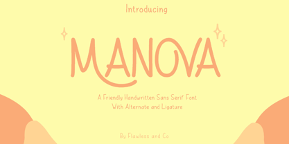 Introducing "Manova" - a friendly and approachable handwritten sans serif font that adds a touch of warmth and authenticity to your designs. There's some connected letters and some alternates that suitable for any graphic designs such as branding materials, t-shirt, print, business cards, logo, poster, t-shirt, photography, quotes .etc This font support for some multilingual. Also contains uppercase A-Z and lowercase a-z, alternate character, numbers 0-9, and some punctuation. If you need help, just write me! Thanks so much for checking out my shop!
 - Linotype Compendio by Linotype,
$40.99Linotype Compendio is a part of the Take Type Library, chosen from the contestants of the International Digital Type Design Contests from 1994 and 1997. Christian Bauer designed this font based on the basic forms of Transitional faces of the 17th century. The outer contours of the letters are purposely raw and irregular, much like alphabets printed on low-quality paper. The legibility of the font is thus reduced, making it necessary to use this font only for shorter texts or headlines, but it is exactly this characteristic which lends Linotype Compendio its distinctiveness. - Grand Dae by Say Studio,
$15.00 Grand Dae is a Modern Elegant Serif Typeface. This font is perfect for branding, logos, social media, prints, stickers, shirts, svg files and more! Grand Dae is unique as it can be used for a variety of design styles. It fits in wonderfully for free-spirited, boho designs and also for more classy editorial looks! There are a lot of fun stylistic alternates available to use with this font. These letters are embedded into the font file and easily accessible in programs such as photoshop and illustrator. Thanks, Have a Wonderful Day, Say Studio
 - Sidecar by Fenotype,
$30.00 Sidecar is an elegant monoline font family of four weights of Script and Sans. Sidecar Script and Sans are designed to play together but they also work great on their own. Sidecar Script is packed with OpenType alternates: keep Contextual Alternates on for smooth flow and try Swash or Titling Alternates for more flashy letters. From Discretionary Ligatures you’ll find Ordinal Suffixes (st, nd, rd, th). Sidecar is a great display family for any project from logo to packaging or actual neon sign design and from print to online!
 - Secret Memories by Flawlessandco,
$9.00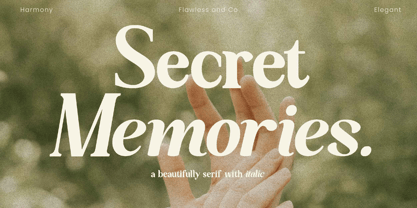 Secret Memories is a Serif Italic Font with a classy and elegant style in each character, so it's fitted for some wedding invitation display. There's some connected letters and some alternates that suitable for any graphic designs such as branding materials, t-shirt, print, business cards, logo, poster, t-shirt, photography, quotes .etc This font support for some multilingual. Also contains uppercase A-Z and lowercase a-z, alternate character, numbers 0-9, and some punctuation. If you need help, just write me! Thanks so much for checking out my shop!
 - Linotype Alphabat by Linotype,
$29.99Jan Tomáš studied at the Universität der Künste, Berlin. He is a multi-talent – the author of many ideas, a font creator, designer, modeller, technician and web designer. In 2011, he founded Future Typo, the first web portal for advanced typography with original design typefaces and 3D typefaces. When you look closely to Linotype Alphabat, the figures start to change from letters into flying bats and scary faces. Linotype Alphabat can be used for very short texts however it is particularly effective for headlines in larger point sizes so that its details are emphasized. - Momentic Yesterday by Flawlessandco,
$9.00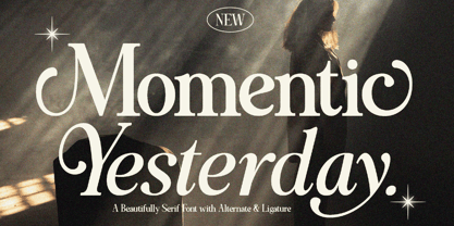 Momentic Yesterday is a Modern Font Duo that contains Serif and Italic Typeface also gives a feel of Elegant font type. There's some connected letters and some alternates that suitable for any graphic designs such as branding materials, t-shirt, print, business cards, logo, poster, t-shirt, photography, quotes .etc This font support for some multilingual. Also contains uppercase A-Z and lowercase a-z, alternate character, numbers 0-9, and some punctuation. If you need help, just write me! Thanks so much for checking out my shop!
 - RealScore Script by NorFonts,
$28.00 RealScore Script was inspired from the old west-coast music copyists. It is a handwritten font coming in 8 weights: Realscore Script Light Realscore Script Light Italic Realscore Script Light Oblique Realscore Script Regular Realscore Script Italic Realscore Script Oblique Realscore Script Bold Realscore Script Bold Italic Realscore Script Bold Oblique RealScore Script fonts can be used with any word processing program for text and display use, print and web projects, apps and ePub, comic books, graphic identities, branding, editorial, advertising, scrapbooking, cards and invitations and any casual lettering purpose… or even just for fun!
 - 1751 GLC Copperplate by GLC,
$38.00 This family was inspired by an engraved plate from Diderot & Dalembert's Encyclopedia (publication beginning in 1751), illustrating the chapter devoted to letter engraving techniques. The plate bears two engravers names : "Aubin" (may be one of the four St Aubin brothers ?)and "Benard" ( which name is present below all plates of the Encyclopedia printed in Geneva ). It seems to be a transitional type, but different from Fournier or Grandjean. Small caps are included in fonts for TTF and OTF version, separate files are included in the family sets of the Mac TT version.
 - Linotype Fresh Ewka by Linotype,
$29.00Linotype Fresh Ewka is part of the Take Type Library, chosen from the contestants of Linotype’s International Digital Type Design Contests of 1994 and 1997. This fun font was designed by Polish artist Dariusz Nowak-Nova and each letter seems to be a work in itself. The fine hair lines are decorated with tiny squares and look like wires with nodes while the thicker strokes have indefinite contours and seem to have been made with a thick brush. Linotype Fresh Ewka is suitable for headlines in large point sizes. - Multipa by Hurufatfont,
$22.00 Multipa takes inspiration from old-style grotesque fonts and reinterprets them for the present. Its contrast structure distinguishes it from other sans serif fonts. Thanks to style sets, letters like t, b, d, k, l are synchronized with capitalization height. It allows you to create powerful typographic designs with body text and heading styles. It is equipped with rich opentype features, style sets and ligatures for professional typography designs. Ideal for packaging, labels, routing designs, mobile applications, brand designs, logos, all kinds of presentation and editorial designs, indoor and outdoor printing works.
 - Rosarian by Laura Worthington,
$29.00 Rosarian celebrates the grace of the pointed brush, flowing expressively from thick, rounded downward strokes to thin, delicate hairlines to create graceful and unique letterforms. Contextual alternates help Rosarian look convincingly hand-lettered, while stylistic alternates allow you to customize Rosarian into a less formal, unconnected script. See what’s included! http://bit.ly/2bIG4Pc *NOTE* Basic versions DO NOT include swashes, alternates or ornaments These fonts have been specially coded for access of all the swashes, alternates and ornaments without the need for professional design software! Info and instructions here: http://lauraworthingtontype.com/faqs/
 - Canes by Flawlessandco,
$9.00 Introducing "Cane's" - A Retro Display Font. Transport your designs to the golden age of retro with "Cane's," a charismatic display font that captures the essence of vintage aesthetics. There's some connected letters and some alternates that suitable for any graphic designs such as branding materials, t-shirt, print, business cards, logo, poster, t-shirt, photography, quotes .etc This font support for some multilingual. Also contains uppercase A-Z and lowercase a-z, alternate character, numbers 0-9, and some punctuation. If you need help, just write me! Thanks so much for checking out my shop!
