10,000 search results
(0.029 seconds)
- Fallujah by Arabetics,
$39.00 A typeface design with extra isolated scattered letters and random careless look. It has six members, normal, bold, and medium, all of which come in two styles, regular and left-slanted italic styles. This font family design follows the guidelines of Mutamathil Taqlidi type style with one glyph for every basic Arabic Unicode character or letter, as defined by the Unicode Standards, and one additional final form glyph, for the freely-connecting letters in traditional Arabic cursive text. Fallujah employs variable x-height values. It includes only the Lam-Alif ligatures. Soft-vowel diacritic marks, harakat, are selectively positioned. Most of them appear by default on the same level, following a letter, to ensure that they would not interfere visually with letters. Tatweel is a zero-width glyph. Keying the tatweel key before Alif-Lam-Lam-Ha will display the Allah ligature. Fallujah includes both Arabic and Arabic-Indic numerals, in addition to standard punctuations.
 - Tecna Dark Up Triangle BNF by Descarflex,
$30.00 The Tecn@ Dark&Light Triangle Background Nomenclature Font family is differentiated by the direction of the triangle tip in the 4 cardinal points. The family were designed to head, enumerate, indicate or highlight writings or design plans, for this reason, the characters are available only in capital letters and some signs or symbols that can serve such purposes. A triangle or empty character is included so that the user can use it overlaying any character of his choice or to be used alone. What is Lorem Ipsum? Lorem Ipsum is simply dummy text of the printing and typesetting industry. Lorem Ipsum has been the industry's standard dummy text ever since the 1500s, when an unknown printer took a galley of type and scrambled it to make a type specimen book. It has survived not only five centuries, but also the leap into electronic typesetting, remaining essentially unchanged. It was popularised in the 1960s with the release of Letraset sheets containing Lorem Ipsum passages, and more recently with desktop publishing software like Aldus PageMaker including versions of Lorem Ipsum. Why do we use it? It is a long established fact that a reader will be distracted by the readable content of a page when looking at its layout. The point of using Lorem Ipsum is that it has a more-or-less normal distribution of letters, as opposed to using 'Content here, content here', making it look like readable English. Many desktop publishing packages and web page editors now use Lorem Ipsum as their default model text, and a search for 'lorem ipsum' will uncover many web sites still in their infancy. Various versions have evolved over the years, sometimes by accident, sometimes on purpose (injected humour and the like). Where does it come from? Contrary to popular belief, Lorem Ipsum is not simply random text. It has roots in a piece of classical Latin literature from 45 BC, making it over 2000 years old. Richard McClintock, a Latin professor at Hampden-Sydney College in Virginia, looked up one of the more obscure Latin words, consectetur, from a Lorem Ipsum passage, and going through the cites of the word in classical literature, discovered the undoubtable source. Lorem Ipsum comes from sections 1.10.32 and 1.10.33 of "de Finibus Bonorum et Malorum" (The Extremes of Good and Evil) by Cicero, written in 45 BC. This book is a treatise on the theory of ethics, very popular during the Renaissance. The first line of Lorem Ipsum, "Lorem ipsum dolor sit amet..", comes from a line in section 1.10.32. The standard chunk of Lorem Ipsum used since the 1500s is reproduced below for those interested. Sections 1.10.32 and 1.10.33 from "de Finibus Bonorum et Malorum" by Cicero are also reproduced in their exact original form, accompanied by English versions from the 1914 translation by H. Rackham. Where can I get some? There are many variations of passages of Lorem Ipsum available, but the majority have suffered alteration in some form, by injected humour, or randomised words which don't look even slightly believable. If you are going to use a passage of Lorem Ipsum, you need to be sure there isn't anything embarrassing hidden in the middle of text. All the Lorem Ipsum generators on the Internet tend to repeat predefined chunks as necessary, making this the first true generator on the Internet. It uses a dictionary of over 200 Latin words, combined with a handful of model sentence structures, to generate Lorem Ipsum which looks reasonable. The generated Lorem Ipsum is therefore always free from repetition, injected humour, or non-characteristic words etc.
 - Lido STF by Storm Type Foundry,
$39.00Times with a Human Face: In my article of the same name which appeared in the magazine Font, volume 2000 I described the long and trying story of an order for a typeface for the Czech periodical Lidové noviny (People’s Newspaper). My task was to design a modification of the existing Times. The work, however, finally resulted in the complete re-drawing of the typeface. The assignment, which was on the whole wisely formulated, was to design a typeface which would enable “a smooth flow of information in the reader’s eye”, therefore a typeface without any artistic ambitions, from which everything which obstructs legibility would be eliminated. A year later Lidové noviny had a different manager who in the spring of 2001 decided to resume the cooperation. The typeface itself definitely profited from this; I simplified everything which could be simplified, but it still was not “it”, because the other, and obviously more important, requirement of the investor held: “the typeface must look like Times”. And that is why the above-mentioned daily will continue to be printed by a system version of Times, negligently adjusted to local conditions, which is unfortunately a far cry from the original Times New Roman of Stanley Morison. When I was designing Lido, the cooperation with the head of production of Lidové noviny was of great use to me. Many tests were carried out directly on the newspaper rotary press during which numerous weak points of the earliest versions were revealed. The printing tests have proved that the basic design of this typeface is even more legible and economical than that of Times. The final appearance of Lido STF was, however, tuned up without regard to the original assignment – the merrier-looking italics and the more daring modelling of bold lower case letters have been retained. The typeface is suitable for all periodicals wishing to abandon inconspicuously the hideous system typefaces with their even more hideous accents and to change over to the contemporary level of graphic design. It is also most convenient for everyday work in text editors and office applications. It has a fairly large x-height of lower case letters, shortened serifs and simplified endings of rounded strokes. This is typical of the typefaces designed for use in small sizes. Our typeface, however, can sustain enlargement even to the size appropriate for a poster, an information table or a billboard, as it is not trite and at the same time is moderate in expression. Its three supplementary condensed designs correspond to approximately 80% compression and have been, of course, drawn quite separately. The intention to create condensed italics was abandoned; in the case of serif typefaces they always seem to be slightly strained. I named the typeface dutifully "Lido" (after the name of the newspaper) and included it in the retail catalog of my type foundry. In order to prevent being suspected of additionally turning a rejected work into cash, Lido STF in six designs is available free of charge. I should not like it if the issuing of this typeface were understood as an “act out of spite” aimed against the venerable Times. It is rather meant as a reminder that there really are now alternatives to all fonts in all price categories. - Cursivo Saxonio by Intellecta Design,
$21.90 Cursivo Saxonio is a typeface inspired in the famous book The Case of Charles Dexter Ward, by H P Lovecraft. It shows better than I get with my studies the authentic "Insularis" or "Cursivo Saxonio" handlettering of the VIII and XI centuries used by some people in Britain. The text on the accompanying poster reads: “Corwinus necandus est. Cadaver aq(ua) forti dissolvendum, nec aliq(ui)d retinendum. Tace ut potes”
 - Oxford Street by K-Type,
$20.00 Oxford Street is a signage font that began as a redrawing of the capital letters used for street nameplates in the borough of Westminster in Central London. The nameplates were designed in 1967 by the Design Research Unit using custom lettering based on Adrian Frutiger’s Univers typeface, a curious combination of Univers 69 Bold Ultra Condensed, a weight that doesn’t seem to exist but which would flatten the long curves of glyphs such as O, C and D, and Universe 67 Bold Condensed with its more rounded lobes on glyphs like B, P and R. Letters were then remodelled to improve their use on street signs. Thin strokes like the inner diagonals of M and N were thickened to create a more monolinear alphabet; the high interior apexes were lowered and the wide joins thinned. The crossbar of the A was lowered, the K was made double junction, and the tail of the Q was given a baseline curve. K-Type Oxford Street continues the process of impertinent improvement and includes myriad minor adjustments and several more conspicuous amendments. The stroke junctions of M and N are further narrowed and their interior apexes modified. The middle apex of the W is narrowed and the glyph is a little more condensed. The C and S are drawn more open, terminals slightly shortened. The K-Type font adds a new lowercase which is also made more monolinear so better suited to signage, loosely based on Univers but also taking inspiration from the Transport typeface both in a taller x-height and character formation. The lowercase L has a curled foot, the k is double junctioned to match the uppercase, and terminals of a, c, e, g and s are drawn shorter for openness and clarity. A full repertoire of Latin Extended-A characters features low-rise diacritics that keep congestion to a minimum in multiple lines of text. The font tips the hat to signage history by including stylistic alternates for M, W and w that have the pointed middles of the earlier MOT street sign typeface. Incidentally, Alistair Hall (‘London Street Signs’, Batsford, 2020) notes that when the manufacturer of signs was changed in 2007, Helvetica Bold Condensed was substituted in place of the custom design, “an unfortunate case of an off-the-peg suit replacing a tailored one” and a blunder that has happily since been rectified, though offending nameplates can still be spotted by discerning font fans.
 - XXII ARMY - Unknown license

- Shakila by Alifinart Studio,
$17.00 Shakila Script is a handwritten font created at the end of March 2021. It is a unique bold font with a pretty and charming casual style with many variants of beautiful swashes, as well as an alternative to capital letters. Shakila is a lovely and delicate font duo (script and sans serif), that exudes elegance and class. This font was particularly crafted for those who need a beautiful and refreshing look to their designs. Also, this font is perfect for branding projects, logo, product designs, invitation cards, wedding cards, stationery designs, advertisements, label, photography, blogging, social media or watermark. Key Features: - Multilingual Accents - Alternative capital letters - Stylistic Alternates up to 20 choices - Has a heart connected feature for a-z and A-Z letters - Available shortcut for Stylistic Alternate by simply adding "period" (.) and “number” (1-20) to each letter. - Has lots of ligatures so the letters connect well together - Has OpenType and PUA Encodes features. This font has a total of 885 glyphs, including capital letters, uppercase alternates, lowercase, numeral and punctuation, multilingual accents, beginning and ending swashes for lowercase, and includes a large number of stylistic alternates and heart swashes (for lowercase-lowercase and uppercase-uppercase). The advantage of the Shakila Script font compared to other fonts is that the alternative capital characters are in 1 font file, so it will make it easier for you to work. Therefore, you are free to choose it as you like, especially this font has the OpenType and PUA Encodes features which means you can access all of the glyphs and swashes with ease. As I mentioned earlier, Shakila Script has a large number of Stylistic Alternates features, up to 14 options for letter a-z and up to 20 options for letter b d h k l. In fact, there is also a swash feature in the form of a connected for the combination of each lowercase-lowercase and uppercase-uppercase letters. Interestingly, you can activate all Stylistic Alternates that are owned by each letter, just by typing; letter + period + number. For example: a.1 a.2 a.3 or b.1 b.2 b.3 and so on. As for activating the heart connected for each letter a-z or A-Z is quite easy. Namely by simply typing; letter + underscore + underscore + letter. For example: a__a or A__A and so on. Shakila Script is a Font Duo pack that pairs with Shakila Sans. The two were created at about the same time, but made in separate file packages. The reason I created this font duo is to make your projects more harmonious and unique. At the end of the sentence, Shakila Font Duo is a very authentic and amazing. If there are things you want to ask, don't hesitate to contact my email. For complete details, please visit my Behance profile. Alifinart Studio alifinart@gmail.com Thank you.
 - Freehand Brush by Zetafonts,
$39.00 Freehand is a type system designed by Debora Manetti and Francesco Canovaro to emulate the natural appearance of handmade brush writing. Open type ligature substitutions are used to randomly alternate between different versions of each character to give the final output a realistic, uneven look. The main typeface of the system is a wide freestyle brush cursive, featuring over four hundreds of alternate version for characters and double letter ligatures. A "brush easy" version is included without the substitutions if you need more consistent look in your design and better control over letter variation through the glyph panel. The two freehand brush weights are complemented by two sets of icons of matching style, one for ui design with navigation icons and one with food icons. The system also includes a blockletter family in two weights, to be used together with the other fonts to create variation and contrast in your design. Freehand covers over 40 languages that use the Latin alphabet, with a full range of accents and diacritics.
 - Sassoon Primary Cond by Sassoon-Williams,
$48.00 Those who design books for young children should consider the different needs of their readers. When laying out pages for young readers, particular care should be taken over word spacing. Don't forget that justifying short lines disrupts spacing. Justification should be used only when absolutely necessary. In the research undertaken with young readers the importance of consistent spacing was clear. It also appeared that the poorer readers profited from wider word spacing, while spacing that suited the poorest readers, positively annoyed the better readers. These typefaces have built-in letter spacing because of their exit strokes, as well as extra clarity designed into them. Sassoon Primary Medium Condensed is a compact style for headlines combining the right amount of weight, yet in a friendly style. When used at large sizes the friendliness of Sassoon types really shines. Why not use it for headings throughout a book. You can find many other new ways to use this typeface. Ideal perhaps for the masthead or a magazine? Free to download resources: How to access Stylistic Sets of alternative letters in these fonts
 - Mi Casa by FontMesa,
$25.00 Mi Casa is a new condensed version of our Home Style font which is a revival of an old 1800's classic ornate French font. This new 2021 condensed version takes this old classic to an all new level by adding small caps, italics and a new black version. Mi Casa is perfect for headlines and logos from advertising to product labels, t-shirt lettering and restaurant menus. Fill fonts are also part of this family, new to this font style is the half fill font for creating a two color effect on the letters, you'll need an application that works in layers to use the fill fonts in Mi Casa. The regular fill font for Mi Casa isn't meant to be used as a stand alone font so we've created a solid black version with thicker serifs on top and adjusted outlines throughout for a better appearance as a solo font. We hope you enjoy Mi Casa as much as we did making it. Mi Casa is a trademark of FontMesa LLC
 - Bazaruto by Stiggy & Sands,
$29.00 Our Bazaruto family was inspired by an old fashioned specimen from “Letters and Lettering” by Carlyle & Oring, but you'll find the inspiration has been greatly expounded upon. What began as an all Capitals specimen has been fleshed out to an extended full character set with many features and variants from the original design. Bazaruto has been an exercise in typographic evolution. The original Art Deco style spawned an Engraved version, then a Bodoni-esque text style, and then a monoline version of that text style (both of the latter complete with Obliques). But after that is when the real interpretations of form began with the development of the Iron fonts, playing off the original specimen having a visual flavor of wrought ironwork in them, and blending that into the Bodoni-esque typestyles. Lastly, a fast and loose hand drawn version of the Iron fonts and an ornaments font were created to add more variety and spunk to the family. The Bazaruto family is a visual grab bag of styles which all have an underlying harmony.
 - Delphi by Positype,
$22.00 Delphi grew from a logotype Lily Feinberg produced using Greek-column-inspired letterforms. As that concept expanded to include more and more letters, the typeface had its beginnings. Intertwined, kinetic, and deliberate, Delphi carves itself onto the page and screen, encouraging variation and experimentation. The letterforms’ unique construction and predispostion for experimentation inspired two varying sets: Delphi Dio, comprised of two-line strokes, and Delphi Tria, built of both 2- and 3-line strokes. With a design as elaborate, yet tightly tuned as this, the desire to add more and more was irresistible—you'll see a number of stylistic, swash, and titling alternates (and even more hidden away in further stylistic sets). Because Dio and Tria could only hold so much, alternate cuts were produced to better organize your options: the Delphi Alt fonts feature certain letter styles and stylistic alternate sets distinct from those in Delphi. Delphi’s sophisticated, striking letterforms make it an ideal display face for use at large sizes, and with so many unique details and alternate letterforms, it’s simply fun to use.
 - Colwell - Unknown license

- Pacific Island JNL by Jeff Levine,
$29.00 Lettering on the sheet music cover for the title song from the 1957 Marlon Brando movie "Sayonara" was the model for Pacific Island JNL. The design has an Asiatic influence, but also reflects a bit of show card lettering as well. Available in both regular and oblique versions.
 - Union Station by Matteson Typographics,
$19.95 Union Station is based on the transit scroll lettering displayed in Denver’s Union Station. The letter shapes are reminiscent of grotesque sans serif typefaces of the same era with quirky details left by the artist’s brush. The typeface gives a sense of rugged Americana and a handcrafted spirit.
 - Noka by Blackletra,
$50.00 Noka is a powerful display geometric sanserif with a lot of personality. Its clean structure refers to a more digital and technological atmosphere. Letters P F T L are narrower than usual to create a distinct feeling. Diagonal strokes of letters V v W w A are parallel.
 - Scurvy Dog by Hanoded,
$15.00 Aye, me lovelies, this be Scurvy Dog, a grand font! The letters were etched into a dead man's chest with a blunt rapier, pickled in brine and covered in spew. Ye could be using this crafty penmanship for yer logs or writing yer dear ol' mothers a letter.
 - Murderous Desire by PizzaDude.dk,
$20.00 Murderous desire for grunge! Grunge is timeless, and Murderous Desire is worn and torn, yet very legible. Great for massive text or headlines! Comes with different lower- and uppercase plus alternate letters and on top of that, ligatures for double letter! Go crazy, go grunge - and use Murderous Desire!
 - MD-Type Rounded by MD-Type,
$25.00 MD-Type Rounded is a modern, stylish font family. The family consists of five fonts (Regular, Bold, Light, Block, Black) which are formed by all capital letters. The strong and accented letters were rounded on the corners and therefore softened. The font family supports Turkish language as well.
 - Morningside Heights JNL by Jeff Levine,
$29.00 Named for a Manhattan neighborhood, Morningside Heights JNL is based on lettering found on a 1920s-era piece of sheet music. Part of the charm of hand lettering from the Art Nouveau era is found in the non-standard line thicknesses, experimental character shapes and varying character widths.
 - Martin&Hellen by Supfonts,
$14.00 Martin&Hellen will be perfect for wedding lettering, beautiful frame for your home, book covers, greeting cards, logos, marketing, magazines or anything that requires cute handwritten lettering :) What's inside: Martin&Hellen.otf Multilingual support Cricut support Swashes If you have any questions, please contact me directly or in instagram @superdizigner
 - Queenzy by ZetDesign,
$15.00 Introducing my new font "Queenzy" Queenzy is made by paying attention to details on each letter so that it produces a beautiful arrangement of letters that can be used in each of your design work. I hope you like my creation.This font is also made in an italic version
 - Magic Charm by Supfonts,
$10.00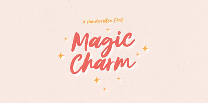 Magic Charm will be perfect for wedding lettering, beautiful frame for your home, book covers, greeting cards, logos, marketing, magazines or anything that requires cute handwritten lettering :) What's inside: - Magic Charm Script - Multilingual support - Cricut support If you have any questions, please contact me directly or in instagram @superdizigner
 - Cift by Graptail,
$15.00 Cift Serif is inspired by the work of charming lettering artists with a combination of Old Style Display Bold. Each letter is modified so that the distance, width and weight can give the beauty of the alternates given. A passionate curve gives a touch of beauty to this font.
 - Daisy Flowers by Supfonts,
$12.00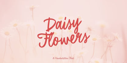 Daisy Flowers will be perfect for wedding lettering, beautiful frame for your home, book covers, greeting cards, logos, marketing, magazines or anything that requires cute handwritten lettering :) What's inside: Daisy Flowers font Multilingual support Cricut support If you have any questions, please contact me directly or in instagram @superdizigner
 - Blacksmith JNL by Jeff Levine,
$29.00What started as an image of a single vintage brass stencil of the letter 'P' spotted in an online auction has turned into Blacksmith JNL. From that single letter Jeff Levine has created a complete Western stencil font, retaining the hand-made look of the original stencil piece. - Rotham Industria by Greater Albion Typefounders,
$18.00 Rotham Industrial. Stylised lettering for industrial flavoured projects. Imagine, if you will letters shaped from metal tube, or perhaps from a solid rod, or perhaps made from brass handrails? You get the idea. A stylised and fun typeface for those occasions where you want to suggest an engineering influence.
 - Bloodred by Supfonts,
$9.00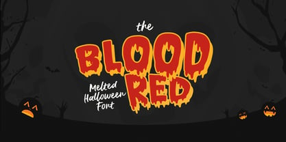 Bloodred Cyrillic will be perfect for halloween lettering, beautiful frame for your home, book covers, greeting cards, logos, marketing, magazines or anything that requires cute handwritten lettering :) What's inside: Bloodred Script Multilingual support Cricut support If you have any questions, please contact me directly or in instagram @superdizigner
 - Pumpkinly by Supfonts,
$14.00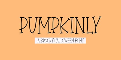 PUMPKINLY Cyrillic will be perfect for halloween lettering, beautiful frame for your home, book covers, greeting cards, logos, marketing, magazines or anything that requires cute handwritten lettering :) What's inside: PUMPKINLY Script Multilingual support Cricut support If you have any questions, please contact me directly or in instagram @superdizigner
 - Hallo Queen by Supfonts,
$10.00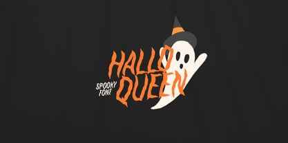 HalloQueen Cyrillic will be perfect for halloween lettering, beautiful frame for your home, book covers, greeting cards, logos, marketing, magazines or anything that requires cute handwritten lettering :) What's inside: HalloQueen Script Multilingual support Cricut support If you have any questions, please contact me directly or in instagram @superdizigner
 - Ramones by Namistudio,
$15.00 Rebel, Energy, Punk, Power... Ramones, jagged interlock letter with bold line. This font will bring that IN YOUR FACE attitude in your design. No more soft side. It's all about the energy ! Either choosing the auto-generate interlocking letters, or keep it original, Ramones still brings you the power.
 - Ailey Display by Graptail,
$15.00 Ailey Display is inspired by the work of charming lettering artists with a combination of Old Style Display Bold. Each letter is modified so that the distance, width and weight can give the beauty of the alternates given. A passionate curve gives a touch of beauty to this font.
 - Showpiece JNL by Jeff Levine,
$29.00 Showpiece JNL was redrawn from the hand lettering for the name and address of a music publisher found on some 1930s-era sheet music. The lettering style has features influenced a bit by both the end of the Art Nouveau period and the beginning of the Art Deco movement.
 - Harvey by ITC,
$29.99Harvey is a work of American graphic designer Dale R. Kramer. It is an all capital sans serif typeface which features a distinctive, light-hearted look and includes both conventional and unusual letter forms. Alternate letters give Harvey even more flexibility, making it a great typeface for any headline. - Anter Script by vuuuds,
$16.00 Anter is modern script font, every single letters have been carefully crafted to make your text looks beautiful. With modern script style this font will perfect for many different project ex: quotes, blog header, poster, wedding, branding, logo, fashion, apparel, letter, invitation, stationery, etc. Anter script including alternate glyph.
 - Nuvoletta by Biroakakarati,
$9.00 Nuvoletta is the italian name of "speech balloon", its mean a little cloud. In comics world "nuvoletta" it use to write the speeches of characters! I designed this font inspired by comics books. It's really fit also for your awesome fantasy! Nuvoletta is drew letter by letter. Thank you!
 - Second Guess JNL by Jeff Levine,
$29.00 The cover of the 1934 sheet music for "Your Guess Is Just as Good as Mine" offers up another hand lettered Art Deco sans with a classic period look. The square-ish lettering with rounded corners of Second Guess JNL is available in both regular and oblique versions.
 - Common Area JNL by Jeff Levine,
$29.00 The unusual hybrid of square letter forms mixed with Art Deco-influenced ones in the digital typeface Common Area JNL is brought to you by the hand lettering found on a vintage piece of sheet music for "William Tell". The typeface is available in both regular and oblique versions.
 - Red Star by Comicraft,
$39.00 The Red Star has risen. Capitalism is on the decline. Under the supervision of Kommisar Christian Gossett and his Red Star cabinet, Comrade Craft has completed the revolutionary new Soviet Block Letters; RedStar, RedSquare and DropCase. The Proletariat is instructed to rejoice. Today is truly a Red Letter Day!
 - Rillilove by Yoga Letter,
$18.00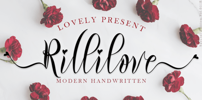 "Rillilove" is a very beautiful, smooth, elegant, and high-quality font. This font is perfect for weddings, marketing products, marketing your business, creating quotes, invitation cards, logos, branding, holiday updates, and more. Equipped with uppercase letters, lowercase letters, numerals, punctuation, swash, titling, uppercase alternates, ligatures, and multilingual support

