10,000 search results
(0.029 seconds)
- Stressed by 4RM Font,
$14.00 Inspired by brutalism and horror movie designs, the Stressed font is made with random pen strokes, giving this font a brutal/unbalanced feel. suitable for use in graphic design, especially with horror themes such as movie posters, and Brutalism graphic design.
 - Euroika by Ingrimayne Type,
$12.95 Crisp and clean with a non-traditional italics, Euroika is a decorative, serifed alphabet. The letters have high contrast between the thick and thin strokes and the lower-case letters have a small x-height. The family consists of ten members.
 - Authoritative by Viswell,
$16.00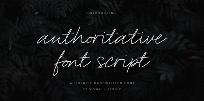 Introducing Authoritative, an natural handwritting script font, made with natural hand strokes which will be suitable for you to use for branding, quotes, logos, stationery, crafting and many more. Authoritative includes : Uppercase & Lowercase Numeral & Punctuation Standard Ligature Multilingual Thank you.
 - Sweet Holidays Brush by Stripes Studio,
$20.00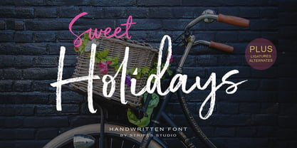 Sweet Holidays Brush is a super casual hand brushed script with detailed brush stroke texture, and a quirky, Can be used for various purposes. such as the title, signature, letterhead, signage, labels, newsletters, posters, logos, correspondence, wedding invitations, badges, etc.
 - HeiT ASC Traditional Chinese by Ascender,
$523.99The HeiT ASC Font family contains 3 Traditional Chinese fonts with Big 5 support. HeiT ASC Font Family features a sans serif style with consistent strokes. HeiT ASC Bold Font Family character Set: Latin-1, Traditional Chinese (code page 950). - Kis Antiqua Now TH Pro by Elsner+Flake,
$99.00 In the course of the re-vitalization of its Typoart typeface inventory, Elsner+Flake decided in 2006 to offer the “Kis Antiqua” by Hildegard Korger, in a re-worked form and with an extended sortiment, as an OpenType Pro-version. After consultation with Hildegard Korger, Elsner+Flake tasked the Leipzig type designer Erhard Kaiser with the execution of the re-design and expansion of the sortiment. Detlef Schäfer writes in “Fotosatzschriften Type-Design+Schrifthersteller”, VEB Fachbuchverlag Leipzig, 1989: No other printing type has ever generated as far-reaching a controversy as this typeface which Jan Tschichold called the most beautiful of all the old Antiqua types. For a long time, it was thought to have been designed by Anton Janson. In 1720 a large number of the original types were displayed in the catalog of the „Ehrhardische Gycery“ (Ehrhardt Typefoundry) in Leipzig. Recently, thanks to the research performed by Beatrice Warde and especially György Haimann, it has been proven unambiguously that the originator of this typeface was Miklós (Nicholas) Tótfalusi Kis (pronounced Kisch) who was born in 1650 in the Hungarian town of Tótfal. His calvinistic church had sent him to the Netherlands to oversee the printing of a Hungarian language bible. He studied printing and punch cutting and earned special recognition for his Armenian and Hebrew types. Upon his return to Hungary, an emergency situation forced him to sell several of his matrice sets to the Ehrhardt Typefoundry in Leipzig. In Hungary he printed from his own typefaces, but religious tensions arose between him and one of his church elders. He died at an early age in 1702. The significant characteristics of the “Dutch Antiqua” by Kis are the larger body size, relatively small lower case letters and strong upper case letters, which show clearly defined contrasts in the stroke widths. The “Kis Antiqua” is less elegant than the Garamond, rather somewhat austere in a calvinistic way, but its expression is unique and full of tension. The upper and lower case serifs are only slightly concave, and the upper case O as well as the lower case o have, for the first time, a vertical axis. In the replica, sensitively and respectfully (responsibly) drawn by Hildegard Korger, these characteristics of this pleasantly readable and beautiful face have been well met. For Typoart it was clear that this typeface has to appear under its only true name “Kis Antiqua.” It will be used primarily in book design. Elsner+Flake added these two headline weights, which are available besides a separate font family Kis Antiqua Now TB Pro. Designer: Miklós (Nicholas) Tótfalusi Kis, 1686 Hildegard Korger, 1986-1988 Erhard Kaiser, 2008
 - Salad by Zetafonts,
$39.00 The island of Fuerteventura is more known for its white sand beaches and windsurf-friendly constant winds than for its typographic marvels. Still, it's on the walls of a ballroom next to its white-sand beaches that Debora Manetti found the hand-painted letterforms that she took as inspiration for her typeface Sala de Fiestas. The resulting font was a condensed sans serif full of curious details and a jumpy latino vibe that many years after still keeps its freshness and vernacular charme. Francesco Canovaro took the original typeface as a starting point for a grand tour into sign-painter aesthetics, developing a reboot of the original into a new type family: Salad. While being faithful to the original proportions and feeling, Salad provides extreme versatility through its five-weights range, its extended charset and its set of Open Type features including stylistic sets, alternates, positional numerals, small capitals and case sensitive forms. While the roman family with its italic counterpart provide a good workhorse tool for informal branding, packaging and editorial projects, the interlocking and the inline weights add additional possibilities for display purposes. This is enriched by the inclusion in the typeface of a set hand-drawn decorative dingbats that further complement the sign painting vibe of the family. All Zetafonts expertise in handmade lettering, typographic design and water sports has been put to test to assure Salad is the best typographical alternative to a a trip to Canary Islands!
 - Sunset by Komet & Flicker,
$10.00 Bowl a perfect strike! Sunset was inspired by the retro stylings of the local bowl-o-rama.
 - Diethelm AR by ARTypes,
$35.00 Based on the 10- and 36-point Diethelm-Antiqua types designed by Walter Diethelm and issued by Haas (Münchenstein) 1948-51. DiethelmAR™ series text-size fonts are based on the 10-point designs. Eastern European accents, swash capitals, alternative figures and small capitals are available. The DiethelmARd fonts are based on the 36-point (dreicicero) designs. OpenType fonts are available individually or in two packages: text fonts (with EE accents, small capitals) and display fonts.
 - Forever Black - Unknown license

- SF Big Whiskey SC - Unknown license

- Blackout - 100% free

- Rutherford by Device,
$39.00 Rutherford is clear, robust and authoritative, and reads well at small text sizes while also having the required heft for larger headlines. A wide range of weights makes it a versatile choice for magazines, branding, brochures and advertising. A slightly condensed obround serif with squared stroke terminals. The t, j and f curve around to harmonize with the terminals on the a and g, as does the tail of the Q. The italic incorporates cursive forms on the ends of the lower right and upper left strokes, and uses a single-story a. Includes full European Latin support and alternate designs for the Q and g in all weights.
 - M Marker HK by Monotype HK,
$523.99 M Marker is a humanistic script design characterised by its italic, modern, box marker pen-like style. M Marker incorporates features of carton box marker pen, its strokes beginning and ending are rough, parallel without flare. Contrast of strokes is high. Its extra bold stems (豎) make it suitable for large display text to catch attention. Crossbars (橫) and stems (豎) are straight but slanted while angles (折) are smooth and well rounded. Dots (點), ticks (剔), hooks (勾) and downstrokes (撇、捺) are irregular, smooth and long to create softness, liveliness. It is best suited for casual and lively display, illustrations, set upright (naturally slanted), non-condensed.
 - Boster by Rhd Studio,
$20.00 Boster is a stylish modern calligraphy font with a chic casual style. It's perfect for branding, wedding invitations and cards, and maybe for red wine labels. The booster includes a beautiful full set of upper and lower case letters, numbers, assorted punctuation marks. All lowercase letters include start and end strokes, providing a realistic handwriting style. What did you get, honey? To use beautiful strokes, you need a program that supports OpenType features such as Adobe Illustrator CS, Adobe Photoshop CC, Adobe Indesign, and Corel Draw. but if your software doesn't have Glyphs panel, you can install additional font swash file: Thank you and have a nice day, Gulya
 - Linotype Pisa by Linotype,
$29.99Linotype Pisa is part of the Take Type Library, selected from the contestants of Linotype’s International Digital Type Design Contests of 1994 and 1997. It was designed by Swedish artist Lutz Baar and is a modern text font based on the humanistic Old Face style. The dynamic lines and harmonious proportions make Linotype Pisa a pleasant and legible font. Distinguishing characteristics are the elongated cross strokes of the capital A, B, E, F and P and the slanted cross stroke of the lower case e, typical of Venecian Old Face characters of the 15th century. Linotype Pisa is well-suited to longer texts and headlines. - Cayuse by Pacific Standard Type,
$36.00 Cayuse is a super-slab, all-caps titling face that tips its hat to the classic French and Italian “fat face” serifs of the nineteenth century. Structurally, Cayuse utilizes a reverse-stress stroke configuration—with thick, meaty slab serifs and sinuous, spiked connecting strokes. This crackling contrast gives Cayuse a very black, dense texture, and the ability to combine and contrast well with other typefaces. Arm yourself with Cayuse to create richly-textured, high-impact typography for packaging, editorial, brand identity, posters, signage, and many other applications. What's more, Cayuse also features an array of “word logos”, providing you even more options for creating dynamic typography.
 - Rimbomba by Muykyta,
$13.00 Rimbomba is a freehand style font with long ascenders and descenders and a steep slant making it elegant yet casual. It is inspired by writing letters by hand, as it was done before, with strokes that in the normal style imitate the tip of a pen and in the medium and bold styles they imitate a round pen stroke. It is a font with strength in its movements and finesse in its curves, which creates a homogeneous set that is easy to read and which produces a certain reading speed. It is complemented with stylistic alternatives for the beginning and the end of the words.
 - Lajoya by Keristyper Studio,
$12.00 Lajoya is a unique and natural handwritten script. The appearance of the strokes is in the form of light, free-flowing brush strokes. This font is good for logo design, Social media, Movie Titles, Books Titles, short text even long text letters, and good for your secondary text font with sans or serif. Featured: Standard Uppercase & Lowercase Numeral & Punctuation Multilingual : ä ö ü Ä Ö Ü ß ¿ ¡ Alternate & Ligature PUA encoded We recommend programs that support the OpenType feature and the Glyphs panel such as Adobe applications or Corel Draw. so you can use all the variations of the glyphs. Hope you enjoy our fonts!
 - Julia Script by ITC,
$29.99Julia Script is a playful calligraphic font designed by David Harris in 1983. It takes the viewer back to the flower power of the 1970s. Generous capitals with cheerful, rounded stroke beginnings and endings contrast perfectly with the narrower, closer, but nevertheless vibrant lower case letters. Characteristic of this typeface and similar to Candice is the marked increase in stroke width in the lower third of the figures. This detail is reminiscent of the platform shoes typical of the 1970s. Julia Script suggests freedom and fun and can often be found on party fliers and retro advertisements. Used sparingly in headlines and slogans, Julia Script will be sure to attract attention. - M Marker PRC by Monotype HK,
$523.99 M Marker is a humanistic script design characterised by its italic, modern, box marker pen-like style. M Marker incorporates features of carton box marker pen, its strokes beginning and ending are rough, parallel without flare. Contrast of strokes is high. Its extra bold stems (豎) make it suitable for large display text to catch attention. Crossbars (橫) and stems (豎) are straight but slanted while angles (折) are smooth and well rounded. Dots (點), ticks (剔), hooks (勾) and downstrokes (撇、捺) are irregular, smooth and long to create softness, liveliness. It is best suited for casual and lively display, illustrations, set upright (naturally slanted), non-condensed.
 - 1470 Sorbonne by GLC,
$21.00 This family was created inspired from the first font carved and cast in France, for the Sorbonne University’s printing workshop (Paris). The characters were drawn by Jean Heynlin, rector of the university - inspired from Pannartz’s - and in all probability was carved by Adolf Rusch. It has only one style, in one size (about 14 Didots points). We have added the U, J, W and Y, some accented characters and others not in use in the original, but the standard and historical ligatures and the numerous Latins abbreviations are these of the original font. The font is proposed in two choices : Basic Latin, MacTT & TTF, free for a private use, and “Pro”, TTF/OTF, available for standard basic Latin plus Central Europe, Baltic, Turkish, Croatian, Romanian, Celtic.
 - Alexander Quill by Canada Type,
$24.95 Alexander Quill was originally designed in the early 1980s to be cut in 14 point for casting into foundry type for the setting and printing of limited edition books at Pie Tree Press, Jim Rimmer's private sanctum. This alphabet exhibits traditional calligraphic tension, which helps its simple, somewhat octagonal forms play well together for an easy read. Its setting expresses a dramatic sense of history or fantasy. Alexander Quill was updated and remastered for the latest technologies in 2012. It comes with plenty of built-in alternates, a glyphset of over 410 characters, and supports the majority of Latin-based languges. 20% of this font's revenues will be donated to the GDC Scholarship Fund, supporting higher typography education in Canada.
 - 1913 Typewriter by GLC,
$38.00 This font was patterned after a few characters on a genuine old 1913 small portable typewriter. It looks like those early typescripts, rough, irregular and eroded, suggestive of mythical famous authors, such as Hemingway, as well as “serie noire” movies or anonymous state employee working in a gloomy Kafkaesque office. It is a complete alphabetic full font. It can be used as web-site titles, poster design, or book editing. It may be preferable, if possible, when printing, to choose a pale color a little rather than condensed - dark grey instead of heavy black, for example - to give the best appearance and to benefit from the full details. The old typewriter character size is 11 to 12 points, but this font easily supports enlargement.
 - ITC Arecibo by ITC,
$29.99 In ITC Arecibo, Argentinean type designer Luis Siquot has created a typeface of subtle typographic turns. At first glance, ITC Arecibo has a sturdy 19th century wood type flavor, yet the delicate hairline shadow is decidedly Art Deco. Its condensed proportions and character shapes have been carefully modeled to ensure legibility. Siquot added uniqueness and versatility to the face by drawing two sets of small caps: one in which the central horizontal strokes share the same plane (ITC Arecibo) as those in the full-size letters, and another where the horizontal strokes are proportional with the small caps(ITC Arecibo Too). Another intriguing subtlety is what Siquot calls the “soul of the face,” the distinctive highlight/shadow. “This ambiguous line is an effect I have wanted to incorporate into a design for some time,” says Siquot. “Is it a black hairline that surrounds the letters, or a white line incised into the left and bottom of strokes?” ITC Arecibo and ITC Arecibo Too: distinctive, powerful and economical of space. What more could you ask from a headline face?
 - Weisy by MIX.Jpg,
$12.00 Weisy Signature is a modern calligraphy font that is light, smooth, modern with original pen strokes. This script includes holes or spaces in strokes, because all handwritten strokes with brushes use the ink flow structure. Suitable for branding, signatures, wedding invitations, and cards. Weisy Signature includes a complete set of upper and lower case letters, numbers, various punctuation marks and binders. All lowercase letters include the beginning and end of swash, giving a realistic handwriting style. All uppercase letters include the beginning of swash, which makes the font look great! If you don't have the Glyph panel to use swash, don't worry. You can type -1 instead of swash. For example, if you type -1A, the initial "A" swash appears and the "a" swash ends. If you type-1, the initial "a" swash will appear. PLEASE NOTE: With a Standard License you are NOT permitted to sell digital goods using fonts in editable software such as Templates. Please, contact me for a license extension. Thank you and enjoy MIX.Jpg
 - Fundstueck by Ingo,
$12.00 Inspired by a find a coarse but decorative font was created. "Fundstueck" ist the German term for it. Fonts can be so simple. That is what I was thinking as my attention was turned to this rusty piece of metal. Only a few centimeters in size, I couldn’t imagine which purpose it might truly serve. But my eyes also saw an E, even a well-proportioned E: a width to height ratio of approximately 2/3, black and fine strokes with a 1/2 proportion — could I create more characters on this basis? Thought it, did it. The form is based on a 5mm unit. The strikingly thick middle stroke of E suggests that the emphasis is not necessarily placed on the typical stroke, and likewise with the other characters. But if the font is going to be somewhat legible, then you cannot leave out slanted strokes completely. Eventually I found enough varying solutions for all letters of the alphabet and figures. A font designed in this way doesn’t really have to be extremely legible, which is why I forwent creating lower case letters. Nevertheless, Fundstueck still contains some diverse forms in the layout of upper and lower case letters. Thus, the typeface is a bit richer in variety. By the way — the “lower” letters with accents and umlauts stay between the baseline and cap height. And with that, you get wonderful ribbon-type lines.
 - Le Havre Rough by insigne,
$19.00 Le Havre Rough. It’s high-resolution, hand-crafted letterpress to the core. Based on insigne’s popular Le Havre typeface, this new heat-treated, weathered face of all caps joins the realism and appeal of the top-quality Le Havre family. Rough’s eroded, printed look is extremely customizable, offering eleven distressed choices that appear fantastic even at large output sizes. Go ahead. Try it on, say, a billboard. Maybe even Times Square. The font includes hand-printed texture and distinctive shadow choices, too. Options include three inline versions, two shadow layers, and a clean primary version. Combine and match the options easily as you need, layering normal and shadow variations to alter appearance and texture. You can activate Art Deco alternates by using OpenType contextual alternates. Rough has an extra-large character set for many languages. Additionally, the typeface offers 62 extra ornaments like arrows, emblems, numbers & lines. Use its full texture and grit to capture the classic, genuine print feel that you need in your project. A few suggestions for use: - In Photoshop, jigger with various 'anti-aliasing' options for best outcomes. Smooth or strong is generally best. - In Illustrator, the shadow layer occasionally doesn't align when using the regular layer. To fix the alignment, open the type drop-down menu and choose Area Type Options > Em Box Height. Learn more about the using layered type styles on this informative video.
 - Atlantic Sea Washed by URW Type Foundry,
$39.99 The original plan for Atlantic was to design a typeface in the Venetian syle of the Renaissance, with handwriting character and large ascenders. There is a wave-rolling unevenness in both the x- and cap-height caused by the strong ductus pointing to the upper right, together with heavily curved serifs, resulting in a very lively image of text on a page. Atlantic – its name reflects the ocean, ships, carriers and loads, tourism and so on. These are the themes Atlantic is best suited for. The extended family includes a serif, a sans, and a special variant – a SeaWashed. Atlantic was designed for the URW++ SelecType collection.
 - TT Slabs Condensed by TypeType,
$29.00 TT Slabs Condensed update 1.110 What’s new. • Case Sensitive Forms • Tabular Figures • Fractions • Numerators • Denominators • Superiors • Scientific Inferiors TT Slabs Condensed it is a condensed version of our TT Slabs font family. This new version is designed for strong headlines and design presentations. Very well suited for designers who create Identity and logos, as well as for interior design and navigation. The special features of the typefaces include the classic formula: Thin, Light, Regular, Bold & Black. Scope: food packaging, packaging of household appliances, newspapers, magazines, headers, signs, theatrical scenery, logos, interior design, decoration of shops. Optimized for the websites, mobile applications, and printing materials.
 - Hobies by Flawlessandco,
$9.00 Introducing "Hobies" - a display font that combines firm boldness with a touch of uniqueness. With its strong and commanding letterforms, Hobies makes a bold statement, while its outline regular variant adds a distinctive edge to your designs. There's some connected letters and some alternates that suitable for any graphic designs such as branding materials, t-shirt, print, business cards, logo, poster, t-shirt, photography, quotes .etc This font support for some multilingual. Also contains uppercase A-Z and lowercase a-z, alternate character, numbers 0-9, and some punctuation. If you need help, just write me! Thanks so much for checking out my shop!
 - Mercado by MADType,
$24.00 Mercado is a versatile stencil font family with 3 styles and 3 weights of each style. I was inspired by local boutique supermarkets to create a stencil font family with both upper and lowercase as well as a large international characterset. Mercado Regular can be used at small point sizes without the stencil gaps filling in. It also makes a bold statement when used large. Mercado Display with it's precision slices is best used large, or in any design solution where the tight gaps will not become filled in. Mercado Sans is a quirky and strong sans serif based on the bones of the stencil version.
 - Uncle Edward by Hanoded,
$15.00 First of all, I don’t have an uncle called Edward, nor do I know anyone by that name. When I had finished this font, it had a strong ‘Uncle Edward’ feeling to it, so the name stuck. Uncle Edward is a handmade script font. I used a Japanese brush pen and some rough paper to create that ‘vintage’ look. Use Uncle Edward for your book covers, your invitations or your product packaging. Create labels for your vintage record collection with it, or print a guest list for your Christmas dinner party. Uncle Edward gives you his blessing. Comes with ligatures for double letters and a whole bunch of accents.
 - Maszeh by Din Studio,
$29.00 It’s time to see our impressive font, Maszeh. It is a firm font to escalate your design level higher. In line with the racing theme, this font creates brave strong impressions on your designs and is aimed to be used in any larger-sized texts such as titles than the body texts. Enjoy other incredible features available on this font. Features: Multilingual Supports PUA Encoded Numerals and Punctuation Use Maszeh for any design projects such as posters, banners, logos, book covers, headings, printed products, merchandise, social media, and so on. Find out more ways to use this font by taking a look at the font preview. Get it now. Happy designing.
 - Ranmor by Arterfak Project,
$24.00 Ranmor is a vintage slab serif typeface. Inspired by vintage logos & design, Ranmor gets the more strong typeface by adding the grunge feels, and inky effect on the letterforms. This font is a perfect choice for vintage or old-school themes. Ranmor represented strength, confidence, and an old-school aesthetic. You can use this font for many purposes such as vintage logo, mug, embroidery, prints, display, short text, packaging, cards, emblem, signage, and many more! Equipped with special characters to get your design more powerful. TTF & OTF in a zip file including : Uppercase Lowercase Numbers & punctuation Accented characters Stylistic alternates Stylistic set 01-02 That's all, folks! Thank you for visiting.
 - Enfluence by Thera Type,
$9.00 Enfluence is a modern typeface perfect for titles and short texts. It could worked in print and digital mediums. It depicts a fresh and modern image but with some winks to older typefaces. About the shape of the letter, it was built with a wide “x” height, short ascendants and descendants, a high contrast, angular serif, and some round terminals. Some letters such as “m, n, h” show a light inclination in the right stem. These characteristics give this typeface great readability with a strong attraction to the eye for its cool forms. Not enough? Also includes a set of ornamental capital letters perfect for the creation of awesome designs.
 - 1902 Loïe Fuller by GLC,
$45.00 This script font was inspired by the 1900s Art Nouveau style, in tribute to the well known American dancer Loïe Fuller. This font is specially developed for the OpenType possibilities. The TTF and OTF versions contain, besides all accented Western European Latin characters and ligatures, small caps, contextual alternates, more than seventy titling alternates, and others... It is used as variously as web-site titles, posters and fliers design or greeting cards, all various sorts of presentations, menus, certificates, letters. This font supports very strong enlargements as well as small sizes. When printed, it remain perfectly legible and elegant from 7 pts even if using an ordinary inkjet printer .
 - Amaretto by JVB Fonts,
$39.00 AMARETTO, inspired by classic structure of italics, as an original variation of vertical style. Ludovico Arrighi has given us the legacy of classical calligraphic structures that times later lays the foundations of Cancelleresca style and then, the italics as extension of a classic roman serif used in the Renaissance, as main typographic way of expression in Italian printed books. The name Amaretto reminds one of the most representative and delicious liqueur as strong distinctive Italian taste. AMARETTO can be used mainly in titles, long and display texts. Supports East Europe languages. Includes standard and discretionary ligatures, complete small caps, old style numbers, fractions, numerators and denominators and several OpenType features included.
 - Jotia by Hashtag Type,
$32.00 Creating a combination between serif and sans serif typefaces, Jotia utilises the best of both worlds, resulting in a unique and modern neo-humanist font family. Taking its inspiration from lapidary inscriptions rather than pen drawn text, Jotia uses triangular serif shape details to create a strong uniformed personality with clear legibility. This original quality enables characters to be expressive in headlines, as well as in printed and onscreen text situations. Jotia also works beautifully alongside both serif and sans serif typefaces giving complex editorial work a more powerful and visually stimulating dynamic. Details include six weights, manual kerning and spacing, ligatures and alternatives.
 - 1621 GLC Pilgrims by GLC,
$30.00 This font was created with inspiration from the wood blocks carved for chapbooks, posters, calendars or newspaper in the late 1500’s and early 1600’s. We have tried to keep their innocence and rough style. It has been conceived as an homage to the “Pilgrim fathers” landing in Plymouth Bay in 1620 and celebrating the first Thanksgiving with Native Indians in autumn, 1621. The font, consisting of two English capital alphabets (so, without any accented characters): Initials and caps, and a lot of separate figures added, is especially improved by strong enlargments, 72 pts and more, and has very good results when printed.


