10,000 search results
(0.066 seconds)
- Today Sans Now by Elsner+Flake,
$59.00 With the publication of the “Today Sans Now” Elsner+Flake extends its offering of the “Today Sans Serif” type family, developed in 1988 by Volker Küster for Scangraphic, by another cut so that the gradation of the stroke width can now be more finely calibrated. The type complement is available for 72 Latin-based languages as well as Cyrillic. Where available, small caps were integrated, and mathematical symbols as well as fractions were included. In order to make the symbols for text applications in regard to headlines more flexible, the insertions which were formerly added, for technical reasons in order to sharpen the corners, were eliminated, and the optical size adjustments of the vertical and diagonal stem endings (I, v, H, V) to the horizontal bars (z, Z) were scaled back. Already since the end of 1984, Volker Küster experimented with broad sticks of chalk and a broad felt pen in order to develop a new sans serif typeface which, in the interest of easy legibility, would be built on the basic structures and proportions of the Renaissance-Antiqua. Using a normal angle of writing, his experiments lead to the form structure of the characters: a small contrast between bold and light weights, serif-like beginning and end strokes in some of the lower-case characters, and the typical, left-leaning slant of all round lower-case letters and the typical left-leaning axis of all round letter forms. In this way, a rhythmization of a line of type was achieved which created a lively image without being “noisy”. With this concept, Volker Küster has enlarged the Sans Serif by a distinctive, trend-setting form variation.
 - Engel New by The Northern Block,
$30.36 EngelNewSans is sans serif family of 12 weights and an upgrade of the typeface Engel also published by Die Gestalten Verlag. The project began with an extension to the original Engel character set and freshening up the typeface to suit the OpenType format. EngelNewSerif came about as a sibling to EngelNewSans as a corresponding serif family also of 12 weights, matching those of EngelNewSans. Both families are designed for a wide usage in running text and headlines. EngelNewSans is an evolved version of the original Engel typeface, which undergone improvements to the individual letterforms and the overall look which resulted in this sans serif type family with a more mature confident character and with softer, rounder and more harmonious shapes. The characteristics between the two could perhaps, very fittingly, be compared to a person showing different sides to their personality at different stages in life. With EngelNewSans portraying the more mature role while the original Engel shows traits of a cool teenager with rough edges, not yet fully developed. To make the light weights function with serifs attached for EngelNewSerif, the same low stroke contrast as seen in EngelNewSans was applied. Further discovery found that the serifs and the stem width had to be optically similar for the light weights not to appear too fragile. In the heavy weights however, the stroke contrast was higher than in the Sans versions, this was done to open up the counters and make room for the serifs to breathe. The intention of the families is to motivate an element of play and give the designer a larger selection to work with.
 - Caribe by Andinistas,
$37.00 Caribe is an expressive typefamily like the blue sky and bright Caribbean sun, designed by CFCG @andinistas. We love to design experimental fonts with a large amount of ligatures and swashes, drawn with special respect and study for what is handmade by ancient artisans. In this context, Caribe is an impressive typefamily of 5 fonts to create logos, posters, book covers, menus, labels, packaging, etc. The 5 Caribbean fonts add up to more than 1500 glyphs that serve to be mixed or independent, functioning as a springboard to encourage your creativity in the design of words, phrases or remarkable headlines of the elements that appear around them. Caribe Script has lowercase letters such as "b d f g h i j k l p q y z" with extremely short ascending and descending strokes achieving generous height x in: "a c e m n o r s u v w x". Caribe Script Produces visual attraction in words and phrases that need lowercase letters with sparing horizontal space width and bold stroke thickness, producing exceptional legibility in headlines or advertising texts. Caribe Script & Caps are based on ancient and multiple letterings from the 40s and 50s that were useful inspiration tools to produce visual pleasure. Caribe Words has more than 60 script words drawn diagonally generating greater intensity within a sentence. Caribe Shields & Digits has more than 50 designs each and they have containers and numbers designed to accompany words, phrases or drawings that serve to harmonize different writings. ENJOY more than 1500 glyphs: + Caribe Script: 743 glyphs + Caribe Caps: 507 glyphs + Caribe Words: 71 glyphs + Caribe Shields: 230 glyphs + Caribe Digits: 40 glyphs
 - Bargain Shopping by Jeff Levine,
$29.00 F.W. Woolworth was once one of the giants of the variety store chains, along with the likes of Kress, S.S. Kresge, McCrory’s, Neisner Brothers, Ben Franklin and others. In 1960, the company brought out a new corporate logo with a type design harking back to the Art Deco style of the 1930s and 1940s. A photo of one of their old store fronts (despite having only eight letters to work with) inspired the digital interpretation of the signage as Bargain Shopping JNL, which is available in both regular and oblique versions.
 - Youre Gone by Typodermic,
$11.95 Typography is the art of crafting letters and shaping language, and for designers, selecting the right font is crucial. Every typeface has its unique personality and can evoke different emotions, which is why selecting the right one for your project is essential. With that in mind, we introduce to you the You’re Gone typeface—a true gem in the world of typography. This rounded techno typeface with an industrial vibe from the 1980s is the perfect way to add a unique, technical edge to your message. Its dauntless strokes and mellow, rounded edges create an industrial look with a contemporary twist, making it the ideal choice for designers looking for something fresh and modern. With its distinct, detached letterforms, You’re Gone is perfect for capturing attention and leaving a lasting impression. This typeface is ideal for all kinds of design projects, from branding and packaging to websites and social media graphics. Its bold, techno look is perfect for businesses in the technology, manufacturing, and industrial sectors. You’re Gone is a versatile typeface that can be used in a variety of ways. Its rounded edges and thick strokes create a distinctive and memorable look, while its technical vibe adds a sense of professionalism and expertise to your message. It’s the perfect way to stand out in a crowded marketplace and make a bold statement with your design. Overall, if you’re looking for a typeface that combines industrial vibes with a contemporary twist, then You’re Gone is the perfect choice. With its bold, rounded strokes and detached letterforms, it’s sure to make a lasting impression and give your message the edge it needs to stand out. Most Latin-based European writing systems are supported, including the following languages. Afaan Oromo, Afar, Afrikaans, Albanian, Alsatian, Aromanian, Aymara, Bashkir (Latin), Basque, Belarusian (Latin), Bemba, Bikol, Bosnian, Breton, Cape Verdean, Creole, Catalan, Cebuano, Chamorro, Chavacano, Chichewa, Crimean Tatar (Latin), Croatian, Czech, Danish, Dawan, Dholuo, Dutch, English, Estonian, Faroese, Fijian, Filipino, Finnish, French, Frisian, Friulian, Gagauz (Latin), Galician, Ganda, Genoese, German, Greenlandic, Guadeloupean Creole, Haitian Creole, Hawaiian, Hiligaynon, Hungarian, Icelandic, Ilocano, Indonesian, Irish, Italian, Jamaican, Kaqchikel, Karakalpak (Latin), Kashubian, Kikongo, Kinyarwanda, Kirundi, Kurdish (Latin), Latvian, Lithuanian, Lombard, Low Saxon, Luxembourgish, Maasai, Makhuwa, Malay, Maltese, Māori, Moldovan, Montenegrin, Ndebele, Neapolitan, Norwegian, Novial, Occitan, Ossetian (Latin), Papiamento, Piedmontese, Polish, Portuguese, Quechua, Rarotongan, Romanian, Romansh, Sami, Sango, Saramaccan, Sardinian, Scottish Gaelic, Serbian (Latin), Shona, Sicilian, Silesian, Slovak, Slovenian, Somali, Sorbian, Sotho, Spanish, Swahili, Swazi, Swedish, Tagalog, Tahitian, Tetum, Tongan, Tshiluba, Tsonga, Tswana, Tumbuka, Turkish, Turkmen (Latin), Tuvaluan, Uzbek (Latin), Venetian, Vepsian, Võro, Walloon, Waray-Waray, Wayuu, Welsh, Wolof, Xhosa, Yapese, Zapotec Zulu and Zuni.
 - Blacky Anthurium by Java Pep,
$17.00 Proudly present a bouncy pretty script called Blacky Anthurium. Every strike of the shape brings the vibes of pretty and elegant. Blacky Anthurium font comes with a lot of alternates, every letter uppercase and lowercase has the alternate characters from SS01-SS06. For more outstanding looks, this font comes with doodles and ornaments characters too so you can mix and match it for outstanding looks. Blacky Anthurium font is perfect for logo font, branding, greeting card, cut files for quotes, silhouette font design, monogram font, etc.
 - HK Modular by Hanken Design Co.,
$45.00 HK Modular stands out as a versatile and adaptable typeface that finds its strength in serving as an impactful display, title, or poster font. Its design allows for effective use in spanning entire pages, highlighting article titles, and designing logos. With a regular cut and rounded-corner design, HK Modular strikes a harmonious balance between sleekness and approachability. This dual nature of the typeface allows it to seamlessly blend sharp, defined edges with a touch of softness, making it suitable for a wide range of design contexts.
 - Sheila by Laura Worthington,
$25.00 Sheila strikes the perfect balance between casual handwriting and careful calligraphy, making it both approachable and aspirational. Put Sheila’s airy, breezy letterforms to use in friendly or feminine settings like inspirational quotes and fashion layouts. Contextual alternates and ligatures lend Sheila natural-looking connections; swash forms add flair. Great news! Laura Worthington fonts have been specially coded so that almost anyone can access all of the swashes, alternates and ornaments without the need for professional design software. For more information and instructions, visit: http://bit.ly/1qJNnsO
 - Sobek by Thinkdust,
$10.00 Sobek, the Egyptian crocodile god, comes to life in this font as a striking and impressive set of characters. Somewhat alien and dangerous, Sobek uses sharp corners, excessive lines and geometrically circular curves to create a font that looks both organic and crafted at the same time. Use Sobek when you want your words to stand out from the crowd, and convey the feeling of something Other. Sobek even has support for numerous languages, so you can create interesting forms in many different dialects.
 - Intervogue by Miller Type Foundry,
$25.99 Released by Intertype in the 1930’s, Vogue was a geometric sans serif rival to Futura and Kabel. Vogue had many unique quirks such as its distinctive G, that striking Q with a vertical tail, and many others. Almost ninety years later there has been no decent digital revival of this wonderful typeface... until now. Intervogue brings this classic to life in the modern age. Seven weights complete with true obliques and an alternate cut give Intervogue the versatility to be a true workhorse.
 - Intervogue Soft by Miller Type Foundry,
$25.99 Released by Intertype in the 1930’s, Vogue, was a geometric sans serif rival to Futura and Kabel. Vogue had many unique quirks like its distinct G, that striking Q with a vertical tail, and many others. Almost ninety years later there has been no decent digital revival of this wonderful typeface... until now. Intervogue Soft brings this classic to life in the modern age. Seven weights complete with true obliques and an alternate cut give Intervogue Soft the versatility to be a true workhorse.
 - Polke by ArtyType,
$29.00 Polke is a single weight display face brimming with style and charm but simultaneously exuding impressive core strength and a vibrant personality. Floating ball terminals rub shoulders with contrasting sharp and rounded letterforms to produce a distinctively decorative headline font built on robust foundations. Polke's name is derived from the striking terminal dots which dominate the character set, creating a Polka-Dot effect throughout. I also had the artist Sigmar Polke in mind which explains the spelling, and so the two ideas simply morphed together.
 - Taurunum by Kostic,
$40.00 The initial idea for this font came when a friend of mine asked me to create a logo for a sports team that he was forming. Since it was a martial arts competitive sport, bold and striking lettering was needed to reflect that. When the logo was finished, I was really pleased whith the letters so I decided to create the entire font. Taurunum is made with intention to be used for display design (logos, posters, etc.), and combining the weights should give best results.
 - Virtue Script by Jehoo Creative,
$16.00 Virtue Script is a font that is meant to make your designs attractive and striking, having a serif foundation makes this script font different from the usual scripts. all the letters can connect nicely and also the fonts are designed with simple nodes so that they can be easily stretched and changed as you wish. Virtue Script has 9 weights from Thin to Black and each letter has 4 beautiful stylistic Alternates, combining this Font with other font types will really give your design a distinctive look.
 - Cevilla Grotesk by Parker Creative,
$18.00 Cevilla Grotesk is a thick and quirky sans serif that is loaded with personality. Handcrafted for branding and logo projects, Cevilla Grotesk brings a unique aesthetic to any design thanks to its distinct embellishments and unique stylized cutouts found throughout the letterforms. Put those Google and Adobe Fonts away for your next branding project! With a striking bold appearance, Cevilla Grotesk is sure to bring a totally new look to anything from logos, websites, magazines and posters, to emails, social media posts and so much more!
 - Sunbathe by Java Pep,
$13.00 Introducing an elegant script font called Sunbathe, every shape of this font is made by the natural strike. To customize, Sunbathe comes with some features like alternate and ligature. It's perfect for branding, magazines, greeting card, wedding invitation, social media stories, etc. What you will get : - Opentype features - Multilingual, support 16 languages ( Afrikaans, Albanian, Catalan, Danish, Dutch, English, Estonian, Finnish, French, German, Icelandic, Italian, Norwegian, Portuguese, Spanisch, Swedish, Zulu ) If you have any questions or need technical support, don't hesitate to comment, message or contact java.indonesian@yahoo.com.
 - SK Quadratica by Shriftovik,
$32.00 SK Quadratica™ is a monumental accidental typeface inspired by the coexistence of nature and human industrialization. Font characters are similar to blocks. The block structure of the typeface allows you to create various typographic compositions with striking simplicity. Besides, typeface symbols are easy to modify because of which it is a pleasure to work with it. SK Quadratica also contains many alternative character variations. In addition to the basic Latin alphabet, the font supports various languages, including the expanded Latin alphabet, Cyrillic, etc.
 - Notes and Quotes by Ana's Fonts,
$14.00 Notes And Quotes is a font duo that includes a bold typewriter font and a casual script font. The contrast between the fonts makes it a striking pair, perfect for logotype design, modern branding and packaging, quotes and social media posts. Notes And Quotes includes 6 fonts: a handwritten script font with a slant alternative and a bonus set of handwritten doodles (underlines, circles, words and short sentences, etc) a bold typewriter font with a "jumpy" alternative and a set of bonus misprints and grungy elements
 - TT Marxiana by TypeType,
$59.00 TT Marxiana useful links: Specimen | History of creation | Graphic presentation | Customization options Please note! If you need OTF versions of the fonts, just email us at commercial@typetype.org About TT Marxiana: TT Marxiana is a project to reconstruct a set of pre-revolutionary fonts that were used in the layout of the "Niva" magazine, published by the St. Petersburg publishing house A.F. Marx. In our project, we decided to focus on a specific set of fonts that were used in the preparation and printing of the "Niva" magazine in 1887, namely its Antiqua and Italic, Grotesque and Elzevir. As part of the TT Marxiana project, we sought to adhere to strict historicity and maintain maximum proximity to the paper source. We tried to avoid any “modernization” of fonts, unless of course we consider this to be kerning work, the introduction of OpenType features and creation of manual hinting. As a result, with the TT Marxiana font family, a modern designer gets a full-fledged and functional set of different fonts, which allows using modern methods and using modern software to create, for example, a magazine in a design typical of the late 19th century. The TT Marxiana project started in the late summer of 2018 and from the very beginning went beyond the traditional projects of TypeType because of the importance of preserving the historical identity. Since up to this point, we had never before reconstructed the font from historical paper sources and with such a level of elaboration and attention to detail, it took us two years to implement this project. You can read more about all stages of the project in our blog, and here we will briefly talk about the result. As it turned out, drawing a font following the scanned pages of a century-old magazine is a very difficult task. In fact, such a font reconstruction very much resembles archaeological excavations or solving a complex cipher, and all these efforts are needed only in order to finally understand what steps need to be taken so that the resulting font is not just an antiqua, but the specific and accurate antiqua from "Niva" magazine. In addition, due to the specifics of printing, same characters in the old magazine setting looked completely different, which greatly complicated the task. In one place, there was less ink than needed, and the letter in the reference was not well-printed and thin, in some other place there was more ink and the letter had flooded. An important task was to preserve and convey this feeling of typographic printing, but at the same time it was important to identify the common logic and character of the dot gains so that the font would form a harmonious, single, but at the same time lively picture. Since the "Niva" magazine was historically published in Russian, the magazine had no shortage of references for the reconstruction of Cyrillic characters, but there were not many Latin letters in the magazine at all. In addition, the paper source lacked a part of punctuation, diacritics, there were no currency signs nor ligatures at all—we developed all these characters based on font catalogs of the 19–20 centuries, trying to reflect characteristic details from the main character composition to the max. So, for example, the Germandbls character, which is not in the original "Niva" set, we first found in one of the font catalogs, but still significantly redesigned it. We decided that in such a voluminous project, only graphic similarities with the original source are not enough and we came up with a feature that can be used to exchange modern Russian spelling for pre-revolutionary spelling. When this feature is turned on, yat and yer appear in the necessary places (i, ѣ, b, ѳ and ѵ), the endings of the words change, and so appears a complete sensation of the historical text. This feature works in all fonts of the TT Marxiana font family. TT Marxiana Antiqua is a scotch style serif, the drawing of which carefully preserved some of the artifacts obtained by printing, namely dot gain, a slight deformation of the letters and other visual nuances. TT Marxiana Antiqua has an interesting stylistic set that imitates the old setting and in which some of the signs are made with deliberate sticking or roughness. Using this set will provide an opportunity to further simulate the setting of that great time. TT Marxiana Grotesque is a rather thick and bold old grotesk. Its drawing also maximally preserved the defects obtained during printing and characteristic of its paper reference. In addition to pre-revolutionary spelling, TT Marxiana Grotesque has a decorative set with an inversion. This is a set of uppercase characters, numbers and punctuation, which allows you to type inverse headers, i.e. print white on black. As a result of using this set, you get the text against black bars—this way of displaying was very characteristic for print advertising at the turn of the century. In addition, about 30 decorative indicator stubs were drawn for this set: arrows, hands, clubs, etc. TT Marxiana Elzevir is a title or header font and is a compilation of monastic Elzevir that were actively used in the "Niva" magazine for all its prints. Unlike the antiqua, TT Marxiana Elzevir has sharper forms, and the influence of deformations from typographic printing is not as noticeable in the forms of its signs. This is primarily due to the specifics of its drawing and the fact that it was usually used as a heading font and was printed in large sizes. The height of the lowercase and uppercase characters of Elsevier is the same as the heights of the antiqua, but the font is more contrasting and lighter, it has a lot of white and, unlike the antiqua and the grotesque, there are a lot of sharp corners. An exclusive feature of the TT Marxiana Elzevir is an alternative set of uppercase characters with swash. • TT Marxiana Antiqua consist of 625 glyphs each and and it has 23 OpenType features, such as: aalt, ccmp, locl, subs, sinf, sups, numr, dnom, frac, ordn, lnum, pnum, tnum, onum, salt, calt, liga, ss01, ss02, ss03, ss04, ss05, case. • TT Marxiana Antiqua Italic consist of 586 glyphs each and and it has 22 OpenType features, such as: aalt, ccmp, locl, subs, sinf, sups, numr, dnom, frac, ordn, lnum, pnum, tnum, onum, salt, calt, liga, ss01, ss02, ss03, ss04, case. • TT Marxiana Grotesque consists of 708 glyphs and it has 22 OT features, such as: aalt, ccmp, locl, subs, sinf, sups, numr, dnom, frac, ordn, lnum, pnum, tnum, onum, salt, calt, liga, ss01, ss02, ss03, ss04, case. • TT Marxiana Elzevir consists of 780 glyphs and it has 21 OT features, such as: aalt, ccmp, locl, ordn, frac, tnum, onum, lnum, pnum, calt, ss01, ss02, ss03, ss04, ss05, ss06, salt, c2sc, smcp, case, liga. FOLLOW US: Instagram | Facebook | Website TT Marxiana language support: Acehnese, Afar, Albanian, Alsatian, Aragonese, Asu, Aymara, Banjar, Basque, Belarusian (cyr), Bemba, Bena, Betawi, Bislama, Boholano, Bosnian (cyr), Breton, Bulgarian (cyr), Catalan, Cebuano, Chamorro, Chiga, Cornish, Corsican, Cree, Danish, Dutch, Embu, English, Erzya, Estonian, Faroese, Fijian, Filipino, Finnish, French, Friulian, Gaelic, Galician, German, Gusii, Haitian Creole, Hiri Motu, Hungarian, Icelandic, Ilocano, Indonesian, Interlingua, Irish, Italian, Javanese, Judaeo-Spanish, Kabuverdianu, Kalenjin, Karachay-Balkar (cyr), Kashubian, Khasi, Khvarshi, Kinyarwanda, Kirundi, Kongo, Kumyk, Ladin, Leonese, Luganda, Luo, Luxembourgish, Luyia, Macedonian, Machame, Makhuwa-Meetto, Makonde, Malagasy, Malay, Manx, Mauritian Creole, Minangkabau, Montenegrin (cyr), Mordvin-moksha, Morisyen, Nauruan, Ndebele, Nias, Nogai, Norwegian, Nyankole, Occitan, Oromo, Palauan, Polish, Portuguese, Rheto-Romance, Rohingya, Romansh, Rombo, Rundi, Russian, Rusyn, Rwa, Samburu, Sango, Sangu, Scots, Sena, Serbian (cyr), Seychellois Creole, Shambala, Shona, Soga, Somali, Sotho, Spanish, Sundanese, Swahili, Swazi, Swedish, Swiss German, Tagalog, Taita, Tetum, Tok Pisin, Tsonga, Tswana, Ukrainian, Uyghur, Valencian, Volapük, Võro, Vunjo, Walloon, Xhosa, Zulu.
 - Mythica by K-Type,
$20.00 MYTHICA is a slightly condensed roman with spur serifs, derived from incised lettering on early twentieth century memorial stones and monuments. The typeface is available in 3 weights each with a complimentary italic.
 - Stencil Work JNL by Jeff Levine,
$29.00 Stencil Work JNL was re-drawn from a vintage paper stencil with one inch high Roman letters and numbers, often found in stationery, drug and variety stores in the 1950s through the 1980s.
 - Super Sabretooth by Set Sail Studios,
$13.00 Take your typography to the next level with Super Sabretooth. A vigorous, rebellious brush font designed to bring the noise, start the fun, and leave any inhibitions at the door. It pushes lettering limits to the extreme and breaks down any boundaries on it's journey there. Super Sabretooth is packed full of great features & added extras, providing everything you need to create highly charged typography designs. Here's what this family consists of: Super Sabretooth • A high energy brush font containing upper & lowercase characters, numerals and a large range of punctuation. Super Sabretooth All Caps • This is a second version of Super Sabretooth, with all lowercase characters replaced with a brand new set of small-caps. Use this font as a larger & louder alternative to the regular version. Quick Tip! If you want more freedom, you can combine the two font sets together to create truly awesome customised typography, they will work in harmony as well as being strong standalone fonts. There are no rules with it - play around, mix it up, have fun, and enjoy the ride! Super Sabretooth Swashes • Still looking for even MORE features? Alrighty, check out this extra font containing 17 swashes and 9 paint splatters, designed to add the perfect finishing touch to underline & exaggerate your Super Sabretooth lettering. Simply type any a-z character in this font to generate the extras. Fonts include multilingual support for the following languages; English, French, Italian, Spanish, Portuguese, German, Swedish, Norweigen, Danish, Dutch, Turkish, Polish, Finnish, Romanian, Hungarian, Estonian, Filipino, Indonesian, Icelandic, Romansh, Welsh Thanks for checking it out, and remember: Push the Limits.
 - Gearing by Heyfonts,
$15.00 Gearing is a typeface that is widely associated with the extreme music genre of death metal. It is characterized by its dark and aggressive appearance, evoking a sense of brutality and chaos. The font is typically designed with sharp edges, bold and angular letterforms, and intricate or distorted shapes. The death metal font typically features strong upper and lowercase letter variations, often with sharp, exaggerated serifs or thorn-like spikes. These embellishments contribute to its menacing and threatening aesthetic. The letters may also have broken or damaged elements, giving them a weathered or decayed look. Though death metal fonts come in various styles and variations, they often prioritize legibility and impact over ease of reading. This means that certain parts of the letters may be missing or disconnected, making them appear jagged or incomplete. Ligatures, which are unique letter combinations, are sometimes included in the font to add a sense of continuity or artwork to the overall design. In terms of color, death metal fonts are commonly depicted in monochromatic shades such as black, grey, or dark red to maintain their sinister appearance. The color contrast often enhances the sharpness and intensity of the font, making it more visually striking. Due to its association with the underground music scene, the death metal font has become an essential element in album covers, band logos, posters, and merchandise. It effectively conveys the aggressive and rebellious spirit of the genre, becoming instantly recognizable to fans and enthusiasts.
 - Arekoy by Product Type,
$15.00 Introducing Arekoy Font: A Playful Game-Inspired Display Font Are you in search of a bold, impactful font with a touch of gaming fun? Welcome to the world of Arekoy! Key Benefits: Arekoy is the perfect solution for various projects that require a strong theme and a bold style. With its striking characteristics, this font ensures your message stands out in movies, games, product titles, or any grand event. What Makes Arekoy Unique: Entertaining Game Style: Arekoy is designed with an entertaining game touch. Every character exudes the spirit of adventure and excitement. Four Different Style Families: Arekoy font comes in four distinct style variations: Regular, Outline, 3D, and Blurry. This provides you with the flexibility to convey various nuances in your designs. Multilingual Support: Arekoy supports multiple languages, allowing you to reach a global audience effortlessly. With Arekoy, you’re not just getting a font; you’re obtaining a tool to infuse creativity, boldness, and fun into every one of your designs. Download the Arekoy Font now and witness how your designs transform into something extraordinary! What’s Included : File font All glyphs and standard Iso Latin 1 We highly recommend using a program that supports OpenType features and Glyphs panels like many Adobe apps and Corel Draw, so you can see and access all Glyph variations. PUA Encoded Characters – Fully accessible without additional design software. Fonts include Multilingual support Thank you for your purchase!
 - Carocks by ZetDesign,
$15.00 Carocks is a handwritten brush font inspired by violence, chaos, cruelty, fear, horror, resistance and more. This font gives a strong impression on each of your works and is made in a regular and italic style and is equipped with an opentype feature to help designers produce amazing works.
 - Eilis by Agnieszka Ewa Olszewska,
$25.00 Another modern, fun, and experimental display font in my library. Looks like made with a strong gesture. A bit constructive with cursive elements. Contains 2 uppercase sets, and some extra characters. You can play with them and mix them at your will. Contains European languages diacritics and punctuation signs.
 - Andovine by Stringlabs Creative Studio,
$25.00 Andovine is a strong and powerful display font with a vintage feel. Fall in love with its raw authenticity. Andovine is a handbrush font with authentic style. This font is made with a brush pen with very careful techniques, so the results are charismatic and have enchanting characteristics.
 - Morgan Nice Two by Mightyfire,
$10.00 Hello, Morgan Nice Two is here. This font is inspired from our previous font, Nice One. In Morgan Nice Two we have three versions: light, regular and bold. It has modern and strong looks with a little decoration on it. We hope you enjoy in using Morgan Nice Two! :)
 - Gros by Atom,
$14.00 Gros is a handwritten font with a raw texture and consisting of all uppercase letters. If you want the writing to stand out, bold, very bold, giving your design a very strong impression and attract attention, Gros is perfect for your design needs. Highlight your designs with Gros!
 - Youth Today by Crumphand,
$20.00 hello, Introducing the new textured brush fonts Youth Today Youth Today is textured brush (Transparency) fonts. easy to read, easy to access opentype, good kerning, strong. what's included inside the fonts ? Uppercase Lowercase Numerals Symbols Stylistic Set 1 Stylistic Set 2 Standart Ligature European Multilingual Thank You, Regards!
 - Drab by Pesotsky Victor,
$12.00 Drab is a neutral grotesque, but with decorative elements. Suitable for texts and titles. When you do not need a strong accidental but a boring set, Drab is also not suitable. Drab supportsBasic Latin, Cyrillic and more than 100 languages all together. The font was designed by Viktor Pesotsky.
 - MD-Type Rounded by MD-Type,
$25.00 MD-Type Rounded is a modern, stylish font family. The family consists of five fonts (Regular, Bold, Light, Block, Black) which are formed by all capital letters. The strong and accented letters were rounded on the corners and therefore softened. The font family supports Turkish language as well.
 - Luminados Fraktur by Sipanji21,
$18.00 This font inspired by classical fraktur who made in the middle of 19th century which featured strong contrast and artistic lines. The font is well-suited for headlines, advertising or artistic purpose. But with your creative idea you can use this font to make your project outstanding and elegance.
 - Ancientos by ZetDesign,
$15.00 ancientos is a font inspired by ancient writings, transporting you to the past that is amazing and full of beauty and strong character. This font is perfect for use on all historical-themed projects and comes with italic style and opentype features that help designers produce stunning work.
 - Slaughter by Zamjump,
$17.00 Slaughter is a display font that includes uppercase letters, numbers, multilingual and punctuation. ou can perfectly customize it for your own designs, suggestions for creating logos, emblems, posters. Slaughter is very stylish, perfect for strong moods, future technology and innovative products! Uppercase Lowercase Numbers Punctuation multi language support
 - Rockgen by Typebae,
$10.00 Rockgen is a sans serif font that has 4 cool styles. It has a strong and unique look and it is perfectly suited for branding, logos, magazines, films, websites, headlines, titles and more. What's Included? 4 Font Style Regular, Expanded & Rounded Uppercase & Lowercase Numbers & Punctuation Multilingual support PUA Encoded
 - Niblick by Prioritype,
$23.00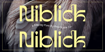 "Niblick" is a modern and classic styled display typeface. The unique touches on each character add to the visual impression that is more impressive. Useful if your project requires strong, memorable visuals. Great for branding designs, posters and logos. Features: Uppercase, Lowercase, Numeral, Punctuation, Multilingual, Ligatures & PUA Encoded. Thanks!
 - Ningrat by Bejeletter,
$20.00 Ningrat is a mix of classic with modern serif font family. It’s weight cover regular. The black weight of Ningrat Display font offers very strong impression. As a great choice for title and headers, it pairs well with most of the popular sans serif fonts for body text.
 - Arbinova by Brithos Type,
$11.00 Arbinova is a strong slab serif font. With its swash and beautiful arrangement of letters, this typeface will look outstanding in both formal and non-formal designs. This font is PUA encoded which means you can access all of the glyphs and swashes with ease! Caps only Fonts.
 - Fellaure by MJB Letters,
$17.00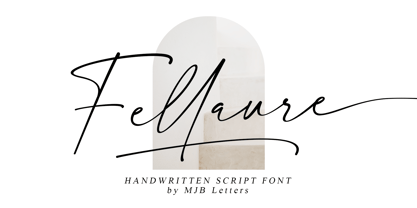 Fellaure is a modern authentic handwritten script, this font has a strong character in each letter that makes the font looks suitable for branding design, packaging, wedding design, logo design, poster design, signature, stationery design, and more. Fellaure comes with beautiful ligature, multilingual support, and additional underline swashes.