10,000 search results
(0.029 seconds)
- Streamwood JNL by Jeff Levine,
$29.00 Streamwood JNL is an outline sans wood type re-drawn from vintage source material. The design bears strong resemblance to Woodlawn JNL; but is a bit narrower and has a much different set of numbers as well as a more stylized letter "Q".
 - Paducah JNL by Jeff Levine,
$29.00 The hand lettered screen credits for the 1940 film “The Proud Valley” feature a bold, hand lettered sans serif type design with strong Art Deco influences. This is now available as Paducah JNL, which is available in both regular and oblique versions.
 - ShAqA by Okaycat,
$29.50 Shaqa is a bold and beautiful inline typeface designed by Natsuko Hayashida in 2014. The eye-catching poster style of Shaqa has a graphic quality which is especially well suited for strong headlines and titles. Shaqa matches well with the Komela font family.
 - Silver Notes by MJB Letters,
$17.00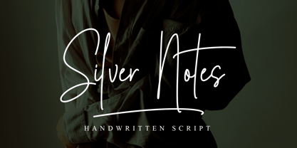 Silver Notes is a stylish handwritten font that has a strong character in each letter and will be very suitable for signatures, branding designs, packaging designs, watermarks, logo designs, wedding designs, stationery, business cards, and more. Features : Ligatures Underline swashes Multilanguage support
 - Aerillyo by Stringlabs Creative Studio,
$29.00 The Aerillyo is a strong and bold script font. It’s curved and rounded in every single touch, and has an unique vintage and retro styles that’s perfect for branding. The Aerillyo font is suitable for all your retro, vintage, and 80s style projects.
 - Romestone by Almarkha Type,
$25.00 Introducing our latest collection Romestone, a super bold condensed font family with 4 styles with strong and challenging nuances. Very suitable for titles, typography, clothes, magazines, brochures, packaging and much more for your design needs, making your designs more modern and professional.
 - Contagia by Rockboys Studio,
$26.00 Contagia is a trendy and stylish serif font. It is PUA encoded which means you can access all of the glyphs and swashes with ease! This font reads as strong, confident, and dynamic and can add tons of nostalgic character to your designs.
 - Kripke by Haiku Monkey,
$10.00 Kripke is a slab serif with rounded corners. It's readable and soft at small sizes, strong and friendly at large sizes. It's got a Greek and Cyrillic glyphs, as well as a large complement of accented characters. Try it on your designs!
 - Shaheen Arabic by Zaza type,
$29.00 Shaheen Arabic is an Arabic typeface that embodies power and a tendency towards uniformity. While preserving the neat, minimalist look which is associated with it. The name, too, hints at the strong character of the typeface. Shaheen Arabic comes in 5 wights
 - Counthills by Namara Creative Studio,
$20.00 A modern contemporary display typeface, can be used for large headings and titles, characterized by clean lines and stylish design elements. It conveys innovation and sophistication, creating a strong visual impact in modern design projects like websites, ads, logos, and branding materials.
 - HK Requisite by Hanken Design Co.,
$- HK Requisite™ is a sans serif typeface inspired by the compactness of Neue Haas Grotesk and the strong character of Akzidenz Grotesk. The name came from the fact that fonts are elements that are necessary for the achievement of a specified end.
 - Asrafel by Scriptorium,
$18.00Asrafel is an original font by Dave Nalle. It is a strong, stylish titling font based on hand lettering influenced by Celtic uncial styles and Art Nouveau titling fonts. It includes a variety of alternate character forms to create interesting visual relationships. - Eqoos by Iwm Design,
$10.00 Eqoos font captivates with its distinctive stripe style, exuding a modern and professional vibe. Perfect for logos, brand identities, and promotional materials, this font seamlessly combines robust typography with trendy elegance, infusing a unique and captivating visual appeal into your graphic designs.
 - Triplett by Monotype,
$40.99The capitals of the Triplett font bare a strong resemblance to Roman inscriptions, while the lowercase alphabet has been drawn with a rounded hand, inspired by the cursive uncial handwriting. Serifs are very small, giving a clean modern look to texts and headings. - Lino Cut by ITC,
$29.99Lino Cut is the work of British designer Bob Anderton, who was inspired by the strong effect of linocut images. Capitals and lowercase letters should be set closely. Lino Cut can bring its unique, eye-catching style to a variety of display applications. - Electroz by 4RM Font,
$30.00 Electroz font is a techno themed font made with futuristic values, made with condensed width and slanted cuts at the corners of the letters making this font look cool and have a strong futuristic value. suitable for use in futuristic-themed designs
 - Restrick by ZetDesign,
$15.00 Restrick is a strong display font. uses curved corners for flexible use on a variety of media displays. This font is very suitable for use as a headline in a newspaper, poster, or magazine. This font is available in regular and italic format.
 - Farmer by SparkyType,
$19.00The OpenType version of Farmer contains two sets of slightly different upper-case letters. The alternate version is accessible as Titling Caps in OpenType feature enabled software. Mixed and matched they create a strong and persuasive headline, logo or For Sale notice. - ATC Duel by Avondale Type Co.,
$20.00 ATC Duel is a strong, extra heavy multi-width sans-serif display font with sharp edges and an extended horizontal span, inspired by the automotive industry. Font contains 500+ glyphs, full alphabet, ligatures, numberals, accents and punctuation. ATC Duel was released in 2016.
 - YT Rain Latin by Yangtype,
$9.00The concept of this letter is ‘pleasure’. The shape of the letters with the rain is refreshing. The hardness of the letters, which can tolerate a certain amount of rain, and the intensity of the strong rain create a sense of pleasure. - Spartacus by Alan Meeks,
$45.00 A further development of the Colosseum range but this with a slab serif. Visually monoline and modern in appearence it still retains its Trajan characteristics. The addition of Spartacus black with its unusual Italic gives a the face a strong original headline font.
 - Backover by Alit Design,
$19.00 Introducing “Backover Typeface” – Unleash the Power of Words with a Heroic Twist! 🔥 Immerse yourself in the epic realm of typography with our latest creation, the “Backover Typeface.” Inspired by the valor of superheroes and the chivalry of knights, this font is a visual journey into the heart of heroic tales. 🗡️ Strike with Power: Channel the strength of legendary warriors as each letter in “Backover Typeface” is meticulously crafted to embody the essence of a hero’s decisive strike. The sharp angles and bold lines evoke the precision of a superhero’s punch or a knight’s swordplay. 🛡️ Defend with Style: The font doesn’t just pack a punch; it defends with flair! Each curve and contour replicate the resilience of a shield, offering a typographic fortress that stands strong against the ordinary. Let your words be the armor that shields your message with distinction. 👤 Unleash Your Inner Hero: “Backover Typeface” isn’t just a font; it’s a transformation. Feel the power surge as you type words that resonate with the bravery of classic heroes. This font empowers your message to become a beacon of courage, ready to take on any adventure. ⚔️ Warrior’s Arsenal: Immerse your audience in the visual feast of classic warrior illustrations included with “Backover Typeface.” Swords clash, shields protect, and helmets gleam with the promise of valor. These meticulously designed elements seamlessly integrate into your typography, allowing you to create a visual narrative that echoes the grandeur of heroism. 🎮** Level Up Your Designs:** Whether you’re working on a superhero movie poster, a knight-themed game interface, or any project that demands a touch of legendary charm, “Backover Typeface” is your ultimate companion. Elevate your designs, captivate your audience, and let the font be the hero of your creative journey. 🌟 Key Features: Heroic Typography Superhero and Knight Theme Sword, Shield, and Helmet Illustrations Perfect for Movie Posters, Game Graphics, and more 🚀 Elevate your design game with “Backover Typeface” – where every word becomes a heroic adventure! Download now and embark on a typographic journey like never before. Unleash the hero within your words! ⚡️
 - Abudabi by Etewut,
$20.00 Abudabi is a connected script typeface that includes 3 font styles: • REGULAR for signs and basic text • BOLD for titles and highlights • STONE for single words or backgrounds
 - Ruby Red by Hanoded,
$15.00 Ruby Red is a playful font, made with ink and a brush. Ruby Red would look great in ads and packaging. Comes with a treasure trove of diacritics.
 - Window Sign JNL by Jeff Levine,
$29.00 Window Sign JNL is a solidified re-working of Sign Stencil JNL; originally modeled from some vintage lettering stencils that were part of a store sign making kit.
 - Plantin Infant by Monotype,
$29.99Plantin is a family of text typefaces created by Monotype in 1913. Their namesake, Christophe Plantin (Christoffel Plantijn in Dutch), was born in France during the year 1520. In 1549, he moved to Antwerp, located in present-day Belgium. There he began printing in 1555. For a brief time, he also worked at the University of Leiden, in the Netherlands. Typefaces used in Christophe Plantin's books inspired future typographic developments. In 1913, the English Monotype Corporation's manager Frank Hinman Pierpont directed the Plantin revival. Based on 16th century specimens from the Plantin-Moretus Museum in Antwerp, specifically a type cut by Robert Granjon and a separate cursive Italic, the Plantin" typeface was conceived. Plantin was drawn for use in mechanical typesetting on the international publishing markets. Plantin, and the historical models that inspired it, are old-style typefaces in the French manner, but with x-height that are larger than those found in Claude Garamond's work. Plantin would go on to influence another Monotype design, Times New Roman. Stanley Morison and Victor Larent used Plantin as a reference during that typeface's cutting. Like Garamond, Plantin is exceptionally legible and makes a classic, elegant impression. Plantin is indeed a remarkably accommodating type face. The firm modelling of the strokes and the serifs in the letters make the mass appearance stronger than usual; the absence of thin elements ensures a good result on coated papers; and the compact structure of the letters, without loss of size makes Plantin one of the economical faces in use. In short, it is essentially an all-purpose face, excellent for periodical or jobbing work, and very effective in many sorts of book and magazine publishing. Plantin's Bold weight was especially optimized to provide ample contrast: bulkiness was avoided by introducing a slight sharpening to the serifs' forms." - Diane Script by GroupType,
$27.00 In 1995, FontHaus came upon a rare opportunity to create a revival of Aries, a little known and previously unavailable typeface by the legendary Eric Gill. Discovering a lost typeface by one of the major designers of the 20th Century, was the discovery of a buried treasure, and being the first type company to release it was an honor. Thirteen years later, FontHaus came across another little known typeface treasure: Diane. Designed by the legendary French designer Roger Excoffon in 1956, this remarkable script has never been faithfully recreated until now. In close collaboration with Mark Simonson, FontHaus and Mr. Simonson painstakingly researched rare type books, publications, European metal type services, and period showings from the United States, England, Germany and from the University of Groningen in the Netherlands. Finding full specimens of the font turned out to be quite a challenge. In most cases, only the caps and lowercase were shown. Furthermore, the more we researched Diane, many curious facts came to light. The caps in earlier specimens of Diane are completely different from specimens published later, suggesting that the face was redesigned at some point, perhaps in the mid-1960s. So we are left with two different sets of caps. The original had very elaborate, swirly strokes, very characteristic of Excoffon¹s gestural designs for posters and logos. Later on, these appear to have been replaced by a set of simpler, more traditional script caps. The original caps are criticized in one source Mark found (Practical Handbook on Display Typefaces, 1959) as being "exquisite" but "not highly legible". Perhaps this is what led to the simpler caps being introduced. Nevertheless, FontHaus's release includes not only both sets of caps, but a range of alternates and a number of new characters not originally available such as the Euro, and a magnificent alternate Ampersand to name a few.
 - FS Conrad by Fontsmith,
$50.00 Art into type In 2008, Fontsmith were approached by their friend, Jon Scott, to investigate whether a typeface could assume the aesthetic of one artist’s body of work. Jon’s not-for-profit charity, Measure, was organising an event for the artist, Conrad Shawcross, whose giant mechanical installation, entitled Chord, was going on public display in the long-disused Kingsway tram tunnel in Holborn. Chord explores the way we perceive time, as either a line or a cycle. Two enormous machines with dozens of rotating arms and moving in opposite directions, weave rope with almost infinite slowness. An unusual brief Phil Garnham visited Conrad in his Hackney studio to get a feel for his work and ideas. “Conrad is a very clever and philosophical guy. He struggled to see how typeface design had any relevance to him and his art. This was going to be a challenge.” The artist presented the type designer with a pile of rope and a huge diagram of sketches and mathematical workings. “This was, in essence, my brief.” Phil developed three concepts, the simplest of which ticked all the boxes. “The idea of the strokes in the letterforms appearing and ending at peaks or points of origin fitted perfectly with Conrad’s idea of time occurring and ending at two ends of the sculpture.” Two versions Phil planned modules for two versions of the typeface: one with five lines in the letterforms and one with seven. He then drew the modules on-screen and twisted and turned them to build the machine that is FS Conrad. “This is not a simple headline typeface,” says Phil. “It’s not a rigid structure. It has varying character widths, and it’s informed by real typographic insight and proportions so that it actually works as piece of functioning, harmonious type.”
 - Barchowsky Fluent Hand by Swansbury,
$24.00Swansbury, Inc. provides handwriting instruction to all ages, accompanied by two exemplar fonts, Barchowsky Fluent Hand.otf and Barchowsky Dot.otf. The basis for the design of the characters is the italic of the Renaissance. With the advantage of contextual alternates, Barchowsky Fluent Hand automatically joins lowercase letters so it can be used in any venue where a clean and elegant appearance of handwriting is desired. The fonts allow maximum instructional flexibility. Aside from their use in lesson plans, educators can customize pages for specific student interests, studies and needs. Included are all math symbols that one typically encounters in school curricula. Nan Jay Barchowsky, designer of this font, believes that children should hone their handwriting skills as they learn all subjects, reading, math, history and foreign languages. Both fonts support all Western European languages and Turkish. Barchowsky Dot is for young children or others who need remediation. The letterforms are identical to those in Barchowsky Fluent Hand. Used at a large point size open dots appear within the lines that form the characters indicating where one should start each stroke in a letter or number. Once formations are learned Barchowsky Fluent Hand can be used with the contextual alternates turned off until students are ready to write in the joined-up manner of a true cursive. Specifications: The technology for fonts that automatically join letters, or allow them to be unjoined is relatively new. At present, both fonts work on Windows XP with Service Pack 1 or later (or Vista), using AbiWord, a free word processor (go to abisource.com). They also work well with InDesign 2. Currently there is an unknown factor in later versions of InDesign for Windows that disallows joining. Macs completely support the fonts using InDesign 2 and later, PhotoshopCS and IllustratorCS. If you do not have these applications, there is an inexpensive word processor for Macs. - Givens Antiqua by Monotype,
$29.99Drawn by George Ryan and named after Robert Givens, the co-founder and first president of Monotype Imaging, the Givens Antiqua™ typeface speaks with elegance and subtle authority. The design's open proportions, generous x-height and soft serifs lend Givens Antiqua a gracious quality that invites reading. I didn't work from any single design model," Ryan recalls. "The face grew out of my experimenting with several characters from a hand-lettered headline in a magazine. I worked on the shapes and forms for some time before I put the drawings in a drawer." At that point Ryan had finished the basic alphabet in two weights, but had not yet tackled the italics. A new project came along that demanded his full attention, and it was two years before he revisited the drawings. He liked what he saw and decided to finish the job. "The italics were the most problematic designs in the family," says Ryan, "but once I had their basic shapes and proportions, the rest was basically a production project." Another year of sketching, testing, editing and reworking characters ensued before Givens Antiqua was ready for release. The result is a four-weight family of roman designs and small caps, with complementary italics for the lightest three weights and a suite of swash caps for the italic designs. Givens Antiqua and Givens Antiqua Light show a modest stroke weight stress and a light, even text color. Givens Antiqua Bold is an effective emphasizer for text copy and an authoritative communicator at display sizes. The Black weight performs best at large sizes and makes a powerful statement without shouting, while the italic swash capitals possess enough vitality to serve as standalone initial letters." - Arlette by TypeTogether,
$49.00 Pilar and Ferran based Arlette on the fast stroke of one letter from a Roger Excoffon family, but along the way they abandoned that starting point in favour of experimentation. Many sans serifs are like a svelte black dress: functional, beautiful, and the unfussy outfit for a nice evening get together. The Arlette family isn’t like this. It’s a stunner — an incandescent reimagining of what defines a sans and how it can look. Arlette explores the boundaries of the sans serif landscape and returns with forms developed from gestural vigour. Thinking of it as “painterly” may at first seem to fit, but it underestimates Arlette’s ability to master an unseen world of countless emotions and physical applications: magazines, branding, editorial, teen and young adult works, book covers, and a host of products and packaging whose content will be amplified with Arlette’s voice. Not only does Arlette use its eight weights plus italics to speak in Latin-based scripts, it is also fluent in Thai and has six weights (hairline through bold) with which it meets that challenge, whether in text or display. Arlette Thai’s modern nature is seen in two features for the script. One is the decorative Thai characters that are based on original palm leaf manuscripts. Another is a version of the Latin numerals adapted to the height of the script due to their wide use in Thailand. Arlette Thai has been meticulously developed, including contextual kerning to avoid mark clashes. Arlette’s OpenType capabilities include mathematic and scientific figures, positional forms, pointers, arrows, and oldstyle, lining, and tabular lining numerals. In addition to all this, it’s packed with swashes and swash ligatures in both scripts for enthusiastic typesetting. Because it pushes experimentation without compromising readability, both Arlette Thai and Latin are surprisingly legible in small sizes and arrestingly beautiful when their details can be seen.
 - Kabyah by Alit Design,
$17.00 Presenting 🕌Kabyah Ramadhan Typeface🕌 by alitdesign. Kabyah Ramadhan Typeface is a beautifully crafted font that combines traditional Arabic calligraphy with modern design elements. The font has a contemporary look and feel, with elegant swashes and alternate characters that add a unique touch to any design project. The font draws inspiration from the rich cultural heritage of the Arabic language, with its intricate shapes and ornate embellishments. The strokes and curves of Kabyah Ramadhan Typeface are carefully crafted to create a harmonious balance between legibility and aesthetic appeal. With its clean lines and precise detailing, Kabyah Ramadhan Typeface is perfect for a variety of design applications, including branding, packaging, logos, and headlines. It is also an ideal choice for print and digital media, such as posters, brochures, and social media graphics. The Kabyah Ramadhan Typeface has 820 characters, supports multilingual characters, and includes PUA Unicode encoding, makes it a very versatile font. Designers can use it to create designs in a variety of languages and scripts, making it a great choice for global projects. In addition to its extensive character set, the font also includes Kabyah Dingbats with 304 characters, which can be used to add decorative elements to designs. These dingbats can be used to create unique and eye-catching designs, adding an extra layer of creativity to any project. Overall, Kabyah Ramadhan Typeface seems like a fantastic font with a lot of potential for designers who are looking for an Arabic-inspired modern font with lots of characters and flexibility. Language Support : Latin, Basic, Western European, Central European, South European,Vietnamese. In order to use the beautiful swashes, you need a program that supports OpenType features such as Adobe Illustrator CS, Adobe Photoshop CC, Adobe Indesign and Corel Draw. but if your software doesn't have Glyphs panel, you can install additional swashes font files.
 - Barchowsky Dot by Swansbury,
$17.00Swansbury, Inc. provides handwriting instruction to all ages, accompanied by two exemplar fonts, Barchowsky Fluent Hand.otf and Barchowsky Dot.otf. The basis for the design of the characters is the italic of the Renaissance. With the advantage of contextual alternates, Barchowsky Fluent Hand automatically joins lowercase letters so it can be used in any venue where a clean and elegant appearance of handwriting is desired. The fonts allow maximum instructional flexibility. Aside from their use in lesson plans, educators can customize pages for specific student interests, studies and needs. Included are all math symbols that one typically encounters in school curricula. Nan Jay Barchowsky, designer of this font, believes that children should hone their handwriting skills as they learn all subjects, reading, math, history and foreign languages. Both fonts support all Western European languages and Turkish. Barchowsky Dot is for young children or others who need remediation. The letterforms are identical to those in Barchowsky Fluent Hand. Used at a large point size open dots appear within the lines that form the characters indicating where one should start each stroke in a letter or number. Once formations are learned Barchowsky Fluent Hand can be used with the contextual alternates turned off until students are ready to write in the joined-up manner of a true cursive. Specifications: The technology for fonts that automatically join letters, or allow them to be unjoined is relatively new. At present, both fonts work on Windows XP with Service Pack 1 or later (or Vista), using AbiWord, a free word processor (go to abisource.com). They also work well with InDesign 2. Currently there is an unknown factor in later versions of InDesign for Windows that disallows joining. Macs completely support the fonts using InDesign 2 and later, PhotoshopCS and IllustratorCS. If you do not have these applications, there is an inexpensive word processor for Macs. - Orange Flower by Anastasia Kuznetsova,
$18.00 Say hello to 'Orange Flower'!! A bold and beautiful font with a brush and a lot of additions! I am very pleased to present 'Orange Flower' - a versatile and artistic set of handmade fonts with a brush! The font comes with alternative uppercase and lowercase characters. Thanks to the very clear contrast in weight and authentic style made with a brush, 'Orange Flower' is guaranteed to give your text an individual, individual feeling - ideal for logos, printed quotes, invitations, postcards, product packaging, headlines and everything your imagination is capable of, use in ink-based drawings or watercolors or independently in the form of bold handmade inscriptions!! :) The font comes with a lot of great features to keep you busy :) Each character has its own alternative version, which allows you to create unique words and layouts. There is also a second font brush 'Orange Flower Brush', which contains brush strokes, underscores and brush splashes. This gives you the opportunity to create an artistic image of your text, which will give your design a sloppy realistic look :) Both fonts have a large selection of characters, including ligatures. 'Orange Flower' includes ligatures and stylistic alternatives for those who have software with opentype support (for example, Photoshop/Illustrator). I really hope you enjoy it, and please feel free to write me a message if you have any questions or concerns! :) Font Features: - A-Z; a-z character set; - 1 language (English); - numbers and punctuation marks, symbols. Fonts can be opened and used in any software that can read standard fonts, even in MS Word. No special software is required to get started. It is recommended to use it in Adobe Illustrator or Adobe Photoshop. Made with love and magic ♡ Thank you for reading it, and do not hesitate to send me a message if you have any questions! ~ Anastasia
 - Plantin Headline by Monotype,
$29.00Plantin is a family of text typefaces created by Monotype in 1913. Their namesake, Christophe Plantin (Christoffel Plantijn in Dutch), was born in France during the year 1520. In 1549, he moved to Antwerp, located in present-day Belgium. There he began printing in 1555. For a brief time, he also worked at the University of Leiden, in the Netherlands. Typefaces used in Christophe Plantin's books inspired future typographic developments. In 1913, the English Monotype Corporation's manager Frank Hinman Pierpont directed the Plantin revival. Based on 16th century specimens from the Plantin-Moretus Museum in Antwerp, specifically a type cut by Robert Granjon and a separate cursive Italic, the Plantin" typeface was conceived. Plantin was drawn for use in mechanical typesetting on the international publishing markets. Plantin, and the historical models that inspired it, are old-style typefaces in the French manner, but with x-height that are larger than those found in Claude Garamond's work. Plantin would go on to influence another Monotype design, Times New Roman. Stanley Morison and Victor Larent used Plantin as a reference during that typeface's cutting. Like Garamond, Plantin is exceptionally legible and makes a classic, elegant impression. Plantin is indeed a remarkably accommodating type face. The firm modelling of the strokes and the serifs in the letters make the mass appearance stronger than usual; the absence of thin elements ensures a good result on coated papers; and the compact structure of the letters, without loss of size makes Plantin one of the economical faces in use. In short, it is essentially an all-purpose face, excellent for periodical or jobbing work, and very effective in many sorts of book and magazine publishing. Plantin's Bold weight was especially optimized to provide ample contrast: bulkiness was avoided by introducing a slight sharpening to the serifs' forms." - Heroe by Lián Types,
$37.00 DESCRIPTION Now my feelings about didones are more than evident. After some years of roman-abstinence (1) I present Heroe, an interesting combination of elegance and sensuality. Heroe, spanish for hero, takes some aspects of roman typefaces to the extreme like my main inspiration, the great Herb Lubalin, did in the majority of his works: Thins turned into hairlines, altered proportions (for display purposes), unique ball terminals, poetic curves and a graceful way of placing them together on a layout. Its classy style makes the font perfect for a wide range of uses. Imagine Heroe Inline (my favorite) dancing over a bottle of perfume; printed on the cover of a fashion magazine; lighting wedding invitations up. Its partner, Heroe Monoline, may help you to make more elaborated pieces of design. Just combine it with Heroe, or Heroe Inline and see how perfect they match. TECHNICAL The difference between Pro and Std styles is the quantity of glyphs. While Pro styles have all the decorative characters available, Standard ones have only the basic set of them. Heroe Monoline Big and Heroe Monoline Small were made for better printing purposes. If you need to print the font in small sizes, then your choice should be Small. Heroe Monoline has the same alternates (and open-type code) as Heroe Pro and Inline, plus some decorative ligatures. NOTES (1) After fonts like Breathe , Aire , and the award winning Reina , I started experimenting with scripts a little more. Erotica , Bird Script and Dream Script are examples of that.
 - DT Stoner Toon by Dragon Tongue Foundry,
$10.00 Inspired by early cool cartoon fonts, early rock and hippie posters, I created this casually organic 'DT Stoner Toon' font. Please use with contextual ligatures turned on when possible. These letters like to adapt to their neighbours. 60's 60s artdeco artnouveau cartoon cartoonesque Cartoon Font cartoonish cartoony casual contextual cool cool font cool typeface dots fun fun font gigposter hippie hippy joined party poster poster font poster typeface rock poster spots spotted Stoned Stoner stones theater poster toon wet with dots written
 - Cesium by Hoefler & Co.,
$51.99 An inline adaptation of a distinctive slab serif, Cesium is an unusually responsive display face that maintains its high energy across a range of different moods. The Cesium typeface was designed by Jonathan Hoefler in 2020. An energetic inline adaptation of Hoefler’s broad-shouldered Vitesse Black typeface (2000), Cesium is named for the fifty-fifth member of the periodic table of the elements, a volatile liquid metal that presents as a scintillating quicksilver. From the desk of the designer, Jonathan Hoefler: I always felt that our Vitesse typeface, an unusual species of slab serif, would take well to an inline. Vitesse is based not on the circle or the ellipse, but on a less familiar shape that has no common name, a variation on the ‘stadium’ that has two opposing flat edges, and two gently rounded sides. In place of sharp corners, Vitesse uses a continuously flowing stroke to manage the transition between upright and diagonal lines, most apparent on letters like M and N. A year of making this gesture with my wrist, both when drawing letterforms and miming their intentions during design critiques, left me thinking about a reduced version of the typeface, in which letters would be defined not by inside and outside contours, but by a single, fluid raceway. Like most straightforward ideas, this one proved challenging to execute, but its puzzles were immensely satisfying to solve. Adding an inline to a typeface is the quickest way to reveal its secrets. All the furtive adjustments in weight and size that a type designer makes — relieving congestion by thinning the center arm of a bold E, or lightening the intersecting strokes of a W — are instantly exposed with the addition of a centerline. Adapting an existing alphabet to accommodate this inline called for renovating every single character (down to the capital I, the period, and even the space), in some cases making small adjustments to reallocate weight, at other times redesigning whole parts of the character set. The longer we worked on the typeface, the more we discovered opportunities to turn these constraints into advantages, solving stubbornly complex characters like € and § by redefining how an inline should behave, and using these new patterns to reshape the rest of the alphabet. The New Typeface The outcome is a typeface we’re calling Cesium. It shares many of Vitesse’s qualities, its heartbeat an energetic thrum of motorsports and industry, and it will doubtless be welcome in both hardware stores and Hollywood. But we’ve been surprised by Cesium’s more reflective moods, its ability to be alert and softspoken at the same time. Much in the way that vibrant colors can animate a typeface, we’ve found that Cesium’s sensitivity to spacing most effectively changes its voice. Tighter leading and tracking turns up the heat, heightening Cesium’s sporty, high-tech associations, but with the addition of letterspacing it achieves an almost literary repose. This range of voices recommends Cesium not only to logos, book covers, and title sequences, but to projects that regularly must adjust their volume, such as identities, packaging, and editorial design. Read more about how to use Cesium. About the Name Cesium is a chemical element, one of only five metals that’s liquid at room temperature. Resembling quicksilver, cesium is typically stored in a glass ampule, where the tension between a sturdy outer vessel and its volatile contents is scintillating. The Cesium typeface hopes to capture this quality, its bright and insistent inline restrained by a strong and sinuous container. Cesium is one of only three H&Co typefaces whose name comes from the periodic table, a distinction it shares with Mercury and Tungsten. At a time when I considered a more sci-fi name for the typeface, I learned that these three elements have an unusual connection: they’re used together in the propulsion system of nasa’s Deep Space 1, the first interplanetary spacecraft powered by an ion drive. I found the association compelling, and adopted the name at once, with the hope that designers might employ the typeface in the same spirit of discovery, optimism, and invention. —JH Featured in: Best Fonts for Logos
 - KG Fractions by Kimberly Geswein,
$5.00 This font was created with math teachers in mind. It is hard to represent fractions in a way that can print easily in black and white on worksheets or tests. The extra outlines on these shapes are created just for that purpose- so your student can easily identify how many parts are shaded in the image. Blanks are also included so students can color in parts of a whole.
 - Feliks Handwriting by SoftMaker,
$7.99 Digitized handwriting fonts are a perfect way to give documents the “very special touch”. Invitations look simply better when handwritten than when printed in bland Arial or Times New Roman. Short handwritten notes look authentic and appealing. There are numerous occasions where handwritten text makes a better impression. Feliks Handwriting is a beautiful typeface that mimics true handwriting closely. Use Feliks Handwriting to create stunningly beautiful designs easily.