10,000 search results
(0.034 seconds)
- Cíclope by Andinistas,
$19.95 Cíclope is a typeface family designed by Carlos Fabián Camargo in 2012 and used to write the headlines. Its idea is based on an army of stone soldiers that with their size and strength cause earthquakes. Under this concept he obtained stencil and sans serif letters with monstrous shapes and torn counterforms. Its usefulness as well as readability consists in imitate rocks with scars and cracks. For that reason, Cíclope family has three sizes, each with their respective italics distributed at different levels of corrosion. In addition, each file contains 260 glyphs useful for designing words and phrases with systematically eroded treatments for advertisement material. Thus Cíclope works as a raw material in the exploration of new graphic design. Finally, Cíclope concept has grotesque, geometric and humanistics letters roots that seem disastrous but each and every detail has been planned with high definition drawing. Most importantly, it expresses a big amount of grunge style with cracked edges and medium contrast between thin and thick strokes. In that sense, the writing seems impaired and special for design of logos, posters, flyers, brochures and worn, crusty or demolished graphic design.
 - HWT Bon Air by Hamilton Wood Type Collection,
$24.95 Bon Air was one of a series of script typefaces cut into wood by the Hamilton Manufacturing Company for the Morgan Sign Machine Co. (makers of the Line-o-Scribe showcard press) in the mid 20th Century. These were some of the last new designs cut into wood by Hamilton until the museum revival in the early 2000s. Bon Air was created in 1958 and trademarked in 1961. The wood type made for Morgan was used largely in department stores to make their own signage. The script styles are reminiscent of sign painters alphabets and evoke a Mad Men era advertising aesthetic. The font was only cut in four sizes: 12, 18, 36 and 72 line. It was distributed by Morgan for use in their presses, but as type high wood type, it could be used on any press. The font was issued with several alternate letters and ligatures to simulate the effect of hand lettering. Its lively strokes and odd details give it an exotic flavor suitable for advertising display work. The digital version includes all of the original alternates plus new characters to fill out a full European character set.
 - Mantika Book by Linotype,
$50.99 Mantika Book was originally conceived and drawn parallel to the first Agilita drawings. *[images: pencil drawings] It took several years before having a chance looking at these designs again. But then, my first impulse was to turn this alphabet into a new sanserif, which was to become Mantika Sans. This was the starting point to conceive a super family consisting of different design styles and corresponding weights. The initial drawings of Mantika Book were refined and an Italic was developed to go with it. The aim was to create a modern serif typeface which is reminiscent of humanistic Renaissance typefaces, yet without following a particular historic model. Its large x-height for one is far away from original Renaissance models. Mantika Book was designed as a companion serif typeface to Mantika Sans that can be set for lengthy texts as in books, hence its name. It shares the same x-height with Mantika Sans but has longer ascenders and descenders, making for better word shapes in long, continuous reading. The approach of an ›old-style‹ looking typeface with large minuscules makes Mantika Book also a choice for magazine text settings where one often needs smaller point sizes to fit in a multiple columns layout. The unique details of Mantika Book are the asymetric bracketed serifs in the upright font and its higher stroke contrast than usual in a Renaissance style. The stems are slightly curved inwards. Also, the Italics have a low degree of inclination, which makes longer passages of text set in Italic rather pleasing to read. Another feature Mantika Book shares with Mantika Sans is that all four weights take up the same line length. It covers all European languages plus Cyrillic and Greek, is equipped with lots of useful scientific symbols [double square brackets, angle brackets, empty set, arrows] and the regular weight has small caps. There is a kind of an old-style feeling to Mantika Book, yet these citations were turned into a contemporary serif typeface with a soft but sturdy character.
 - Biome by Monotype,
$29.99 In the sketches that formed the basis for his typeface Biome, Crossgrove experimented with inner and outer shapes in different styles, adapted letters to the form of the super-ellipse, and added curves only to remove these again. His challenge was to find a harmonious and coherent approach that provided sufficient contrast with existing fonts. Biome is essentially in the sans serif tradition and the letters exhibit only minor variations in terms of line thickness. There is still a suggestion of the super-ellipse at many points, but this never becomes the predominant design factor. While most of the terminals of the vertical strokes are only slightly rounded, the horizontals and diagonals have pronounced arches and it is these that basically determine the round and soft character of the typeface. The more unconventionally shaped letters, such as the lowercase 'g' with its two semi-open counters and the 'k' and 'x' with their crossbars, provide Biome with an individual personality. And this effect is emphasized by the generously rounded links in the 'v' and 'w' and the uppercase 'M' and 'N'. Biome has been designed as a typeface super-family. From the near hairline Extra Light to the amply proportioned Ultra, there are seven clearly differentiated weights and three tracking widths. There are oblique italic versions of all variants. The range includes small caps and numeral sets containing lowercase and uppercase digits. With its available range of characters, Biome can be used to set texts in all Eastern European languages. Although the remarkable individuality of Biome is most clearly apparent in the larger point sizes, this typeface is not just suitable for producing headlines and logos. Biome's elegant visual effects mean that it is equally comfortable in short texts while its large x-height and generous counters make it readily legible even in the small font sizes. Biome is a contemporary typeface that employs mid-20th century futurist elements which ironically give it a retro feel.
 - Mundo Serif by Monotype,
$50.99 With designs drawn specifically for comfortable reading in everything from on-screen digital content to print in periodicals and books, Mundo Serif is ready to take on just about any project. Carl Crossgrove drew the suite of typefaces to complement his Mundo Sans family’s classic humanistic design traits – and added a subtle modern influence. Restrained stroke modulation, generous counters, commanding x-height and tall ascenders ensure that content set in Mundo Serif is both legible and easy on the eyes. While primarily designed for text copy in print and on screen, Mundo Serif becomes a powerful display type tool in the lightest and boldest weights. Headlines, navigational links and banners are naturals for this versatile collection of typefaces. Mundo Serif is a large family. Nine weights, each with an italic companion, enable precise typographic tuning. Captions, subheads, pull quotes and long-form copy can be melded to create a welcoming page of modulated text. For best results in digital environments, skipping a weight – or even two – ensures hierarchical clarity. Crossgrove did extensive testing of Mundo Serif to ensure the best possible on-screen readability. To further guarantee optimal digital imaging of the family, he gave the design generous inter-character spacing and slightly expanded intricate characters like the lowercase a and g. If the goal is diversified or multi-platform branding, look no further than Mundo Sans. The two designs harmonize with each other perfectly in weight, typographic color and proportion. Both designs benefit from large international character set that includes support for most Central European and many Eastern European languages. For a stronger contrast, pair Mundo Serif with virtually any sans serif grotesque design. Crossgrove has designed a variety of typefaces ranging from the futuristic and organic Biome™ to the warm, clean lines of the Mundo Sans. His work for Monotype also often takes Crossgrove into the realm of custom fronts for branding and non-Latin scripts.
 - Atrament by Suitcase Type Foundry,
$75.00The Atrament font family was originally conceived in 2003 as the corporate display type family for Suitcase Type Foundry. Its original source of inspiration is the front cover of the Devetsil - Revolucni slovn’k almanac (1922), designed by Karel Teige. The lettering on this cover is a condensed sans serif with rounded stroke terminals. Atrament is significantly broader than the model and its characters are better balanced, reflecting the evolution of semi-condensed sans serifs throughout the 1960s. The horizontal strokes of both lower and upper case are less stressed than the vertical stems. Noteworthy are the unusual tiny gaps in the apex and vertex of letters with diagonal strokes, designed to prevent ink from spreading and smudging the letter shapes. This detail is one of the main features of the font's character. The general feel of the italics closely matches the strictly vertical, parallel character of the regular cut. When converting the family to OpenType the alternate character shapes from the Alternator weights were incorporated in the regular cut, which allows the user to switch selected characters from one shape to another within the same font. A number of glyphs and accents were corrected, and all the glyphs missing in the Suitcase Standard character set were added, along with the relevant kerning pairs. The individual weights of Atrament Std thus contain accented upper and lower case, small caps, alternate glyphs for most European languages, nine types of numerals, superscript characters, caps glyph versions, and much more. Its narrow proportions make Atrament the perfect choice whenever economy of space is a must. It is however not very well suited for setting long texts. Ideal for headlines and display use, it is perfect for situations where the text needs to make a great impact in a little space. - ITC Christoph's Quill by ITC,
$29.99ITC Christoph's Quill is just about everything you could want in a typeface: it's distinctive, beautiful, and exceptionally versatile. According to designer Russell Bean, ITC Christoph's Quill is the culmination of experimentation with a graphics tablet that spanned several years. Then one day, as if by magic, it all just fell into place. The design seemed to flow from my pen." Bean was born in Australia and, except for a brief stint with a photo-lettering firm in Southern California, has spent most of his career working down under. "I can recall a deep fascination for the written word," he says. "Even before learning to spell, read or write, I think I recognized that this was a means of visual communication." Bean's first job was in a small ad agency as a trainee in the production department, where he learned art techniques and how to handle print, as well as "the value of visual impressions," he says. His career path meandered from one design job to another, but always in the general direction of fonts and typefaces. Today, his workload consists of logo design commissions, font editing, typography and print production consultation to a select group of loyal clients - still leaving time, notes Bean, "to pursue my type design ambitions." ITC Christoph's Quill began life as a simple, visually striking font of caps, lowercase, punctuation and numerals. To this Bean added a bold weight, for when a little more strength is desirable. Next came a flock of alternate characters. Finally, Bean drew a set of decorative caps, a suite of logos, and a sprinkling of beginning and ending swashes. The net result is a type family that can add a signature flourish to a vast range of projects: from invitations and menus to logos, signage, packaging and more." - Expline Variable by Formatype Foundry,
$140.00 Expline typeface finds its roots in modernist design but subtly pays homage to early Modern Industrial Grotesks. This fusion creates a font that encapsulates the essence of tradition while embracing the contemporary. The font incorporates sharp details in select characters and curves, imparting a delicate sweetness while preserving the robust character associated with Grotesk fonts. This unique blend allows Expline to strike a perfect balance between display and text usage, making it a versatile choice for a variety of design projects. Expline's flexibility shines through its extensive weight options. The font family offers eight distinct weights, each thoughtfully crafted to establish a clear typographic hierarchy. Designers can easily choose the right weight to suit the specific needs of their projects, whether it's a bold headline or a refined body text. This variety ensures that your typography will always make the right visual impact. Expline typeface doesn't stop at weights. It provides expansive character sets across each weight, encompassing all Western European diacritics, Punctuation, Mathematics, and Numerics. This ensures that your typography will seamlessly support various languages and punctuation marks, making it a global choice. In addition, the font boasts OpenType features, granting the flexibility to explore multiple subsets. This includes alternate capital letterforms, tabular and lining numerals (both proportional and old-style), enabling endless typographic possibilities. Whether you're designing for print or web, these features allow you to fine-tune your typography for a perfect fit. Expline is a font that bridges the gap between modernist design principles and early industrial influences, resulting in a Neo-Grotesk font with a contemporary twist. Its comprehensive weight options, expansive character sets, and OpenType features make it a versatile choice for any medium between print and screen.
 - Expline by Formatype Foundry,
$39.00 Expline typeface finds its roots in modernist design but subtly pays homage to early Modern Industrial Grotesks. This fusion creates a font that encapsulates the essence of tradition while embracing the contemporary. The font incorporates sharp details in select characters and curves, imparting a delicate sweetness while preserving the robust character associated with grotesk fonts. This unique blend allows Expline to strike a perfect balance between display and text usage, making it a versatile choice for a variety of design projects. Expline's flexibility shines through its extensive weight options. The font family offers eight distinct weights, each thoughtfully crafted to establish a clear typographic hierarchy. Designers can easily choose the right weight to suit the specific needs of their projects, whether it's a bold headline or a refined body text. This variety ensures that your typography will always make the right visual impact. Expline typeface doesn't stop at weights. It provides expansive character sets across each weight, encompassing all Western European diacritics, Punctuation, Mathematics, and Numerics. This ensures that your typography will seamlessly support various languages and punctuation marks, making it a global choice. In addition, the font boasts OpenType features, granting the flexibility to explore multiple subsets. This includes alternate capital letterforms, tabular and lining numerals (both proportional and old-style), enabling endless typographic possibilities. Whether you're designing for print or web, these features allow you to fine-tune your typography for a perfect fit. Expline is a font that bridges the gap between modernist design principles and early industrial influences, resulting in a Neo-Grotesk font with a contemporary twist. Its comprehensive weight options, expansive character sets, and OpenType features make it a versatile choice for any medium between print and screen.
 - Boardwalk Avenue by Fenotype,
$30.00 Boardwalk Avenue is an elegant type collection of three styles and two weights of each. It’s divided into Boardwalk Pen, Boardwalk Antiqua and Boardwalk Serif. Boardwalk Avenue’s core is a connected mono linear script that works fantastic when paired with either of the impressive serif styles. All the fonts work great on their own but try putting them all together for a complete display font setup for a project. Here’s a short introduction on what’s included: Boardwalk Avenue Pen is a connected Script. It’s great for headlines, quotes or in packaging. It has a casual hand drawn vibe to it but it’s clean and legible. It’s equipped with automatic Contextual Alternates that keep the connections smooth and versatile. For instance when you type double letter another of them will automatically change to add variation. Or if you type “i” for example, as a first letter after space or after capital letter the code will add starting point to the letter to keep the letterforms more balanced. If you need more ambitious letterforms you can try Swash or Titling Alternates -there’s alternates for every standard letter and seek for even more alternates from the glyph palette. Boardwalk Avenue Antiqua is a high contrast serif with strong character. It’s great for glamorous headlines or as a logotype. Boardwalk Avenue Serif is a low contrast serif with bulky character. It’s great for strong and sturdy headlines or as a logotype.
 - Karita by Nathatype,
$29.00 Your design project is your brand’s introduction to the public, so it is crucial to do it in the right way. An inappropriate font can totally change your messages and damage your work. For that reason, Karita is here to assist you with your needs. Karita is a classic, elegant, professional display serif font to increase the product and brand values promoted. This font looks more prominent than the others and shows strong, yet elegant impressions to attract customers. Continuity elements on every little scratch of the letters’ edges lead your eyes to follow one letter to another in line with serif font characters. Besides, this font type has thick lines and strong contrasts to attract customers and to show firm impressions. For a legibility reason, you can use this font for big text sizes. You can enjoy the available features here as well. Features: Stylistic Sets Ligatures Multilingual Supports PUA Encoded Numerals and Punctuations Karita fits best for various design projects, such as brandings, posters, banners, headings, magazine covers, quotes, invitations, name cards, printed products, merchandise, social media, etc. Find out more ways to use this font by taking a look at the font preview. Thanks for purchasing our fonts. Hopefully, you have a great time using our font. Feel free to contact us anytime for further information or when you have trouble with the font. Thanks a lot and happy designing.
 - Mecanic by Manolo Type,
$15.00 Their angular lines are strongly contrasted by sweeping curves, the result: one type with firm character and strong personality.
 - Brougham by Jonahfonts,
$25.00 Brougham keeps its legibility with a strong presence. Usage recommendations: Captions, packaging, cards, posters, ads, book jackets and manuals.
 - Perpetuity by Zang-O-Fonts,
$25.00Strict, strong and narrow, Perpetuity is clean and perfectly designed to be used as a more formal display face. - Tasty by Hubert Jocham Type,
$29.90 Tasty is an strong self-confident brush script headline typeface. It is ideal for food packaging and product branding.
 - InfoBits by Fonthead Design,
$19.00 InfoBits is a two-font system of dingbats with a strong technology theme. The complete family has 188 icons.
 - SwissCheese - Unknown license

- Tropicollo by OzType.,
$16.00 Tropicollo is a handwritten mono weight cursive font. Its super clean and tidy design will turn any idea into a true standout end result! Works great applied to logos, prints, quotes, magazine headers, clothing, advertisements, product designs, labels, and much more!
 - Goodbees by ZetDesign,
$15.00 Goodbees is built from a bold base, unique combinations, smooth curves, and sharp edges. Goodbees is best uses for headings, Logo types, quotes, apparel design, invitations, flyers, posters, greeting cards, product packaging, book covers, printed quotes, album covers, movies and more.
 - PUJI by pororoca,
$25.00 PUJI is an experimental sans serif perfectly suited for graphic design and any display use. It could work for web, print, motion graphics etc. PUJI has the other version "PUJI narrow" which has different letter's width in "A","V","W".
 - Europa Text by Solotype,
$19.95This circa 1910 European face was introduced into the United States by a German type foundry traveling salesman during the great depression of the 1930s. We have used it quite successfuly in sizes as small as 10 and 12 point. - Brogado JNL by Jeff Levine,
$29.00Make room for Brogado JNL! This bold, yet squat slab serif font takes command when set into headlines. Although not thoroughly in the Western mold, Brogado JNL can still exude enough macho appeal to make its point strongly, yet clearly. - RM Victoriana by Ray Meadows,
$19.00 A decorative and fancy slice of the gay '90s (1890s that is). Due to the modular nature of this design there may be a slight lack of smoothness to the curves at very large point sizes (around 100 pt and above).
 - Ft Thyson by Fateh.Lab,
$30.00 FT Thyson is a powerful and elegant display typeface. can be used to present your ideas in sports/fitness or editorials, Its weight is superior in posters, social media, headlines, titles, large format print - and wherever you want to be noticed.
 - Auther by Seniors Studio,
$21.00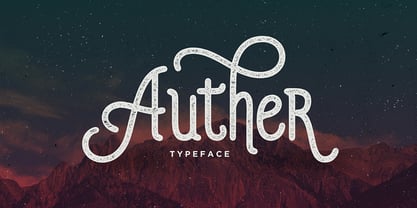 Auther is a modern design with a vintage feel. A monoline display font that combines classic & modern styles. Includes OpenType features with Stylistic Alternates and ligatures. Auther is suited for various print and digital designs, including logos, stationery, posters and more.
 - The Heista Killer by Almarkha Type,
$29.00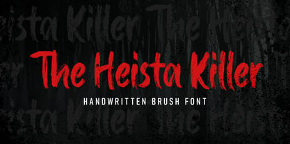 The Heista Killer – Handwritten Brush font with a clear style and dramatic movement this font is great for your next creative project such as logos, printed quotes, invitations, cards, product packaging, headers, Logotype, Letterhead, Poster, Apparel Design, Label, and etc.
 - Buttercell Script by Wacaksara co,
$16.00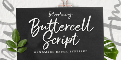 Buttercell Script is a hand brush script available in clean and rough edge versions. This font is great for your next creative project such as Logotype, printed quotes, invitations, cards, product packaging, headers, Letterhead, Poster, Apparel Design, Label, and etc.
 - Fayte by That That Creative,
$15.00 Fayte is a modern blackletter font that gives focus on contemporary display type. This vintage-made new typeface is unmistakably blackletter, However, it is accessible enough to be used across many projects, for branding, Instagram, print posters, magazines, Fashion, whatever.
 - Franie by That That Creative,
$50.00 Franie is a variable geometric sans serif font family with 72 styles. Fully customize the width, weight and italic angle. This modern clean typeface is perfect for contemporary layouts for print, magazines, posters, web, social media, branding logos, or whatever.
 - Cachiyuyo by MendozaVergara,
$9.99 Cachiyuyo is a bitmap font designed for screen titles and to be printed, has a large x height, is very tight and orthogonal. Cachiyuyo is meant for short texts and simple layouts. Is optimized for screen at 8px, 16px, 32px etc.
 - Selenic by Paul Dersidan,
$23.00 Selenic is a solid typeface with a clean look, interesting texture and quick impact. Friendly but also aggressive it is best suited for massive headlines, fashion photography, album covers, logo design or any other typographical work on digital and print.
 - Rits Calltown by Zamjump,
$17.00 Rits Calltown is casual script typeface. Perfect for your next creative project such as Logotype, printed quotes, invitations, cards, product packaging, headers, Letterhead, Poster, Apparel Design, Label, and etc. FEATURES : – Uppercase – Lowercase – Number – Multilingual – Opentype FILES INCLUDED : OTF., TTF WOFF file
 - Syndebuk by Bogstav,
$17.00 Syndebuk is designed with comics and print in mind. I’ve added 5 slightly different versions of each letter, which really comes in hand when you need a natural and organic handmade look. Play around with the different layers for nice effects!
 - Just Realize by Kimberly Geswein,
$5.00 This messy, natural handwriting font is a mix of cursive and print. It seems that the busier my life is, the messier my handwriting gets- and this is based on my real-life scribbled notes to myself and shopping lists.
 - Wingfead by Letterena Studios,
$17.00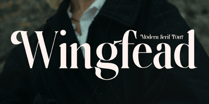 Wingfead is a bold and thick lettered serif font. It is perfect for any branding project such as logos, t-shirt printing, creative products, and more. Wingfead is PUA encoded which means you can access all glyphs and swashes with ease!
 - Wire Mesh JNL by Jeff Levine,
$29.00Wire Mesh JNL is an outline variation of the same design that produced Shady Characters JNL (lettering printed over a simulated halftone). This time around, the end effect gives the impression of looking at lettering cut out of a mesh screen. - Sweet Fig by Din Studio,
$29.00 Sweet Fig is a bold script. This font is suitable for any design like branding especially for food packaging, quotes, printing, etc. The design can elevate your design project. Features: Beautiful Ligatures Stylistics Set Many Swashes Multilingual Support Numerals and Punctuation
 - Dreadful by Aiyari,
$14.00 Introducing a new layered typeface called Dreadful. Inspired from classic horror movie and vintage comic. Dreadful typeface best uses for headings, Logo type, quotes, apparel design, invitations, flyer, poster, greeting cards, product packaging, book cover, printed quotes, cover album, movie, etc.
 - Baksoda by Wacaksara co,
$15.00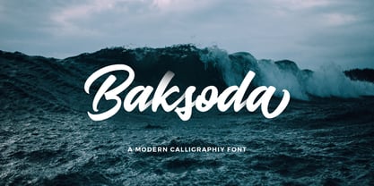 Baksoda is a handlettering script font with a clear style and dramatic movement this font is great for your next creative project such as logos, printed quotes, invitations, cards, product packaging, headers, Logotype, Letterhead, Poster, Apparel Design, Label, and etc.
 - GretchenHello by Ingrimayne Type,
$9.95 GretchenHello is a typeface family of informal hand printing that looks as if it were done with a calligraphic pen. It has tall ascenders and long descenders that give it a certain elegance. The family has three weights, each with italics.
