9,175 search results
(0.076 seconds)
- Didot Display by Canada Type,
$24.95 In spite of its name, this font family embodies the ultimate classic modern advertising typeface, rather than concern itself with revivalism or Didone authenticity. Naturally the spirit of the original Didot faces still exists in this family, but over twelve years of work on it have made it more fitting to the luxurious expression of our day and age, rather than nineteenth century Europe. Upscale and stylish, Didot Display is an essential tool for any designer involved in magazines, books, tasteful music, or overall luxury packaging that requires clean and large classic typography with an unmistakable modern spin. We recommend the use of Didot Display at 48 points and over. For 12-48 pt. use, check out its sister family, Didot Headline.
 - Bodoni by ParaType,
$30.00 Designed at ParaType in 1989 by Alexander Tarbeev. A modern replica of the typeface by Giambattista Bodoni, the Italian punchcutter and typographer of the late 18th century. Bodoni was a director of printing house of Duke of Parma in Italy. His early types were based on those of Fournier and Didot, but he developed the designs to become what are now considered to be the first modern typefaces. His letters have strong vertical stress, sharply contrasting thick and thin strokes and unbracketed hairline serifs. The contrast of thick and thin in Bodoni typefaces can produce a sparkling effect on a page: should be carefully used in texts; good for headlines and display. Condensed and decorative styles were added in 1993–97.
 - Letraset Romic by ITC,
$40.99Typeface designer and Letraset type director Colin Brignall created the font Romic. The character of the strokes as well as the serif forms give the font its calligraphic look. The placement of the serifs, on the upper left and lower right of a character, also distinguishes this typeface and allows the figures to be set very close to one another. The dots on the i and j do not hang in the air, rather, they are connected to the rest of the letter with a light, serif-like stroke. The elegant and lively Romic font is legible even in smaller point sizes. It is best used in middle length texts and headlines and wherever an individual and sophisticated image is the goal. - Napzer by Craft Supply Co,
$20.00 Napzer - Geometric Sans Serif is the embodiment of modern typographic design, seamlessly merging precision and simplicity into a versatile typeface. With its sharp, geometric letterforms and clean lines, Napzer is the perfect choice for projects that demand a contemporary and professional aesthetic. This typeface ensures outstanding legibility in both digital and print media, making it suitable for a wide range of applications. Whether you're designing a website, creating marketing materials, or establishing a corporate identity, Napzer's clear and crisp design will enhance your content with sophistication and clarity. Choose Napzer - Geometric Sans Serif to bring a touch of contemporary elegance to your design projects. Whether you're working on branding, editorial design, or digital interfaces, Napzer offers a timeless and professional typographic experience.
 - Big by Walking Fearless,
$20.00 BIG is an elegant condensed display font created for strong and impactful headlines. It comes from a series of hand printed specimens taken from wood type found in Andrew Howard’s Studio in Porto (Portugal). A wooden type that reassembles the industrial victorian style which has now been expanded to 20 cuts, ranging from ExtraLight to Bold, with Italics and a stencil version, covering all your needs for a striking visual effect just with plain type with distinctive features and personality, standing out from the crowded world of display sans serif. The font was engineered with essential OpenType features, that allows the user to compose the headlines in two different heights, with case-sensitive punctuation, symbols and special ligatures such as “the”, “of” and “le”.
 - HWT Lustig Elements by Hamilton Wood Type Collection,
$24.95 'Euclid. A New Type,' originally designed in the 1930s by modern American designer Alvin Lustig (1915-1955), has been revived as 'Lustig Elements' through a collaboration of designers Craig Welsh and Elaine Lustig Cohen. Only twelve letterforms from the original font design had been retained in archive material in the many decades since its initial development. Lustig Elements combines four simple, geometric shapes aligned to an underlying grid with letterform designs that hold true to the spirit of the original font. Lustig Elements initially came to life in 2015 as wood type cut at Hamilton Wood Type & Printing Museum. The digital version expands on the basic character set with a pro expanded latin character set, small caps and even an Inline variation.
 - ITC Vino Bianco by ITC,
$29.99ITC Vino Bianco was created by German designer Jochen Schuss. He drew his inspiration from the handwriting of the waiter in his favorite local pub, especially the form of the capital Q. Based on this one character Schuss developed the entire alphabet. The figures are sketchy and generous and look as though they were written on paper with a ball point pen. Vino Bianco is an alphabet of capital letters, each of which also has an alternative form, making it very flexible and true to the tendency of true handwriting. In spite of its fine strokes, the overall look is open and light due to the large amount of space each character occupies. The cheerful, carefree ITC Vino Bianco is best used for headlines and short texts. - Althera - Personal use only

- PMN Caecilia Sans by Monotype,
$50.99 Few projects are outside the range of PMN Caecilia® Sans. Drawn specifically for on-screen imaging, the family benefits from a large suite of weights, each with several stylistic variations. This is a design ideally suited to building digital interfaces, complex websites, apps, games, kiosks, HTML ads and large-scale brand identities. “My goal was to create a, friendly, versatile, ageless, yet discerning typeface family that will serve the needs of many users,” says Peter Matthias Noordzij. the typeface’s designer. “It is not intended to be eye-catching, but generous: enabling numerous visual and typographical expressions.” The use of Noordzij’s earlier design, PMN Caecilia, in Amazon’s Kindle® wireless reading devices, gave him the opportunity to study the behavior of the slab serif typeface in an on-screen environment. Although based on his earlier design, Noordzij incorporated fundamental changes to optimize PMN Caecilia® Sans’ digital performance. While PMN Caecilia has proven to be a steadfast serif typeface in print and on screen, the addition of a sans serif counterpart gives designers more flexibility when creating complex hierarchies. The combination of serif and sans serif makes the PMN Caecilia family a good choice for everything from print editorial projects to complicated web sites. A broad range of typefaces pair well with PMN Caecilia Sans. Humanist serif typefaces, such as Agmena™, Dante®, and Frutiger® Serif, set up dynamic typographic harmony, while designs like ITC New Veljovic™ Masqualero™ and Perpetua®, will create a striking counterpoint. And, of course, PMN Caecilia is a natural design partner – as are other slab serif typefaces, like the Aptifer™ Slab, Joanna® Nova and Soho® families.
 - TT Tricks by TypeType,
$35.00 TT Tricks useful links: Specimen | Graphic presentation | Customization options TT Tricks is a modern serif font family whose design refers us to the style of transitional serifs. The distinctive features of TT Tricks are the relatively low contrast of strokes, the slightly squarish shapes of round characters and the emphasized businesslike nature. The original idea of TT Tricks is based on the graduation project of student Sofia Yasenkova, who chose to create a daily planner font as her final project. This led to many stylistic decisions, for example, the large and asymmetrical serifs, low contrast strokes, and the presence of interesting details. In the process of working on TT Tricks, we have significantly revised the initial idea and expanded the areas of possible font application, while maintaining the original spirit of the project. Despite the large number of display details, the typeface looks great in a small point size, and also when it is used in large text arrays. TT Tricks features an original stylistic set which, when turned on, adds features of typical pointed-pen serifs to some of the lowercase characters. In addition, TT Tricks has small capitals for Latin and Cyrillic alphabets, as well as several interesting ligatures. The TT Tricks font family consists of two font subfamilies, these are the main version and the version with the original stencil cutting. Each subfamily consists of 12 fonts: Light, Regular, DemiBold, Bold, ExtraBold, Black + True Italics. Following a good tradition, TT Tricks supports a large number of OpenType features: ordn, case, c2sc, smcp, frac, sinf, sups, numr, dnom, onum, tnum, pnum, dlig, liga, calt, salt (ss01).
 - Gimbal Egyptian by AVP,
$19.00 Gimbal Egyptian is a richly-featured font family providing many style options across a broad range of languages. It is twinned with Gimbal Grotesque, a sans-serif family with an identical range of weights and features. Originally conceived as a small webfont family, the letterforms have been revitalised to put a spring in their step and the family has been extended to create a versatile multi-script text face equally at home on the printed page. Carefully crafted at all weights, Gimbal also lends itself to headlines and display applications such as posters, exhibitions and signage while resolving well on-screen for general document creation and web-based applications. The letters are spaced for best readability on-screen and in the usual printed body text ranges but are tolerant of tracking adjustment to suit other uses. The styles are divided by width into four families (Compressed, Condensed, Normal, Extended), each family possessing six weights plus corresponding italics. Within each family, the 'regular' and 'bold' weights are style-linked, and all upright forms have an italic counterpart. The full opentype character set includes latin, greek and cyrillic scripts with appropriate local variants (also as stylistic sets) for Turkish, Polish and Romanian (latin) and Russian, Bulgarian and Serbian (cyrillic). All fonts contain small capitals for all scripts, superscript for latin and commonly used greek together with the usual numeral style, size and positioning options. The default numerals are 'proportional lining'. Other opentype features include case-sensitive marks, fractions, and some discretionary ligatures. A set of circled numerals and circled latin capitals is included, along with an unusual feature that composes 2-character country codes.
 - Gimbal Grotesque by AVP,
$19.00 Gimbal Grotesque is a richly-featured font family providing many style options across a broad range of languages. It is twinned with Gimbal Egyptian, a slab-serif family with an identical range of weights and features. Originally conceived as a small webfont family, the letterforms have been revitalised to put a spring in their step and the family has been extended to create a versatile multi-script text face equally at home on the printed page. Carefully crafted at all weights, Gimbal also lends itself to headlines and display applications such as posters, exhibitions and signage while resolving well on-screen for general document creation and web-based applications. The letters are spaced for best readability on-screen and in the usual printed body text ranges but are tolerant of tracking adjustment to suit other uses. The styles are divided by width into four families (Compressed, Condensed, Normal, Extended), each family possessing six weights plus corresponding italics. Within each family, the 'regular' and 'bold' weights are style-linked, and all upright forms have an italic counterpart. The full opentype character set includes latin, greek and cyrillic scripts with appropriate local variants (also as stylistic sets) for Turkish, Polish and Romanian (latin) and Russian, Bulgarian and Serbian (cyrillic). All fonts contain small capitals for all scripts, superscript for latin and commonly used greek together with the usual numeral style, size and positioning options. The default numerals are 'proportional lining'. Other opentype features include case-sensitive marks, fractions, and some discretionary ligatures. A set of circled numerals and circled latin capitals is included, along with an unusual feature that composes 2-character country codes.
 - Breviary by Heyfonts,
$18.00 Breviary - Display Typeface "UNIQUE serif modern font" likely refers to a typeface that combines elements of traditional serif design with contemporary and distinctive features. Serif fonts have small lines or strokes attached to the ends of characters, which can contribute to a more formal or traditional appearance. The term "modern" in this context typically implies a contemporary or updated style. Here's an explanation of the characteristics and significance of a UNIQUE serif modern font: -Serif Elements: Serifs are the small lines or strokes at the ends of characters, and they are a hallmark of traditional typography. In a UNIQUE serif modern font, these serif elements are likely to be present but may have a distinctive shape or style that sets them apart from more conventional serif fonts. -Contemporary Design: The "modern" aspect of the font suggests a contemporary or updated design. This may involve a departure from the more classical serif styles seen in traditional typefaces, incorporating modern design principles, cleaner lines, and a more minimalist aesthetic. -Distinctive Characters: A UNIQUE serif modern font is likely to feature characters with unique and individual design elements. This could include unconventional serifs, letter shapes, or other stylistic details that make the font stand out and contribute to its uniqueness. -Versatility: While serif fonts are often associated with formality and readability, a UNIQUE serif modern font may offer versatility suitable for a range of design applications. It could be used in both traditional and modern contexts, providing flexibility for various design projects. -Applicability to Branding: Fonts play a crucial role in branding, and a UNIQUE serif modern font could be an excellent choice for businesses or projects that want to convey a sense of tradition and reliability while maintaining a contemporary and innovative image. -Digital and Print Design: Modern serif fonts are often designed with both digital and print applications in mind. The clarity of the typeface, even at smaller sizes, and its aesthetic appeal make it suitable for a variety of design projects, from websites and apps to print materials like brochures and posters. -Attention to Detail: The uniqueness of the font may be reflected in the careful attention to detail in each character. This could include refined curves, balanced proportions, and other design elements that contribute to the overall visual appeal and readability of the font. -Available Features: Unique serif modern fonts may come with additional features, such as alternative characters, ligatures, or stylistic sets, allowing designers to customize the appearance of the text for specific design needs.
 - Razumec by Igor Petrovic,
$29.00 Razumec is a carefully crafted display serif typeface with a highly unique personality. Its epic yet warm sentiment is established by a skillful blend of slab and wedge serifs, tapered stems, curves with raised center, and creative weight distribution. Proper pronunciation of these style elements influenced wide proportions and medium-to-high contrast. Besides its main typology, it incorporates subtle allusions to a spectrum of typographic and visual traditions, from calligraphy, ordinary handwriting, blackletter, and medieval uncial script to the neoclassical Didone and industrial typefaces. All of these flavors are combined tastefully and consistently throughout the whole set. With its rich visual identity, Razumec is primarily intended for display usage, as shown in the promo images. It's perfect for branding and packaging. Fantastic for projects focusing on storytelling like fairy tales, epic fantasy books, board and video games with historic or adventurous themes. Superb for theme magazines, quotes, headlines, museum and concert brochures. On the other side, its authentic historical voice works great as a strong counterpart point in ultra-modern contemporary designs for print and screen. Web design, motion graphics, conceptual art, posters, and social media material are just the first few ideas. The laborious production process focused on achieving a high level of classical typographic virtues rather than having an extensive character set. Beautiful stylistically consistent characters with balanced weight and width, high-quality curves, meticulous spacing and kerning, well-articulated diacritics, and punctuation were priorities. Special attention is given to solving problematic letter pairs through contextual alternates, which enable better spacing and smooth joints (hence the recommendation to always keep the Contextual alternates feature on for this font. Learn more about it HERE). Razumec is a small but well-executed and thoroughly tested font. Font family comprises nine weights plus variable font.* * Variable font lets you access all the weights through the single font file. In apps that support it, you will find a slider where you can pick any number from 100 to 900 corresponding to 800 possible font weights. Learn more about variable fonts and their support on the following two links: VF ABOUT and VF SUPPORT.
 - Noort by TypeTogether,
$51.60 Juan Bruce’s Noort is not a type family for wayfinding or mapmaking alone, but for clarifying information and engaging readers along their own journey. The information designer’s role is to bring clarity and style to overwhelming amounts of information, which fortunately is Noort’s purpose as well. Hierarchies submit to its will and layering colour only adds more presence to its active posture. Noort’s design uses the proven editorial text features of a large x-height, ample spacing, and low contrast to check all the boxes for paragraph text use. But it’s the long serifs, wide characters, and overall typographic presence that make it resilient and ease the task of reading in small point sizes. These details mean Noort is able to demonstrate importance not only with its five pitch-perfect weights, but with its brindled colour within a layout. Noort’s roman and italic styles play off each other by transplanting their design features. The roman style’s serifs are transferred in substance but expectedly increased in speed in the italic styles. And the italic’s inktraps and separated strokes are echoed amidst the roman’s upright structure. Where digitisation could have removed the influence of the hand, Noort retains the analogue nature of its creation. This antiphonal seeding of details creates a cohesive family that is as fascinating as it is functional. Noort’s axis and serifs have a slightly varying ductus — the directional flow that aids reading and character clarity. Its latent obviousness in text sizes immediately becomes its signature style when bumped up to subhead sizes. And since Noort’s counters are so wide and welcoming, its heavier weights can expand more within themselves than along their exterior edges. Noort’s ten total fonts cover the Latin A Extended glyph set to bring its unbordered, globetrotting sensibilities to your projects. OpenType features include ligatures, fractions, and several figure styles, along with mature-rather-than-overbearing swashes. Aligned with TypeTogether’s commitment to produce high-quality type for the global market, the complete Noort family can set digital and printed works with ease, capitalising on the dual needs of clear information and fascinating textual artistry.
 - Teutonia by HiH,
$10.00 How can Teutonia be called “Art Nouveau” with all those straight lines? It seems like a contradiction. In fact, however, Art Nouveau embraces a rather wide variety of stylistic approaches. Five well-known examples in the field of architecture serve to illustrate the range of diversity in Art Nouveau: Saarinen’s Helsinki Railroad Station, Hoffman’s Palais Stocklet in Brussels, Lechner’s Museum of Applied Arts on Budapest, Mackintosh’s Glasgow School of Art and Gaudi’s Sagrada Familia in Barcelona. Only the last fits comfortably within the common perception of Art Nouveau. Whereas Gaudi would avoid the straight line as much as possible, Macintosh seemed to employ it as much as possible. The uniting factor is that they all represent “new art” -- an attempt to look things differently than the previous generation. Even when they draw on the past -- e.g. Lechner in the use of traditional Hungarian folk art -- the totality of the expression in new. Teutonia clearly shows its blackletter roots in the ‘D’ and the ‘M.’ Roos & Junge of Offenbach am Main in Germany produced Teutonia in a "back-to-basics" effort that has seen many quite similar attempts in the field of topography. In 1883, Baltimore Type Foundry released its Geometric series. In 1910, Geza Farago in Budapest used a similar letter design on a Tungsram light bulb poster. In 1919 Theo van Doesburg, a founder with Mondrian and others of the De Stijl movement, designed an alphabet using rectangles only -- no diagonals. In 1923 Joost Schmidt at Bauhaus in Weimer took the same approach for a Constructivist exhibit poster. The 1996 Agfatype Collection catalog lists a Geometric in light, bold and italic that is very close to the old Baltimore version. Even though none of these designs took the world by storm, they all made a contribution to our understanding of letterforms and how we use them. Teutonia is compact and surprisingly readable at 12 points in print, but does not do as well on the screen. Extra leading is suggested. Four ligatures are supplied: ch, ck, sch and tz. The numerals are tabular.
 - Evans by Zetafonts,
$39.00 Evans was named after Walker Evans, an american photojournalist whose photographs often featured unassuming subjects – ordinary people, roadside scenes, and the subtle details of the American landscape. His ability to find beauty in simplicity and appreciate the mundane inspired Cosimo Lorenzo Pancini and Andrea Tartarelli to create this typographic family that aims to convey the ideals of journalistic storytelling: simplicity, clarity, and unpretentious honesty. Looking for a soothing, relaxed visual flow in body text, Evans was designed by gently narrowing classical proportions to answer the designers' need of maximizing the arrangement of lengthy text within confined spaces. Combining the vintage appeal of a semi-condensed old-style structure with a very slight transitional slanted axis resulted in text-oriented typeface with visual charm on both printed and digital pages. Subtly reducing the size of majuscules allowed the effect of an increased x-height, balancing space saving with increased readability at same point size. Using soft, semi-calligraphic shapes and keeping a generous letter spacing, the designers embraced a minimalist approach, aiming at a smooth reading experience. For maximum versatility, Evans provides two distinct variations tailored to different purposes: the Regular and the Narrow subfamilies. While both are fine-tuned for body text applications , the second is suited also for display-oriented contexts, where attention-grabbing headlines take center stage. Each subfamily is developed in a range of 8 weights from Extralight to Heavy, and includes over 700 glyphs with full coverage of language using extened latin glyphs. True italics are designed for all weights, providing additional typographic control through the design of Swash Alternates, available through Open Type features that also include Standard and Discretionary Ligatures, Positional Numerals, Case Sensitive Forms and Stylistic Alternates. The family is complemented also by a rich set of Ornaments, available both as special glyphs or in a separate font. With its retro-inspired design and unwavering commitment to form and function, Evans effortlessly extends its versatility from editorial design to digital interfaces and logo creation, inviting users to appreciate the beauty in simplicity, find joy in the ordinary, and embrace a relaxed and unhurried mindset.
 - Dupla by Tipo Pèpel,
$22.00 When Dupla was designed, its DNA shown the best of the typographic heritage from the XIX century types, the oldest san serif known, also named as “Grotesk”, a soft synonym for bizarre, unnatural weird. XIX century Germans' eyes were surprised, astonished by the formal strangeness that provoked the mutilation of the well known serifed types. But the skeleton and DNA are barely perceptible, an invisible part of the nature of objects. We are interested in the epidermis, the outer, the visible, which directly speak to the eyes, and Dupla tells us with overwhelming presence, that is a formal, traditional type, covered with a childlike sweetness, with slight curves, epidermic, sweetening even ink’s traps up. Frutiger said that Latin alphabet letter’s minimum skeleton is like a lock where you should fit all the letters you see, but that skeleton allows many skins. We use a different skin for every specific use. And Dupla’s skin points to how generous, how friendly it is; the sweetness of the big and good-natured. They do not feel very comfortable in low-cost airplanes company’s seats, but in the proper location with enough room, they'll fill the atmosphere with kindness. Do not ask for narrow columns, or terse captions in squalid sizes; do not ask for ridiculous “small print” in dark contracts where «The party of the first part shall be known in this contract as the party of the first part …» That’s not for Dupla. Large headlines, generous width columns to cover, rude pullquotes half-breaking columns, loud exclamations, great sizes, with black weights. It’s in the insultingly generous, almost obscene use where Dupla is felt. And if you consider this a obscene, gargantuan, typographical feast, Dupla brings you everything to demonstrate that quantity does not mean less quality. Multi-language support, Latin plus full coverage, complete sets of small caps, fractions, old numerals, modern, tabular, bonds and all the “gourmet” paraphernalia that Patau has accustomed us, after many years of work. If you want to be obscene and pass the censorship, use Dupla. Hedonism is just a venial sin.
 - Thwaites by Eyad Al-Samman,
$20.00 ‘Thwaites’ typeface is fully dedicated to one of my best Canadian friends who I do cherish and value highly. This great and industrious Canadian friend is ‘James Douglas Thwaites’ who lives along with his good-natured family in British Columbia, Canada. For me, James is like a source of inspiration and I do consider him as an ideal in my life. Our strong friendship has started since 1999 and I hope that it will endure just to the last moment of my life. Sometimes I see him as the writer and poet that I learn a lot from, sometimes I see him as a devoted religious minister that I try to understand more about his teachings, and other times I see him as the educator that I strive to imitate verbatim in my life. When I want to talk more about this Canadian friend, I will not be able to give him his due in full. Thus, I will instead mention some excerpts of his biography that he wrote himself saying that: “James D. Thwaites is a self-accomplished man. Having worked in various fields including restaurant management and cleaning, he has achieved his goals of being a full-time teacher, past-time writer, and volunteer religious minister for the Christian Congregation of Jehovah's Witnesses. His personal and academic pursuits have led him to be published in various magazines, newspapers, self-published books, and websites, including his now defunct ‘poetryofthemonth.com’ website. He continues to learn and augment the craft of writing while working primarily in early literacy and delayed literacy learners, teaching reading and literature to a wide age range of students. He views his religious endeavors as an extension of his academic ones. He teaches others both as a public speaker and in one-on-one situations, teaching about the benefits of submission to God and to His teachings. His future goals include expanding his ministry and continuing his writing.” The name ‘Thwaites’ itself comes from Great Britain and originated from the last Viking raids upon England, being an Anglicized version of a Scandinavian term meaning—depending on the source material—either "a place that is difficult to approach" or "a small thicket of trees." Another recitation mentions that ‘Thwaites’ can be described also as an English surname but one of pre 7th century Norse-Viking origins. It may be either topographical or locational, and is derived from the word "thveit", meaning a clearing or farm. As a locational surname it originates from any one of the various places called "Thwaite", found in several parts of Northern England and East Anglia to the south. The various modern spelling forms include Thwaite, Thwaites, Thwaytes, Thoytes, Twaite, Twatt, Twaites, Tweats and Twite. The name, although often appearing unique to outsiders, can often be found within other famous names like Braithwaite, Goldthwaites, or Misslethwaites. With various spellings, some families not including the ‘e’ or the ‘s’ at the end, Thwaites and its derivations—although not exceedingly common—is a name found worldwide. ‘Thwaites’ typeface is simply a sans-serif streamlined, stylish, and versatile font. It is designed using a combination of thick and thin strokes for its +585 characters. Its character set supports nearly most of the Central, Eastern, and Western European languages using Latin scripts including the Irish language. The typeface is appropriate for any type of typographic and graphic designs in web, print, and other media. It is also absolutely preferable to be used in the wide fields related to publication, press, services, and production industries. It can create a very impressive impact when used in headlines, posters, titles, products’ surfaces, logos, medical packages, product and corporate branding, and also signage. It has also both of lining and old-style numerals which makes it more suitable for any printing or designing purposes. ‘Thwaites’ typeface is really the cannot-miss choice for anyone who wants to possess unique artistic and modern designs produced using this streamlined typeface.
 - Syarlina by Stripes Studio,
$14.00 Introducing the latest font Syarlina Script with a kind of modern hand scratches, I hope you are interested in this font. It can easily and simply be used because there are a lot of features in it: Syarlina Script contains a complete set of lower and uppercase letters, assorted punctuation, numbers, multilingual support and also several ligatures and alternate style Stylistic. To enable the OpenType Stylistic alternates, you need a program that supports OpenType features such as Adobe Illustrator CS, Adobe Indesign & CorelDraw X6-X7, Microsoft Word 2010 or later versions. And there are additional ways to access alternates/swashes, using Character Map (Windows), Nexus Font (Windows), Font Book (Mac) or a software program such as PopChar (for Windows and Mac). How to access all alternative characters using Adobe Illustrator: https://www.youtube.com/watch?v=XzwjMkbB-wQ How to access all alternative characters, using Windows Character Map with Photoshop: https://www.youtube.com/watch?v=Go9vacoYmBw This Font has given PUA unicode. Thank you for your purchase!
 - Osward Script by Youngtype,
$14.00 Osward Script is a modern typeface with a tasty flow. It features alternate characters, including initial and end swashes, ligatures and international support for most Western Languages. This one should make your designs instantly professional and jaw-dropping! Be a perfect professional in a minute and start creating modern designs like ads, sales, logos, branding, posters, social media text overlays today! To enable the OpenType Stylistic alternates, you need a program that supports OpenType features such as Adobe Illustrator CS, Adobe Indesign & CorelDraw X6-X7, Microsoft Word 2010 or later versions. and there are additional ways to access alternates/swashes, using Character Map (Windows), Nexus Font (Windows), Font Book (Mac) or a software program such as PopChar (for Windows and Mac). How to access all alternative characters using Adobe Illustrator: https://www.youtube.com/watch?v=XzwjMkbB-wQ How to access all alternative characters, using Windows Character Map with Photoshop: https://www.youtube.com/watch?v=Go9vacoYmBw Thank you for your purchase!
 - Rastania Script by Straight.Co,
$12.00 Rastania Script is a calligraphy script font that comes with lovely alternates character. a mixture of from copperplate calligraphy with handlettering style. Designed to convey style elegance. Rastania is attractive like a smooth, clean, feminine, sensual, glamorous, simple and highly legible typeface. Its classic style is perfect to be applied in any type of formal pieces such invitations, labels, menus, Logos, fashion, make up, stationery, letterpress, romantic novels, magazines, books, greeting / wedding cards, packaging, labels. Rastania features 498 + glyphs and 283 + alternative characters. including multiple language support. With OpenType features with stylistic alternates, ligatures and swash characters, that allows you to mix and match pairs of letters to fit your design. To enable the OpenType Stylistic alternates, you need a program that supports OpenType features such as Adobe Illustrator CS, Adobe Indesign & CorelDraw X6-X7, Microsoft Word 2010 or later versions. (Windows), Font Book (Mac) or a software program such as PopChar (for Windows and Mac).
 - Suhainora by Picatype,
$12.00 Suhainora Script is a hand drawn calligraphy font, organic, dynamic and energetic style. It can used for various purposes. such as the title, signature, logo, correspondence, wedding invitations, letterhead, signage, labels, newsletters, posters, badges, etc. To enable the OpenType Stylistic alternates, you need a program that supports OpenType features such as Adobe Illustrator CS, Adobe Indesign & CorelDraw X6-X7, Microsoft Word 2010 or later versions. How to access all alternative characters, using Windows Character Map with Photoshop: https://www.youtube.com/watch?v=Go9vacoYmBw How to access all alternative characters using Adobe Illustrator: https://www.youtube.com/watch?v=XzwjMkbB-wQ Suhainora Script is coded with PUA Unicode, which allows full access to all the extra characters without having special designing software. Mac users can use Font Book , and Windows users can use Character Map to view and copy any of the extra characters to paste into your favourite text editor/app. Thanks so much for looking and please let me know if you have any questions.
 - Sinkwitz Gotisch by preussTYPE,
$29.00 Sinkwitz Gotisch is a new release of the font of the same name originally designed by Paul Sinkwitz in 1942. The Sinkwitz Gotisch was 1942 by Schriftguss AG Dresden font cast first cast and later supplied by the East German firm VEB Typoart. Paul Sinkwitz (1899-1981) has created them. This font displays not the characteristics of a chunky Gothic, which have influenced the image of national socialism. Paul Sinkwitz was a painter, graphic artist, wood engraver, was interested in religious topics, which he had presented in numerous graphics. But also his interpretation of his Gothic font is modern, without having the font this is ugly. In addition to the GOTISCH he created Roman Uppercase letters, which perfectly harmonize with the lowercase letters. This extra font is called BASTARD. The digital version of Sinkwitz is a beneficial addition to a Gothic with calligraphic character and should be in any historically interested graphic design.
 - Onetha by Gatype,
$12.00 Onetha is elegant calligraphy font. This font is casual and pretty with swashes. Can used for various purposes. such as logo, product packaging, wedding invitations, branding, headlines, signage, labels, signature, book covers, posters, quotes and more. Onetha features OpenType stylistic alternates, ligatures and International support for most Western Languages is included. To enable the OpenType Stylistic alternates, you need a program that supports OpenType features such as Adobe Illustrator CS, Adobe Indesign & CorelDraw X6-X7, Microsoft Word 2010 or later versions. Onetha is coded with PUA Unicode, which allows full access to all the extra characters without having special designing software. Mac users can use Font Book , and Windows users can use Character Map to view and copy any of the extra characters to paste into your favourite text editor/app. How to access all alternative characters, using Windows Character Map with Photoshop: https://www.youtube.com/watch?v=Go9vacoYmBw Thanks so much for looking and Enjoy it!
 - Brilliant Garden by Romie Creative,
$15.00 Brilliant Garden is a soft and sweet calligraphic typeface, with characters dancing along its basic lines. It has a casual and elegant touch. Can be used for various purposes such as logos, wedding invitations, headings, t-shirts, letterheads, signage, labels, news, posters, badges etc. Files include: OpenType features with alternative styles, ligatures, and multiple language support. To enable the OpenType Stylistic alternative, you need a program that supports OpenType features such as Adobe Illustrator CS, Adobe Indesign & CorelDraw X6-X7, Microsoft Word 2010 or later. How to access all alternative characters, using the Windows Character Map with Photoshop: https://www.youtube.com/watch?v=Go9vacoYmBw How to access all alternative characters using Adobe Illustrator: http://youtu.be/iptSFA7feQ0 There are additional ways to access alternatives/swashes, using the Character Map (Windows), Nexus Font (Windows), Font Book (Mac) or a software program such as PopChar (for Windows and Mac). Need help? If you need help or advice, please contact me by email. Thank You!
 - Zena by Arabetics,
$39.00 Zena is an Arabetic typeface design with visually connected glyphs, named for designer’s younger daughter, Zena, for her twelfth birthday. Zena follows the guidelines of the Mutamathil Taqlidi type style with one glyph for every basic Arabic Unicode character or letter, as defined in Unicode Standards, and one additional final form glyph for each Arabic letter that can connect with other letters from both sides in traditional cursive Arabic strings. Zena employs variable x-height values. It includes all required Lam-Alif ligatures and selected marks. Tatweel (or Kashida) glyph is a zero width space. Keying it before any glyph will display that glyph isolated form, if desired. Keying Tatweel before Alif Lam Lam Ha will display the Allah ligature. The Zena typeface family includes both Arabic and Arabic-Indic numerals; all required diacritic marks, in addition to Standard English keyboard punctuations and major currency symbols. Zena is available in regular and italic (slated to the left) styles.
 - Malaka Script by Typehill Studio,
$14.00 Malaka Script is a new modern script font with an irregular baseline featuring a trendy and feminine style. Malaka looks lovely on wedding invitations, thank you cards, quotes, greeting cards, logos, business cards and more. Perfect for using in ink or watercolour. Including initial and terminal letters, alternates, ligatures and multiple language support. To enable the OpenType Stylistic alternates, you need a program that supports OpenType features such as Adobe Illustrator CS, Adobe Indesign & CorelDraw X6-X7, Microsoft Word 2010 or later versions. There are additional ways to access alternates/swashes, using Character Map (Windows), Nexus Font (Windows), Font Book (Mac) or a software program such as PopChar (for Windows and Mac). How to access all alternative characters: https://www.youtube.com/watch?v=Go9vacoYmBw https://www.youtube.com/watch?v=XzwjMkbB-wQ https://www.youtube.com/watch?v=x1A_ilsBsGs https://www.youtube.com/watch?v=xFlMwARHusY Thanks so much for looking and please let me know if you have any questions.
 - Salloon by Ingrimayne Type,
$8.95 The original version of Salloon was what has become Salloon-Wide. It was designed a year or two before 1990. The narrower version, which is now the regular version of the face, was constructed a few years later. There never has been a true lower-case set of letters for these fonts, but the narrower version introduced a second set of caps by removing the side bumps from the letters. Although Salloon may look like an old font, no historic font closely resembles it. Fonts with bold, thick stems such as Salloon invite interior decoration. The five striped versions and the shattered version of the font were produced a year or two after the construction of the narrower Salloon when the arrival of a font distortion program made it easy to cracked and stripe fonts. In 2019 an outline style and two highlighter styles were added to be used in layers with the Salloon-Regular and one highlighter style was added to be used with Salloon-Wide.
 - Redynand Script by Strong,
$21.00 Redynand Script is a soft and sweet Bold typeface, with characters dancing along the baseline. It has a casual and elegant touch. Can be used for various purposes such as logos, wedding invitations, headings, t-shirts, letterheads, signage, labels, news, posters, badges etc. OpenType features with alternative styles, ligatures, and multiple language support. To enable the OpenType Stylistic alternative, you need a program that supports OpenType features such as Adobe Illustrator CS, Adobe Indesign & CorelDraw X6-X7, Microsoft Word 2010 or later. How to access all alternative characters, using the Windows Character Map with Photoshop: https://www.youtube.com/watch?v=Go9vacoYmBw How to access all alternative characters using Adobe Illustrator: http://youtu.be/iptSFA7feQ0 There are additional ways to access alternatives/swashes, using the Character Map (Windows), Nexus Font (Windows), Font Book (Mac) or a software program such as PopChar (for Windows and Mac). Need help? If you need help or advice, please contact me by email. Thank you!
 - Melisenda Script by Stripes Studio,
$13.00 Melisenda Script with the kind of modern hand writing, I hope you are interested in this font. This font can be used easily and simply because there are a lot of features in it and therefore contain a complete set of letters lower and uppercase letters, assorted punctuation, numbers, and multilingual support. It also contains several ligatures and alternate style stylistic characters. To enable the OpenType Stylistic alternates, you need a program that supports OpenType features such as Adobe Illustrator CS, Adobe Indesign & CorelDraw X6-X7, Microsoft Word 2010 or later versions. And there are additional ways to access alternates/swashes, using Character Map (Windows), Nexus Font (Windows), Font Book (Mac) or a software program such as PopChar (for Windows and Mac). How to access all alternative characters using Adobe Illustrator: https://www.youtube.com/watch?v=XzwjMkbB-wQ How to access all alternative characters, using Windows Character Map with Photoshop: https://www.youtube.com/watch?v=Go9vacoYmBw This Font has given PUA unicode Thank you for your purchase!
 - Mozsar by Miklós Ferencz,
$59.00 Mozsár, named after Mozsár Street in the downtown of Budapest (pronounced ‘mo-zhar’, meaning mortar in Hungarian.) Mozsár is a unicase display typeface with constructivist characteristics from the early 20th Century. It uses pure geometric shapes and purposefully departs from strict typographical rules to give a more friendly look. With Mozsár you can create really unique and awesome looking displays, titles and even name plates for your business. It works very well in big size. The central idea behind the design was that two variants of the typeface would randomly alternate as the user types. The typeface uses Contextual Alternates (CALT) created with the OpenType’s semi-random feature to mix the variants. The width and height of the letter shapes are generally equal, but I made some exceptions to lend the type a character of unexpectedness. The curves are identical in both versions of each letter, and the intersections of the axes are always perpendicular (with some evident exceptions).
 - Wild Smith by Lucky Type,
$14.00 Wild Smith Script is a new modern script font with an irregular baseline. Trendy and feminine style.Wild Smith looks lovely on wedding invitations, thank you cards, quotes, greeting cards, logos, business cards and more. Perfect for using in ink or watercolour. Including initial and terminal letters, alternates, ligatures and multiple language support. To enable the OpenType Stylistic alternates, you need a program that supports OpenType features such as Adobe Illustrator CS, Adobe Indesign & CorelDraw X6-X7, Microsoft Word 2010 or later versions. There are additional ways to access alternates/swashes, using Character Map (Windows), Nexus Font (Windows), Font Book (Mac) or a software program such as PopChar (for Windows and Mac). How to access all alternative characters: https://www.youtube.com/watch?v=Go9vacoYmBw https://www.youtube.com/watch?v=XzwjMkbB-wQ https://www.youtube.com/watch?v=x1A_ilsBsGs https://www.youtube.com/watch?v=xFlMwARHusY Thanks so much for looking and please let me know if you have any questions.
 - Haydena by Gatype,
$12.00 Haydena Script is a calligraphic manuscript font, modern, dynamic and pretty with swashes. It can be used for many purposes. such as titles, signatures, logos, wedding invitations, letterhead, signages, labels, newsletters, posters, badges, etc. To activate OpenType Stylistic alternative, you need a program that supports OpenType features such as Adobe Illustrator CS, Adobe Indesign and CorelDraw X6-X7, Microsoft Word 2010 or later. How to access all of the alternate characters, using the Windows Character Map to Photoshop: https://www.youtube.com/watch?v=Go9vacoYmBw How to access all of the alternate character using Adobe Illustrator: http://youtu.be/iptSFA7feQ0nn Haydena Script is PUA encoded with Unicode, which allows full access to all the extra characters without having special design software. Mac users can use Font Book, and Windows users can use the Character Map to view and copy one additional character to paste into your favorite text applications. Thank you very much for looking and please tell me if you have questions.
 - Derby Script by madjack.font,
$13.00 Derby Script is a modern, organic, dynamic and energetic brush font. Can be used for various purposes. such as titles, signatures, logos, correspondence, wedding invitations, letterheads, signage, labels, newsletters, posters, badges, etc. Derby Script (otf) To activate the OpenType Stylistic alternative, you need a program that supports OpenType features such as Adobe Illustrator CS, Adobe Indesign & CorelDraw X6-X7, Microsoft Word 2010 or a later version. How to access all alternative characters, using the Windows Character Map with Photoshop: https://www.youtube.com/watch?v=Go9vacoYmBw How to access all alternative characters using Adobe Illustrator: https://www.youtube.com/watch?v=XzwjMkbB-wQ Derby Script is coded with PUA Unicode, which allows full access to all additional characters without having to design any special software. Mac users can use Font Book, and Windows users can use Character Map to view and copy additional characters for pasting into your favorite text editor / application. Thank you so much for looking up and letting me know if you have any questions
 - Shiffany by Attract Studio,
$12.00 INTRODUCING Shiffany Script is a new modern script font with an irregular baseline. Trendy and feminine style. Shiffany Script looks lovely on wedding invitations, thank you cards, quotes, greeting cards, logos, business cards and more. Perfect for using in ink or watercolour. Including initial and terminal letters, alternates, ligatures and multiple language support. Files included: Shiffany Script OTF To enable the OpenType Stylistic alternates, you need a program that supports OpenType features such as Adobe Illustrator CS, Adobe Indesign & CorelDraw X6-X7, Microsoft Word 2010 or later versions. There are additional ways to access alternates/swashes, using Character Map (Windows), Nexus Font (Windows), Font Book (Mac) or a software program such as PopChar (for Windows and Mac). How to access all alternative characters: https://www.youtube.com/watch?v=Go9vacoYmBw https://www.youtube.com/watch?v=XzwjMkbB-wQ https://www.youtube.com/watch?v=x1A_ilsBsGs https://www.youtube.com/watch?v=xFlMwARHusY Thanks so much for looking and please let me know if you have any questions.
 - Anitasha by Great Studio,
$14.00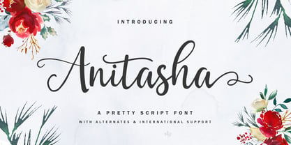 Anitasha is a modern pretty script font, organic, dynamic and energetic style. Can be used for various purposes such as the titles, signature, logos, correspondence, wedding invitations, letterhead, signage, labels, newsletters, posters, badges, etc. To enable the OpenType Stylistic alternates, you need a program that supports OpenType features such as Adobe Illustrator CS, Adobe Indesign & CorelDraw X6-X7, Microsoft Word 2010 or later versions. How to access all alternative characters, using Windows Character Map with Photoshop: https://www.youtube.com/watch?v=Go9vacoYmBw How to access all alternative characters using Adobe Illustrator: https://www.youtube.com/watch?v=XzwjMkbB-wQ Anitasha is coded with PUA Unicode, which allows full access to all the extra characters without having special designing software. Mac users can use Font Book and Windows users can use Character Map to view and copy any of the extra characters to paste into your favorite text editor/app. Thanks so much for looking and please let me know if you have any questions.
 - Bridgate Script by Rotterlab Studio,
$9.00 Kimberly Script is a contemporary calligraphic typeface, a mixture of retro script. get a classic and elegant touch. Can be used for various purposes.such as logos, wedding invitations, t-shirts, letterheads, signage, labels, news, posters, badges etc. Kimberly Script features 583+ glyphs and 350 alternate characters, ligatures, swash and multiple language support. To enable the OpenType Stylistic alternates, you need a program that supports OpenType features such as Adobe Illustrator CS, Adobe Indesign & CorelDraw X6-X7, Microsoft Word 2010 or later versions. There are additional ways to access alternates/swashes, using Character Map (Windows), Nexus Font (Windows), Font Book (Mac) or a software program such as PopChar (for Windows and Mac).How to access all alternative characters, using Windows Character Map with Photoshop: https://www.youtube.com/watch?v=Go9vacoYmBw Files include: Kimberly Script.OTF Kimberly Script Bold.OTF Kimberly Script Italic.OTF If you need help or advice, please contact me by e-mail Thank you
 - Milroy Upright SG by Spiece Graphics,
$39.00 As a beautiful yet eccentric unconnected script, Milroy Upright SG Regular can be a refreshing alternative to the formal upright scripts seen on so many anniversary and wedding announcements today. This nineteenth century classic was designed by Max Rosenow and Julius Schmol for Barnhart Brothers & Spindler in 1895. Milroy Upright was originally known as Oliphant. It was later renamed Advertisers Upright Script in 1925. This new version, Milroy Upright, contains many new alternative characters including a modified cap X and cap Z, a two-story lowercase g, and a matching set of oldstyle figures. Milroy Upright SG Regular is now available in the OpenType format. Some new characters have been added to this OpenType version including stylistic alternates, discretionary ligatures, and oldstye figures. Advanced features currently work in Adobe Creative Suite InDesign, Creative Suite Illustrator, and Quark XPress. Check for OpenType advanced feature support in other applications as it gradually becomes available with upgrades.
 - Austin Script by Typehill Studio,
$15.00 Austin Script is a new modern font with an irregular baseline and a trendy and feminine style. Austin Script looks lovely on wedding invitations, thank you cards, quotes, greeting cards, logos, business cards and more. It is perfect for using in ink or watercolour. Including initial and terminal letters, alternates and multiple language support. To enable the OpenType Stylistic alternates, you need a program that supports OpenType features such as Adobe Illustrator CS, Adobe Indesign & CorelDraw X6-X7, Microsoft Word 2010 or later versions. There are additional ways to access alternates/swashes, using Character Map (Windows), Nexus Font (Windows), Font Book (Mac) or a software program such as PopChar (for Windows and Mac). How to access all alternative characters: https://www.youtube.com/watch?v=Go9vacoYmBw https://www.youtube.com/watch?v=XzwjMkbB-wQ https://www.youtube.com/watch?v=x1A_ilsBsGs https://www.youtube.com/watch?v=xFlMwARHusY Thanks so much for looking and please let me know if you have any questions.
