10,000 search results
(0.028 seconds)
- Skypilot by Ferry Ardana Putra,
$19.00 Hello there! We are introducing my new font - Skypilot! This font is carefully selected from hundreds of letters. We manually created this font using a flat pen and make it as close as possible to street graffiti style. Not only that, we also make another typeface that is perfectly suited for this theme, Skypilot extruded! With those fonts, you can combine them as a pair to make them a layered style! You will make exquisite real street graffiti art just like on the wall that you saw in the city! Besides all this, the Skypilot Swashes and ornaments are designed to make your designs more fun! You can apply this font to t-shirt designs, posters, covers, video thumbnails, merchandise, wall, and so on to make it look special. ——— Skypilot features: A full set of uppercase and lowercase Numbers and punctuation Multilingual language support PUA Encoded Characters OpenType Features Layered Style +379 Total Glyphs +100 Graffiti Swashes and Ornaments included! ——— ⚠️To enable the OpenType Stylistic alternates, you need a program that supports OpenType features such as Adobe Illustrator CS, Adobe InDesign & CorelDraw X6-X7, Microsoft Word 2010 or later versions. There are additional ways to access alternates/swashes, using Character Map (Windows), Nexus Font (Windows), Font Book (Mac) or a software program such as Pop Char (for Windows and Mac). ⚠️For more information about accessing alternative, you can see this link: http://adobe.ly/1m1fn4Y
 - Jazz Gothic by Canada Type,
$24.95Jazz Gothic is a digitization and expansion of an early 1970s film type from Franklin Photolettering called Pinto Flare. This type became an instant titling classic with jazz and soul album designers; then it caught on wildly with film and television designers. Blue Note and Motown would not have been the same without this face. Jazz Gothic is a simple geometric idea, quite likely originally inspired by the heavier display weights of Futura. The resulting product is a versatile message-driver that stands quite strong and cherishes the limelight, yet shows a playful and artistic side within its curvy thick swashes and rebellious unicase forms. In the hands of a good designer, Jazz Gothic eliminates any doubt about the delivery of the message or the attractive purposeful way it is delivered. It is the kind of typeface that loves a design program's bells and whistles. Knock it out of dark or light backgrounds, shade it, mask-alize it, roughen it, stretch it, squeeze it, and the message will still stand larger than life. Jazz Gothic comes in two fonts, a main one with a full character set to accommodate the majority of Latin-based languages, and a second one that contains about 50 alternates and swashed forms. The OpenType version is a single font that has all the alternates and swashes at the disposal of the buttons of OT-savvy program palettes. - Ah, the font named "Immoral," a typographical riddle wrapped in an enigma, dressed scandalously in serifs and swashes. This is not your grandmother's font, oh no. It's the font that sneaks out at nig...
- As of my last update in April 2023, there's no widely recognized or standard font specifically named "Signboard" that's known across major font repositories or among typographic tools; however, the i...
- Winter Glows by Fargun Studio,
$14.00 Thanks for checking out Winter Glows! A fabulously fun yet elegant script font with tons of energy, allowing you to create beautiful hand-made typography in an instant. With extra bouncy curves & loops, Winter Glows is guaranteed to make your text stand out - perfect for logos, printed quotes, invitations, cards, product packaging, headers and whatever your imagination holds. What's really awesome is that Winter Glows comes with a complete set of lowercase alternates, which allows you to create even more authentic custom-feel text. Another great feature is the bonus ornaments font, which allows you to add some really unique and elegant finishing touches to your script text. Winter Glows Family includes 5 font files; Winter Glows • A handwritten script font containing upper & lowercase characters, numerals and a large range of punctuation. Winter Glows Alt 1 • This is a second version Winter Glows, with a completely new set of both lower and uppercase characters. this versions do not contain as many glyphs as the Regular style. If you wanted to avoid letters looking the same each time to recreate a custom-made style, or try a different word shape, simply switch to this font for an additional layout option. Winter Glows Alt 2 • This is a second version Winter Glows, with a completely new set of both lower and uppercase characters. this versions do not contain as many glyphs as the Regular style. If you wanted to avoid letters looking the same each time to recreate a custom-made style, or try a different word shape, simply switch to this font for an additional layout option. Winter Glows Alt 3 • This is a second version Winter Glows, with a completely new set of both lower and uppercase characters. this versions do not contain as many glyphs as the Regular style. If you wanted to avoid letters looking the same each time to recreate a custom-made style, or try a different word shape, simply switch to this font for an additional layout option. Winter Glows Extras • A set of hand-drawn swashes & doodles, the perfect finishing touch to underline your Winter Glows text & doodles for perfect lettering logos. Simply install this as a separate font, select it from your font menu and type any A-Z, a-z & 0-9 character to create a swash & Doodles. Standard Ligatures • Are also available for several lowercase characters (double-letters which flow more naturally). Ligatures will automatically replace the standard letter pairs whenever available, when using any OpenType capable software.
 - Ainslie by insigne,
$- Get your Aussie on! The new typeface, Ainslie, with its mix of influences from Oz, makes its mark as the first semi-serif from insigne Design. Ainslie, named for Mt. Ainslie and Canberra’s inner suburb of the same name, was originally developed for the Canberra Australia Centennial Typeface Competition. Canberra is Australia’s capital, and it’s a planned city designed by American Walter Burley Griffin, a contemporary and one-time associate of Frank Lloyd Wright. Griffin’s plan involved a distinctly geometric design with several focal points--one of which was Mt. Ainslie. This same purely geometric scheme is now the basis for insigne’s new release. Similar to the Chatype project in its scope, its challenge, and the way its concept was developed, Ainslie incorporates influences from Canberra and surrounding areas to form a font that is uniquely Australian. In comparison, Chatype was developed for the city of Chattanooga, Tennessee by insigne in conjunction with designer Robbie de Villiers. Chatype took elements from Chattanooga’s industrial character and Cherokee past and merged them with the area’s technological influences. Likewise, Ainslie takes Canberra’s distinct, geometric design and blends it with the organic, flowing effect of aboriginal art. Add in touches from the smooth, aerodynamic design of the boomerang and Ainslie gives you a look uniquely Australian yet usable in a wide range of applications. The fashionable typeface includes a multitude of alternates that can be accessed in any OpenType-enabled application. These stylish alternates along with a number of swashes as well as meticulously refined details with ball terminals and alternate titling caps keep the font well accessorized. Also included are capital swash alternates, old style figures, and small caps. Peruse the PDF brochure to see these features in action. OpenType enabled applications such as the Adobe suite or Quark can take full advantage of the automatic replacing ligatures and alternates. This family also offers the glyphs to support a wide range of languages. While Ainslie wasn't selected as the final font in the Canberra competition, the outcome allowed for additional adjustments to the typeface. Several approaches were attempted for the final product including a technological hexagonal concept, which may still be developed to another form later. Some of the organic forms were removed and substituted with more abrupt endings, leaving the face looking pretty spiffy and a fair bit more legible. In the end, Ainslie was pulled back to the basic forms from which it was started. Give it a go for your next project. It’s guaranteed to be anything but a barbeque stopper.
 - Indie by Lián Types,
$37.00 A FEW THOUGHTS Indie is a trendy script, result of the wide range of possibilities that can be achieved using a pointed brush. (1) “You Only Live Once” say The Strokes, (to me, symbols of indie music) so, what would represent that sensation of volatility better than a brush? As you may already know, this time inspiration came from hipsters and indies around us: We may sometimes criticise them, we may sometimes want to be like them, but the truth is that the universo gráfico they generated these past years is gigantic, full of colour and variations. (2) Brush lettering and Sign painting are fields I've been fond of since I started as a designer. Nowadays, these styles are getting a lot of attention and maybe it’s due to the undeniable mark of life that is materialised when using a brush. This tool is so expressive that shows the passions and fears of the artist, and materialises that idea of “living the present”, so popular in this era. When you see Indie, you think of skaters, rollers, surfers, hiphop dancers, street artists, summer, and why not? California beaches. So if you feel life is only one, it’s high time you got Indie into your fonts' collection! STYLES Indie comes in 4 styles plus another one which consists only in capitals. Indie; Indie Shade; Indie Shade Solo; Indie Inline are all open-type programmed and have exactly the same glyphs and metrics, so you can combine them without probem. (I.E. You may use Indie Inline, then write the same word using Indie Shade Solo, and finally put them together). In applications such as Adobe Illustrator, the font has nice results when fi ligatures is activated. However, if you want a more casual look, activate the contextual and the decorative ligatures. NOTES 1. After several years of practicing calligraphy I can say that to me, there’s nothing more satisfying than being able to create fonts out of your own handlettering. I owe a lot of this brush-style to Carl Rohrs. He was the very first calligrapher who taught it to me. His style is unique and what he can do with a brush is truly marvelous. I'm serious. 2. In spite of some particular cases, I can say I'm happy to live in a present in which Typography is living a kind of Renaissance along with Lettering. Like it happened with W. Morris a hundred years ago, handcrafts are being revalued/reborn, and some of this may be happening thanks to these indie designers that, trying to be unique, gave new/fresh air to different areas of graphic design.
 - Winslow Title by Kimmy Design,
$25.00 Winslow Title is a high contrast modern type family comes in two styles and a monolinear script family. The traditional proportions of Winslow Title are historical in nature and follow the design and style of Winslow Book as a high contrast variant. The Winslow Title Mod family is a contemporary take on the style, with tapering terminals and less pronounced finials. Each family includes both styles, to be accessed through the opentype panel as a stylistic alternate. If preferable, you can purchase the entire family collection to have easier access to both styles, but it's not necessary. The typeface family comprises of roman and italic styles in six weights from Thin to Black and two widths in the roman style: Regular and Narrow. The accompanying script family has a single weight but offers five tracking widths, from Narrow to Wide. The bundle is an elegant combination of styles perfect for titling and display design. The serif typeface is packed with features that make ideal titling styles. Not only do they include the Stylistic Alternates, but also Titling Alternates, Discretionary Ligatures, Small Capitals, Swashes and Contextual Ligatures. As noted previously, the typeface comes in two styles, Traditional and Modern. Each can be accessed either by the Stylistic Alternates or Stylistic Sets. Titling Alternates are alternates that expand the ball terminals to K, R, V, W, and Y (see Titling Alternates slide). Contextual Ligatures are for capital combinations with A that tighten the gap created by the extended serifs. It connects characters with a pairing serif (the lower right serif of the M with the lower right serif of the A) and bridges them together. This combination works for single and multiple A combinations. It is turned on automatically in the Opentype panel and shouldn’t need to be accessed individually. Alternatively, the Discretionary Ligatures feature combines diagonal or baseline stems with lifted small capitals, creating a unique combination of characters. Swashes is an extensive feature that offers up to five swash options per many of each character. These can be selected via the Glyphs panel or as character alternates in Adobe programs. The Script family has a feature set of it’s own, with initial and final swashes on lowercase letters, middle swashes for select characters, and a titling feature that joins words together by replacing the space with a line. Stylistic alternates create a bouncing baseline on connecting strokes. *Note: there is no great need to purchase both families as all styles can be accessed via Opentype features, but if customers prefer to purchase both styles, it can be done by selecting the Complete Typeface Family collection.
 - RePublic by Suitcase Type Foundry,
$75.00In 1955 the Czech State Department of Culture, which was then in charge of all the publishing houses, organised a competition amongst printing houses and generally all book businesses for the design of a newspaper typeface. The motivation for this contest was obvious: the situation in the printing presses was appalling, with very little quality fonts existing and financial resources being too scarce to permit the purchase of type abroad. The conditions to be met by the typeface were strictly defined, and far more constrained than the ones applied to regular typefaces designed for books. A number of parameters needed to be considered, including the pressure of the printing presses and the quality of the thin newspaper ink that would have smothered any delicate strokes. Rough drafts of type designs for the competition were submitted by Vratislav Hejzl, Stanislav Marso, Frantisek Novak, Frantisek Panek, Jiri Petr, Jindrich Posekany, and the team of Stanislav Duda, Karel Misek and Josef Tyfa. The committee published its comments and corrections of the designs, and asked the designers to draw the final drafts. The winner was unambiguous — the members of the committee unanimously agreed to award Stanislav Marso’s design the first prize. His typeface was cast by Grafotechna (a state-owned enterprise) for setting with line-composing machines and also in larger sizes for hand-setting. Regular, bold, and bold condensed cuts were produced, and the face was named Public. In 2003 we decided to digitise the typeface. Drawings of the regular and italic cuts at the size of approximatively 3,5 cicero (43 pt) were used as templates for scanning. Those originals covered the complete set of caps except for the U, the lowercase, numerals, and sloped ampersand. The bold and condensed bold cuts were found in an original specimen book of the Rude Pravo newspaper printing press. These specimens included a dot, acute, colon, semicolon, hyphens, exclamation and question marks, asterisk, parentheses, square brackets, cross, section sign, and ampersand. After the regular cut was drafted, we began to modify it. All the uppercase letters were fine-tuned, the crossbar of the A was raised, E, F, and H were narrowed, L and R were significantly broadened, and the angle of the leg and arm of the K were adjusted. The vertex of the M now rests on the baseline, making the glyph broader. The apex of the N is narrower, resulting in a more regular glyph. The tail of Q was made more decorative; the uppercase S lost its implied serifs. The lowercase ascenders and descenders were slightly extended. Corrections on the lower case a were more significant, its waist being lowered in order to improve its colour and light. The top of the f was redrawn, the loop of lowercase g now has a squarer character. The diagonals of the lowercase k were harmonised with the uppercase K. The t has a more open and longer terminal, and the tail of the y matches its overall construction. Numerals are generally better proportioned. Italics have been thoroughly redrawn, and in general their slope is lessened by approximatively 2–3 degrees. The italic upper case is more consistent with the regular cut. Unlike the original, the tail of the K is not curved, and the Z is not calligraphic. The italic lower case is even further removed from the original. This concerns specifically the bottom finials of the c and e, the top of the f, the descender of the j, the serif of the k, a heavier ear on the r, a more open t, a broader v and w, a different x, and, again, a non-calligraphic z. Originally the bold cut conformed even more to the superellipse shape than the regular one, since all the glyphs had to be fitted to the same width. We have redrawn the bold cut to provide a better match with the regular. This means its shapes have become generally broader, also noticeably darker. Medium and Semibold weights were also interpolated, with a colour similar to the original bold cut. The condensed variants’ width is 85 percent of the original. The design of the Bold Condensed weights was optimised for the setting of headlines, while the lighter ones are suited for normal condensed settings. All the OpenType fonts include small caps, numerals, fractions, ligatures, and expert glyphs, conforming to the Suitcase Standard set. Over half a century of consistent quality ensures perfect legibility even in adverse printing conditions and on poor quality paper. RePublic is an exquisite newspaper and magazine type, which is equally well suited as a contemporary book face. - Boatman by YdhraStudio,
$20.00 Boatman Font – 3 Styles + Extras We introduce our new font called Boatman. Boatman is a (All Caps) vintage display font inspired from classic whiskey labels, vintage labels and sing painting. Boatman comes with 3 styles (Regular, Outline and Stamped) that extends the possibilities when you design something. Boatman also has the Stylistic Set. With the Stylistic Set, Boatman gives you so many options to create something awesome. Mix and match the alternate characters to add an attractive message to your design. Furthermore the Boatman includes a Set of Ornament Labels which perfectly complement text compositions. You can see it on my presentation examples. Boatman is great for Logotype, Branding Design, Logo Design, Badges, Digital Lettering Arts, T-Shirt/Apparel, Headline, Posters, Magazine, Signs, Advertising Design, and any vintage design needs. Boatman Features : - All Caps Characters, Punctuation, Numerals. - Opentype Feature such as Stylistic Set. - Fully accessible without additional design software. - Includes a range of multilingual characters. - Ornament Labels You can access all those alternate characters by using a program that supports OpenType features such as Adobe Illustrator CS, Adobe Indesign & CorelDraw X6-X7. Guides to access all alternates glyphs : http://adobe.ly/1m1fn4Y
 - Rockinstead by PintassilgoPrints,
$35.00 Rockinstead counts 1, 2, 3, 4, 5, 6, 7, 8... Eight variations per letter, plus alternates for numbers and even for punctuation marks! It is equipped with some clever OpenType programming to make substitutions on-the-fly: the Contextual Alternates feature, with the help of a very careful kerning table, takes care of cycling the alternates in an amazing random-like way, impressively mimicking a true handwritten text. The Discretionary Ligatures feature manages the substitution of handy cursive catchwords, adding that charming twist. To put it more bluntly, this font AUTOMATICALLY alters your typing so that it substitutes glyph variations while you do nothing but type away! No need to use PopChar here to do the substitutions manually, the font itself takes care of that for you. This typeface was originally painted on paper, drawing inspiration from Ralph Steadman’s seminal lettering style. On a first glance it may look quite wild - and it proudly is, indeed. But look again: it is stylishly wild, it is strong, unpredictable, full of attitude and good energy. This multifaceted font will certainly strike its way for free-spirited design applications. Just please be warned: it’s seriously addictive!
 - Sqwared by Monotype,
$25.00 Sqwared is a square sans serif type family... with flares! This typeface has a retro, hand-painted quality – the slight flaring of its verticals evoke the steady brush of a signwriter. Sqwared benefits from large, open counters and a generous x-height that aids clarity and legibility, while a wide footprint gives these fonts a degree of stature and an air of confidence. Each character was drawn while immersed in a late sixties/early seventies vibe, but there’s no reason why Sqwared can’t be used for your contemporary designs. There are 16 fonts altogether, ranging from Thin to Ultra weights in both roman and italic. It has a Latin character set that covers all Latin European languages. Sqwared will dazzle in headlines, add flair and distinction to your logo designs, bring flamboyance to your branding material, and your body text will most definitely be unique! Variable fonts are included in this family, so you can tune the weight of each font to your exact preference. Key features: 8 weights in Roman and Italic Old Style Figures included Full European character set (Latin only) 440 glyphs per font.
 - Delfin Scripts by Eclectotype,
$40.00 Delfino Script is a cool, connecting script that can appear both retro and contemporary. Curved on the outsides of strokes, and jagged inside, the forms look like an abstraction of strips of tape, folding and flowing, or even marker pen style lettering. This script is not created by any pen though - its forms are constructed, not painted. Typographic features like ink traps add sparkle to the text. OpenType features include ligatures, contextual alternates (for more realistic connections) and stylistic sets. Stylistic Set 1 changes certain upper case letters into forms more suited for all caps setting, although they can also be used freely with the lower case. Set 2 changes the r into a less scripty form and set 3 adds a connecting tail to the q. Delfino Script would find itself at home in cookery books, fashion blogs, vintage car magazines and set large and proud on expanses of concrete, or, most likely, whatever you might have in mind for it! Delfina Script is practically identical to Delfino save for round tittles, periods and any other dot shaped glyph components. Strangely for such a little change, it does seem to give the face a different character.
 - Calaveras by Design is Culture,
$29.00 In August of 2009, I was commissioned by Zoo York, a New York City based skateboard company, to visit Buenos Aires to study and document street typography. As soon as my taxi driver took the bustling street Entre Ríos, it was clear that the city and I were going to be good friends. Many of the independently owned businesses on Entre Ríos are adorned with handmade signage. These signs are painted in a style called Fileteado which is a century-old Argentinian type of lettering and floral ornamentation. Nowadays, Fileteado is still a prominent part of the city’s landscape, coloring the façades of restaurants, bars and coffee shops. Calaveras and Diablitos are two new typefaces that were inspired by Fileteado. Stylistically, the fonts are a return to a rhythmic and playful sensibility reminiscent of Vitrina and Cuba, two fonts that I designed in 1996. Along with dynamism and dance, these new fonts incorporate a rigor and functionality essential to labelling any font a ‘workhorse.’ The names Calaveras and Diablitos, came from the name of a song by the infamous Buenos Aires rock band, Los Fabulosos Cadillacs. —Pablo A. Medina
 - Various by Ahmad Jamaludin,
$17.00 Say hello to VARIOUS! Completely unique and custom font with a 00s style, inspired by vintage and hand-painted retro signs :D Various is a font with a delightful retro touch perfect for capturing the essence of the 60s, 70s, 80s, 90s, and even Y2K designs! Its unique characteristics will transport you to those iconic eras, adding a nostalgic vibe to your creative projects. Various come in two versions - Regular and Outline. With two different style fonts, you can easily create eye-catching designs without any extra effort This font is perfect for a retro 00s theme and can be used for cover magazines, brochures, logos, headlines or quotes, stand-alone displays, and short paragraphs or content. Each font in the family is dynamic and authoritative on its own, making it perfect for any display project. What do you get? Various Various Outline Alternates and Ligatures Instructions ( Access special characters, even in circuit design ) Letters, numbers, symbols, and punctuation No special software is required to use this typeface even work in Canva Multilingual Support Let Various take you on a journey through time Enjoy your day! Dharmas Studio
 - VLNL Beatbox by VetteLetters,
$30.00 VLNL Beatbox is a solid tech heavy straight stencil-face with a lot of character. It was originally designed as a logo for dj Markus Schultz back in 2004, who rejected it. His management couldn't read it, or thought people wouldn’t be able to read it. But Chef Donald DBXL found the concept interesting enough to finish it and has used it in many projects since. It was the identity font for the Battle of Amsterdam, a talent showcase in beat boxing and other skills. Beatboxing is a style of hiphop music (beats) made with the mouth and a microphone. A box is a handy container to store stuff. Like food, or fonts. We use a lot of boxes at the VetteLetters office. VLNL Beatbox is best deployed big, like in logos or headlines. Or flyers, album covers, posters and signage. As a display and headline typeface it’s got a lot of character. We could definitely see it painted on the side of a tank, or an airplane. It’s heavy, but not at all dangerous. Use it without risk. VLNL Beatbox comes in two variations; Regular and Small (smallcaps)
 - Diablitos by Design is Culture,
$29.00 In August of 2009, I was commissioned by Zoo York, a New York City based skateboard company, to visit Buenos Aires to study and document street typography. As soon as my taxi driver took the bustling street Entre Ríos, it was clear that the city and I were going to be good friends. Many of the independently owned businesses on Entre Ríos are adorned with handmade signage. These signs are painted in a style called Fileteado which is a century-old Argentinian type of lettering and floral ornamentation. Nowadays, Fileteado is still a prominent part of the city’s landscape, coloring the façades of restaurants, bars and coffee shops. Calaveras and Diablitos are two new typefaces that were inspired by Fileteado. Stylistically, the fonts are a return to a rhythmic and playful sensibility reminiscent of Vitrina and Cuba, two fonts that I designed in 1996. Along with dynamism and dance, these new fonts incorporate a rigor and functionality essential to labelling any font a ‘workhorse.’ The names Calaveras and Diablitos, came from the name of a song by the infamous Buenos Aires rock band, Los Fabulosos Cadillacs. —Pablo A. Medina
 - FHA Eccentric French by The Fontry,
$25.00 The curves are vintage and the serifs are big. They're so big that for years I never had the courage to tackle this intimidating font. But when fellow signmaker Frank Smith laid the groundwork for this intriguing typeface by Frank H. Atkinson, I couldn't pass on the opportunity to take it from paper to keyboard. After all, at over 100 years old, I felt this alphabet had never been given a proper, digital treatment. So how did this face survive the last century? Well, for those who don't know the history, it survived in Atkinson's ubiquitous book, Sign Painting, published first in 1908, the generational standard for anyone interested in sign-related type design. The layouts and lettering treatments in this book have influenced countless designers for more than a hundred years, but most haunting to me was this strange face with the big serifs. Well, I'm haunted no more. The work is done, the kerning is complete, and nothing but a mouse-click separates a very old idea from the modern world. It's wide, it's big, and with those crazy serifs, it is definitely eccentric-!!!
 - EraMax 123 by Our House Graphics,
$15.00 EraMax 123 is a multi-layered display geometric sans serif, meant to be set BIG, for large, colourful statements. It's the perfect face for packaging, posters & branding, where a strong, colourful voice is needed... Did I mention posters? The "Max" in EraMax comes from the ultra bold weight, but also, and mainly as a tip of the hat to Peter Max, the designer and artist, known for creating so many images which have come to be emblematic of the sixties and seventies. The bold gradient effects in some of his posters were the inspiration behind the dotted and striped layers. This font's vintage flavour truly stand out in a retro setting, but also has a modern flavour that lends it the flexibility to work well in a more contemporary context. This is the second of what is to be an extended family of typefaces based on the original hand painted signage found in the T. H. & B Railway station in Hamilton Ontario, a classic Art Moderne building, designed by the New York architectural firm of Fellheimer and Wagner for the Toronto Hamilton and Buffalo Railway line and completed in 1933.
 - Broken Crush by Arterfak Project,
$21.00 Broken Crush is a rough brush font, made created with an express brush line, keeping the details and give an eye-catchy combination between the uppercase and small caps, also complete with alternates and swashes! Broken Crush is pretty good for display with sporty, vibrant, and youth taste! Good choice to use this font for Logo, Merchandise, Brand imagery, Apparel, Packaging, Simple quotes, and many more!
 - Are You Shaw NF by Nick's Fonts,
$10.00This decorative delight is based on a typeface discovered within the pages of "Schriftatlas: Alphabete von A bis Z," and originally named Pygmalion. The swash caps and plain caps in the lowercase positions allow for wide-ranging creativity in the composition of dramatic headlines. Both versions include the complete Latin 1252, Central European 1250 and Turkish 1254 character sets, as well as localization for Moldovan and Romanian. - Cretina by Supfonts,
$17.00 Cretina is amazing clear lettering font, every single letters have been carefully crafted to make your text looks beautiful. With lettering script style this font will perfect for many different project ex: quotes, blog header, poster, wedding, branding, logo, fashion, apparel, letter, invitation, stationery, etc. FEATURES: Cretina OTF & TTF Multilingual support Alternates / Swashes / Ligatures Thanks for looking. Check out my blog: instagram.com/media.lab.co pinterest.com/dmitriychirkov7
 - Christmas Deer by Arttype7,
$15.00 We just launched a new product font. charming fonts with a pretty christmas look, named "cristmas deer font". This font is inspired by deer antlers. has 3 beautiful swash variations. and also has more than 650 glyphs. This font also has a stylistic alternative for multilingual support. Perfect for logos, Christmas greeting cards, wedding invitations, web, t-shirts, souvenirs, quotes, graphic watermarks. thank you regards
 - Southwave by FHFont,
$19.00 Southwave is script font with a hand-lettered, modern caligraphy style, with OpenType feature include in the font. Suitable for design, element design, wedding, event, t-shirt, logo, badges, sticker, and awesome work. Features Of The Font: - All Standard Character, Symbol, Multi-lingual Support, Ligature, Stylistic Sets and Swashes. - PUA Encoding Follow Me: - https://www.instagram.com/FHFont - https://twitter.com/FH_Font - https://www.facebook.com/FHFont/ - https://id.pinterest.com/feydesign/
 - Payung Senja by Zamjump,
$17.00 Introducing, Payung Senja is a beautiful handwritten typeface with an elegant style that is here to give a luxurious impression to your designs, made with consistent strokes to produce works that enhance your designs, complete with alternative ending swashes that will add to the luxurious impression. impact on your design. Payung Senja is perfect for Branding, Logos, Magazines, crafts, quotes, book covers, wedding invitations and more.
 - Heibird by Letterena Studios,
$17.00 Heibird is a bold and elegant serif font. It looks gorgeous and stylish and it will most certainly enhance a large range of designs. This font is PUA encoded which means you can access all of the glyphs and swashes with ease! This typeface is perfect for an elegant & luxury logo, book or movie title design, fashion brand, magazine, clothes, lettering, quotes, and so much more.
 - Monasha Script by Almeera Studio,
$15.00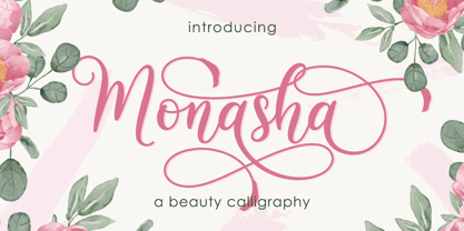 Monasha is a beautiful calligraphy font with many alternative styles & leaf swash, this font looks natural, elegant and perfect for any extraordinary project.Monasha is suitable for various products such as invitations, product packaging, quotes, product design, crafter, labels, photography, watermarks, logos & branding.Everything can be accessed using software that supports Opentype, such as Adobe Indesign, Adobe CS Illustrator, Adobe Photoshop CC, and Corel Draw. Thank you & Happy design :)
 - Brightline by Lucky Type,
$18.00 Let me introduce my newest font Brightline is a new modern font with an irregular baseline. This is the latest script font for those of you who need elegant writing and the latest design styles and is perfect for wedding invitations, business cards and more. Complete with upper and lower case, as well as multi-language support, numbers, punctuation, and multiple ligatures and swash glyphs.
 - Sabrina Pamella by Bluestype Studio,
$15.00 This is our newest product called Sabrina Pamella. Sabrina Pamella is a stunning signature font with a bold vibe. It will turn any design idea into a true standout. This font is suitable for use on business cards, weddings, t-shirt designs, logos, magazines, quotes, fashion, watermarks, invitations, signatures. What's include: - Alternate Characters - Multilingual Support - Swashes Thank you, and don't forget to check out our other products.
 - Lets get crazy by Pedro Teixeira,
$14.00 Let's get crazy is a font inspired by modern lettering and calligraphy with pronounced swashes, ascending / descending and crazy ear in "r" (btw you have more ordinary alternates) and so on, challenging the boundaries of reasonable. This font is good for titles or short sentences in combo with Let's get crazy sans serif majuscule letters, giving you a nice pairing of the modern lettering.
 - Loving me by Letterara,
$12.00 Loving me is a new, fresh, sweet, and quirky handmade font. It’s ideal for branding and decorate your projects. Loving me font has a classy, and modern look that can be used for logos, branding, invitations, poster, advertising, stationery, wedding designs, social media posts, and much more! It is PUA encoded which means you can access all of the glyphs and swashes with ease!
 - Anfield by Natural Ink,
$16.00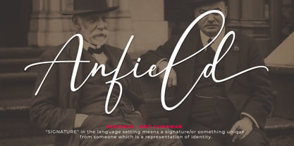 Anfield Signature is a natural handwritten font, this font Is perfect for logos, invitations, stationery, wedding designs, social media posts, advertisements, product packaging, product designs, label, photography, watermark, special events, or anything. Anfield Signature comes with a full set of uppercase and lowercase letters, lowercase swashes, multilingual symbols, numerals, punctuation. If you have any questions please don't hesitate to drop me a message.. Thank You!
 - Whitehella by Ditatype,
$29.00 Whitehella is a cute and modern handwritten font with an incredibly friendly feel. It features gorgeous swashes and ligatures that make this script incredibly versatile. Whether you’re looking for fonts for Instagram or calligraphy scripts for DIY projects, Whitehella will turn any creative idea into a true piece of art! Featured : Accents (Multilingual characters) PUA encoded Numerals and Punctuation (OpenType Standard) Full Support Dita Type
 - Sabyan by Bluestudio,
$15.00 Introducing our newest product Sabyan. Sabyan is a modern and clean handwriting script font. Sabyan is suitable for all your design project needs such as: logo design, branding, covers, posters, magazines, wedding invitations, greeting cards, quotes and more. What's included: - Sabyan OTF - Titling - Swashes - Stylistic Alternates: Sets 01, 02, 05 -Multilingual support: AÀÁÂÃÄÅCÇDÐEÈÉÌÍÎÏIÌÍÎÏNÑOØÒÓÔÕÖUÙÜÚÛWYÝŸÆßÞþ - Encoded PUA Characters Fonts are fully accessible without additional design software.
 - Killer Ants by Cool Fonts,
$24.00 There are two versions of Killer Ants, regular and bold. Regular is a very cool cracked up looking font that will be great for all kinds of stuff. Bold is on of the most distressed fonts I've ever seen - there's crap everywhere - adjust your leading (line spacing) so the grunge overlaps and you have one awesome effect. Yes, those dots are actually smashed ants. Killer!
 - Masthina by Sibelumpagi,
$16.00 Masthina is a lovely calligraphy typeface with a modern bouncy style. It comes with a natural flow that looks like a handwritten letter and also we added some swashes and alternates to make the font more elegant. Masthina is perfect for many different projects such as logos & branding, invitation, stationery, wedding designs, social media posts, advertisements, product packaging, product designs, label, photography, watermark, special events or anything.
 - VVDS London Oatmeal by Vintage Voyage Design Supply,
$15.00 London Oatmeal - a new stylish font duo, an elegant modern art-deco inspired sans with a lot of ligatures with retro look stylish brush script. It's nice font pair for use it in blogs, posters, magazines, logo’s or greeting/wedding cards. The sans has caps lowercase, so you can combine them in many ways. More than 100 OpenType features as Alternates, Swashes and Ligatures.
 - Blues Malone by Subectype,
$17.00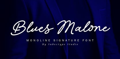 Blues Malone is a monoline signature font with an elegant style. It has good readability and is perfect for logos, invitations, wedding, signatures, Branding, clothing, headline, and much more! Blues Malone comes with ending swash alternate which will make your design more beautiful and elegant. I hope you enjoy this font. If you have any questions please don't hesitate to drop me a message :) Thank You, Subectype
 - Vulgary by Etewut,
$24.00 Vulgary is a script family that includes 4 fonts. They match each other but can be used separately as well. It supports all euro languages based on Latin alphabet. To use swashes you have to open glyphs panel in menu Window. The font is compatible on both Windows and Mac. You can use it in all popular apps like Adobe, Corel Draw, Microsoft, Final Cut etc.
 - Yilactha by Attype Studio,
$10.00 Introducing Yilactha - Inspired by typeface on 70s era, Yilactha has the vintage font & retro font with two style solid & textured. Two style Font: solid & textured. Yilactha is perfect for children product, branding, logo, invitation, stationery, product packaging, merchandise, monogram, blog design, game titles, cute style design, Book/Cover Title and more. Features : - Ending swash - Multilingual Support --- Hope you enjoy with our font! Attype Studio