10,000 search results
(0.061 seconds)
- Roadkill by Device,
$39.00 Derived from a photograph Rian Hughes took in Hong Kong, the Roadkill family of typefaces is a literal interpretation of rough and worn road lettering. The original provided almost all of the key character shapes, with the others being designed to keep the unique hand painted feel intact. Most of the letters have alternate versions provided. This font works equally well at wider letterspacing settings. Roadkill Alternates provides curved versions of the 2 and the S, a G with higher crossbar, and less worn versions of several other characters. The heavy version packs even more gritty wallop in a non-condensed and blacker weight. Roadkill Heavy packs even more gritty wallop in a non-condensed and blacker weight. Use in conjuction with the original Roadkill and Roadkill Alternates. A set of arrows and other road symbols again taken directly from tarmac to Mac, thus preserving the worn and eroded appearance of the original characters is also part of the Roadkill family.
 - Weird Better by Heyfonts,
$15.00 Weird Better fonts are typography designs that imitate or simulate the appearance of liquids. They are often fluid and dynamic in nature, providing an illusion of movement and flow in letters and characters. Weird Better fonts can be created using different design techniques, including hand-drawn illustrations, digital effects, or 3D modeling software. Some common features of liquid fonts include: Fluid and dynamic appearance: Weird Better fonts have a free-flowing and organic appearance, mimicking the look and movement of liquids such as water, ink, or paint. Variations in thickness: The thickness of the lines and curves in Weird Better fonts can vary, creating an uneven and organic appearance. Versatile use: Weird Better fonts are commonly used in creative designs such as logos, album covers, and advertising campaigns to create an eye-catching and memorable visual impact. Overall, Weird Better fonts are a unique and creative way to portray text, giving a sense of energy, motion, and fluidity to design projects.
 - LCT Palissade by LCT,
$19.90 Started during 2012, LCT Palissade is a letter type belonging to the Didone classification. It takes over the Italian characters from the XVII century. Century affected by a huge artistic and industrial mutation, we assist to the eruption of the railroad network and Turner’s paintings. In typography, the Didones(XVIIe) begins to concede the place to the Egyptians XIXe. We noticed an evolution to rectangular drawings, that were heavier and darker. LCT Palissade is in fact the study of a history flow, crossing through the industrial revolution and romanticism; the result of a strong letter type, solid, strict the drawing is orientated towards very dark, reminiscent of the characters beginning XIXe. The serifs are the summary between the British characters from the end of (XVIe) and the Italian ones beginning of (XVIIe). In order to spread out the romanticism, they are very fine to allow a largest contrast and keep the elegance of the global shape.
 - The Wayfaring Font by Set Sail Studios,
$13.99 Hey guys, I'm really excited to introduce The Wayfaring Font Duo! A hand-painted set of fonts designed to add a rustic and whimsical charm to your design projects. It's rough around the edges and not without imperfections - but aren't we all? With distinctive bold & playful brush strokes, The Wayfaring Font Duo is ideal for your logo designs, product packaging, wedding designs, book covers, social media posts, merchandise & more. The awesome thing about this typeface duo is that it's so easy to mix up the various font styles and create totally unique, hand-made looking words each time. Not only are there 2 sets of upper & lowercase characters, there is also a unique 'all-caps' version - which not only looks great as a supporting font, but can also be combined with the regular Wayfaring font to give you even more layout options. I'm serious! Just throw a small-caps character in the middle of a word, it's really fun to play around with.
 - Movie Script by Wiescher Design,
$39.50 Movie Script is the script that was used in German movie-brochures. Those were small four page leaflets with a lot of sepia-colored pictures about the movie one was about to see. Today those things are collectors items. The script was also used on those hand-painted posters above the cinema entrance. I cleaned up the old script and made it just a little bit more readable, but overall I left it as it was. Of course I added the necessary glyphs for today's world, like Euro and so on. When I was a kid, my grandfather gave me 1 German Mark and I could go to the movies matinee, that was around 10:30 in the morning, the entrance cost something like 60 Pfennig and the rest was for peanuts and a drink. Still today I love my grandfather for that, movies introduced the world to me (no TV then). Your grandfather-loving designer Gert Wiescher
 - Durham Latin by Mayfield Type Foundry,
$25.00 Durham Latin brings the Latin style from the Industrial Revolution to the modern era. These letterforms could be seen painted on a road sign in France, engraved in a sign over a tavern door in London, or seen on a playbill in America. The rich and varied history of these forms inspired me to capture that personality, and interpret it in a way that fits the wide range of needs of modern designers. Condensed forms and strong serifs imbue Durham Latin with a presence that can’t be ignored yet doesn’t overwhelm. It shines as a powerful display font, and becomes affable when used at smaller sizes for subheadings. Durham thrives in spartan and ornate environments alike. Durham Latin features Outline and Fill variants that allow for more creative display elements. The lowercase are 80% height small caps. Each font contains 448 characters and has full Western European support. Advanced typographic features are built in, including tabular numbers, fractions, arrows, and more.
 - Resplendent by Set Sail Studios,
$16.00 Resplendent is a beautiful and free-flowing hand-lettered modern brush script font. Along with a full set of alternate lowercase characters, Resplendent comes in 2 different styles; Brush and Solid - giving you a hugely versatile brush font which can be used in a range of different scenarios. Resplendent Brush maintains a rough hand-painted aesthetic, whereas Resplendent Solid has a totally clean & smooth finish to it's edges; ideal for vinyl cutters such as Cricut and Silhouette Cameo, or simply for any project which needs a silky smooth style. Both styles of the font include an 'Alt' version, this has replaced all of the lowercase characters with a completely new set. If you wanted to avoid letters looking the same each time to recreate custom lettering, or try a different word shape, simply switch to the 'Alt' fonts for an additional layout option. Language Support • All Resplendent fonts include language support for; English, French, Italian, Spanish, Portuguese, German, Swedish, Norwegian, Danish, Dutch, Finnish, Indonesian, Malay
 - Horror Graffiti Cholo by Biroakakarati,
$10.99 This handwritten font is inspired by the cholo calligraphy of graffiti artists. It has a scary design, which is suitable for horor film posters and at the same time for signs and tattoo designs. It has an original style an effect font also available in a color version with drops of blood or paint to give a more lively touch. Try using it for your halloween party invitations or for your tattoo designs, for scary greeting cards. I used the word "Cholo" because this lettering in inspired by cholo-graffiti culture in Los Angeles in 70's years. The one of the best rappresent is Charles "Chaz" Bojorquez the father of cholo-lettering. Cholo because i think that in 70's in Los Angeles neighborhoods where graffiti-culture grow up there was a persons whit a mixed multicultural connexion and Chaz is one of them. Cholo-graffiti or Cholo-lettering is a specifing style o lettering. I think this is a good keyword for this lettering.
 - Halley by Eurotypo,
$24.00 Halley is a modern, funny and casual script with an irregular base line that gives it a unique and modern look. All the glyphs have been carefully painted giving the texts a wonderful flow. A fat and thin blow in this font impresses the harmony. Halley family pack comes in three styles: regular, italic and Shadow. Each font contains 746 “regular or irregular" glyphs, including up to seven alternatives in upper case and six in lower case, standard and discretionary ligatures for a genuine handwriting effect. It also includes a Central European language support with its corresponding alternative characters to have more options in those languages. We have added some useful ornaments that will serve for the most demanding design project! Halley looks good in children's books, fashion, magazines, restaurant menus, book covers, wedding invitations, greeting cards, logos, business cards and is perfect for use in designs based on ink or watercolor, and more
 - MCM Hellenic Wide by Victory Type,
$15.99 Victory Type Studios is pleased to announce the release of MCM Hellenic Wide, the first typeface from the upcoming Mid-Century Modern Collection--a set of vintage American typefaces rescued from the dustbin of history and rendered for digital use. You've seen it before. But it’s been a while... MCM Hellenic Wide is an extended slab-serif typeface that was painted on railroad cars and stamped on posters; it was found in textbooks and once proudly graced letterheads. MCM Hellenic Wide lacks frills and flourishes. Its trademark single-thickness alphabet features broad and squared-off serifs. Now that retro is en vogue, do yourself a favor and download MCM Hellenic Wide today. This digital revival of a once pervasive unappreciated typeface was rendered from scans of primary source material. MCM Hellenic Wide will add a bit of classy Americana to your next design. MCM Hellenic Wide is available for Mac and PC, in TrueType, OpenType and PostScript formats. Includes kerning.
 - Burner by Graffiti Fonts,
$29.99 Burner is an advanced, connecting, wildstyle graffiti font family including over 200 unique letters, numbers & symbols. The family includes outlines, fills, details and more. Mix and match glyphs from 3 alphabets, add end pieces and more. Repeating flames, arrows & flourishes & other embellishments are included. The Burner family includes 3 full alphabets in each of the 4 styles as well as numbers, punctuation and a wide array of arrows, bars , begining & end pieces. Like some of our earlier wildstyle typefaces such as RaseOne or WildStyle, the Burner font family is a layered type system made to work as a team. In nearly any application 2 or more styles can be easily layered to create advanced, multicolor, wildstyle pieces. This layering system provides a shortcut to time consuming effects such as sharp corners & variable widths on outlines, fills & details. The original glyphs were all drawn by hand taking inspiration from actual painted & drawn wildstyles from RaseOne spanning the late 90's to about 2006.
 - Worthington Arcade by Device,
$39.00 Worthington Arcade is a classically-proportioned capitals-only type incorporating a selection of ligatures and alternates. It loosely resembles the hand-painted architectural lettering of the 30s to the 50s, exemplified by the likes of Percy Smith’s interior signage for the BBC or George Mansell’s lettering for the University of London and the signs found on London’s bridges. However, rather than a slavish copy of any historical model, it is more an examination and evocation of certain idiosyncratic quirks of civic lettering of the period, and an attempt to create a peculiarly English titling typeface. The round letters, for example the O, Q and C, are wider than the perfect circle usually found in such designs, while the straight-sided characters, usually drawn on a square, are narrower. This lends the whole a subtle elegance that is also emphasized by the raised crossbars on the H, E and F and extended lower leg of the E. Includes old-style numerals.
 - Hyper Turfu by Bisou,
$10.00 Made in La Chaux-de-Fonds (Switzerland), HyperTurfu was born during the shooting of “The Return of Hyperturfu Xpress 2”. A GoPro on a lego electric train, meters and meters of rails, an empty industrial space, loads of puppets, paper, cardboard, pizza boxes, lights, hot glue and a bunch of friends preparing a one shot scene for a month. The title of the movie was made out of lego pieces, painted with golden spray and hanged over the rails. It was the first inspiration for this awsome superbold font. HyperTurfu is thought from ground up to give a strong impact. It’s gothic retro science fiction 80’s style makes it best suitable for metal music albums or posters. As the “Banco” font it works perfectly with short texts for advertisement, bar, cofee shops concert places or even fancy hairdresser. Just hang it over a pet shop and see what cool animals will come in.
 - Bizarries by Typephases,
$25.00 This series, with 104 illustrations in three files, collects original ink drawings with absurdities, bizarre people, whimsical personalities and risky behaviors! There is a very peculiar sense of narrative in the sucession of characters, even if they came out rather spontaneously and their order is random.With a vintage look and feel, these people seem to come out of a time capsule from Victorian times. Almost everything in the Bizarries (and also in their close relatives, our Illustries, Whimsies, Ombres, Absurdies and Genteta dingbats) is invented and drawn with no references —just a handful of images were sketched from historical photography. These illustrations can be very useful for a variety of projects, either in black and white, or colored in a paint or drawing application. You can use them at any size, from a small spot illustration to a huge poster, depending on your needs. The outlines remain crisp and clear no matter how much you enlarge, reduce, distort or tweak their shapes.
 - Goodland by Swell Type,
$25.00 Built tall and strong, the Goodland font family is ready to do the heavy lifting in your next design project! Inspired by painted signs on industrial buildings in the town of Goleta, California, Goodland combines a mid-20th century aesthetic with modern features. Three widths: Normal, Condensed and Compressed Eight weights from ExtraLight to UltraBold Matching italics for all 584 glyphs support 223 languages, including Vietnamese & Cyrillics Two sets of Stylistic Alternates Variable font to select any amount of width, weight or slant The Goodland font family is a versatile branding solution. Extreme Light and Bold weights stand out in headlines and display type, while the mid-range Regular and Medium make for easily readable body text on light or dark backgrounds. Dial in the exact look you need with Stylistic Alternates and Variable Font features. Explore the many features of the Goodland font with wonderful things that have come out of the Goodland!
 - Liquidity by Heyfonts,
$15.00 Liquidity fonts are typography designs that imitate or simulate the appearance of liquids. They are often fluid and dynamic in nature, providing an illusion of movement and flow in letters and characters. Liquid fonts can be created using different design techniques, including hand-drawn illustrations, digital effects, or 3D modeling software. Some common features of Liquidity fonts include: Fluid and dynamic appearance: Liquidity fonts have a free-flowing and organic appearance, mimicking the look and movement of liquids such as water, ink, or paint. Variations in thickness: The thickness of the lines and curves in liquid fonts can vary, creating an uneven and organic appearance. Versatile use: Liquidity fonts are commonly used in creative designs such as logos, album covers, and advertising campaigns to create an eye-catching and memorable visual impact. Overall, Liquidity fonts are a unique and creative way to portray text, giving a sense of energy, motion, and fluidity to design projects.
 - Omega Pixel by João Henrique Lopes,
$- OmegaPixel Font Description I created this font for the game Hyper Ninja Blast (but made it useful to all kinds of games!). While creating the game, I searched for pixel fonts, but could not find a suitable one. The fonts were generally ugly and lacking the basic variations (italic and bold). So I decided to create my own pixel font. Just as pixel art can be better than a high-resolution painting, so pixel fonts don’t need to be always worse than traditional fonts. In OmegaPixel I tried to achieve elegance, readability and flexibility within the limitations of a 6 pixel x-height. With 4 versions (regular, italic, bold and bold italic), and a neutral feel, OmegaPixel can be used in any genre of games. Considering the general lack of money among indie game devs, I’m giving the regular version for free! For inspiration, I often remebered Minion’s lowercase ‘a’, Galliard italic lowercase ‘g’, and the calligraphy of Chinese emperor Huizong.
 - Senohraby by Spurnej Type Foundry,
$19.00 Senohraby is an uppercase display typeface inspired by the old sign at Senohraby train station that is now slowly chipping away. Senohraby is available in three interconnected styles that freely various ages of the sign. “Paint” is a more or less preserved font written with a flat brush and featuring slight scratches and errors. The other styles, “Dirt” and “Trash”, follow up on this style and are increasingly marked by age, damage and erosion... In each style one can use simple alternation with lowercase letters, context-based alternation to eliminate repetition of adjacent characters, and a broad range of language support. As a result, each letter offers six variations that can be combined. These can be used as another alternation within a single word or as different bold weights. As a bonus, a fourth, additional style named “Crap” is freely available and as the name implies, it contains a wide array of various impurities.
 - Agmena Paneuropean by Linotype,
$103.99Agmena™ has no historical precursor; it was designed from scratch by Jovica Veljovi? whose aim was to create a new book typeface. Although it generally has certain similarities with the group of Renaissance Antiqua fonts, it is not clearly derived from any of these. Clear and open forms, large counters and a relatively generous x-height ensure that the characters that make up Agmena are readily legible even in small point sizes. The slightly tapering serifs with their curved attachments to letter stems soften the rigidity of the typeface, bringing Agmena to life. This non-formal quality is further enhanced by numerous tiny variations to the letter shapes. For example, there are slight differences to the terminals of the b", the "d" and the "h" and minor dissimilarities in the forms and lengths of serifs of many of the letters. The tittles over the "i" and "j" and those of the German umlauts are almost circular, while the diamond shape that is more characteristic of a calligraphic script is used for the punctuation marks. Although many of these variations are only apparent on closer inspection, they are enough to give Agmena the feeling of a hand-made typeface. It is in the larger point sizes that this feature of Agmena comes particularly into play, and individual characters gain an almost sculptural quality. The italic variants of Agmena are actually real cursives. The narrower and thus markedly dynamically formed lowercase letters have a wider range of contrast in terms of line thickness and have the appearance of having been manually produced with a quill thanks to the variations in their terminals. The lowercase "a" assumes a closed form and the "f" has a descender. The italic capitals, on the other hand, have been consciously conceived to act as a stabilising element, although the way they have been inclined does not produce a simply mechanical effect. This visual convergence with the upright characters actually means that it is possible to use letters from both styles in combination. Agmena is available in four weights: Book, Regular, Semibold and Bold, and each has its matching italic variant. Veljovi? designed Book and Regular not only to provide an optical balance between various point sizes, such as between that used for the text and that used in footnotes, but also to take account of different paper forms: Regular for lined paper and Book for publishing paper. Agmena's range of characters leaves nothing to be desired. All variants include small caps and various numeral sets with oldstyle and lining figures for setting proportional text and table columns. Thanks to its pan-European language support, Agmena can be used to set texts not only in languages that use the Latin alphabet as it also features Cyrillic and Greek characters. The set of standard ligatures has been extended to include special combinations for setting Greek and Serbian. Agmena also has some initial letters, alternative glyphs and ornaments. Agmena is a poetic text font with forms and spacing that have been optimised over years of work to provide a typeface that is ideal for setting books. But its letters also cut a good figure in the larger font sizes thanks to their individual, vibrant and, in some cases, sculptural effects. Its robust forms are not merely suited to a printed environment, but are also at home among the complex conditions on terminal screens. You can thus also use Agmena as a web font when designing your internet page."Agmena has received the Certificate of Excellence in Type Design at the Type Directors Club of New York TDC2 competition in 2013. - Haarlemmer by Monotype,
$29.00 Haarlemmer is a recreation of a never-produced Jan Van Krimpen typeface that goes one step beyond authentic: it shows how he wanted it to be designed in the first place. The original, drawn in the late 1930s, was created for the Dutch Society for the Art of Printing and Books and was to be used to set a new edition of the Bible, using Monotype typesetting. Hence the problem: fonts for metal typesetting machines like the Linotype and Monotype had to be created within a crude system of predetermined character width values. Every letter had to fit within and have its spacing determined by a grid of only 18 units. Often, the italic characters had to share the same widths as those in the roman design. Van Krimpen believed this severely impaired the design process. The invasion of Holland in World War II halted all work on the Bible project, and the original Haarlemmer never went into production. Flash forward about sixty years. Frank E. Blokland, of The Dutch Type Library, wanted to revive the original Haarlemmer, but this time as Van Krimpen would have intended. Blokland reinterpreted the original drawings and created a typeface that matched, as much as possible, Van Krimpen's initial concept. While Van Krimpen's hand could no longer be on the tiller, a thorough study of his work made up for his absence. The result is an exceptional text family of three weights, with complementary italic designs and a full suite of small caps and old style figures. Van Krimpen would be proud.
 - Boardwalk Avenue Rough by Fenotype,
$30.00 Boardwalk Avenue Rough is a textured version of Boardwalk Avenue. It’s a robust type collection of three styles and two weights of each. It’s divided into Boardwalk Pen, Boardwalk Antiqua and Boardwalk Serif. Boardwalk Avenue’s core is a connected mono linear script that works fantastic when paired with either of the impressive serif styles. All the fonts work great on their own but try putting them all together for a complete display font setup for a project. Here’s a short introduction on what’s included: Boardwalk Avenue Rough Pen is a connected Script. It’s great for headlines, quotes or in packaging. It has a casual hand drawn vibe to it but it’s clean and legible. It’s equipped with automatic Contextual Alternates that keep the connections smooth and versatile. For instance when you type double letter another of them will automatically change to add variation. Or if you type “i” for example, as a first letter after space or after capital letter the code will add starting point to the letter to keep the letterforms more balanced. If you need more ambitious letterforms you can try Swash or Titling Alternates -there’s alternates for every standard letter and seek for even more alternates from the glyph palette. Boardwalk Avenue Rough Antiqua is a high contrast serif with strong character. It’s great for glamorous headlines or as a logotype. Boardwalk Avenue Rough Serif is a low contrast serif with bulky character. It’s great for strong and sturdy headlines or as a logotype.
 - Sehatie by Sapre Studio,
$12.00 Sehatie Script is a contemporary calligraphy font that dances up and down the baseline. which comes with a wonderful alternative. It has a casual and elegant touch. This font is PUA encoded which means you can access all the glyphs and sweeps easily! Works perfectly for logos, fashion, stationery, printing press, magazines, menus, books, invitations, wedding/greeting cards, packaging, labels, clothing, marketing, etc. Sehatie Script features 580+ glyphs and 350 alternate characters. includes initial and terminal letters, alternatives, ligatures and multiple language support. Files include: Sehatie Script One (otf) Sehatie Script Two (otf) Sehatie Script Three (otf) Sehatie Script Four (otf) To enable the OpenType Stylistic alternative, you need a program that supports OpenType features such as Adobe Illustrator CS, Adobe Indesign & CorelDraw X6-X7, Microsoft Word 2010 or a later version. and there are additional ways to access alternatives/swashes, using the Character Map (Windows), Nexus Font (Windows), Font Book (Mac) or a software program such as PopChar (for Windows and Mac). How to Access Alternate Characters in Photoshop CC. https://www.youtube.com/watch?v=xFlMwARHusY How to access all alternative characters using Adobe Illustrator: https://www.youtube.com/watch?v=XzwjMkbB-wQ How to access all alternative characters, using the Windows Character Map with Photoshop: https://www.youtube.com/watch?v=Go9vacoYmBw How to use the font style set in Microsoft Word 2010 or later versions: https://youtu.be/x1A_ilsBsGs How to Use OpenType Fonts in Silhouette Studio or Cricut Design Space: http://cuttingforbusiness.com/2016/01/28/how-to-use-opentype-fonts-in-silhouette-studio-or-cricut-design-space/
 - The Spring by Sakha Design,
$14.00 The Spring is a romantic and sweet handwritten font. It looks astonishing on love letters, greeting cards, logos, business cards, and every other design which needs a personalized touch. This font is PUA encoded which means you can access all of the glyphs and swashes with ease!
 - Andyou by Sakha Design,
$12.00 Andyou is a lovely and delicate script font that exudes elegance and class. This font was particularly crafted for those who need a beautiful and refreshing look to their designs. Andyou is PUA encoded which means you can access all of the glyphs and swashes with ease!
 - AT Orlando by Monotype,
$29.99Orlando is the work of British designer Freda Sack. It is an all capital, outline typeface including a complete set of swash initials and an array of stunning flourishes designed especially for this typeface. Orlando was inspired by and modelled upon 19th century antique type styles. - Honey Crafter by Lettersiro,
$19.00 Honey Crafter is modern retro font. Made carefully with digital sketch and vectorizing one by one to get best shapes. Honey crafter comes with a lot of alternate that let you make great design composition. What is inside : Multilingual Support Stylistic Alternate, Stylistic set (01,02,03,04), Swash
 - Chriselda by Fikryal,
$15.00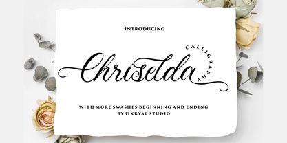 Chriselda is a beautiful calligraphy font perfect for crafting, branding, invitation, stationery, wedding designs, social media posts, advertisements, product packaging, product designs, label, photography, watermark, special events or anything. Chriselda comes with full set of uppercase and lowercase letters, swash alternates, ligatures,multilingual symbols, numerals and punctuation.
 - King of August by Tour De Force,
$25.00 King of August is single weight script font. Simple, elegant, designed letters with power to fit and lead any project. It is ideal for product names, labels, packages, King of August works well in titles and shorter paragraphs as well. Comes with Swashes as OpenType feature.
 - Amartha by Fikryal,
$15.00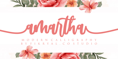 Amartha is a natural script font perfect for crafting, branding, invitation, stationery, wedding designs, social media posts, advertisements, product packaging, product designs, label, photography, watermark, special events, or anything. Amartha comes with full set of uppercase and lowercase letters, swash alternates, ligatures,multilingual symbols, numerals and punctuation.
 - Bulgari by Slex Studio,
$15.00 Bulgari is an organic handwritten font suitable for branding, wedding invitations, promotions, product packaging and other necessities. This font is modern, simple, but still authentic. You'll get a full set of lowercase and uppercase letters, numbers and punctuation, multilingual symbols, lowercase start and end swashes, and ligatures.
 - Mistyca Brush by Letterena Studios,
$9.00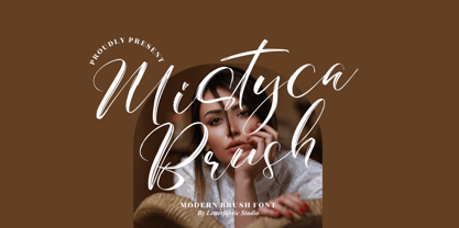 Mistyca Brush is a lovely and delicate script font that exudes elegance and class. This font was particularly crafted for those who need a beautiful and refreshing look to their designs. Mistyca Brush is PUA encoded which means you can access all glyphs and swashes with ease!
 - Welcome Santa Claus by Andrey Font Design,
$10.00 Welcome Santa Claus is a beautiful handwritten font. Its natural and unique style makes it incredibly fitting to a large pool of designs. The only limit is your imagination! This font is PUA encoded which means you can access all of the glyphs and swashes with ease!
 - Nevia BT by Bitstream,
$50.99Nevia BT is a four weight text family loaded with subtle design nuances. These OpenType Pro fonts support many OT features including smallcaps, oldstyle figures, contextual swashes, ornaments, discretionary ligatures, fractions and much more. The extended character set supports both Western European and Central European languages. - Hello Berlin by Hrz Studio,
$14.00 Hello Berlin is a sweet, all round and flexible handwritten font. Warm, romantic and jolly, this font will turn each of your project ideas into real works of art. This font is PUA encoded which means you can access all of the glyphs and swashes with ease!
 - The Urbanists by Arendxstudio,
$18.00 The Urbanists is a free style font that has the characteristics of street art that shows freedom and is filled with unique characters. Features : • Character Set A-Z • Numerals & Punctuations (OpenType Standard) • Accents (Multilingual characters) • Ligature • Swash There it is! I really hope you enjoy it.
 - Heart Strung by PizzaDude.dk,
$20.00 Simple, yet thrilling! Heart Strung is my handmade font! Useful for a wide range of things - such as invitations, greeting cards, headlines, notes and quotes ... and a lot of other things! Comes with swashes for uppercase and ligatures for double lettering - and some lovely swashy alternates! :)
 - Callicotez by Sesa Grafika,
$10.00 Callicotez is a retro styled and unique with Reverse Contrast display font. It embodies playfulness and authenticity and is the perfect choice for any children activity or school project. This font is PUA encoded which means you can access all of the glyphs and swashes with ease!
 - Albertiny by Nurf Designs,
$19.00 Albertiny comes with an awesome look and has a variety of alternative characters. Albertiny is the perfect fit for all of your logos, branding, social media, and crafty DIY projects. It has OpenType features (alternates, swash, ligature) that can help you find different sensations with each use.
 - Original Taste by Arttype7,
$12.00 I hope you are very happy today. we want to introduce our newest font, which we named `` Original Taste font ''. This font is a very bold bold cript font and has cool alternets and swashes. original taste font. This font has a taste, old, modern and unique.
 - Dream Earth by Epiclinez,
$18.00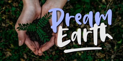 Dream Earth is a cool, brushed, and relaxed handwritten font. This font is suitable for designs such as t-shirts, sportswear, logos, advertisements, clothing, and more So what's included : Basic Latin A-Z & a-z Numbers, symbols, and punctuations Ligatures and swashes Accented Characters : ÀÁÂÃÄÅÆÇÈÉÊËÌÍÎÏÑÒÓÔÕÖØŒŠÙÚÛÜŸÝŽàáâãäåæçèéêëìíîïñòóôõöøœšùúûüýÿžß Thank you