10,000 search results
(0.035 seconds)
- Mechaniclove by ahweproject,
$14.00 Mechaniclove is a gorgeous and bold handwritten font, crafted to give your headlines and logotype projects a retro touch. This font reads as strong, confident, and dynamic and can add tons of nostalgic character to your designs. This font is PUA encoded which means you can access all of the glyphs and swashes with ease!
 - Creamer by Creativework Studio,
$14.00 Creamer is a gorgeous and bold handwritten font, crafted to give your headlines and logotype projects a stylish touch. This font reads as strong, confident, and dynamic and can add tons of nostalgic character to your designs. Creamer is PUA encoded which means you can access all of the glyphs and swashes with ease.
 - Tag Banger by Okaycat,
$12.50 TagBanger WADE1 is the first in a short graffiti font series. This series will showcase the hand-styles of various mature street artists that Okaycat is working with. This first release highlights the style of one such graffiti writer, WADE1, who has an eclectic writing style after many years proliferating street art. Long-term graffiti artists develop their own style over their careers, spending as many endless hours honing their letter-forms as any full-time professional typographical artist. Style, individuality, and originality are everything. These attributes are key to the graffiti artist's tao. A writer who copies, or "bites" loses respect -- their work will be painted over or "crossed out" by all other writers. Okaycat's TagBanger series aims to demonstrate just how widely these individual styles can diverge, likely due, at least in part, to the social pressures of a community that ruthlessly punishes copycats. WADE1's tags were transformed into vector format from a generous sampling of their most recent scrawls. Our TagBanger series may not be composed of the most legible or beautiful fonts, but we imagine there are uses for these whenever highly unusual handwriting is needed. TagBanger WADE1 is extended, containing the full West European diacritics & a full set of ligatures, making it suitable for multilingual environments & publications.
 - Naratif Condensed by Akufadhl,
$25.00 Naratif is a condensed display based on an early 1900 sans-serifs and gothic faces and it has 7 weights including italic. Great for anything big and for not so small text or display. With a wide range of latin support, and OpenType features such as Small Caps, Fractions, Alternates Character, Inferior and Arrows.
 - Eckhardt Freehand JNL by Jeff Levine,
$29.00Eckhardt Freehand JNL is the fourth font based on the lettering of sign painters and show card writers. Jeff Levine has chosen to name this “mini series” of fonts in honor of his friend Albert Eckhardt, Jr., a talented sign man who ran Allied Signs [in Miami, Florida] from 1959 until his passing in 2005. - Kammerlander by Juraj Chrastina,
$29.00 Kammerlander is a sans typeface with a distinctively strong thick/thin contrast. It’s based on Messner- a hairline font with a constant stroke weight, so their combination looks very natural. They look great in fashion magazines, in the expensive world of beauty and glory. Kammerlander is an all caps face, especially suitable for larger sizes.
 - Clairveaux by Scriptorium,
$12.00Clairveaux is based on samples of an ornate 12th century calligraphic style. It has some interesting features, including small caps which combine some characteristics of both traditional upper and lower cae character forms. It's ornate enough to look decorative, but not overwhelmingly complex, and looks remarkably attractive when used for titles in a large size. - Distancia by Hindia Studio,
$15.00 Distancia is a super-extended sans family of six weights. Inspired by stunning 70's sports cars advertisement, this typeface is designed for sheer elegance and casual experience. Distancia has its own particular friendly and warm appearance of modern touch. With its extensive and open proportions, it makes a grand appearance for your projects.
 - Wardrobe JNL by Jeff Levine,
$29.00 A 1938 issue of the Spanish language movie fan magazine Cine-Mundial (Movie World) had an article entitled "Lo Que Visten Las Estrellas" ("What Stars Wear"). The headline of the article was hand lettered in a lovely Art Deco monoline sans serif, which is now available as Wardrobe JNL in both regular and oblique versions.
 - Rolade by Akufadhl,
$25.00 Rolade is a Rounded Condensed Sans. Designed for Display purpose. Firstly designed on late 2015 as an All Caps typeface based on a personal project. Rolade has a Rounded and cute character with condensed proportion. It also come with some alternates to give more flavour and variation. Supports a wide range of latin based language.
 - Varial Two Rounded by Paavola Type Studio,
$21.00 Varial Two typefaces are new and updated versions of Varial family created 2014: Extra-condensed Opentype™ sans-serifs with small caps, extended character set (european languages support) and extra features (fractions, ligatures and alternatives). Varial Two Rounded family is versatile in all design applications, for example all headlines, display use, infographics and more!
 - Mongoose by Kostic,
$40.00 Mongoose is a condensed sans serif, made for posters, headlines and logotypes. Caps and x-height were made to match the ultra wide Briller, so it could be fun to combine these two highly contrasting type families. Thanks to the OpenType features, figures come in both tabular and proportional widths, fractions and superior/inferior positions.
 - Stat Display Pro by Jure Kožuh,
$45.00 www.Stat-Type.com Complementary Type Family Stat Text Pro Stat Display Pro is an information design sans serif type family legible in circumstances of low visibility. Its large character set with multiple weights is defined by optimal size ratio, distinctive letter shapes, wide aperture and balanced counters. Stat Display Pro remains legible in unfavorable circumstances of distance, size, movement and similar. It contains nearly 700 glyphs, including diacritics, ligatures, small caps, old–style figures, arrows and more. This enables it to achieve wide language support. It consists of four main (Light, Regular, Medium, Bold) and four secondary, negative weights (Light Negative, Regular Negative, Medium Negative, Bold Negative) which are accompanied by their corresponding obliques. Stat Display Pro type family has higher than average x height (72% of cap height) which is accompanied by matching ascender and descender size ratios. With its distinctive letter shape detail it minimizes the possibility of letter shape confusion, while optimizing legibility with wide aperture and balanced counters. Its main intended use is information design, where it, with its characteristics, meets the requirements of wayfinding, infographics, table setting and much, much more. The development of the type family was based on research in legibility to achieve highly legible letter shapes, while not diminishing their visual character. A detailed description of Stat Pro type family is available at Stat-Type.com where a DEMO font can be downloaded.
 - Obliterate GRP by Grype,
$16.00 Obliterate is a self destructing sans-serif typeface created from old rub off typography sheets brought back from the brink of becoming landfill fodder. It contains four sets of capitals and one alternate set of numerals for a randomized look. Here’s what’s included with Obliterate: 633 glyphs - including Capitals, Alternate Capitals (in lowercase slots), Numerals, Punctuation, two additional alternate Capitals sets and an extensive character set that covers multilingual support of latin based languages. (see the last graphic for a preview of the characters included) Ligatures Feature that auto-switches between Capitals & three other alternate Capitals glyphsets, as well as Numerals and Alternate Numerals for visual randomness. The ligatures feature will be automatically enabled for most with opentype compatibility, otherwise you can access the alternate glyphs via a Glyphs panel. (try typing below to watch it alternate between sets) Four Sets of Distressed Capitals each come complete with international accented characters for each version. Here’s why Obliterate is for you: You're into legible but distressed typestyles that imitate a random looking distress to it You're a fan of the band Inner Circle, whom the font was originally a tribute to You're a fan of old Letraset/Transfertype rub off lettering You're designing a modern horror movie poster and want a typeface with some tooth to it You just like to collect quality fonts to add to your design arsenal
 - Strezed by Gholib Tammami,
$14.00 This font is for anyone who wants to give a touch of pain and horror to their project. This handwritten font is suitable for display use, titles, and some designs with the theme of sadness, fatigue, or anything alike.
 - Aeroport by Brownfox,
$45.00 Aeroport is a new typeface in the spirit of both German geometric sans serifs and Swiss neogrotesques. Its deliberately wide proportions and relatively short capitals account for the excellent way the type carries the line. Its short ascenders and descenders allow for very tight leading. When used in large point sizes, Aeroport reveals its industrial ancestry and its unconventional design: the somewhat unbalanced top of the lowercase a, the capital B that has deliberately not been compensated optically, the overly wide capital M. In smaller sizes the type creates a starkly different effect: its measured widths and low contrast make a text setting appear neutral and homogenous. This versatility is what makes Aeroport a multipurpose sans serif suitable for a wide variety of typographic applications. The family includes four weights with their italics and a monospased style. Character set includes an alternate lowercase a, two sets of figures and currency symbols, uppercase punctuation, and a set of arrows. Includes Latin and Cyrillic sets supporting over forty languages. Designed by Gayaneh Bagdasaryan & Vyacheslav Kirilenko, 2017.
 - Slate by Monotype,
$34.99 A typeface of grace, power and exceptional versatility, the Slate collection is a truly beautiful design that achieves stellar levels of readability, both in print and on screen. Created by the award winning type designer Rod McDonald, this six-weight sans serif family is a rare example of sublime aesthetics meeting world-class functionality. The typeface’s legible letterforms embody an amalgam of the best traits of both humanistic and grotesque letterforms. “I didn’t want a face with an ‘engineered’ look, or with any noticeable design gimmicks or devices,” admits designer McDonald. “I wanted a pure design. I confess that I was ruthless with any character that wanted to stand out from the rest.” The Slate collection is available in six weights with complementary italics, with slight changes in structure from the light to the black weights. Its light weight is reminiscent of early American sans. Whether for use in display work or in longer-form settings, few typefaces possess the beauty and power of this design, leaving the Slate family an excellent addition to any designer’s typographic quiver.
 - Adoreles by Nathatype,
$29.00 Adoreles is a distinctive sans-serif display font that stands out with its elegance and unconventional charm. Crafted with a delicate touch, this font creates a visual experience that is both refined and uniquely artistic. With Adoreles, you have a sans-serif display font that redefines the expected. The characters in Adoreles are presented in uppercase, each possessing a subtle sophistication. By eschewing boldness, the font embraces a refined simplicity. The true magic of Adoreles lies in its inlines—irregular, yet meticulously designed to add a touch of unpredictability and individuality to each letter. Enjoy the features here. Features: Multilingual Supports PUA Encoded Numerals and Punctuations Adoreles fits in headlines, logos, posters, flyers, branding materials, greeting cards, print media, editorial layouts, and many more designs. Find out more ways to use this font by taking a look at the font preview. Thanks for purchasing our fonts. Hopefully, you have a great time using our font. Feel free to contact us anytime for further information or when you have trouble with the font. Thanks a lot and happy designing.
 - Mairy by Typesketchbook,
$39.00 Mairy font family is a modern sans serif font family. Featuring 9 separate weights each followed by own true italics Mairy is positioned somewhere between rounded sans with humanist touch. In fact the humanist presence in Mairy is a little bit more than the usual doze adding more calligraphic elements mostly noticeable in italic weights but also very important in regulars. This symbiosis of Grotesk geometry with handwriting is well balanced regarding contrast and legibility so that at the end we have a highly usable font family. Light weights are very tender and elegant while the old and blacks are soft, friendly and full of vitality. The mid weights are just perfect with their medium contrast and excellent legibility. Mairy is very fresh font family and is surprisingly flexible when it comes to screen or print use – it is optimized for both even if the conditions are poor. Use it with OpenType compatible software and explore its true potential by accessing additional set of ligatures, alternates and multilingual support.
 - Sonny Gothic by W Type Foundry,
$25.00 Sonny Gothic is our most rational-geometric typefamily until so far. It’s inspired by the geometric style of the 70s, specifically by Herb Lubalin’s work. Since we were students, we have been gazing Lubalin’s logos, typefaces and magazines as inspiration that still lives in our subconscious. At first, we made a pure geometrical typeface with modern caps proportion, then we combine those proportions with the 70s traditional caps ligatures. It was at that point that we knew Sonny Gothic was ready to arise. Even though Chile is not the origin of a modern visual culture, for us geometric typefaces and Lubalin’s work are one of the most attractive aesthetics of the creative realm, and therefore, this is our homage. Designed with powerful opentype features, each weight includes alternate characters, ligatures, fractions, special numbers, arrows, extended language support and many more… Perfectly suited for the several areas of graphic design. Learn about upcoming releases, work in progress and get to know us better! On Instagram W Foundry On facebook W Foundry wtypefoundry.com
 - Westblue by Ditatype,
$29.00 Westblue is a captivating sans-serif display font. Crafted in bold style and intricate brushwork, this font is a versatile choice for designers seeking a perfect combination of impact and creativity. The characters in Westblue command attention with their substantial size and clean, sans-serif lines. What sets this font apart is the meticulously added brushed details, which bring an organic and handcrafted touch to each letter. These details create a sense of dynamism, making Westblue ideal for projects that demand both modernity and a hint of artistic flair. In addition, enjoy the features here. Features: Multilingual Supports PUA Encoded Numerals and Punctuations Westblue fits in headlines, logos, posters, flyers, branding materials, greeting cards, print media, editorial layouts, and many more designs. Find out more ways to use this font by taking a look at the font preview. Thanks for purchasing our fonts. Hopefully, you have a great time using our font. Feel free to contact us anytime for further information or when you have trouble with the font. Thanks a lot and happy designing.
 - Liberta TA by Elsner+Flake,
$40.00 Between 1958 and 1961, Herbert Thannhaeuser developed the typeface Liberta for Typoart as a broadly conceived newspaper type which established itself quickly. Its positive adaptation by publishing houses and printing companies was based, next to its agreeable and reader-friendly general impression, also on a relatively robust typeface character which does not sacrifice its power of impression and elegance even when confronted with poor paper and printing qualities. In the 1970s, a bullish and robust design style took over the area of consumer goods which then required a corresponding advertising face. Harald Brödel re-worked the Liberta Ultra for phototypesetting, and, with great sensitivity, designed a matching cursive variation. Both types work especially well as an attention getter for advertising and for emphasis purposes.
 - 1495 Bastarde Lyon by GLC,
$38.00 Font designed from this who was used by an unknown printer in Lyon (France) to print the “Conte de Griseldis ” (Griseldis' tale), from Petrarque, inspired by Boccace, in 1495. The original font has a relatively small number of special characters and ligature, for the time. This font includes “long s”, naturally, as typicaly medieval but numerous letters - as accented ones - were added for this version. A render sheet, enclosed with the file, helps to identify them on keyboard. It is used variously in web-site titles, posters and fliers design, editing ancient texts or greeting cards as a very decorative and fine font... This font works at a small size like 9, remaining clear and easy to read on screen, but always better when printed.
 - Le Monde Livre Std by Typofonderie,
$59.00 A text face in 4 styles Before the arrival of Phototypesetting, each font size had a specific design. Le Monde Livre, designed by Jean François Porchez, along with Le Monde Journal re-establishes this practice. When Le Monde Journal was developed specifically for use at small point sizes (below 10 points.) Le Monde Livre works beautifully for book typography, magazine settings. In comparison to the italics in Le Monde Journal, Le Monde Livre’s italics are of a totally different design, closer to the models of the Renaissance. The families match well together on the same page, Le Monde Journal for small sizes settings, Le Monde Livre for large settings. The verticals metrics and proportions of Le Monde Livre are calibrated to match perfectly others Typofonderie families.
 - Mariam by Linotype,
$187.99Mariam is a traditional-style Arabic headline face designed by the famous Arabic type designer Ismet Chanbour, who also designed Al Harf Al Jadid - another highly successful typeface from Linotype. Mariam is characterised by certain design features which contribute to its stylistically lively, yet graceful appearance: downward-pointing tails combining with the swinging finial strokes of certain characters, and the various cut-away" effects. This headline face successfully offers a wide range of applications, from very large, bold poster-size work to use at 18 point for emphasis in text work. Available as in the OpenType format, Miriam incorporates the Arabic codepage (CP 1256), and supports Arabic and Persian. It also includes both tabular Arabic and Persian numerals, as well as Latin figures and complete punctuation." - Agilo Handwriting Pro by SoftMaker,
$15.99 Digitized handwriting fonts are a perfect way to give documents the “very special touch”. Invitations look simply better when handwritten than when printed in bland Arial or Times New Roman. Short handwritten notes look authentic and appealing. There are numerous occasions where handwritten text makes a better impression. Agilo Handwriting Pro is an upright, medium weight handwriting font with a simplified, slightly sloped print (non-connecting) style that mimics true handwriting closely. Use Agilo Handwriting Pro to create stunningly beautiful designs easily. This typeface comes with many pre-made ligatures and alternative characters for sophisticated typography – all easily accessible as OpenType features. A “random” feature even allows for automated random switching between variations of the same character, resulting in type that looks authentically handwritten.
 - Linotype Sangue by Linotype,
$29.99Linotype Sangue is part of the Take Type Library, selected from the contestants of Linotype’s International Digital Type Design Contests of 1994 and 1997. This prize-winning font was designed by the German artist Gabriele Laubinger. The most distinguishing characteristic of Linotype Sangue is the contrast between the wide, rounded capital letters and the tall, narrow and pointed lower case. Another factor which makes this font so unique is the way Laubinger worked with stroke contrasts, using heavy strokes in the top third of the characters and diminishing to extremely light strokes at the bottom. Linotype Sangue makes a mysterious, secretive impression. It is best used for headlines and displays and shorters texts with point sizes of 12 and larger. - HWT Showcard Script by Hamilton Wood Type Collection,
$29.95 Described as “An extended script type that lends itself well to fine fashion, ready-to-wear and all quality merchandise” in a marketing blurb pitching Beaufont by the Morgan Sign Machine Company of Chicago for their Line-O-Scribe sign printing system. This advertising script font was originally manufactured exclusively for Morgan Sign under license by the Hamilton Wood Type Manufacturing Company. The source patterns and original artwork for this typeface exist in the archives of the Hamilton Wood Type & Printing Museum, and were used for this fresh digitization of this font. This digital take includes alternate letters as originally designed in the mid-century wood type version, and now includes a full extended latin character set with over 350 characters.
 - TT Trailers by TypeType,
$39.00 Meet the new TT Trailers! The first version of TT Trailers was conceived as a font suitable for the film industry. The font harmoniously looks in posters, it is ideally suited for setting titles. However, the font has gained wide popularity among designers, and now you can find TT Trailers on the covers of magazines, on restaurant signs and on the main pages of websites. TT Trailers useful links: Specimen | Graphic presentation | Customization options Since 2019 when we released the first version, the TypeType studio team has released dozens of fonts, constantly improving our skills. In 2022, we decided to look at TT Trailers again, improving and expanding the font. In the new TT Trailers, we expanded the character set, corrected the contours, and improved the technical content. We have added extended Latin and Cyrillic characters, new symbols, and additional sets of numbers. The number of glyphs in one style has increased from 1081 to 1242. The inclined styles were long-awaited. The italics in TT Trailers are as eccentric as the upright fonts. The 15-degree tilt looks absolutely harmonious, complementing the character of the font family. We added italics to the variable font, so the new font changes along two axes at once, weight and slant. From the technical point of view, TT Trailers has become more modern and correct, and the number of OpenType features has increased from 29 to 42. We have added new alternative versions of glyphs and created a large number of localized features. The font retained all the qualities thanks to which designers fell in love with it, but became even more convenient. TT Trailers in the new version is suitable for titles and posters, for websites and printed materials. The font will embellish in restaurant and cafe signs and look beautiful in posters. There are 19 styles in TT Trailers: 9 upright, 9 italic and 1 variable font.
 - LD Charlie Clown by Illustration Ink,
$3.00LD Charlie Clown is an enjoyable scrapbooking font that can put a smile on anyone's face. - FT Forest by Fenotype,
$29.95 With Forest Dingbats you can easily create fast nature patterns or use the images as such.
 - FG Suzanne by YOFF,
$13.95 Suzanne in a can is an expressive yet naive writing that has a straightforwardness about it.
 - Naguel by RodrigoTypo,
$25.00 With only 2 pesos, this font can be the most fun! multilanguage and special for titles!
 - Hymers JNL by Jeff Levine,
$29.00 Born on May 8, 1892 in Reno Nevada, Lewis Franklin (“Lew” ) Hymers left an indelible mark as a caricaturist, cartoonist and graphic artist. At the age of twenty [in 1912] he worked for the San Francisco Chronicle. During World War I he worked for the Washington Post. He even was employed for a time by Walt Disney as an animator - but most of his life was spent in either Tujunga, California or his birthplace of Reno, Nevada as a self-employed illustrator. Hymers inked a feature for the Nevada State Journal called “Seen About Town”, which was published during the 1930s and 1940s. In this panel, he caricaturized many of the familiar faces around Reno. He also designed signs, logos, post cards and numerous other commercial illustrations for clients, but what has endeared him to a number of fans was his vast library of stock cuts (the predecessor to paper and electronic clip art) which feature his humorous characters in various professions and life situations. So popular is his work amongst those “in the know” that a clip art book collection of over seven hundred of his drawings that was issued by Dover Publications [but long out of print] commands asking prices ranging from just under $15 to well over $100 for a single copy. Lew Hymers passed away on February 5, 1953 just a few months shy of his 61st birthday. Although his artwork depicts the 1930s and 1940s lifestyles, equipment and conveniences, more than sixty years after his death they stand up amazingly well as cheerful pieces of nostalgia. The twenty-seven images (and some variants) in Hymers JNL were painstakingly re-drawn from scans of one of his catalogs and is but just a tiny fraction of the hundreds upon hundreds of illustrations from the pen of this prolific artist.
 - Blackhaus by Canada Type,
$25.00Almost a half of a millennium after being mistaken for the original 4th century Gothic alphabet and falsely labeled "barbaric" by the European Renaissance, the blackletter alphabet was still flourishing exclusively in early 20th century Germany, not only as an ode to Gutenberg and the country's rich printing history, but also as a continuous evolution, taking on new shapes and textures influenced by almost every other form of alphabet available. Blackletter would continue to go strong in Germany until just before the second World War, when it died a political death at the height of its hybridization. For almost 50 years after the war, blackletter was very rarely used in a prominent manner, but it continued to be seen sparely in a variety of settings, almost as a subliminal reminder of western civilization's first printed letters; on certificates and official documents of all kinds, religious publications, holiday cards and posters, to name a few. In the early 21st century, blackletter type has been appearing sporadically on visible media, but as of late 2005, it is not known how long the renewed interest will last, or even whether or not it will catch on at all. The last few years before World War II were arguably the most fascinating and creative in modern blackletter design. During those years, and as demonstrated with the grid-based Leather font, the geometric sans serif was influencing the blackletter forms, taking them away from their previous Jugendstil (Art Nouveau) hybridizations. Blackhaus is a digitization and elaborate expansion of a typeface called Kursachsen Auszeichnung, designed in 1937 by Peterpaul Weiss for the Schriftguss foundry in Dresden. This is one of very few designs from that time attempting to infuse more Bauhaus than Jugendstil into the Blackletter forms. This is why we used a concatenation of the words blackletter and Bauhaus to name this face. The result of injecting Bauhaus elements into blackletter turned out to be a typeface that is very legible and usable in modern settings, while at the same time harking back to the historical forms of early printing. The original 1937 design was just one typeface of basic letters and numbers. After digitizing and expanding it, we developed a lighter version, then added a few alternates to both weights. The Rough style came as a mechanically-grunged afterthought, due to current user demand for such treatment. Having the flexibility of 2 weights and many alternates of a blackletter typeface is not a very common find in digital fonts. More specifically, having the flexibility of 2 weights and alternates of a 20th century blackletter typeface is almost unheard of in digital fonts. So the Blackhaus family can be quite useful and versatile in an imaginative designer's hands. - Dueblo by alphabeet.at,
$40.00 Dueblo is a font family in serif, sans serif and semi serif with variability in weight and serifs. It's a classical antiqua with a sans serif basis, a semi serif version, two decor styles for headlines and initials and the italics in sans and in serif. The small caps, alternates as well as other useful optional and contextual open type features are included in the fonts. It has been in development since 2012 and in use for several projects and publications since 2015. It was worked on until 2020, the cyrillic and greek letters were added, and it was built up in a new and modern way. Now it's really ready for building words and paragraphs.
 - Vilanders by Edignwn Type,
$18.00 Introducing Vilanders, a must-have hand-drawn pair script and san serif font collection designed exclusively for graphic designers. With three unique style fonts (regular, rough, and stamp) and an additional 20 hand-drawn motorcycle illustrations, this versatile package is perfect for logo creation, branding, apparel design, and more. Infuse your designs with vintage and stamp font flair and explore the possibilities with Vilanders. Vilanders font features : - 3 style typefaces (regular, rough and stamp) - Uppercase, lowercase, numeral, symbol, punctuation and alternate in script font - All-caps, numeral, symbol and punctuation in sans serif font - Multilingual - PUA Encoded Vilanders includes : - 7 fonts (script, sans serif and dingbat) - 20 hand-drawn illustrations in dingbat
 - Bristol by GroupType,
$19.00 Bristol and Bristol Adornado (also known as Greco) was first released by Fundición Richard Gans of Madrid, Spain, in 1925. The Richard Gans Foundry is a defunct Spanish foundry which existed from 1888-1975. Throughout its existence, types were designed by a number of people including José Ausejo Matute (d. 1998), Antonio Bilbao (who created Escorial in 1960), the son Ricardo Gans, and Carl Winkow. GroupType's versions of this font pair have been with FontHaus since the mid 1990s. Bristol is a charming and strong period design. Its structure is masculine and vertical. A great poster font and the Adornado style is an excellent choice for an eye-catching large drop cap.
 - Maritha by Doehantz Studio,
$21.00 Maritha is a gorgeous, cursive and thick lettered handwritten font, crafted to give your headlines and logotype projects a stylish touch. This font reads as strong, confident, and dynamic and can add tons of nostalgic character to your designs. Maritha is PUA encoded which means you can access all of the glyphs and swashes with ease!
 - Shutterday by Heinzel Std,
$20.00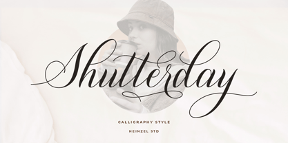 Shutterday is a beautiful and refined script font, featuring a lovely flow. It has a classy, elegant and modern look that can be used for logos, branding, invitations, stationery, wedding designs, social media posts, materials marketing and much more! This font is PUA encoded which means you can access all of the amazing glyphs and ligatures with ease!