10,000 search results
(0.019 seconds)
- Kefir by ROHH,
$39.00 Kefir™ is charismatic, cheerful and full of character. It is inspired by such classics as Cooper and Windsor and serves as their modern alternative. It is a display font family with very strong personality and feels at home in editorial design, all kinds of headlines, posters, badges, websites and branding. Its light weights let you set friendly and legible paragraphs of text as well! Kefir has beautifully flowing lines, its nature is soft, rounded and elegant with charming retro vibes. The letterforms were crafted with much passion and love in order to send powerful positive message whenever used! Kefir has two additional stylistic sets to adjust the font to your liking and decide if you choose upright or sloping stems (in characters like h, m ,n , a) or go even more playful with some super-friendly letterforms. Kefir family consists of 7 styles + 1 variable font, letting you adjust the weight to your exact needs. It has extended latin language support as well as broad number of OpenType features, such as stylistic sets case sensitive forms, ligatures, swash caps, final forms, contextual alternates, lining & oldstyle figures, basic fractions, superscript and subscript, ordinals, currencies and symbols.
 - Digital Sans Now by Elsner+Flake,
$59.00 Digital Sans Now combines and completes the many diverse requests and requirements by users of the past years. By now, 36 versions for over 70 Latin and Cyrillic languages have become available, including Small Caps. Digital Sans Now is also available as a webfont and reflects, with its simplified and geometric construction and its consciously maintained poster-like forms as well as with its ornamental character, the spirit of the decorative serif-less headline typefaces of the 1970s. The basic severity of other grotesque typefaces is here repressed by means of targeted rounds. Exactly these formal breaks allow the impression that it could be used in a variety of visual applications. Short texts, headlines and logos of all descriptions are its domain. It is because of this versatility that the typeface has become a desirable stylistic element, especially in such design provinces as technology, games and sports, and that, for many years now, it appears to be timeless. Additional weights designed on the basis of the original, from Thin to Ultra, the Italics, Small Caps and alternative characters allow for differentiated “looks and feels”, and, with deliberate usage, give the “Digital Sans Now” expanded possibilities for expression. The basis for the design of Digital Sans Now is a headline typeface created in 1973 by Marty Goldstein and the Digital Sans family which has been available from Elsner+Flake since the mid-1990s under a license agreement. The four weights designed by Marty Goldstein, Thin, Plain, Heavy and Fat, were originally sold by the American company Visual Graphics Corporation (VGC) under the name of “Sol”. Similarly, the company Fotostar International offered film fonts for 2” phototypesetting machines, these however under the name “Sun”. The first digital adaptation had already been ordered in the mid 1970s in Germany by Walter Brendel for the phototypesetting system Unitype used by the TypeShop Group, in three widths and under the name “Digital Part of the Serial Collection.” Based on the versions by VGC, Thin, Plain, Heavy and Fat, new versions were then created with appropriate stroke and width adaptations for data sets for the fonts Light, Medium and Bold as well as for the corresponding italics
 - Allysa Daguise by Natural Ink,
$12.00 Introducing the latest styles Allysa Daguise Script with the kind of modern calligraphy font, I hope you are interested in this font, if you want to use for your work this font can be used easily and simply because there are a lot of features in it to contain a complete set of letters lower and uppercase letters, assorted punctuation, numbers, and multilingual support. font also contains several ligatures and alternate style Stylistic Sets for those of you who have software that is able to work OpenType (Photoshop / Illustrator / InDesign). Allysa Daguise Script is suitable use for market design developed at this time, this font has a model Trendy, natural and gentle, with this font you can take advantage of the opportunity in every moment of one wonderful way to highlight the celebration of the feast of your best, because this font will be advocates for purposes such as wedding invitations, party, graduation, birthday, gathering, etc. If you need help or have questions, please let me know. I am happy to help :) Thank you & Congratulations on Designing! Thank you,
 - Model by Lián Types,
$49.00 When designing a typeface, one has to be conscious of superfluous details. Although I am always tempted to add little personal touches, experience taught me that the phrase -less is more- is totally true. In Model, the letters (like models do) participated of a contest: An event in which models engage in competition against each other, often for a prize or similar incentive. The prize was staying in the font! yay! Tall, delicate, refined, the right amount of elegancy: These were some of the aspects to be chosen. Typographically speaking, these things were achieved thanks to a tall x-height (which leaded the font to be somehow condensed), a subtle contrast between thicks and thins, and just the right amount of decorative swirls. The result is a nice script that can be used in magazines, invitations, posters, book-covers and works very well when used over photographs. Get Model and let it be the star of the catwalk. STYLES Model Pro and Model Small Pro are the most complete styles of the font. Both have all the ligatures and decorative glyphs seen in posters above (OT programmed). Model Std One, Std Two and Std Three are reduced versions of Pro. This means they have less glyphs inside. TIP If you are planning to print the font in small sizes, it’s highly recommended to purchase Model Small Pro. Its thins are thicker so they will be better printed.
 - Kinfolk Pro by Fontforecast,
$29.00 Kinfolk Pro is a font collection of six fonts. The main styles Rough and Smooth are extremely sturdy and bold brush fonts. As the name suggests the smooth style has clean, crisp contours and the rough version has the authentic strokes of a slightly dried out brush. Both versions have 606 glyphs and 4 alternate ornamented capital letters to play with, organized in stylistic sets. With Discretionary Ligatures and Contextual Alternates activated you can access elongated swashes by simply typing +1 (+2, +3, +4, +5) in front of any letter and =1 (=2, =3, =4, =5) at the back. On top of that Kinfolk Pro Rough and Smooth have some extra stand alone swashes that can be accessed via the glyphs panel or by typing _1, _2 ,_3 _4 _5. Kinfolk Pro Script is a fully connected script that goes together beautifully with the other styles. For the best connections, activate Discretionary Ligatures and Contextual Alternates. Additionally there is Kinfolk Pro Ornaments for extra swashes, ink blobs and interesting strokes. Kinfolk Pro Arrows and Kinfolk Pro Flowers both offer 230 glyphs to further juice up your designs. You'll need an Open Type savvy application to get the most out of Kinfolk Pro.
 - 946 Latin by Roman Type,
$35.00 946 is a multilingual techno-style family developed by Berlin-based type designer Roman Wilhelm (RomanType). While more and more text families have recently been extended to a multilingual and multi-script level, not so much attention has been given to the more decorative styles. The 946 family does exactly that. A lot of care has been given to the various diacritics: they were designed a little more brutal, a little more European than with some other fonts of this category. Do also watch out for the non-Latin legs of this family. 946 is inspired by electronic music. When Roman found a second-hand Roland TR-606 drum machine in a store in his hometown back in 1995, he started to hang out with would-be DJs and musicians, trying to play the beats that went around the globe. When he started to study visual communication three years later, he was assigned the matriculation number of 946, which has now become the name of this family. Language support: Afrikaans, Albanian, Catalan, Croatian, Czech, Danish, Dutch, English, Estonian, Finnish, French, German, Hungarian, Icelandic, Italian, Latvian, Lithuanian, Maltese, Norwegian, Polish, Portuguese, Romanian, Slovak, Slovenian, Spanish, Swedish, Turkish, Vietnamese, Zulu. Do also watch out for the other script versions of this family!
 - Mello by J Foundry,
$25.00 Mello is a bold, easy going Grotesque. It was designed for display, branding, advertising, packaging or anywhere a strong but friendly voice is needed. Mello features soft curves and rounded corners; set in 4 widths and 8 weights. The character set is robust, covering extended Latin. The default forms are contemporary with alternates including: single-story a, two-story g, rounded top A, traditional G, rounded leg R, rounded K, and rounded form y in both uppercase and lowercase, all separated into individual style sets for control and customization. A set of icons rounds out the character set, with hand signs and shapes.
 - Paper - Personal use only

- Veggie Spray by PizzaDude.dk,
$16.00 I bet a lot of people would love to have a Veggie Spray - I bet they would use it to turn candy, ice cream, cakes and other fattening products into something more healthy! Well, this font has zero calories and is 100% handmade, and comes with contextual alternates - which means that every letter has 5 different versions!
 - Cleopatra by Solotype,
$19.95Here's a great old face from the H. W. Caslon foundry in London; a real workhorse. The lowercase is eminently readable, so you can set entire paragraphs to good effect. We don't recommend it for setting all caps, but we did take time to kern it well; so you won't get a jumble of ovelapping letters if you do. - Avalaqus by Amera Type,
$10.00 Avalaqus is a font inspired by certificate, labels, posters, F&B packaging and has ligatures with alternate style that can make your display better than before. You will get a decorative font, sans, serif with bold and outline styles. And you will also get a set of badges with the open type feature format that match this typeface
 - Handlettery by Scratch Design,
$10.00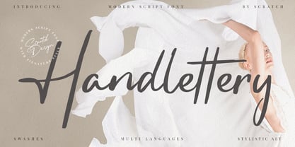 Handlettery is a modern script and handwritten font, which is suit for casual and feminine design stuff. This font is suitable for signature, wedding invitation, branding, promotion, product packaging, poster, and others. You will get a full set of lowercase and uppercase letters, numerals and punctuation, multilingual language, multilingual symbols, swashes, and ligatures. What You Get : Swashes Stylistic Alternates
 - Fado by Olga Umpeleva,
$50.00 Fado is a calligraphic typeface based on the broad nib calligraphy. It has a lot of alternates, ligatures, initial and final forms. The font has 3 sets of length and complexity of ascenders and descenders. It allows the user to chose the style: simple, with more complicated forms, with a lot of flourishes, and even mix all 3 styles.
 - Overloaded by PizzaDude.dk,
$19.00 Overloaded is an excellent font for a wide variety of use - most likely something that needs a kind of worn look. Works well in both large and small sizes, that being headlines and/or display. Surprisingly versatile and will fit tons of different purposes. I put in 3 different versions of the lowercase letters for you to pick as you please, and play around with. Comes with multilingual support
 - Muggy Feet by PizzaDude.dk,
$17.00 Muggy Feet is my handpainted and layered font. Mix the five different layers for realistic looking results. What makes it even more realistic is that the font uses "contextual alternates", which means that every letter of Muggy Feet has 5 different versions. Also, try to play around with the transparency of each layer of Muggy Feet. Muggy Feet is ready for your invitation, poster, book cover, packaging or signs.
 - Volut by jpFonts,
$19.95 Volut is a very charming display font designed by Christoph Ulherr. The family comes with four design variations as Base, Blocks, Outline and Outline Blocks. It’s touching and kissing characters create an outstanding sex appeal. Volut invites you to play and have fun, just try it. It should only be used in large point sizes beyond 24pt. All fonts include stylistic alternates and special ligatures to guarantee the best typographic quality.
 - Rayleigh by Allouse Studio,
$16.00 Rayleigh a Handwritten font. Rayleigh come along with Stylistic Alternate, Swash, Underline Style and Multi-Lingual Support which will give you many choices to play around. We highly recommend using a program that supports OpenType features and Glyphs panels like many of Adobe apps and Corel Draw, so you can see and access all Glyph variations. Enjoy the font, feel free to comment or feedback, send me PM or email.
 - Aschere by Nurrontype,
$15.00 Aschere is not just yet another retro font. It was designed carefully to give harmony ambient when you use it in your project. You can play with plenty ligature option. Or use unique stylistic to make your project stand out. Nevertheless you can find some prebuilt ornament, it would help to create instant logo or quotes. Be it as body text, or header/title, Aschere is the right choice.
 - Umbrella Man by Hanoded,
$15.00 Some time ago, I read an article about the Kennedy assassination. In that article, a person dubbed ‘the umbrella man’ played a rather bizarre role: apparently an innocent bystander with an opened umbrella was thought to be in cahoots with Kennedy’s killer. I immediately thought that the name ‘Umbrella Man’ was a good title for a horror movie, so when I created this rough brush font, I named it Umbrella Man.
 - Risley by Craft Supply Co,
$15.00 Risley: A timeless classic in editorial typography, Risley embodies the essence of a bygone era with its retro 90s serif font. Perfectly suited for editorial projects, Risley infuses a touch of nostalgia and sophistication into your designs. This typeface is ideal for greeting card, packaging, brand identity, poster, or any purpose to make your design project look eye catching and trendy. Feel free to play with this typeface!
 - Neckyn by Craft Supply Co,
$20.00 Introducing Neckyn - Quirky Sans Serif: A playful typeface that embraces individuality with its unique character. With its unconventional shapes and quirky charm, Neckyn adds a distinctive touch to any project, making a charming statement that stands out from the crowd. This typeface is ideal for greeting card, packaging, brand identity, poster, or any purpose to make your design project look eye catching and trendy. Feel free to play with this typeface!
 - Akrux by Harvester Type,
$20.00 Akrux is a futuristic variable wide font. It is inspired by forms that are close to futurism, stars and space. Everything related to space, movies, cartoons, art, books, spaceships. Ideas came from everywhere. The font is suitable for headlines, posters, logos, large typography, magazines, everything related to cars and anything that can be futuristic and meaningful. It has great language support, and Cyrillic is planned in the future.
 - Baguede by Craft Supply Co,
$15.00 Introducing Baguede, a post modern grotesque typeface with Fancy and catchy touch to maintain a sophisticated feel for the purpose of display. You want to make a greeting card or a package design, or even a brand identity, craft design, any DIY project, book title, poster, pop vintage design, retro design or any purpose to make your art / design project look pretty and trendy? Feel free to play with this typeface!
 - Bensonhurst JNL by Jeff Levine,
$29.00 The model for Bensonhurst JNL was a 1930s-era hand-lettered WPA (Works Project Administration) poster for the play "Hell Bent For Heaven". Although the basic style is a classic Art Deco "thick and thin" format, the design (in certain characters) starts to take on the feel of a 1970s revival style. With this in mind, Bensonhurst JNL is a bit of a hybrid between the 1930s and the 1970s.
 - Drafting Class JNL by Jeff Levine,
$29.00 Within the pages of “The Essentials of Lettering” by Thomas E. French and Robert Meiklejohn (circa 1912) is an example for creating a sans serif alphabet and numerals. The lesson plate is entitled “Upright Single-Stroke Gothic”; a basic monoline font most useful for architectural and drafting plans because of its easy-to-read properties. This type design is now available as Drafting Class JNL, in both regular and oblique versions.
 - Alcapone by Adam Fathony,
$17.00 Alcapone, a name based from legendary donuts on some brand, It's crunchy and melty. So, I've created this fonts while eating this meal. The Concept is Groovy, Retro & Psychedelic look. Created with a base on standard Serif fonts, playing with melted on the serif itself giving more weight to represent the grooviness and retro-ish look. Alcapone are good for Display, Header, Headline, Poster, Logos, or etc on a big typography.
 - Magic Twanger NF by Nick's Fonts,
$10.00Hiya, kids! Hiya, hiya, hiya! was the customary greeting of Froggy (a rather cheap rubber toy), who played second banana to otherwise-perennial sidekick Andy Devine on the 1950s TV show, Andy's Gang. The Magic Twanger was the thing which, when plunked, brought on the cartoons and other kid-friendly fare. The Opentype version of this font supports Unicode 1250 (Central European) languages, as well as Unicode 1252 (Latin) languages. - Crazy Party by Sarid Ezra,
$15.00 Crazy Party is a quirky handmade font that will make all your project more unique and handy. This font also including a unique lowercase and uppercase with very different weight. Combining the uppercase and lowercase in one word will make your project even more stunning. You can use this font for quotes, your cover book or playing with words in your instagram post. This font also support multilingual!
 - Aurisha Script by Matra Creative,
$14.00 Aurisha - Handwritten Font is an brush script font based on the expression of real handwriting, lets you transform type into an exciting and beautiful piece of work. Hand-lettered look adds a real human touch to things and comes along with a lot of loving details. Aurisha- Handwritten Font has lots of alternates that gives you possibility to build your text almost like handwriting with all the charming imperfections and variations that a real handwriting has. Aurisha will work perfectly for fashion, e-commerce brands, trend blogs, wedding boutiques or any business that wants to appear upscale
 - The Fox Tail by Din Studio,
$22.00 Hi Font Lovers! Let me introduce you to The Fox Tail – Font Duo&Extras The Fox Tail – Font Duo&Extras is a font inspired by the retro style and fox’s tail. It has a unique and attractive design so it is suitable for logos, branding projects, product packaging, quotes, greeting cards and many more. Includes: Features: A Full Set of Lowercase and Uppercase Stylistic Alternates Character Set (A-Z) Numerals and Punctuation (OpenType Standard) Accents (Multilingual Characters) PUA Encoded Make your design look unique with retro vibes. I hope The Fox Tail could fit your project’s standard.
 - Anyelir Script by Fredysujono,
$15.00 Anyelir script is a tasty and friendly brush font packed with OpenType ligatures, swashes and lots of alternate characters. The family has an character set supporting Western European, Central European and South Eastern European.
 - St Transmission by Stereotypes,
$19.00 St Transmission was one of the first ambitious projects for Stereotypes. Building a complete family with a lot of weights along with the italics. Transmission supports extended Latin character set, plus Cyrillic and Greek.
 - Guilloche B by Wiescher Design,
$24.00 »Guilloche B« is a set of graphics that join with each other to form very sophisticated, op-art-like borders. Try them on lots of different assignments, they form very surprising bands or patterns.
 - Slab Compact JNL by Jeff Levine,
$29.00 Slab Compact JNL was based on the printed title found on the box cover of a 1950s-era word games set called “Lex-O-Grams” and is available in both regular and oblique versions.
 - Vintage Price Tags JNL by Jeff Levine,
$29.00 Vintage Price Tags JNL comprises three sets of numbers in both ribbon, circle and star patterns which, when combined will produce point-of-sale price elements. The designs were re-drawn from examples found in an old wood type catalog, and are now collected in digital format. Ribbon-style numbers are found on the upper case keys. A through J have the large numbers, K through T are the smaller, underlined numbers. The remaining upper case keys contain the dollar sign, cents sign and the phrases "each", "for", "dozen" and "pair". On the lower case, the circle set of combination numbers are on the following keystrokes: The keys a through j are the left side semi-circle numbers and the "k" key is a blank left side semi-circle. The l through u keys are the right side semicircle numbers and the "v" keystroke is a blank right side semi-circle. The star set is on the standard numbers keys for the left side of the star, with the right side characters on the corresponding shift keystrokes for the number keys. In following the original design examples, a cents sign follows the numbers on the right side of the circle or star sets. The lower case w through z contain a left side star blank, a left side star with $1, a right side star blank and a right side star with small double zeros (to comprise a star shaped price tag for $1.00).
 - Pantera by Lián Types,
$39.00 ROARRR! THE STYLES -Pantera Pro is the most complete style, and although its default look is mono-rhythmic it gets really playful and crazy like the examples of the posters by just activating the Decorative Ligatures button in the Open-type Panel of Adobe Illustrator. However, I recommend using also the Glyphs Panel because there you'll find much more variants per letter. Pantera Pro is in fact, coded in a way the combination of thicknesses will always look fantastic. -Pantera Black Left, and Pantera Black Right are actually “lite” versions of Pantera Pro: They have very little Open-Type code, so what you see here is what you get. Pantera Black Left has its left strokes thick, while Pantera Black Right has its right strokes thick. -Pantera White is a lovely member in this family that looks lighter and airy, hence its name. With the feature Standard Ligatures activated (liga) the font gets very playful. -Pantera Caps is based on sign painters lettering and since it follows the same pointed brush rules as the other styles, it matches perfectly. -Pantera Claws like its name suggests, is a set of icons that were done by our dear panther. THE STORY It is said that typography can never be as expressive as calligraphy, but sometimes it can get close enough. I tend to think that calligraphic trials, in order to work well as potential fonts, need first to go through very strict filters before going digital: While calligraphy is synonym of freedom (once its rules are mastered), type-design, in the other hand, has its battlefield a little tighter and tougher. When I practice pointed brush lettering, there are so many things happening on the paper. And most of them are delicious. The ones who know my work may see that although many of my fonts are very expressive, my handmade brush trials are much more lively than them. With that in mind, this time I tried to go further and rescue more of those things that are lost in the process of thinking type when first sketches are calligraphic. I wondered if I could create something wild, hence its name Panther, by understanding the randomness that sometimes calligraphy conveys and turning it to something systemic: With Pantera, I created an ordered disorder. Like it happens a lot in many kinds of lettering styles, in order to enrich the written word the scribe mixes the thickness of the strokes and the width of the letters. Like one of my favorite mentors say (1), they make thoughtful gestures Some lively strokes go down with a thick, while some do that with a thin. Some letters are very narrow, meaning some of them will need to be very wide to compensate. Why not?. The calligrapher is always thinking on the following letters, and he/she designs in his head the combination of thicks and thins before he/she executes them. He/she knows the playful rhythm the words will have before writing them. It takes time and skill to master this and achieve graceful results. Going back to the font, in Pantera, this combination of varying thicknesses and widths of letters were Open-Type coded so the user will see satisfactory results by just enabling or disabling some buttons on the glyphs panel. I'm very pleased with the result since it’s not very easy to find fonts which play with the words' rhythm like Pantera does, following of course, a strong calligraphic base. I believe that if you were on the prowl for innovative fonts, this is your chance to go wild and get Pantera! NOTES (1) Phrase by Yves Leterme. In fact, it’s the title of a book by him. EPILOGUE Esta fuente está dedicada a mi panterita
 - Corporatus by Alex Rosario,
$60.00 The legendary retro-futuristic typeface returns, now in digital format! While there may be copycats of varying quality, none of them have taken the time and care to revive, reproduce, and expand the original Roc Mitchell “Corporate” typeface like Corporatus has. Made directly from scans of the original type specimens and expanded to include the full WGL4, Corporatus is YOUR solution for your retro, futuristic, and corporate design needs. Descended from Microgramma and originally designed to be the American competition to distant cousin Eurostile, Corporate and subsequently Corporatus is best known for being the typeface used by video game developer and publisher Nintendo for many NES-related media in the West, including its controllers, and by Colecovision for its logo. With the original Latin character set as well as Greek and Cyrillic lettering available, now you're playing with TYPOPOWER!
 - Trepa by Tipo Pèpel,
$22.00 From time to time at Tipo Pèpel we like to play like children and get our hands dirty with whatever implement that can be used to mark or draw on the walls, even if the grown-ups don’t like it. And this is more or less what happened with “Trepa” (catalan for “stencil”), a typeface with a fresh and uninhibited appearance, inspired by commercial signs and the 1950’s French art movement “Graphie Latine”. Far removed from the straight lines of vector art, “Trepa” has the necessary roughness to make this class of font stand out and what’s more it has an extensive range of latin characters covering more than 200 languages, and a pair of complementary texture fonts which further multiply its creative possibilities. If you want to protest with elegance, “Trepa” is your best choice.
 - Northstream Wind by Monotype,
$-Northstream is a Neo-Grotesque in motion. The typeface was inspired by an attempted photograph of an interesting shop sign that was interrupted by a passing truck. The resulting effect was a blur of movement and designer, Hendrik Weber, wanted to capture that feeling within the typeface. The result is a whirlwind of a design and the shadow behind the letterforms creates a very interesting effect. This typeface is meant for graphic designers to enjoy and play around with, and it is best suited for display text and large sizes such in posters and billboards. Northstream was designed as part of the Font Marathon that was run at the Monotype London office in November 2016. This version is available for free and because of the short time frame is supporting a Basic Latin character set and a few alternates. - Marshmallow by Positype,
$39.00 Marshmallow is a fun, fat, super high-contrast script typeface in two variants. A slick connected (Script) and a mellow unconnected (Fluff) style that provides the versatility you need regardless of the display usage you plan. Marshmallow Script tops out at 820 characters, and both fonts feature a wide array of swash and stylistic alternates that complement the other, with varying options in the three additional stylist sets, titling alternates, ligatures and contextual ligature combinations. The fonts even contain ordinals, superior and inferior numerals, OpenType-generated fractions. All of these extras are produced with a sense of decadence and fun to expand the possible uses of the typeface. It can’t be used everywhere, but when it is used, it should be used with indulgent abandon… which is pretty much what happens any time we take a soft, gooey bite into marshmallow now, right?!
