10,000 search results
(0.087 seconds)
- Balinda by TM Type,
$12.00 Balinda is a distinct and graceful script font. Fall for its ravishing style and use it to create gorgeous designs. This font is PUA encoded which means you can access all glyphs and swashes with ease!
 - Balina by Fanart Studio,
$15.00 Balina is a distinct and graceful script font. Fall for its ravishing style and use it to create gorgeous designs. This font is PUA encoded which means you can access all glyphs and swashes with ease
 - Summer Strike by Letterafandi Studio,
$14.00 Summer Strike is a simple, thin lettered and flowing handwritten font. This adaptable font will look great on a variety of design ideas. It will add a fun and friendly touch to each of your projects!
 - Pumpkinos Horror by Sipanji21,
$12.00 Pumpkinos is an incredibly unique horror display font. Add this font to your favorite Halloween themed ideas and notice how it makes them come alive. Pumpkinos is perfect for posters, packaging, banners, advertising, apparel, and more.
 - Early Christmas by Letterafandi Studio,
$12.00 Early Christmas is a lovely script font featuring charming, playful characters that seem to dance along the baseline. This font is PUA encoded which means you can access all of the glyphs and swashes with ease!
 - Melody and Memory by Epiclinez,
$19.00 Melody and Memory is a delicate and elegant handwritten font. Its distinct and well rounded letters make this font a masterpiece. Fall in love with its incredibly versatile style and use it to create spectacular designs!
 - Autumn Stories by Tlatous Type,
$19.00 Introducing Autumn Stories by Tlatous Type. Autumn Stories is a Modern Script Handwritten Font. This font is perfect for product packaging, branding project, megazine, social media, wedding, or just used to express words above the background.
 - Waves Killer by Forberas Club,
$16.00 Introducing Waves Killer by forberas, This font born to be a Halloween Project. But still can be made as a display font, and still suit your other fun project. Your review and response are most welcome.
 - Veruzza Hollow by Sipanji21,
$10.00 Veruzza Hollow is a cute and modern display font. This enchanting font will turn any creative idea into a true standout. Get creative with its unique look, and use it to brighten up any crafting project!
 - Rara by Jiaone,
$9.00 Rara is a display font that has a free and energetic expressive character. Rara has a letter shape similar to brushes but solid, this font is suitable for use as a medium that complements passive objects
 - Cake Zombie by Forberas Club,
$16.00 Introducing Cake Zombie by forberas, This font born to be a Halloween Project. But still can be made as a display font, and still suit your other fun project. Your review and response are most welcome.
 - Ony by Cuda Wianki,
$20.00 Ony font was made by cutting letters in cardboard and printing them on paper. This non-perfect printing was used to get heavy, dirty letters. Font has alternate characters so it can imitate real printed words.
 - Old Jersey Distressed by Alphabet Agency,
$15.00 Old Jersey Distressed is a cool, vintage styled and rough textured display font. This adaptable font will look great on a variety of design ideas. It will add a distinct touch to each of your projects.
 - Religiosity by Seemly Fonts,
$12.00 Religiosity is a cute and casual handwritten font. Its friendly feel makes this font incredibly versatile, fitting a wide range of contexts. Add it to your creative ideas and notice how it makes them stand out!
 - Atheline by Yoga Letter,
$15.00 "Atheline" is a beautiful and elegant handwritten font. This font is equipped with uppercase, lowercase, numerals, punctuation, and multilingual support. It is suitable for weddings, engagements, photography, stickers, banners, branding, Christmas, back to school, and others.
 - Teh And Kopi by Tigade Std,
$20.00 Teh and Kopi is a cute and charming display font. Whimsical and a bit quirky, this font will brighten up each of your designs. Add it confidently to your projects, and you will love the results.
 - 1845 Mistress by GLC,
$38.00 This font was inspired by Spencer’s patterns, particularly the elegant varieties called “Ladies' Hand” in some handbooks. Intelligent OTF ligatures and alternates (about 160) are included in the font, giving a closer appearance to realistic handwriting.
 - Fortnight by ErlosDesign,
$12.00 Fortnight is an incredibly stylish script font which will look stunning in a wide variety of contexts. Created with the help of an outstanding brush pen, this font will elevate your projects to the highest level.
 - Oh, embark on a whimsical adventure into the realm of typography and meet Ruthless Drippin TWO by Måns Grebäck, where letters don't just sit quietly on the page – they throw a full-fledged, ink-sling...
- Talonica by Nantia.co,
$24.00 Greek Signature Font Talonica The Greek Signature Font Talonica is a signature decorative font with which you can achieve a hand-lettering style. Talonica is a multilingual lettering font with Greek (of course), Latin characters, and diacritics. Supports all European languages. This signature style is perfect if you want to achieve a modern-looking graphic design project. In addition, this font has a really nice flow so you can also use it in a larger body of text. It can also be used on social media content, for branding or packaging applications. Also, this is the ideal typeface for organic product wine branding and packaging. You can use it to create logotypes with character and natural flow. Additionally, you can use its romantic vibes for wedding invitation designs. Especially if you are looking for a handwritten font for Instagram quote posts or any other social media content, this signature typeface is for you!
 - spanky 20 second version - Unknown license

- Long Tall Palito by Pedro Teixeira,
$15.00 This font can make a great art element to emphasize, to provide impact, can stand out as a banner, or with a few words in headers and headlines and allow you to optimize space and keep neat and organized.
 - Chelsea Olivia by Garisman Studio,
$17.00 A warm duo of fonts in front of you! This is a super duo with lots of ligature. This is perfect for logos, wedding invitations, easter, posters, business cards, logos, headlines, Instagram stories, youtube stories, book cover, poster promotion and many more! Get the best pairing fonts with Chelsea Olivia!
 - Edane by Arttype7,
$15.00 This font will have a grunge shape that gives a clean impression, and is accompanied by attractive ligatures. You can choose the shape of the letters that you want to convey through your brand logo, EDANE This font comes with all the caps, a hint of Japanese flavor embedded in the corners of the characters.
 - Invention by Create Big Supply,
$15.00 Invention Font is a unique, This will add a very unique and powerful touch to your design. This font is PUA encoded which means you can access all the glyphs and sweeps easily! Features: Uppercase & lowercase Numbers and punctuation Multilingual PUA Encoding Full Character Set !"#$%&()*+,-./0123456789:;=?@ABCDEFGHIJKLMNOPQRSTUVWXYZ[\]^_abcdefghijklmnopqrstuvwxyz{|}~ ¡¢£¤¥§©ª«®°±²³·¹º»¿ÀÁÂÃÄÅÆÇÈÉÊËÌÍÎÏÑÒÓÔÕÖ×ØÙÚÛÜÝÞßàáâãäåæçèéêëìíîïñòóôõö÷øùúûüýþÿıŒœŠšŸž–—‘’‚“”„†•‹›€−
 - Soutkind by Sitintahitam,
$19.00 SOUTKIND is a display typeface with heavy bold style, inspired by pop culture in 80s century. Soutkind have a unique and fat forms. This font suitable for your design suh as packaging, poster, apparel, etc. SOUTKINDalso includes a set of some pop illustration. Extras allows you to develop awesome design with this font. Cheers! 🍻
 - Roline by HansCo,
$17.00 INTRODUCING ROLINE – Modern Display typeface! ROLINE is a modern lined font with unique style that will make your design looks modern and sophisticated. You can use this font for any purpose, especially to make logotype like a technology logo brand. This typeface is comes in ALL CAPS also support multilingual in ALL CAPS only. Enjoy!
 - Nucleo by HansCo,
$17.00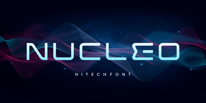 INTRODUCING NUCLEO – Modern Display typeface! NUCLEO is a modern monoline font with unique style that will make your design looks modern and futuristic. You can use this font for any purpose, especially to make logotype like a technology logo brand. This typeface is comes in uppercase, lowercase, punctuation, symbols, numerals, etc also support multilingual. Enjoy!
 - Chuterolk by Namara Creative Studio,
$12.00 Modern sans serif font that is out of this world. A strong balance between strong pointed corners and smooth curves, Perfect for all purposes but especially for headlines. With 8 Variant to choose : Light, Light Italic, Regular, Italic, Rounded, Shadow, Bold and Bold Italic. This font also includes alternative glyphs, ligatures and multilingual support.
 - The Socker by Mozatype,
$11.00 THE SHOCKER a natural brush font. THE SHOCKER would be perfect for sports, music festivals, quotes, special events, or anything. What’s Included : - Works on PC & Mac - Easy to use ( Installations ) - Compatibility Windows, Apple, Linux, Cricut, Silhouette, and Other cutting machines Thank you for purchasing this font. Please appreciate, if you like this. ENJOY it :)
 - Aventi by Sign Studio,
$15.00 Aventi is an absolutely elegant serif font. This typeface includes stylistic alternates set (a, e, g, y) and discretionary ligatures. It will elevate a wide range of design ideas, from cards to branding, labels, and more. This font is PUA encoded, which means you can access all of the glyphs, alternate characters, ligatures with ease.
 - Mesa Verde NF by Nick's Fonts,
$10.00A travel poster from the 1940s for Mexican tourism provided the inspiration for this voluptuous font with a strong architectural feel. A few unexpected idiosynracies in the letterforms add to its charm. Both versions of this font contain the Unicode 1252 Latin and Unicode 1250 Central European character sets, with localization for Romanian and Moldovan. - Calhoun by Josh Grzybowski,
$19.99 Built with both thick and thin lines this display font uses heavy round terminals giving this almost didone-style font a more playful and slightly stylish look. Perfect for magazines and publications as well as for identity and branding. The character set contains typical OpenType features in addition to small caps, and old style numbers.
 - Trasandina by TipoType,
$24.00 Trasandina is a very unique font-family: a modern, versatile, workhorse typeface with a special personality, given by the mix of humanist and geometric models, remaining far from both extremes. This typeface has 9 styles plus their matching italics, it has an incredible wide range of weights, from very thin to an ultra thick stem. This was made following the Luc(as) de Groot’s Interpolation Theory. Trasandina’s versatility also resides in the +800 characters that each weight includes, having several open type features and language support for more than 200 languages. This font has been specially designed for web (using hinting instructions), making it work in small and large sizes on different types of screen resolutions. Trasandina’s most interesting feature is its flexibility: On one hand, is easy to read thanks to its humanistic letterforms which allow this typeface to be legible in small sizes while remaining neutral (specially around its middle weights). And, at the same time, it’s perfect for logos and posters that need a lot more personality, this is mainly due to its more geometric nature in light and bold weights. Thank you for your support! It’s people like you that allow our team to keep enjoying creating new fonts. That’s why we’d like to hear from you! Send us your work using our fonts: info@tipotype.com, and you'll have a special 50% OFF on Tipotype at Myfonts
 - Ladington by Gloow Studio,
$25.00 Ladington is a retro and modern typeface inspired by 60s - 80s designs with more unique exploratory styles such as swoshes and alternative characters. This font is made from a manual sketch with lots of strokes then finished into a font. Create your design project with this font and extra illustrations to make it more beautiful. This font is also suitable for designs such as logos, stickers, t-shirt designs, banners, posters, signs, display designs, packaging and other amazing designs! Enyoy with our products and feel free to contact us for support! Feature : Complete Set of Uppercase & Lowercase Characters Numbers & Punctuation Multilingual Language PUA encoded Open Type Feature To use the alternative features of OpenType Stylistic (including swosh), you must use a program that supports OpenType such as Adobe Illustrator CS, Adobe Indesign, Corel Draw X6-X7 and Microsoft Office 2010 or later versions. An additional way to access alternatives/swoshes is using Character Map (Windows), Nexus Font (Windows), Font Book (Mac), or any of the more programs that have Character Pop. Thank you for buying our products and supporting us! We hope that this font will become part of your design project. If you have any other questions, inquiries or concerns, don't hesitate and have fun contacting us directly. We'd love to be able to help you even more! If you are satisfied with our product, please put your star in our design review, it is very great moment for us. Thank You! :)
 - *Reacting to Reactor Sans!* In an imaginary world where fonts are not just mere letters but beings with personality and purpose, Reactor Sans would surely be the cool, energetic, and slightly edgy ...
- Trumania EEN - 100% free

- Silom - Unknown license

- Greek by Scholtz Fonts,
$8.95The Greek font started from an experiment with designing fonts based on a geometric grid. I joined the points on the grid with straight lines to form the various characters and found that this resulted in a font that closely resembled Greek writing (derived from inscriptions carved in stone) of ancient times. I continued to develop this theme but I now accentuated the look and feel of Greek writing. The three styles shown are the results of this development. I did not kern or letterspace the individual letters since this would have been out of character with the orignal Greek writing. This means that the font is mono-spaced. At a later stage I may produce more refined and "modern" versions of these fonts. Surprisingly, the Greek SCF styles are very readable. The font is fully professional in terms of its character set. It contains over 235 characters - (upper and lower case characters, punctuation, numerals, symbols and accented characters are present). In fact, it has all the accented characters used in the major European languages. - Home Style by FontMesa,
$25.00 Home Style is a revival of a very old font previously thought to have been designed by Joseph Gillé in or around the year 1820, however recent evidence from France suggests that an artist by the name of Silvestre from the same time period may be the true designer of this font. You may have seen this font in the past under the names of Circus, Roma, Madame and Gillé Classic. Originally designed in France, this very decorative font was only available in uppercase including numbers. Today this font has been re-mastered and updated with the addition of a newly designed lowercase set of letters. Home Style with its diagonal or cast shadow lines breaks away from the original design which has squared off shadows. If you're looking for the original version of this font please refer to the FontMesa version named Maison Luxe. New in 2016 for Home Style is an uppercase German Double S (versal eszett), opentype features including case sensitive forms and old style numerals.


