670 search results
(0.015 seconds)
- P22 Late November by IHOF,
$39.95 P22 Late November is a transitional Antiqua-inspired type design great for text and display uses. The name is derived from the dark, November night in which the design of the font began. The Pro version features fractions, ligatures and full Central European support.
 - P22 Folk Art by P22 Type Foundry,
$24.95 Primarily based on the work of German settlers in Pennsylvania, this collection showcases a variety of needlework and folk art styles of the early United States. Produced in conjunction with the Philadelphia Museum of Art, this set is a digital recreation of homespun Americana.
 - P22 Koch Signs by P22 Type Foundry,
$24.95This set reproduces over 350 of the signs contained in German typographer Rudolf Koch's "The Book of Signs," the symbols include Astrological, Christian, Medieval and Runic iconography. - P22 Zaner Pro by IHOF,
$39.95P22 Zaner is based on ornamental penmanship from the turn of the 20th century. The Zaner font set includes four unique fonts that complement the other fonts in the set. Each font is available in PostScript and TrueType formats as well as OpenType which offers even more characters, options and overall functionality. Set options include PostScript and TrueType with a bonus set of extras and a “super” pro set containing over 3,000 characters. Zaner is perfect for wedding invitations and documents that require a touch of elegance. - P22 FLW Exhibition by P22 Type Foundry,
$29.95 This font set is the second in a series from P22 Type Foundry based on the lettering styles of Frank Lloyd Wright. Created in 1931, the Exhibition lettering was intended primarily to accompany Frank Lloyd Wright's exhibition drawings and models. Many of the 72 Extras were designed to form continuous linking borders. Combinations of these geometric forms can provide endless variations of decorative elements in the style of Frank Lloyd Wright. Many of these images were based on Mr Wright's "Saguaro Forms and Cactus Flowers" illustration for an unused Liberty magazine cover of 1926. Other imagery in this set was derived from assorted geometric designs by Wright. Exhibition Regular, Light, and Bold have been remastered and now contain almost 400 characters including support for Western and Central European languages.
 - P22 Underground Pro by P22 Type Foundry,
$49.95 The P22 Underground Pro font family started in 1997 as the first and only officially licensed revival of Edward Johnston’s London Underground railway lettering. The original design by Richard Kegler sought to be as true to the original as possible. In 2007 P22 revised and expanded the fonts into a massive character set with additional weights, language support, and stylistic alternates. Endeavoring to make this font family a more versatile and useful tool for a designer, P22 sought to add true italics to this stalwart type design. The only other existing italic interpretation of Johnston’s Underground type was executed by the inimitable Dave Farey and Richard Dawson at Housestyle Graphics. We asked Dave Farey to imagine an Underground italic that would pair well with the P22 Underground, done as if Edward Johnston himself might approach the design challenge. This new italic version was then expanded for all six of the existing P22 Underground weights and characters sets by James Todd of JTD Type. Final mastering of the P22 Underground Pro roman and italic with a streamlined yet still expansive language coverage by P22 partner Patrick Griffin of Canada Type. These refinements remain true to the original Johnston design while employing contemporary typographic finesse to create six weights with optional alternates to increase legibility. The new P22 Underground Pro family is now a rock-solid and very versatile humanist sans serif font family that should be a cornerstone of any designer’s typographic toolkit. After five years in development, the new P22 Underground Pro is the most iconic and useful font family ever presented by P22 Type Foundry.
 - P22 Nudgewink Pro by IHOF,
$39.95 P22 Nudgewink is a funky font family with humorous retro 1960s attitude and crazy bouncy baseline now in four weights (That is one louder!) Each character in the Pro fonts has four different variations accessible with any OpenType friendly application. The "P22 Randomizer" feature makes sure that variations of each letter keep the look of hand lettering with slight variations of up to four versions of the same letter appearing automatically. Along with stylistic alternates, Pro versions include automatic fractions, ligatures, superiors, inferiors, ordinals and a whole bunch of groovy graphic dingbats. With all these options at your disposal, dynamic handcrafted effects can be achieved with just a little bit of goofing around. So check it out, load it up and turn it on!
 - P22 Ching Mang by IHOF,
$24.95 Ching Mang is a cartoon character created by Hajime Kawakami for a magazine in Japan in the 1980s. This picture font features various expressions of this fun creature. It features solid and outline variations for multi-color overlay effects in layout.
 - P22 Foxtrot Pro by IHOF,
$39.95 The design of P22 Foxtrot is inspired by the lively ballroom dance of the same name. Foxtrot is a transitional antiqua with rounded serifs that features ligatures, small caps, oldstyle numerals and full Central European support for those with applications that support OpenType features. The companion, Foxtrot Sans, is a sans serif version with a little more jazzy expression. Both fonts are great for text and display.
 - P22 Koch Nueland by P22 Type Foundry,
$24.95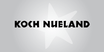
- P22 Peanut Pro by IHOF,
$39.95 Peanut is a face full of bounce and playfulness but is based on the traditions of the long revered Roman minuscule. The letters are unique in that they imply “youth” without relying on cliché child-like letterforms. Peanut and Peanut Sans come in a ‘Salted’ style which features many alternate letterforms. Both the Salted and regular styles are combined into in the Pro fonts.
 - P22 Sneaky Pro by IHOF,
$39.95 P22 Sneaky is the newest font by award winning type designer Michael Clark. Sneaky is a connecting-script and sibling of his popular Pooper Black type which shares a similar flow and casual elegance. It features shared details and relative size so that with careful design, the two can be mixed and matched. Sneaky Pro features over 500 glyphs with alternates and a Central European character set.
 - P22 Mai Pro by IHOF,
$39.95 Mai Pro is a new transitional antiqua that features ligatures, smallcaps and full Central European support. Mai's classic design is understated enough to be used for long running text applications yet includes unique characters suitable for design purposes. It is the Norwegian name for the month of May.
 - P22 Art Nouveau by P22 Type Foundry,
$24.95 The Art Nouveau styles of the late 19th century exhibited a bold approach to organic lines and lavish decoration. This new style was spread throughout the world and helped usher in a new era that led to modern art and design.
 - P22 Zaner Basic by IHOF,
$24.95 P22 Zaner is based on ornamental penmanship from the turn of the 20th century. The Zaner font set includes four unique fonts that complement the other fonts in the set. Each font is available in PostScript and TrueType formats as well as OpenType which offers even more characters, options and overall functionality. Set options include PostScript and TrueType with a bonus set of extras and a “super” pro set containing over 3,000 characters. Zaner is perfect for wedding invitations and documents that require a touch of elegance.
 - P22 Muschamp Pro by IHOF,
$29.95 Prolific illustrator and veteran typographer Tracy Sabin draws on more than 40 years of multi-disciplinary design experience to bring us Muschamp Pro, a loopy, bouncy, free-form alphabet adaptable for many uses. It embodies the spirit of the massive art nouveau wave that broke out in the late 1950s and ingrained itself in popular culture for about three decades on both sides of the pond. Carefree, playful, rhythmic and versatile, this font evokes plenty of album jackets, children book covers, and cartoon titling from the times that really defined those design expressions and enshrined them as essential pop art. Muschamp Pro comes with plenty of alternates, ligatures of both standard and discretionary varieties, and extended Latin language support, all contained in a glyphset of more than 500 characters. Use this font if you want your design to transmit a message of crafty and joyful activity.
 - P22 Art Deco by P22 Type Foundry,
$24.95 Art Deco turned mundane objects into graceful, sensual works of art, with a nod towards the opulent and extreme. Art Deco sought to build upon the elements of Modern Art movements by focusing on the principal object and removing the extraneous elements found in the Victorian era and in Art Nouveau. The concept of "form following function" and the technological advances of the early 20th century played a very important role in defining the direction of Art Deco. Popular images included stylized people, svelte animals, tall buildings, sleek vehicles and exotic scenes. Art Deco typographic designers were also inspired by these diverse themes. P22's Art Deco font set shows the influence of a cross section of some of the various European and American Art Deco styles.
 - P22 Pop Art by P22 Type Foundry,
$24.95 This font set was developed for the Albright-Knox Art Gallery and is inspired by their collection of Pop Art. Artists such as Warhol, Lichtenstein, and Rauchenberg sought to blur the lines between high and low art as well as the boundaries between art and everyday life. The alphabets and extras in this set reflect that spirit.
 - P22 FLW Midway by P22 Type Foundry,
$29.95 This font set is based on Frank Lloyd Wright's hand-lettering found on the Chicago Midway Gardens working drawings from 1913. This type of architectural lettering is a bit more casual than standard lettering found on most blueprints. It evokes the personality of Frank Lloyd Wright and complements the other fonts in the P22 FLW font series. Midway One and Midway Two can be used interchangeably to give a more naturalistic feeling of hand lettering. Midway Ornaments features over 100 decorative border elements that can be combined is many ways for surprising and effective decorative motifs. Midway One and Midway Two have been remastered and now contain over 400 characters including support for Western and Central European languages.
 - P22 Stickley Pro by IHOF,
$39.95 Stickley Optical Family is an expansion of P22 Stickley Text, a humanist, Oldstyle-rooted design with a contemporary execution and full OpenType abilities. The font contains ten distinct cuts across four optical masters—in addition to Text for page content, the optical family includes Display for titling; Headline for emphasis; and Caption for footnotes and small sizes. Typefaces were originally designed for the physical size at which they were to be printed, with subtle variations in proportion, detail, contrast, and visual weight to ensure they were as clear at 6 pt. as they were elegant at 68 pt. This created a unified design as the various sizes were set together on a page. Text is the foundation of this typeface family and is built for use in extended reading. Its proportions are carefully balanced for visual clarity while retaining its character; designed for use at 9 to 13 pt. Caption is a sturdy, simplified interpretation of the Text letterforms, with ink traps, generous letters and spacing, and hefty proportions to give balance to the smallest content on a page; designed for use at 5 to 8pt. Headline is a complement to the Text master size. It is a gently modified version with larger small caps to add visual strength and has a greater delicacy; designed for use at 14 to 26 pt. Display is an elegant refinement with stylized details. It harmonizes with the smaller optical masters as a more intricate manifestation of the typeface. Designed for use at 34 pt. and above. Opentype features include ligatures, oldstyle and lining figures, alternates, Central European characters and diacritics, and Swash Caps for the Italics. Stickley Optical Family is a feature-rich workhorse with international functionality.
 - P22 Folkwang Pro by IHOF,
$29.95 Folkwang is an unusual roman type with a lowercase that resembles an upright italic. Unusual top serifs are contrasted by almost no foot serifs. Originally released by the Klingspor foundry in 1955, this face originated from Hermann Schardt while he was the director of the Folkwang Werkkunstschule in Essen Germany circa 1949. According to British book designer and printing historian John Dreyfus in the 1955 Penrose Annual: Folkwang “…is a lovingly made piece of work which could have easily have been little more than an act of awe-struck reverence for the calligraphic techniques rediscovered by Edward Johnston and spread abroad in Germany by Anna Simons. Of special interest is the serif treatment of the lower-case letters: at the feet the terminals are mostly left bare, but the ascenders and the cross-strokes of the f and t are given elaborate curving serifs which in the mass create an effect unusual in a page of letters made as movable types, resembling rather more a piece of intaglio engraving. The ligatures ch and ck are original and successful.”
 - P22 Il Futurismo by P22 Type Foundry,
$24.95 Italian Futurism (1908-43) was one of the 20th century's first and most influential avant garde art movements. Futurist typography sought to disrupt traditional notions of harmony, space and composition on the printed page. The bold and jarring shapes of this set faithfully recall a tumultuous era in both Italian history and Italian graphic design.
 - P22 Schumann Pro by IHOF,
$29.95 Schumann Pro is the very first issue of a long lost early 1960s typeface project done by Heinz Schumann while he was at the University of Graphics and Book Design in Leipzig, where he studied under German type design giants Albert Kapr and Herbert Thannhaeuser. This alphabet was never published as a typeface, but Schumann went on to design Stentor for Typoart a couple of years after graduating. Albert Kapr’s influence is unmistakable in this playful upright script, especially in the wide and breezy capital forms. Unique exit strokes and serif placement work together to define the bouncy rhythm of this face. This is an expressive original alphabet that successfully bridges the gap between expert calligraphy and everyday sign lettering. P22 Schumann Pro comes with over 500 glyphs, which include plenty of alternates, quite a few ligatures, and extended Latin language support. It is a very effective font when used sparingly in packaging, signage, posters and things designed to catch the eye.
 - P22 Pouty Pro by IHOF,
$39.95 Newly remastered, this elegant font features over 770 characters. P22 Pouty Pro is a light contemporary italic, including a large set of ligatures and alternate characters, offering plenty of options for customization. Award winning commercial lettering artist, Michael Clark had noticed that italic, and its limitless variants, is more utilitarian than other calligraphic styles and Pouty—named for his youngest daughter Jennifer, a sulky beauty—is one of his favorite variations. Perfect for wedding materials, fashion editorial, packaging design, product labels and anywhere a sophisticated calligraphic style is desired.
 - P22 Spiggie Pro by IHOF,
$24.95 Spiggie is a sans-serif, whose name came to me on a Shetland beach. The beach traces a tight curve between the shoreline and the sea paralleled in the fonts controlled yet smooth character. The design language reaches back to the art deco period and the 1920s, yet retains a distinct modern flavor.
 - P22 Da Vinci by P22 Type Foundry,
$24.95 The great Italian artist, inventor, and visionary Leonardo da Vinci created an extraordinary variety of work which continues to amaze those who study it. This set faithfully captures Leonardo's remarkable imagination and includes an exclusive Da Vinci Backwards font (reflecting the artist's own unique style of handwriting). The 72 extras included are drawn from Leonardo's sketchbooks and journals.
 - P22 Roanoke Script by IHOF,
$24.95 Roanoke Script is a hand-written script inspired by 18th century forms. The visual effect is of a steel nib pen writing on uncalendered paper. Ideal for a few words in display sizes.
 - P22 Platten Neu by IHOF,
$39.95 The P22 Platten font family has been revisited and expanded by designer Colin Kahn. Platten is based on lettering found in German fountain pen practice books from the 1920s (you may have seen the similar Speedball books in the US). This round tip pen lettering is comparable to the basic forms used in grammar school teaching alphabets, but with a few original characteristics. The Italic version has even more of these unusual features. Geometric and simple yet casual and timeless. Perfect for many uses.
 - P22 Durer Caps by IHOF,
$24.95 Durer Caps is three fonts in one. Based on master artist Albrecht Dürer’s 1525 geometric construction of Roman capitals, this font features A to Z as caps only. But there are three variations included: filled construction, unfilled construction, and the solid fill letters by themselves.The user can layer the unfilled and the solid fill letters to do two-color overlay effects.
 - P22 Alpha Roman by IHOF,
$39.95 This font is a slightly calligraphic roman font with one major difference. In place of the upper case characters, there are decorative lower case “Drop Caps” accentuated by a decorative rendering of the alphabet in script form. As enlarged decorative caps—great for beginning paragraphs set in any number of fonts including the lower case included in the font itself.
 - P22 Basel Roman by P22 Type Foundry,
$24.95 In mid 2001, P22 was approached by a Daniel Garrison, a Classics scholar at Northwestern University about possibly digitizing a long lost "Garamond" typeface. This font was used by Johannes Herbst (a.k.a. Ioannes Oporinus) in 1543 to publish Andreas Vesalius' "On the Fabric of the Human Body" (De humani corporis fabrica) in Basel. The story of the development of this font takes a few twists and almost becomes forgotten itself over time.Forteen years later it is available to the public.
 - P22 Goudy Aries by P22 Type Foundry,
$24.95 Frederic W. Goudy (1865-1947) created over 100 typefaces during his lifetime. Like most type designers, he is known principally to most people only through his eponymously titled faces such as Goudy Modern, Goudy Old Style etc. This set includes one of Goudy's rarest Arts & Crafts styled faces, a font known as Aries. The font was originally created by Goudy for a private press in Eden, New York in 1926. Also included in this set are two decorative fonts: one font of 52 decorative Ornaments & one font that contains 52 Ampersands.
 - P22 Amelia Jayne by IHOF,
$39.95Amelia Jayne is Ted Staunton's updated revision and expansion of his own Amelia decorative cap font. Amelia Jayne started as a Roman font to accompany the Amelia initials but has taken on a new life as a Pro Roman font with small caps and several variations of new matching initial companion fonts. (The initials are not included in the pro font but come bundled with the set.) - P22 Gothic Gothic by IHOF,
$24.95 The name says it all. Gothic from the old literary style and/or current subculture genre. And Gothic meaning a block or sans serif style of lettering. The concept was to take the classic German style lettering and create a contemporary extended block letter typeface. The result is a fusion of old and new.
 - P22 Glaser Babyteeth by P22 Type Foundry,
$24.95 In 2019, P22 Type Foundry met with Milton Glaser (1929–2020) to initiate the official digital series of typefaces designed by Glaser in the 1960s and 70s. P22 Glaser Babyteeth is the first family released in the series. According to Glaser: “The inspiration for my Babyteeth type face came from this sign I photographed in Mexico City. It’s an advertisement for a tailor. The E was drawn as only someone unfamiliar with the alphabet could have conceived. Yet it is completely legible. I tried to invent the rest of the alphabet consistent with this model.” P22 Glaser Babyteeth was based on original drawings and phototype proofs from the Milton Glaser Studios archives. Over the years there have been many typefaces that borrowed heavily from the Glaser designs, but these are the only official Babyteeth fonts approved by Milton Glaser Studio and the Estate of Milton Glaser. The solid and open versions are designed to overlap for two-color font effects and can even be mixed and matched for multi layer chromatic treatments. Babyteeth includes an expanded character set to support the majority of Latin languages.
 - P22 FLW Terracotta by P22 Type Foundry,
$29.95The lettering and 100 extras for this font set, the third in P22’s Frank Lloyd Wright series, are derived from letterforms and decorative embellishments found in Wright’s early work (1893–1910) and in his book, The House Beautiful (1896–97). Wright based his delicate graphic designs on stylized natural plant forms. Users go this font can adorn their graphics with these beautiful motifs. Terracotta Regular and Terracotta Alt have been remastered and now contain almost 400 characters including support for Western and Central European languages. - P22 Glaser Babyfat by P22 Type Foundry,
$24.95 Milton Glaser on designing Babyfat: “This is the first alphabet I ever designed. For some inexplicable reason I called it Babyfat. Because I’m not a type designer, most of my alphabets are actually novelties or graphic ideas expressed typographically. Here the idea was to take a gothic letter and view it simultaneously from two sides. It started out as a rather esoteric letterform; it ended up being used in supermarkets for ‘Sale’ signs.” This forced perspective 3-D font has appeared on many LP covers and posters from the mid 1960s onward. This revival includes the original lowercase for the first time in digital form. Besides the three original styles (Outline, Shaded, and Black) made for photo typesetting, the new P22 Glaser Babyfat introduces six additional variations to allow the user to easily colorize the type as Glaser envisioned. The Keyline, Fill, Glyph, Left, Right, and Down font styles give the user nearly infinite options to create dynamic chromatic effects. P22 Glaser Babyfat was based on original drawings and phototype proofs from the Milton Glaser Studios archives. Typographic punctuation and sorts were imagined by James Grieshaber to work with Glaser’s design, as well as diacritics to accommodate most European languages. Over the years there have been many typefaces that borrowed heavily from the Glaser designs, but these are the only official fonts approved by Milton Glaser Studio and the Estate of Milton Glaser.
 - P22 Casual Script by IHOF,
$39.95 P22 Casual Script Pro is a flexible OpenType font based on mid-20th Century hand drawn advertising lettering scripts. As an alternate to thicker casual script styles, this free-flowing thin brush style is evocative of vintage product advertisements and packaging lettering and is highly suitable for a retro flavor. The Pro font includes over 500 glyphs with at least 2 of all upper and lower case characters with OpenType scripting and ligatures for a more natural and random effect. There is also a unique feature not found in other script fonts: Small Caps! While it may seem unnatural for a script font to have small caps, these work well as an authentic variation of brush script lettering for advertising. Also included in the Pro version is a full Central European character set, swash characters and more. OpenType features include: Small Caps, ligatures, discretionary ligatures, swashes, contextual alternates, stylistic alternates, Old Style/Lining Figures
 - P22 Preissig Calligraphic by P22 Type Foundry,
$29.95 P22 Preissig Calligraphic was originally designed by Czech typographer, artist, and designer Vojtěch Preissig (1873–1944). Preissig developed this type design in 1928 and has remained unpublished until recently. One can only speculate why this wonderful design was never produced into a commercially available typeface. His original designs feature an accompanying italic as well as small caps. Preissig had originally named the typeface design after his former employer in New York, Butterick Publishing Co. The ‘Butterick’ typeface retains the angularity of his previous typeface, Preissig Antiqua (AKA P22 Preissig Roman), but displays a more fluid calligraphic influence. P22 Preissig Calligraphic was started shortly after Richard Kegler saw the original drawings in an exhibit in Prague in 2004. A sympathetic security guard allowed a few photographs and the contraband images fueled a development of the typefaces. The design simmered for many years and is now ready to enter the world of contemporary design. P22 Preissig Calligraphic is a 2 font family that contains the originally designed small caps as an OpenType feature, as well as all the necessary diacritical to cover most European languages.
 - P22 Tuscan Expanded by IHOF,
$24.95 P22 Tuscan Expanded is a digitization of the mid-19th Century Woodtype font "Antique Tuscan Expanded - Wells & Webb 1854". Specimens of this font are rarely, if ever, seen with a lower case. It is noted in the book American Wood Type 1828-1900 by Rob Roy Kelly that the lower case is "missing". This version was digitized from a recently discovered full set including all lower case plus ff ligatures. One unique feature of this design is the heart shape formed in the V, X & Y.